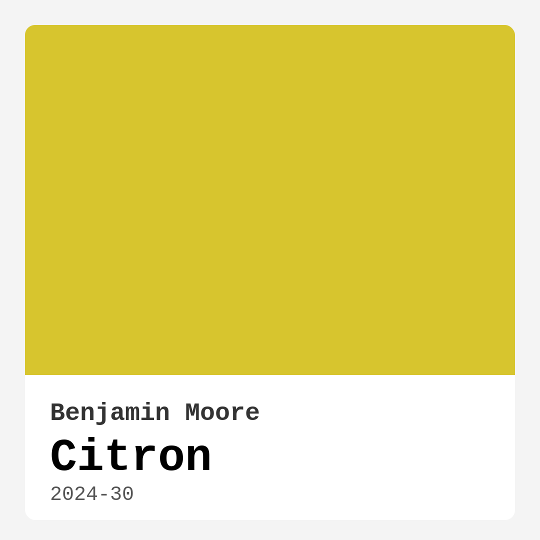
Color Preview & Key Details
| HEX Code | #D7C52E |
| RGB | 215, 197, 46 |
| LRV | 52.20% |
| Undertone | Yellow |
Imagine standing in a room that feels a bit dull, the walls almost begging for a touch of life. You want to create a space that feels welcoming, energetic, and vibrant. Have you considered a sunny, cheerful color like Benjamin Moore’s Citron? This vibrant yellow, with the code 2024-30, has a way of transforming any area into a bright haven, radiating warmth and positivity. Let’s dive deeper into what makes Citron such a captivating choice for your home.
Citron is not just any yellow; it’s a medium-bright hue that strikes a perfect balance between playful and sophisticated. With an LRV (Light Reflectance Value) of 52.20%, it reflects about half the light that hits it, making it a great option for spaces that need a little extra brightness. This means it can contribute to making a room feel larger and more open, which is particularly important in areas that may lack natural light.
What I love about Citron is its versatility. It shines beautifully in various settings, from kitchens to living rooms, and even nurseries. Picture a kitchen painted in Citron, where the color mimics the freshness of lemons, instantly making your cooking space feel more inviting. Or how about using it in a dining room where it sparks joy and conversation as friends gather around the table? Citron is sure to uplift the mood, making it an ideal choice for social spaces.
For those of you drawn to eclectic or bohemian styles, Citron can be a fantastic base color to play with. It pairs wonderfully with natural woods and earthy tones, enhancing its warmth and complementing other decor elements. If you prefer a more modern or contemporary aesthetic, consider using deep blues or grays alongside Citron for a striking contrast. The bright yellow really pops against cooler shades, creating a lively dynamic that’s both fun and sophisticated.
When it comes to applying Citron, you’ll find it’s notably beginner-friendly. Thanks to its smooth application, whether you’re rolling it on or brushing it, you can expect a quick-drying finish that covers well. Typically, you’ll need just one to two coats for a brilliant and even coverage, making this a practical choice for those who may not have a weekend to dedicate solely to painting. Plus, it’s highly washable—ideal if you’ve got kids or pets running around.
Now, a little heads-up—while Citron is undeniably vibrant, its brightness can be a bit overwhelming in smaller spaces. It’s best to use it as an accent wall or pair it with neutral tones if you’re working with a cozy room. Think of soft whites or light grays to balance the boldness of Citron, ensuring that your space feels both energetic and harmonious.
Testing the color in your home is crucial. The undertones of Citron lean towards yellow, enriching its character and influencing how it interacts with other colors in your decor. Depending on the furniture and flooring already in your space, Citron can take on different moods throughout the day. In natural light, it can seem almost luminous, whereas artificial light might soften its brightness. So grab some swatches, and see how it feels at different times of the day.
Let’s not forget about the practicality of Citron. It’s a low VOC paint, so you won’t have to worry too much about unpleasant odors or harmful emissions while you’re painting. This makes it a great choice for homes, especially if you have little ones around. And if you’re in a rental, Citron is a designer favorite that can make a strong impact without the need for permanent changes.
To truly elevate the look of a Citron-painted room, consider your trim and fixtures. Pairing it with classic whites like White Dove or Pure White can create a crisp, clean contrast that enhances the vibrancy of the yellow. Add in some brass fixtures, and you’ve got a chic, modern vibe that feels warm and inviting.
As far as maintenance goes, Citron is touch-up friendly, meaning you won’t need to fret too much about minor scuffs or scratches. Just keep a bit of leftover paint handy, and you’ll be able to keep your walls looking fresh with minimal effort.
If you’re feeling adventurous, use Citron on furniture pieces to bring a pop of color without committing to a full room transformation. Picture a dining chair set or a side table that vibrantly contrasts with neutral surroundings. It’s a way to keep the energy flowing in your home while retaining flexibility in your decor style.
In the grand scheme of things, incorporating Citron into your home decor can elevate your space, making it feel more alive and welcoming. Whether you’re welcoming guests into a bright entryway, creating an inviting atmosphere in a sunny kitchen, or providing a cheerful backdrop in a nursery, Citron is a color that delivers happiness and warmth.
In conclusion, if you’re on the lookout for a paint color that embodies brightness and joy, Benjamin Moore’s Citron might just be the perfect fit for you. Its versatility across different styles, ease of application, and ability to uplift any room makes it an excellent choice for your next project. So, take a leap and let Citron breathe new life into your home—it might just become your new favorite shade.

Real Room Photo of Citron 2024-30
Undertones of Citron ?
The undertones of Citron are a key aspect of its character, leaning towards Yellow. These subtle underlying hues are what give the color its depth and complexity. For example, a gray with a blue undertone will feel cooler and more modern, while one with a brown undertone will feel warmer and more traditional. It’s essential to test this paint in your home and observe it next to your existing furniture, flooring, and decor to see how these undertones interact and reveal themselves throughout the day.
HEX value: #D7C52E
RGB code: 215, 197, 46
Is Citron Cool or Warm?
Citron is considered a warm paint color. This characteristic plays a huge role in the overall feel of a room. Warm colors, like this one, tend to create a cozy, inviting, and energetic atmosphere, making them great for social spaces like living rooms and dining rooms. In contrast, cool colors often evoke a sense of calm and serenity, which is why they are popular in bedrooms and bathrooms. The warmth of Citron means it will pair beautifully with corresponding decor elements.
Understanding Color Properties and Interior Design Tips
Hue refers to a specific position on the color wheel, measured in degrees from 0 to 360. Each degree represents a different pure color:
- 0° represents red
- 120° represents green
- 240° represents blue
Saturation describes the intensity or purity of a color and is expressed as a percentage:
- At 0%, the color appears completely desaturated—essentially a shade of gray
- At 100%, the color is at its most vivid and vibrant
Lightness indicates how light or dark a color is, also expressed as a percentage:
- 0% lightness results in black
- 100% lightness results in white
Using Warm Colors in Interior Design
Warm hues—such as reds, oranges, yellows, warm beiges, and greiges—are excellent choices for creating inviting and energetic spaces. These colors are particularly well-suited for:
- Kitchens, living rooms, and bathrooms, where warmth enhances comfort and sociability
- Large rooms, where warm tones can help reduce the sense of emptiness and make the space feel more intimate
For example:
- Warm beige shades provide a cozy, inviting atmosphere, ideal for living rooms, bedrooms, and hallways.
- Warm greige (a mix of beige and gray) offers the warmth of beige with the modern appeal of gray, making it a versatile backdrop for dining areas, bedrooms, and living spaces.
However, be mindful when using warm light tones in rooms with limited natural light. These shades may appear muted or even take on an unpleasant yellowish tint. To avoid a dull or flat appearance:
- Add depth by incorporating richer tones like deep greens, charcoal, or chocolate brown
- Use textured elements such as curtains, rugs, or cushions to bring dimension to the space
Pro Tip: Achieving Harmony with Warm and Cool Color Balance
To create a well-balanced and visually interesting interior, mix warm and cool tones strategically. This contrast adds depth and harmony to your design.
- If your walls feature warm hues, introduce cool-colored accents such as blue or green furniture, artwork, or accessories to create contrast.
- For a polished look, consider using a complementary color scheme, which pairs colors opposite each other on the color wheel (e.g., red with green, orange with blue).
This thoughtful mix not only enhances visual appeal but also creates a space that feels both dynamic and cohesive.

Light Temperature Affects on Citron
Natural Light
Natural daylight changes in color temperature as the sun moves across the sky. At sunrise and sunset, the light tends to have a warm, golden tone with a color temperature around 2000 Kelvin (K). As the day progresses and the sun rises higher, the light becomes cooler and more neutral. Around midday, especially when the sky is clear, natural light typically reaches its peak brightness and shifts to a cooler tone, ranging from 5500 to 6500 Kelvin. This midday light is close to what we perceive as pure white or daylight-balanced light.
These shifts in natural light can significantly influence how colors appear in a space, which is why designers often consider both the time of day and the orientation of windows when planning interior color schemes.
Artificial Light
When choosing artificial lighting, pay close attention to the color temperature, measured in Kelvin (K). This determines how warm or cool the light will appear. Lower temperatures, around 2700K, give off a warm, yellow glow often used in living rooms or bedrooms. Higher temperatures, above 5000K, create a cool, bluish light similar to daylight, commonly used in kitchens, offices, or task areas.
Use the slider to see how lighting temperature can affect the appearance of a surface or color throughout a space.


4800K
LRV of Citron
The Light Reflectance Value (LRV) of Citron is 52.20%, which places it in the Light Medium colors category. This means it reflect half of the incident light. Understanding a paint’s LRV is crucial for predicting how it will look in your space. A higher LRV indicates a lighter color that reflects more light, making rooms feel larger and brighter. A lower LRV signifies a darker color that absorbs more light, creating a cozier, more intimate atmosphere. Always consider the natural and artificial lighting in your room when selecting a paint color based on its LRV.
Detailed Review of Citron
Additional Paint Characteristics
Citron offers a bold, lively presence that can transform your interior. When applied, it has a smooth finish that enhances its brightness, making it an excellent choice for accent walls or open spaces. The paint’s coverage is impressive, typically requiring only one to two coats for a radiant finish. Additionally, it pairs well with a variety of colors, making it versatile for different decor styles. Whether you’re aiming for a cheerful kitchen or a vibrant nursery, Citron shines through beautifully, creating an inviting atmosphere that feels fresh and modern. Just keep in mind that its brightness can be overwhelming in smaller spaces, so consider your room’s size before diving in.
Pros & Cons of 2024-30 Citron
Colors that go with Benjamin Moore Citron
FAQ on 2024-30 Citron
Can Citron be used in small rooms?
While Citron is a bright and cheerful color, it can be overwhelming in very small rooms. To maintain a sense of balance, consider using it as an accent wall or pairing it with neutral tones. This way, you can enjoy the vibrancy without it overpowering the space. Also, ensure the room receives ample natural light to avoid making it feel claustrophobic.
What colors pair well with Citron?
Citron pairs beautifully with a variety of colors. For a fresh look, consider pairing it with soft whites like Simply White or Creamy. For a more dramatic effect, deep blues or grays can provide a striking contrast. Additionally, earthy tones and natural woods complement Citron well, enhancing its warmth and adding depth to your decor.
Comparisons Citron with other colors
Official Page of Benjamin Moore Citron 2024-30