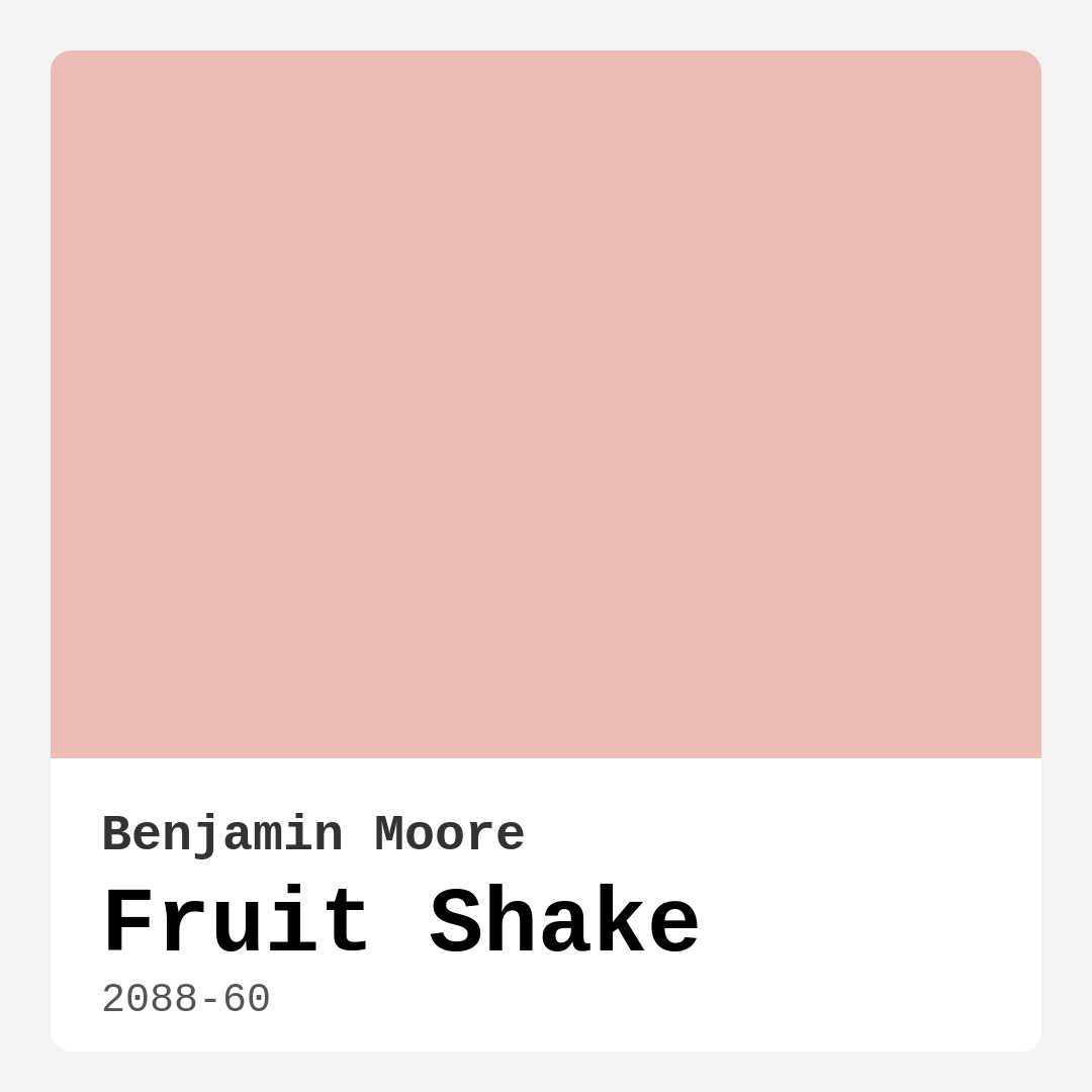
Color Preview & Key Details
| HEX Code | #ECBDB7 |
| RGB | 236, 189, 183 |
| LRV | 56.58% |
| Undertone | Red |
| Finish Options | Eggshell, Matte, Satin |
Imagine stepping into a room that instantly feels like a warm hug — that’s the magic of Fruit Shake by Benjamin Moore. This delightful soft peach hue, with its gentle charm, creates a cozy and inviting atmosphere that can transform any space into a sanctuary. You might be asking yourself, “Is this the right color for my home?” Let’s dive deep into the character of Fruit Shake and explore how it can elevate your interiors.
Fruit Shake isn’t just a color; it’s an experience. With its hex code #ECBDB7 and an RGB value of 236, 189, 183, this warm paint shade leans beautifully into the realm of soft pastels. It strikes the perfect balance between playful and sophisticated, making it ideal for a variety of rooms. You can easily see it gracing the walls of a nursery, adding a soothing touch, or brightening up a dining room, where it invites conversation and warmth.
One of the standout features of Fruit Shake is its versatility. It adapts seamlessly to different decor styles — whether you lean towards modern minimalism, the rustic charm of farmhouse, or a breezy coastal vibe, this color fits right in. Imagine pairing it with crisp whites or earthy tones for a balanced look. You can also have a bit of fun by mixing it with deeper shades like teal or navy for a playful contrast. The possibilities are endless!
When you start considering how to apply Fruit Shake, you’ll find it beginner-friendly and easy to work with. It comes in finishes like matte, eggshell, and satin, allowing you to choose the perfect sheen for your space. Plus, the application process is smooth and forgiving, which is a blessing for DIY novices. In fact, it dries quickly and has a low odor, making it ideal for projects that need to be completed swiftly without overwhelming your senses.
You’ll appreciate that Fruit Shake features a Light Reflectance Value (LRV) of 56.58%, placing it firmly among light colors. This means it reflects most of the incident light, making any room feel larger and airier. In bright daylight, the color radiates with a soft, peachy vibrance, invigorating your space. In contrast, under dim lighting, it subtly shifts to a deeper tone, maintaining its charm without losing depth. This ability to adapt to various lighting conditions is crucial when selecting the right color for your home.
Let’s talk about the undertones of Fruit Shake, which play a significant role in defining its character. Leaning towards red, these subtle undertones add depth and complexity to the color, making it more dynamic than you might initially perceive. Testing it in your home against existing furniture and decor will help you appreciate how these undertones reveal themselves throughout the day. One moment, it may feel warm and inviting, and the next, it may take on a sophisticated elegance.
Now, you might be wondering about the practical aspects of using Fruit Shake. With good coverage, you’ll typically need just one to two coats for a beautiful finish. It’s also touch-up friendly, meaning that maintaining your walls can be hassle-free. The washability feature ensures that everyday smudges and marks can be wiped away easily, making it suitable for high-traffic areas as long as you apply a durable topcoat. Opting for a satin or eggshell finish will enhance durability while keeping that cozy aesthetic intact.
However, it’s important to note that while Fruit Shake is an excellent choice for many spaces, it may not be suitable for very small rooms. The warm tones can sometimes feel overwhelming in compact settings, so consider the scale of your space when making a decision. Additionally, if you’re painting over a darker surface, using a good primer will help achieve the true essence of this lovely hue.
As you plan the layout of your rooms, think about how Fruit Shake can define your environment. It’s particularly fabulous in living rooms, bedrooms, kitchens, and even dining areas. Imagine a cozy living room where friends gather, adorned with warm accents and beautiful natural light reflecting off the walls. Or picture a serene bedroom retreat where you can unwind in a soft, peach-toned embrace. The color creates a mood that is both cozy and inviting, making it a designer favorite.
When it comes to trim and accents, Fruit Shake pairs beautifully with whites, especially shades like White Dove. This combination enhances the color’s warmth while providing a fresh contrast. If you’re looking to add a bit of flair, brass fixtures can complement Fruit Shake beautifully, enhancing its warm undertones and creating a cohesive look.
As you weigh your options, consider the feelings you want to evoke in your home. Do you crave a lively atmosphere for entertaining, or perhaps a calming retreat for relaxation? Fruit Shake’s warm, creamy tone will help you achieve either scenario. It brings a sense of comfort and joy to spaces, making it a perfect candidate for any room that feels like the heart of your home.
In summary, Fruit Shake is more than just a trendy paint color; it’s a versatile hue that invites warmth and charm into your home. With its easy application, adaptability to various styles, and ability to create cozy atmospheres, it’s a choice that can truly elevate your interiors. So, whether you’re embarking on a full remodel or just looking to refresh a single room, consider giving this delightful peach shade a try. It might just be the perfect touch to make your space feel like home.
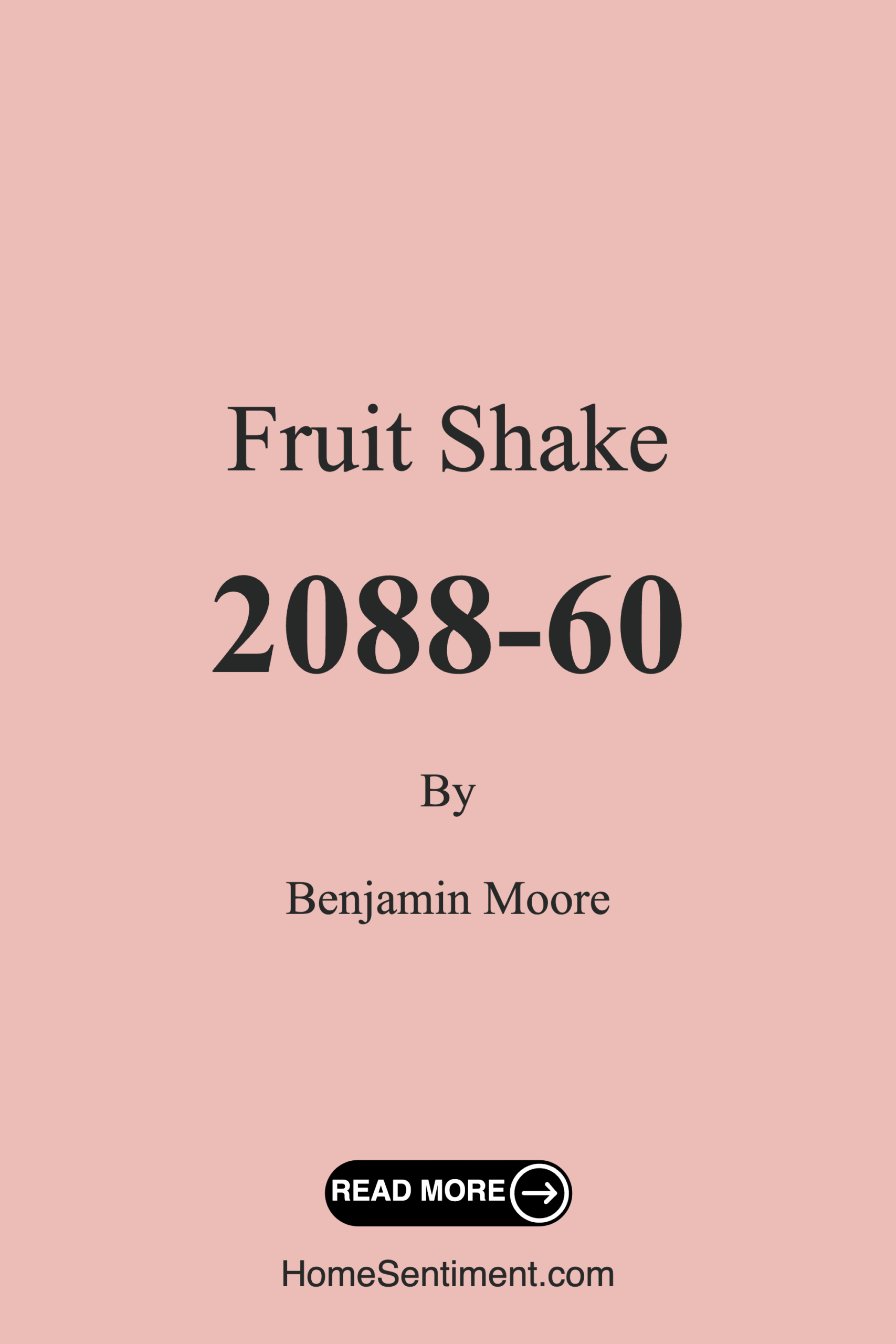
Save this color to your Pinterest board to revisit when planning your room.
Real Room Photo of Fruit Shake 2088-60
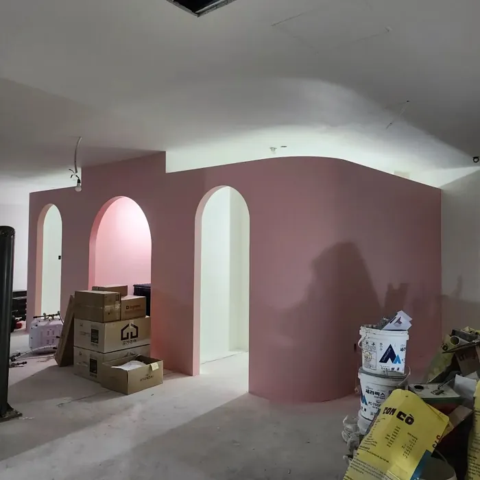
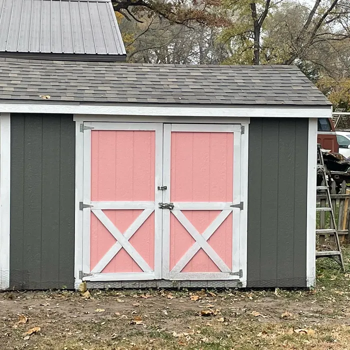
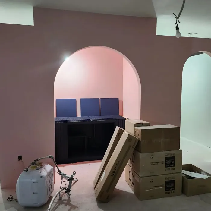
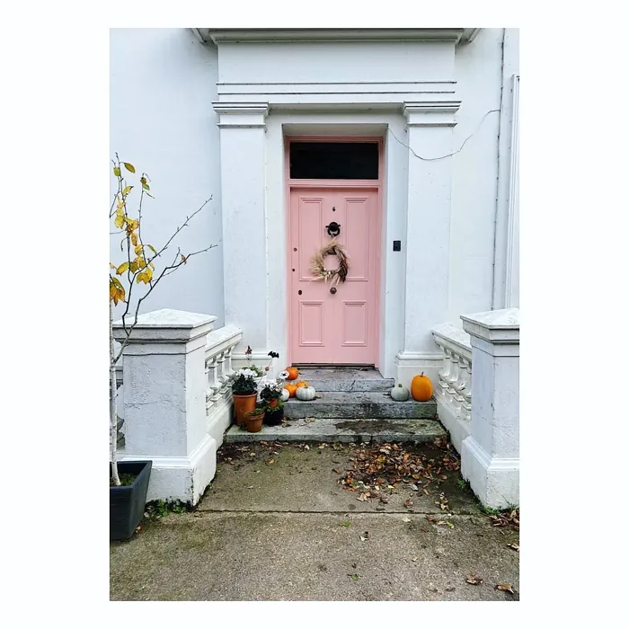
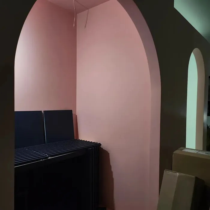
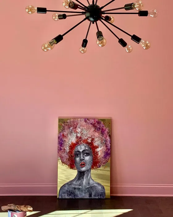
Real rooms painted with Fruit Shake 2088-60 by Benjamin Moore. Lighting and photography can affect how colors appear — always test a sample swatch in your own space.
Undertones of Fruit Shake ?
The undertones of Fruit Shake are a key aspect of its character, leaning towards Red. These subtle underlying hues are what give the color its depth and complexity. For example, a gray with a blue undertone will feel cooler and more modern, while one with a brown undertone will feel warmer and more traditional. It’s essential to test this paint in your home and observe it next to your existing furniture, flooring, and decor to see how these undertones interact and reveal themselves throughout the day.
HEX value: #ECBDB7
RGB code: 236, 189, 183
Is Fruit Shake Cool or Warm?
Fruit Shake is considered a warm paint color. This characteristic plays a huge role in the overall feel of a room. Warm colors, like this one, tend to create a cozy, inviting, and energetic atmosphere, making them great for social spaces like living rooms and dining rooms. In contrast, cool colors often evoke a sense of calm and serenity, which is why they are popular in bedrooms and bathrooms. The warmth of Fruit Shake means it will pair beautifully with corresponding decor elements.
Understanding Color Properties and Interior Design Tips
Hue refers to a specific position on the color wheel, measured in degrees from 0 to 360. Each degree represents a different pure color:
- 0° represents red
- 120° represents green
- 240° represents blue
Saturation describes the intensity or purity of a color and is expressed as a percentage:
- At 0%, the color appears completely desaturated—essentially a shade of gray
- At 100%, the color is at its most vivid and vibrant
Lightness indicates how light or dark a color is, also expressed as a percentage:
- 0% lightness results in black
- 100% lightness results in white
Using Warm Colors in Interior Design
Warm hues—such as reds, oranges, yellows, warm beiges, and greiges—are excellent choices for creating inviting and energetic spaces. These colors are particularly well-suited for:
- Kitchens, living rooms, and bathrooms, where warmth enhances comfort and sociability
- Large rooms, where warm tones can help reduce the sense of emptiness and make the space feel more intimate
For example:
- Warm beige shades provide a cozy, inviting atmosphere, ideal for living rooms, bedrooms, and hallways.
- Warm greige (a mix of beige and gray) offers the warmth of beige with the modern appeal of gray, making it a versatile backdrop for dining areas, bedrooms, and living spaces.
However, be mindful when using warm light tones in rooms with limited natural light. These shades may appear muted or even take on an unpleasant yellowish tint. To avoid a dull or flat appearance:
- Add depth by incorporating richer tones like deep greens, charcoal, or chocolate brown
- Use textured elements such as curtains, rugs, or cushions to bring dimension to the space
Pro Tip: Achieving Harmony with Warm and Cool Color Balance
To create a well-balanced and visually interesting interior, mix warm and cool tones strategically. This contrast adds depth and harmony to your design.
- If your walls feature warm hues, introduce cool-colored accents such as blue or green furniture, artwork, or accessories to create contrast.
- For a polished look, consider using a complementary color scheme, which pairs colors opposite each other on the color wheel (e.g., red with green, orange with blue).
This thoughtful mix not only enhances visual appeal but also creates a space that feels both dynamic and cohesive.
Save this color to your Pinterest board to revisit when planning your room.
Light Temperature Affects on Fruit Shake
Natural Light
Natural daylight changes in color temperature as the sun moves across the sky. At sunrise and sunset, the light tends to have a warm, golden tone with a color temperature around 2000 Kelvin (K). As the day progresses and the sun rises higher, the light becomes cooler and more neutral. Around midday, especially when the sky is clear, natural light typically reaches its peak brightness and shifts to a cooler tone, ranging from 5500 to 6500 Kelvin. This midday light is close to what we perceive as pure white or daylight-balanced light.
These shifts in natural light can significantly influence how colors appear in a space, which is why designers often consider both the time of day and the orientation of windows when planning interior color schemes.
Explore how this color transforms from sunrise through sunset as natural light changes throughout the day. Use the slider to simulate morning light, midday brightness, and warm afternoon tones.
North-facing rooms stay cooler throughout the day and benefit from warmer paint tones to compensate. South-facing rooms receive more direct sunlight, making even deeper shades more workable. East-facing rooms get bright morning light that fades by afternoon, while west-facing rooms glow warmly in the evening.
Artificial Light
When choosing artificial lighting, pay close attention to the color temperature, measured in Kelvin (K). This determines how warm or cool the light will appear. Lower temperatures, around 2700K, give off a warm, yellow glow often used in living rooms or bedrooms. Higher temperatures, above 5000K, create a cool, bluish light similar to daylight, commonly used in kitchens, offices, or task areas.
Use the slider to see how lighting temperature can affect the appearance of a surface or color throughout a space.
See how this color looks under different artificial light temperatures — from warm candlelight (2000K) to cool daylight (7000K). Move the slider to simulate your room's lighting conditions.


4800K
Keep in mind that natural light from windows, the warmth of lamps, and overhead lighting all affect how this color reads on your walls at different times of day. Always observe a sample swatch in your actual space before purchasing.
LRV of Fruit Shake
The Light Reflectance Value (LRV) of Fruit Shake is 56.58%, which places it in the Light colors category. This means it reflect most of the incident light. Understanding a paint’s LRV is crucial for predicting how it will look in your space. A higher LRV indicates a lighter color that reflects more light, making rooms feel larger and brighter. A lower LRV signifies a darker color that absorbs more light, creating a cozier, more intimate atmosphere. Always consider the natural and artificial lighting in your room when selecting a paint color based on its LRV.
Detailed Review of Fruit Shake
Additional Paint Characteristics
Ideal Rooms
Bedroom, Dining Room, Kitchen, Living Room, Nursery
Decor Styles
Bohemian, Coastal, Farmhouse, Modern, Transitional
Coverage
Good (1–2 Coats), Touch-Up Friendly
Ease of Application
Beginner Friendly, Brush Smooth, Fast-Drying, Roller-Ready
Washability
Washable, Wipeable
VOC Level
Low VOC
Best Use
Accent Wall, Bedroom, Interior Walls, Living Room, Nursery
Room Suitability
Bedroom, Dining Room, Kitchen, Living Room, Nursery
Tone Tag
Creamy, Pastel, Warm
Finish Type
Eggshell, Matte, Satin
Paint Performance
Easy Touch-Up, Low Odor, Quick Drying
Use Cases
Best for Rentals, Best for Small Spaces, Designer Favorite
Mood
Brightening, Cozy, Inviting
Trim Pairing
Complements Brass Fixtures, Pairs with White Dove, Works with Warm Trim
Fruit Shake is a soft peach color that exudes warmth and charm. It’s perfect for creating cozy spaces that feel inviting and relaxed. When applied, it offers a sophisticated yet playful ambiance that works beautifully in various rooms. The color adapts well to different lighting conditions, appearing lighter in natural light and slightly deeper in dimmer settings, making it versatile for any area of your home.
One of the standout features of Fruit Shake is its compatibility with a wide range of decor styles. Whether your home is modern, farmhouse, or even coastal, this color can blend seamlessly with your existing palette. It pairs beautifully with neutral whites or earthy tones for a balanced look, making it a great choice for accent walls or even larger spaces. Plus, its application is smooth and forgiving, ensuring that even DIY novices can achieve a professional finish.
Pros & Cons of 2088-60 Fruit Shake
Pros
Cons
Colors that go with Benjamin Moore Fruit Shake
FAQ on 2088-60 Fruit Shake
Can Fruit Shake be used in high-traffic areas?
Yes, Fruit Shake can be used in high-traffic areas as long as you apply a durable topcoat. Its washability makes it easy to maintain, and with proper care, it can withstand everyday wear. Just ensure to choose a finish that enhances durability, like satin or eggshell.
What colors pair well with Fruit Shake?
Fruit Shake pairs beautifully with whites, light grays, and earthy tones. For a more playful contrast, consider combining it with deeper shades of teal or navy. This color’s versatility allows it to complement both warm and cool palettes, making it a fantastic choice for various decor styles.
Comparisons Fruit Shake with other colors
Fruit Shake 2088-60 vs Realist Beige SW 6078
| Attribute | Fruit Shake 2088-60 | Realist Beige SW 6078 |
|---|---|---|
| Color Name | Fruit Shake 2088-60 | Realist Beige SW 6078 |
| Color | ||
| Hue | Pink | Pink |
| Brightness | Medium | Medium |
| RGB | 236, 189, 183 | 211, 200, 189 |
| LRV | 56.58% | 34% |
| Finish Type | Eggshell, Matte, Satin | Eggshell, Matte, Satin |
| Finish Options | Eggshell, Matte, Satin | Eggshell, Matte, Satin |
| Ideal Rooms | Bedroom, Dining Room, Kitchen, Living Room, Nursery | Bedroom, Dining Room, Entryway, Home Office, Kitchen, Living Room |
| Decor Styles | Bohemian, Coastal, Farmhouse, Modern, Transitional | Contemporary, Minimalist, Modern Farmhouse, Rustic, Traditional |
| Coverage | Good (1–2 Coats), Touch-Up Friendly | Good (1–2 Coats), Touch-Up Friendly |
| Ease of Application | Beginner Friendly, Brush Smooth, Fast-Drying, Roller-Ready | Beginner Friendly, Brush Smooth, Fast-Drying, Roller-Ready |
| Washability | Washable, Wipeable | Washable, Wipeable |
| Room Suitability | Bedroom, Dining Room, Kitchen, Living Room, Nursery | Bedroom, Dining Room, Home Office, Kitchen, Living Room |
| Tone | Creamy, Pastel, Warm | Earthy, Neutral, Warm |
| Paint Performance | Easy Touch-Up, Low Odor, Quick Drying | High Coverage, Low Odor, Quick Drying |
Lighting conditions, wall orientation, and surrounding decor can significantly affect how these colors appear in your space. Always test a sample swatch before committing to a full application.
Fruit Shake 2088-60 vs Rosaline Pearl SW 9077
| Attribute | Fruit Shake 2088-60 | Rosaline Pearl SW 9077 |
|---|---|---|
| Color Name | Fruit Shake 2088-60 | Rosaline Pearl SW 9077 |
| Color | ||
| Hue | Pink | Pink |
| Brightness | Medium | Medium |
| RGB | 236, 189, 183 | 163, 136, 135 |
| LRV | 56.58% | 69% |
| Finish Type | Eggshell, Matte, Satin | Eggshell, Matte |
| Finish Options | Eggshell, Matte, Satin | Eggshell, Matte, Satin |
| Ideal Rooms | Bedroom, Dining Room, Kitchen, Living Room, Nursery | Bedroom, Dining Room, Home Office, Living Room |
| Decor Styles | Bohemian, Coastal, Farmhouse, Modern, Transitional | Bohemian, Contemporary, Modern, Transitional |
| Coverage | Good (1–2 Coats), Touch-Up Friendly | Good (1–2 Coats) |
| Ease of Application | Beginner Friendly, Brush Smooth, Fast-Drying, Roller-Ready | Beginner Friendly, Brush Smooth, Fast-Drying, Roller-Ready |
| Washability | Washable, Wipeable | Washable, Wipeable |
| Room Suitability | Bedroom, Dining Room, Kitchen, Living Room, Nursery | Bedroom, Dining Room, Home Office, Living Room |
| Tone | Creamy, Pastel, Warm | Dusty, Muted, Warm |
| Paint Performance | Easy Touch-Up, Low Odor, Quick Drying | Easy Touch-Up, Fade Resistant, Low Odor |
Lighting conditions, wall orientation, and surrounding decor can significantly affect how these colors appear in your space. Always test a sample swatch before committing to a full application.
Fruit Shake 2088-60 vs Cabbage Rose SW 0003
| Attribute | Fruit Shake 2088-60 | Cabbage Rose SW 0003 |
|---|---|---|
| Color Name | Fruit Shake 2088-60 | Cabbage Rose SW 0003 |
| Color | ||
| Hue | Pink | Pink |
| Brightness | Medium | Medium |
| RGB | 236, 189, 183 | 197, 159, 145 |
| LRV | 56.58% | 15% |
| Finish Type | Eggshell, Matte, Satin | Eggshell, Matte, Satin |
| Finish Options | Eggshell, Matte, Satin | Eggshell, Matte, Satin |
| Ideal Rooms | Bedroom, Dining Room, Kitchen, Living Room, Nursery | Bedroom, Dining Room, Hallway, Living Room, Nursery |
| Decor Styles | Bohemian, Coastal, Farmhouse, Modern, Transitional | Cottage, Modern Farmhouse, Romantic, Shabby Chic, Vintage |
| Coverage | Good (1–2 Coats), Touch-Up Friendly | Good (1–2 Coats), Touch-Up Friendly |
| Ease of Application | Beginner Friendly, Brush Smooth, Fast-Drying, Roller-Ready | Beginner Friendly, Brush Smooth, Roller-Ready |
| Washability | Washable, Wipeable | Washable, Wipeable |
| Room Suitability | Bedroom, Dining Room, Kitchen, Living Room, Nursery | Bedroom, Dining Room, Hallway, Living Room, Nursery |
| Tone | Creamy, Pastel, Warm | Earthy, Muted, Warm |
| Paint Performance | Easy Touch-Up, Low Odor, Quick Drying | Easy Touch-Up, Low Odor |
Lighting conditions, wall orientation, and surrounding decor can significantly affect how these colors appear in your space. Always test a sample swatch before committing to a full application.
Fruit Shake 2088-60 vs Sashay Sand SW 6051
| Attribute | Fruit Shake 2088-60 | Sashay Sand SW 6051 |
|---|---|---|
| Color Name | Fruit Shake 2088-60 | Sashay Sand SW 6051 |
| Color | ||
| Hue | Pink | Pink |
| Brightness | Medium | Medium |
| RGB | 236, 189, 183 | 207, 180, 168 |
| LRV | 56.58% | 64% |
| Finish Type | Eggshell, Matte, Satin | Eggshell, Matte, Satin |
| Finish Options | Eggshell, Matte, Satin | Eggshell, Matte, Satin |
| Ideal Rooms | Bedroom, Dining Room, Kitchen, Living Room, Nursery | Bedroom, Dining Room, Home Office, Kitchen, Living Room |
| Decor Styles | Bohemian, Coastal, Farmhouse, Modern, Transitional | Bohemian, Contemporary, Modern Farmhouse, Scandinavian, Transitional |
| Coverage | Good (1–2 Coats), Touch-Up Friendly | Good (1–2 Coats), Touch-Up Friendly |
| Ease of Application | Beginner Friendly, Brush Smooth, Fast-Drying, Roller-Ready | Beginner Friendly, Fast-Drying, Roller-Ready |
| Washability | Washable, Wipeable | Highly Washable, Washable |
| Room Suitability | Bedroom, Dining Room, Kitchen, Living Room, Nursery | Bedroom, Dining Room, Home Office, Kitchen, Living Room |
| Tone | Creamy, Pastel, Warm | Earthy, Muted, Warm |
| Paint Performance | Easy Touch-Up, Low Odor, Quick Drying | Easy Touch-Up, Low Odor, Quick Drying, Scuff Resistant |
Lighting conditions, wall orientation, and surrounding decor can significantly affect how these colors appear in your space. Always test a sample swatch before committing to a full application.
Fruit Shake 2088-60 vs Touch of Sand SW 9085
| Attribute | Fruit Shake 2088-60 | Touch of Sand SW 9085 |
|---|---|---|
| Color Name | Fruit Shake 2088-60 | Touch of Sand SW 9085 |
| Color | ||
| Hue | Pink | Pink |
| Brightness | Medium | Medium |
| RGB | 236, 189, 183 | 213, 199, 186 |
| LRV | 56.58% | 66% |
| Finish Type | Eggshell, Matte, Satin | Eggshell, Matte, Satin |
| Finish Options | Eggshell, Matte, Satin | Eggshell, Matte, Satin |
| Ideal Rooms | Bedroom, Dining Room, Kitchen, Living Room, Nursery | Bathroom, Bedroom, Dining Room, Home Office, Kitchen, Living Room |
| Decor Styles | Bohemian, Coastal, Farmhouse, Modern, Transitional | Bohemian, Coastal, Contemporary, Modern Farmhouse, Rustic |
| Coverage | Good (1–2 Coats), Touch-Up Friendly | Good (1–2 Coats), Touch-Up Friendly |
| Ease of Application | Beginner Friendly, Brush Smooth, Fast-Drying, Roller-Ready | Beginner Friendly, Brush Smooth, Fast-Drying, Roller-Ready |
| Washability | Washable, Wipeable | Washable, Wipeable |
| Room Suitability | Bedroom, Dining Room, Kitchen, Living Room, Nursery | Bathroom, Bedroom, Dining Room, Home Office, Kitchen, Living Room |
| Tone | Creamy, Pastel, Warm | Earthy, Muted, Neutral, Warm |
| Paint Performance | Easy Touch-Up, Low Odor, Quick Drying | Easy Touch-Up, Low Odor, Quick Drying, Scuff Resistant |
Lighting conditions, wall orientation, and surrounding decor can significantly affect how these colors appear in your space. Always test a sample swatch before committing to a full application.
Fruit Shake 2088-60 vs Pink Shadow SW 0070
| Attribute | Fruit Shake 2088-60 | Pink Shadow SW 0070 |
|---|---|---|
| Color Name | Fruit Shake 2088-60 | Pink Shadow SW 0070 |
| Color | ||
| Hue | Pink | Pink |
| Brightness | Medium | Medium |
| RGB | 236, 189, 183 | 222, 195, 185 |
| LRV | 56.58% | 45% |
| Finish Type | Eggshell, Matte, Satin | Eggshell, Matte, Satin |
| Finish Options | Eggshell, Matte, Satin | Eggshell, Matte, Satin |
| Ideal Rooms | Bedroom, Dining Room, Kitchen, Living Room, Nursery | Bedroom, Dining Room, Home Office, Living Room, Nursery |
| Decor Styles | Bohemian, Coastal, Farmhouse, Modern, Transitional | Bohemian, Minimalist, Modern Farmhouse, Scandinavian, Traditional |
| Coverage | Good (1–2 Coats), Touch-Up Friendly | Good (1–2 Coats) |
| Ease of Application | Beginner Friendly, Brush Smooth, Fast-Drying, Roller-Ready | Beginner Friendly, Brush Smooth, Fast-Drying, Roller-Ready |
| Washability | Washable, Wipeable | Washable, Wipeable |
| Room Suitability | Bedroom, Dining Room, Kitchen, Living Room, Nursery | Bedroom, Dining Room, Living Room, Nursery |
| Tone | Creamy, Pastel, Warm | Muted, Pastel, Warm |
| Paint Performance | Easy Touch-Up, Low Odor, Quick Drying | Easy Touch-Up, High Coverage, Low Odor |
Lighting conditions, wall orientation, and surrounding decor can significantly affect how these colors appear in your space. Always test a sample swatch before committing to a full application.
Fruit Shake 2088-60 vs Hushed Auburn SW 9080
| Attribute | Fruit Shake 2088-60 | Hushed Auburn SW 9080 |
|---|---|---|
| Color Name | Fruit Shake 2088-60 | Hushed Auburn SW 9080 |
| Color | ||
| Hue | Pink | Pink |
| Brightness | Medium | Medium |
| RGB | 236, 189, 183 | 168, 133, 122 |
| LRV | 56.58% | 12% |
| Finish Type | Eggshell, Matte, Satin | Eggshell, Matte, Satin |
| Finish Options | Eggshell, Matte, Satin | Eggshell, Matte, Satin |
| Ideal Rooms | Bedroom, Dining Room, Kitchen, Living Room, Nursery | Bedroom, Dining Room, Home Office, Living Room |
| Decor Styles | Bohemian, Coastal, Farmhouse, Modern, Transitional | Contemporary, Modern Farmhouse, Rustic, Transitional |
| Coverage | Good (1–2 Coats), Touch-Up Friendly | Good (1–2 Coats), Touch-Up Friendly |
| Ease of Application | Beginner Friendly, Brush Smooth, Fast-Drying, Roller-Ready | Beginner Friendly, Brush Smooth, Fast-Drying, Roller-Ready |
| Washability | Washable, Wipeable | Washable, Wipeable |
| Room Suitability | Bedroom, Dining Room, Kitchen, Living Room, Nursery | Bedroom, Dining Room, Home Office, Living Room |
| Tone | Creamy, Pastel, Warm | Earthy, Muted, Warm |
| Paint Performance | Easy Touch-Up, Low Odor, Quick Drying | Easy Touch-Up, High Coverage, Low Odor |
Lighting conditions, wall orientation, and surrounding decor can significantly affect how these colors appear in your space. Always test a sample swatch before committing to a full application.
Fruit Shake 2088-60 vs Likeable Sand SW 6058
| Attribute | Fruit Shake 2088-60 | Likeable Sand SW 6058 |
|---|---|---|
| Color Name | Fruit Shake 2088-60 | Likeable Sand SW 6058 |
| Color | ||
| Hue | Pink | Pink |
| Brightness | Medium | Medium |
| RGB | 236, 189, 183 | 209, 183, 168 |
| LRV | 56.58% | 61% |
| Finish Type | Eggshell, Matte, Satin | Eggshell, Matte, Satin |
| Finish Options | Eggshell, Matte, Satin | Eggshell, Matte, Satin |
| Ideal Rooms | Bedroom, Dining Room, Kitchen, Living Room, Nursery | Bedroom, Dining Room, Home Office, Kitchen, Living Room |
| Decor Styles | Bohemian, Coastal, Farmhouse, Modern, Transitional | Bohemian, Coastal, Contemporary, Modern Farmhouse, Rustic |
| Coverage | Good (1–2 Coats), Touch-Up Friendly | Good (1–2 Coats), Touch-Up Friendly |
| Ease of Application | Beginner Friendly, Brush Smooth, Fast-Drying, Roller-Ready | Beginner Friendly, Brush Smooth, Fast-Drying, Roller-Ready |
| Washability | Washable, Wipeable | Washable, Wipeable |
| Room Suitability | Bedroom, Dining Room, Kitchen, Living Room, Nursery | Bedroom, Dining Room, Home Office, Kitchen, Living Room |
| Tone | Creamy, Pastel, Warm | Earthy, Muted, Warm |
| Paint Performance | Easy Touch-Up, Low Odor, Quick Drying | Easy Touch-Up, Low Odor, Quick Drying |
Lighting conditions, wall orientation, and surrounding decor can significantly affect how these colors appear in your space. Always test a sample swatch before committing to a full application.
Fruit Shake 2088-60 vs Glamour SW 6031
| Attribute | Fruit Shake 2088-60 | Glamour SW 6031 |
|---|---|---|
| Color Name | Fruit Shake 2088-60 | Glamour SW 6031 |
| Color | ||
| Hue | Pink | Pink |
| Brightness | Medium | Medium |
| RGB | 236, 189, 183 | 182, 160, 154 |
| LRV | 56.58% | 30% |
| Finish Type | Eggshell, Matte, Satin | Eggshell, Matte, Satin |
| Finish Options | Eggshell, Matte, Satin | Eggshell, Matte, Satin |
| Ideal Rooms | Bedroom, Dining Room, Kitchen, Living Room, Nursery | Bedroom, Dining Room, Home Office, Living Room |
| Decor Styles | Bohemian, Coastal, Farmhouse, Modern, Transitional | Bohemian, Classic, Modern, Transitional |
| Coverage | Good (1–2 Coats), Touch-Up Friendly | Good (1–2 Coats) |
| Ease of Application | Beginner Friendly, Brush Smooth, Fast-Drying, Roller-Ready | Beginner Friendly, Brush Smooth, Fast-Drying, Roller-Ready |
| Washability | Washable, Wipeable | Scrubbable, Washable |
| Room Suitability | Bedroom, Dining Room, Kitchen, Living Room, Nursery | Bedroom, Dining Room, Home Office, Living Room |
| Tone | Creamy, Pastel, Warm | Balanced, Neutral, Warm |
| Paint Performance | Easy Touch-Up, Low Odor, Quick Drying | Easy Touch-Up, Low Odor, Quick Drying |
Lighting conditions, wall orientation, and surrounding decor can significantly affect how these colors appear in your space. Always test a sample swatch before committing to a full application.
Fruit Shake 2088-60 vs Temperate Taupe SW 6037
| Attribute | Fruit Shake 2088-60 | Temperate Taupe SW 6037 |
|---|---|---|
| Color Name | Fruit Shake 2088-60 | Temperate Taupe SW 6037 |
| Color | ||
| Hue | Pink | Pink |
| Brightness | Medium | Medium |
| RGB | 236, 189, 183 | 191, 177, 170 |
| LRV | 56.58% | 34% |
| Finish Type | Eggshell, Matte, Satin | Eggshell, Matte, Satin |
| Finish Options | Eggshell, Matte, Satin | Eggshell, Matte, Satin |
| Ideal Rooms | Bedroom, Dining Room, Kitchen, Living Room, Nursery | Bedroom, Dining Room, Home Office, Kitchen, Living Room |
| Decor Styles | Bohemian, Coastal, Farmhouse, Modern, Transitional | Bohemian, Modern Farmhouse, Rustic, Transitional |
| Coverage | Good (1–2 Coats), Touch-Up Friendly | Good (1–2 Coats), Touch-Up Friendly |
| Ease of Application | Beginner Friendly, Brush Smooth, Fast-Drying, Roller-Ready | Beginner Friendly, Brush Smooth, Fast-Drying, Roller-Ready |
| Washability | Washable, Wipeable | Highly Washable, Washable |
| Room Suitability | Bedroom, Dining Room, Kitchen, Living Room, Nursery | Bedroom, Dining Room, Home Office, Living Room |
| Tone | Creamy, Pastel, Warm | Earthy, Neutral, Warm |
| Paint Performance | Easy Touch-Up, Low Odor, Quick Drying | Long Lasting, Low Odor, Quick Drying, Scuff Resistant |
Lighting conditions, wall orientation, and surrounding decor can significantly affect how these colors appear in your space. Always test a sample swatch before committing to a full application.
Official Page of Benjamin Moore Fruit Shake 2088-60