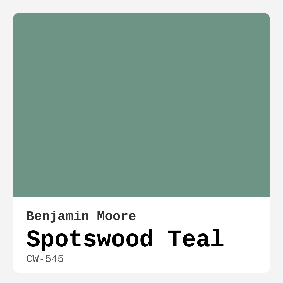
Color Preview & Key Details
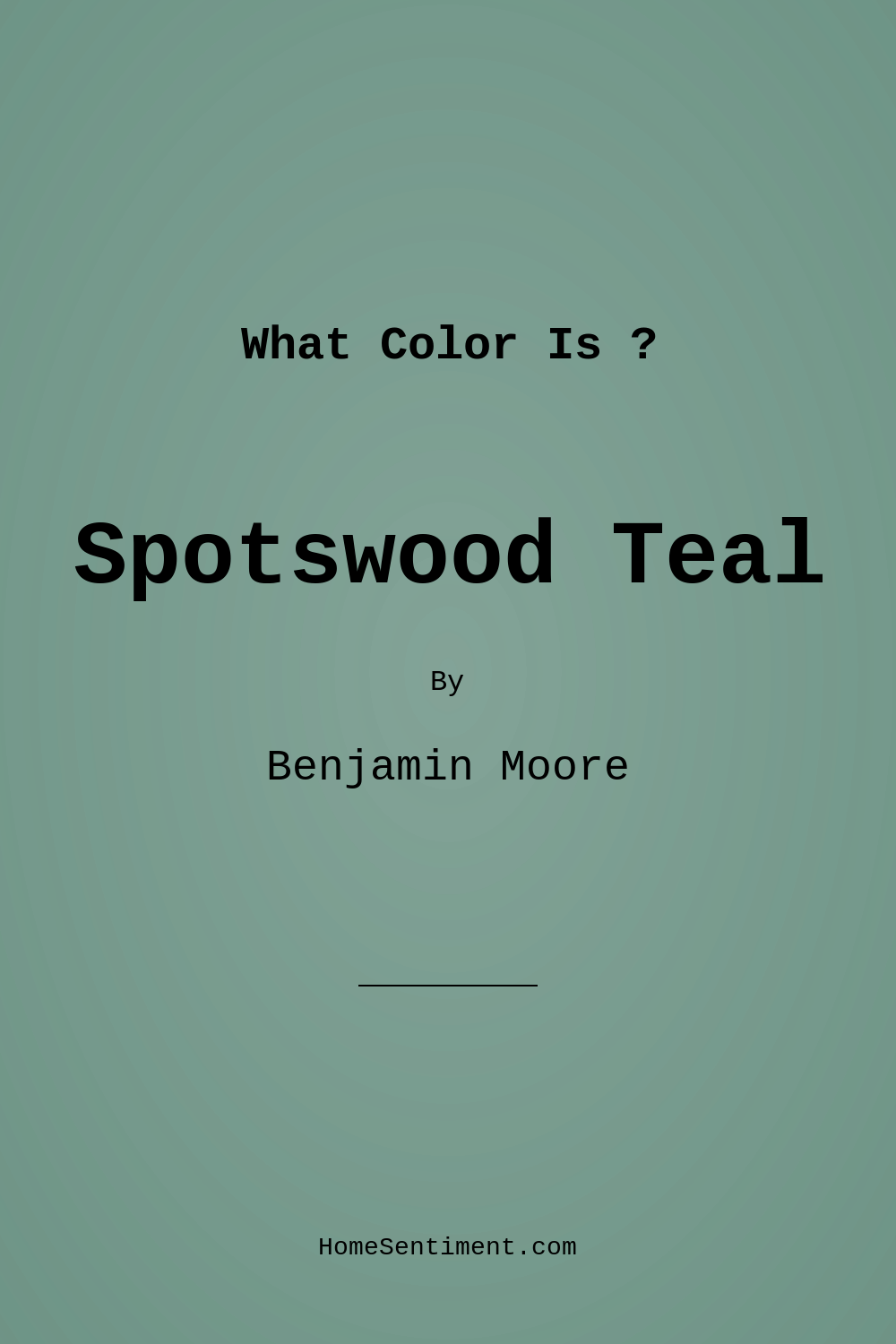
| HEX Code | #6E9486 |
| RGB | 110, 148, 134 |
| LRV | 28.06% |
| Undertone | Green |
| Finish Options | Eggshell, Flat, Satin |
Have you ever walked into a room and felt an instant sense of calm? That’s the magic of color, and one hue that can truly transform your space into a serene haven is Spotswood Teal by Benjamin Moore. This captivating blend of blue and green evokes the tranquility of nature, making it an inviting choice for any home. Whether you’re redesigning a cozy bedroom or refreshing a vibrant living room, Spotswood Teal could be the perfect shade to bring your vision to life.
Imagine stepping into a room painted in Spotswood Teal. The cool undertones wash over you, creating an atmosphere that feels both grounding and uplifting. It’s a color that walks the fine line between being a statement piece and a calming backdrop, making it versatile enough to suit various decor styles. If you’re contemplating a fresh coat of paint, this hue deserves your attention.
Spotswood Teal, with the color code CW-545, strikes a perfect balance between being vibrant and muted. Its unique blend of blue and green, coupled with subtle gray undertones, gives it a sophistication that can elevate any space. Unlike some teal shades that lean too heavily into brightness, Spotswood Teal offers a more refined appearance, making it suitable for traditional and modern designs alike.
One of the standout features of this color is its Light Reflectance Value (LRV) of 28.06%. This places it in the medium color category, meaning it reflects a decent amount of light while still maintaining depth. When you apply it to your walls, you’ll notice how it changes throughout the day; bright and lively in sunlight, softer and more intimate as evening approaches. This dynamic quality is particularly appealing for those who want a color that evolves with the natural light in their home.
If you’re considering using Spotswood Teal in a smaller room, you might wonder if it could make the space feel closed in. While it can appear darker in compact areas, this doesn’t have to be a drawback. Instead, think of it as an opportunity to create a dramatic focal point. Pairing it with lighter furnishings, ample natural light, and strategically placed mirrors can keep the room feeling open and airy. The beauty of this color is that it invites creativity; you can play with textures, patterns, and complementary shades to find the perfect balance.
Artfully combining Spotswood Teal with other colors can enhance its beauty even further. Imagine it paired with crisp white trim—like Benjamin Moore’s White Dove—offering a fresh contrast that highlights the teal’s richness. You could even incorporate brass fixtures or wooden elements, introducing warmth that complements the coolness of the teal. This interplay of colors and materials allows for endless customization, making it perfect for diverse decor styles, from coastal to bohemian to modern farmhouse.
When it comes to application, you’ll find that Spotswood Teal is beginner-friendly. Its smooth application means that you can cover your walls with minimal splatter, making it approachable for DIY enthusiasts. One or two coats will generally do the trick for good coverage, allowing you to enjoy its calming qualities without too much fuss. Plus, it’s scrubbable and washable, meaning you can maintain its beauty without significant effort.
Imagine this beautiful color enveloping your living room, creating a backdrop for lively conversations or quiet evenings. It’s not just paint; it’s an experience. The calming aura of Spotswood Teal invites relaxation, making it an excellent choice for bedrooms and home offices as well. Whether you’re creating a serene retreat for restful nights or a stimulating environment for productivity, this hue sets the perfect tone.
If you’re curious about how Spotswood Teal performs under different lighting conditions, allow me to share a little insight. This color shines in natural light, revealing its beautiful teal tones that can lift your mood. In darker settings, it takes on a cozier vibe, making it ideal for creating an intimate atmosphere. This adaptability makes it a fantastic choice for open-concept spaces where light shifts throughout the day.
For those who love to experiment with color, consider using Spotswood Teal as an accent wall. The rich, inviting hue creates a focal point that draws the eye and brings depth to your space. You could even use it on furniture pieces, like a bookcase or an island in your kitchen, to create a cohesive look throughout your home. The versatility of this color allows you to play with it in various ways, infusing your personal style into every corner.
Spotswood Teal is also a great choice for renters looking to make their space feel like home. Its low VOC level and eco-certification mean you’re not just choosing a beautiful color, but also a healthier option for your indoor environment. Being mindful of the air quality in your home while transforming it into a sanctuary is a win-win.
As you contemplate this color for your project, remember that testing is key. Sample Spotswood Teal on your walls and observe how it interacts with your existing furniture and decor. Lighting can dramatically change how a paint color appears, so take the time to see how it looks at different times of the day. You might find that it enhances your space in ways you hadn’t expected.
In summary, Spotswood Teal is a stunning choice that can elevate any room’s design. Its beautiful blend of blue and green creates a calming atmosphere, perfect for fostering relaxation and inviting conversation. Whether you decide to embrace it as a wall color, an accent, or on furniture, this hue will undoubtedly add a layer of sophistication and tranquility to your home.
So, are you ready to embrace the serenity of Spotswood Teal? Trust me, once you see how it transforms your space, you won’t look back. Happy decorating!
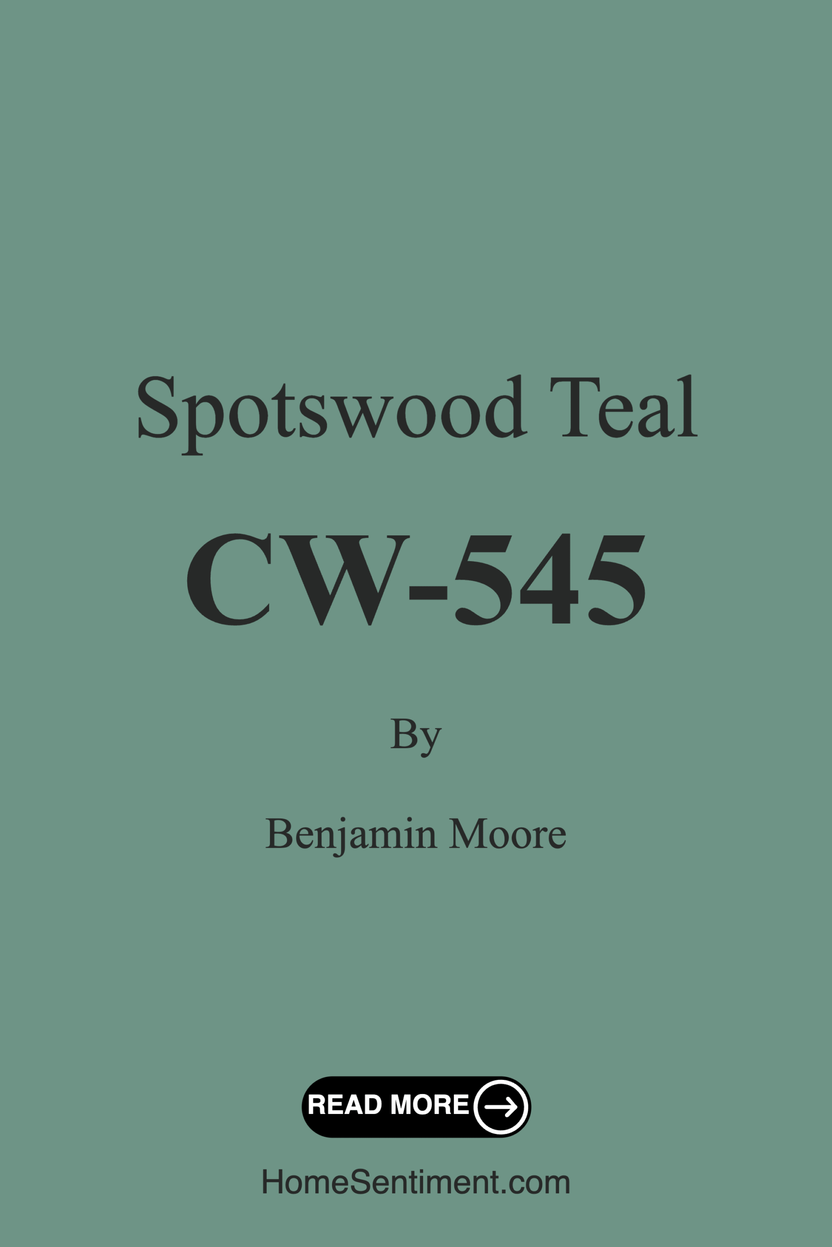
Save this color to your Pinterest board to revisit when planning your room.
Real Room Photo of Spotswood Teal CW-545
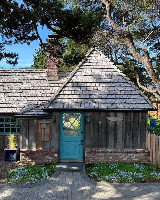
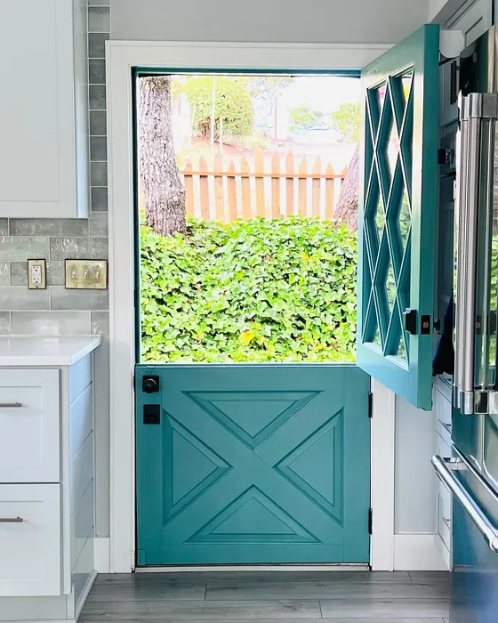
Real rooms painted with Spotswood Teal CW-545 by Benjamin Moore. Lighting and photography can affect how colors appear — always test a sample swatch in your own space.
Undertones of Spotswood Teal ?
The undertones of Spotswood Teal are a key aspect of its character, leaning towards Green. These subtle underlying hues are what give the color its depth and complexity. For example, a gray with a blue undertone will feel cooler and more modern, while one with a brown undertone will feel warmer and more traditional. It’s essential to test this paint in your home and observe it next to your existing furniture, flooring, and decor to see how these undertones interact and reveal themselves throughout the day.
HEX value: #6E9486
RGB code: 110, 148, 134
Is Spotswood Teal Cool or Warm?
Spotswood Teal is considered a cool paint color. This characteristic plays a huge role in the overall feel of a room. Cool colors, like this one, tend to create a cozy, inviting, and energetic atmosphere, making them great for social spaces like living rooms and dining rooms. In contrast, warm colors often evoke a sense of calm and serenity, which is why they are popular in bedrooms and bathrooms. The coolth of Spotswood Teal means it will pair beautifully with corresponding decor elements.
Understanding Color Properties and Interior Design Tips
Hue refers to a specific position on the color wheel, measured in degrees from 0 to 360. Each degree represents a different pure color:
- 0° represents red
- 120° represents green
- 240° represents blue
Saturation describes the intensity or purity of a color and is expressed as a percentage:
- At 0%, the color appears completely desaturated—essentially a shade of gray
- At 100%, the color is at its most vivid and vibrant
Lightness indicates how light or dark a color is, also expressed as a percentage:
- 0% lightness results in black
- 100% lightness results in white
Using Warm Colors in Interior Design
Warm hues—such as reds, oranges, yellows, warm beiges, and greiges—are excellent choices for creating inviting and energetic spaces. These colors are particularly well-suited for:
- Kitchens, living rooms, and bathrooms, where warmth enhances comfort and sociability
- Large rooms, where warm tones can help reduce the sense of emptiness and make the space feel more intimate
For example:
- Warm beige shades provide a cozy, inviting atmosphere, ideal for living rooms, bedrooms, and hallways.
- Warm greige (a mix of beige and gray) offers the warmth of beige with the modern appeal of gray, making it a versatile backdrop for dining areas, bedrooms, and living spaces.
However, be mindful when using warm light tones in rooms with limited natural light. These shades may appear muted or even take on an unpleasant yellowish tint. To avoid a dull or flat appearance:
- Add depth by incorporating richer tones like deep greens, charcoal, or chocolate brown
- Use textured elements such as curtains, rugs, or cushions to bring dimension to the space
Pro Tip: Achieving Harmony with Warm and Cool Color Balance
To create a well-balanced and visually interesting interior, mix warm and cool tones strategically. This contrast adds depth and harmony to your design.
- If your walls feature warm hues, introduce cool-colored accents such as blue or green furniture, artwork, or accessories to create contrast.
- For a polished look, consider using a complementary color scheme, which pairs colors opposite each other on the color wheel (e.g., red with green, orange with blue).
This thoughtful mix not only enhances visual appeal but also creates a space that feels both dynamic and cohesive.
Save this color to your Pinterest board to revisit when planning your room.
Light Temperature Affects on Spotswood Teal
Natural Light
Natural daylight changes in color temperature as the sun moves across the sky. At sunrise and sunset, the light tends to have a warm, golden tone with a color temperature around 2000 Kelvin (K). As the day progresses and the sun rises higher, the light becomes cooler and more neutral. Around midday, especially when the sky is clear, natural light typically reaches its peak brightness and shifts to a cooler tone, ranging from 5500 to 6500 Kelvin. This midday light is close to what we perceive as pure white or daylight-balanced light.
These shifts in natural light can significantly influence how colors appear in a space, which is why designers often consider both the time of day and the orientation of windows when planning interior color schemes.
Explore how this color transforms from sunrise through sunset as natural light changes throughout the day. Use the slider to simulate morning light, midday brightness, and warm afternoon tones.
North-facing rooms stay cooler throughout the day and benefit from warmer paint tones to compensate. South-facing rooms receive more direct sunlight, making even deeper shades more workable. East-facing rooms get bright morning light that fades by afternoon, while west-facing rooms glow warmly in the evening.
Artificial Light
When choosing artificial lighting, pay close attention to the color temperature, measured in Kelvin (K). This determines how warm or cool the light will appear. Lower temperatures, around 2700K, give off a warm, yellow glow often used in living rooms or bedrooms. Higher temperatures, above 5000K, create a cool, bluish light similar to daylight, commonly used in kitchens, offices, or task areas.
Use the slider to see how lighting temperature can affect the appearance of a surface or color throughout a space.
See how this color looks under different artificial light temperatures — from warm candlelight (2000K) to cool daylight (7000K). Move the slider to simulate your room's lighting conditions.


4800K
Keep in mind that natural light from windows, the warmth of lamps, and overhead lighting all affect how this color reads on your walls at different times of day. Always observe a sample swatch in your actual space before purchasing.
LRV of Spotswood Teal
The Light Reflectance Value (LRV) of Spotswood Teal is 28.06%, which places it in the Medium colors category. This means it reflect a lot of light. Understanding a paint’s LRV is crucial for predicting how it will look in your space. A higher LRV indicates a lighter color that reflects more light, making rooms feel larger and brighter. A lower LRV signifies a darker color that absorbs more light, creating a cozier, more intimate atmosphere. Always consider the natural and artificial lighting in your room when selecting a paint color based on its LRV.
Detailed Review of Spotswood Teal
Additional Paint Characteristics
Ideal Rooms
Bedroom, Dining Room, Home Office, Living Room
Decor Styles
Bohemian, Coastal, Modern, Traditional
Coverage
Good (1–2 Coats)
Ease of Application
Beginner Friendly, Brush Smooth, Roller-Ready
Washability
Scrubbable, Washable
VOC Level
Eco-Certified, Low VOC
Best Use
Accent Wall, Furniture, Interior Walls
Room Suitability
Bedroom, Home Office, Kitchen, Living Room
Tone Tag
Balanced, Cool, Muted
Finish Type
Eggshell, Satin
Paint Performance
Low Odor, Quick Drying, Scuff Resistant
Use Cases
Best for Modern Farmhouse, Best for Open Concept, Best for Rentals
Mood
Calm, Grounding, Inviting
Trim Pairing
Complements Brass Fixtures, Good with Wood Trim, Pairs with White Dove
Spotswood Teal is truly a standout color that invites peace and calm into any room. Its rich undertones provide depth without overwhelming the space, making it versatile enough for both bold statement walls and subtle accents. When applied, it reveals a lovely sheen that enhances its color depth, especially in natural light. The application is smooth, and it dries evenly, minimizing the risk of streaks. This color pairs beautifully with both light and dark furnishings, allowing for creative freedom in your decor choices. Overall, Spotswood Teal can transform your space into a serene retreat, making it a fantastic choice for those looking to refresh their home.
Pros & Cons of CW-545 Spotswood Teal
Pros
Cons
Colors that go with Benjamin Moore Spotswood Teal
FAQ on CW-545 Spotswood Teal
Can I use Spotswood Teal in a small room?
Absolutely! While Spotswood Teal can appear darker in smaller spaces, it can also add a dramatic touch. To mitigate the darkness, consider pairing it with plenty of natural light and lighter furnishings to keep the room feeling open and airy.
How does Spotswood Teal compare to other teal colors?
Spotswood Teal stands out due to its unique blend of blue and green with subtle gray undertones. Unlike some teal hues that can be overly vibrant, it offers a more muted, sophisticated take, making it versatile for both modern and traditional spaces.
Comparisons Spotswood Teal with other colors
Spotswood Teal CW-545 vs Acacia Haze SW 9132
| Attribute | Spotswood Teal CW-545 | Acacia Haze SW 9132 |
|---|---|---|
| Color Name | Spotswood Teal CW-545 | Acacia Haze SW 9132 |
| Color | ||
| Hue | Green | Green |
| Brightness | Medium | Medium |
| RGB | 110, 148, 134 | 150, 156, 146 |
| LRV | 28.06% | 30% |
| Finish Type | Eggshell, Satin | Eggshell, Satin |
| Finish Options | Eggshell, Flat, Satin | Eggshell, Matte, Satin |
| Ideal Rooms | Bedroom, Dining Room, Home Office, Living Room | Bedroom, Dining Room, Home Office, Living Room, Nursery |
| Decor Styles | Bohemian, Coastal, Modern, Traditional | Bohemian, Coastal, Modern Farmhouse, Scandinavian |
| Coverage | Good (1–2 Coats) | Good (1–2 Coats), Touch-Up Friendly |
| Ease of Application | Beginner Friendly, Brush Smooth, Roller-Ready | Beginner Friendly, Brush Smooth, Roller-Ready |
| Washability | Scrubbable, Washable | Washable, Wipeable |
| Room Suitability | Bedroom, Home Office, Kitchen, Living Room | Bedroom, Home Office, Living Room, Nursery |
| Tone | Balanced, Cool, Muted | Balanced, Earthy, Muted |
| Paint Performance | Low Odor, Quick Drying, Scuff Resistant | Easy Touch-Up, High Coverage, Low Odor |
Lighting conditions, wall orientation, and surrounding decor can significantly affect how these colors appear in your space. Always test a sample swatch before committing to a full application.
Spotswood Teal CW-545 vs Evergreen Fog SW 9130
| Attribute | Spotswood Teal CW-545 | Evergreen Fog SW 9130 |
|---|---|---|
| Color Name | Spotswood Teal CW-545 | Evergreen Fog SW 9130 |
| Color | ||
| Hue | Green | Green |
| Brightness | Medium | Medium |
| RGB | 110, 148, 134 | 149, 151, 138 |
| LRV | 28.06% | 30% |
| Finish Type | Eggshell, Satin | Eggshell, Matte, Satin |
| Finish Options | Eggshell, Flat, Satin | Eggshell, Matte, Satin |
| Ideal Rooms | Bedroom, Dining Room, Home Office, Living Room | Bedroom, Dining Room, Home Office, Living Room, Nursery |
| Decor Styles | Bohemian, Coastal, Modern, Traditional | Coastal, Modern Farmhouse, Rustic, Scandinavian, Transitional |
| Coverage | Good (1–2 Coats) | Good (1–2 Coats), Touch-Up Friendly |
| Ease of Application | Beginner Friendly, Brush Smooth, Roller-Ready | Beginner Friendly, Brush Smooth, Roller-Ready |
| Washability | Scrubbable, Washable | Scrubbable, Washable |
| Room Suitability | Bedroom, Home Office, Kitchen, Living Room | Bedroom, Dining Room, Home Office, Living Room, Nursery |
| Tone | Balanced, Cool, Muted | Balanced, Earthy, Muted |
| Paint Performance | Low Odor, Quick Drying, Scuff Resistant | Easy Touch-Up, Low Odor, Scuff Resistant |
Lighting conditions, wall orientation, and surrounding decor can significantly affect how these colors appear in your space. Always test a sample swatch before committing to a full application.
Spotswood Teal CW-545 vs Clary Sage SW 6178
| Attribute | Spotswood Teal CW-545 | Clary Sage SW 6178 |
|---|---|---|
| Color Name | Spotswood Teal CW-545 | Clary Sage SW 6178 |
| Color | ||
| Hue | Green | Green |
| Brightness | Medium | Medium |
| RGB | 110, 148, 134 | 172, 173, 151 |
| LRV | 28.06% | 24% |
| Finish Type | Eggshell, Satin | Eggshell, Matte |
| Finish Options | Eggshell, Flat, Satin | Eggshell, Matte, Satin |
| Ideal Rooms | Bedroom, Dining Room, Home Office, Living Room | Bathroom, Bedroom, Home Office, Kitchen, Living Room |
| Decor Styles | Bohemian, Coastal, Modern, Traditional | Bohemian, Minimalist, Modern Farmhouse, Scandinavian, Traditional |
| Coverage | Good (1–2 Coats) | Good (1–2 Coats), Touch-Up Friendly |
| Ease of Application | Beginner Friendly, Brush Smooth, Roller-Ready | Beginner Friendly, Brush Smooth, Roller-Ready |
| Washability | Scrubbable, Washable | Washable, Wipeable |
| Room Suitability | Bedroom, Home Office, Kitchen, Living Room | Bathroom, Bedroom, Home Office, Kitchen, Living Room |
| Tone | Balanced, Cool, Muted | Cool, Earthy, Muted |
| Paint Performance | Low Odor, Quick Drying, Scuff Resistant | Easy Touch-Up, High Coverage, Low Odor |
Lighting conditions, wall orientation, and surrounding decor can significantly affect how these colors appear in your space. Always test a sample swatch before committing to a full application.
Spotswood Teal CW-545 vs Softened Green SW 6177
| Attribute | Spotswood Teal CW-545 | Softened Green SW 6177 |
|---|---|---|
| Color Name | Spotswood Teal CW-545 | Softened Green SW 6177 |
| Color | ||
| Hue | Green | Green |
| Brightness | Medium | Medium |
| RGB | 110, 148, 134 | 187, 188, 167 |
| LRV | 28.06% | 48% |
| Finish Type | Eggshell, Satin | Eggshell, Matte, Satin |
| Finish Options | Eggshell, Flat, Satin | Eggshell, Matte, Satin |
| Ideal Rooms | Bedroom, Dining Room, Home Office, Living Room | Bathroom, Bedroom, Dining Room, Home Office, Kitchen, Living Room, Nursery |
| Decor Styles | Bohemian, Coastal, Modern, Traditional | Coastal, Farmhouse, Minimalist, Modern, Scandinavian |
| Coverage | Good (1–2 Coats) | Good (1–2 Coats), Touch-Up Friendly |
| Ease of Application | Beginner Friendly, Brush Smooth, Roller-Ready | Beginner Friendly, Brush Smooth, Fast-Drying, Roller-Ready |
| Washability | Scrubbable, Washable | Washable, Wipeable |
| Room Suitability | Bedroom, Home Office, Kitchen, Living Room | Bathroom, Bedroom, Dining Room, Home Office, Kitchen, Living Room |
| Tone | Balanced, Cool, Muted | Calm, Earthy, Muted |
| Paint Performance | Low Odor, Quick Drying, Scuff Resistant | Easy Touch-Up, Fade Resistant, Low Odor, Quick Drying |
Lighting conditions, wall orientation, and surrounding decor can significantly affect how these colors appear in your space. Always test a sample swatch before committing to a full application.
Spotswood Teal CW-545 vs Eventide SW 9643
| Attribute | Spotswood Teal CW-545 | Eventide SW 9643 |
|---|---|---|
| Color Name | Spotswood Teal CW-545 | Eventide SW 9643 |
| Color | ||
| Hue | Green | Green |
| Brightness | Medium | Medium |
| RGB | 110, 148, 134 | 163, 175, 172 |
| LRV | 28.06% | 24% |
| Finish Type | Eggshell, Satin | Eggshell, Matte, Satin |
| Finish Options | Eggshell, Flat, Satin | Eggshell, Matte, Satin |
| Ideal Rooms | Bedroom, Dining Room, Home Office, Living Room | Bedroom, Home Office, Kitchen, Living Room, Nursery |
| Decor Styles | Bohemian, Coastal, Modern, Traditional | Coastal, Contemporary, Minimalist, Modern |
| Coverage | Good (1–2 Coats) | Good (1–2 Coats), Touch-Up Friendly |
| Ease of Application | Beginner Friendly, Brush Smooth, Roller-Ready | Beginner Friendly, Brush Smooth, Fast-Drying, Roller-Ready |
| Washability | Scrubbable, Washable | Washable, Wipeable |
| Room Suitability | Bedroom, Home Office, Kitchen, Living Room | Bedroom, Home Office, Living Room, Nursery |
| Tone | Balanced, Cool, Muted | Airy, Balanced, Cool, Muted |
| Paint Performance | Low Odor, Quick Drying, Scuff Resistant | Easy Touch-Up, High Coverage, Low Odor, Quick Drying |
Lighting conditions, wall orientation, and surrounding decor can significantly affect how these colors appear in your space. Always test a sample swatch before committing to a full application.
Spotswood Teal CW-545 vs Escape Gray SW 6185
| Attribute | Spotswood Teal CW-545 | Escape Gray SW 6185 |
|---|---|---|
| Color Name | Spotswood Teal CW-545 | Escape Gray SW 6185 |
| Color | ||
| Hue | Green | Green |
| Brightness | Medium | Medium |
| RGB | 110, 148, 134 | 171, 172, 159 |
| LRV | 28.06% | 48% |
| Finish Type | Eggshell, Satin | Eggshell, Matte |
| Finish Options | Eggshell, Flat, Satin | Eggshell, Matte, Satin |
| Ideal Rooms | Bedroom, Dining Room, Home Office, Living Room | Bathroom, Bedroom, Entryway, Home Office, Living Room |
| Decor Styles | Bohemian, Coastal, Modern, Traditional | Minimalist, Modern, Scandinavian, Transitional |
| Coverage | Good (1–2 Coats) | Good (1–2 Coats) |
| Ease of Application | Beginner Friendly, Brush Smooth, Roller-Ready | Beginner Friendly, Brush Smooth, Roller-Ready |
| Washability | Scrubbable, Washable | Highly Washable, Washable |
| Room Suitability | Bedroom, Home Office, Kitchen, Living Room | Bathroom, Bedroom, Home Office, Living Room |
| Tone | Balanced, Cool, Muted | Cool, Muted, Neutral, Warm |
| Paint Performance | Low Odor, Quick Drying, Scuff Resistant | Easy Touch-Up, Low Odor, Scuff Resistant |
Lighting conditions, wall orientation, and surrounding decor can significantly affect how these colors appear in your space. Always test a sample swatch before committing to a full application.
Spotswood Teal CW-545 vs Coastal Plain SW 6192
| Attribute | Spotswood Teal CW-545 | Coastal Plain SW 6192 |
|---|---|---|
| Color Name | Spotswood Teal CW-545 | Coastal Plain SW 6192 |
| Color | ||
| Hue | Green | Green |
| Brightness | Medium | Medium |
| RGB | 110, 148, 134 | 159, 166, 148 |
| LRV | 28.06% | 66% |
| Finish Type | Eggshell, Satin | Eggshell, Satin |
| Finish Options | Eggshell, Flat, Satin | Eggshell, Satin, Semi-Gloss |
| Ideal Rooms | Bedroom, Dining Room, Home Office, Living Room | Bathroom, Bedroom, Home Office, Kitchen, Living Room |
| Decor Styles | Bohemian, Coastal, Modern, Traditional | Bohemian, Coastal, Contemporary, Modern Farmhouse, Rustic |
| Coverage | Good (1–2 Coats) | Good (1–2 Coats) |
| Ease of Application | Beginner Friendly, Brush Smooth, Roller-Ready | Beginner Friendly, Brush Smooth, Fast-Drying, Roller-Ready |
| Washability | Scrubbable, Washable | Scrubbable, Washable |
| Room Suitability | Bedroom, Home Office, Kitchen, Living Room | Bathroom, Bedroom, Dining Room, Home Office, Kitchen, Living Room |
| Tone | Balanced, Cool, Muted | Cool, Earthy, Muted |
| Paint Performance | Low Odor, Quick Drying, Scuff Resistant | High Coverage, Low Odor, Quick Drying |
Lighting conditions, wall orientation, and surrounding decor can significantly affect how these colors appear in your space. Always test a sample swatch before committing to a full application.
Spotswood Teal CW-545 vs Contented SW 6191
| Attribute | Spotswood Teal CW-545 | Contented SW 6191 |
|---|---|---|
| Color Name | Spotswood Teal CW-545 | Contented SW 6191 |
| Color | ||
| Hue | Green | Green |
| Brightness | Medium | Medium |
| RGB | 110, 148, 134 | 189, 192, 179 |
| LRV | 28.06% | 45% |
| Finish Type | Eggshell, Satin | Eggshell, Matte, Satin |
| Finish Options | Eggshell, Flat, Satin | Eggshell, Matte, Satin |
| Ideal Rooms | Bedroom, Dining Room, Home Office, Living Room | Bedroom, Dining Room, Home Office, Kitchen, Living Room |
| Decor Styles | Bohemian, Coastal, Modern, Traditional | Contemporary, Minimalist, Modern, Scandinavian, Transitional |
| Coverage | Good (1–2 Coats) | Good (1–2 Coats), Touch-Up Friendly |
| Ease of Application | Beginner Friendly, Brush Smooth, Roller-Ready | Beginner Friendly, Brush Smooth, Roller-Ready |
| Washability | Scrubbable, Washable | Stain Resistant, Washable |
| Room Suitability | Bedroom, Home Office, Kitchen, Living Room | Bedroom, Dining Room, Home Office, Kitchen, Living Room |
| Tone | Balanced, Cool, Muted | Muted, Neutral, Warm |
| Paint Performance | Low Odor, Quick Drying, Scuff Resistant | Easy Touch-Up, High Coverage, Low Odor |
Lighting conditions, wall orientation, and surrounding decor can significantly affect how these colors appear in your space. Always test a sample swatch before committing to a full application.
Spotswood Teal CW-545 vs Jade Dragon SW 9129
| Attribute | Spotswood Teal CW-545 | Jade Dragon SW 9129 |
|---|---|---|
| Color Name | Spotswood Teal CW-545 | Jade Dragon SW 9129 |
| Color | ||
| Hue | Green | Green |
| Brightness | Medium | Medium |
| RGB | 110, 148, 134 | 144, 152, 134 |
| LRV | 28.06% | 12% |
| Finish Type | Eggshell, Satin | Eggshell, Matte, Satin |
| Finish Options | Eggshell, Flat, Satin | Eggshell, Matte, Satin |
| Ideal Rooms | Bedroom, Dining Room, Home Office, Living Room | Bedroom, Dining Room, Home Office, Living Room, Nursery |
| Decor Styles | Bohemian, Coastal, Modern, Traditional | Bohemian, Minimalist, Modern, Traditional, Transitional |
| Coverage | Good (1–2 Coats) | Good (1–2 Coats), Touch-Up Friendly |
| Ease of Application | Beginner Friendly, Brush Smooth, Roller-Ready | Beginner Friendly, Brush Smooth, Fast-Drying, Roller-Ready |
| Washability | Scrubbable, Washable | Highly Washable, Stain Resistant, Washable |
| Room Suitability | Bedroom, Home Office, Kitchen, Living Room | Bedroom, Dining Room, Home Office, Living Room, Nursery |
| Tone | Balanced, Cool, Muted | Balanced, Cool, Earthy, Muted |
| Paint Performance | Low Odor, Quick Drying, Scuff Resistant | Easy Touch-Up, Fade Resistant, Low Odor, Stain Resistant |
Lighting conditions, wall orientation, and surrounding decor can significantly affect how these colors appear in your space. Always test a sample swatch before committing to a full application.
Spotswood Teal CW-545 vs Underseas SW 6214
| Attribute | Spotswood Teal CW-545 | Underseas SW 6214 |
|---|---|---|
| Color Name | Spotswood Teal CW-545 | Underseas SW 6214 |
| Color | ||
| Hue | Green | Green |
| Brightness | Medium | Medium |
| RGB | 110, 148, 134 | 124, 142, 135 |
| LRV | 28.06% | 24% |
| Finish Type | Eggshell, Satin | Eggshell, Matte, Satin |
| Finish Options | Eggshell, Flat, Satin | Eggshell, Matte, Satin |
| Ideal Rooms | Bedroom, Dining Room, Home Office, Living Room | Bathroom, Bedroom, Dining Room, Hallway, Home Office, Living Room |
| Decor Styles | Bohemian, Coastal, Modern, Traditional | Coastal, Eclectic, Farmhouse, Modern, Scandinavian |
| Coverage | Good (1–2 Coats) | Good (1–2 Coats), Touch-Up Friendly |
| Ease of Application | Beginner Friendly, Brush Smooth, Roller-Ready | Beginner Friendly, Brush Smooth, Fast-Drying, Roller-Ready |
| Washability | Scrubbable, Washable | Highly Washable, Washable, Wipeable |
| Room Suitability | Bedroom, Home Office, Kitchen, Living Room | Bathroom, Bedroom, Dining Room, Home Office, Living Room |
| Tone | Balanced, Cool, Muted | Balanced, Cool, Earthy, Muted |
| Paint Performance | Low Odor, Quick Drying, Scuff Resistant | Easy Touch-Up, Fade Resistant, High Coverage, Low Odor |
Lighting conditions, wall orientation, and surrounding decor can significantly affect how these colors appear in your space. Always test a sample swatch before committing to a full application.
Official Page of Benjamin Moore Spotswood Teal CW-545