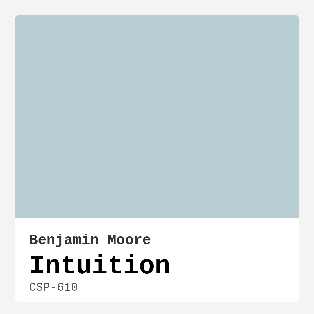
Color Preview & Key Details
| HEX Code | #B7CED4 |
| RGB | 183, 206, 212 |
| Undertone | Blue |
| Finish Options | Eggshell, Matte, Satin |
Imagine stepping into a room that instantly calms you, a space that feels as refreshing as a gentle breeze over tranquil waters. That’s exactly what you get with Benjamin Moore’s Intuition, a serene blue hue that invites peace and clarity into your home. It’s not just a color; it’s an experience, an atmosphere, and a way of enhancing your living spaces.
Intuition, with its delightful blend of soft blue and hints of gray, is the perfect choice for anyone looking to create a tranquil environment. Picture it on the walls of a bedroom, where you unwind after a long day, or in a cozy living room, where you gather with loved ones. It draws you in, making you feel at ease and comfortable, like a soft hug after a chilly day.
One of the standout features of Intuition is its versatility. Whether your decor style leans toward modern, coastal, or minimalist, this color can adapt beautifully. It’s like a blank canvas that complements your existing furnishings while adding its touch of elegance. The cool undertone of Intuition creates a balanced atmosphere that harmonizes with both warm and cool accents in your home. So, if you have brass fixtures or warm wooden elements, you’ll find that Intuition enhances those elements without clashing.
Now, let’s talk about application. You might be wondering how beginner-friendly it is. The good news? Very! Intuition is roller-ready and brush smooth, making it easy for anyone to apply. Plus, it dries quickly, which means less waiting around for your project to finish. It does require one to two coats for optimal coverage, especially if you’re painting over darker colors. But don’t let that deter you; the effort is well worth the tranquil ambiance it creates in your space.
What about its washability? Intuition is designed to be wipeable and washable, making it an excellent choice for high-traffic areas or rooms where kids and pets roam. You won’t have to worry about scuff marks or stains ruining your serene vibe. A quick wipe is all you need to keep it looking fresh.
When it comes to lighting, Intuition shines in various settings. Under natural light, it has a bright and airy quality that enhances its calming attributes. It can transform a small space, making it appear open and inviting. If you’re using it in a room with artificial lighting, rest assured it maintains its serene essence, adapting beautifully to the environment. Just remember that proper lighting can maximize its effect, so consider your light sources when making your decision.
You might be curious about how it pairs with other colors. Intuition works wonderfully with shades like White Dove, which is perfect for trim and moldings. This pairing creates a soft contrast that elevates the overall look of your space. If you’re considering accent pieces, think about incorporating complementary colors like warm grays or muted greens to enhance the tranquil feel without overwhelming the room.
As you explore your options, don’t forget about the potential for Intuition in various rooms. It’s an outstanding choice for bedrooms, where you can create a restful sanctuary. In bathrooms, it can turn your space into a spa-like retreat, offering a refreshing start or end to your day. Living rooms benefit from its calming presence, inviting you to relax and enjoy your time with family and friends.
However, it’s essential to note that Intuition is a cool-toned shade. While many will find its calming nature appealing, it may not suit everyone’s personal taste. If you prefer warmer colors, this might not be the right choice for you. But if you’re open to its soothing vibe, you may discover that Intuition becomes one of your favorite hues.
Let’s dive into some practical tips. If you’re painting a small space, Intuition is a fantastic option. Its light and airy quality can make even the coziest corners feel more spacious. Just be sure to complement it with good lighting to truly maximize its effect. For rentals, this color is a classic favorite, easily turning your space into a serene haven without making permanent changes.
In terms of maintenance, Intuition’s low VOC level means it’s a healthier choice for your home environment. You won’t have to deal with overwhelming paint odors, and it contributes to a better indoor air quality. Plus, its quick-drying nature means you can get back to enjoying your space sooner rather than later.
As you explore the possibilities, consider incorporating Intuition into your accent walls. It makes for a striking focal point without overwhelming the room. Use it sparingly in combination with other colors to create dynamic yet restful spaces. The gentle sophistication of Intuition lends itself beautifully to any decor, making your home feel cohesive and thoughtfully curated.
In summary, Benjamin Moore’s Intuition is more than just a color; it’s a tool for crafting the ambiance you desire in your home. It offers a calm, restful experience, perfect for bedrooms, living rooms, and bathrooms. Its versatility allows it to fit seamlessly into various design styles, from modern and coastal to minimalist.
So, are you ready to transform your space? With its easy application, beautiful adaptability, and soothing qualities, Intuition may just be the perfect choice for your next decorating project. Embrace the tranquility it offers, and watch how it elevates your home into a sanctuary of peace and clarity.
Save this color to your Pinterest board to revisit when planning your room.
Real Room Photo of Intuition CSP-610
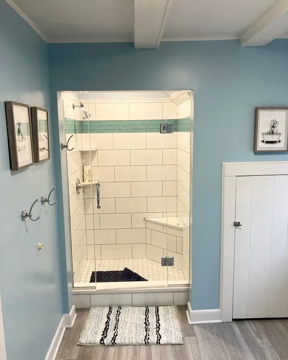
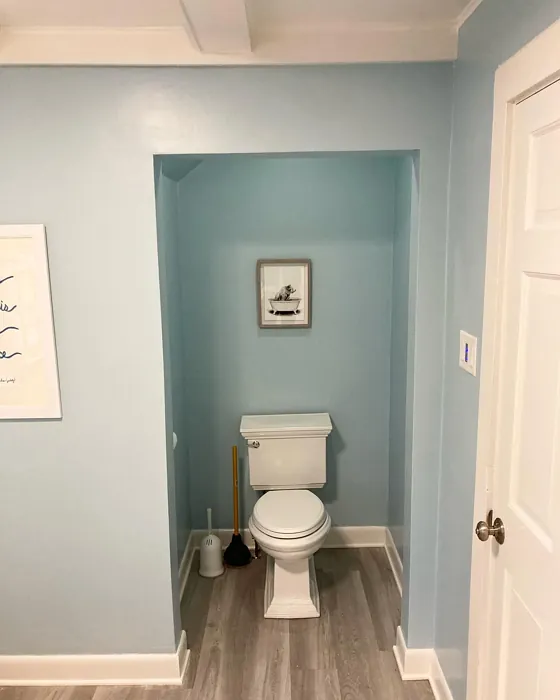
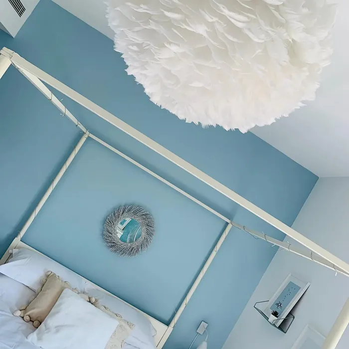
Real rooms painted with Intuition CSP-610 by Benjamin Moore. Lighting and photography can affect how colors appear — always test a sample swatch in your own space.
Undertones of Intuition ?
The understone of Intuition leans towards cool gray, which amplifies its calming effect. This subtle undertone allows it to blend beautifully with both warm and cool accents in your home.
HEX value: #B7CED4
RGB code: 183, 206, 212
Is Intuition Cool or Warm?
Intuition is predominantly cool, making it ideal for spaces where you want to evoke a sense of tranquility and relaxation. Its coolness can balance warmer furnishings, creating a harmonious environment.
Understanding Color Properties and Interior Design Tips
Hue refers to a specific position on the color wheel, measured in degrees from 0 to 360. Each degree represents a different pure color:
- 0° represents red
- 120° represents green
- 240° represents blue
Saturation describes the intensity or purity of a color and is expressed as a percentage:
- At 0%, the color appears completely desaturated—essentially a shade of gray
- At 100%, the color is at its most vivid and vibrant
Lightness indicates how light or dark a color is, also expressed as a percentage:
- 0% lightness results in black
- 100% lightness results in white
Using Warm Colors in Interior Design
Warm hues—such as reds, oranges, yellows, warm beiges, and greiges—are excellent choices for creating inviting and energetic spaces. These colors are particularly well-suited for:
- Kitchens, living rooms, and bathrooms, where warmth enhances comfort and sociability
- Large rooms, where warm tones can help reduce the sense of emptiness and make the space feel more intimate
For example:
- Warm beige shades provide a cozy, inviting atmosphere, ideal for living rooms, bedrooms, and hallways.
- Warm greige (a mix of beige and gray) offers the warmth of beige with the modern appeal of gray, making it a versatile backdrop for dining areas, bedrooms, and living spaces.
However, be mindful when using warm light tones in rooms with limited natural light. These shades may appear muted or even take on an unpleasant yellowish tint. To avoid a dull or flat appearance:
- Add depth by incorporating richer tones like deep greens, charcoal, or chocolate brown
- Use textured elements such as curtains, rugs, or cushions to bring dimension to the space
Pro Tip: Achieving Harmony with Warm and Cool Color Balance
To create a well-balanced and visually interesting interior, mix warm and cool tones strategically. This contrast adds depth and harmony to your design.
- If your walls feature warm hues, introduce cool-colored accents such as blue or green furniture, artwork, or accessories to create contrast.
- For a polished look, consider using a complementary color scheme, which pairs colors opposite each other on the color wheel (e.g., red with green, orange with blue).
This thoughtful mix not only enhances visual appeal but also creates a space that feels both dynamic and cohesive.
Save this color to your Pinterest board to revisit when planning your room.
Light Temperature Affects on Intuition
Natural Light
Natural daylight changes in color temperature as the sun moves across the sky. At sunrise and sunset, the light tends to have a warm, golden tone with a color temperature around 2000 Kelvin (K). As the day progresses and the sun rises higher, the light becomes cooler and more neutral. Around midday, especially when the sky is clear, natural light typically reaches its peak brightness and shifts to a cooler tone, ranging from 5500 to 6500 Kelvin. This midday light is close to what we perceive as pure white or daylight-balanced light.
These shifts in natural light can significantly influence how colors appear in a space, which is why designers often consider both the time of day and the orientation of windows when planning interior color schemes.
Explore how this color transforms from sunrise through sunset as natural light changes throughout the day. Use the slider to simulate morning light, midday brightness, and warm afternoon tones.
North-facing rooms stay cooler throughout the day and benefit from warmer paint tones to compensate. South-facing rooms receive more direct sunlight, making even deeper shades more workable. East-facing rooms get bright morning light that fades by afternoon, while west-facing rooms glow warmly in the evening.
Artificial Light
When choosing artificial lighting, pay close attention to the color temperature, measured in Kelvin (K). This determines how warm or cool the light will appear. Lower temperatures, around 2700K, give off a warm, yellow glow often used in living rooms or bedrooms. Higher temperatures, above 5000K, create a cool, bluish light similar to daylight, commonly used in kitchens, offices, or task areas.
Use the slider to see how lighting temperature can affect the appearance of a surface or color throughout a space.
See how this color looks under different artificial light temperatures — from warm candlelight (2000K) to cool daylight (7000K). Move the slider to simulate your room's lighting conditions.


4800K
Keep in mind that natural light from windows, the warmth of lamps, and overhead lighting all affect how this color reads on your walls at different times of day. Always observe a sample swatch in your actual space before purchasing.
LRV of Intuition
The Light Reflectance Value (LRV) of Intuition is around 60, making it a medium-light color that reflects a good amount of light without being too stark.
Detailed Review of Intuition
Additional Paint Characteristics
Ideal Rooms
Bathroom, Bedroom, Living Room
Decor Styles
Coastal, Minimalist, Modern
Coverage
Good (1–2 Coats)
Ease of Application
Beginner Friendly, Brush Smooth, Fast-Drying, Roller-Ready
Washability
Washable, Wipeable
VOC Level
Low VOC
Best Use
Accent Wall, Bedrooms, Interior Walls
Room Suitability
Bathrooms, Bedrooms, living rooms
Tone Tag
Airy, Balanced, Cool
Finish Type
Eggshell, Matte
Paint Performance
Easy Touch-Up, Low Odor, Quick Drying
Use Cases
Best for Rentals, Best for Small Spaces, Classic Favorite
Mood
Calm, Inviting, Restful
Trim Pairing
Complements Brass Fixtures, Pairs with White Dove
Intuition stands out for its gentle yet impactful hue. It brings a refreshing touch to any room, allowing for a versatile backdrop that matches various decor styles. When applied, it maintains a soft, inviting quality, perfect for creating a relaxing atmosphere. Its modern appeal makes it a fantastic choice for coastal or minimalist homes. While it offers decent coverage, expect to apply two coats for an even finish, especially over darker shades. Overall, Intuition provides a refreshing vibe that feels effortlessly chic, enhancing the beauty of your space without overpowering the decor.
Pros & Cons of CSP-610 Intuition
Pros
Cons
Colors that go with Benjamin Moore Intuition
FAQ on CSP-610 Intuition
Can I use Intuition in a small space?
Absolutely! Intuition is a great choice for small spaces. Its light and airy quality can make a room feel more open and inviting. Just remember to complement it with good lighting to maximize its effect.
How does Intuition work with different lighting?
Intuition adapts beautifully to various lighting conditions. In natural light, it shines bright and refreshing. Under warm artificial lights, it retains its calming essence, making it a versatile choice for both day and night environments.
Comparisons Intuition with other colors
Intuition CSP-610 vs Dutch Tile Blue SW 0031
| Attribute | Intuition CSP-610 | Dutch Tile Blue SW 0031 |
|---|---|---|
| Color Name | Intuition CSP-610 | Dutch Tile Blue SW 0031 |
| Color | ||
| Hue | Blue | Blue |
| Brightness | Medium | Medium |
| RGB | 183, 206, 212 | 154, 171, 171 |
| LRV | N/A | 24% |
| Finish Type | Eggshell, Matte | Eggshell, Matte, Satin |
| Finish Options | Eggshell, Matte, Satin | Eggshell, Flat, Matte, Satin |
| Ideal Rooms | Bathroom, Bedroom, Living Room | Bathroom, Bedroom, Dining Room, Hallway, Home Office, Kitchen, Living Room |
| Decor Styles | Coastal, Minimalist, Modern | Coastal, Modern Farmhouse, Scandinavian, Traditional, Transitional |
| Coverage | Good (1–2 Coats) | Good (1–2 Coats) |
| Ease of Application | Beginner Friendly, Brush Smooth, Fast-Drying, Roller-Ready | Beginner Friendly, Brush Smooth, Fast-Drying, Roller-Ready |
| Washability | Washable, Wipeable | Highly Washable, Washable |
| Room Suitability | Bathrooms, Bedrooms, living rooms | Bathroom, Bedroom, Dining Room, Kitchen, Living Room |
| Tone | Airy, Balanced, Cool | Balanced, Cool, Muted |
| Paint Performance | Easy Touch-Up, Low Odor, Quick Drying | Easy Touch-Up, High Coverage, Low Odor, Quick Drying |
Lighting conditions, wall orientation, and surrounding decor can significantly affect how these colors appear in your space. Always test a sample swatch before committing to a full application.
Intuition CSP-610 vs Debonair SW 9139
| Attribute | Intuition CSP-610 | Debonair SW 9139 |
|---|---|---|
| Color Name | Intuition CSP-610 | Debonair SW 9139 |
| Color | ||
| Hue | Blue | Blue |
| Brightness | Medium | Medium |
| RGB | 183, 206, 212 | 144, 160, 166 |
| LRV | N/A | 30% |
| Finish Type | Eggshell, Matte | Eggshell, Matte, Satin |
| Finish Options | Eggshell, Matte, Satin | Eggshell, Matte, Satin |
| Ideal Rooms | Bathroom, Bedroom, Living Room | Bedroom, Dining Room, Home Office, Living Room |
| Decor Styles | Coastal, Minimalist, Modern | Coastal, Industrial, Modern, Transitional |
| Coverage | Good (1–2 Coats) | Good (1–2 Coats) |
| Ease of Application | Beginner Friendly, Brush Smooth, Fast-Drying, Roller-Ready | Beginner Friendly, Brush Smooth, Roller-Ready |
| Washability | Washable, Wipeable | Washable, Wipeable |
| Room Suitability | Bathrooms, Bedrooms, living rooms | Bedroom, Dining Room, Home Office, Living Room |
| Tone | Airy, Balanced, Cool | Balanced, Cool, Muted |
| Paint Performance | Easy Touch-Up, Low Odor, Quick Drying | Easy Touch-Up, Low Odor, Quick Drying |
Lighting conditions, wall orientation, and surrounding decor can significantly affect how these colors appear in your space. Always test a sample swatch before committing to a full application.
Intuition CSP-610 vs Stardew SW 9138
| Attribute | Intuition CSP-610 | Stardew SW 9138 |
|---|---|---|
| Color Name | Intuition CSP-610 | Stardew SW 9138 |
| Color | ||
| Hue | Blue | Blue |
| Brightness | Medium | Medium |
| RGB | 183, 206, 212 | 166, 178, 181 |
| LRV | N/A | 30% |
| Finish Type | Eggshell, Matte | Eggshell, Satin |
| Finish Options | Eggshell, Matte, Satin | Eggshell, Matte, Satin |
| Ideal Rooms | Bathroom, Bedroom, Living Room | Bathroom, Bedroom, Home Office, Living Room, Nursery |
| Decor Styles | Coastal, Minimalist, Modern | Coastal, Farmhouse, Modern, Scandinavian |
| Coverage | Good (1–2 Coats) | Good (1–2 Coats) |
| Ease of Application | Beginner Friendly, Brush Smooth, Fast-Drying, Roller-Ready | Beginner Friendly, Brush Smooth, Roller-Ready |
| Washability | Washable, Wipeable | Highly Washable, Washable, Wipeable |
| Room Suitability | Bathrooms, Bedrooms, living rooms | Bathroom, Bedroom, Home Office, Living Room |
| Tone | Airy, Balanced, Cool | Calm, Cool, Muted |
| Paint Performance | Easy Touch-Up, Low Odor, Quick Drying | Easy Touch-Up, High Coverage, Low Odor |
Lighting conditions, wall orientation, and surrounding decor can significantly affect how these colors appear in your space. Always test a sample swatch before committing to a full application.
Intuition CSP-610 vs Niebla Azul SW 9137
| Attribute | Intuition CSP-610 | Niebla Azul SW 9137 |
|---|---|---|
| Color Name | Intuition CSP-610 | Niebla Azul SW 9137 |
| Color | ||
| Hue | Blue | Blue |
| Brightness | Medium | Medium |
| RGB | 183, 206, 212 | 182, 195, 196 |
| LRV | N/A | 48% |
| Finish Type | Eggshell, Matte | Eggshell, Matte, Satin |
| Finish Options | Eggshell, Matte, Satin | Eggshell, Matte, Satin |
| Ideal Rooms | Bathroom, Bedroom, Living Room | Bedroom, Home Office, Living Room, Nursery |
| Decor Styles | Coastal, Minimalist, Modern | Coastal, Modern, Scandinavian, Transitional |
| Coverage | Good (1–2 Coats) | Good (1–2 Coats), Touch-Up Friendly |
| Ease of Application | Beginner Friendly, Brush Smooth, Fast-Drying, Roller-Ready | Beginner Friendly, Brush Smooth, Roller-Ready |
| Washability | Washable, Wipeable | Highly Washable, Washable |
| Room Suitability | Bathrooms, Bedrooms, living rooms | Bedroom, Home Office, Living Room, Nursery |
| Tone | Airy, Balanced, Cool | Airy, Cool, Muted |
| Paint Performance | Easy Touch-Up, Low Odor, Quick Drying | Easy Touch-Up, Fade Resistant, Low Odor, Scuff Resistant |
Lighting conditions, wall orientation, and surrounding decor can significantly affect how these colors appear in your space. Always test a sample swatch before committing to a full application.
Intuition CSP-610 vs Rain SW 6219
| Attribute | Intuition CSP-610 | Rain SW 6219 |
|---|---|---|
| Color Name | Intuition CSP-610 | Rain SW 6219 |
| Color | ||
| Hue | Blue | Blue |
| Brightness | Medium | Medium |
| RGB | 183, 206, 212 | 171, 190, 191 |
| LRV | N/A | 50% |
| Finish Type | Eggshell, Matte | Eggshell, Matte, Satin |
| Finish Options | Eggshell, Matte, Satin | Eggshell, Matte, Satin |
| Ideal Rooms | Bathroom, Bedroom, Living Room | Bathroom, Bedroom, Home Office, Living Room, Nursery |
| Decor Styles | Coastal, Minimalist, Modern | Coastal, Minimalist, Modern, Scandinavian, Transitional |
| Coverage | Good (1–2 Coats) | Good (1–2 Coats), Touch-Up Friendly |
| Ease of Application | Beginner Friendly, Brush Smooth, Fast-Drying, Roller-Ready | Beginner Friendly, Brush Smooth, Fast-Drying, Roller-Ready |
| Washability | Washable, Wipeable | Scrubbable, Stain Resistant, Washable |
| Room Suitability | Bathrooms, Bedrooms, living rooms | Bathroom, Bedroom, Home Office, Living Room, Nursery |
| Tone | Airy, Balanced, Cool | Balanced, Cool, Muted |
| Paint Performance | Easy Touch-Up, Low Odor, Quick Drying | Easy Touch-Up, Low Odor, Quick Drying, Stain Resistant |
Lighting conditions, wall orientation, and surrounding decor can significantly affect how these colors appear in your space. Always test a sample swatch before committing to a full application.
Intuition CSP-610 vs Morning at Sea SW 9634
| Attribute | Intuition CSP-610 | Morning at Sea SW 9634 |
|---|---|---|
| Color Name | Intuition CSP-610 | Morning at Sea SW 9634 |
| Color | ||
| Hue | Blue | Blue |
| Brightness | Medium | Medium |
| RGB | 183, 206, 212 | 130, 151, 155 |
| LRV | N/A | 50% |
| Finish Type | Eggshell, Matte | Eggshell, Matte |
| Finish Options | Eggshell, Matte, Satin | Eggshell, Matte, Satin |
| Ideal Rooms | Bathroom, Bedroom, Living Room | Bathroom, Bedroom, Home Office, Living Room |
| Decor Styles | Coastal, Minimalist, Modern | Coastal, Minimalist, Modern, Scandinavian |
| Coverage | Good (1–2 Coats) | Good (1–2 Coats), Touch-Up Friendly |
| Ease of Application | Beginner Friendly, Brush Smooth, Fast-Drying, Roller-Ready | Beginner Friendly, Brush Smooth, Roller-Ready |
| Washability | Washable, Wipeable | Washable, Wipeable |
| Room Suitability | Bathrooms, Bedrooms, living rooms | Bathroom, Bedroom, Home Office, Living Room |
| Tone | Airy, Balanced, Cool | Airy, Cool, Muted |
| Paint Performance | Easy Touch-Up, Low Odor, Quick Drying | Easy Touch-Up, Fade Resistant, Low Odor |
Lighting conditions, wall orientation, and surrounding decor can significantly affect how these colors appear in your space. Always test a sample swatch before committing to a full application.
Intuition CSP-610 vs Sleepy Blue SW 6225
| Attribute | Intuition CSP-610 | Sleepy Blue SW 6225 |
|---|---|---|
| Color Name | Intuition CSP-610 | Sleepy Blue SW 6225 |
| Color | ||
| Hue | Blue | Blue |
| Brightness | Medium | Medium |
| RGB | 183, 206, 212 | 188, 203, 206 |
| LRV | N/A | 50% |
| Finish Type | Eggshell, Matte | Eggshell, Matte, Satin |
| Finish Options | Eggshell, Matte, Satin | Eggshell, Matte, Satin |
| Ideal Rooms | Bathroom, Bedroom, Living Room | Bedroom, Home Office, Living Room, Nursery |
| Decor Styles | Coastal, Minimalist, Modern | Coastal, Minimalist, Modern Farmhouse, Scandinavian |
| Coverage | Good (1–2 Coats) | Good (1–2 Coats) |
| Ease of Application | Beginner Friendly, Brush Smooth, Fast-Drying, Roller-Ready | Beginner Friendly, Brush Smooth, Fast-Drying, Roller-Ready |
| Washability | Washable, Wipeable | Highly Washable, Washable |
| Room Suitability | Bathrooms, Bedrooms, living rooms | Bedroom, Home Office, Living Room, Nursery |
| Tone | Airy, Balanced, Cool | Airy, Cool, Muted |
| Paint Performance | Easy Touch-Up, Low Odor, Quick Drying | Easy Touch-Up, Low Odor, Quick Drying, Scuff Resistant |
Lighting conditions, wall orientation, and surrounding decor can significantly affect how these colors appear in your space. Always test a sample swatch before committing to a full application.
Intuition CSP-610 vs Lakeside SW 9683
| Attribute | Intuition CSP-610 | Lakeside SW 9683 |
|---|---|---|
| Color Name | Intuition CSP-610 | Lakeside SW 9683 |
| Color | ||
| Hue | Blue | Blue |
| Brightness | Medium | Medium |
| RGB | 183, 206, 212 | 173, 184, 192 |
| LRV | N/A | 24% |
| Finish Type | Eggshell, Matte | Eggshell, Matte, Satin |
| Finish Options | Eggshell, Matte, Satin | Eggshell, Matte, Satin |
| Ideal Rooms | Bathroom, Bedroom, Living Room | Bathroom, Bedroom, Home Office, Living Room |
| Decor Styles | Coastal, Minimalist, Modern | Coastal, Minimalist, Modern, Rustic |
| Coverage | Good (1–2 Coats) | Good (1–2 Coats) |
| Ease of Application | Beginner Friendly, Brush Smooth, Fast-Drying, Roller-Ready | Beginner Friendly, Brush Smooth, Roller-Ready |
| Washability | Washable, Wipeable | Scrubbable, Washable |
| Room Suitability | Bathrooms, Bedrooms, living rooms | Bathroom, Bedroom, Home Office, Living Room |
| Tone | Airy, Balanced, Cool | Balanced, Cool, Muted |
| Paint Performance | Easy Touch-Up, Low Odor, Quick Drying | Easy Touch-Up, Fade Resistant, High Coverage, Low Odor |
Lighting conditions, wall orientation, and surrounding decor can significantly affect how these colors appear in your space. Always test a sample swatch before committing to a full application.
Intuition CSP-610 vs Upward SW 6239
| Attribute | Intuition CSP-610 | Upward SW 6239 |
|---|---|---|
| Color Name | Intuition CSP-610 | Upward SW 6239 |
| Color | ||
| Hue | Blue | Blue |
| Brightness | Medium | Medium |
| RGB | 183, 206, 212 | 191, 201, 208 |
| LRV | N/A | 75% |
| Finish Type | Eggshell, Matte | Eggshell, Satin |
| Finish Options | Eggshell, Matte, Satin | Eggshell, Flat, Satin |
| Ideal Rooms | Bathroom, Bedroom, Living Room | Bedroom, Dining Room, Home Office, Living Room, Nursery |
| Decor Styles | Coastal, Minimalist, Modern | Coastal, Minimalist, Modern, Scandinavian |
| Coverage | Good (1–2 Coats) | Good (1–2 Coats), Touch-Up Friendly |
| Ease of Application | Beginner Friendly, Brush Smooth, Fast-Drying, Roller-Ready | Beginner Friendly, Brush Smooth, Fast-Drying, Roller-Ready |
| Washability | Washable, Wipeable | Washable, Wipeable |
| Room Suitability | Bathrooms, Bedrooms, living rooms | Bedroom, Home Office, Living Room, Nursery |
| Tone | Airy, Balanced, Cool | Cool, Crisp, Muted |
| Paint Performance | Easy Touch-Up, Low Odor, Quick Drying | High Coverage, Low Odor, Quick Drying |
Lighting conditions, wall orientation, and surrounding decor can significantly affect how these colors appear in your space. Always test a sample swatch before committing to a full application.
Intuition CSP-610 vs Aleutian SW 6241
| Attribute | Intuition CSP-610 | Aleutian SW 6241 |
|---|---|---|
| Color Name | Intuition CSP-610 | Aleutian SW 6241 |
| Color | ||
| Hue | Blue | Blue |
| Brightness | Medium | Medium |
| RGB | 183, 206, 212 | 152, 169, 183 |
| LRV | N/A | 24% |
| Finish Type | Eggshell, Matte | Eggshell, Matte, Satin |
| Finish Options | Eggshell, Matte, Satin | Eggshell, Matte, Satin |
| Ideal Rooms | Bathroom, Bedroom, Living Room | Bathroom, Bedroom, Home Office, Kitchen, Living Room, Nursery |
| Decor Styles | Coastal, Minimalist, Modern | Coastal, Minimalist, Modern, Scandinavian, Transitional |
| Coverage | Good (1–2 Coats) | Good (1–2 Coats), Touch-Up Friendly |
| Ease of Application | Beginner Friendly, Brush Smooth, Fast-Drying, Roller-Ready | Beginner Friendly, Brush Smooth, Fast-Drying, Roller-Ready |
| Washability | Washable, Wipeable | Scrubbable, Stain Resistant, Washable |
| Room Suitability | Bathrooms, Bedrooms, living rooms | Bathroom, Bedroom, Home Office, Living Room, Nursery |
| Tone | Airy, Balanced, Cool | Airy, Balanced, Cool, Muted |
| Paint Performance | Easy Touch-Up, Low Odor, Quick Drying | Easy Touch-Up, Fade Resistant, Low Odor, Quick Drying |
Lighting conditions, wall orientation, and surrounding decor can significantly affect how these colors appear in your space. Always test a sample swatch before committing to a full application.
Official Page of Benjamin Moore Intuition CSP-610