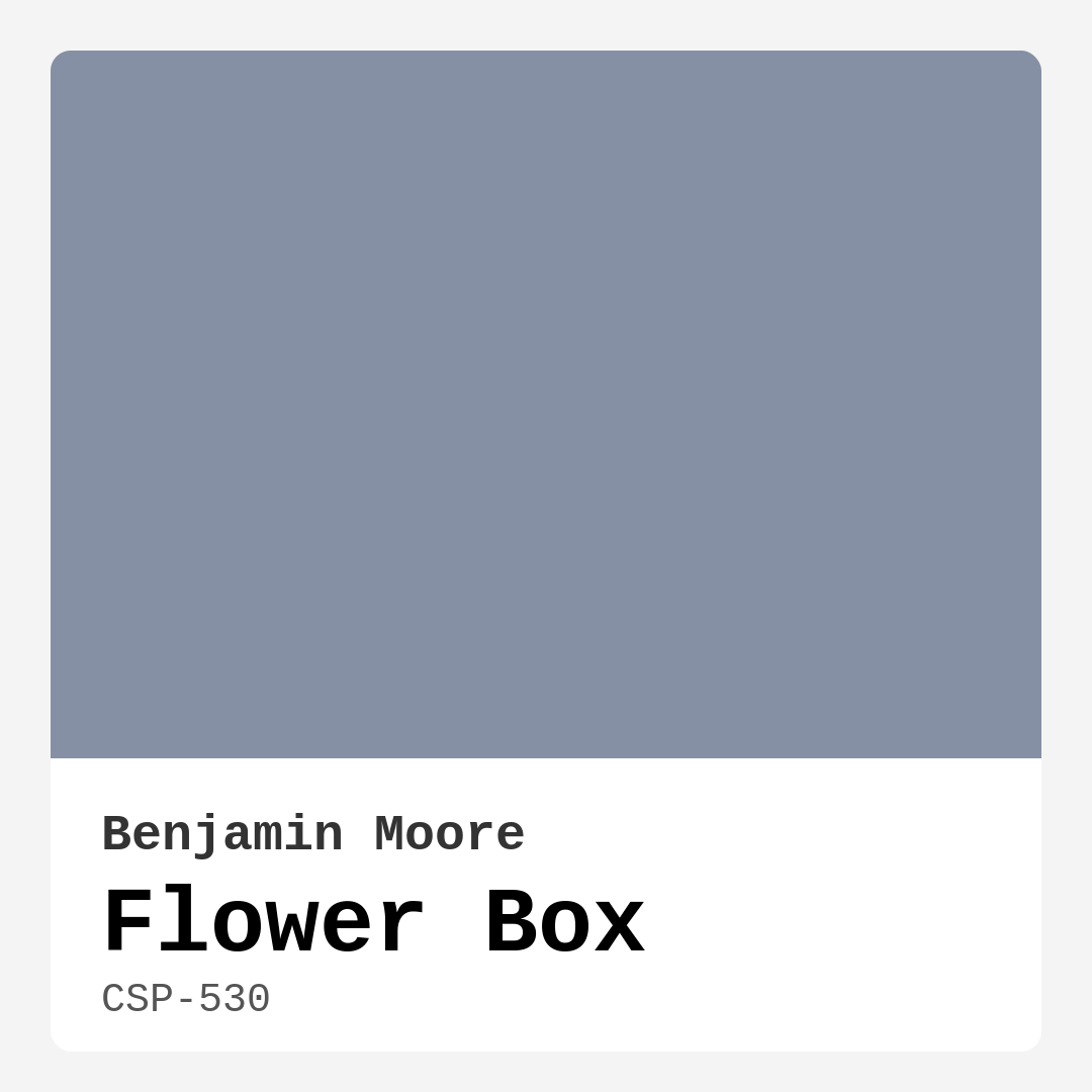
Color Preview & Key Details
| HEX Code | #8690A4 |
| RGB | 134, 144, 164 |
| LRV | 28.94% |
| Undertone | Blue |
| Finish Options | Eggshell, Matte, Satin |
Imagine stepping into a room that instantly makes you feel calm and relaxed, where the colors wrap around you like a warm hug. That’s the magic of Flower Box by Benjamin Moore. This exquisite paint color, with its soft, muted blue-gray hue, evokes the tranquility of a serene garden in full bloom. If you’re on a journey to transform your space, let’s dive deep into what makes Flower Box the perfect choice for your home.
Flower Box (CSP-530) is more than just a color; it’s a mood enhancer. With its Light Reflectance Value (LRV) of about 28.94%, this shade reflects enough light to keep your space feeling open and airy, yet it also provides depth and character. It strikes a fine balance — not too dark to feel heavy, and not too bright to be overwhelming. In natural light, you’ll notice its soft and inviting quality, while artificial lighting brings out its sophisticated undertones, making it adaptable to various settings throughout the day.
As an expert in home design, I can confidently say that Flower Box is a versatile gem. It works beautifully in living rooms, bedrooms, dining areas, and even home offices. Whether you’re looking to create a cozy reading nook or a tranquil workspace, this color fits seamlessly into your vision. Plus, its subtle gray undertone adds a sophisticated touch without making the space feel cold or stark.
One of the best parts about Flower Box is its compatibility with different decor styles. Whether your home leans towards modern, Scandinavian, farmhouse, or transitional aesthetics, this color will complement your furnishings and accents beautifully. Its muted quality allows it to harmonize with both warm and cool tones, making it exceptionally flexible when mixing and matching decor pieces.
When it comes to application, Flower Box shines. It’s beginner-friendly, gliding on smoothly with both rollers and brushes. Most users find that it offers good coverage, typically requiring just one to two coats for an even finish. You’ll love how easy it is to touch up any spots later, thanks to its durable and washable nature. With a low VOC level, it’s also an eco-certified option that prioritizes indoor air quality, making it suitable for any home.
Now, let’s talk about the light effect. In bright daylight, Flower Box radiates a soft, airy quality, filling your space with a gentle glow. As the day winds down and the sun dips below the horizon, it transforms into a cozy retreat, maintaining its elegant charm. This adaptability is a significant advantage, especially if you want a color that evolves with the changing light.
Pairing Flower Box with the right trim can elevate your design game. For a crisp and clean look, consider white options like White Dove or Simply White. These choices create a lovely contrast, allowing Flower Box to take center stage. If you prefer a more cohesive feel, wood trims can add warmth and character, blending beautifully with the color’s cool undertones.
Now, let’s talk about some practical applications. This color isn’t just for walls; it’s also a fantastic choice for accent walls, trim, and even furniture. Imagine a beautifully painted accent wall in your living room that draws the eye, or a Flower Box-stained piece of furniture that adds a unique touch to your decor. Its versatility means you can use it in various ways to make your design vision come to life.
While there are so many positives, it’s essential to consider how Flower Box may fit into your overall color palette. If your home leans heavily toward warm colors, Flower Box might feel a bit cool in comparison. However, this can also create a beautiful contrast, enhancing the warmth of the surrounding colors. It’s all about balance and how you choose to integrate it into your space.
For those wondering about high-traffic areas, you’ll be pleased to know that Flower Box is quite durable. Its washable finish allows for easy maintenance, making it suitable for spaces that see a lot of action. Just ensure you prepare your surfaces well and apply it correctly for the best results.
You might be curious about how to pull it all together. Start by identifying what mood you want to create in your space. If you’re after a calm, inviting atmosphere, Flower Box is your go-to. Consider incorporating natural elements like wood accents or soft textiles to complement its soothing vibe.
To enhance the elegance of Flower Box, you could add brass fixtures or warm lighting elements. These accents can help bridge the color’s cool tones with warmer hues, resulting in a beautifully balanced space. With the right accessories, Flower Box can serve as a backdrop for your personality, allowing your decor style to shine.
If you’re still unsure about committing to Flower Box, remember that it can also serve as an excellent choice for rentals. Its classic appeal and adaptability make it an ideal color for anyone wishing to make a statement without overwhelming their space. Plus, if you ever decide to move, you’ll find that it appeals to a broad range of tastes, should you need to repaint.
In conclusion, Benjamin Moore’s Flower Box (CSP-530) is more than just a paint color; it’s an invitation to create a tranquil and inviting environment. It captures the essence of nature while offering an adaptable backdrop for various decor styles. Whether you’re painting your whole home or just an accent wall, this soft, muted blue-gray hue can elevate your space to new heights of sophistication. So, what do you say? Are you ready to embrace the serene beauty of Flower Box in your home? I guarantee you won’t regret it.

Save this color to your Pinterest board to revisit when planning your room.
Real Room Photo of Flower Box CSP-530
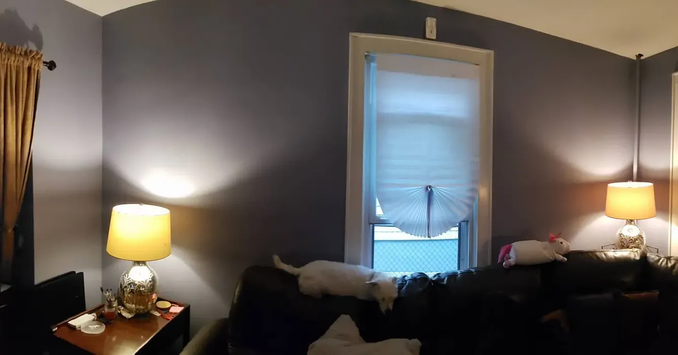
Real rooms painted with Flower Box CSP-530 by Benjamin Moore. Lighting and photography can affect how colors appear — always test a sample swatch in your own space.
Undertones of Flower Box ?
Flower Box has a subtle gray undertone that enhances its sophistication while keeping it grounded. This makes it an excellent choice for spaces where you want a peaceful vibe without feeling too cold or stark.
HEX value: #8690A4
RGB code: 134, 144, 164
Is Flower Box Cool or Warm?
This color leans towards the cool spectrum, providing a refreshing and calming effect that can brighten up any room without overwhelming it.
Understanding Color Properties and Interior Design Tips
Hue refers to a specific position on the color wheel, measured in degrees from 0 to 360. Each degree represents a different pure color:
- 0° represents red
- 120° represents green
- 240° represents blue
Saturation describes the intensity or purity of a color and is expressed as a percentage:
- At 0%, the color appears completely desaturated—essentially a shade of gray
- At 100%, the color is at its most vivid and vibrant
Lightness indicates how light or dark a color is, also expressed as a percentage:
- 0% lightness results in black
- 100% lightness results in white
Using Warm Colors in Interior Design
Warm hues—such as reds, oranges, yellows, warm beiges, and greiges—are excellent choices for creating inviting and energetic spaces. These colors are particularly well-suited for:
- Kitchens, living rooms, and bathrooms, where warmth enhances comfort and sociability
- Large rooms, where warm tones can help reduce the sense of emptiness and make the space feel more intimate
For example:
- Warm beige shades provide a cozy, inviting atmosphere, ideal for living rooms, bedrooms, and hallways.
- Warm greige (a mix of beige and gray) offers the warmth of beige with the modern appeal of gray, making it a versatile backdrop for dining areas, bedrooms, and living spaces.
However, be mindful when using warm light tones in rooms with limited natural light. These shades may appear muted or even take on an unpleasant yellowish tint. To avoid a dull or flat appearance:
- Add depth by incorporating richer tones like deep greens, charcoal, or chocolate brown
- Use textured elements such as curtains, rugs, or cushions to bring dimension to the space
Pro Tip: Achieving Harmony with Warm and Cool Color Balance
To create a well-balanced and visually interesting interior, mix warm and cool tones strategically. This contrast adds depth and harmony to your design.
- If your walls feature warm hues, introduce cool-colored accents such as blue or green furniture, artwork, or accessories to create contrast.
- For a polished look, consider using a complementary color scheme, which pairs colors opposite each other on the color wheel (e.g., red with green, orange with blue).
This thoughtful mix not only enhances visual appeal but also creates a space that feels both dynamic and cohesive.
Save this color to your Pinterest board to revisit when planning your room.
Light Temperature Affects on Flower Box
Natural Light
Natural daylight changes in color temperature as the sun moves across the sky. At sunrise and sunset, the light tends to have a warm, golden tone with a color temperature around 2000 Kelvin (K). As the day progresses and the sun rises higher, the light becomes cooler and more neutral. Around midday, especially when the sky is clear, natural light typically reaches its peak brightness and shifts to a cooler tone, ranging from 5500 to 6500 Kelvin. This midday light is close to what we perceive as pure white or daylight-balanced light.
These shifts in natural light can significantly influence how colors appear in a space, which is why designers often consider both the time of day and the orientation of windows when planning interior color schemes.
Explore how this color transforms from sunrise through sunset as natural light changes throughout the day. Use the slider to simulate morning light, midday brightness, and warm afternoon tones.
North-facing rooms stay cooler throughout the day and benefit from warmer paint tones to compensate. South-facing rooms receive more direct sunlight, making even deeper shades more workable. East-facing rooms get bright morning light that fades by afternoon, while west-facing rooms glow warmly in the evening.
Artificial Light
When choosing artificial lighting, pay close attention to the color temperature, measured in Kelvin (K). This determines how warm or cool the light will appear. Lower temperatures, around 2700K, give off a warm, yellow glow often used in living rooms or bedrooms. Higher temperatures, above 5000K, create a cool, bluish light similar to daylight, commonly used in kitchens, offices, or task areas.
Use the slider to see how lighting temperature can affect the appearance of a surface or color throughout a space.
See how this color looks under different artificial light temperatures — from warm candlelight (2000K) to cool daylight (7000K). Move the slider to simulate your room's lighting conditions.


4800K
Keep in mind that natural light from windows, the warmth of lamps, and overhead lighting all affect how this color reads on your walls at different times of day. Always observe a sample swatch in your actual space before purchasing.
LRV of Flower Box
The Light Reflectance Value (LRV) of Flower Box is around 45, making it a balanced choice that reflects enough light while still providing depth and character to your walls.
Detailed Review of Flower Box
Additional Paint Characteristics
Ideal Rooms
Bedroom, Home Office, Living Room, Nursery
Decor Styles
Farmhouse, Modern, Scandinavian, Transitional
Coverage
Good (1–2 Coats), Self-Priming
Ease of Application
Beginner Friendly, Brush Smooth, Roller-Ready
Washability
Highly Washable, Washable
VOC Level
Eco-Certified, Low VOC
Best Use
Accent Wall, Furniture, Interior Walls, Trim
Room Suitability
Bedroom, Dining Room, Home Office, Living Room
Tone Tag
Balanced, Cool, Muted
Finish Type
Eggshell, Matte, Satin
Paint Performance
Easy Touch-Up, Low Odor, Quick Drying, Scuff Resistant
Use Cases
Best for Low Light Rooms, Best for Modern Farmhouse, Best for Rentals, Classic Favorite
Mood
Calm, Inviting, Sophisticated
Trim Pairing
Complements Brass Fixtures, Good with Wood Trim, Pairs with White Dove
When you think of a serene garden, Flower Box is the color that instantly comes to mind. This hue not only captures the essence of nature but also adapts beautifully to different lighting conditions. In natural light, it appears soft and airy, while in artificial light, it takes on a more sophisticated tone. Users rave about how easy it is to apply, gliding smoothly on surfaces and providing excellent coverage. Its versatility is truly impressive; whether you want to create a cozy reading nook or a peaceful home office, Flower Box fits the bill perfectly. Additionally, it pairs wonderfully with both warm and cool tones, making it a great choice for a variety of furnishings and accents.
Pros & Cons of CSP-530 Flower Box
Pros
Cons
Colors that go with Benjamin Moore Flower Box
FAQ on CSP-530 Flower Box
Can Flower Box be used in high-traffic areas?
Absolutely! Flower Box’s durable finish and washability make it a suitable choice for high-traffic areas. Just ensure proper preparation and application for the best results.
What trim colors work best with Flower Box?
Flower Box pairs beautifully with both warm and cool trim colors. For a crisp contrast, consider pairing it with White Dove or Simply White. If you prefer a more cohesive look, it complements wood trims and can also work well with neutral tones.
Comparisons Flower Box with other colors
Flower Box CSP-530 vs Dutch Tile Blue SW 0031
| Attribute | Flower Box CSP-530 | Dutch Tile Blue SW 0031 |
|---|---|---|
| Color Name | Flower Box CSP-530 | Dutch Tile Blue SW 0031 |
| Color | ||
| Hue | Blue | Blue |
| Brightness | Medium | Medium |
| RGB | 134, 144, 164 | 154, 171, 171 |
| LRV | 28.94% | 24% |
| Finish Type | Eggshell, Matte, Satin | Eggshell, Matte, Satin |
| Finish Options | Eggshell, Matte, Satin | Eggshell, Flat, Matte, Satin |
| Ideal Rooms | Bedroom, Home Office, Living Room, Nursery | Bathroom, Bedroom, Dining Room, Hallway, Home Office, Kitchen, Living Room |
| Decor Styles | Farmhouse, Modern, Scandinavian, Transitional | Coastal, Modern Farmhouse, Scandinavian, Traditional, Transitional |
| Coverage | Good (1–2 Coats), Self-Priming | Good (1–2 Coats) |
| Ease of Application | Beginner Friendly, Brush Smooth, Roller-Ready | Beginner Friendly, Brush Smooth, Fast-Drying, Roller-Ready |
| Washability | Highly Washable, Washable | Highly Washable, Washable |
| Room Suitability | Bedroom, Dining Room, Home Office, Living Room | Bathroom, Bedroom, Dining Room, Kitchen, Living Room |
| Tone | Balanced, Cool, Muted | Balanced, Cool, Muted |
| Paint Performance | Easy Touch-Up, Low Odor, Quick Drying, Scuff Resistant | Easy Touch-Up, High Coverage, Low Odor, Quick Drying |
Lighting conditions, wall orientation, and surrounding decor can significantly affect how these colors appear in your space. Always test a sample swatch before committing to a full application.
Flower Box CSP-530 vs Debonair SW 9139
| Attribute | Flower Box CSP-530 | Debonair SW 9139 |
|---|---|---|
| Color Name | Flower Box CSP-530 | Debonair SW 9139 |
| Color | ||
| Hue | Blue | Blue |
| Brightness | Medium | Medium |
| RGB | 134, 144, 164 | 144, 160, 166 |
| LRV | 28.94% | 30% |
| Finish Type | Eggshell, Matte, Satin | Eggshell, Matte, Satin |
| Finish Options | Eggshell, Matte, Satin | Eggshell, Matte, Satin |
| Ideal Rooms | Bedroom, Home Office, Living Room, Nursery | Bedroom, Dining Room, Home Office, Living Room |
| Decor Styles | Farmhouse, Modern, Scandinavian, Transitional | Coastal, Industrial, Modern, Transitional |
| Coverage | Good (1–2 Coats), Self-Priming | Good (1–2 Coats) |
| Ease of Application | Beginner Friendly, Brush Smooth, Roller-Ready | Beginner Friendly, Brush Smooth, Roller-Ready |
| Washability | Highly Washable, Washable | Washable, Wipeable |
| Room Suitability | Bedroom, Dining Room, Home Office, Living Room | Bedroom, Dining Room, Home Office, Living Room |
| Tone | Balanced, Cool, Muted | Balanced, Cool, Muted |
| Paint Performance | Easy Touch-Up, Low Odor, Quick Drying, Scuff Resistant | Easy Touch-Up, Low Odor, Quick Drying |
Lighting conditions, wall orientation, and surrounding decor can significantly affect how these colors appear in your space. Always test a sample swatch before committing to a full application.
Flower Box CSP-530 vs Stardew SW 9138
| Attribute | Flower Box CSP-530 | Stardew SW 9138 |
|---|---|---|
| Color Name | Flower Box CSP-530 | Stardew SW 9138 |
| Color | ||
| Hue | Blue | Blue |
| Brightness | Medium | Medium |
| RGB | 134, 144, 164 | 166, 178, 181 |
| LRV | 28.94% | 30% |
| Finish Type | Eggshell, Matte, Satin | Eggshell, Satin |
| Finish Options | Eggshell, Matte, Satin | Eggshell, Matte, Satin |
| Ideal Rooms | Bedroom, Home Office, Living Room, Nursery | Bathroom, Bedroom, Home Office, Living Room, Nursery |
| Decor Styles | Farmhouse, Modern, Scandinavian, Transitional | Coastal, Farmhouse, Modern, Scandinavian |
| Coverage | Good (1–2 Coats), Self-Priming | Good (1–2 Coats) |
| Ease of Application | Beginner Friendly, Brush Smooth, Roller-Ready | Beginner Friendly, Brush Smooth, Roller-Ready |
| Washability | Highly Washable, Washable | Highly Washable, Washable, Wipeable |
| Room Suitability | Bedroom, Dining Room, Home Office, Living Room | Bathroom, Bedroom, Home Office, Living Room |
| Tone | Balanced, Cool, Muted | Calm, Cool, Muted |
| Paint Performance | Easy Touch-Up, Low Odor, Quick Drying, Scuff Resistant | Easy Touch-Up, High Coverage, Low Odor |
Lighting conditions, wall orientation, and surrounding decor can significantly affect how these colors appear in your space. Always test a sample swatch before committing to a full application.
Flower Box CSP-530 vs Niebla Azul SW 9137
| Attribute | Flower Box CSP-530 | Niebla Azul SW 9137 |
|---|---|---|
| Color Name | Flower Box CSP-530 | Niebla Azul SW 9137 |
| Color | ||
| Hue | Blue | Blue |
| Brightness | Medium | Medium |
| RGB | 134, 144, 164 | 182, 195, 196 |
| LRV | 28.94% | 48% |
| Finish Type | Eggshell, Matte, Satin | Eggshell, Matte, Satin |
| Finish Options | Eggshell, Matte, Satin | Eggshell, Matte, Satin |
| Ideal Rooms | Bedroom, Home Office, Living Room, Nursery | Bedroom, Home Office, Living Room, Nursery |
| Decor Styles | Farmhouse, Modern, Scandinavian, Transitional | Coastal, Modern, Scandinavian, Transitional |
| Coverage | Good (1–2 Coats), Self-Priming | Good (1–2 Coats), Touch-Up Friendly |
| Ease of Application | Beginner Friendly, Brush Smooth, Roller-Ready | Beginner Friendly, Brush Smooth, Roller-Ready |
| Washability | Highly Washable, Washable | Highly Washable, Washable |
| Room Suitability | Bedroom, Dining Room, Home Office, Living Room | Bedroom, Home Office, Living Room, Nursery |
| Tone | Balanced, Cool, Muted | Airy, Cool, Muted |
| Paint Performance | Easy Touch-Up, Low Odor, Quick Drying, Scuff Resistant | Easy Touch-Up, Fade Resistant, Low Odor, Scuff Resistant |
Lighting conditions, wall orientation, and surrounding decor can significantly affect how these colors appear in your space. Always test a sample swatch before committing to a full application.
Flower Box CSP-530 vs Rain SW 6219
| Attribute | Flower Box CSP-530 | Rain SW 6219 |
|---|---|---|
| Color Name | Flower Box CSP-530 | Rain SW 6219 |
| Color | ||
| Hue | Blue | Blue |
| Brightness | Medium | Medium |
| RGB | 134, 144, 164 | 171, 190, 191 |
| LRV | 28.94% | 50% |
| Finish Type | Eggshell, Matte, Satin | Eggshell, Matte, Satin |
| Finish Options | Eggshell, Matte, Satin | Eggshell, Matte, Satin |
| Ideal Rooms | Bedroom, Home Office, Living Room, Nursery | Bathroom, Bedroom, Home Office, Living Room, Nursery |
| Decor Styles | Farmhouse, Modern, Scandinavian, Transitional | Coastal, Minimalist, Modern, Scandinavian, Transitional |
| Coverage | Good (1–2 Coats), Self-Priming | Good (1–2 Coats), Touch-Up Friendly |
| Ease of Application | Beginner Friendly, Brush Smooth, Roller-Ready | Beginner Friendly, Brush Smooth, Fast-Drying, Roller-Ready |
| Washability | Highly Washable, Washable | Scrubbable, Stain Resistant, Washable |
| Room Suitability | Bedroom, Dining Room, Home Office, Living Room | Bathroom, Bedroom, Home Office, Living Room, Nursery |
| Tone | Balanced, Cool, Muted | Balanced, Cool, Muted |
| Paint Performance | Easy Touch-Up, Low Odor, Quick Drying, Scuff Resistant | Easy Touch-Up, Low Odor, Quick Drying, Stain Resistant |
Lighting conditions, wall orientation, and surrounding decor can significantly affect how these colors appear in your space. Always test a sample swatch before committing to a full application.
Flower Box CSP-530 vs Morning at Sea SW 9634
| Attribute | Flower Box CSP-530 | Morning at Sea SW 9634 |
|---|---|---|
| Color Name | Flower Box CSP-530 | Morning at Sea SW 9634 |
| Color | ||
| Hue | Blue | Blue |
| Brightness | Medium | Medium |
| RGB | 134, 144, 164 | 130, 151, 155 |
| LRV | 28.94% | 50% |
| Finish Type | Eggshell, Matte, Satin | Eggshell, Matte |
| Finish Options | Eggshell, Matte, Satin | Eggshell, Matte, Satin |
| Ideal Rooms | Bedroom, Home Office, Living Room, Nursery | Bathroom, Bedroom, Home Office, Living Room |
| Decor Styles | Farmhouse, Modern, Scandinavian, Transitional | Coastal, Minimalist, Modern, Scandinavian |
| Coverage | Good (1–2 Coats), Self-Priming | Good (1–2 Coats), Touch-Up Friendly |
| Ease of Application | Beginner Friendly, Brush Smooth, Roller-Ready | Beginner Friendly, Brush Smooth, Roller-Ready |
| Washability | Highly Washable, Washable | Washable, Wipeable |
| Room Suitability | Bedroom, Dining Room, Home Office, Living Room | Bathroom, Bedroom, Home Office, Living Room |
| Tone | Balanced, Cool, Muted | Airy, Cool, Muted |
| Paint Performance | Easy Touch-Up, Low Odor, Quick Drying, Scuff Resistant | Easy Touch-Up, Fade Resistant, Low Odor |
Lighting conditions, wall orientation, and surrounding decor can significantly affect how these colors appear in your space. Always test a sample swatch before committing to a full application.
Flower Box CSP-530 vs Sleepy Blue SW 6225
| Attribute | Flower Box CSP-530 | Sleepy Blue SW 6225 |
|---|---|---|
| Color Name | Flower Box CSP-530 | Sleepy Blue SW 6225 |
| Color | ||
| Hue | Blue | Blue |
| Brightness | Medium | Medium |
| RGB | 134, 144, 164 | 188, 203, 206 |
| LRV | 28.94% | 50% |
| Finish Type | Eggshell, Matte, Satin | Eggshell, Matte, Satin |
| Finish Options | Eggshell, Matte, Satin | Eggshell, Matte, Satin |
| Ideal Rooms | Bedroom, Home Office, Living Room, Nursery | Bedroom, Home Office, Living Room, Nursery |
| Decor Styles | Farmhouse, Modern, Scandinavian, Transitional | Coastal, Minimalist, Modern Farmhouse, Scandinavian |
| Coverage | Good (1–2 Coats), Self-Priming | Good (1–2 Coats) |
| Ease of Application | Beginner Friendly, Brush Smooth, Roller-Ready | Beginner Friendly, Brush Smooth, Fast-Drying, Roller-Ready |
| Washability | Highly Washable, Washable | Highly Washable, Washable |
| Room Suitability | Bedroom, Dining Room, Home Office, Living Room | Bedroom, Home Office, Living Room, Nursery |
| Tone | Balanced, Cool, Muted | Airy, Cool, Muted |
| Paint Performance | Easy Touch-Up, Low Odor, Quick Drying, Scuff Resistant | Easy Touch-Up, Low Odor, Quick Drying, Scuff Resistant |
Lighting conditions, wall orientation, and surrounding decor can significantly affect how these colors appear in your space. Always test a sample swatch before committing to a full application.
Flower Box CSP-530 vs Lakeside SW 9683
| Attribute | Flower Box CSP-530 | Lakeside SW 9683 |
|---|---|---|
| Color Name | Flower Box CSP-530 | Lakeside SW 9683 |
| Color | ||
| Hue | Blue | Blue |
| Brightness | Medium | Medium |
| RGB | 134, 144, 164 | 173, 184, 192 |
| LRV | 28.94% | 24% |
| Finish Type | Eggshell, Matte, Satin | Eggshell, Matte, Satin |
| Finish Options | Eggshell, Matte, Satin | Eggshell, Matte, Satin |
| Ideal Rooms | Bedroom, Home Office, Living Room, Nursery | Bathroom, Bedroom, Home Office, Living Room |
| Decor Styles | Farmhouse, Modern, Scandinavian, Transitional | Coastal, Minimalist, Modern, Rustic |
| Coverage | Good (1–2 Coats), Self-Priming | Good (1–2 Coats) |
| Ease of Application | Beginner Friendly, Brush Smooth, Roller-Ready | Beginner Friendly, Brush Smooth, Roller-Ready |
| Washability | Highly Washable, Washable | Scrubbable, Washable |
| Room Suitability | Bedroom, Dining Room, Home Office, Living Room | Bathroom, Bedroom, Home Office, Living Room |
| Tone | Balanced, Cool, Muted | Balanced, Cool, Muted |
| Paint Performance | Easy Touch-Up, Low Odor, Quick Drying, Scuff Resistant | Easy Touch-Up, Fade Resistant, High Coverage, Low Odor |
Lighting conditions, wall orientation, and surrounding decor can significantly affect how these colors appear in your space. Always test a sample swatch before committing to a full application.
Flower Box CSP-530 vs Upward SW 6239
| Attribute | Flower Box CSP-530 | Upward SW 6239 |
|---|---|---|
| Color Name | Flower Box CSP-530 | Upward SW 6239 |
| Color | ||
| Hue | Blue | Blue |
| Brightness | Medium | Medium |
| RGB | 134, 144, 164 | 191, 201, 208 |
| LRV | 28.94% | 75% |
| Finish Type | Eggshell, Matte, Satin | Eggshell, Satin |
| Finish Options | Eggshell, Matte, Satin | Eggshell, Flat, Satin |
| Ideal Rooms | Bedroom, Home Office, Living Room, Nursery | Bedroom, Dining Room, Home Office, Living Room, Nursery |
| Decor Styles | Farmhouse, Modern, Scandinavian, Transitional | Coastal, Minimalist, Modern, Scandinavian |
| Coverage | Good (1–2 Coats), Self-Priming | Good (1–2 Coats), Touch-Up Friendly |
| Ease of Application | Beginner Friendly, Brush Smooth, Roller-Ready | Beginner Friendly, Brush Smooth, Fast-Drying, Roller-Ready |
| Washability | Highly Washable, Washable | Washable, Wipeable |
| Room Suitability | Bedroom, Dining Room, Home Office, Living Room | Bedroom, Home Office, Living Room, Nursery |
| Tone | Balanced, Cool, Muted | Cool, Crisp, Muted |
| Paint Performance | Easy Touch-Up, Low Odor, Quick Drying, Scuff Resistant | High Coverage, Low Odor, Quick Drying |
Lighting conditions, wall orientation, and surrounding decor can significantly affect how these colors appear in your space. Always test a sample swatch before committing to a full application.
Flower Box CSP-530 vs Aleutian SW 6241
| Attribute | Flower Box CSP-530 | Aleutian SW 6241 |
|---|---|---|
| Color Name | Flower Box CSP-530 | Aleutian SW 6241 |
| Color | ||
| Hue | Blue | Blue |
| Brightness | Medium | Medium |
| RGB | 134, 144, 164 | 152, 169, 183 |
| LRV | 28.94% | 24% |
| Finish Type | Eggshell, Matte, Satin | Eggshell, Matte, Satin |
| Finish Options | Eggshell, Matte, Satin | Eggshell, Matte, Satin |
| Ideal Rooms | Bedroom, Home Office, Living Room, Nursery | Bathroom, Bedroom, Home Office, Kitchen, Living Room, Nursery |
| Decor Styles | Farmhouse, Modern, Scandinavian, Transitional | Coastal, Minimalist, Modern, Scandinavian, Transitional |
| Coverage | Good (1–2 Coats), Self-Priming | Good (1–2 Coats), Touch-Up Friendly |
| Ease of Application | Beginner Friendly, Brush Smooth, Roller-Ready | Beginner Friendly, Brush Smooth, Fast-Drying, Roller-Ready |
| Washability | Highly Washable, Washable | Scrubbable, Stain Resistant, Washable |
| Room Suitability | Bedroom, Dining Room, Home Office, Living Room | Bathroom, Bedroom, Home Office, Living Room, Nursery |
| Tone | Balanced, Cool, Muted | Airy, Balanced, Cool, Muted |
| Paint Performance | Easy Touch-Up, Low Odor, Quick Drying, Scuff Resistant | Easy Touch-Up, Fade Resistant, Low Odor, Quick Drying |
Lighting conditions, wall orientation, and surrounding decor can significantly affect how these colors appear in your space. Always test a sample swatch before committing to a full application.
Official Page of Benjamin Moore Flower Box CSP-530