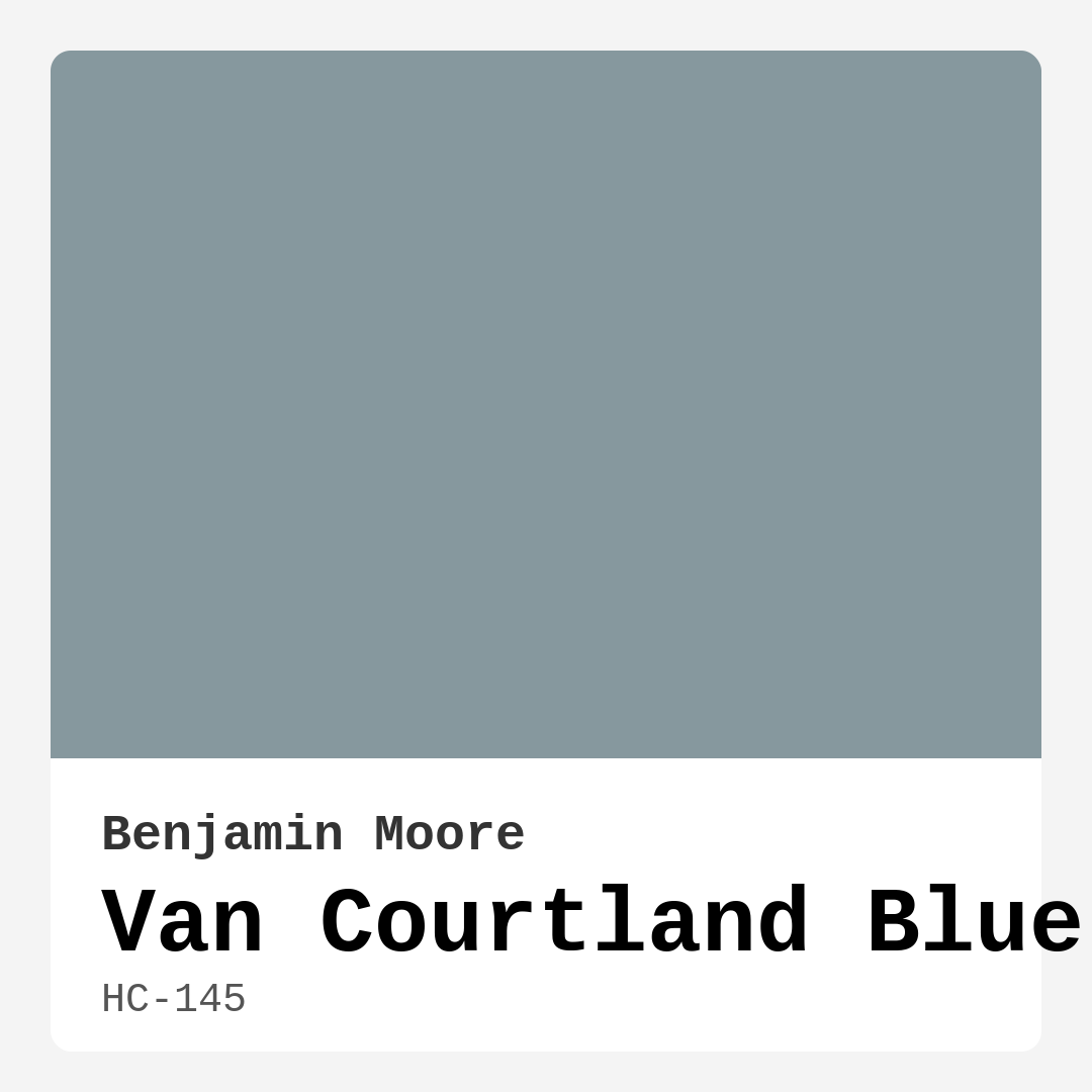
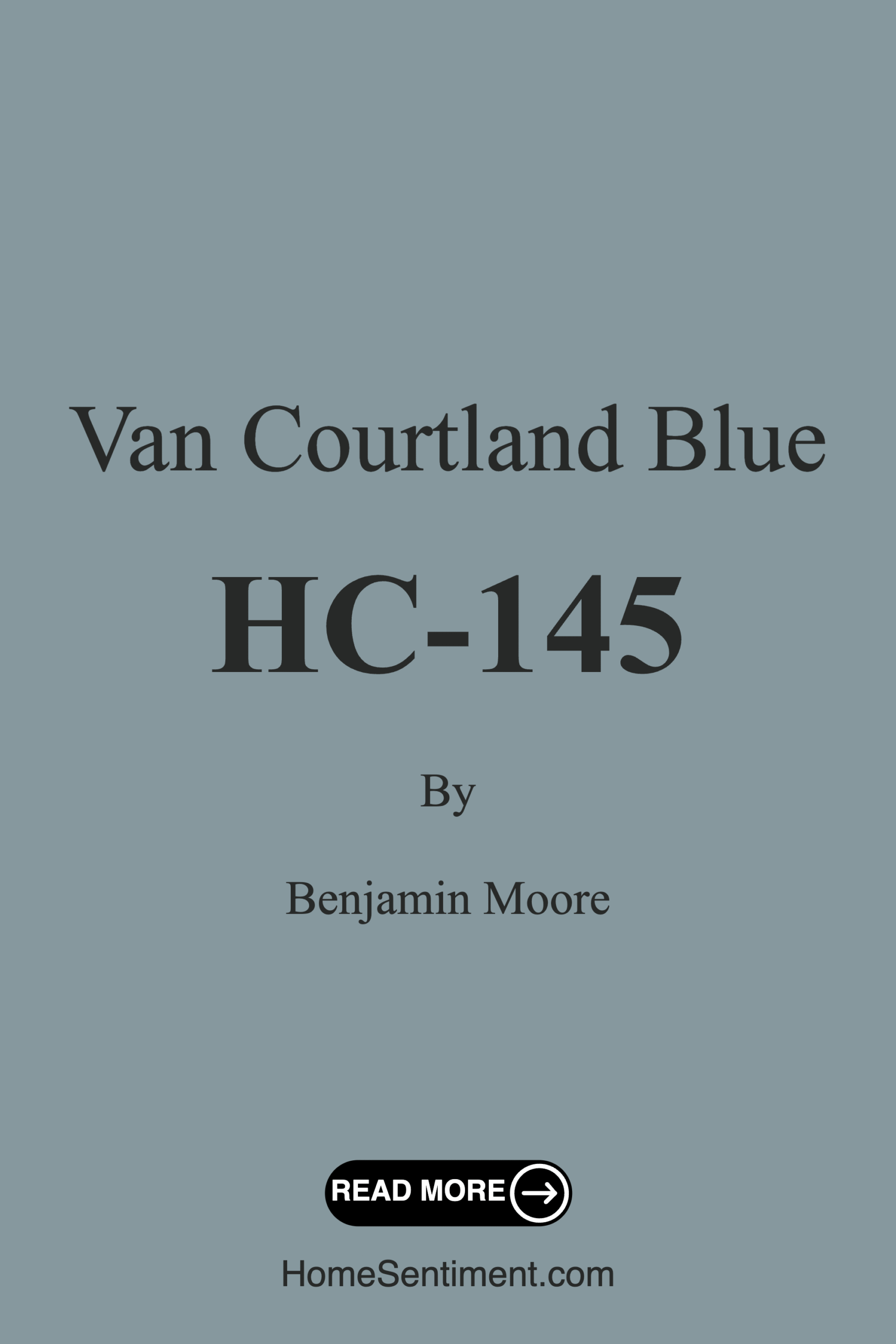
Color Preview & Key Details
| HEX Code | #86989E |
| RGB | 134, 152, 158 |
| LRV | 31.47% |
| Undertone | Blue |
| Finish Options | Eggshell, Flat, Satin, Semi-Gloss |
Imagine stepping into a room that immediately makes you feel at ease, a space where your worries seem to melt away. The walls are painted in a soft, serene hue that invites calmness and tranquility. That’s the magic of Van Courtland Blue by Benjamin Moore. This color isn’t just paint; it’s an experience waiting to transform your space.
Van Courtland Blue, officially labeled HC-145, is a medium blue with a sophisticated blend of gray undertones. Its hex code, #86989E, reflects a cool yet warm essence that balances beautifully in a variety of settings. This isn’t just another shade of blue; it’s a versatile color that brings a sense of balance to your home. Whether you’re leaning towards a coastal aesthetic or something more modern and traditional, Van Courtland Blue fits the bill effortlessly.
One of the standout features of this color is how it interacts with light. With a Light Reflectance Value (LRV) of about 31.47%, it reflects a significant amount of natural light, making spaces feel larger and more inviting. This is particularly beneficial for smaller rooms, where a well-chosen color can create a more open and airy atmosphere. If you’re thinking about using Van Courtland Blue in a small room, you’re on the right track! Just ensure there’s enough natural light streaming in to enhance its beauty.
As you consider incorporating Van Courtland Blue into your home, it’s essential to think about the spaces where it will shine the most. This color is an excellent choice for living rooms, bedrooms, bathrooms, and even nurseries. The calming vibe it exudes makes it perfect for places where relaxation is key. Imagine unwinding in a bedroom that feels like a serene retreat or enjoying a peaceful bathroom sanctuary, all thanks to the soothing touch of this lovely blue.
Now, let’s talk about decor styles. Van Courtland Blue is incredibly adaptable. Whether you’re going for a coastal vibe with airy whites and sandy beiges or a modern farmhouse aesthetic with rustic wood accents, this color will complement your vision beautifully. It works wonderfully with natural materials like wood and stone, enhancing its calming essence and creating a cohesive look in your home.
When it comes to application, you’ll be pleased to know that Van Courtland Blue is beginner-friendly. It’s designed for easy application, whether you choose to use a roller or brush. The paint glides on smoothly and dries quickly, making the process a breeze. Plus, it has low VOC levels, which means you can breathe easier knowing that you’re using a healthier option for your indoor air quality.
You might be wondering about the best finishes to use with Van Courtland Blue. For interior walls, I recommend opting for eggshell or satin finishes. These provide a subtle sheen that adds depth without being overly reflective. If you’re highlighting trim or accents, a semi-gloss finish will create a lovely contrast while adding a touch of elegance.
With the beauty of Van Courtland Blue, there are also some considerations to keep in mind. In poorly lit areas, it may appear darker than intended, which is worth noting when planning your space. Additionally, it’s important to carefully match this hue with your furnishings to create a harmonious look. While it’s a versatile color, it may not be the best fit for overly bright or bold themes, as it shines best in softer, more muted settings.
Pairing this color with the right accents can elevate your space further. Think about using lighter shades to complement Van Courtland Blue. Shades like White Dove can create a crisp, clean look that balances its depth. You can also consider brass fixtures to add warmth and sophistication, or rich wood tones that enhance its calming vibe.
For those who love experimenting with color, you’ll find that Van Courtland Blue harmonizes beautifully with a range of complementary shades. From soft greens to muted grays, the options are plentiful. You might explore lighter shades like AF-545 or bolder tones like HC-191 to create a more dynamic palette.
As you embark on this color journey, let’s not forget the transformative power of paint. Van Courtland Blue isn’t just a choice; it’s a mood setter, an atmosphere creator. When applied thoughtfully, it can bring an inviting, restful vibe to your home.
Remember, incorporating a new color is about more than just aesthetics; it’s about how it makes you feel in your space. With Van Courtland Blue, you’re choosing a hue that speaks to calmness and comfort. Whether you’re painting an accent wall or refreshing an entire room, this color can help create the sanctuary you’ve always desired.
So, are you ready to explore the possibilities with Van Courtland Blue? Imagine the stunning results and the way it will enhance your living environment. Grab some paint samples, test them in your space, and watch as your home transforms into a serene haven, all with the perfect splash of blue. Your walls have a story to tell, and Van Courtland Blue is the ideal narrator.
Save this color to your Pinterest board to revisit when planning your room.
Real Room Photo of Van Courtland Blue HC-145
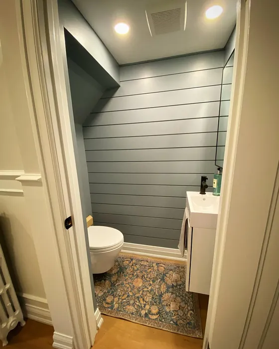
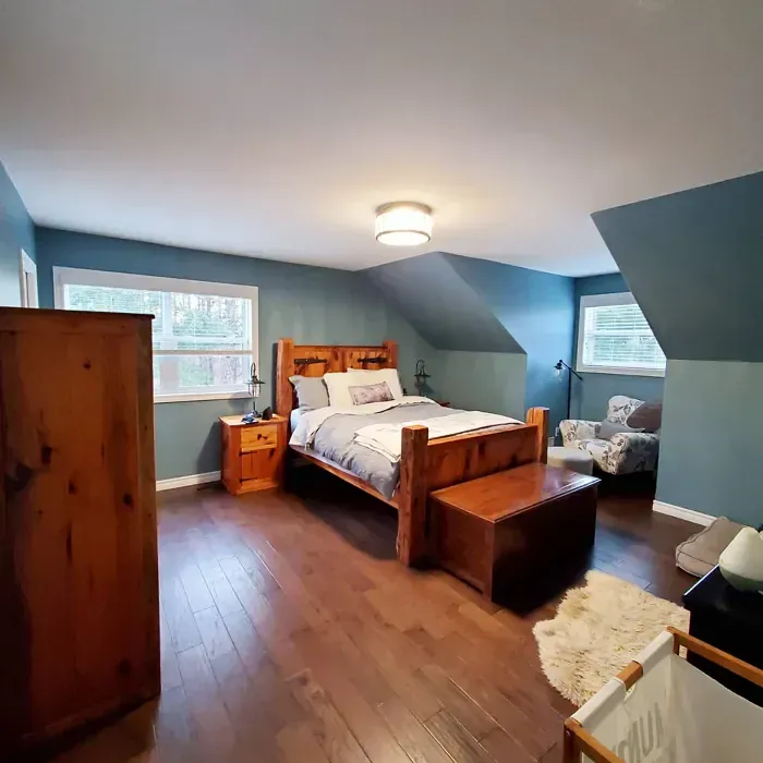
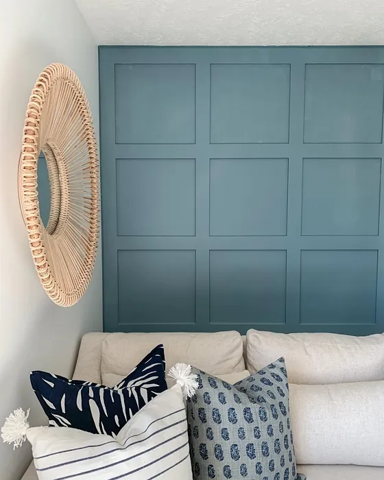
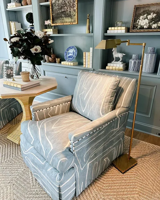
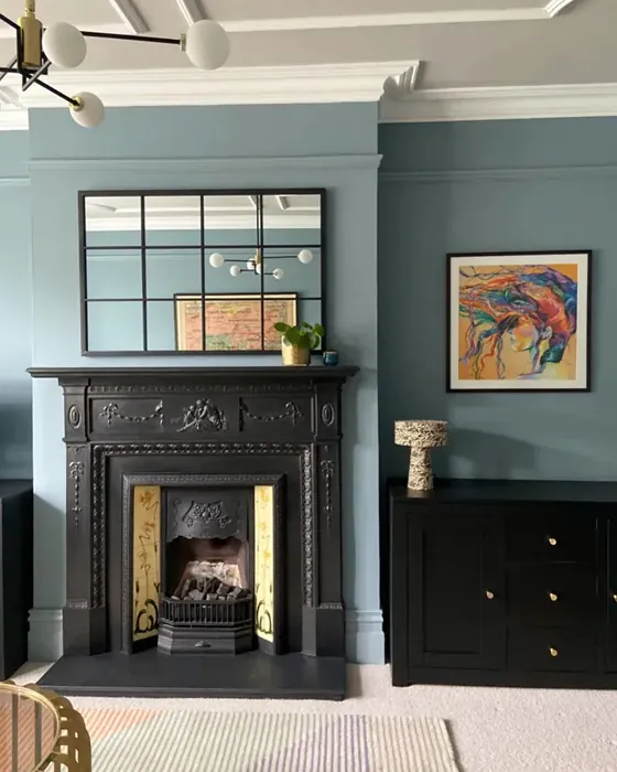
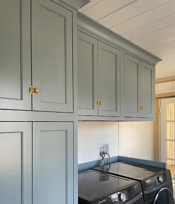
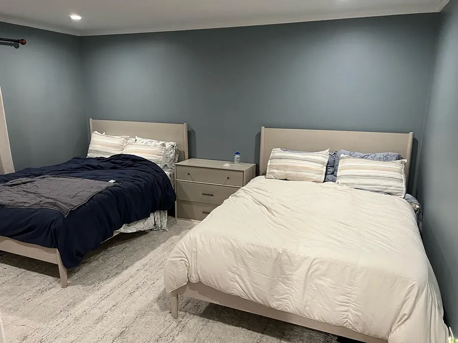
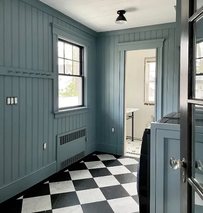
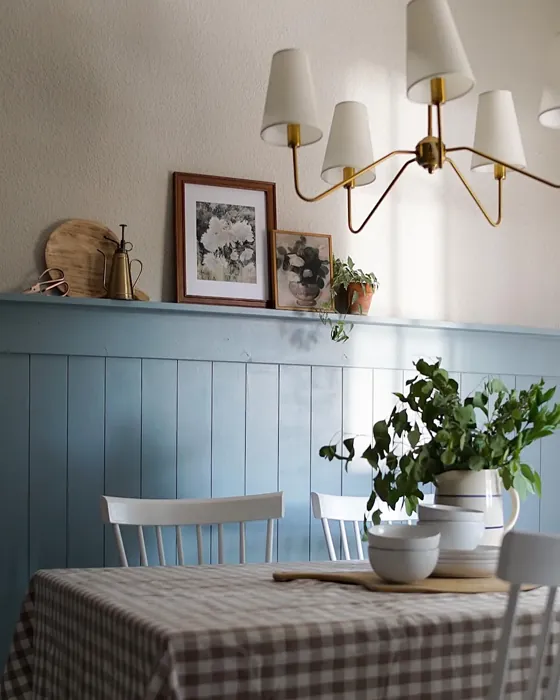
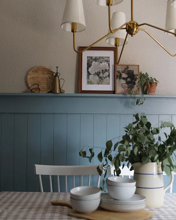
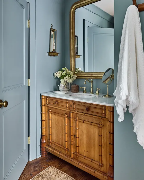
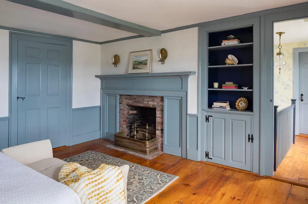
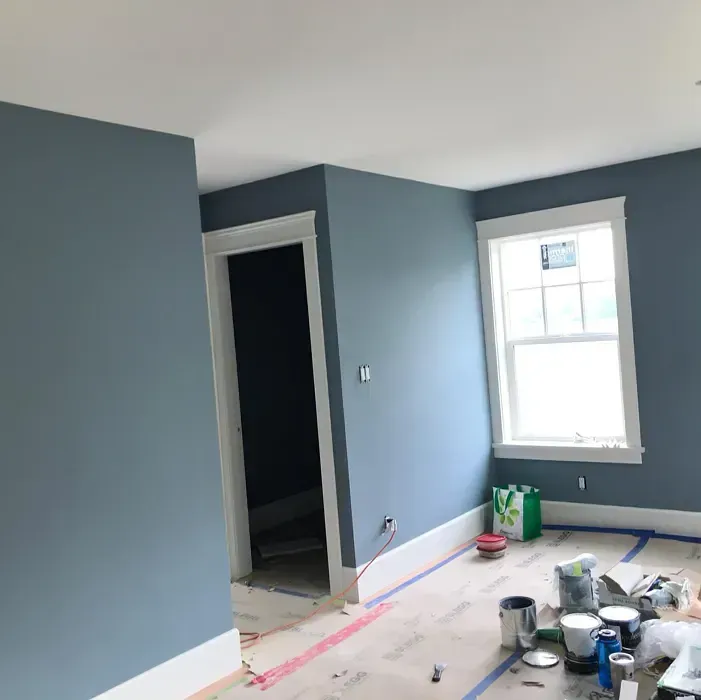
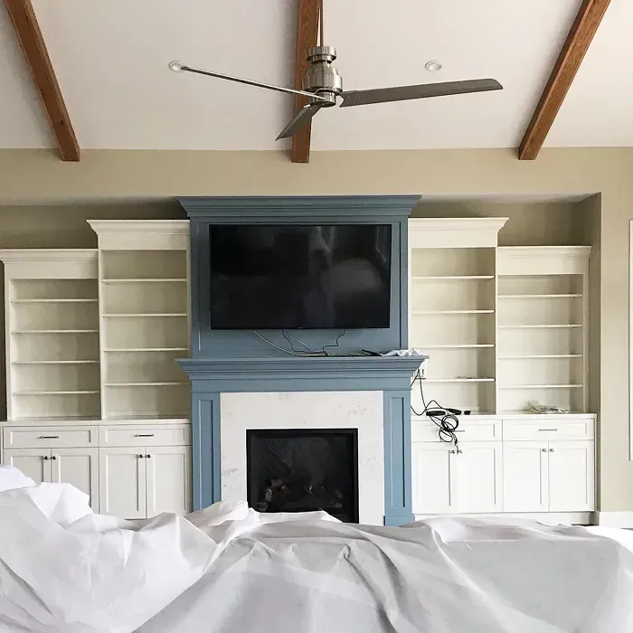
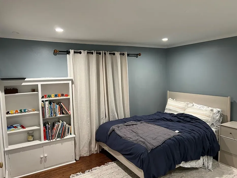
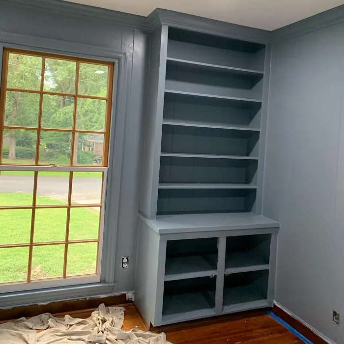
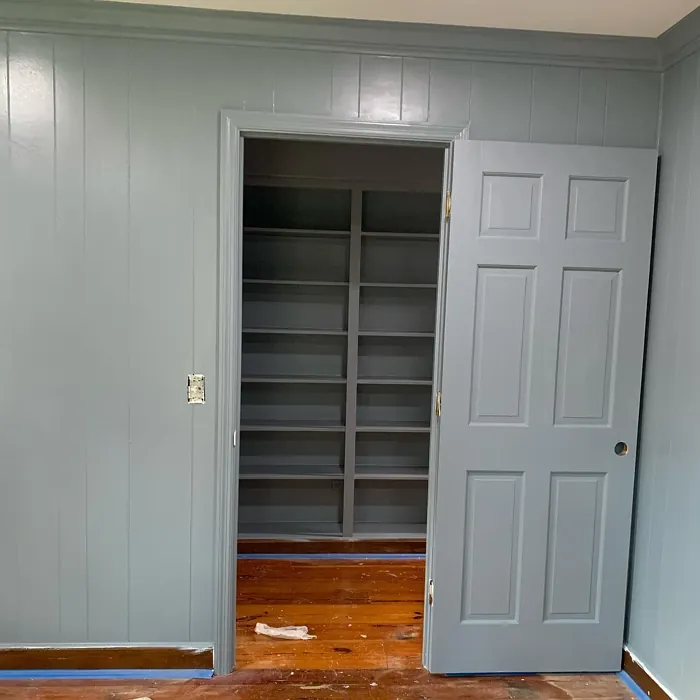
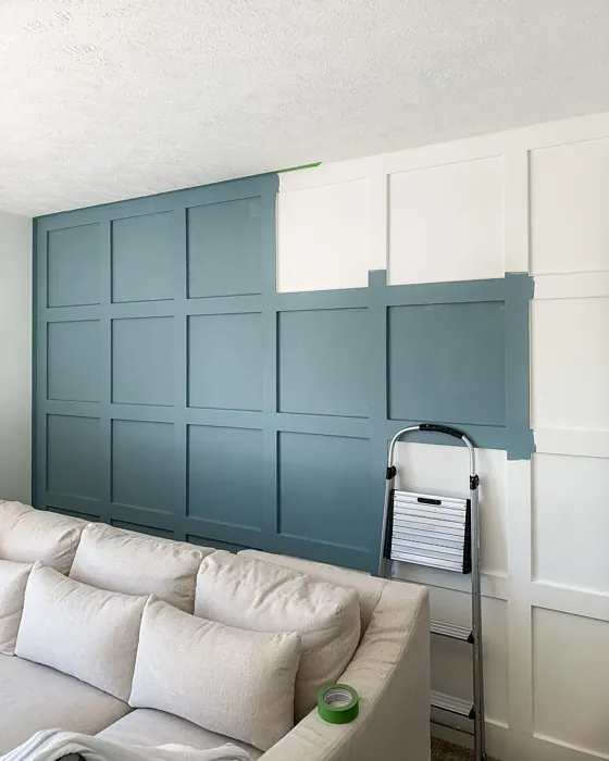
Real rooms painted with Van Courtland Blue HC-145 by Benjamin Moore. Lighting and photography can affect how colors appear — always test a sample swatch in your own space.
Undertones of Van Courtland Blue ?
This color leans towards a cooler palette with soft gray undertones, which helps it maintain a sophisticated look while still feeling approachable and warm.
HEX value: #86989E
RGB code: 134, 152, 158
Is Van Courtland Blue Cool or Warm?
Van Courtland Blue is predominantly cool but has just enough warmth to make it adaptable to various styles and settings, ensuring it doesn’t feel too stark.
Understanding Color Properties and Interior Design Tips
Hue refers to a specific position on the color wheel, measured in degrees from 0 to 360. Each degree represents a different pure color:
- 0° represents red
- 120° represents green
- 240° represents blue
Saturation describes the intensity or purity of a color and is expressed as a percentage:
- At 0%, the color appears completely desaturated—essentially a shade of gray
- At 100%, the color is at its most vivid and vibrant
Lightness indicates how light or dark a color is, also expressed as a percentage:
- 0% lightness results in black
- 100% lightness results in white
Using Warm Colors in Interior Design
Warm hues—such as reds, oranges, yellows, warm beiges, and greiges—are excellent choices for creating inviting and energetic spaces. These colors are particularly well-suited for:
- Kitchens, living rooms, and bathrooms, where warmth enhances comfort and sociability
- Large rooms, where warm tones can help reduce the sense of emptiness and make the space feel more intimate
For example:
- Warm beige shades provide a cozy, inviting atmosphere, ideal for living rooms, bedrooms, and hallways.
- Warm greige (a mix of beige and gray) offers the warmth of beige with the modern appeal of gray, making it a versatile backdrop for dining areas, bedrooms, and living spaces.
However, be mindful when using warm light tones in rooms with limited natural light. These shades may appear muted or even take on an unpleasant yellowish tint. To avoid a dull or flat appearance:
- Add depth by incorporating richer tones like deep greens, charcoal, or chocolate brown
- Use textured elements such as curtains, rugs, or cushions to bring dimension to the space
Pro Tip: Achieving Harmony with Warm and Cool Color Balance
To create a well-balanced and visually interesting interior, mix warm and cool tones strategically. This contrast adds depth and harmony to your design.
- If your walls feature warm hues, introduce cool-colored accents such as blue or green furniture, artwork, or accessories to create contrast.
- For a polished look, consider using a complementary color scheme, which pairs colors opposite each other on the color wheel (e.g., red with green, orange with blue).
This thoughtful mix not only enhances visual appeal but also creates a space that feels both dynamic and cohesive.
Save this color to your Pinterest board to revisit when planning your room.
Light Temperature Affects on Van Courtland Blue
Natural Light
Natural daylight changes in color temperature as the sun moves across the sky. At sunrise and sunset, the light tends to have a warm, golden tone with a color temperature around 2000 Kelvin (K). As the day progresses and the sun rises higher, the light becomes cooler and more neutral. Around midday, especially when the sky is clear, natural light typically reaches its peak brightness and shifts to a cooler tone, ranging from 5500 to 6500 Kelvin. This midday light is close to what we perceive as pure white or daylight-balanced light.
These shifts in natural light can significantly influence how colors appear in a space, which is why designers often consider both the time of day and the orientation of windows when planning interior color schemes.
Explore how this color transforms from sunrise through sunset as natural light changes throughout the day. Use the slider to simulate morning light, midday brightness, and warm afternoon tones.
North-facing rooms stay cooler throughout the day and benefit from warmer paint tones to compensate. South-facing rooms receive more direct sunlight, making even deeper shades more workable. East-facing rooms get bright morning light that fades by afternoon, while west-facing rooms glow warmly in the evening.
Artificial Light
When choosing artificial lighting, pay close attention to the color temperature, measured in Kelvin (K). This determines how warm or cool the light will appear. Lower temperatures, around 2700K, give off a warm, yellow glow often used in living rooms or bedrooms. Higher temperatures, above 5000K, create a cool, bluish light similar to daylight, commonly used in kitchens, offices, or task areas.
Use the slider to see how lighting temperature can affect the appearance of a surface or color throughout a space.
See how this color looks under different artificial light temperatures — from warm candlelight (2000K) to cool daylight (7000K). Move the slider to simulate your room's lighting conditions.


4800K
Keep in mind that natural light from windows, the warmth of lamps, and overhead lighting all affect how this color reads on your walls at different times of day. Always observe a sample swatch in your actual space before purchasing.
LRV of Van Courtland Blue
The Light Reflectance Value (LRV) of Van Courtland Blue is around 40, making it a mid-tone that offers depth without overwhelming a space.
Detailed Review of Van Courtland Blue
Additional Paint Characteristics
Ideal Rooms
Bedroom, Home Office, Living Room, Nursery
Decor Styles
Coastal, Farmhouse, Minimalist, Modern, Traditional
Coverage
Good (1–2 Coats)
Ease of Application
Beginner Friendly, Brush Smooth, Fast-Drying, Roller-Ready
Washability
Highly Washable, Washable
VOC Level
Low VOC
Best Use
Accent Wall, Furniture, Interior Walls
Room Suitability
Bathroom, Bedroom, Home Office, Living Room, Nursery
Tone Tag
Balanced, Cool, Muted
Finish Type
Eggshell, Satin
Paint Performance
Easy Touch-Up, Low Odor, Quick Drying, Scuff Resistant
Use Cases
Best for Modern Farmhouse, Best for Rentals, Designer Favorite
Mood
Calm, Inviting, Restful
Trim Pairing
Complements Brass Fixtures, Good with Wood Trim, Pairs with White Dove
Van Courtland Blue is more than just a color; it’s an experience. When applied, it brings a refreshing ambiance to both contemporary and classic settings. The shade has a way of shifting with light throughout the day, appearing more muted in the morning and vibrant in the afternoon. This dynamic quality allows it to adapt to various decor styles, whether you’re aiming for a beachy vibe or a more traditional look. Plus, it pairs beautifully with natural materials like wood and stone, enhancing its calming essence. For best results, consider applying it in well-lit areas to showcase its full potential.
Pros & Cons of HC-145 Van Courtland Blue
Pros
Cons
Colors that go with Benjamin Moore Van Courtland Blue
FAQ on HC-145 Van Courtland Blue
Can I use Van Courtland Blue in a small room?
Absolutely! Van Courtland Blue can work wonders in small spaces. Its calming tone can make a room feel larger and more open. Just ensure you have enough natural light to enhance its beauty. Pair it with lighter accents to keep the space inviting and airy.
What finishes work best with Van Courtland Blue?
For Van Courtland Blue, I recommend using eggshell or satin finishes for interior walls. These finishes provide a subtle sheen that adds depth without being too reflective. If you’re looking to highlight trim or accents, a semi-gloss finish will complement the color beautifully while adding contrast.
Comparisons Van Courtland Blue with other colors
Van Courtland Blue HC-145 vs Dutch Tile Blue SW 0031
| Attribute | Van Courtland Blue HC-145 | Dutch Tile Blue SW 0031 |
|---|---|---|
| Color Name | Van Courtland Blue HC-145 | Dutch Tile Blue SW 0031 |
| Color | ||
| Hue | Blue | Blue |
| Brightness | Medium | Medium |
| RGB | 134, 152, 158 | 154, 171, 171 |
| LRV | 31.47% | 24% |
| Finish Type | Eggshell, Satin | Eggshell, Matte, Satin |
| Finish Options | Eggshell, Flat, Satin, Semi-Gloss | Eggshell, Flat, Matte, Satin |
| Ideal Rooms | Bedroom, Home Office, Living Room, Nursery | Bathroom, Bedroom, Dining Room, Hallway, Home Office, Kitchen, Living Room |
| Decor Styles | Coastal, Farmhouse, Minimalist, Modern, Traditional | Coastal, Modern Farmhouse, Scandinavian, Traditional, Transitional |
| Coverage | Good (1–2 Coats) | Good (1–2 Coats) |
| Ease of Application | Beginner Friendly, Brush Smooth, Fast-Drying, Roller-Ready | Beginner Friendly, Brush Smooth, Fast-Drying, Roller-Ready |
| Washability | Highly Washable, Washable | Highly Washable, Washable |
| Room Suitability | Bathroom, Bedroom, Home Office, Living Room, Nursery | Bathroom, Bedroom, Dining Room, Kitchen, Living Room |
| Tone | Balanced, Cool, Muted | Balanced, Cool, Muted |
| Paint Performance | Easy Touch-Up, Low Odor, Quick Drying, Scuff Resistant | Easy Touch-Up, High Coverage, Low Odor, Quick Drying |
Lighting conditions, wall orientation, and surrounding decor can significantly affect how these colors appear in your space. Always test a sample swatch before committing to a full application.
Van Courtland Blue HC-145 vs Debonair SW 9139
| Attribute | Van Courtland Blue HC-145 | Debonair SW 9139 |
|---|---|---|
| Color Name | Van Courtland Blue HC-145 | Debonair SW 9139 |
| Color | ||
| Hue | Blue | Blue |
| Brightness | Medium | Medium |
| RGB | 134, 152, 158 | 144, 160, 166 |
| LRV | 31.47% | 30% |
| Finish Type | Eggshell, Satin | Eggshell, Matte, Satin |
| Finish Options | Eggshell, Flat, Satin, Semi-Gloss | Eggshell, Matte, Satin |
| Ideal Rooms | Bedroom, Home Office, Living Room, Nursery | Bedroom, Dining Room, Home Office, Living Room |
| Decor Styles | Coastal, Farmhouse, Minimalist, Modern, Traditional | Coastal, Industrial, Modern, Transitional |
| Coverage | Good (1–2 Coats) | Good (1–2 Coats) |
| Ease of Application | Beginner Friendly, Brush Smooth, Fast-Drying, Roller-Ready | Beginner Friendly, Brush Smooth, Roller-Ready |
| Washability | Highly Washable, Washable | Washable, Wipeable |
| Room Suitability | Bathroom, Bedroom, Home Office, Living Room, Nursery | Bedroom, Dining Room, Home Office, Living Room |
| Tone | Balanced, Cool, Muted | Balanced, Cool, Muted |
| Paint Performance | Easy Touch-Up, Low Odor, Quick Drying, Scuff Resistant | Easy Touch-Up, Low Odor, Quick Drying |
Lighting conditions, wall orientation, and surrounding decor can significantly affect how these colors appear in your space. Always test a sample swatch before committing to a full application.
Van Courtland Blue HC-145 vs Stardew SW 9138
| Attribute | Van Courtland Blue HC-145 | Stardew SW 9138 |
|---|---|---|
| Color Name | Van Courtland Blue HC-145 | Stardew SW 9138 |
| Color | ||
| Hue | Blue | Blue |
| Brightness | Medium | Medium |
| RGB | 134, 152, 158 | 166, 178, 181 |
| LRV | 31.47% | 30% |
| Finish Type | Eggshell, Satin | Eggshell, Satin |
| Finish Options | Eggshell, Flat, Satin, Semi-Gloss | Eggshell, Matte, Satin |
| Ideal Rooms | Bedroom, Home Office, Living Room, Nursery | Bathroom, Bedroom, Home Office, Living Room, Nursery |
| Decor Styles | Coastal, Farmhouse, Minimalist, Modern, Traditional | Coastal, Farmhouse, Modern, Scandinavian |
| Coverage | Good (1–2 Coats) | Good (1–2 Coats) |
| Ease of Application | Beginner Friendly, Brush Smooth, Fast-Drying, Roller-Ready | Beginner Friendly, Brush Smooth, Roller-Ready |
| Washability | Highly Washable, Washable | Highly Washable, Washable, Wipeable |
| Room Suitability | Bathroom, Bedroom, Home Office, Living Room, Nursery | Bathroom, Bedroom, Home Office, Living Room |
| Tone | Balanced, Cool, Muted | Calm, Cool, Muted |
| Paint Performance | Easy Touch-Up, Low Odor, Quick Drying, Scuff Resistant | Easy Touch-Up, High Coverage, Low Odor |
Lighting conditions, wall orientation, and surrounding decor can significantly affect how these colors appear in your space. Always test a sample swatch before committing to a full application.
Van Courtland Blue HC-145 vs Niebla Azul SW 9137
| Attribute | Van Courtland Blue HC-145 | Niebla Azul SW 9137 |
|---|---|---|
| Color Name | Van Courtland Blue HC-145 | Niebla Azul SW 9137 |
| Color | ||
| Hue | Blue | Blue |
| Brightness | Medium | Medium |
| RGB | 134, 152, 158 | 182, 195, 196 |
| LRV | 31.47% | 48% |
| Finish Type | Eggshell, Satin | Eggshell, Matte, Satin |
| Finish Options | Eggshell, Flat, Satin, Semi-Gloss | Eggshell, Matte, Satin |
| Ideal Rooms | Bedroom, Home Office, Living Room, Nursery | Bedroom, Home Office, Living Room, Nursery |
| Decor Styles | Coastal, Farmhouse, Minimalist, Modern, Traditional | Coastal, Modern, Scandinavian, Transitional |
| Coverage | Good (1–2 Coats) | Good (1–2 Coats), Touch-Up Friendly |
| Ease of Application | Beginner Friendly, Brush Smooth, Fast-Drying, Roller-Ready | Beginner Friendly, Brush Smooth, Roller-Ready |
| Washability | Highly Washable, Washable | Highly Washable, Washable |
| Room Suitability | Bathroom, Bedroom, Home Office, Living Room, Nursery | Bedroom, Home Office, Living Room, Nursery |
| Tone | Balanced, Cool, Muted | Airy, Cool, Muted |
| Paint Performance | Easy Touch-Up, Low Odor, Quick Drying, Scuff Resistant | Easy Touch-Up, Fade Resistant, Low Odor, Scuff Resistant |
Lighting conditions, wall orientation, and surrounding decor can significantly affect how these colors appear in your space. Always test a sample swatch before committing to a full application.
Van Courtland Blue HC-145 vs Rain SW 6219
| Attribute | Van Courtland Blue HC-145 | Rain SW 6219 |
|---|---|---|
| Color Name | Van Courtland Blue HC-145 | Rain SW 6219 |
| Color | ||
| Hue | Blue | Blue |
| Brightness | Medium | Medium |
| RGB | 134, 152, 158 | 171, 190, 191 |
| LRV | 31.47% | 50% |
| Finish Type | Eggshell, Satin | Eggshell, Matte, Satin |
| Finish Options | Eggshell, Flat, Satin, Semi-Gloss | Eggshell, Matte, Satin |
| Ideal Rooms | Bedroom, Home Office, Living Room, Nursery | Bathroom, Bedroom, Home Office, Living Room, Nursery |
| Decor Styles | Coastal, Farmhouse, Minimalist, Modern, Traditional | Coastal, Minimalist, Modern, Scandinavian, Transitional |
| Coverage | Good (1–2 Coats) | Good (1–2 Coats), Touch-Up Friendly |
| Ease of Application | Beginner Friendly, Brush Smooth, Fast-Drying, Roller-Ready | Beginner Friendly, Brush Smooth, Fast-Drying, Roller-Ready |
| Washability | Highly Washable, Washable | Scrubbable, Stain Resistant, Washable |
| Room Suitability | Bathroom, Bedroom, Home Office, Living Room, Nursery | Bathroom, Bedroom, Home Office, Living Room, Nursery |
| Tone | Balanced, Cool, Muted | Balanced, Cool, Muted |
| Paint Performance | Easy Touch-Up, Low Odor, Quick Drying, Scuff Resistant | Easy Touch-Up, Low Odor, Quick Drying, Stain Resistant |
Lighting conditions, wall orientation, and surrounding decor can significantly affect how these colors appear in your space. Always test a sample swatch before committing to a full application.
Van Courtland Blue HC-145 vs Morning at Sea SW 9634
| Attribute | Van Courtland Blue HC-145 | Morning at Sea SW 9634 |
|---|---|---|
| Color Name | Van Courtland Blue HC-145 | Morning at Sea SW 9634 |
| Color | ||
| Hue | Blue | Blue |
| Brightness | Medium | Medium |
| RGB | 134, 152, 158 | 130, 151, 155 |
| LRV | 31.47% | 50% |
| Finish Type | Eggshell, Satin | Eggshell, Matte |
| Finish Options | Eggshell, Flat, Satin, Semi-Gloss | Eggshell, Matte, Satin |
| Ideal Rooms | Bedroom, Home Office, Living Room, Nursery | Bathroom, Bedroom, Home Office, Living Room |
| Decor Styles | Coastal, Farmhouse, Minimalist, Modern, Traditional | Coastal, Minimalist, Modern, Scandinavian |
| Coverage | Good (1–2 Coats) | Good (1–2 Coats), Touch-Up Friendly |
| Ease of Application | Beginner Friendly, Brush Smooth, Fast-Drying, Roller-Ready | Beginner Friendly, Brush Smooth, Roller-Ready |
| Washability | Highly Washable, Washable | Washable, Wipeable |
| Room Suitability | Bathroom, Bedroom, Home Office, Living Room, Nursery | Bathroom, Bedroom, Home Office, Living Room |
| Tone | Balanced, Cool, Muted | Airy, Cool, Muted |
| Paint Performance | Easy Touch-Up, Low Odor, Quick Drying, Scuff Resistant | Easy Touch-Up, Fade Resistant, Low Odor |
Lighting conditions, wall orientation, and surrounding decor can significantly affect how these colors appear in your space. Always test a sample swatch before committing to a full application.
Van Courtland Blue HC-145 vs Sleepy Blue SW 6225
| Attribute | Van Courtland Blue HC-145 | Sleepy Blue SW 6225 |
|---|---|---|
| Color Name | Van Courtland Blue HC-145 | Sleepy Blue SW 6225 |
| Color | ||
| Hue | Blue | Blue |
| Brightness | Medium | Medium |
| RGB | 134, 152, 158 | 188, 203, 206 |
| LRV | 31.47% | 50% |
| Finish Type | Eggshell, Satin | Eggshell, Matte, Satin |
| Finish Options | Eggshell, Flat, Satin, Semi-Gloss | Eggshell, Matte, Satin |
| Ideal Rooms | Bedroom, Home Office, Living Room, Nursery | Bedroom, Home Office, Living Room, Nursery |
| Decor Styles | Coastal, Farmhouse, Minimalist, Modern, Traditional | Coastal, Minimalist, Modern Farmhouse, Scandinavian |
| Coverage | Good (1–2 Coats) | Good (1–2 Coats) |
| Ease of Application | Beginner Friendly, Brush Smooth, Fast-Drying, Roller-Ready | Beginner Friendly, Brush Smooth, Fast-Drying, Roller-Ready |
| Washability | Highly Washable, Washable | Highly Washable, Washable |
| Room Suitability | Bathroom, Bedroom, Home Office, Living Room, Nursery | Bedroom, Home Office, Living Room, Nursery |
| Tone | Balanced, Cool, Muted | Airy, Cool, Muted |
| Paint Performance | Easy Touch-Up, Low Odor, Quick Drying, Scuff Resistant | Easy Touch-Up, Low Odor, Quick Drying, Scuff Resistant |
Lighting conditions, wall orientation, and surrounding decor can significantly affect how these colors appear in your space. Always test a sample swatch before committing to a full application.
Van Courtland Blue HC-145 vs Lakeside SW 9683
| Attribute | Van Courtland Blue HC-145 | Lakeside SW 9683 |
|---|---|---|
| Color Name | Van Courtland Blue HC-145 | Lakeside SW 9683 |
| Color | ||
| Hue | Blue | Blue |
| Brightness | Medium | Medium |
| RGB | 134, 152, 158 | 173, 184, 192 |
| LRV | 31.47% | 24% |
| Finish Type | Eggshell, Satin | Eggshell, Matte, Satin |
| Finish Options | Eggshell, Flat, Satin, Semi-Gloss | Eggshell, Matte, Satin |
| Ideal Rooms | Bedroom, Home Office, Living Room, Nursery | Bathroom, Bedroom, Home Office, Living Room |
| Decor Styles | Coastal, Farmhouse, Minimalist, Modern, Traditional | Coastal, Minimalist, Modern, Rustic |
| Coverage | Good (1–2 Coats) | Good (1–2 Coats) |
| Ease of Application | Beginner Friendly, Brush Smooth, Fast-Drying, Roller-Ready | Beginner Friendly, Brush Smooth, Roller-Ready |
| Washability | Highly Washable, Washable | Scrubbable, Washable |
| Room Suitability | Bathroom, Bedroom, Home Office, Living Room, Nursery | Bathroom, Bedroom, Home Office, Living Room |
| Tone | Balanced, Cool, Muted | Balanced, Cool, Muted |
| Paint Performance | Easy Touch-Up, Low Odor, Quick Drying, Scuff Resistant | Easy Touch-Up, Fade Resistant, High Coverage, Low Odor |
Lighting conditions, wall orientation, and surrounding decor can significantly affect how these colors appear in your space. Always test a sample swatch before committing to a full application.
Van Courtland Blue HC-145 vs Upward SW 6239
| Attribute | Van Courtland Blue HC-145 | Upward SW 6239 |
|---|---|---|
| Color Name | Van Courtland Blue HC-145 | Upward SW 6239 |
| Color | ||
| Hue | Blue | Blue |
| Brightness | Medium | Medium |
| RGB | 134, 152, 158 | 191, 201, 208 |
| LRV | 31.47% | 75% |
| Finish Type | Eggshell, Satin | Eggshell, Satin |
| Finish Options | Eggshell, Flat, Satin, Semi-Gloss | Eggshell, Flat, Satin |
| Ideal Rooms | Bedroom, Home Office, Living Room, Nursery | Bedroom, Dining Room, Home Office, Living Room, Nursery |
| Decor Styles | Coastal, Farmhouse, Minimalist, Modern, Traditional | Coastal, Minimalist, Modern, Scandinavian |
| Coverage | Good (1–2 Coats) | Good (1–2 Coats), Touch-Up Friendly |
| Ease of Application | Beginner Friendly, Brush Smooth, Fast-Drying, Roller-Ready | Beginner Friendly, Brush Smooth, Fast-Drying, Roller-Ready |
| Washability | Highly Washable, Washable | Washable, Wipeable |
| Room Suitability | Bathroom, Bedroom, Home Office, Living Room, Nursery | Bedroom, Home Office, Living Room, Nursery |
| Tone | Balanced, Cool, Muted | Cool, Crisp, Muted |
| Paint Performance | Easy Touch-Up, Low Odor, Quick Drying, Scuff Resistant | High Coverage, Low Odor, Quick Drying |
Lighting conditions, wall orientation, and surrounding decor can significantly affect how these colors appear in your space. Always test a sample swatch before committing to a full application.
Van Courtland Blue HC-145 vs Aleutian SW 6241
| Attribute | Van Courtland Blue HC-145 | Aleutian SW 6241 |
|---|---|---|
| Color Name | Van Courtland Blue HC-145 | Aleutian SW 6241 |
| Color | ||
| Hue | Blue | Blue |
| Brightness | Medium | Medium |
| RGB | 134, 152, 158 | 152, 169, 183 |
| LRV | 31.47% | 24% |
| Finish Type | Eggshell, Satin | Eggshell, Matte, Satin |
| Finish Options | Eggshell, Flat, Satin, Semi-Gloss | Eggshell, Matte, Satin |
| Ideal Rooms | Bedroom, Home Office, Living Room, Nursery | Bathroom, Bedroom, Home Office, Kitchen, Living Room, Nursery |
| Decor Styles | Coastal, Farmhouse, Minimalist, Modern, Traditional | Coastal, Minimalist, Modern, Scandinavian, Transitional |
| Coverage | Good (1–2 Coats) | Good (1–2 Coats), Touch-Up Friendly |
| Ease of Application | Beginner Friendly, Brush Smooth, Fast-Drying, Roller-Ready | Beginner Friendly, Brush Smooth, Fast-Drying, Roller-Ready |
| Washability | Highly Washable, Washable | Scrubbable, Stain Resistant, Washable |
| Room Suitability | Bathroom, Bedroom, Home Office, Living Room, Nursery | Bathroom, Bedroom, Home Office, Living Room, Nursery |
| Tone | Balanced, Cool, Muted | Airy, Balanced, Cool, Muted |
| Paint Performance | Easy Touch-Up, Low Odor, Quick Drying, Scuff Resistant | Easy Touch-Up, Fade Resistant, Low Odor, Quick Drying |
Lighting conditions, wall orientation, and surrounding decor can significantly affect how these colors appear in your space. Always test a sample swatch before committing to a full application.
Official Page of Benjamin Moore Van Courtland Blue HC-145