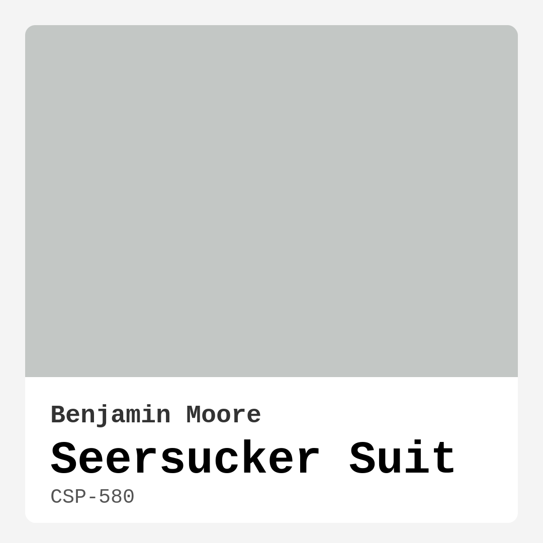
Color Preview & Key Details
| HEX Code | #C3C7C5 |
| RGB | 195, 199, 197 |
| LRV | 56.29% |
| Undertone | Green |
| Finish Options | Eggshell, Matte, Satin |
Have you ever walked into a room and instantly felt at ease? That warm, inviting vibe often comes down to the right choice of color. Today, let’s chat about a particular shade that can effortlessly transform your space: Benjamin Moore’s Seersucker Suit (CSP-580). It’s a soft, muted gray that brings a touch of sophistication and warmth, making it a perfect candidate for your next home decor project.
Picture this: you’ve just moved into a new home, or maybe you’re looking to refresh your existing space. You want a color that’s versatile, inviting, and capable of complementing both modern and traditional aesthetics. Seersucker Suit is that color. With its subtle undertone of green, this hue escapes the sterility that often comes with cooler grays, providing a cozy backdrop that feels like a breath of fresh air.
One of the great things about Seersucker Suit is its adaptability. It plays well with a wide variety of decor styles, including Scandinavian minimalism, coastal charm, and farmhouse coziness. Whether you’re dressing up a living room, bedroom, dining room, or kitchen, this medium gray can be your secret weapon. Its soft tone enhances the room’s natural light, reflecting most of the incident light thanks to its Light Reflectance Value (LRV) of about 56.29%. This means it doesn’t just sit there; it practically dances with the light, making spaces feel more open and airy.
Now, let’s talk about application. If you’re a DIY enthusiast or just starting with home projects, you’ll appreciate that Seersucker Suit is beginner-friendly. Its smooth application makes it roller-ready, and it dries quickly, which is great if you’re eager to see the results. Imagine finishing up your painting project and being able to enjoy your newly transformed space in no time!
When applying this color, you might find that it requires one to two coats for full coverage. While it’s generally easy to work with, the subtlety of the hue means you want to ensure an even application. Don’t let that deter you, though; the payoff is well worth it. Once it’s up, Seersucker Suit maintains its character beautifully under various lighting conditions. In bright light, it’ll appear lighter and airier. But when the sun sets and the room dims, it takes on a richer, more enveloping quality, transforming your space into a cozy retreat.
What’s more, this color is not just aesthetically pleasing; it’s also practical. With its washable and wipeable finish, you won’t have to worry too much about day-to-day wear and tear. That makes it ideal for high-traffic areas like kitchens and living rooms. Plus, its low VOC (Volatile Organic Compound) level means you can breathe easy, knowing you’re making an eco-friendly choice that’s safer for your family and the environment.
Still unsure if Seersucker Suit is the right fit for your project? Let’s consider how it interacts with other colors. It pairs beautifully with whites like Benjamin Moore’s White Dove or Pure White, creating a crisp and clean contrast that can elevate any space. If you’re looking for complementary accents, think about incorporating brass fixtures or wooden elements to add warmth and texture. This color can also serve as an excellent backdrop for more vibrant hues, allowing your decor to pop without overwhelming your senses.
If you’re working with small spaces, Seersucker Suit shines even brighter. Its light-reflecting quality helps open up areas, making them feel larger and more inviting. This makes it a fantastic choice for hallways, bedrooms, or any nook where you want to create a cozy yet spacious atmosphere. The warm undertones ensure the color isn’t cold or sterile, which can often happen with other gray paints.
Now, you might wonder how Seersucker Suit measures up against other popular gray paints. While many gray shades can feel too stark or cold, this one stands out thanks to its warmth and softness. It’s like a gentle hug for your walls, creating a calm environment that’s still visually engaging. If you want a gray that feels like home and complements your personal style, this is a fantastic option.
In terms of mood, Seersucker Suit sets just the right tone. It exudes a calm and inviting aura, perfect for creating a peaceful sanctuary in your living room or a relaxing retreat in your bedroom. You’ll find that it enhances the overall atmosphere of your space without competing for attention, allowing your decor and personal touches to shine through.
When you think about your design vision, consider how this color can serve as a foundation. Its muted tone offers a sophisticated backdrop for bolder decor choices. You could layer in textures—think soft linens, rich woods, or even metallics—to create depth and dimension within the space. This color leans warm, effectively softening harsher elements in your decor without overwhelming your design.
As you embark on your painting journey, remember to consider the finish as well. Seersucker Suit comes in eggshell, satin, and matte finishes, allowing you to choose the sheen that best suits your style and needs. An eggshell finish offers a bit of sheen that’s easy to clean, making it great for kitchens and dining areas. Meanwhile, a matte finish provides a more subdued look that’s perfect for cozy spaces.
For those of you who love the idea of layering colors, think about the lighter or darker shades in the Benjamin Moore palette that can complement Seersucker Suit. Lighter shades like 2133-70 and 1604 can create a gentle gradient, while darker shades like HC-164 or AF-625 can provide a striking contrast that emphasizes the warmth of your chosen gray.
In conclusion, if you’re on the hunt for a soft, inviting gray that effortlessly enhances your home, Seersucker Suit may just be the color for you. Its versatility, warm undertones, and ability to adapt to various styles make it a timeless choice. Coupled with its practicality and ease of application, you can’t go wrong with this sophisticated hue. So grab that paintbrush and get ready to transform your space into a cozy sanctuary that reflects your personal style!
Save this color to your Pinterest board to revisit when planning your room.
Real Room Photo of Seersucker Suit CSP-580
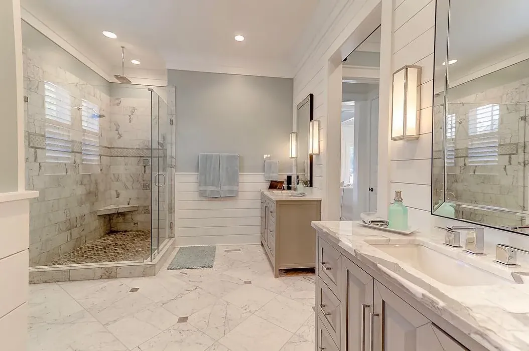
Real rooms painted with Seersucker Suit CSP-580 by Benjamin Moore. Lighting and photography can affect how colors appear — always test a sample swatch in your own space.
Undertones of Seersucker Suit ?
This color leans slightly warm, giving it a cozy aura that softens harsher elements in your decor. Its understated warmth makes it approachable and versatile, ensuring it doesn’t overwhelm other colors in your space.
HEX value: #C3C7C5
RGB code: 195, 199, 197
Is Seersucker Suit Cool or Warm?
Seersucker Suit leans warm, providing a gentle backdrop that enhances your decor without competing for attention. This warmth makes it an excellent choice for spaces where comfort is a priority.
Understanding Color Properties and Interior Design Tips
Hue refers to a specific position on the color wheel, measured in degrees from 0 to 360. Each degree represents a different pure color:
- 0° represents red
- 120° represents green
- 240° represents blue
Saturation describes the intensity or purity of a color and is expressed as a percentage:
- At 0%, the color appears completely desaturated—essentially a shade of gray
- At 100%, the color is at its most vivid and vibrant
Lightness indicates how light or dark a color is, also expressed as a percentage:
- 0% lightness results in black
- 100% lightness results in white
Using Warm Colors in Interior Design
Warm hues—such as reds, oranges, yellows, warm beiges, and greiges—are excellent choices for creating inviting and energetic spaces. These colors are particularly well-suited for:
- Kitchens, living rooms, and bathrooms, where warmth enhances comfort and sociability
- Large rooms, where warm tones can help reduce the sense of emptiness and make the space feel more intimate
For example:
- Warm beige shades provide a cozy, inviting atmosphere, ideal for living rooms, bedrooms, and hallways.
- Warm greige (a mix of beige and gray) offers the warmth of beige with the modern appeal of gray, making it a versatile backdrop for dining areas, bedrooms, and living spaces.
However, be mindful when using warm light tones in rooms with limited natural light. These shades may appear muted or even take on an unpleasant yellowish tint. To avoid a dull or flat appearance:
- Add depth by incorporating richer tones like deep greens, charcoal, or chocolate brown
- Use textured elements such as curtains, rugs, or cushions to bring dimension to the space
Pro Tip: Achieving Harmony with Warm and Cool Color Balance
To create a well-balanced and visually interesting interior, mix warm and cool tones strategically. This contrast adds depth and harmony to your design.
- If your walls feature warm hues, introduce cool-colored accents such as blue or green furniture, artwork, or accessories to create contrast.
- For a polished look, consider using a complementary color scheme, which pairs colors opposite each other on the color wheel (e.g., red with green, orange with blue).
This thoughtful mix not only enhances visual appeal but also creates a space that feels both dynamic and cohesive.
Save this color to your Pinterest board to revisit when planning your room.
Light Temperature Affects on Seersucker Suit
Natural Light
Natural daylight changes in color temperature as the sun moves across the sky. At sunrise and sunset, the light tends to have a warm, golden tone with a color temperature around 2000 Kelvin (K). As the day progresses and the sun rises higher, the light becomes cooler and more neutral. Around midday, especially when the sky is clear, natural light typically reaches its peak brightness and shifts to a cooler tone, ranging from 5500 to 6500 Kelvin. This midday light is close to what we perceive as pure white or daylight-balanced light.
These shifts in natural light can significantly influence how colors appear in a space, which is why designers often consider both the time of day and the orientation of windows when planning interior color schemes.
Explore how this color transforms from sunrise through sunset as natural light changes throughout the day. Use the slider to simulate morning light, midday brightness, and warm afternoon tones.
North-facing rooms stay cooler throughout the day and benefit from warmer paint tones to compensate. South-facing rooms receive more direct sunlight, making even deeper shades more workable. East-facing rooms get bright morning light that fades by afternoon, while west-facing rooms glow warmly in the evening.
Artificial Light
When choosing artificial lighting, pay close attention to the color temperature, measured in Kelvin (K). This determines how warm or cool the light will appear. Lower temperatures, around 2700K, give off a warm, yellow glow often used in living rooms or bedrooms. Higher temperatures, above 5000K, create a cool, bluish light similar to daylight, commonly used in kitchens, offices, or task areas.
Use the slider to see how lighting temperature can affect the appearance of a surface or color throughout a space.
See how this color looks under different artificial light temperatures — from warm candlelight (2000K) to cool daylight (7000K). Move the slider to simulate your room's lighting conditions.


4800K
Keep in mind that natural light from windows, the warmth of lamps, and overhead lighting all affect how this color reads on your walls at different times of day. Always observe a sample swatch in your actual space before purchasing.
LRV of Seersucker Suit
The Light Reflectance Value (LRV) of Seersucker Suit is around 50, which means it reflects a substantial amount of light while maintaining its depth. This balance helps keep spaces feeling open and airy.
Detailed Review of Seersucker Suit
Additional Paint Characteristics
Ideal Rooms
Bedroom, Dining Room, Hallway, Kitchen, Living Room
Decor Styles
Coastal, Farmhouse, Modern, Scandinavian, Transitional
Coverage
Good (1–2 Coats)
Ease of Application
Beginner Friendly, Brush Smooth, Fast-Drying, Roller-Ready
Washability
Washable, Wipeable
VOC Level
Eco-Certified, Low VOC
Best Use
Accent Wall, Interior Walls, Small Spaces
Room Suitability
Bedroom, Dining Room, Hallway, Kitchen, Living Room
Tone Tag
Muted, Neutral, Warm
Finish Type
Eggshell, Matte, Satin
Paint Performance
Easy Touch-Up, High Coverage, Low Odor, Quick Drying
Use Cases
Best for Rentals, Best for Small Spaces, Classic Favorite
Mood
Calm, Cozy, Inviting
Trim Pairing
Complements Brass Fixtures, Matches Pure White, Pairs with White Dove
Seersucker Suit is a versatile color that effortlessly enhances any room with its soft, inviting hue. One of its standout features is its adaptability; it can complement a wide range of furniture and decor styles, from minimalist to rustic. When applied, it provides a smooth finish that elevates the overall look of your space, making it feel polished and well-designed. The color maintains its character well in various lighting conditions, shifting gracefully from soft gray to warm taupe as the day progresses. Overall, it’s a great choice for anyone looking to refresh their home with a neutral that’s anything but boring.
Pros & Cons of CSP-580 Seersucker Suit
Pros
Cons
Colors that go with Benjamin Moore Seersucker Suit
FAQ on CSP-580 Seersucker Suit
How does Seersucker Suit compare to other gray paints?
Seersucker Suit stands out among gray paints due to its unique warmth and softness. Unlike some cooler grays, this shade has a hint of beige that makes it more inviting and versatile. It’s great for creating a calm environment while still providing enough contrast against white or darker colors. If you’re looking for a gray that feels cozy rather than stark, Seersucker Suit is a fantastic option. It can serve as a perfect backdrop for both modern and traditional decor, adapting beautifully to your personal style.
Is Seersucker Suit suitable for small spaces?
Yes, Seersucker Suit is particularly well-suited for small spaces. Its light-reflecting quality helps to open up areas, making them feel larger and more inviting. The warm undertones prevent it from feeling cold or unwelcoming, which can sometimes happen with cooler grays. When paired with adequate lighting and thoughtful decor, this color can transform a small room into a cozy retreat rather than a cramped quarters. It’s a wonderful choice for hallways, bedrooms, or any area where you want to create an inviting atmosphere.
Comparisons Seersucker Suit with other colors
Seersucker Suit CSP-580 vs Repose Gray SW 7015
| Attribute | Seersucker Suit CSP-580 | Repose Gray SW 7015 |
|---|---|---|
| Color Name | Seersucker Suit CSP-580 | Repose Gray SW 7015 |
| Color | ||
| Hue | Grey | Grey |
| Brightness | Medium | Medium |
| RGB | 195, 199, 197 | 204, 201, 192 |
| LRV | 56.29% | 58% |
| Finish Type | Eggshell, Matte, Satin | Eggshell, Matte, Satin |
| Finish Options | Eggshell, Matte, Satin | Eggshell, Matte, Satin |
| Ideal Rooms | Bedroom, Dining Room, Hallway, Kitchen, Living Room | Bedroom, Dining Room, Hallway, Home Office, Living Room |
| Decor Styles | Coastal, Farmhouse, Modern, Scandinavian, Transitional | Contemporary, Farmhouse, Minimalist, Modern, Transitional |
| Coverage | Good (1–2 Coats) | Good (1–2 Coats), Touch-Up Friendly |
| Ease of Application | Beginner Friendly, Brush Smooth, Fast-Drying, Roller-Ready | Beginner Friendly, Brush Smooth, Fast-Drying, Roller-Ready |
| Washability | Washable, Wipeable | Highly Washable, Washable |
| Room Suitability | Bedroom, Dining Room, Hallway, Kitchen, Living Room | Bedroom, Dining Room, Hallway, Home Office, Living Room |
| Tone | Muted, Neutral, Warm | Muted, Neutral, Warm |
| Paint Performance | Easy Touch-Up, High Coverage, Low Odor, Quick Drying | Low Odor, Quick Drying, Scuff Resistant |
Lighting conditions, wall orientation, and surrounding decor can significantly affect how these colors appear in your space. Always test a sample swatch before committing to a full application.
Seersucker Suit CSP-580 vs Light French Gray SW 0055
| Attribute | Seersucker Suit CSP-580 | Light French Gray SW 0055 |
|---|---|---|
| Color Name | Seersucker Suit CSP-580 | Light French Gray SW 0055 |
| Color | ||
| Hue | Grey | Grey |
| Brightness | Medium | Medium |
| RGB | 195, 199, 197 | 194, 192, 187 |
| LRV | 56.29% | 53% |
| Finish Type | Eggshell, Matte, Satin | Eggshell, Matte, Satin |
| Finish Options | Eggshell, Matte, Satin | Eggshell, Matte, Satin |
| Ideal Rooms | Bedroom, Dining Room, Hallway, Kitchen, Living Room | Bedroom, Dining Room, Home Office, Kitchen, Living Room |
| Decor Styles | Coastal, Farmhouse, Modern, Scandinavian, Transitional | Contemporary, Farmhouse, Modern, Scandinavian, Transitional |
| Coverage | Good (1–2 Coats) | Good (1–2 Coats), Touch-Up Friendly |
| Ease of Application | Beginner Friendly, Brush Smooth, Fast-Drying, Roller-Ready | Beginner Friendly, Brush Smooth, Roller-Ready |
| Washability | Washable, Wipeable | Highly Washable, Washable |
| Room Suitability | Bedroom, Dining Room, Hallway, Kitchen, Living Room | Bedroom, Dining Room, Home Office, Kitchen, Living Room |
| Tone | Muted, Neutral, Warm | Balanced, Muted, Neutral, Warm |
| Paint Performance | Easy Touch-Up, High Coverage, Low Odor, Quick Drying | Easy Touch-Up, High Coverage, Low Odor |
Lighting conditions, wall orientation, and surrounding decor can significantly affect how these colors appear in your space. Always test a sample swatch before committing to a full application.
Seersucker Suit CSP-580 vs Wordly Gray SW 7043
| Attribute | Seersucker Suit CSP-580 | Wordly Gray SW 7043 |
|---|---|---|
| Color Name | Seersucker Suit CSP-580 | Wordly Gray SW 7043 |
| Color | ||
| Hue | Grey | Grey |
| Brightness | Medium | Medium |
| RGB | 195, 199, 197 | 206, 198, 187 |
| LRV | 56.29% | 58% |
| Finish Type | Eggshell, Matte, Satin | Eggshell, Satin |
| Finish Options | Eggshell, Matte, Satin | Eggshell, Flat, Satin |
| Ideal Rooms | Bedroom, Dining Room, Hallway, Kitchen, Living Room | Bedroom, Home Office, Kitchen, Living Room |
| Decor Styles | Coastal, Farmhouse, Modern, Scandinavian, Transitional | Minimalist, Modern, Scandi, Transitional |
| Coverage | Good (1–2 Coats) | Good (1–2 Coats) |
| Ease of Application | Beginner Friendly, Brush Smooth, Fast-Drying, Roller-Ready | Beginner Friendly, Brush Smooth, Fast-Drying, Roller-Ready |
| Washability | Washable, Wipeable | Highly Washable, Washable |
| Room Suitability | Bedroom, Dining Room, Hallway, Kitchen, Living Room | Bedroom, Dining Room, Home Office, Living Room |
| Tone | Muted, Neutral, Warm | Muted, Neutral, Warm |
| Paint Performance | Easy Touch-Up, High Coverage, Low Odor, Quick Drying | Easy Touch-Up, Low Odor, Scuff Resistant |
Lighting conditions, wall orientation, and surrounding decor can significantly affect how these colors appear in your space. Always test a sample swatch before committing to a full application.
Seersucker Suit CSP-580 vs Illusive Green SW 9164
| Attribute | Seersucker Suit CSP-580 | Illusive Green SW 9164 |
|---|---|---|
| Color Name | Seersucker Suit CSP-580 | Illusive Green SW 9164 |
| Color | ||
| Hue | Grey | Grey |
| Brightness | Medium | Medium |
| RGB | 195, 199, 197 | 146, 148, 141 |
| LRV | 56.29% | 24% |
| Finish Type | Eggshell, Matte, Satin | Eggshell, Matte, Satin |
| Finish Options | Eggshell, Matte, Satin | Eggshell, Matte, Satin |
| Ideal Rooms | Bedroom, Dining Room, Hallway, Kitchen, Living Room | Bedroom, Dining Room, Home Office, Living Room, Nursery |
| Decor Styles | Coastal, Farmhouse, Modern, Scandinavian, Transitional | Coastal, Minimalist, Modern, Rustic, Scandinavian |
| Coverage | Good (1–2 Coats) | Good (1–2 Coats), Touch-Up Friendly |
| Ease of Application | Beginner Friendly, Brush Smooth, Fast-Drying, Roller-Ready | Beginner Friendly, Brush Smooth, Fast-Drying, Roller-Ready |
| Washability | Washable, Wipeable | Highly Washable, Washable, Wipeable |
| Room Suitability | Bedroom, Dining Room, Hallway, Kitchen, Living Room | Bedroom, Dining Room, Home Office, Living Room, Nursery |
| Tone | Muted, Neutral, Warm | Balanced, Earthy, Muted |
| Paint Performance | Easy Touch-Up, High Coverage, Low Odor, Quick Drying | Easy Touch-Up, Low Odor, Quick Drying, Scuff Resistant |
Lighting conditions, wall orientation, and surrounding decor can significantly affect how these colors appear in your space. Always test a sample swatch before committing to a full application.
Seersucker Suit CSP-580 vs Fawn Brindle SW 7640
| Attribute | Seersucker Suit CSP-580 | Fawn Brindle SW 7640 |
|---|---|---|
| Color Name | Seersucker Suit CSP-580 | Fawn Brindle SW 7640 |
| Color | ||
| Hue | Grey | Grey |
| Brightness | Medium | Medium |
| RGB | 195, 199, 197 | 167, 160, 148 |
| LRV | 56.29% | 24% |
| Finish Type | Eggshell, Matte, Satin | Eggshell, Matte |
| Finish Options | Eggshell, Matte, Satin | Eggshell, Matte, Satin |
| Ideal Rooms | Bedroom, Dining Room, Hallway, Kitchen, Living Room | Bedroom, Dining Room, Hallway, Home Office, Living Room |
| Decor Styles | Coastal, Farmhouse, Modern, Scandinavian, Transitional | Bohemian, Minimalist, Modern Farmhouse, Transitional |
| Coverage | Good (1–2 Coats) | Good (1–2 Coats) |
| Ease of Application | Beginner Friendly, Brush Smooth, Fast-Drying, Roller-Ready | Brush Smooth, Fast-Drying, Roller-Ready |
| Washability | Washable, Wipeable | Stain Resistant, Washable |
| Room Suitability | Bedroom, Dining Room, Hallway, Kitchen, Living Room | Bedroom, Dining Room, Home Office, Living Room |
| Tone | Muted, Neutral, Warm | Earthy, Neutral, Warm |
| Paint Performance | Easy Touch-Up, High Coverage, Low Odor, Quick Drying | Easy Touch-Up, Fade Resistant, Low Odor |
Lighting conditions, wall orientation, and surrounding decor can significantly affect how these colors appear in your space. Always test a sample swatch before committing to a full application.
Seersucker Suit CSP-580 vs Balanced Beige SW 7037
| Attribute | Seersucker Suit CSP-580 | Balanced Beige SW 7037 |
|---|---|---|
| Color Name | Seersucker Suit CSP-580 | Balanced Beige SW 7037 |
| Color | ||
| Hue | Grey | Grey |
| Brightness | Medium | Medium |
| RGB | 195, 199, 197 | 192, 178, 162 |
| LRV | 56.29% | 44% |
| Finish Type | Eggshell, Matte, Satin | Eggshell, Matte, Satin |
| Finish Options | Eggshell, Matte, Satin | Eggshell, Matte, Satin |
| Ideal Rooms | Bedroom, Dining Room, Hallway, Kitchen, Living Room | Bedroom, Dining Room, Home Office, Kitchen, Living Room |
| Decor Styles | Coastal, Farmhouse, Modern, Scandinavian, Transitional | Contemporary, Minimalist, Modern Farmhouse, Rustic, Transitional |
| Coverage | Good (1–2 Coats) | Good (1–2 Coats), Touch-Up Friendly |
| Ease of Application | Beginner Friendly, Brush Smooth, Fast-Drying, Roller-Ready | Beginner Friendly, Brush Smooth, Roller-Ready |
| Washability | Washable, Wipeable | Washable, Wipeable |
| Room Suitability | Bedroom, Dining Room, Hallway, Kitchen, Living Room | Bedroom, Dining Room, Hallway, Kitchen, Living Room |
| Tone | Muted, Neutral, Warm | Balanced, Earthy, Warm |
| Paint Performance | Easy Touch-Up, High Coverage, Low Odor, Quick Drying | Easy Touch-Up, High Coverage, Low Odor |
Lighting conditions, wall orientation, and surrounding decor can significantly affect how these colors appear in your space. Always test a sample swatch before committing to a full application.
Seersucker Suit CSP-580 vs Mushroom SW 9587
| Attribute | Seersucker Suit CSP-580 | Mushroom SW 9587 |
|---|---|---|
| Color Name | Seersucker Suit CSP-580 | Mushroom SW 9587 |
| Color | ||
| Hue | Grey | Grey |
| Brightness | Medium | Medium |
| RGB | 195, 199, 197 | 208, 199, 183 |
| LRV | 56.29% | 24% |
| Finish Type | Eggshell, Matte, Satin | Eggshell, Satin |
| Finish Options | Eggshell, Matte, Satin | Eggshell, Flat, Matte, Satin |
| Ideal Rooms | Bedroom, Dining Room, Hallway, Kitchen, Living Room | Bedroom, Dining Room, Hallway, Home Office, Living Room |
| Decor Styles | Coastal, Farmhouse, Modern, Scandinavian, Transitional | Bohemian, Contemporary, Modern Farmhouse, Traditional |
| Coverage | Good (1–2 Coats) | Good (1–2 Coats) |
| Ease of Application | Beginner Friendly, Brush Smooth, Fast-Drying, Roller-Ready | Beginner Friendly, Brush Smooth, Roller-Ready |
| Washability | Washable, Wipeable | Highly Washable, Washable |
| Room Suitability | Bedroom, Dining Room, Hallway, Kitchen, Living Room | Bedroom, Dining Room, Home Office, Living Room |
| Tone | Muted, Neutral, Warm | Earthy, Neutral, Warm |
| Paint Performance | Easy Touch-Up, High Coverage, Low Odor, Quick Drying | Easy Touch-Up, Long Lasting, Low Odor, Scuff Resistant |
Lighting conditions, wall orientation, and surrounding decor can significantly affect how these colors appear in your space. Always test a sample swatch before committing to a full application.
Seersucker Suit CSP-580 vs Silver Strand SW 7057
| Attribute | Seersucker Suit CSP-580 | Silver Strand SW 7057 |
|---|---|---|
| Color Name | Seersucker Suit CSP-580 | Silver Strand SW 7057 |
| Color | ||
| Hue | Grey | Grey |
| Brightness | Medium | Medium |
| RGB | 195, 199, 197 | 200, 203, 196 |
| LRV | 56.29% | 66% |
| Finish Type | Eggshell, Matte, Satin | Eggshell, Satin |
| Finish Options | Eggshell, Matte, Satin | Eggshell, Matte, Satin |
| Ideal Rooms | Bedroom, Dining Room, Hallway, Kitchen, Living Room | Bedroom, Dining Room, Hallway, Home Office, Living Room |
| Decor Styles | Coastal, Farmhouse, Modern, Scandinavian, Transitional | Coastal, Minimalist, Modern, Traditional, Transitional |
| Coverage | Good (1–2 Coats) | Good (1–2 Coats), Touch-Up Friendly |
| Ease of Application | Beginner Friendly, Brush Smooth, Fast-Drying, Roller-Ready | Beginner Friendly, Brush Smooth, Roller-Ready |
| Washability | Washable, Wipeable | Highly Washable, Washable |
| Room Suitability | Bedroom, Dining Room, Hallway, Kitchen, Living Room | Bathroom, Bedroom, Home Office, Kitchen, Living Room |
| Tone | Muted, Neutral, Warm | Balanced, Neutral, Warm |
| Paint Performance | Easy Touch-Up, High Coverage, Low Odor, Quick Drying | Easy Touch-Up, High Coverage, Low Odor |
Lighting conditions, wall orientation, and surrounding decor can significantly affect how these colors appear in your space. Always test a sample swatch before committing to a full application.
Seersucker Suit CSP-580 vs Cadet SW 9143
| Attribute | Seersucker Suit CSP-580 | Cadet SW 9143 |
|---|---|---|
| Color Name | Seersucker Suit CSP-580 | Cadet SW 9143 |
| Color | ||
| Hue | Grey | Grey |
| Brightness | Medium | Medium |
| RGB | 195, 199, 197 | 145, 153, 156 |
| LRV | 56.29% | 12% |
| Finish Type | Eggshell, Matte, Satin | Eggshell, Matte, Satin |
| Finish Options | Eggshell, Matte, Satin | Eggshell, Matte, Satin |
| Ideal Rooms | Bedroom, Dining Room, Hallway, Kitchen, Living Room | Bathroom, Bedroom, Hallway, Home Office, Kitchen, Living Room |
| Decor Styles | Coastal, Farmhouse, Modern, Scandinavian, Transitional | Coastal, Industrial, Minimalist, Modern, Scandinavian |
| Coverage | Good (1–2 Coats) | Good (1–2 Coats), Touch-Up Friendly |
| Ease of Application | Beginner Friendly, Brush Smooth, Fast-Drying, Roller-Ready | Beginner Friendly, Brush Smooth, Roller-Ready |
| Washability | Washable, Wipeable | Washable, Wipeable |
| Room Suitability | Bedroom, Dining Room, Hallway, Kitchen, Living Room | Bathroom, Bedroom, Hallway, Home Office, Living Room |
| Tone | Muted, Neutral, Warm | Balanced, Cool, Muted |
| Paint Performance | Easy Touch-Up, High Coverage, Low Odor, Quick Drying | Easy Touch-Up, High Coverage, Low Odor |
Lighting conditions, wall orientation, and surrounding decor can significantly affect how these colors appear in your space. Always test a sample swatch before committing to a full application.
Seersucker Suit CSP-580 vs Dovetail SW 7018
| Attribute | Seersucker Suit CSP-580 | Dovetail SW 7018 |
|---|---|---|
| Color Name | Seersucker Suit CSP-580 | Dovetail SW 7018 |
| Color | ||
| Hue | Grey | Grey |
| Brightness | Medium | Medium |
| RGB | 195, 199, 197 | 144, 138, 131 |
| LRV | 56.29% | 24% |
| Finish Type | Eggshell, Matte, Satin | Eggshell, Matte, Satin |
| Finish Options | Eggshell, Matte, Satin | Eggshell, Matte, Satin |
| Ideal Rooms | Bedroom, Dining Room, Hallway, Kitchen, Living Room | Bedroom, Dining Room, Hallway, Home Office, Living Room |
| Decor Styles | Coastal, Farmhouse, Modern, Scandinavian, Transitional | Minimalist, Modern Farmhouse, Rustic, Transitional |
| Coverage | Good (1–2 Coats) | Good (1–2 Coats), Touch-Up Friendly |
| Ease of Application | Beginner Friendly, Brush Smooth, Fast-Drying, Roller-Ready | Beginner Friendly, Brush Smooth, Roller-Ready |
| Washability | Washable, Wipeable | Washable, Wipeable |
| Room Suitability | Bedroom, Dining Room, Hallway, Kitchen, Living Room | Bedroom, Dining Room, Home Office, Living Room |
| Tone | Muted, Neutral, Warm | Earthy, Neutral, Warm |
| Paint Performance | Easy Touch-Up, High Coverage, Low Odor, Quick Drying | Easy Touch-Up, Fade Resistant, Low Odor |
Lighting conditions, wall orientation, and surrounding decor can significantly affect how these colors appear in your space. Always test a sample swatch before committing to a full application.
Official Page of Benjamin Moore Seersucker Suit CSP-580