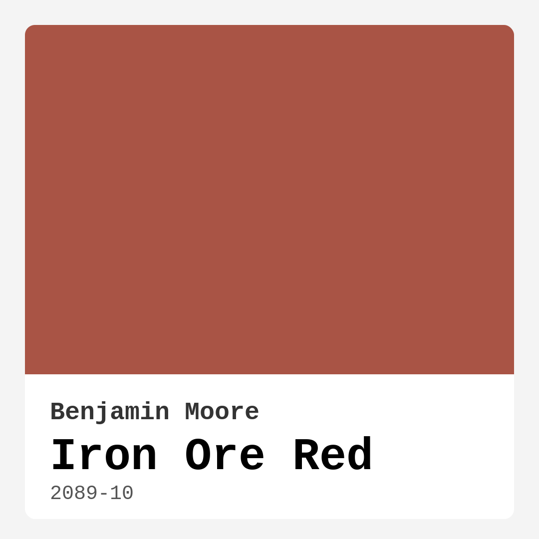
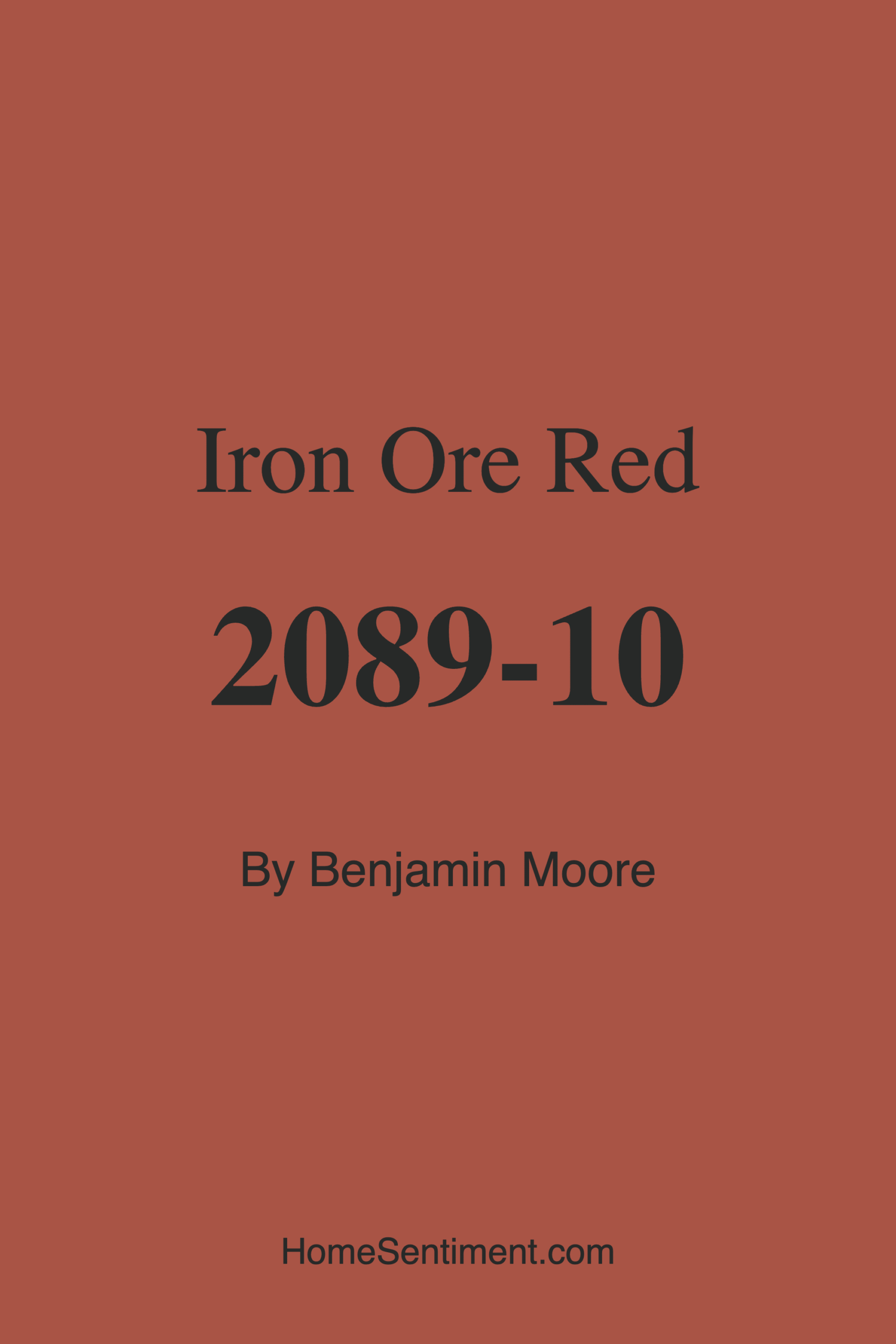
Color Preview & Key Details
| HEX Code | #A95445 |
| RGB | 169, 84, 69 |
| LRV | 16.24% |
| Undertone | Red |
| Finish Options | Eggshell, Matte, Satin |
If you’re looking for a paint color that brings warmth, depth, and a touch of sophistication to your home, Benjamin Moore’s Iron Ore Red (2089-10) might just be your perfect match. This deep, earthy red is more than just a color—it’s a mood. Imagine the rich, grounded tones of iron ore, blended with a warmth that makes any space feel instantly inviting. Whether you’re aiming for a cozy living room, a romantic bedroom, or a striking dining area, this shade has the versatility to deliver.
One of the standout qualities of Iron Ore Red is its ability to adapt to different decor styles. It’s a natural fit for rustic or industrial spaces, where its earthy undertones complement raw materials like wood and metal. But don’t let that limit you—this color also shines in contemporary settings. Pair it with sleek furniture, minimalist lines, and metallic accents, and suddenly, you’ve got a modern space with a bold, grounded focal point. The key is balance. If you’re going for a modern look, use it sparingly—think an accent wall or a single statement piece—and let the rest of the room breathe with neutrals.
Now, let’s talk about application. This paint is a dream to work with. It’s roller-ready, brushes on smoothly, and has low splatter, so you won’t spend hours cleaning up afterward. With good coverage in just one to two coats, it’s a time-saver, especially if you’re covering darker walls. The high hide means you won’t be fighting with streaks or uneven patches. And because it’s low VOC and odor-free, you can paint without worrying about harsh fumes lingering in your home. Once it’s up, it’s also washable and stain-resistant, making it practical for high-traffic areas like living rooms or dining spaces.
Lighting plays a huge role in how Iron Ore Red performs in your space. With an LRV (Light Reflectance Value) of 16.24%, it’s on the darker side, meaning it absorbs more light than it reflects. In natural light, the color comes alive, showing off its rich, warm undertones. But in lower light, it deepens into a moody, almost sultry shade—perfect for creating an intimate atmosphere. If you’re using it in a room with limited natural light, consider balancing it with lighter trim or furnishings to keep the space from feeling too closed in.
Speaking of trim, pairing Iron Ore Red with the right accents can elevate the entire look. Benjamin Moore’s Simply White is a classic choice for trim, offering a crisp contrast that lets the red pop. For hardware and fixtures, brass or gold tones complement the warmth of the color beautifully, adding a touch of elegance. If you’re feeling adventurous, lean into the complementary green hues—think deep emerald or sage—for a dynamic, nature-inspired palette.
Is this color right for small spaces? It can be, but with some strategy. Painting an entire small room in Iron Ore Red might make it feel cozier than you’d like—sometimes a little too cozy. Instead, use it as an accent. A single wall, a painted door, or even built-in shelving in this shade can add depth and character without overwhelming the space. Pair it with lighter colors and plenty of lighting to keep things airy.
As for mood, Iron Ore Red is all about creating a sense of comfort and sophistication. It’s romantic without being overly dramatic, warm without being overwhelming, and bold without being loud. It’s the kind of color that makes a room feel lived-in and loved, like a well-worn leather chair or a favorite wool blanket. If you’re selling your home, it’s also a great choice for creating memorable, inviting spaces that stand out to buyers—especially in open-concept areas where a single accent wall can define the entire flow of the space.
Before you commit, though, always test the color in your home. Paint a small section and observe it at different times of day. Notice how it changes with the light, how it interacts with your furniture and flooring, and how it makes you feel. Colors are personal, and what works in one space might not in another. But if you’re drawn to rich, warm tones that bring depth and character to a room, Iron Ore Red is worth a serious look.
At the end of the day, paint is one of the easiest ways to transform a space, and Iron Ore Red is a color that does it with style. Whether you’re going for rustic charm, modern edge, or just a cozy retreat, this shade delivers. So grab a sample, roll up your sleeves, and get ready to fall in love with your walls all over again.
Save this color to your Pinterest board to revisit when planning your room.
Real Room Photo of Iron Ore Red 2089-10
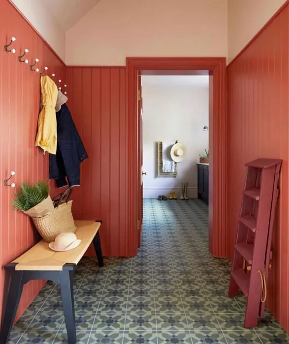
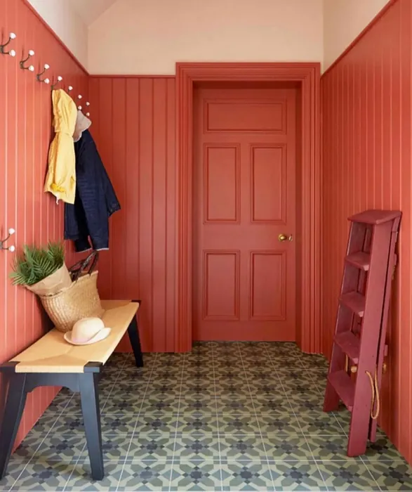
Real rooms painted with Iron Ore Red 2089-10 by Benjamin Moore. Lighting and photography can affect how colors appear — always test a sample swatch in your own space.
Undertones of Iron Ore Red ?
The undertones of Iron Ore Red are a key aspect of its character, leaning towards Red. These subtle underlying hues are what give the color its depth and complexity. For example, a gray with a blue undertone will feel cooler and more modern, while one with a brown undertone will feel warmer and more traditional. It’s essential to test this paint in your home and observe it next to your existing furniture, flooring, and decor to see how these undertones interact and reveal themselves throughout the day.
HEX value: #A95445
RGB code: 169, 84, 69
Is Iron Ore Red Cool or Warm?
This color is decidedly warm, offering a cozy and inviting atmosphere to any room. Its warm nature makes it especially suitable for spaces where comfort and relaxation are key, like living rooms and bedrooms. The warmth from its red and brown tones brings a sense of grounding and stability, making it a great backdrop for both lighter and darker accents.
Understanding Color Properties and Interior Design Tips
Hue refers to a specific position on the color wheel, measured in degrees from 0 to 360. Each degree represents a different pure color:
- 0° represents red
- 120° represents green
- 240° represents blue
Saturation describes the intensity or purity of a color and is expressed as a percentage:
- At 0%, the color appears completely desaturated—essentially a shade of gray
- At 100%, the color is at its most vivid and vibrant
Lightness indicates how light or dark a color is, also expressed as a percentage:
- 0% lightness results in black
- 100% lightness results in white
Using Warm Colors in Interior Design
Warm hues—such as reds, oranges, yellows, warm beiges, and greiges—are excellent choices for creating inviting and energetic spaces. These colors are particularly well-suited for:
- Kitchens, living rooms, and bathrooms, where warmth enhances comfort and sociability
- Large rooms, where warm tones can help reduce the sense of emptiness and make the space feel more intimate
For example:
- Warm beige shades provide a cozy, inviting atmosphere, ideal for living rooms, bedrooms, and hallways.
- Warm greige (a mix of beige and gray) offers the warmth of beige with the modern appeal of gray, making it a versatile backdrop for dining areas, bedrooms, and living spaces.
However, be mindful when using warm light tones in rooms with limited natural light. These shades may appear muted or even take on an unpleasant yellowish tint. To avoid a dull or flat appearance:
- Add depth by incorporating richer tones like deep greens, charcoal, or chocolate brown
- Use textured elements such as curtains, rugs, or cushions to bring dimension to the space
Pro Tip: Achieving Harmony with Warm and Cool Color Balance
To create a well-balanced and visually interesting interior, mix warm and cool tones strategically. This contrast adds depth and harmony to your design.
- If your walls feature warm hues, introduce cool-colored accents such as blue or green furniture, artwork, or accessories to create contrast.
- For a polished look, consider using a complementary color scheme, which pairs colors opposite each other on the color wheel (e.g., red with green, orange with blue).
This thoughtful mix not only enhances visual appeal but also creates a space that feels both dynamic and cohesive.
Save this color to your Pinterest board to revisit when planning your room.
Light Temperature Affects on Iron Ore Red
Natural Light
Natural daylight changes in color temperature as the sun moves across the sky. At sunrise and sunset, the light tends to have a warm, golden tone with a color temperature around 2000 Kelvin (K). As the day progresses and the sun rises higher, the light becomes cooler and more neutral. Around midday, especially when the sky is clear, natural light typically reaches its peak brightness and shifts to a cooler tone, ranging from 5500 to 6500 Kelvin. This midday light is close to what we perceive as pure white or daylight-balanced light.
These shifts in natural light can significantly influence how colors appear in a space, which is why designers often consider both the time of day and the orientation of windows when planning interior color schemes.
Explore how this color transforms from sunrise through sunset as natural light changes throughout the day. Use the slider to simulate morning light, midday brightness, and warm afternoon tones.
North-facing rooms stay cooler throughout the day and benefit from warmer paint tones to compensate. South-facing rooms receive more direct sunlight, making even deeper shades more workable. East-facing rooms get bright morning light that fades by afternoon, while west-facing rooms glow warmly in the evening.
Artificial Light
When choosing artificial lighting, pay close attention to the color temperature, measured in Kelvin (K). This determines how warm or cool the light will appear. Lower temperatures, around 2700K, give off a warm, yellow glow often used in living rooms or bedrooms. Higher temperatures, above 5000K, create a cool, bluish light similar to daylight, commonly used in kitchens, offices, or task areas.
Use the slider to see how lighting temperature can affect the appearance of a surface or color throughout a space.
See how this color looks under different artificial light temperatures — from warm candlelight (2000K) to cool daylight (7000K). Move the slider to simulate your room's lighting conditions.


4800K
Keep in mind that natural light from windows, the warmth of lamps, and overhead lighting all affect how this color reads on your walls at different times of day. Always observe a sample swatch in your actual space before purchasing.
LRV of Iron Ore Red
The Light Reflectance Value (LRV) of Iron Ore Red is 16.24%, which places it in the Medium Dark category. This means it reflects very little light. Understanding a paint’s LRV is crucial for predicting how it will look in your space. A higher LRV indicates a lighter color that reflects more light, making rooms feel larger and brighter. A lower LRV signifies a darker color that absorbs more light, creating a cozier, more intimate atmosphere. Always consider the natural and artificial lighting in your room when selecting a paint color based on its LRV.
Detailed Review of Iron Ore Red
Additional Paint Characteristics
Ideal Rooms
Bedroom, Dining Room, Home Office, Living Room
Decor Styles
Contemporary, Industrial, Rustic
Coverage
Good (1–2 Coats), High Hide
Ease of Application
Brush Smooth, Low Splatter, Roller-Ready
Washability
Stain Resistant, Washable
VOC Level
Low VOC, Odor-Free
Best Use
Accent Wall, Doors, Interior Walls
Room Suitability
Bedroom, Dining Room, Living Room
Tone Tag
Bold, Deep, Earthy, Moody, Warm
Finish Type
Eggshell, Matte, Satin
Paint Performance
Fade Resistant, High Coverage, Long Lasting
Use Cases
Best for Low Light Rooms, Best for Open Concept, Best for Selling Your Home
Mood
Cozy, Inviting, Romantic, Sophisticated
Trim Pairing
Complements Brass Fixtures, Pairs with Simply White, Works with Warm Trim
Iron Ore Red is a stunning choice for anyone wanting to infuse their space with warmth and depth. Its rich, earthy tones make it incredibly versatile, seamlessly fitting into a variety of decor styles, from rustic to modern industrial. In terms of application, this paint covers well with just one to two coats, providing excellent hide and a smooth finish. Due to its strong pigmentation, it does a fantastic job of covering previous colors, even darker shades. While it’s a bold choice, it doesn’t overpower a room, instead adding a sense of coziness and comfort. This paint is particularly suited for accent walls or feature areas, where it can draw the eye and create a focal point. For best results, pair it with lighter trims or neutral furnishings to let its color depth truly shine.
Pros & Cons of 2089-10 Iron Ore Red
Pros
Cons
Colors that go with Benjamin Moore Iron Ore Red
FAQ on 2089-10 Iron Ore Red
Is Iron Ore Red suitable for small spaces?
Iron Ore Red, with its deep and rich tones, can be a bold choice for small spaces. While it adds warmth and depth, it can also make smaller rooms feel more enclosed. To counteract this, consider using it as an accent color rather than painting an entire small room. Pairing it with lighter colors and ensuring the space has adequate lighting can help maintain a sense of openness while still enjoying the cozy atmosphere this color provides. It’s an excellent option for creating a statement wall or highlighting architectural features in a smaller area.
Can Iron Ore Red be used in a modern decor style?
Absolutely, Iron Ore Red is a versatile color that can complement modern decor beautifully. Its deep, earthy tones lend a sophisticated and grounded feel, which pairs well with sleek, modern lines and minimalist furnishings. For a modern look, consider using Iron Ore Red as a feature wall in a room with neutral or monochromatic color schemes. This approach allows the red to stand out as a bold statement while maintaining the clean, uncluttered aesthetic typical of modern decor. Additionally, pairing this color with metallic accents or contemporary art pieces can further enhance its modern appeal.
Comparisons Iron Ore Red with other colors
Iron Ore Red 2089-10 vs Cavern Clay SW 7701
| Attribute | Iron Ore Red 2089-10 | Cavern Clay SW 7701 |
|---|---|---|
| Color Name | Iron Ore Red 2089-10 | Cavern Clay SW 7701 |
| Color | ||
| Hue | Red | Red |
| Brightness | Dark | Dark |
| RGB | 169, 84, 69 | 172, 107, 83 |
| LRV | 16.24% | 30% |
| Finish Type | Eggshell, Matte, Satin | Eggshell, Matte, Satin |
| Finish Options | Eggshell, Matte, Satin | Eggshell, Matte, Satin |
| Ideal Rooms | Bedroom, Dining Room, Home Office, Living Room | Bedroom, Dining Room, Home Office, Kitchen, Living Room |
| Decor Styles | Contemporary, Industrial, Rustic | Bohemian, Contemporary, Modern Farmhouse, Rustic, Transitional |
| Coverage | Good (1–2 Coats), High Hide | Good (1–2 Coats), Touch-Up Friendly |
| Ease of Application | Brush Smooth, Low Splatter, Roller-Ready | Beginner Friendly, Brush Smooth, Roller-Ready |
| Washability | Stain Resistant, Washable | Washable, Wipeable |
| Room Suitability | Bedroom, Dining Room, Living Room | Bedroom, Dining Room, Home Office, Kitchen, Living Room |
| Tone | Bold, Deep, Earthy, Moody, Warm | Earthy, Muted, Warm |
| Paint Performance | Fade Resistant, High Coverage, Long Lasting | Easy Touch-Up, Low Odor, Scuff Resistant |
Lighting conditions, wall orientation, and surrounding decor can significantly affect how these colors appear in your space. Always test a sample swatch before committing to a full application.
Iron Ore Red 2089-10 vs Burgundy SW 6300
| Attribute | Iron Ore Red 2089-10 | Burgundy SW 6300 |
|---|---|---|
| Color Name | Iron Ore Red 2089-10 | Burgundy SW 6300 |
| Color | ||
| Hue | Red | Red |
| Brightness | Dark | Dark |
| RGB | 169, 84, 69 | 99, 51, 62 |
| LRV | 16.24% | 6% |
| Finish Type | Eggshell, Matte, Satin | Eggshell, Matte, Satin |
| Finish Options | Eggshell, Matte, Satin | Eggshell, Matte, Satin |
| Ideal Rooms | Bedroom, Dining Room, Home Office, Living Room | Bedroom, Dining Room, Home Office, Living Room |
| Decor Styles | Contemporary, Industrial, Rustic | Contemporary, Rustic, Traditional, Vintage |
| Coverage | Good (1–2 Coats), High Hide | Good (1–2 Coats), Touch-Up Friendly |
| Ease of Application | Brush Smooth, Low Splatter, Roller-Ready | Beginner Friendly, Brush Smooth, Fast-Drying, Roller-Ready |
| Washability | Stain Resistant, Washable | Washable, Wipeable |
| Room Suitability | Bedroom, Dining Room, Living Room | Bedroom, Dining Room, Home Office, Living Room |
| Tone | Bold, Deep, Earthy, Moody, Warm | Bold, Deep, Warm |
| Paint Performance | Fade Resistant, High Coverage, Long Lasting | High Coverage, Low Odor, Quick Drying |
Lighting conditions, wall orientation, and surrounding decor can significantly affect how these colors appear in your space. Always test a sample swatch before committing to a full application.
Iron Ore Red 2089-10 vs Rookwood Red SW 2802
| Attribute | Iron Ore Red 2089-10 | Rookwood Red SW 2802 |
|---|---|---|
| Color Name | Iron Ore Red 2089-10 | Rookwood Red SW 2802 |
| Color | ||
| Hue | Red | Red |
| Brightness | Dark | Dark |
| RGB | 169, 84, 69 | 98, 47, 45 |
| LRV | 16.24% | 6% |
| Finish Type | Eggshell, Matte, Satin | Eggshell, Matte, Satin |
| Finish Options | Eggshell, Matte, Satin | Eggshell, Matte, Satin |
| Ideal Rooms | Bedroom, Dining Room, Home Office, Living Room | Bedroom, Dining Room, Home Office, Living Room |
| Decor Styles | Contemporary, Industrial, Rustic | Arts and Crafts, Modern Farmhouse, Rustic, Traditional |
| Coverage | Good (1–2 Coats), High Hide | Good (1–2 Coats), Touch-Up Friendly |
| Ease of Application | Brush Smooth, Low Splatter, Roller-Ready | Beginner Friendly, Brush Smooth, Fast-Drying, Roller-Ready |
| Washability | Stain Resistant, Washable | Washable, Wipeable |
| Room Suitability | Bedroom, Dining Room, Living Room | Bedroom, Dining Room, Living Room |
| Tone | Bold, Deep, Earthy, Moody, Warm | Deep, Earthy, Warm |
| Paint Performance | Fade Resistant, High Coverage, Long Lasting | Easy Touch-Up, High Coverage, Low Odor |
Lighting conditions, wall orientation, and surrounding decor can significantly affect how these colors appear in your space. Always test a sample swatch before committing to a full application.
Iron Ore Red 2089-10 vs Spiced Cider SW 7702
| Attribute | Iron Ore Red 2089-10 | Spiced Cider SW 7702 |
|---|---|---|
| Color Name | Iron Ore Red 2089-10 | Spiced Cider SW 7702 |
| Color | ||
| Hue | Red | Red |
| Brightness | Dark | Dark |
| RGB | 169, 84, 69 | 176, 120, 92 |
| LRV | 16.24% | 20% |
| Finish Type | Eggshell, Matte, Satin | Eggshell, Satin |
| Finish Options | Eggshell, Matte, Satin | Eggshell, Satin, Semi-Gloss |
| Ideal Rooms | Bedroom, Dining Room, Home Office, Living Room | Bedroom, Dining Room, Kitchen, Living Room |
| Decor Styles | Contemporary, Industrial, Rustic | Modern Farmhouse, Rustic, Traditional, Transitional |
| Coverage | Good (1–2 Coats), High Hide | Good (1–2 Coats), Touch-Up Friendly |
| Ease of Application | Brush Smooth, Low Splatter, Roller-Ready | Beginner Friendly, Brush Smooth, Roller-Ready |
| Washability | Stain Resistant, Washable | Scrubbable, Washable |
| Room Suitability | Bedroom, Dining Room, Living Room | Bedroom, Dining Room, Kitchen, Living Room |
| Tone | Bold, Deep, Earthy, Moody, Warm | Earthy, Inviting, Warm |
| Paint Performance | Fade Resistant, High Coverage, Long Lasting | Easy Touch-Up, High Coverage, Low Odor |
Lighting conditions, wall orientation, and surrounding decor can significantly affect how these colors appear in your space. Always test a sample swatch before committing to a full application.
Iron Ore Red 2089-10 vs Carnelian SW 7580
| Attribute | Iron Ore Red 2089-10 | Carnelian SW 7580 |
|---|---|---|
| Color Name | Iron Ore Red 2089-10 | Carnelian SW 7580 |
| Color | ||
| Hue | Red | Red |
| Brightness | Dark | Dark |
| RGB | 169, 84, 69 | 87, 62, 62 |
| LRV | 16.24% | 20% |
| Finish Type | Eggshell, Matte, Satin | Eggshell, Satin |
| Finish Options | Eggshell, Matte, Satin | Eggshell, Matte, Satin |
| Ideal Rooms | Bedroom, Dining Room, Home Office, Living Room | Bedroom, Dining Room, Hallway, Home Office, Living Room |
| Decor Styles | Contemporary, Industrial, Rustic | Bohemian, Modern Farmhouse, Rustic, Traditional |
| Coverage | Good (1–2 Coats), High Hide | Good (1–2 Coats), Touch-Up Friendly |
| Ease of Application | Brush Smooth, Low Splatter, Roller-Ready | Beginner Friendly, Brush Smooth, Fast-Drying, Roller-Ready |
| Washability | Stain Resistant, Washable | Washable, Wipeable |
| Room Suitability | Bedroom, Dining Room, Living Room | Bedroom, Dining Room, Home Office, Living Room |
| Tone | Bold, Deep, Earthy, Moody, Warm | Deep, Earthy, Warm |
| Paint Performance | Fade Resistant, High Coverage, Long Lasting | Easy Touch-Up, Low Odor, Quick Drying |
Lighting conditions, wall orientation, and surrounding decor can significantly affect how these colors appear in your space. Always test a sample swatch before committing to a full application.
Iron Ore Red 2089-10 vs Sommelier SW 7595
| Attribute | Iron Ore Red 2089-10 | Sommelier SW 7595 |
|---|---|---|
| Color Name | Iron Ore Red 2089-10 | Sommelier SW 7595 |
| Color | ||
| Hue | Red | Red |
| Brightness | Dark | Dark |
| RGB | 169, 84, 69 | 93, 55, 54 |
| LRV | 16.24% | 6% |
| Finish Type | Eggshell, Matte, Satin | Eggshell, Matte, Satin |
| Finish Options | Eggshell, Matte, Satin | Eggshell, Matte, Satin |
| Ideal Rooms | Bedroom, Dining Room, Home Office, Living Room | Bedroom, Dining Room, Home Office, Living Room |
| Decor Styles | Contemporary, Industrial, Rustic | Modern, Rustic, Traditional, Transitional |
| Coverage | Good (1–2 Coats), High Hide | Good (1–2 Coats), Touch-Up Friendly |
| Ease of Application | Brush Smooth, Low Splatter, Roller-Ready | Brush Smooth, Fast-Drying, Low Splatter, Roller-Ready |
| Washability | Stain Resistant, Washable | Washable, Wipeable |
| Room Suitability | Bedroom, Dining Room, Living Room | Bedroom, Dining Room, Home Office, Living Room |
| Tone | Bold, Deep, Earthy, Moody, Warm | Deep, Earthy, Warm |
| Paint Performance | Fade Resistant, High Coverage, Long Lasting | Easy Touch-Up, High Coverage, Low Odor, Scuff Resistant |
Lighting conditions, wall orientation, and surrounding decor can significantly affect how these colors appear in your space. Always test a sample swatch before committing to a full application.
Iron Ore Red 2089-10 vs Sun Dried Tomato SW 7585
| Attribute | Iron Ore Red 2089-10 | Sun Dried Tomato SW 7585 |
|---|---|---|
| Color Name | Iron Ore Red 2089-10 | Sun Dried Tomato SW 7585 |
| Color | ||
| Hue | Red | Red |
| Brightness | Dark | Dark |
| RGB | 169, 84, 69 | 105, 43, 43 |
| LRV | 16.24% | 20% |
| Finish Type | Eggshell, Matte, Satin | Matte, Satin, Semi-Gloss |
| Finish Options | Eggshell, Matte, Satin | Matte, Satin, Semi-Gloss |
| Ideal Rooms | Bedroom, Dining Room, Home Office, Living Room | Dining Room, Home Office, Kitchen, Living Room |
| Decor Styles | Contemporary, Industrial, Rustic | Industrial, Mediterranean, Modern Farmhouse, Rustic |
| Coverage | Good (1–2 Coats), High Hide | Good (1–2 Coats), Touch-Up Friendly |
| Ease of Application | Brush Smooth, Low Splatter, Roller-Ready | Beginner Friendly, Brush Smooth, Roller-Ready |
| Washability | Stain Resistant, Washable | Washable, Wipeable |
| Room Suitability | Bedroom, Dining Room, Living Room | Dining Room, Home Office, Kitchen, Living Room |
| Tone | Bold, Deep, Earthy, Moody, Warm | Bold, Earthy, Warm |
| Paint Performance | Fade Resistant, High Coverage, Long Lasting | Easy Touch-Up, High Coverage, Low Odor |
Lighting conditions, wall orientation, and surrounding decor can significantly affect how these colors appear in your space. Always test a sample swatch before committing to a full application.
Iron Ore Red 2089-10 vs Rustic Red SW 7593
| Attribute | Iron Ore Red 2089-10 | Rustic Red SW 7593 |
|---|---|---|
| Color Name | Iron Ore Red 2089-10 | Rustic Red SW 7593 |
| Color | ||
| Hue | Red | Red |
| Brightness | Dark | Dark |
| RGB | 169, 84, 69 | 112, 50, 41 |
| LRV | 16.24% | 12% |
| Finish Type | Eggshell, Matte, Satin | Matte, Satin |
| Finish Options | Eggshell, Matte, Satin | Matte, Satin, Semi-Gloss |
| Ideal Rooms | Bedroom, Dining Room, Home Office, Living Room | Bedroom, Dining Room, Hallway, Living Room |
| Decor Styles | Contemporary, Industrial, Rustic | Country, Farmhouse, Rustic, Traditional |
| Coverage | Good (1–2 Coats), High Hide | Good (1–2 Coats) |
| Ease of Application | Brush Smooth, Low Splatter, Roller-Ready | Beginner Friendly, Brush Smooth, Fast-Drying, Roller-Ready |
| Washability | Stain Resistant, Washable | Washable, Wipeable |
| Room Suitability | Bedroom, Dining Room, Living Room | Bedroom, Dining Room, Living Room |
| Tone | Bold, Deep, Earthy, Moody, Warm | Deep, Earthy, Warm |
| Paint Performance | Fade Resistant, High Coverage, Long Lasting | Easy Touch-Up, Low Odor, Quick Drying |
Lighting conditions, wall orientation, and surrounding decor can significantly affect how these colors appear in your space. Always test a sample swatch before committing to a full application.
Iron Ore Red 2089-10 vs Roycroft Copper Red SW 2839
| Attribute | Iron Ore Red 2089-10 | Roycroft Copper Red SW 2839 |
|---|---|---|
| Color Name | Iron Ore Red 2089-10 | Roycroft Copper Red SW 2839 |
| Color | ||
| Hue | Red | Red |
| Brightness | Dark | Dark |
| RGB | 169, 84, 69 | 123, 55, 40 |
| LRV | 16.24% | 12% |
| Finish Type | Eggshell, Matte, Satin | Matte, Satin, Semi-Gloss |
| Finish Options | Eggshell, Matte, Satin | Matte, Satin, Semi-Gloss |
| Ideal Rooms | Bedroom, Dining Room, Home Office, Living Room | Bedroom, Dining Room, Entryway, Home Office, Living Room |
| Decor Styles | Contemporary, Industrial, Rustic | Arts and Crafts, Eclectic, Farmhouse, Rustic, Traditional |
| Coverage | Good (1–2 Coats), High Hide | Good (1–2 Coats), Touch-Up Friendly |
| Ease of Application | Brush Smooth, Low Splatter, Roller-Ready | Beginner Friendly, Brush Smooth, Roller-Ready |
| Washability | Stain Resistant, Washable | Stain Resistant, Washable |
| Room Suitability | Bedroom, Dining Room, Living Room | Bedroom, Dining Room, Entryway, Home Office, Living Room |
| Tone | Bold, Deep, Earthy, Moody, Warm | Deep, Earthy, Warm |
| Paint Performance | Fade Resistant, High Coverage, Long Lasting | Easy Touch-Up, High Coverage, Low Odor |
Lighting conditions, wall orientation, and surrounding decor can significantly affect how these colors appear in your space. Always test a sample swatch before committing to a full application.
Iron Ore Red 2089-10 vs Rookwood Dark Red SW 2801
| Attribute | Iron Ore Red 2089-10 | Rookwood Dark Red SW 2801 |
|---|---|---|
| Color Name | Iron Ore Red 2089-10 | Rookwood Dark Red SW 2801 |
| Color | ||
| Hue | Red | Red |
| Brightness | Dark | Dark |
| RGB | 169, 84, 69 | 75, 41, 41 |
| LRV | 16.24% | 6% |
| Finish Type | Eggshell, Matte, Satin | Matte, Satin, Semi-Gloss |
| Finish Options | Eggshell, Matte, Satin | Matte, Satin, Semi-Gloss |
| Ideal Rooms | Bedroom, Dining Room, Home Office, Living Room | Bedroom, Dining Room, Home Office, Living Room |
| Decor Styles | Contemporary, Industrial, Rustic | Farmhouse, Modern, Rustic, Traditional |
| Coverage | Good (1–2 Coats), High Hide | Good (1–2 Coats) |
| Ease of Application | Brush Smooth, Low Splatter, Roller-Ready | Beginner Friendly, Brush Smooth, Roller-Ready |
| Washability | Stain Resistant, Washable | Highly Washable, Washable |
| Room Suitability | Bedroom, Dining Room, Living Room | Bedroom, Dining Room, Home Office, Living Room |
| Tone | Bold, Deep, Earthy, Moody, Warm | Deep, Earthy, Warm |
| Paint Performance | Fade Resistant, High Coverage, Long Lasting | Easy Touch-Up, High Coverage, Low Odor |
Lighting conditions, wall orientation, and surrounding decor can significantly affect how these colors appear in your space. Always test a sample swatch before committing to a full application.
Official Page of Benjamin Moore Iron Ore Red 2089-10