
Color Preview & Key Details
| HEX Code | #69181A |
| RGB | 105, 24, 26 |
| LRV | 7.23% |
| Undertone | Red |
| Finish Options | Eggshell, Flat, Matte, Satin, Semi-Gloss |
If you’re looking for a paint color that oozes sophistication and warmth, let’s talk about Benjamin Moore’s Classic Burgundy (HC-182). This deep, rich red isn’t just a color—it’s a mood. It’s the kind of shade that transforms a room into something timeless, elegant, and undeniably inviting. Whether you’re designing a cozy living room, a dramatic dining space, or a romantic bedroom, this hue has the power to elevate your decor with its bold yet refined presence.
First, let’s break down what makes Classic Burgundy so special. With an LRV (Light Reflectance Value) of just 7.23%, this is a dark color that absorbs light rather than reflecting it. That means it creates an intimate, cocoon-like atmosphere—perfect for spaces where you want to feel enveloped in warmth. But don’t let the depth intimidate you. When used thoughtfully, it can make a room feel luxurious rather than cramped. The key is balance. Pair it with lighter neutrals on trim or ceilings, or use it as an accent wall to keep the space from feeling too heavy.
One of the standout qualities of Classic Burgundy is its versatility. It plays well with a range of decor styles, from traditional to modern. In a classic setting, it pairs beautifully with dark wood furniture, velvet upholstery, and brass accents for a look that’s straight out of a high-end design magazine. For a more contemporary vibe, try it against crisp white walls or sleek black fixtures—it’ll add just the right amount of warmth to keep the space from feeling sterile. And if your style leans eclectic? This color acts as a unifying force, tying together mixed patterns and textures with its rich, grounding presence.
Now, let’s talk application. Classic Burgundy has excellent coverage—you’ll likely only need one or two coats for full opacity. It’s brush-smooth and roller-ready, though because of its depth, a professional touch can ensure an even, flawless finish. The good news? It’s wipeable, stain-resistant, and low-VOC, so it’s as practical as it is beautiful. When choosing a finish, matte or eggshell will enhance its velvety richness, while satin can add a subtle sheen for a more polished look.
Lighting is another factor to consider. In natural light, Classic Burgundy shows off its true red hue, but as the sun sets, it deepens into a moodier, almost wine-like tone. That’s why it’s a fantastic choice for rooms with softer lighting—think dining rooms with dimmable chandeliers or bedrooms with warm, ambient lamps. If you’re using it in a space with limited natural light, just be mindful that it can make the room feel cozier (which isn’t always a bad thing!).
Wondering what colors to pair with it? Classic Burgundy’s complementary shade is green, so think emerald or olive accents for a striking contrast. For a more harmonious palette, try it with warm neutrals like cream, taupe, or golden beige. And if you’re feeling bold, brass or gold fixtures will add a touch of glamour that plays off its richness beautifully.
Of course, no color is perfect for every situation. If you’re working with a small room, you might want to use Classic Burgundy sparingly—say, on a single accent wall—to avoid overwhelming the space. But in larger rooms or those with high ceilings, it can create a sense of intimacy and drama that lighter colors just can’t match.
At the end of the day, Classic Burgundy is for those who aren’t afraid to make a statement. It’s a color that demands attention but rewards you with warmth, depth, and a sense of timeless elegance. Whether you’re going for a vintage-inspired library, a modern dining room with edge, or a bedroom that feels like a retreat, this shade delivers. So grab a sample, test it in your space, and see how it transforms your home. You might just fall in love with the way it makes every room feel a little more special.
Save this color to your Pinterest board to revisit when planning your room.
Real Room Photo of Classic Burgundy HC-182
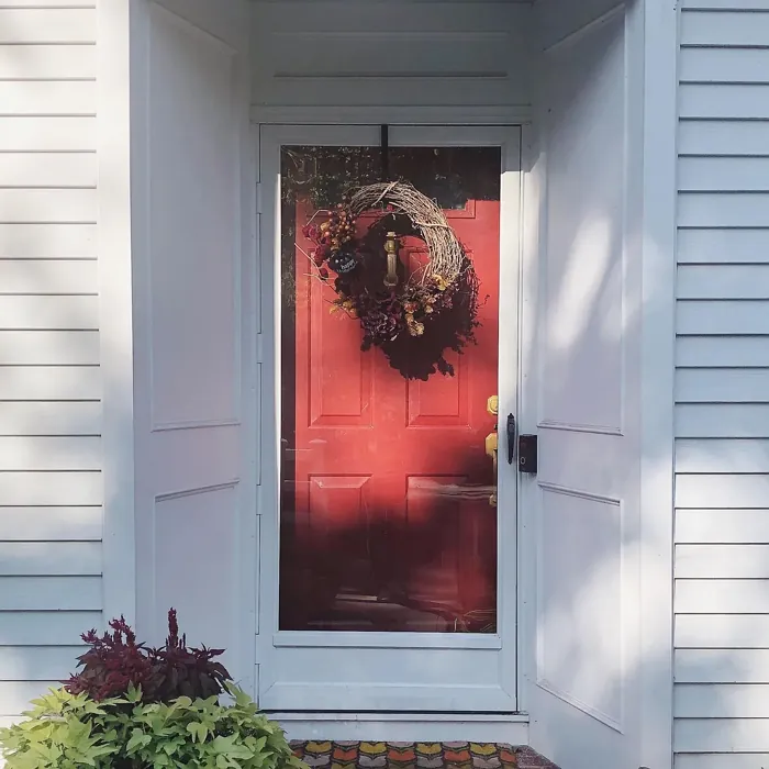
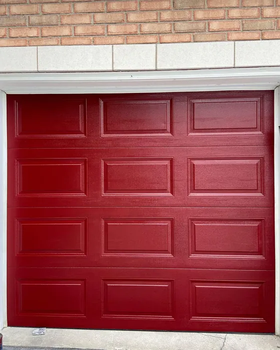
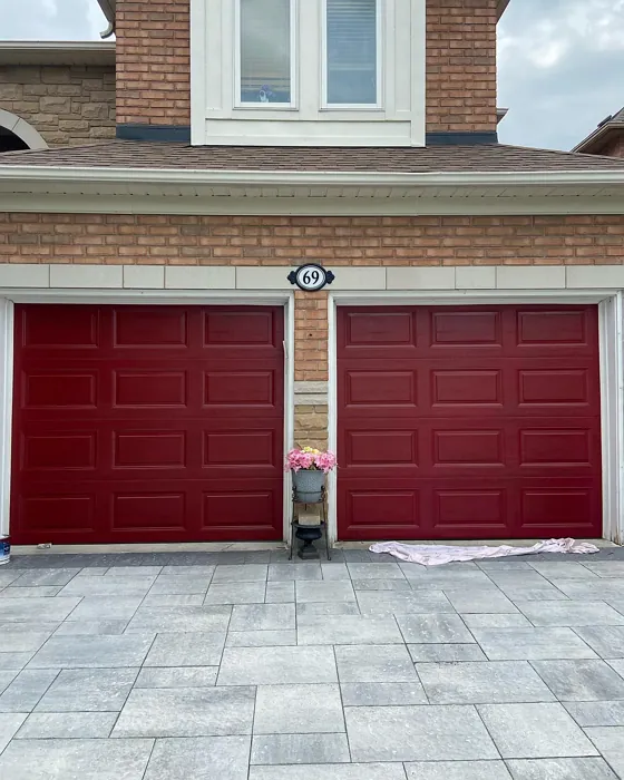
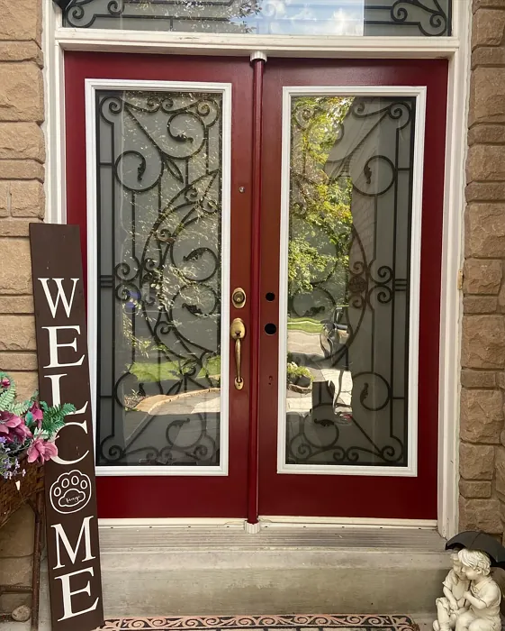
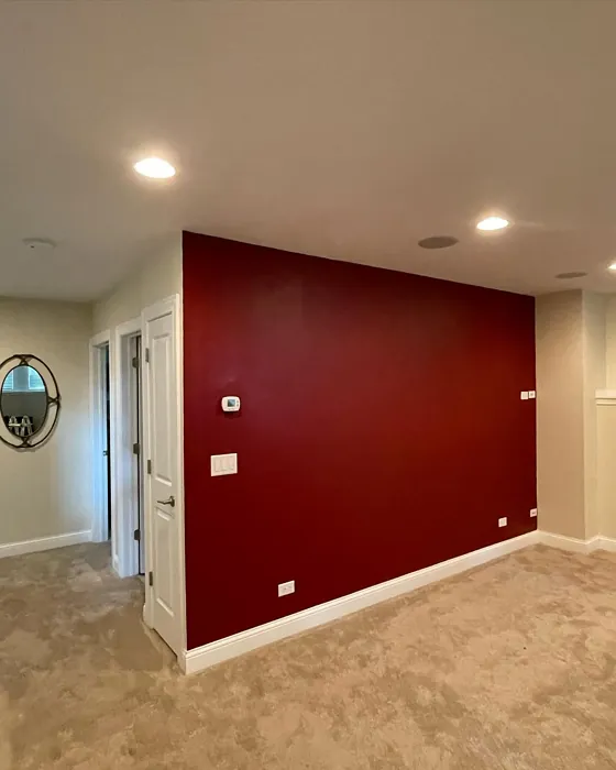
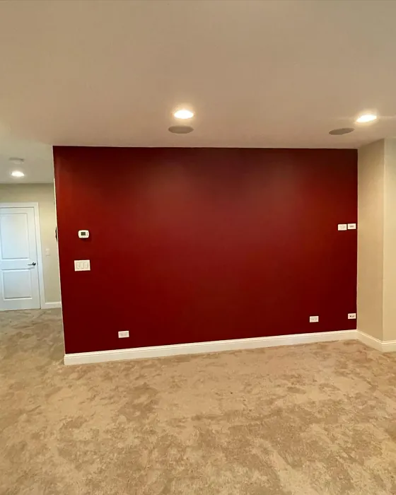
Real rooms painted with Classic Burgundy HC-182 by Benjamin Moore. Lighting and photography can affect how colors appear — always test a sample swatch in your own space.
Undertones of Classic Burgundy ?
The undertones of Classic Burgundy are a key aspect of its character, leaning towards Red. These subtle underlying hues are what give the color its depth and complexity. For example, a gray with a blue undertone will feel cooler and more modern, while one with a brown undertone will feel warmer and more traditional. It’s essential to test this paint in your home and observe it next to your existing furniture, flooring, and decor to see how these undertones interact and reveal themselves throughout the day.
HEX value: #69181A
RGB code: 105, 24, 26
Is Classic Burgundy Cool or Warm?
Classic Burgundy leans towards the warm side of the color spectrum. Its red base with brown undertones gives it a cozy and inviting feel, perfect for creating a warm atmosphere in any room. This warmth makes it ideal for spaces where you want to feel relaxed and comfortable.
Understanding Color Properties and Interior Design Tips
Hue refers to a specific position on the color wheel, measured in degrees from 0 to 360. Each degree represents a different pure color:
- 0° represents red
- 120° represents green
- 240° represents blue
Saturation describes the intensity or purity of a color and is expressed as a percentage:
- At 0%, the color appears completely desaturated—essentially a shade of gray
- At 100%, the color is at its most vivid and vibrant
Lightness indicates how light or dark a color is, also expressed as a percentage:
- 0% lightness results in black
- 100% lightness results in white
Using Warm Colors in Interior Design
Warm hues—such as reds, oranges, yellows, warm beiges, and greiges—are excellent choices for creating inviting and energetic spaces. These colors are particularly well-suited for:
- Kitchens, living rooms, and bathrooms, where warmth enhances comfort and sociability
- Large rooms, where warm tones can help reduce the sense of emptiness and make the space feel more intimate
For example:
- Warm beige shades provide a cozy, inviting atmosphere, ideal for living rooms, bedrooms, and hallways.
- Warm greige (a mix of beige and gray) offers the warmth of beige with the modern appeal of gray, making it a versatile backdrop for dining areas, bedrooms, and living spaces.
However, be mindful when using warm light tones in rooms with limited natural light. These shades may appear muted or even take on an unpleasant yellowish tint. To avoid a dull or flat appearance:
- Add depth by incorporating richer tones like deep greens, charcoal, or chocolate brown
- Use textured elements such as curtains, rugs, or cushions to bring dimension to the space
Pro Tip: Achieving Harmony with Warm and Cool Color Balance
To create a well-balanced and visually interesting interior, mix warm and cool tones strategically. This contrast adds depth and harmony to your design.
- If your walls feature warm hues, introduce cool-colored accents such as blue or green furniture, artwork, or accessories to create contrast.
- For a polished look, consider using a complementary color scheme, which pairs colors opposite each other on the color wheel (e.g., red with green, orange with blue).
This thoughtful mix not only enhances visual appeal but also creates a space that feels both dynamic and cohesive.
Save this color to your Pinterest board to revisit when planning your room.
Light Temperature Affects on Classic Burgundy
Natural Light
Natural daylight changes in color temperature as the sun moves across the sky. At sunrise and sunset, the light tends to have a warm, golden tone with a color temperature around 2000 Kelvin (K). As the day progresses and the sun rises higher, the light becomes cooler and more neutral. Around midday, especially when the sky is clear, natural light typically reaches its peak brightness and shifts to a cooler tone, ranging from 5500 to 6500 Kelvin. This midday light is close to what we perceive as pure white or daylight-balanced light.
These shifts in natural light can significantly influence how colors appear in a space, which is why designers often consider both the time of day and the orientation of windows when planning interior color schemes.
Explore how this color transforms from sunrise through sunset as natural light changes throughout the day. Use the slider to simulate morning light, midday brightness, and warm afternoon tones.
North-facing rooms stay cooler throughout the day and benefit from warmer paint tones to compensate. South-facing rooms receive more direct sunlight, making even deeper shades more workable. East-facing rooms get bright morning light that fades by afternoon, while west-facing rooms glow warmly in the evening.
Artificial Light
When choosing artificial lighting, pay close attention to the color temperature, measured in Kelvin (K). This determines how warm or cool the light will appear. Lower temperatures, around 2700K, give off a warm, yellow glow often used in living rooms or bedrooms. Higher temperatures, above 5000K, create a cool, bluish light similar to daylight, commonly used in kitchens, offices, or task areas.
Use the slider to see how lighting temperature can affect the appearance of a surface or color throughout a space.
See how this color looks under different artificial light temperatures — from warm candlelight (2000K) to cool daylight (7000K). Move the slider to simulate your room's lighting conditions.


4800K
Keep in mind that natural light from windows, the warmth of lamps, and overhead lighting all affect how this color reads on your walls at different times of day. Always observe a sample swatch in your actual space before purchasing.
LRV of Classic Burgundy
The Light Reflectance Value (LRV) of Classic Burgundy is 7.23%, which places it in the Dark colors category. This means it does not reflect light. Understanding a paint’s LRV is crucial for predicting how it will look in your space. A higher LRV indicates a lighter color that reflects more light, making rooms feel larger and brighter. A lower LRV signifies a darker color that absorbs more light, creating a cozier, more intimate atmosphere. Always consider the natural and artificial lighting in your room when selecting a paint color based on its LRV.
Detailed Review of Classic Burgundy
Additional Paint Characteristics
Ideal Rooms
Bedroom, Dining Room, Home Office, Living Room
Decor Styles
Eclectic, Modern, Traditional, Vintage
Coverage
Good (1–2 Coats), High Hide
Ease of Application
Brush Smooth, Low Splatter, Professional Application Recommended, Roller-Ready
Washability
Stain Resistant, Washable, Wipeable
VOC Level
Eco-Certified, Low VOC
Best Use
Accent Wall, Doors, Interior Walls, Trim
Room Suitability
Bedroom, Dining Room, Living Room
Tone Tag
Bold, Deep, Moody, Warm
Finish Type
Eggshell, Matte, Satin
Paint Performance
Fade Resistant, Long Lasting, Stain Resistant
Use Cases
Best for Low Light Rooms, Classic Favorite, Trending in 2025
Mood
Cozy, Inviting, Romantic, Sophisticated
Trim Pairing
Complements Brass Fixtures, Pairs with Simply White, Works with Warm Trim
Classic Burgundy is more than just a paint color; it’s a statement of sophistication and depth. With its rich red undertones, this paint brings warmth and a touch of luxury to any room. It’s ideal for those looking to create an inviting and cozy atmosphere, while still maintaining a sense of elegance. The color works exceptionally well in living rooms and dining areas, providing a classic backdrop for both modern and traditional decor. When used in a bedroom, it can create a romantic, intimate setting. While it may require more than one coat for full coverage, its deep hue is worth the effort. Pair it with neutral trims to allow the color to stand out, or complement it with brass fixtures for a touch of glamour.
Pros & Cons of HC-182 Classic Burgundy
Pros
Cons
Colors that go with Benjamin Moore Classic Burgundy
FAQ on HC-182 Classic Burgundy
Is Classic Burgundy suitable for small rooms?
While Classic Burgundy can add a rich, luxurious feel to any room, it may not be the best choice for smaller spaces. Its deep hue can make a small room feel even smaller and more confined. However, if you’re drawn to its elegance and want to use it in a compact area, consider using it as an accent wall or balancing it with lighter, neutral colors to prevent the space from feeling too enclosed.
What decor styles pair well with Classic Burgundy?
Classic Burgundy is incredibly versatile and pairs well with a variety of decor styles. It can complement traditional and vintage aesthetics with its rich, luxurious feel. In a modern setting, it can provide a striking contrast against sleek, minimalist elements, adding warmth and depth to the space. For eclectic styles, it serves as a bold backdrop that can tie together diverse elements. Whether your style leans toward the classic or the contemporary, Classic Burgundy can enhance your decor with its timeless appeal.
Comparisons Classic Burgundy with other colors
Classic Burgundy HC-182 vs Cavern Clay SW 7701
| Attribute | Classic Burgundy HC-182 | Cavern Clay SW 7701 |
|---|---|---|
| Color Name | Classic Burgundy HC-182 | Cavern Clay SW 7701 |
| Color | ||
| Hue | Red | Red |
| Brightness | Dark | Dark |
| RGB | 105, 24, 26 | 172, 107, 83 |
| LRV | 7.23% | 30% |
| Finish Type | Eggshell, Matte, Satin | Eggshell, Matte, Satin |
| Finish Options | Eggshell, Flat, Matte, Satin, Semi-Gloss | Eggshell, Matte, Satin |
| Ideal Rooms | Bedroom, Dining Room, Home Office, Living Room | Bedroom, Dining Room, Home Office, Kitchen, Living Room |
| Decor Styles | Eclectic, Modern, Traditional, Vintage | Bohemian, Contemporary, Modern Farmhouse, Rustic, Transitional |
| Coverage | Good (1–2 Coats), High Hide | Good (1–2 Coats), Touch-Up Friendly |
| Ease of Application | Brush Smooth, Low Splatter, Professional Application Recommended, Roller-Ready | Beginner Friendly, Brush Smooth, Roller-Ready |
| Washability | Stain Resistant, Washable, Wipeable | Washable, Wipeable |
| Room Suitability | Bedroom, Dining Room, Living Room | Bedroom, Dining Room, Home Office, Kitchen, Living Room |
| Tone | Bold, Deep, Moody, Warm | Earthy, Muted, Warm |
| Paint Performance | Fade Resistant, Long Lasting, Stain Resistant | Easy Touch-Up, Low Odor, Scuff Resistant |
Lighting conditions, wall orientation, and surrounding decor can significantly affect how these colors appear in your space. Always test a sample swatch before committing to a full application.
Classic Burgundy HC-182 vs Burgundy SW 6300
| Attribute | Classic Burgundy HC-182 | Burgundy SW 6300 |
|---|---|---|
| Color Name | Classic Burgundy HC-182 | Burgundy SW 6300 |
| Color | ||
| Hue | Red | Red |
| Brightness | Dark | Dark |
| RGB | 105, 24, 26 | 99, 51, 62 |
| LRV | 7.23% | 6% |
| Finish Type | Eggshell, Matte, Satin | Eggshell, Matte, Satin |
| Finish Options | Eggshell, Flat, Matte, Satin, Semi-Gloss | Eggshell, Matte, Satin |
| Ideal Rooms | Bedroom, Dining Room, Home Office, Living Room | Bedroom, Dining Room, Home Office, Living Room |
| Decor Styles | Eclectic, Modern, Traditional, Vintage | Contemporary, Rustic, Traditional, Vintage |
| Coverage | Good (1–2 Coats), High Hide | Good (1–2 Coats), Touch-Up Friendly |
| Ease of Application | Brush Smooth, Low Splatter, Professional Application Recommended, Roller-Ready | Beginner Friendly, Brush Smooth, Fast-Drying, Roller-Ready |
| Washability | Stain Resistant, Washable, Wipeable | Washable, Wipeable |
| Room Suitability | Bedroom, Dining Room, Living Room | Bedroom, Dining Room, Home Office, Living Room |
| Tone | Bold, Deep, Moody, Warm | Bold, Deep, Warm |
| Paint Performance | Fade Resistant, Long Lasting, Stain Resistant | High Coverage, Low Odor, Quick Drying |
Lighting conditions, wall orientation, and surrounding decor can significantly affect how these colors appear in your space. Always test a sample swatch before committing to a full application.
Classic Burgundy HC-182 vs Rookwood Red SW 2802
| Attribute | Classic Burgundy HC-182 | Rookwood Red SW 2802 |
|---|---|---|
| Color Name | Classic Burgundy HC-182 | Rookwood Red SW 2802 |
| Color | ||
| Hue | Red | Red |
| Brightness | Dark | Dark |
| RGB | 105, 24, 26 | 98, 47, 45 |
| LRV | 7.23% | 6% |
| Finish Type | Eggshell, Matte, Satin | Eggshell, Matte, Satin |
| Finish Options | Eggshell, Flat, Matte, Satin, Semi-Gloss | Eggshell, Matte, Satin |
| Ideal Rooms | Bedroom, Dining Room, Home Office, Living Room | Bedroom, Dining Room, Home Office, Living Room |
| Decor Styles | Eclectic, Modern, Traditional, Vintage | Arts and Crafts, Modern Farmhouse, Rustic, Traditional |
| Coverage | Good (1–2 Coats), High Hide | Good (1–2 Coats), Touch-Up Friendly |
| Ease of Application | Brush Smooth, Low Splatter, Professional Application Recommended, Roller-Ready | Beginner Friendly, Brush Smooth, Fast-Drying, Roller-Ready |
| Washability | Stain Resistant, Washable, Wipeable | Washable, Wipeable |
| Room Suitability | Bedroom, Dining Room, Living Room | Bedroom, Dining Room, Living Room |
| Tone | Bold, Deep, Moody, Warm | Deep, Earthy, Warm |
| Paint Performance | Fade Resistant, Long Lasting, Stain Resistant | Easy Touch-Up, High Coverage, Low Odor |
Lighting conditions, wall orientation, and surrounding decor can significantly affect how these colors appear in your space. Always test a sample swatch before committing to a full application.
Classic Burgundy HC-182 vs Spiced Cider SW 7702
| Attribute | Classic Burgundy HC-182 | Spiced Cider SW 7702 |
|---|---|---|
| Color Name | Classic Burgundy HC-182 | Spiced Cider SW 7702 |
| Color | ||
| Hue | Red | Red |
| Brightness | Dark | Dark |
| RGB | 105, 24, 26 | 176, 120, 92 |
| LRV | 7.23% | 20% |
| Finish Type | Eggshell, Matte, Satin | Eggshell, Satin |
| Finish Options | Eggshell, Flat, Matte, Satin, Semi-Gloss | Eggshell, Satin, Semi-Gloss |
| Ideal Rooms | Bedroom, Dining Room, Home Office, Living Room | Bedroom, Dining Room, Kitchen, Living Room |
| Decor Styles | Eclectic, Modern, Traditional, Vintage | Modern Farmhouse, Rustic, Traditional, Transitional |
| Coverage | Good (1–2 Coats), High Hide | Good (1–2 Coats), Touch-Up Friendly |
| Ease of Application | Brush Smooth, Low Splatter, Professional Application Recommended, Roller-Ready | Beginner Friendly, Brush Smooth, Roller-Ready |
| Washability | Stain Resistant, Washable, Wipeable | Scrubbable, Washable |
| Room Suitability | Bedroom, Dining Room, Living Room | Bedroom, Dining Room, Kitchen, Living Room |
| Tone | Bold, Deep, Moody, Warm | Earthy, Inviting, Warm |
| Paint Performance | Fade Resistant, Long Lasting, Stain Resistant | Easy Touch-Up, High Coverage, Low Odor |
Lighting conditions, wall orientation, and surrounding decor can significantly affect how these colors appear in your space. Always test a sample swatch before committing to a full application.
Classic Burgundy HC-182 vs Carnelian SW 7580
| Attribute | Classic Burgundy HC-182 | Carnelian SW 7580 |
|---|---|---|
| Color Name | Classic Burgundy HC-182 | Carnelian SW 7580 |
| Color | ||
| Hue | Red | Red |
| Brightness | Dark | Dark |
| RGB | 105, 24, 26 | 87, 62, 62 |
| LRV | 7.23% | 20% |
| Finish Type | Eggshell, Matte, Satin | Eggshell, Satin |
| Finish Options | Eggshell, Flat, Matte, Satin, Semi-Gloss | Eggshell, Matte, Satin |
| Ideal Rooms | Bedroom, Dining Room, Home Office, Living Room | Bedroom, Dining Room, Hallway, Home Office, Living Room |
| Decor Styles | Eclectic, Modern, Traditional, Vintage | Bohemian, Modern Farmhouse, Rustic, Traditional |
| Coverage | Good (1–2 Coats), High Hide | Good (1–2 Coats), Touch-Up Friendly |
| Ease of Application | Brush Smooth, Low Splatter, Professional Application Recommended, Roller-Ready | Beginner Friendly, Brush Smooth, Fast-Drying, Roller-Ready |
| Washability | Stain Resistant, Washable, Wipeable | Washable, Wipeable |
| Room Suitability | Bedroom, Dining Room, Living Room | Bedroom, Dining Room, Home Office, Living Room |
| Tone | Bold, Deep, Moody, Warm | Deep, Earthy, Warm |
| Paint Performance | Fade Resistant, Long Lasting, Stain Resistant | Easy Touch-Up, Low Odor, Quick Drying |
Lighting conditions, wall orientation, and surrounding decor can significantly affect how these colors appear in your space. Always test a sample swatch before committing to a full application.
Classic Burgundy HC-182 vs Sommelier SW 7595
| Attribute | Classic Burgundy HC-182 | Sommelier SW 7595 |
|---|---|---|
| Color Name | Classic Burgundy HC-182 | Sommelier SW 7595 |
| Color | ||
| Hue | Red | Red |
| Brightness | Dark | Dark |
| RGB | 105, 24, 26 | 93, 55, 54 |
| LRV | 7.23% | 6% |
| Finish Type | Eggshell, Matte, Satin | Eggshell, Matte, Satin |
| Finish Options | Eggshell, Flat, Matte, Satin, Semi-Gloss | Eggshell, Matte, Satin |
| Ideal Rooms | Bedroom, Dining Room, Home Office, Living Room | Bedroom, Dining Room, Home Office, Living Room |
| Decor Styles | Eclectic, Modern, Traditional, Vintage | Modern, Rustic, Traditional, Transitional |
| Coverage | Good (1–2 Coats), High Hide | Good (1–2 Coats), Touch-Up Friendly |
| Ease of Application | Brush Smooth, Low Splatter, Professional Application Recommended, Roller-Ready | Brush Smooth, Fast-Drying, Low Splatter, Roller-Ready |
| Washability | Stain Resistant, Washable, Wipeable | Washable, Wipeable |
| Room Suitability | Bedroom, Dining Room, Living Room | Bedroom, Dining Room, Home Office, Living Room |
| Tone | Bold, Deep, Moody, Warm | Deep, Earthy, Warm |
| Paint Performance | Fade Resistant, Long Lasting, Stain Resistant | Easy Touch-Up, High Coverage, Low Odor, Scuff Resistant |
Lighting conditions, wall orientation, and surrounding decor can significantly affect how these colors appear in your space. Always test a sample swatch before committing to a full application.
Classic Burgundy HC-182 vs Sun Dried Tomato SW 7585
| Attribute | Classic Burgundy HC-182 | Sun Dried Tomato SW 7585 |
|---|---|---|
| Color Name | Classic Burgundy HC-182 | Sun Dried Tomato SW 7585 |
| Color | ||
| Hue | Red | Red |
| Brightness | Dark | Dark |
| RGB | 105, 24, 26 | 105, 43, 43 |
| LRV | 7.23% | 20% |
| Finish Type | Eggshell, Matte, Satin | Matte, Satin, Semi-Gloss |
| Finish Options | Eggshell, Flat, Matte, Satin, Semi-Gloss | Matte, Satin, Semi-Gloss |
| Ideal Rooms | Bedroom, Dining Room, Home Office, Living Room | Dining Room, Home Office, Kitchen, Living Room |
| Decor Styles | Eclectic, Modern, Traditional, Vintage | Industrial, Mediterranean, Modern Farmhouse, Rustic |
| Coverage | Good (1–2 Coats), High Hide | Good (1–2 Coats), Touch-Up Friendly |
| Ease of Application | Brush Smooth, Low Splatter, Professional Application Recommended, Roller-Ready | Beginner Friendly, Brush Smooth, Roller-Ready |
| Washability | Stain Resistant, Washable, Wipeable | Washable, Wipeable |
| Room Suitability | Bedroom, Dining Room, Living Room | Dining Room, Home Office, Kitchen, Living Room |
| Tone | Bold, Deep, Moody, Warm | Bold, Earthy, Warm |
| Paint Performance | Fade Resistant, Long Lasting, Stain Resistant | Easy Touch-Up, High Coverage, Low Odor |
Lighting conditions, wall orientation, and surrounding decor can significantly affect how these colors appear in your space. Always test a sample swatch before committing to a full application.
Classic Burgundy HC-182 vs Rustic Red SW 7593
| Attribute | Classic Burgundy HC-182 | Rustic Red SW 7593 |
|---|---|---|
| Color Name | Classic Burgundy HC-182 | Rustic Red SW 7593 |
| Color | ||
| Hue | Red | Red |
| Brightness | Dark | Dark |
| RGB | 105, 24, 26 | 112, 50, 41 |
| LRV | 7.23% | 12% |
| Finish Type | Eggshell, Matte, Satin | Matte, Satin |
| Finish Options | Eggshell, Flat, Matte, Satin, Semi-Gloss | Matte, Satin, Semi-Gloss |
| Ideal Rooms | Bedroom, Dining Room, Home Office, Living Room | Bedroom, Dining Room, Hallway, Living Room |
| Decor Styles | Eclectic, Modern, Traditional, Vintage | Country, Farmhouse, Rustic, Traditional |
| Coverage | Good (1–2 Coats), High Hide | Good (1–2 Coats) |
| Ease of Application | Brush Smooth, Low Splatter, Professional Application Recommended, Roller-Ready | Beginner Friendly, Brush Smooth, Fast-Drying, Roller-Ready |
| Washability | Stain Resistant, Washable, Wipeable | Washable, Wipeable |
| Room Suitability | Bedroom, Dining Room, Living Room | Bedroom, Dining Room, Living Room |
| Tone | Bold, Deep, Moody, Warm | Deep, Earthy, Warm |
| Paint Performance | Fade Resistant, Long Lasting, Stain Resistant | Easy Touch-Up, Low Odor, Quick Drying |
Lighting conditions, wall orientation, and surrounding decor can significantly affect how these colors appear in your space. Always test a sample swatch before committing to a full application.
Classic Burgundy HC-182 vs Roycroft Copper Red SW 2839
| Attribute | Classic Burgundy HC-182 | Roycroft Copper Red SW 2839 |
|---|---|---|
| Color Name | Classic Burgundy HC-182 | Roycroft Copper Red SW 2839 |
| Color | ||
| Hue | Red | Red |
| Brightness | Dark | Dark |
| RGB | 105, 24, 26 | 123, 55, 40 |
| LRV | 7.23% | 12% |
| Finish Type | Eggshell, Matte, Satin | Matte, Satin, Semi-Gloss |
| Finish Options | Eggshell, Flat, Matte, Satin, Semi-Gloss | Matte, Satin, Semi-Gloss |
| Ideal Rooms | Bedroom, Dining Room, Home Office, Living Room | Bedroom, Dining Room, Entryway, Home Office, Living Room |
| Decor Styles | Eclectic, Modern, Traditional, Vintage | Arts and Crafts, Eclectic, Farmhouse, Rustic, Traditional |
| Coverage | Good (1–2 Coats), High Hide | Good (1–2 Coats), Touch-Up Friendly |
| Ease of Application | Brush Smooth, Low Splatter, Professional Application Recommended, Roller-Ready | Beginner Friendly, Brush Smooth, Roller-Ready |
| Washability | Stain Resistant, Washable, Wipeable | Stain Resistant, Washable |
| Room Suitability | Bedroom, Dining Room, Living Room | Bedroom, Dining Room, Entryway, Home Office, Living Room |
| Tone | Bold, Deep, Moody, Warm | Deep, Earthy, Warm |
| Paint Performance | Fade Resistant, Long Lasting, Stain Resistant | Easy Touch-Up, High Coverage, Low Odor |
Lighting conditions, wall orientation, and surrounding decor can significantly affect how these colors appear in your space. Always test a sample swatch before committing to a full application.
Classic Burgundy HC-182 vs Rookwood Dark Red SW 2801
| Attribute | Classic Burgundy HC-182 | Rookwood Dark Red SW 2801 |
|---|---|---|
| Color Name | Classic Burgundy HC-182 | Rookwood Dark Red SW 2801 |
| Color | ||
| Hue | Red | Red |
| Brightness | Dark | Dark |
| RGB | 105, 24, 26 | 75, 41, 41 |
| LRV | 7.23% | 6% |
| Finish Type | Eggshell, Matte, Satin | Matte, Satin, Semi-Gloss |
| Finish Options | Eggshell, Flat, Matte, Satin, Semi-Gloss | Matte, Satin, Semi-Gloss |
| Ideal Rooms | Bedroom, Dining Room, Home Office, Living Room | Bedroom, Dining Room, Home Office, Living Room |
| Decor Styles | Eclectic, Modern, Traditional, Vintage | Farmhouse, Modern, Rustic, Traditional |
| Coverage | Good (1–2 Coats), High Hide | Good (1–2 Coats) |
| Ease of Application | Brush Smooth, Low Splatter, Professional Application Recommended, Roller-Ready | Beginner Friendly, Brush Smooth, Roller-Ready |
| Washability | Stain Resistant, Washable, Wipeable | Highly Washable, Washable |
| Room Suitability | Bedroom, Dining Room, Living Room | Bedroom, Dining Room, Home Office, Living Room |
| Tone | Bold, Deep, Moody, Warm | Deep, Earthy, Warm |
| Paint Performance | Fade Resistant, Long Lasting, Stain Resistant | Easy Touch-Up, High Coverage, Low Odor |
Lighting conditions, wall orientation, and surrounding decor can significantly affect how these colors appear in your space. Always test a sample swatch before committing to a full application.
Official Page of Benjamin Moore Classic Burgundy HC-182