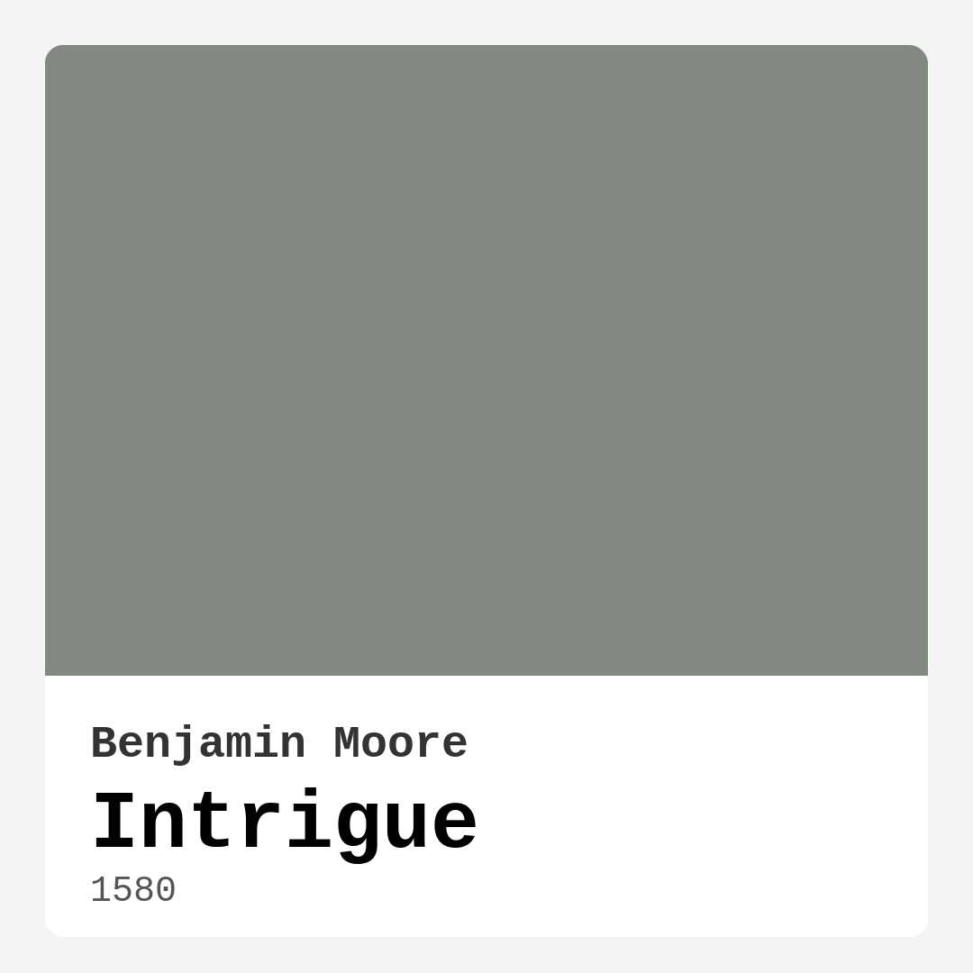
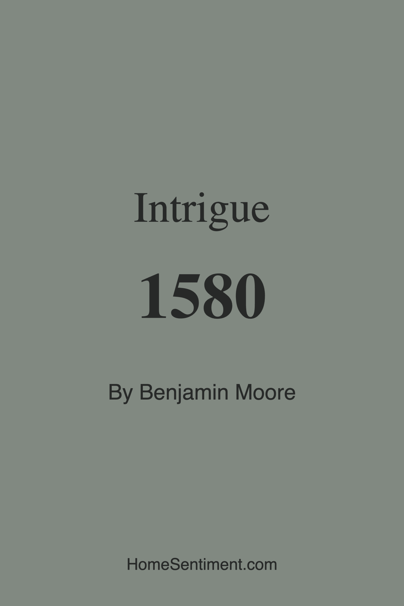
Color Preview & Key Details
| HEX Code | #818981 |
| RGB | 129, 137, 129 |
| LRV | 24.43% |
| Undertone | Green |
| Finish Options | Eggshell, Matte, Satin |
If you’re searching for a paint color that effortlessly balances sophistication and subtlety, Benjamin Moore’s Intrigue (1580) might just be your perfect match. This elegant gray with soft green undertones is one of those rare hues that feels both timeless and fresh, making it a go-to for designers and homeowners alike. Whether you’re refreshing a single room or reimagining your entire home, Intrigue brings a quiet confidence to any space—without overwhelming it. Let’s dive into what makes this color so special and how you can make it work in your home.
First, let’s talk about the color itself. Intrigue sits in that sweet spot between cool and warm, thanks to its gray base and gentle green undertones. It’s not too stark, not too muddy—just a beautifully balanced shade that adapts to its surroundings. In natural light, it reads as a soft, cool gray, but as the day progresses or under artificial lighting, those green undertones peek through, adding depth and dimension. This chameleon-like quality means it plays well with a variety of decor styles, from modern and minimalist to rustic and traditional.
One of the biggest strengths of Intrigue is its versatility. It’s a fantastic choice for living rooms, where it creates a serene backdrop for both bold artwork and neutral furnishings. In bedrooms, it fosters a restful, almost cocoon-like atmosphere—ideal for unwinding after a long day. Home offices benefit from its calming yet focused energy, while dining rooms feel instantly elevated with its understated elegance. And because it’s a medium-toned color with an LRV of 24.43%, it reflects enough light to keep spaces from feeling too dark, even in rooms with limited natural light.
Application is a breeze, which is great news if you’re tackling this project yourself. Intrigue is beginner-friendly, rolling on smoothly and drying quickly. Most surfaces will only need one to two coats, though darker walls might require an extra layer for full coverage. The finish options—matte, eggshell, or satin—give you flexibility depending on the room’s needs. For high-traffic areas, satin offers a bit more durability and washability, while matte lends a velvety, high-end look perfect for bedrooms or formal spaces.
Now, let’s address the elephant in the room: undertones. They can make or break a paint color, and Intrigue’s green undertones are what set it apart from other grays. These subtle hints of green keep it from feeling cold or sterile, giving it a touch of organic warmth. But here’s the thing—undertones can shift depending on lighting and surrounding colors. If your room gets a lot of warm sunlight, the green might soften further. In cooler, north-facing light, the gray will dominate. That’s why it’s always a good idea to test a swatch in your space before committing. Paint a large poster board and move it around the room at different times of day to see how it behaves.
Pairing Intrigue with other colors is where the fun really begins. It’s a neutral at heart, so it plays well with just about anything. For a crisp, classic look, pair it with clean whites like Benjamin Moore’s White Dove on trim and ceilings. If you want to lean into its green undertones, try accents in soft sage or deep emerald. For contrast, warm woods and brass fixtures add a touch of richness, while cooler metals like chrome keep things sleek and modern. And if you’re feeling adventurous, a deep purple (its complementary hue) can make for a striking accent wall or bold accessory.
Maintenance is another area where Intrigue shines. It’s highly washable, so it’s a practical choice for busy households. Scuffs and marks wipe away easily, especially if you opt for a satin finish. And because it’s low-VOC and eco-certified, you won’t have to worry about harsh fumes during or after painting—a win for both your home and the environment.
Of course, no color is perfect for every scenario. Intrigue’s medium depth means it can feel a bit heavy in very small or windowless rooms, so if you’re working with a tight space, consider one of its lighter relatives like CSP-20. On the flip side, if you love the vibe but want something moodier, darker shades like HC-163 or CSP-55 might be worth exploring. And while it’s versatile, it’s not the best fit for overly bright, south-facing rooms where the green undertones might get lost in the glare.
At the end of the day, Intrigue is a color that rewards attention to detail. It’s not flashy, but it’s far from boring. It’s the kind of shade that makes your furniture look better, your art pop, and your space feel intentional. Whether you’re going for a quiet retreat or a polished gathering spot, this paint has the range to deliver. So grab a sample, see how it speaks to you, and get ready to fall in love with a color that’s as intriguing as its name suggests.
Save this color to your Pinterest board to revisit when planning your room.
Real Room Photo of Intrigue 1580
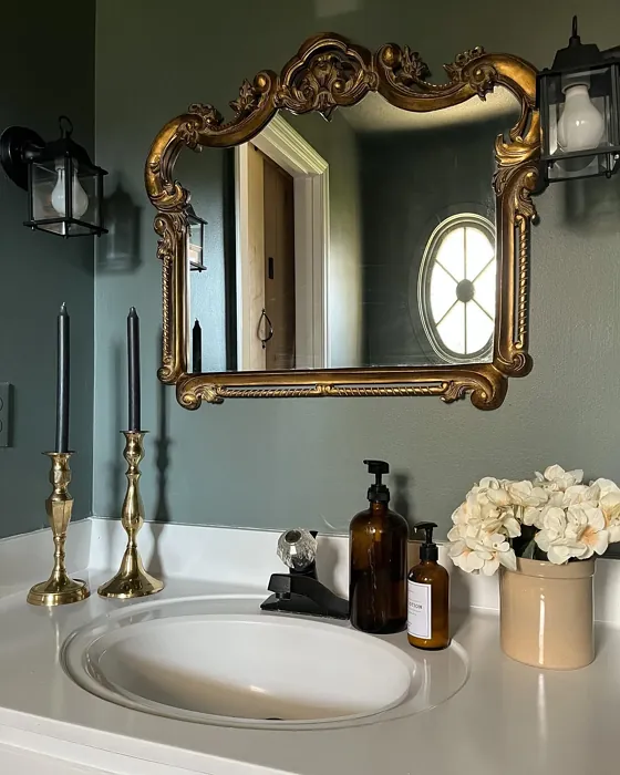
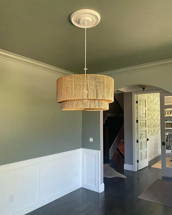
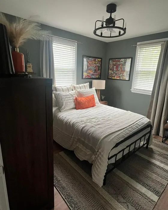
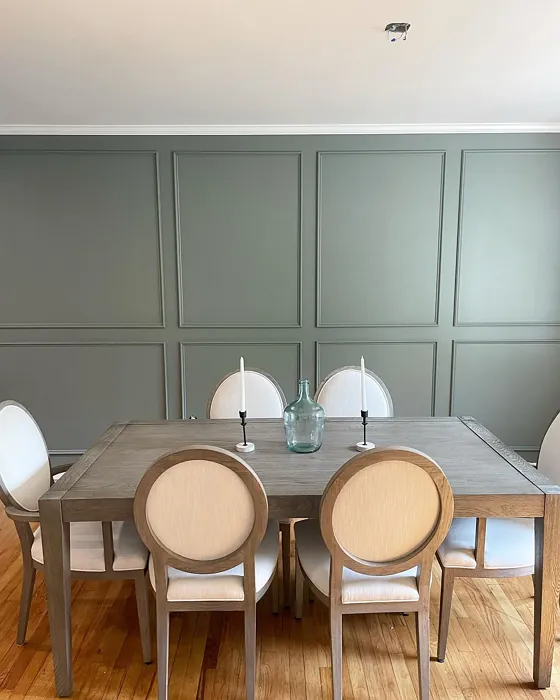
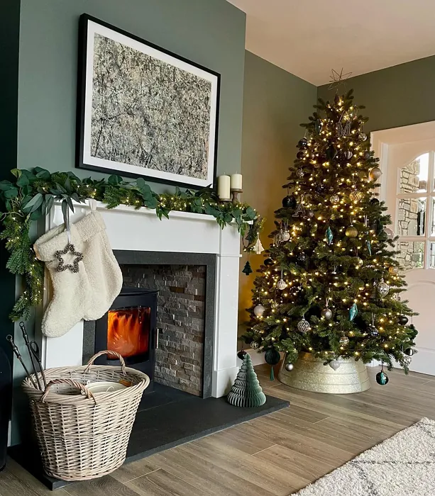
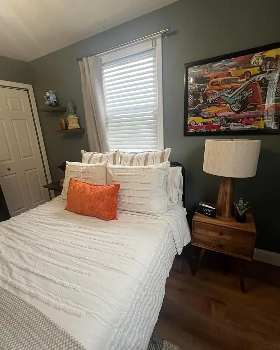
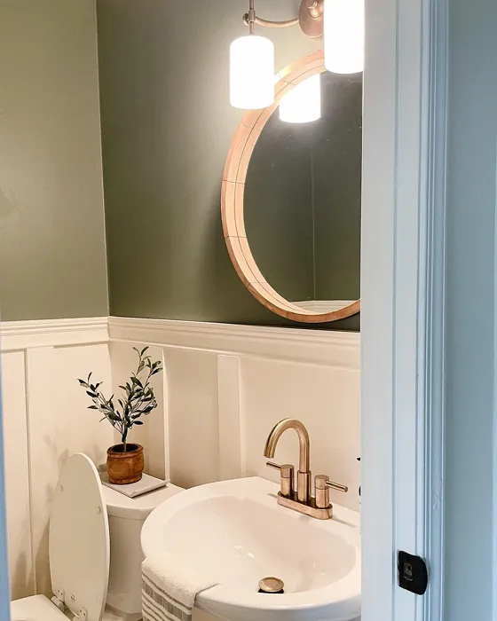
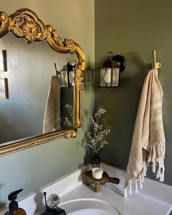
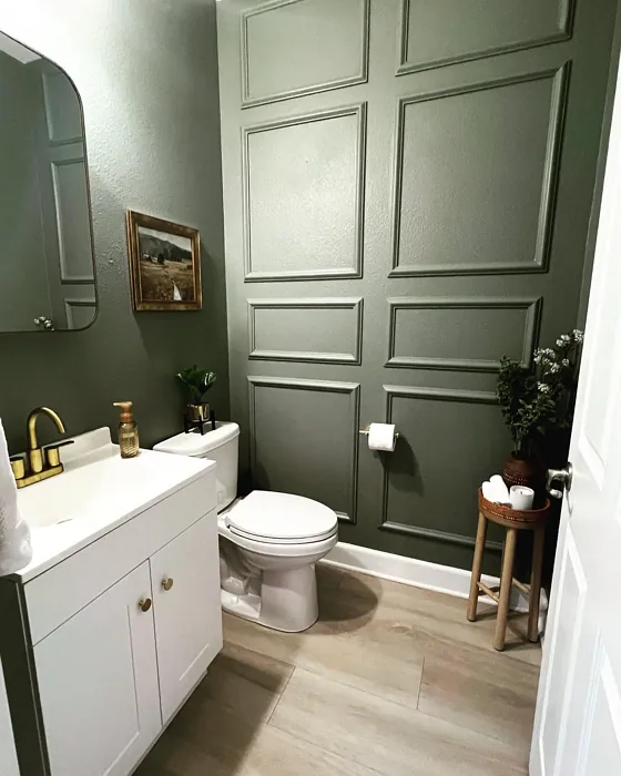
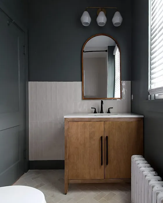
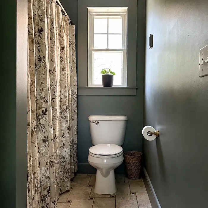
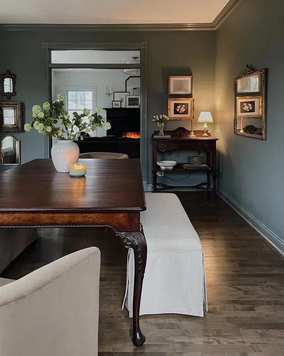
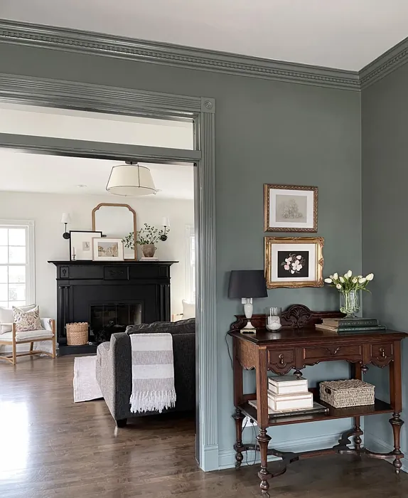
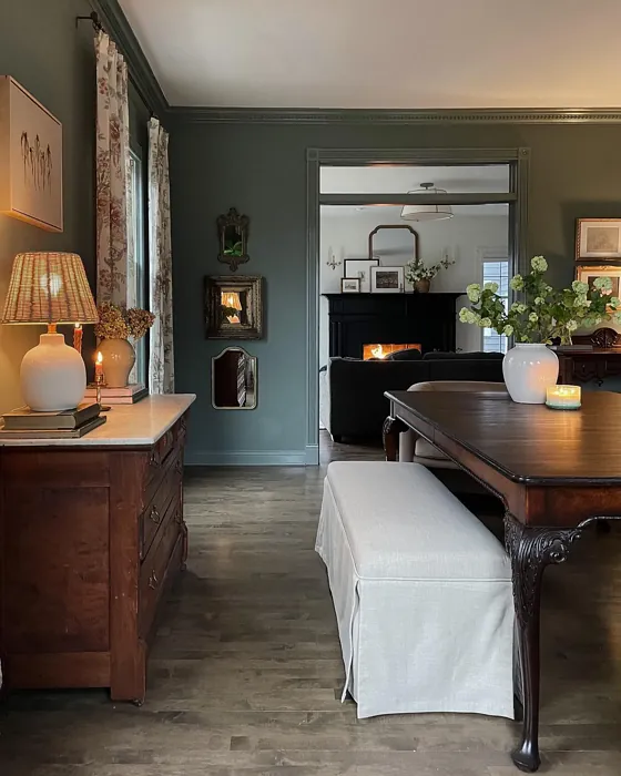
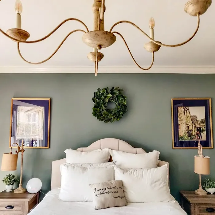
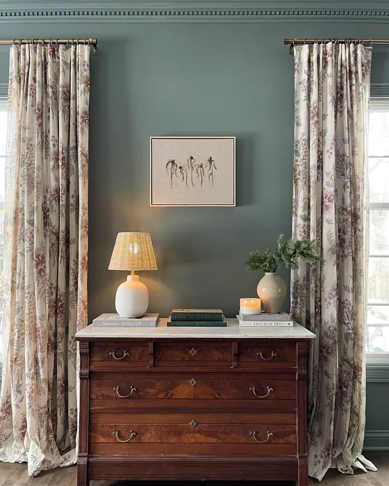
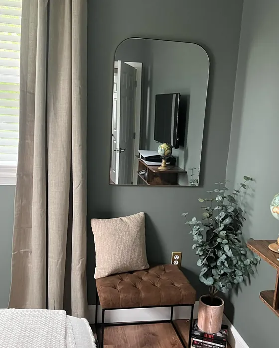
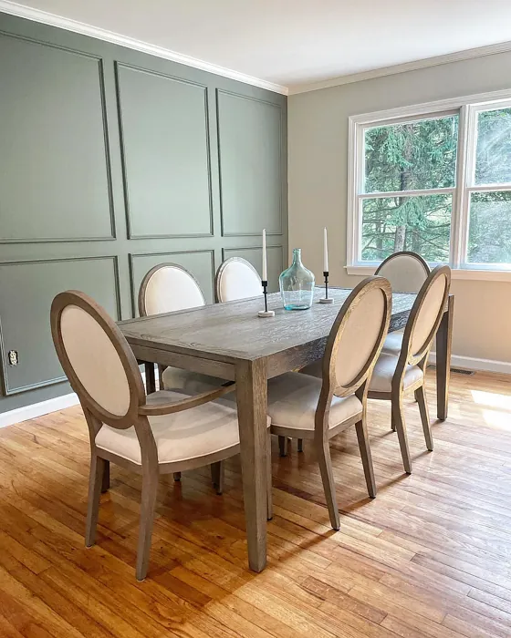
Real rooms painted with Intrigue 1580 by Benjamin Moore. Lighting and photography can affect how colors appear — always test a sample swatch in your own space.
Undertones of Intrigue ?
The undertones of Intrigue are a key aspect of its character, leaning towards Green. These subtle underlying hues are what give the color its depth and complexity. For example, a gray with a blue undertone will feel cooler and more modern, while one with a brown undertone will feel warmer and more traditional. It’s essential to test this paint in your home and observe it next to your existing furniture, flooring, and decor to see how these undertones interact and reveal themselves throughout the day.
HEX value: #818981
RGB code: 129, 137, 129
Is Intrigue Cool or Warm?
Intrigue leans towards a cool tone with its gray base, but the green undertones give it a gentle warmth, making it suitable for various decor styles. This duality enhances its versatility in different lighting conditions.
Understanding Color Properties and Interior Design Tips
Hue refers to a specific position on the color wheel, measured in degrees from 0 to 360. Each degree represents a different pure color:
- 0° represents red
- 120° represents green
- 240° represents blue
Saturation describes the intensity or purity of a color and is expressed as a percentage:
- At 0%, the color appears completely desaturated—essentially a shade of gray
- At 100%, the color is at its most vivid and vibrant
Lightness indicates how light or dark a color is, also expressed as a percentage:
- 0% lightness results in black
- 100% lightness results in white
Using Warm Colors in Interior Design
Warm hues—such as reds, oranges, yellows, warm beiges, and greiges—are excellent choices for creating inviting and energetic spaces. These colors are particularly well-suited for:
- Kitchens, living rooms, and bathrooms, where warmth enhances comfort and sociability
- Large rooms, where warm tones can help reduce the sense of emptiness and make the space feel more intimate
For example:
- Warm beige shades provide a cozy, inviting atmosphere, ideal for living rooms, bedrooms, and hallways.
- Warm greige (a mix of beige and gray) offers the warmth of beige with the modern appeal of gray, making it a versatile backdrop for dining areas, bedrooms, and living spaces.
However, be mindful when using warm light tones in rooms with limited natural light. These shades may appear muted or even take on an unpleasant yellowish tint. To avoid a dull or flat appearance:
- Add depth by incorporating richer tones like deep greens, charcoal, or chocolate brown
- Use textured elements such as curtains, rugs, or cushions to bring dimension to the space
Pro Tip: Achieving Harmony with Warm and Cool Color Balance
To create a well-balanced and visually interesting interior, mix warm and cool tones strategically. This contrast adds depth and harmony to your design.
- If your walls feature warm hues, introduce cool-colored accents such as blue or green furniture, artwork, or accessories to create contrast.
- For a polished look, consider using a complementary color scheme, which pairs colors opposite each other on the color wheel (e.g., red with green, orange with blue).
This thoughtful mix not only enhances visual appeal but also creates a space that feels both dynamic and cohesive.
Save this color to your Pinterest board to revisit when planning your room.
Light Temperature Affects on Intrigue
Natural Light
Natural daylight changes in color temperature as the sun moves across the sky. At sunrise and sunset, the light tends to have a warm, golden tone with a color temperature around 2000 Kelvin (K). As the day progresses and the sun rises higher, the light becomes cooler and more neutral. Around midday, especially when the sky is clear, natural light typically reaches its peak brightness and shifts to a cooler tone, ranging from 5500 to 6500 Kelvin. This midday light is close to what we perceive as pure white or daylight-balanced light.
These shifts in natural light can significantly influence how colors appear in a space, which is why designers often consider both the time of day and the orientation of windows when planning interior color schemes.
Explore how this color transforms from sunrise through sunset as natural light changes throughout the day. Use the slider to simulate morning light, midday brightness, and warm afternoon tones.
North-facing rooms stay cooler throughout the day and benefit from warmer paint tones to compensate. South-facing rooms receive more direct sunlight, making even deeper shades more workable. East-facing rooms get bright morning light that fades by afternoon, while west-facing rooms glow warmly in the evening.
Artificial Light
When choosing artificial lighting, pay close attention to the color temperature, measured in Kelvin (K). This determines how warm or cool the light will appear. Lower temperatures, around 2700K, give off a warm, yellow glow often used in living rooms or bedrooms. Higher temperatures, above 5000K, create a cool, bluish light similar to daylight, commonly used in kitchens, offices, or task areas.
Use the slider to see how lighting temperature can affect the appearance of a surface or color throughout a space.
See how this color looks under different artificial light temperatures — from warm candlelight (2000K) to cool daylight (7000K). Move the slider to simulate your room's lighting conditions.


4800K
Keep in mind that natural light from windows, the warmth of lamps, and overhead lighting all affect how this color reads on your walls at different times of day. Always observe a sample swatch in your actual space before purchasing.
LRV of Intrigue
The Light Reflectance Value (LRV) of Intrigue is 24.43%, which places it in the Medium colors category. This means it reflect a lot of light. Understanding a paint’s LRV is crucial for predicting how it will look in your space. A higher LRV indicates a lighter color that reflects more light, making rooms feel larger and brighter. A lower LRV signifies a darker color that absorbs more light, creating a cozier, more intimate atmosphere. Always consider the natural and artificial lighting in your room when selecting a paint color based on its LRV.
Detailed Review of Intrigue
Additional Paint Characteristics
Ideal Rooms
Bedroom, Dining Room, Home Office, Living Room
Decor Styles
Contemporary, Minimalist, Modern, Rustic
Coverage
Good (1–2 Coats), Touch-Up Friendly
Ease of Application
Beginner Friendly, Brush Smooth, Fast-Drying, Roller-Ready
Washability
Highly Washable, Washable
VOC Level
Eco-Certified, Low VOC
Best Use
Accent Wall, Furniture, Interior Walls
Room Suitability
Bedroom, Dining Room, Home Office, Living Room
Tone Tag
Balanced, Cool, Muted
Finish Type
Eggshell, Matte, Satin
Paint Performance
Easy Touch-Up, Low Odor, Quick Drying, Scuff Resistant
Use Cases
Best for Low Light Rooms, Best for Small Spaces, Designer Favorite
Mood
Calm, Restful, Sophisticated
Trim Pairing
Complements Brass Fixtures, Pairs with White Dove, Works with Warm Trim
Intrigue is a versatile paint that excels in a variety of applications. Its elegant gray tone can serve as a backdrop for both bold and subtle decor choices. The green undertones add depth, making it a great choice for spaces where you want to evoke a sense of calm. Whether you’re updating your living room or refreshing a bedroom, Intrigue offers a refined look that can adapt to your personal style. The paint applies smoothly and dries evenly, ensuring a professional finish that’s easy to achieve even for novice DIYers. Its ability to pair well with both warm and cool accents adds to its appeal, making it a favorite among decorators. Overall, Intrigue is an exquisite choice for anyone looking to elevate their interiors.
Pros & Cons of 1580 Intrigue
Pros
Cons
Colors that go with Benjamin Moore Intrigue
FAQ on 1580 Intrigue
Can Intrigue be used in high humidity areas like bathrooms?
While Intrigue is washable and has good durability, it’s best to opt for a paint specifically designed for high humidity areas if you’re looking for maximum mold resistance. Consider using a satin or semi-gloss finish for better moisture resistance.
How many coats of Intrigue should I apply?
For most surfaces, Intrigue provides good coverage with just one to two coats. However, if you’re transitioning from a darker color, you might need an extra coat for a uniform finish. Always check the surface for evenness before finalizing your application.
Comparisons Intrigue with other colors
Intrigue 1580 vs Dried Thyme SW 6186
| Attribute | Intrigue 1580 | Dried Thyme SW 6186 |
|---|---|---|
| Color Name | Intrigue 1580 | Dried Thyme SW 6186 |
| Color | ||
| Hue | Green | Green |
| Brightness | Dark | Dark |
| RGB | 129, 137, 129 | 123, 128, 112 |
| LRV | 24.43% | 24% |
| Finish Type | Eggshell, Matte, Satin | Eggshell, Satin |
| Finish Options | Eggshell, Matte, Satin | Eggshell, Matte, Satin |
| Ideal Rooms | Bedroom, Dining Room, Home Office, Living Room | Bathroom, Bedroom, Dining Room, Entryway, Home Office, Kitchen, Living Room |
| Decor Styles | Contemporary, Minimalist, Modern, Rustic | Bohemian, Industrial, Minimalist, Modern Farmhouse, Rustic |
| Coverage | Good (1–2 Coats), Touch-Up Friendly | Good (1–2 Coats), Touch-Up Friendly |
| Ease of Application | Beginner Friendly, Brush Smooth, Fast-Drying, Roller-Ready | Beginner Friendly, Brush Smooth, Roller-Ready |
| Washability | Highly Washable, Washable | Washable, Wipeable |
| Room Suitability | Bedroom, Dining Room, Home Office, Living Room | Bathroom, Bedroom, Dining Room, Home Office, Kitchen, Living Room |
| Tone | Balanced, Cool, Muted | Cool, Earthy, Muted |
| Paint Performance | Easy Touch-Up, Low Odor, Quick Drying, Scuff Resistant | Easy Touch-Up, Low Odor, Scuff Resistant |
Lighting conditions, wall orientation, and surrounding decor can significantly affect how these colors appear in your space. Always test a sample swatch before committing to a full application.
Intrigue 1580 vs Retreat SW 6207
| Attribute | Intrigue 1580 | Retreat SW 6207 |
|---|---|---|
| Color Name | Intrigue 1580 | Retreat SW 6207 |
| Color | ||
| Hue | Green | Green |
| Brightness | Dark | Dark |
| RGB | 129, 137, 129 | 122, 128, 118 |
| LRV | 24.43% | 30% |
| Finish Type | Eggshell, Matte, Satin | Eggshell, Matte, Satin |
| Finish Options | Eggshell, Matte, Satin | Eggshell, Matte, Satin |
| Ideal Rooms | Bedroom, Dining Room, Home Office, Living Room | Bathroom, Bedroom, Home Office, Kitchen, Living Room |
| Decor Styles | Contemporary, Minimalist, Modern, Rustic | Minimalist, Modern, Rustic, Transitional |
| Coverage | Good (1–2 Coats), Touch-Up Friendly | Good (1–2 Coats), Touch-Up Friendly |
| Ease of Application | Beginner Friendly, Brush Smooth, Fast-Drying, Roller-Ready | Beginner Friendly, Brush Smooth, Roller-Ready |
| Washability | Highly Washable, Washable | Washable, Wipeable |
| Room Suitability | Bedroom, Dining Room, Home Office, Living Room | Bathroom, Bedroom, Home Office, Living Room |
| Tone | Balanced, Cool, Muted | Cool, Earthy, Muted |
| Paint Performance | Easy Touch-Up, Low Odor, Quick Drying, Scuff Resistant | Easy Touch-Up, Low Odor, Scuff Resistant |
Lighting conditions, wall orientation, and surrounding decor can significantly affect how these colors appear in your space. Always test a sample swatch before committing to a full application.
Intrigue 1580 vs Rosemary SW 6187
| Attribute | Intrigue 1580 | Rosemary SW 6187 |
|---|---|---|
| Color Name | Intrigue 1580 | Rosemary SW 6187 |
| Color | ||
| Hue | Green | Green |
| Brightness | Dark | Dark |
| RGB | 129, 137, 129 | 100, 105, 92 |
| LRV | 24.43% | 45% |
| Finish Type | Eggshell, Matte, Satin | Eggshell, Matte, Satin |
| Finish Options | Eggshell, Matte, Satin | Eggshell, Matte, Satin |
| Ideal Rooms | Bedroom, Dining Room, Home Office, Living Room | Bedroom, Dining Room, Hallway, Home Office, Living Room |
| Decor Styles | Contemporary, Minimalist, Modern, Rustic | Bohemian, Coastal, Modern Farmhouse, Rustic |
| Coverage | Good (1–2 Coats), Touch-Up Friendly | Good (1–2 Coats), Touch-Up Friendly |
| Ease of Application | Beginner Friendly, Brush Smooth, Fast-Drying, Roller-Ready | Beginner Friendly, Brush Smooth, Roller-Ready |
| Washability | Highly Washable, Washable | Washable, Wipeable |
| Room Suitability | Bedroom, Dining Room, Home Office, Living Room | Bedroom, Dining Room, Home Office, Living Room |
| Tone | Balanced, Cool, Muted | Earthy, Muted, Warm |
| Paint Performance | Easy Touch-Up, Low Odor, Quick Drying, Scuff Resistant | Fade Resistant, Low Odor, Quick Drying, Stain Resistant |
Lighting conditions, wall orientation, and surrounding decor can significantly affect how these colors appear in your space. Always test a sample swatch before committing to a full application.
Intrigue 1580 vs Basil SW 6194
| Attribute | Intrigue 1580 | Basil SW 6194 |
|---|---|---|
| Color Name | Intrigue 1580 | Basil SW 6194 |
| Color | ||
| Hue | Green | Green |
| Brightness | Dark | Dark |
| RGB | 129, 137, 129 | 98, 110, 96 |
| LRV | 24.43% | 12% |
| Finish Type | Eggshell, Matte, Satin | Eggshell, Matte, Satin |
| Finish Options | Eggshell, Matte, Satin | Eggshell, Matte, Satin |
| Ideal Rooms | Bedroom, Dining Room, Home Office, Living Room | Bathroom, Bedroom, Dining Room, Home Office, Kitchen, Living Room |
| Decor Styles | Contemporary, Minimalist, Modern, Rustic | Bohemian, Contemporary, Modern Farmhouse, Rustic, Transitional |
| Coverage | Good (1–2 Coats), Touch-Up Friendly | Good (1–2 Coats), Touch-Up Friendly |
| Ease of Application | Beginner Friendly, Brush Smooth, Fast-Drying, Roller-Ready | Beginner Friendly, Brush Smooth, Fast-Drying, Roller-Ready |
| Washability | Highly Washable, Washable | Washable, Wipeable |
| Room Suitability | Bedroom, Dining Room, Home Office, Living Room | Bathroom, Bedroom, Dining Room, Kitchen, Living Room |
| Tone | Balanced, Cool, Muted | Earthy, Muted, Warm |
| Paint Performance | Easy Touch-Up, Low Odor, Quick Drying, Scuff Resistant | Easy Touch-Up, Low Odor, Quick Drying |
Lighting conditions, wall orientation, and surrounding decor can significantly affect how these colors appear in your space. Always test a sample swatch before committing to a full application.
Intrigue 1580 vs Artichoke SW 6179
| Attribute | Intrigue 1580 | Artichoke SW 6179 |
|---|---|---|
| Color Name | Intrigue 1580 | Artichoke SW 6179 |
| Color | ||
| Hue | Green | Green |
| Brightness | Dark | Dark |
| RGB | 129, 137, 129 | 127, 130, 102 |
| LRV | 24.43% | 24% |
| Finish Type | Eggshell, Matte, Satin | Eggshell, Matte, Satin |
| Finish Options | Eggshell, Matte, Satin | Eggshell, Matte, Satin |
| Ideal Rooms | Bedroom, Dining Room, Home Office, Living Room | Bedroom, Dining Room, Home Office, Living Room |
| Decor Styles | Contemporary, Minimalist, Modern, Rustic | Eclectic, Modern Farmhouse, Rustic, Transitional |
| Coverage | Good (1–2 Coats), Touch-Up Friendly | Good (1–2 Coats), Touch-Up Friendly |
| Ease of Application | Beginner Friendly, Brush Smooth, Fast-Drying, Roller-Ready | Beginner Friendly, Brush Smooth, Fast-Drying, Roller-Ready |
| Washability | Highly Washable, Washable | Washable, Wipeable |
| Room Suitability | Bedroom, Dining Room, Home Office, Living Room | Bedroom, Dining Room, Home Office, Living Room |
| Tone | Balanced, Cool, Muted | Earthy, Muted, Warm |
| Paint Performance | Easy Touch-Up, Low Odor, Quick Drying, Scuff Resistant | Easy Touch-Up, High Coverage, Low Odor |
Lighting conditions, wall orientation, and surrounding decor can significantly affect how these colors appear in your space. Always test a sample swatch before committing to a full application.
Intrigue 1580 vs Shade-Grown SW 6188
| Attribute | Intrigue 1580 | Shade-Grown SW 6188 |
|---|---|---|
| Color Name | Intrigue 1580 | Shade-Grown SW 6188 |
| Color | ||
| Hue | Green | Green |
| Brightness | Dark | Dark |
| RGB | 129, 137, 129 | 78, 81, 71 |
| LRV | 24.43% | 24% |
| Finish Type | Eggshell, Matte, Satin | Eggshell, Satin |
| Finish Options | Eggshell, Matte, Satin | Eggshell, Flat, Satin |
| Ideal Rooms | Bedroom, Dining Room, Home Office, Living Room | Bedroom, Dining Room, Home Office, Living Room |
| Decor Styles | Contemporary, Minimalist, Modern, Rustic | Bohemian, Modern, Rustic, Scandinavian |
| Coverage | Good (1–2 Coats), Touch-Up Friendly | Good (1–2 Coats), Touch-Up Friendly |
| Ease of Application | Beginner Friendly, Brush Smooth, Fast-Drying, Roller-Ready | Beginner Friendly, Brush Smooth, Fast-Drying, Roller-Ready |
| Washability | Highly Washable, Washable | Highly Washable, Washable |
| Room Suitability | Bedroom, Dining Room, Home Office, Living Room | Bedroom, Dining Room, Home Office, Living Room |
| Tone | Balanced, Cool, Muted | Deep, Earthy, Muted |
| Paint Performance | Easy Touch-Up, Low Odor, Quick Drying, Scuff Resistant | Easy Touch-Up, High Coverage, Low Odor, Scuff Resistant |
Lighting conditions, wall orientation, and surrounding decor can significantly affect how these colors appear in your space. Always test a sample swatch before committing to a full application.
Intrigue 1580 vs Foxhall Green SW 9184
| Attribute | Intrigue 1580 | Foxhall Green SW 9184 |
|---|---|---|
| Color Name | Intrigue 1580 | Foxhall Green SW 9184 |
| Color | ||
| Hue | Green | Green |
| Brightness | Dark | Dark |
| RGB | 129, 137, 129 | 69, 75, 64 |
| LRV | 24.43% | 12% |
| Finish Type | Eggshell, Matte, Satin | Eggshell, Matte, Satin |
| Finish Options | Eggshell, Matte, Satin | Eggshell, Matte, Satin |
| Ideal Rooms | Bedroom, Dining Room, Home Office, Living Room | Bedroom, Dining Room, Home Office, Living Room |
| Decor Styles | Contemporary, Minimalist, Modern, Rustic | Contemporary, Modern Farmhouse, Rustic, Traditional |
| Coverage | Good (1–2 Coats), Touch-Up Friendly | Good (1–2 Coats), Touch-Up Friendly |
| Ease of Application | Beginner Friendly, Brush Smooth, Fast-Drying, Roller-Ready | Beginner Friendly, Brush Smooth, Fast-Drying, Roller-Ready |
| Washability | Highly Washable, Washable | Washable, Wipeable |
| Room Suitability | Bedroom, Dining Room, Home Office, Living Room | Bedroom, Dining Room, Home Office, Living Room |
| Tone | Balanced, Cool, Muted | Balanced, Deep, Earthy, Muted |
| Paint Performance | Easy Touch-Up, Low Odor, Quick Drying, Scuff Resistant | Easy Touch-Up, Fade Resistant, Low Odor, Quick Drying |
Lighting conditions, wall orientation, and surrounding decor can significantly affect how these colors appear in your space. Always test a sample swatch before committing to a full application.
Intrigue 1580 vs Pewter Green SW 6208
| Attribute | Intrigue 1580 | Pewter Green SW 6208 |
|---|---|---|
| Color Name | Intrigue 1580 | Pewter Green SW 6208 |
| Color | ||
| Hue | Green | Green |
| Brightness | Dark | Dark |
| RGB | 129, 137, 129 | 94, 98, 89 |
| LRV | 24.43% | 24% |
| Finish Type | Eggshell, Matte, Satin | Eggshell, Matte, Satin |
| Finish Options | Eggshell, Matte, Satin | Eggshell, Matte, Satin |
| Ideal Rooms | Bedroom, Dining Room, Home Office, Living Room | Bedroom, Dining Room, Entryway, Home Office, Living Room |
| Decor Styles | Contemporary, Minimalist, Modern, Rustic | Contemporary, Modern Farmhouse, Rustic, Scandinavian, Traditional |
| Coverage | Good (1–2 Coats), Touch-Up Friendly | Good (1–2 Coats), Touch-Up Friendly |
| Ease of Application | Beginner Friendly, Brush Smooth, Fast-Drying, Roller-Ready | Beginner Friendly, Brush Smooth, Fast-Drying, Roller-Ready |
| Washability | Highly Washable, Washable | Highly Washable, Washable, Wipeable |
| Room Suitability | Bedroom, Dining Room, Home Office, Living Room | Bathroom, Bedroom, Dining Room, Kitchen, Living Room |
| Tone | Balanced, Cool, Muted | Balanced, Cool, Earthy, Muted |
| Paint Performance | Easy Touch-Up, Low Odor, Quick Drying, Scuff Resistant | Easy Touch-Up, Fade Resistant, Low Odor, Quick Drying |
Lighting conditions, wall orientation, and surrounding decor can significantly affect how these colors appear in your space. Always test a sample swatch before committing to a full application.
Intrigue 1580 vs Rookwood Dark Green SW 2816
| Attribute | Intrigue 1580 | Rookwood Dark Green SW 2816 |
|---|---|---|
| Color Name | Intrigue 1580 | Rookwood Dark Green SW 2816 |
| Color | ||
| Hue | Green | Green |
| Brightness | Dark | Dark |
| RGB | 129, 137, 129 | 86, 92, 74 |
| LRV | 24.43% | 6% |
| Finish Type | Eggshell, Matte, Satin | Eggshell, Matte, Satin |
| Finish Options | Eggshell, Matte, Satin | Eggshell, Matte, Satin |
| Ideal Rooms | Bedroom, Dining Room, Home Office, Living Room | Bedroom, Dining Room, Home Office, Kitchen, Living Room |
| Decor Styles | Contemporary, Minimalist, Modern, Rustic | Contemporary, Modern Farmhouse, Rustic, Traditional |
| Coverage | Good (1–2 Coats), Touch-Up Friendly | Good (1–2 Coats), Touch-Up Friendly |
| Ease of Application | Beginner Friendly, Brush Smooth, Fast-Drying, Roller-Ready | Beginner Friendly, Brush Smooth, Roller-Ready |
| Washability | Highly Washable, Washable | Washable, Wipeable |
| Room Suitability | Bedroom, Dining Room, Home Office, Living Room | Bedroom, Dining Room, Home Office, Living Room |
| Tone | Balanced, Cool, Muted | Deep, Earthy, Warm |
| Paint Performance | Easy Touch-Up, Low Odor, Quick Drying, Scuff Resistant | Easy Touch-Up, High Coverage, Low Odor, Scuff Resistant |
Lighting conditions, wall orientation, and surrounding decor can significantly affect how these colors appear in your space. Always test a sample swatch before committing to a full application.
Intrigue 1580 vs Ripe Olive SW 6209
| Attribute | Intrigue 1580 | Ripe Olive SW 6209 |
|---|---|---|
| Color Name | Intrigue 1580 | Ripe Olive SW 6209 |
| Color | ||
| Hue | Green | Green |
| Brightness | Dark | Dark |
| RGB | 129, 137, 129 | 68, 72, 61 |
| LRV | 24.43% | 15% |
| Finish Type | Eggshell, Matte, Satin | Eggshell, Matte |
| Finish Options | Eggshell, Matte, Satin | Eggshell, Matte, Satin |
| Ideal Rooms | Bedroom, Dining Room, Home Office, Living Room | Bedroom, Dining Room, Home Office, Living Room |
| Decor Styles | Contemporary, Minimalist, Modern, Rustic | Bohemian, Industrial, Modern Farmhouse, Rustic |
| Coverage | Good (1–2 Coats), Touch-Up Friendly | Good (1–2 Coats) |
| Ease of Application | Beginner Friendly, Brush Smooth, Fast-Drying, Roller-Ready | Beginner Friendly, Brush Smooth, Roller-Ready |
| Washability | Highly Washable, Washable | Highly Washable, Washable |
| Room Suitability | Bedroom, Dining Room, Home Office, Living Room | Bedroom, Dining Room, Home Office, Living Room |
| Tone | Balanced, Cool, Muted | Deep, Earthy, Muted |
| Paint Performance | Easy Touch-Up, Low Odor, Quick Drying, Scuff Resistant | Easy Touch-Up, High Coverage, Low Odor |
Lighting conditions, wall orientation, and surrounding decor can significantly affect how these colors appear in your space. Always test a sample swatch before committing to a full application.
Official Page of Benjamin Moore Intrigue 1580