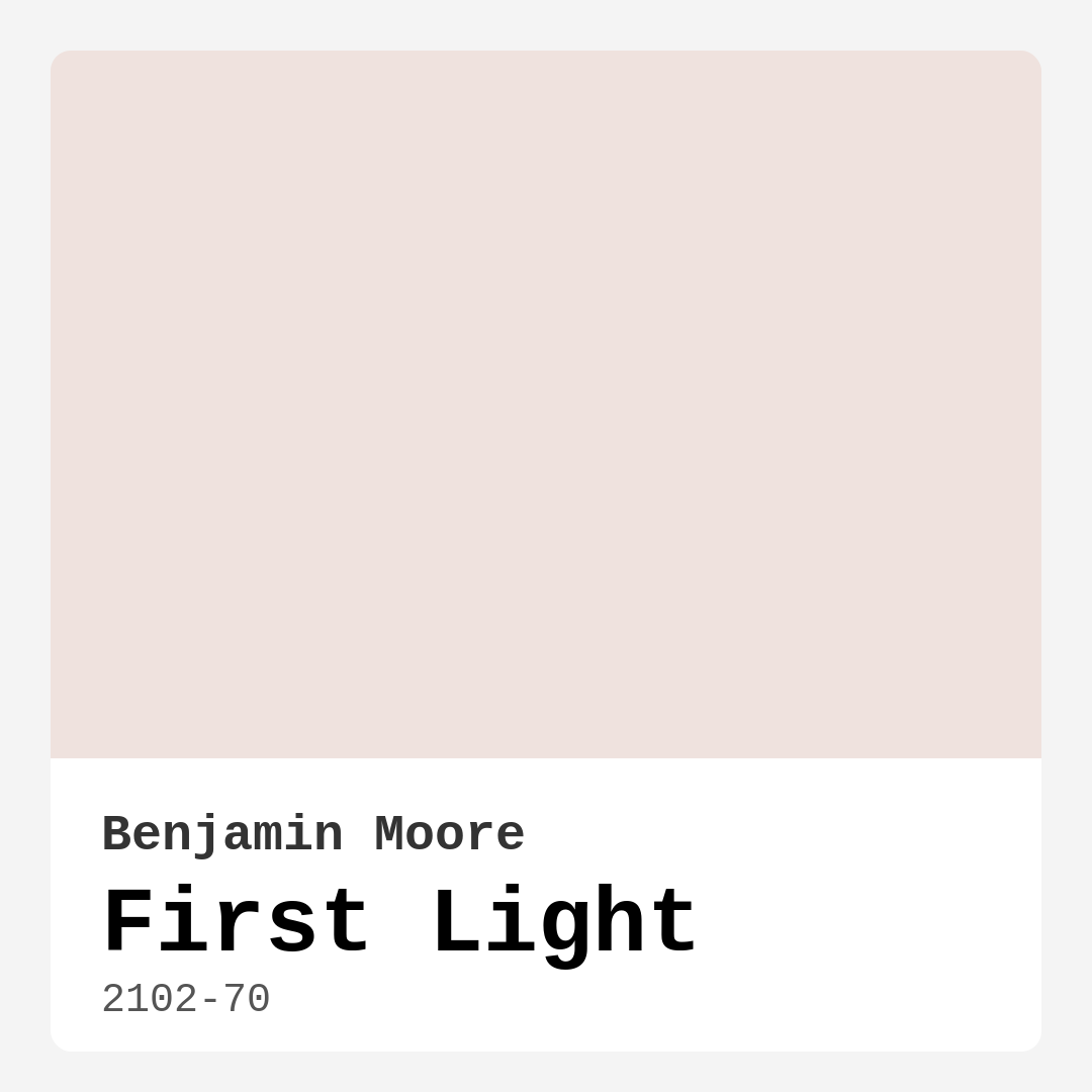
Color Preview & Key Details
| HEX Code | #EFE2DE |
| RGB | 239, 226, 222 |
| LRV | 75.86% |
| Undertone | Red |
| Finish Options | Eggshell, Matte, Satin |
Imagine walking into a room bathed in the soft glow of early morning light—gentle, warm, and impossibly inviting. That’s the magic of Benjamin Moore’s First Light. This isn’t just another pink paint; it’s a whisper of color that transforms walls into a canvas of serenity. Whether you’re refreshing a tired bedroom, designing a cozy nursery, or giving your home office a lift, First Light might just be the perfect shade to bring your vision to life.
First Light (2102-70) is a blush-toned paint with a delicate warmth that feels like a sunrise captured in a can. Its hex code, #EFE2DE, translates to a soft, creamy pink with a red undertone that adds depth without overwhelming a space. With an LRV of 75.86%, it’s firmly in the off-white category, meaning it reflects a lot of light—ideal for rooms that need a brightness boost. The finish options—matte, eggshell, or satin—give you flexibility depending on the room’s function and your style preferences.
One of the standout qualities of First Light is its versatility. It plays well with modern, farmhouse, Scandinavian, and eclectic decor styles. Picture it in a living room with crisp white trim (White Dove is a classic pairing), layered with textured throws and warm wood accents. Or imagine a nursery where it creates a soothing backdrop for whimsical prints and soft linens. Even in a home office, it fosters focus without feeling sterile. The color’s warmth makes it inviting, while its lightness keeps it fresh and airy.
Application is a breeze, even for beginners. The paint is roller-ready, brush-smooth, and touch-up friendly, with good coverage in one to two coats. It’s also low-VOC and eco-certified, so you can breathe easy during and after painting. Maintenance is simple, too—First Light is highly washable, though lighter colors like this can show dirt more easily, so a satin or eggshell finish might be the smarter choice for high-traffic areas.
Now, let’s talk undertones. First Light leans red, which gives it that subtle blush quality. This means it can shift slightly depending on the light and surrounding colors. In north-facing rooms, it might appear cooler, while in south-facing spaces, the warmth will shine. Always test a swatch on your walls and observe it at different times of day. Pair it with greens for a complementary contrast—think potted plants or sage-colored upholstery—or lean into its warmth with gold fixtures and caramel-toned woods.
If you’re worried about commitment, start small. An accent wall in First Light can add just enough color without overwhelming a room. Or go all-in and paint a small space like a hallway or powder room for a cozy, enveloping effect. Larger rooms will feel expansive thanks to its light-reflecting properties, while darker spaces might need an extra coat to achieve full vibrancy.
For those who love First Light but want to explore similar shades, Benjamin Moore’s Soft Pink or Sherwin-Williams’ Heartthrob are close cousins. If you’re craving more depth, darker shades like HC-63 or 1637 offer a richer take on the same family. And if you’re pairing it with trim, stick to clean whites or warm neutrals to let the blush tones sing.
At the end of the day, First Light is more than a paint color—it’s a mood. It’s calm without being cold, warm without being loud, and elegant without being fussy. Whether you’re designing a sanctuary or refreshing a shared space, this shade has the quiet confidence to make any room feel like home. So grab a sample, brush a little on your wall, and see how it makes you feel. You might just find yourself falling in love with the first light of your day, every day.
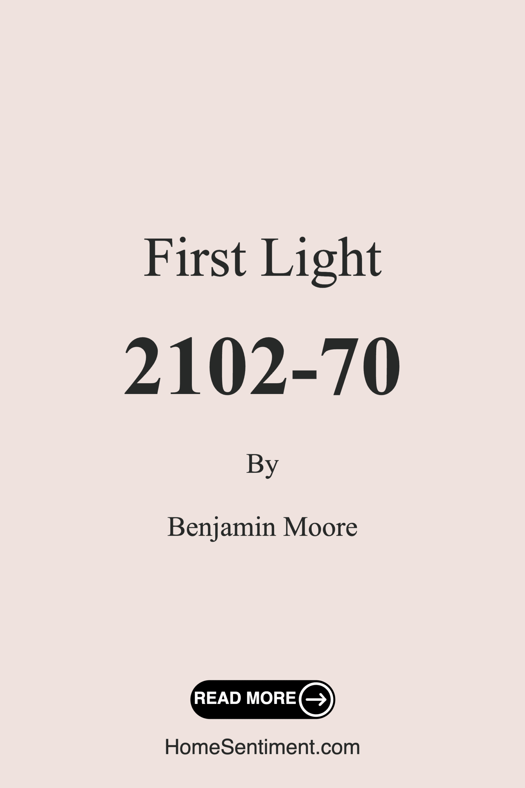
Save this color to your Pinterest board to revisit when planning your room.
Real Room Photo of First Light 2102-70
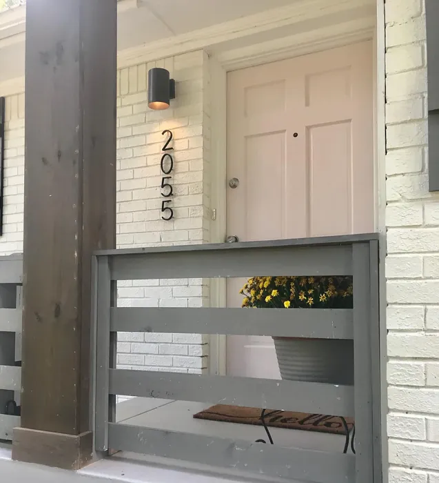
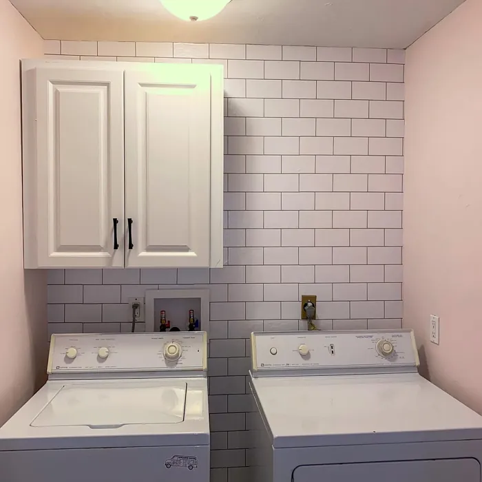
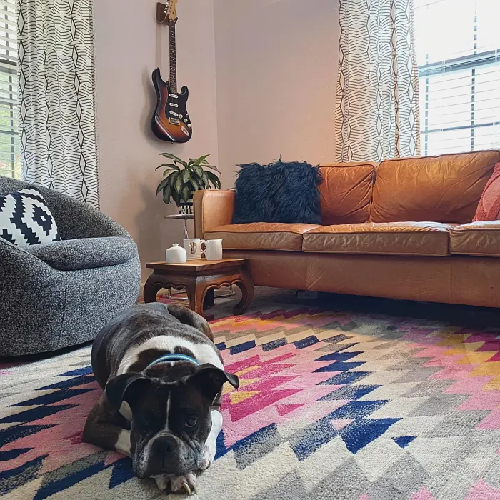
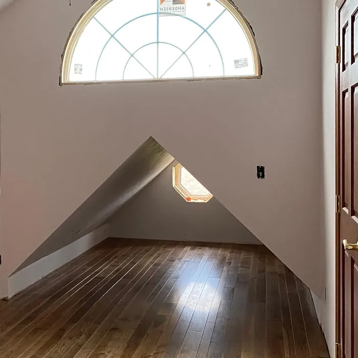
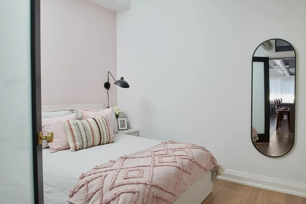
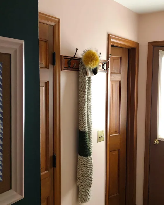
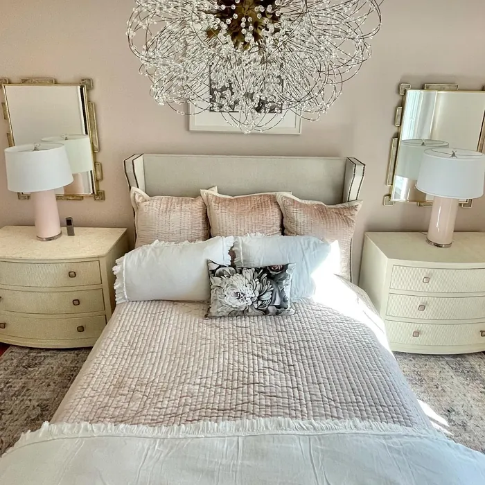
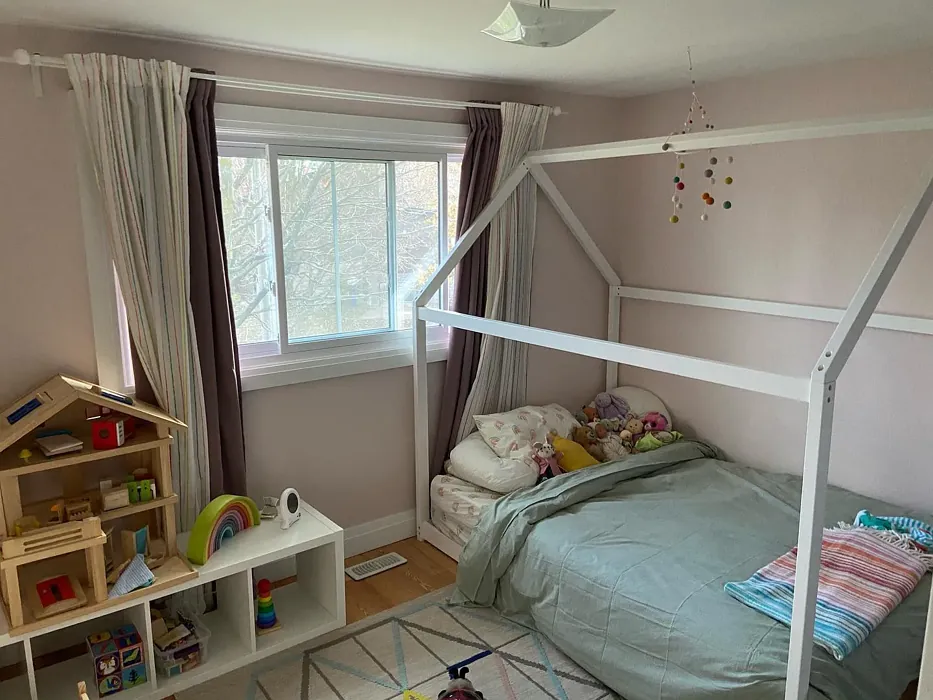
Real rooms painted with First Light 2102-70 by Benjamin Moore. Lighting and photography can affect how colors appear — always test a sample swatch in your own space.
Undertones of First Light ?
The undertones of First Light are a key aspect of its character, leaning towards Red. These subtle underlying hues are what give the color its depth and complexity. For example, a gray with a blue undertone will feel cooler and more modern, while one with a brown undertone will feel warmer and more traditional. It’s essential to test this paint in your home and observe it next to your existing furniture, flooring, and decor to see how these undertones interact and reveal themselves throughout the day.
HEX value: #EFE2DE
RGB code: 239, 226, 222
Is First Light Cool or Warm?
First Light leans towards the warm side of the spectrum, creating a cozy environment. Its blush tones are perfect for adding warmth to any room without overwhelming the senses. This color harmonizes beautifully with warm wood tones and golden fixtures, making it a versatile choice.
Understanding Color Properties and Interior Design Tips
Hue refers to a specific position on the color wheel, measured in degrees from 0 to 360. Each degree represents a different pure color:
- 0° represents red
- 120° represents green
- 240° represents blue
Saturation describes the intensity or purity of a color and is expressed as a percentage:
- At 0%, the color appears completely desaturated—essentially a shade of gray
- At 100%, the color is at its most vivid and vibrant
Lightness indicates how light or dark a color is, also expressed as a percentage:
- 0% lightness results in black
- 100% lightness results in white
Using Warm Colors in Interior Design
Warm hues—such as reds, oranges, yellows, warm beiges, and greiges—are excellent choices for creating inviting and energetic spaces. These colors are particularly well-suited for:
- Kitchens, living rooms, and bathrooms, where warmth enhances comfort and sociability
- Large rooms, where warm tones can help reduce the sense of emptiness and make the space feel more intimate
For example:
- Warm beige shades provide a cozy, inviting atmosphere, ideal for living rooms, bedrooms, and hallways.
- Warm greige (a mix of beige and gray) offers the warmth of beige with the modern appeal of gray, making it a versatile backdrop for dining areas, bedrooms, and living spaces.
However, be mindful when using warm light tones in rooms with limited natural light. These shades may appear muted or even take on an unpleasant yellowish tint. To avoid a dull or flat appearance:
- Add depth by incorporating richer tones like deep greens, charcoal, or chocolate brown
- Use textured elements such as curtains, rugs, or cushions to bring dimension to the space
Pro Tip: Achieving Harmony with Warm and Cool Color Balance
To create a well-balanced and visually interesting interior, mix warm and cool tones strategically. This contrast adds depth and harmony to your design.
- If your walls feature warm hues, introduce cool-colored accents such as blue or green furniture, artwork, or accessories to create contrast.
- For a polished look, consider using a complementary color scheme, which pairs colors opposite each other on the color wheel (e.g., red with green, orange with blue).
This thoughtful mix not only enhances visual appeal but also creates a space that feels both dynamic and cohesive.
Save this color to your Pinterest board to revisit when planning your room.
Light Temperature Affects on First Light
Natural Light
Natural daylight changes in color temperature as the sun moves across the sky. At sunrise and sunset, the light tends to have a warm, golden tone with a color temperature around 2000 Kelvin (K). As the day progresses and the sun rises higher, the light becomes cooler and more neutral. Around midday, especially when the sky is clear, natural light typically reaches its peak brightness and shifts to a cooler tone, ranging from 5500 to 6500 Kelvin. This midday light is close to what we perceive as pure white or daylight-balanced light.
These shifts in natural light can significantly influence how colors appear in a space, which is why designers often consider both the time of day and the orientation of windows when planning interior color schemes.
Explore how this color transforms from sunrise through sunset as natural light changes throughout the day. Use the slider to simulate morning light, midday brightness, and warm afternoon tones.
North-facing rooms stay cooler throughout the day and benefit from warmer paint tones to compensate. South-facing rooms receive more direct sunlight, making even deeper shades more workable. East-facing rooms get bright morning light that fades by afternoon, while west-facing rooms glow warmly in the evening.
Artificial Light
When choosing artificial lighting, pay close attention to the color temperature, measured in Kelvin (K). This determines how warm or cool the light will appear. Lower temperatures, around 2700K, give off a warm, yellow glow often used in living rooms or bedrooms. Higher temperatures, above 5000K, create a cool, bluish light similar to daylight, commonly used in kitchens, offices, or task areas.
Use the slider to see how lighting temperature can affect the appearance of a surface or color throughout a space.
See how this color looks under different artificial light temperatures — from warm candlelight (2000K) to cool daylight (7000K). Move the slider to simulate your room's lighting conditions.


4800K
Keep in mind that natural light from windows, the warmth of lamps, and overhead lighting all affect how this color reads on your walls at different times of day. Always observe a sample swatch in your actual space before purchasing.
LRV of First Light
The Light Reflectance Value (LRV) of First Light is 75.86%, which places it in the Off‑White colors category. This means it reflect a lot of light. Understanding a paint’s LRV is crucial for predicting how it will look in your space. A higher LRV indicates a lighter color that reflects more light, making rooms feel larger and brighter. A lower LRV signifies a darker color that absorbs more light, creating a cozier, more intimate atmosphere. Always consider the natural and artificial lighting in your room when selecting a paint color based on its LRV.
Detailed Review of First Light
Additional Paint Characteristics
Ideal Rooms
Bedroom, Hallway, Home Office, Living Room, Nursery
Decor Styles
Eclectic, Farmhouse, Modern, Scandinavian, Transitional
Coverage
Good (1–2 Coats), Touch-Up Friendly
Ease of Application
Beginner Friendly, Brush Smooth, Roller-Ready
Washability
Highly Washable, Washable
VOC Level
Eco-Certified, Low VOC
Best Use
Accent Wall, Interior Walls, Large Spaces, Small Spaces
Room Suitability
Bedroom, Hallway, Home Office, Living Room, Nursery
Tone Tag
Creamy, Muted, Soft, Warm
Finish Type
Eggshell, Matte, Satin
Paint Performance
Easy Touch-Up, High Coverage, Low Odor, Quick Drying
Use Cases
Best for Rentals, Best for Small Spaces, Classic Favorite, Designer Favorite
Mood
Calm, Cozy, Inviting, Restful
Trim Pairing
Complements Warm Trim, Matches Pure White, Pairs with White Dove
First Light is more than just a paint color; it’s an experience. The soft blush hue transforms any room into a tranquil sanctuary. It beautifully reflects light, making spaces feel airy and open. Whether you’re painting a large living area or a cozy bedroom, First Light adapts effortlessly. The paint applies smoothly and dries evenly, minimizing streaks and ensuring a professional finish. It’s versatile enough to pair with various decor styles, from modern to farmhouse. Plus, it’s perfect for accent walls or as a full-room color. If you’re after a soothing yet stylish look, First Light is a top choice that won’t disappoint.
Pros & Cons of 2102-70 First Light
Pros
Cons
Colors that go with Benjamin Moore First Light
FAQ on 2102-70 First Light
Can First Light be used in high-traffic areas?
Absolutely! First Light is quite durable and washable, making it suitable for high-traffic areas. However, to ensure the best longevity, it’s advisable to apply a satin or eggshell finish, which offers more resilience against scuffs and marks. Regular touch-ups will help maintain its fresh look.
What trim colors work best with First Light?
First Light pairs beautifully with a variety of trim colors. For a classic look, white trims like White Dove or Simply White create a clean contrast. If you’re going for a warmer vibe, consider wood trims or warm neutrals, which will enhance the soft blush tones of the paint. Experimenting with different combinations can yield stunning results!
Comparisons First Light with other colors
First Light 2102-70 vs Malted Milk SW 6057
| Attribute | First Light 2102-70 | Malted Milk SW 6057 |
|---|---|---|
| Color Name | First Light 2102-70 | Malted Milk SW 6057 |
| Color | ||
| Hue | Pink | Pink |
| Brightness | Light | Light |
| RGB | 239, 226, 222 | 222, 202, 189 |
| LRV | 75.86% | 74% |
| Finish Type | Eggshell, Matte, Satin | Eggshell, Satin |
| Finish Options | Eggshell, Matte, Satin | Eggshell, Matte, Satin |
| Ideal Rooms | Bedroom, Hallway, Home Office, Living Room, Nursery | Bedroom, Dining Room, Kitchen, Living Room, Nursery |
| Decor Styles | Eclectic, Farmhouse, Modern, Scandinavian, Transitional | Coastal, Farmhouse, Modern, Scandinavian, Transitional |
| Coverage | Good (1–2 Coats), Touch-Up Friendly | Good (1–2 Coats), Touch-Up Friendly |
| Ease of Application | Beginner Friendly, Brush Smooth, Roller-Ready | Beginner Friendly, Brush Smooth, Fast-Drying, Roller-Ready |
| Washability | Highly Washable, Washable | Washable, Wipeable |
| Room Suitability | Bedroom, Hallway, Home Office, Living Room, Nursery | Bedroom, Dining Room, Kitchen, Living Room, Nursery |
| Tone | Creamy, Muted, Soft, Warm | Creamy, Neutral, Warm |
| Paint Performance | Easy Touch-Up, High Coverage, Low Odor, Quick Drying | High Coverage, Low Odor, Quick Drying |
Lighting conditions, wall orientation, and surrounding decor can significantly affect how these colors appear in your space. Always test a sample swatch before committing to a full application.
First Light 2102-70 vs Intimate White SW 6322
| Attribute | First Light 2102-70 | Intimate White SW 6322 |
|---|---|---|
| Color Name | First Light 2102-70 | Intimate White SW 6322 |
| Color | ||
| Hue | Pink | Pink |
| Brightness | Light | Light |
| RGB | 239, 226, 222 | 240, 225, 216 |
| LRV | 75.86% | 75% |
| Finish Type | Eggshell, Matte, Satin | Eggshell, Matte, Satin |
| Finish Options | Eggshell, Matte, Satin | Eggshell, Matte, Satin |
| Ideal Rooms | Bedroom, Hallway, Home Office, Living Room, Nursery | Bedroom, Hallway, Home Office, Living Room, Nursery |
| Decor Styles | Eclectic, Farmhouse, Modern, Scandinavian, Transitional | Farmhouse, Minimalist, Modern, Traditional |
| Coverage | Good (1–2 Coats), Touch-Up Friendly | Good (1–2 Coats) |
| Ease of Application | Beginner Friendly, Brush Smooth, Roller-Ready | Beginner Friendly, Brush Smooth, Roller-Ready |
| Washability | Highly Washable, Washable | Highly Washable, Washable |
| Room Suitability | Bedroom, Hallway, Home Office, Living Room, Nursery | Bedroom, Hallway, Living Room, Nursery |
| Tone | Creamy, Muted, Soft, Warm | Creamy, Muted, Warm |
| Paint Performance | Easy Touch-Up, High Coverage, Low Odor, Quick Drying | Easy Touch-Up, Fade Resistant, Low Odor |
Lighting conditions, wall orientation, and surrounding decor can significantly affect how these colors appear in your space. Always test a sample swatch before committing to a full application.
First Light 2102-70 vs Abalone Shell SW 6050
| Attribute | First Light 2102-70 | Abalone Shell SW 6050 |
|---|---|---|
| Color Name | First Light 2102-70 | Abalone Shell SW 6050 |
| Color | ||
| Hue | Pink | Pink |
| Brightness | Light | Light |
| RGB | 239, 226, 222 | 219, 199, 189 |
| LRV | 75.86% | 30% |
| Finish Type | Eggshell, Matte, Satin | Eggshell, Matte, Satin |
| Finish Options | Eggshell, Matte, Satin | Eggshell, Matte, Satin |
| Ideal Rooms | Bedroom, Hallway, Home Office, Living Room, Nursery | Bedroom, Dining Room, Home Office, Living Room |
| Decor Styles | Eclectic, Farmhouse, Modern, Scandinavian, Transitional | Coastal, Farmhouse, Minimalist, Modern, Traditional |
| Coverage | Good (1–2 Coats), Touch-Up Friendly | Good (1–2 Coats), Touch-Up Friendly |
| Ease of Application | Beginner Friendly, Brush Smooth, Roller-Ready | Beginner Friendly, Brush Smooth, Fast-Drying, Roller-Ready |
| Washability | Highly Washable, Washable | Washable, Wipeable |
| Room Suitability | Bedroom, Hallway, Home Office, Living Room, Nursery | Bedroom, Dining Room, Home Office, Living Room |
| Tone | Creamy, Muted, Soft, Warm | Balanced, Muted, Warm |
| Paint Performance | Easy Touch-Up, High Coverage, Low Odor, Quick Drying | Easy Touch-Up, Fade Resistant, Low Odor, Quick Drying |
Lighting conditions, wall orientation, and surrounding decor can significantly affect how these colors appear in your space. Always test a sample swatch before committing to a full application.
First Light 2102-70 vs White Truffle SW 6029
| Attribute | First Light 2102-70 | White Truffle SW 6029 |
|---|---|---|
| Color Name | First Light 2102-70 | White Truffle SW 6029 |
| Color | ||
| Hue | Pink | Pink |
| Brightness | Light | Light |
| RGB | 239, 226, 222 | 215, 200, 194 |
| LRV | 75.86% | 48% |
| Finish Type | Eggshell, Matte, Satin | Eggshell, Satin |
| Finish Options | Eggshell, Matte, Satin | Eggshell, Flat, Matte, Satin |
| Ideal Rooms | Bedroom, Hallway, Home Office, Living Room, Nursery | Bedroom, Dining Room, Hallway, Kitchen, Living Room |
| Decor Styles | Eclectic, Farmhouse, Modern, Scandinavian, Transitional | Eclectic, Farmhouse, Modern, Traditional |
| Coverage | Good (1–2 Coats), Touch-Up Friendly | Good (1–2 Coats), Touch-Up Friendly |
| Ease of Application | Beginner Friendly, Brush Smooth, Roller-Ready | Beginner Friendly, Brush Smooth, Roller-Ready |
| Washability | Highly Washable, Washable | Washable, Wipeable |
| Room Suitability | Bedroom, Hallway, Home Office, Living Room, Nursery | Bedroom, Dining Room, Hallway, Living Room |
| Tone | Creamy, Muted, Soft, Warm | Earthy, Neutral, Warm |
| Paint Performance | Easy Touch-Up, High Coverage, Low Odor, Quick Drying | Easy Touch-Up, Low Odor, Scuff Resistant |
Lighting conditions, wall orientation, and surrounding decor can significantly affect how these colors appear in your space. Always test a sample swatch before committing to a full application.
First Light 2102-70 vs Faint Coral SW 6329
| Attribute | First Light 2102-70 | Faint Coral SW 6329 |
|---|---|---|
| Color Name | First Light 2102-70 | Faint Coral SW 6329 |
| Color | ||
| Hue | Pink | Pink |
| Brightness | Light | Light |
| RGB | 239, 226, 222 | 238, 222, 213 |
| LRV | 75.86% | 66% |
| Finish Type | Eggshell, Matte, Satin | Eggshell, Matte, Satin |
| Finish Options | Eggshell, Matte, Satin | Eggshell, Matte, Satin |
| Ideal Rooms | Bedroom, Hallway, Home Office, Living Room, Nursery | Bedroom, Dining Room, Hallway, Living Room, Nursery |
| Decor Styles | Eclectic, Farmhouse, Modern, Scandinavian, Transitional | Bohemian, Coastal, Modern Farmhouse, Scandinavian, Vintage |
| Coverage | Good (1–2 Coats), Touch-Up Friendly | Good (1–2 Coats), Touch-Up Friendly |
| Ease of Application | Beginner Friendly, Brush Smooth, Roller-Ready | Beginner Friendly, Brush Smooth, Fast-Drying, Roller-Ready |
| Washability | Highly Washable, Washable | Washable, Wipeable |
| Room Suitability | Bedroom, Hallway, Home Office, Living Room, Nursery | Bedroom, Dining Room, Hallway, Living Room, Nursery |
| Tone | Creamy, Muted, Soft, Warm | Airy, Muted, Pastel, Warm |
| Paint Performance | Easy Touch-Up, High Coverage, Low Odor, Quick Drying | Easy Touch-Up, Low Odor, Quick Drying |
Lighting conditions, wall orientation, and surrounding decor can significantly affect how these colors appear in your space. Always test a sample swatch before committing to a full application.
First Light 2102-70 vs Romance SW 6323
| Attribute | First Light 2102-70 | Romance SW 6323 |
|---|---|---|
| Color Name | First Light 2102-70 | Romance SW 6323 |
| Color | ||
| Hue | Pink | Pink |
| Brightness | Light | Light |
| RGB | 239, 226, 222 | 235, 207, 195 |
| LRV | 75.86% | 69% |
| Finish Type | Eggshell, Matte, Satin | Eggshell, Matte |
| Finish Options | Eggshell, Matte, Satin | Eggshell, Flat, Matte, Satin |
| Ideal Rooms | Bedroom, Hallway, Home Office, Living Room, Nursery | Bedroom, Dining Room, Living Room, Nursery |
| Decor Styles | Eclectic, Farmhouse, Modern, Scandinavian, Transitional | Bohemian, Modern, Shabby Chic, Vintage |
| Coverage | Good (1–2 Coats), Touch-Up Friendly | Good (1–2 Coats), Touch-Up Friendly |
| Ease of Application | Beginner Friendly, Brush Smooth, Roller-Ready | Beginner Friendly, Brush Smooth, Fast-Drying, Roller-Ready |
| Washability | Highly Washable, Washable | Washable, Wipeable |
| Room Suitability | Bedroom, Hallway, Home Office, Living Room, Nursery | Bedroom, Dining Room, Living Room, Nursery |
| Tone | Creamy, Muted, Soft, Warm | Pastel, Soft, Warm |
| Paint Performance | Easy Touch-Up, High Coverage, Low Odor, Quick Drying | Easy Touch-Up, Low Odor, Quick Drying |
Lighting conditions, wall orientation, and surrounding decor can significantly affect how these colors appear in your space. Always test a sample swatch before committing to a full application.
First Light 2102-70 vs Innocence SW 6302
| Attribute | First Light 2102-70 | Innocence SW 6302 |
|---|---|---|
| Color Name | First Light 2102-70 | Innocence SW 6302 |
| Color | ||
| Hue | Pink | Pink |
| Brightness | Light | Light |
| RGB | 239, 226, 222 | 235, 209, 207 |
| LRV | 75.86% | 75% |
| Finish Type | Eggshell, Matte, Satin | Eggshell, Matte |
| Finish Options | Eggshell, Matte, Satin | Eggshell, Matte, Satin |
| Ideal Rooms | Bedroom, Hallway, Home Office, Living Room, Nursery | Bedroom, Dining Room, Living Room, Nursery |
| Decor Styles | Eclectic, Farmhouse, Modern, Scandinavian, Transitional | Bohemian, Modern Farmhouse, Scandinavian, Shabby Chic |
| Coverage | Good (1–2 Coats), Touch-Up Friendly | Good (1–2 Coats), Touch-Up Friendly |
| Ease of Application | Beginner Friendly, Brush Smooth, Roller-Ready | Beginner Friendly, Brush Smooth, Roller-Ready |
| Washability | Highly Washable, Washable | Washable, Wipeable |
| Room Suitability | Bedroom, Hallway, Home Office, Living Room, Nursery | Bedroom, Dining Room, Living Room, Nursery |
| Tone | Creamy, Muted, Soft, Warm | Pastel, Soft, Warm |
| Paint Performance | Easy Touch-Up, High Coverage, Low Odor, Quick Drying | Easy Touch-Up, Fade Resistant, Low Odor |
Lighting conditions, wall orientation, and surrounding decor can significantly affect how these colors appear in your space. Always test a sample swatch before committing to a full application.
First Light 2102-70 vs Angelic SW 6602
| Attribute | First Light 2102-70 | Angelic SW 6602 |
|---|---|---|
| Color Name | First Light 2102-70 | Angelic SW 6602 |
| Color | ||
| Hue | Pink | Pink |
| Brightness | Light | Light |
| RGB | 239, 226, 222 | 242, 220, 215 |
| LRV | 75.86% | 75% |
| Finish Type | Eggshell, Matte, Satin | Eggshell, Satin |
| Finish Options | Eggshell, Matte, Satin | Eggshell, Flat, Matte, Satin |
| Ideal Rooms | Bedroom, Hallway, Home Office, Living Room, Nursery | Bedroom, Dining Room, Home Office, Living Room, Nursery |
| Decor Styles | Eclectic, Farmhouse, Modern, Scandinavian, Transitional | Bohemian, Farmhouse, Modern, Transitional |
| Coverage | Good (1–2 Coats), Touch-Up Friendly | Good (1–2 Coats), Touch-Up Friendly |
| Ease of Application | Beginner Friendly, Brush Smooth, Roller-Ready | Beginner Friendly, Brush Smooth, Roller-Ready |
| Washability | Highly Washable, Washable | Washable, Wipeable |
| Room Suitability | Bedroom, Hallway, Home Office, Living Room, Nursery | Bedroom, Home Office, Living Room, Nursery |
| Tone | Creamy, Muted, Soft, Warm | Airy, Pastel, Warm |
| Paint Performance | Easy Touch-Up, High Coverage, Low Odor, Quick Drying | Easy Touch-Up, Fade Resistant, Low Odor |
Lighting conditions, wall orientation, and surrounding decor can significantly affect how these colors appear in your space. Always test a sample swatch before committing to a full application.
First Light 2102-70 vs Rosy Outlook SW 6316
| Attribute | First Light 2102-70 | Rosy Outlook SW 6316 |
|---|---|---|
| Color Name | First Light 2102-70 | Rosy Outlook SW 6316 |
| Color | ||
| Hue | Pink | Pink |
| Brightness | Light | Light |
| RGB | 239, 226, 222 | 235, 206, 203 |
| LRV | 75.86% | 45% |
| Finish Type | Eggshell, Matte, Satin | Eggshell, Matte, Satin |
| Finish Options | Eggshell, Matte, Satin | Eggshell, Matte, Satin |
| Ideal Rooms | Bedroom, Hallway, Home Office, Living Room, Nursery | Bedroom, Home Office, Living Room, Nursery |
| Decor Styles | Eclectic, Farmhouse, Modern, Scandinavian, Transitional | Bohemian, Cottage, Modern, Traditional |
| Coverage | Good (1–2 Coats), Touch-Up Friendly | Good (1–2 Coats), Touch-Up Friendly |
| Ease of Application | Beginner Friendly, Brush Smooth, Roller-Ready | Beginner Friendly, Brush Smooth, Roller-Ready |
| Washability | Highly Washable, Washable | Scuff Resistant, Washable, Wipeable |
| Room Suitability | Bedroom, Hallway, Home Office, Living Room, Nursery | Bedroom, Home Office, Living Room, Nursery |
| Tone | Creamy, Muted, Soft, Warm | Muted, Pastel, Warm |
| Paint Performance | Easy Touch-Up, High Coverage, Low Odor, Quick Drying | High Coverage, Low Odor, Quick Drying |
Lighting conditions, wall orientation, and surrounding decor can significantly affect how these colors appear in your space. Always test a sample swatch before committing to a full application.
First Light 2102-70 vs Demure SW 6295
| Attribute | First Light 2102-70 | Demure SW 6295 |
|---|---|---|
| Color Name | First Light 2102-70 | Demure SW 6295 |
| Color | ||
| Hue | Pink | Pink |
| Brightness | Light | Light |
| RGB | 239, 226, 222 | 232, 212, 213 |
| LRV | 75.86% | 50% |
| Finish Type | Eggshell, Matte, Satin | Eggshell, Matte |
| Finish Options | Eggshell, Matte, Satin | Eggshell, Matte, Satin |
| Ideal Rooms | Bedroom, Hallway, Home Office, Living Room, Nursery | Bedroom, Home Office, Living Room, Nursery |
| Decor Styles | Eclectic, Farmhouse, Modern, Scandinavian, Transitional | Minimalist, Modern, Shabby Chic, Transitional |
| Coverage | Good (1–2 Coats), Touch-Up Friendly | Good (1–2 Coats), Touch-Up Friendly |
| Ease of Application | Beginner Friendly, Brush Smooth, Roller-Ready | Beginner Friendly, Brush Smooth, Roller-Ready |
| Washability | Highly Washable, Washable | Washable, Wipeable |
| Room Suitability | Bedroom, Hallway, Home Office, Living Room, Nursery | Bedroom, Home Office, Living Room, Nursery |
| Tone | Creamy, Muted, Soft, Warm | Muted, Pastel, Warm |
| Paint Performance | Easy Touch-Up, High Coverage, Low Odor, Quick Drying | Easy Touch-Up, Low Odor, Quick Drying |
Lighting conditions, wall orientation, and surrounding decor can significantly affect how these colors appear in your space. Always test a sample swatch before committing to a full application.
Official Page of Benjamin Moore First Light 2102-70