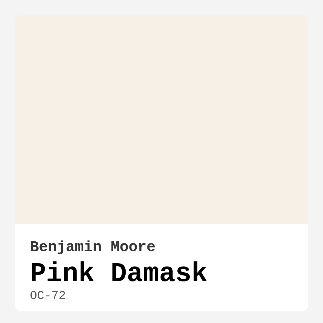
Color Preview & Key Details
| HEX Code | #F6F0E7 |
| RGB | 246, 240, 231 |
| LRV | 85.46% |
| Undertone | Red |
| Finish Options | Eggshell, Flat, Satin |
Imagine walking into a room that instantly makes you exhale—a space that feels like a warm hug, soft and inviting, with just the right touch of elegance. That’s the magic of Benjamin Moore’s Pink Damask (OC-72). It’s not just a paint color; it’s a mood. Whether you’re dreaming of a serene bedroom, a cozy living room, or a charming nursery, this delicate pink hue has the power to transform your space into something truly special.
Pink Damask is one of those rare colors that strikes the perfect balance between warmth and sophistication. With its light, creamy pink base and subtle red undertones, it brings a gentle energy to any room. The LRV (Light Reflectance Value) of 85.46% means it reflects nearly all the light that hits it, making spaces feel brighter and more open. But don’t let its lightness fool you—this color has depth. Those warm undertones give it a richness that keeps it from feeling flat or sterile.
If you’re worried about pink being too bold or girly, Pink Damask is here to change your mind. It’s soft enough to feel neutral but distinctive enough to make an impact. Think of it as a whisper of color rather than a shout. It plays beautifully with a variety of decor styles, from modern farmhouse to shabby chic, and even contemporary spaces craving a touch of warmth. Pair it with crisp white trim like Benjamin Moore’s White Dove for a classic look, or layer it with brass fixtures and natural wood tones for a more organic, lived-in feel.
Application is a breeze, even if you’re a DIY beginner. The paint goes on smoothly, whether you’re using a roller or a brush, and it’s forgiving when it comes to touch-ups. You might need two coats for full, even coverage, especially if you’re painting over a darker color, but the result is worth it. The finish options—flat, eggshell, or satin—give you flexibility depending on the room’s needs. Eggshell is a great middle ground for most spaces, offering a slight sheen that’s easy to clean without being too glossy.
Where does Pink Damask shine brightest? Bedrooms and nurseries are a natural fit—its calming vibe creates a sanctuary-like atmosphere. But don’t overlook it for living rooms or dining spaces, where its warmth can make gatherings feel more intimate. It’s also a surprisingly great choice for home offices, where a soothing backdrop can help creativity flow. Just keep in mind that while it’s durable enough for most interiors, high-traffic areas might require a more resilient finish or a different color altogether.
Lighting plays a big role in how Pink Damask shows up. In natural light, it glows with a soft, airy quality that makes rooms feel expansive. Under artificial light, it leans into its warmth, creating a cozy, enveloping effect. Always test a swatch in your space before committing—paint colors can shift dramatically depending on the time of day and your lighting choices.
If you’re playing with complementary colors, lean into blues and soft grays to balance Pink Damask’s warmth. Deeper shades like navy or charcoal can add contrast without overwhelming the room, while lighter blues keep things fresh and airy. For a monochromatic look, layer it with other soft pinks or creamy whites. And if you’re feeling bold, a touch of muted green (think sage or eucalyptus) can create a subtle, nature-inspired palette.
One of the best things about Pink Damask is its versatility. It works in small spaces, making them feel larger and more inviting, but it also holds its own in bigger rooms where you want a soft, cohesive backdrop. It’s a chameleon in the best way—elegant enough for formal spaces but warm enough for everyday living.
So, is Pink Damask the right choice for your home? If you’re after a color that’s equal parts calming and chic, with just enough personality to stand out without dominating, then yes. It’s a shade that feels timeless, like it’s always belonged in well-loved homes. Whether you’re refreshing a single wall or reimagining an entire room, Pink Damask has a way of making spaces feel intentional, inviting, and effortlessly beautiful.
At the end of the day, the best paint color is one that makes you happy every time you walk into the room. And if that’s what you’re after, Pink Damask might just be your perfect match.
Save this color to your Pinterest board to revisit when planning your room.
Real Room Photo of Pink Damask OC-72
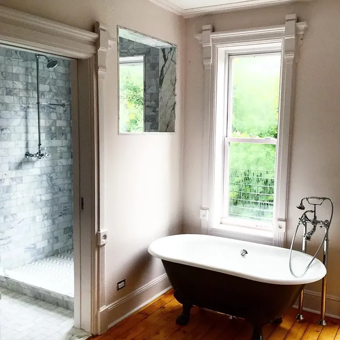
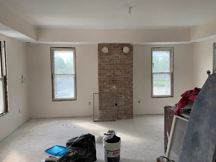
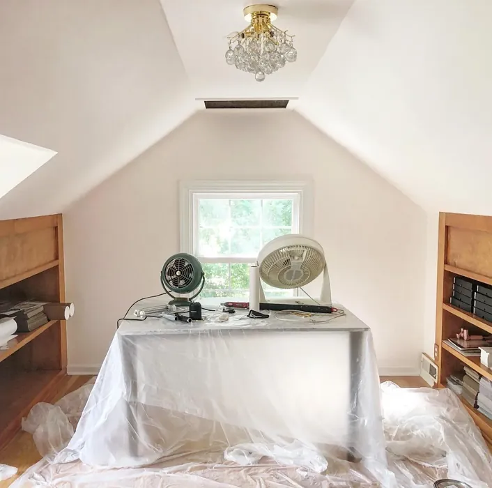
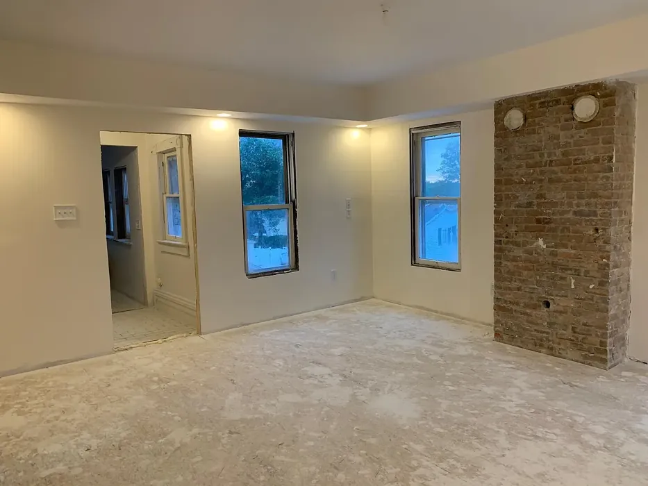
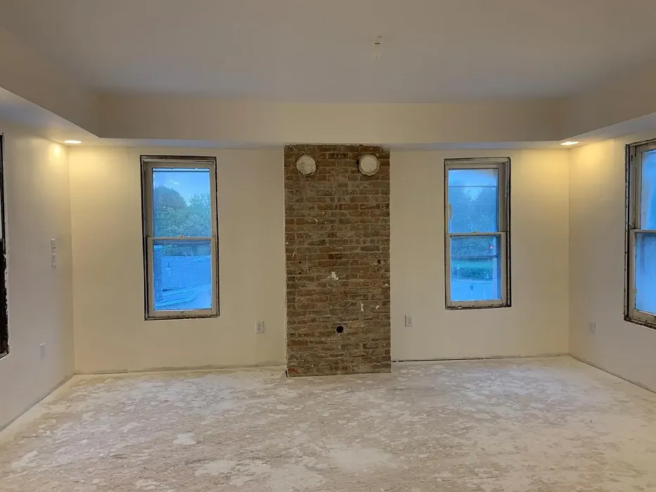
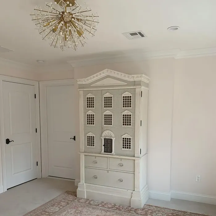
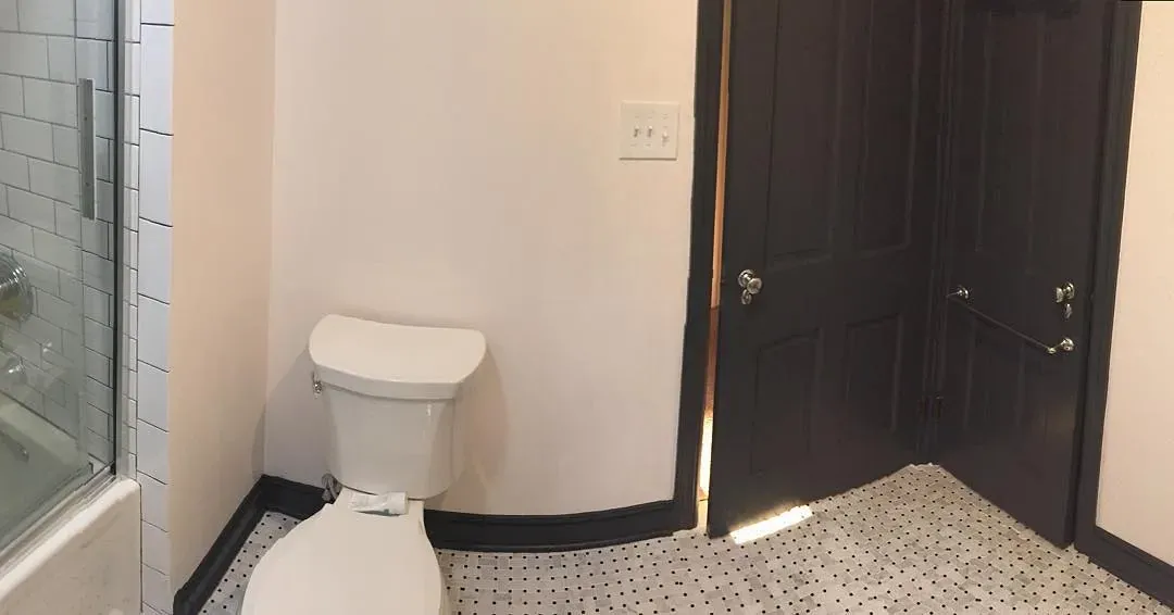
Real rooms painted with Pink Damask OC-72 by Benjamin Moore. Lighting and photography can affect how colors appear — always test a sample swatch in your own space.
Undertones of Pink Damask ?
The undertones of Pink Damask are a key aspect of its character, leaning towards Red. These subtle underlying hues are what give the color its depth and complexity. For example, a gray with a blue undertone will feel cooler and more modern, while one with a brown undertone will feel warmer and more traditional. It’s essential to test this paint in your home and observe it next to your existing furniture, flooring, and decor to see how these undertones interact and reveal themselves throughout the day.
HEX value: #F6F0E7
RGB code: 246, 240, 231
Is Pink Damask Cool or Warm?
Pink Damask is definitely a warm tone, bringing a sense of comfort and coziness to any space. Its warmth can help create a nurturing environment, especially in areas where relaxation is key.
Understanding Color Properties and Interior Design Tips
Hue refers to a specific position on the color wheel, measured in degrees from 0 to 360. Each degree represents a different pure color:
- 0° represents red
- 120° represents green
- 240° represents blue
Saturation describes the intensity or purity of a color and is expressed as a percentage:
- At 0%, the color appears completely desaturated—essentially a shade of gray
- At 100%, the color is at its most vivid and vibrant
Lightness indicates how light or dark a color is, also expressed as a percentage:
- 0% lightness results in black
- 100% lightness results in white
Using Warm Colors in Interior Design
Warm hues—such as reds, oranges, yellows, warm beiges, and greiges—are excellent choices for creating inviting and energetic spaces. These colors are particularly well-suited for:
- Kitchens, living rooms, and bathrooms, where warmth enhances comfort and sociability
- Large rooms, where warm tones can help reduce the sense of emptiness and make the space feel more intimate
For example:
- Warm beige shades provide a cozy, inviting atmosphere, ideal for living rooms, bedrooms, and hallways.
- Warm greige (a mix of beige and gray) offers the warmth of beige with the modern appeal of gray, making it a versatile backdrop for dining areas, bedrooms, and living spaces.
However, be mindful when using warm light tones in rooms with limited natural light. These shades may appear muted or even take on an unpleasant yellowish tint. To avoid a dull or flat appearance:
- Add depth by incorporating richer tones like deep greens, charcoal, or chocolate brown
- Use textured elements such as curtains, rugs, or cushions to bring dimension to the space
Pro Tip: Achieving Harmony with Warm and Cool Color Balance
To create a well-balanced and visually interesting interior, mix warm and cool tones strategically. This contrast adds depth and harmony to your design.
- If your walls feature warm hues, introduce cool-colored accents such as blue or green furniture, artwork, or accessories to create contrast.
- For a polished look, consider using a complementary color scheme, which pairs colors opposite each other on the color wheel (e.g., red with green, orange with blue).
This thoughtful mix not only enhances visual appeal but also creates a space that feels both dynamic and cohesive.
Save this color to your Pinterest board to revisit when planning your room.
Light Temperature Affects on Pink Damask
Natural Light
Natural daylight changes in color temperature as the sun moves across the sky. At sunrise and sunset, the light tends to have a warm, golden tone with a color temperature around 2000 Kelvin (K). As the day progresses and the sun rises higher, the light becomes cooler and more neutral. Around midday, especially when the sky is clear, natural light typically reaches its peak brightness and shifts to a cooler tone, ranging from 5500 to 6500 Kelvin. This midday light is close to what we perceive as pure white or daylight-balanced light.
These shifts in natural light can significantly influence how colors appear in a space, which is why designers often consider both the time of day and the orientation of windows when planning interior color schemes.
Explore how this color transforms from sunrise through sunset as natural light changes throughout the day. Use the slider to simulate morning light, midday brightness, and warm afternoon tones.
North-facing rooms stay cooler throughout the day and benefit from warmer paint tones to compensate. South-facing rooms receive more direct sunlight, making even deeper shades more workable. East-facing rooms get bright morning light that fades by afternoon, while west-facing rooms glow warmly in the evening.
Artificial Light
When choosing artificial lighting, pay close attention to the color temperature, measured in Kelvin (K). This determines how warm or cool the light will appear. Lower temperatures, around 2700K, give off a warm, yellow glow often used in living rooms or bedrooms. Higher temperatures, above 5000K, create a cool, bluish light similar to daylight, commonly used in kitchens, offices, or task areas.
Use the slider to see how lighting temperature can affect the appearance of a surface or color throughout a space.
See how this color looks under different artificial light temperatures — from warm candlelight (2000K) to cool daylight (7000K). Move the slider to simulate your room's lighting conditions.


4800K
Keep in mind that natural light from windows, the warmth of lamps, and overhead lighting all affect how this color reads on your walls at different times of day. Always observe a sample swatch in your actual space before purchasing.
LRV of Pink Damask
The Light Reflectance Value (LRV) of Pink Damask is 85.46%, which places it in the White colors category. This means it reflect all light. Understanding a paint’s LRV is crucial for predicting how it will look in your space. A higher LRV indicates a lighter color that reflects more light, making rooms feel larger and brighter. A lower LRV signifies a darker color that absorbs more light, creating a cozier, more intimate atmosphere. Always consider the natural and artificial lighting in your room when selecting a paint color based on its LRV.
Detailed Review of Pink Damask
Additional Paint Characteristics
Ideal Rooms
Bedroom, Dining Room, Home Office, Living Room, Nursery
Decor Styles
Contemporary, Modern Farmhouse, Shabby Chic, Traditional
Coverage
Good (1–2 Coats), Touch-Up Friendly
Ease of Application
Beginner Friendly, Brush Smooth, Roller-Ready
Washability
Washable, Wipeable
VOC Level
Eco-Certified, Low VOC
Best Use
Accent Wall, Bedroom, Interior Walls, Nursery
Room Suitability
Bedroom, Dining Room, Living Room, Nursery
Tone Tag
Creamy, Pastel, Warm
Finish Type
Eggshell, Satin
Paint Performance
Easy Touch-Up, Low Odor, Scuff Resistant
Use Cases
Best for Modern Farmhouse, Best for Small Spaces, Classic Favorite
Mood
Calm, Cozy, Inviting
Trim Pairing
Complements Brass Fixtures, Pairs with White Dove
Pink Damask is a color that welcomes you with open arms. Its soft pink tone is reminiscent of blooming flowers and vintage damask patterns, making it ideal for spaces meant for relaxation and comfort. When applied, it provides a warm glow that can brighten up a room without feeling overpowering. The paint goes on smoothly, whether you’re using a roller or a brush, and tends to self-level nicely, minimizing brush strokes. However, for the best results, a second coat may be beneficial to achieve that perfect finish. It’s especially lovely in bedrooms and nurseries, where a cozy vibe is desired, and it pairs beautifully with whites and soft greys for a balanced look.
Pros & Cons of OC-72 Pink Damask
Pros
Cons
Colors that go with Benjamin Moore Pink Damask
FAQ on OC-72 Pink Damask
Can Pink Damask be used in high-traffic areas?
While Pink Damask is lovely for bedrooms and living spaces, it’s best used in areas that don’t experience heavy wear and tear. For high-traffic areas, consider a more durable finish or a different color that can withstand more use. If you choose to use it in such spaces, opting for a washable finish can help maintain its beauty.
What trim color works best with Pink Damask?
Pink Damask pairs beautifully with white trims like White Dove or Simply White. These lighter shades will enhance the warmth of Pink Damask, creating a cohesive and inviting look throughout your space. For a bit of contrast, you could also consider using a soft grey trim.
Comparisons Pink Damask with other colors
Pink Damask OC-72 vs Malted Milk SW 6057
| Attribute | Pink Damask OC-72 | Malted Milk SW 6057 |
|---|---|---|
| Color Name | Pink Damask OC-72 | Malted Milk SW 6057 |
| Color | ||
| Hue | Pink | Pink |
| Brightness | Light | Light |
| RGB | 246, 240, 231 | 222, 202, 189 |
| LRV | 85.46% | 74% |
| Finish Type | Eggshell, Satin | Eggshell, Satin |
| Finish Options | Eggshell, Flat, Satin | Eggshell, Matte, Satin |
| Ideal Rooms | Bedroom, Dining Room, Home Office, Living Room, Nursery | Bedroom, Dining Room, Kitchen, Living Room, Nursery |
| Decor Styles | Contemporary, Modern Farmhouse, Shabby Chic, Traditional | Coastal, Farmhouse, Modern, Scandinavian, Transitional |
| Coverage | Good (1–2 Coats), Touch-Up Friendly | Good (1–2 Coats), Touch-Up Friendly |
| Ease of Application | Beginner Friendly, Brush Smooth, Roller-Ready | Beginner Friendly, Brush Smooth, Fast-Drying, Roller-Ready |
| Washability | Washable, Wipeable | Washable, Wipeable |
| Room Suitability | Bedroom, Dining Room, Living Room, Nursery | Bedroom, Dining Room, Kitchen, Living Room, Nursery |
| Tone | Creamy, Pastel, Warm | Creamy, Neutral, Warm |
| Paint Performance | Easy Touch-Up, Low Odor, Scuff Resistant | High Coverage, Low Odor, Quick Drying |
Lighting conditions, wall orientation, and surrounding decor can significantly affect how these colors appear in your space. Always test a sample swatch before committing to a full application.
Pink Damask OC-72 vs Intimate White SW 6322
| Attribute | Pink Damask OC-72 | Intimate White SW 6322 |
|---|---|---|
| Color Name | Pink Damask OC-72 | Intimate White SW 6322 |
| Color | ||
| Hue | Pink | Pink |
| Brightness | Light | Light |
| RGB | 246, 240, 231 | 240, 225, 216 |
| LRV | 85.46% | 75% |
| Finish Type | Eggshell, Satin | Eggshell, Matte, Satin |
| Finish Options | Eggshell, Flat, Satin | Eggshell, Matte, Satin |
| Ideal Rooms | Bedroom, Dining Room, Home Office, Living Room, Nursery | Bedroom, Hallway, Home Office, Living Room, Nursery |
| Decor Styles | Contemporary, Modern Farmhouse, Shabby Chic, Traditional | Farmhouse, Minimalist, Modern, Traditional |
| Coverage | Good (1–2 Coats), Touch-Up Friendly | Good (1–2 Coats) |
| Ease of Application | Beginner Friendly, Brush Smooth, Roller-Ready | Beginner Friendly, Brush Smooth, Roller-Ready |
| Washability | Washable, Wipeable | Highly Washable, Washable |
| Room Suitability | Bedroom, Dining Room, Living Room, Nursery | Bedroom, Hallway, Living Room, Nursery |
| Tone | Creamy, Pastel, Warm | Creamy, Muted, Warm |
| Paint Performance | Easy Touch-Up, Low Odor, Scuff Resistant | Easy Touch-Up, Fade Resistant, Low Odor |
Lighting conditions, wall orientation, and surrounding decor can significantly affect how these colors appear in your space. Always test a sample swatch before committing to a full application.
Pink Damask OC-72 vs Abalone Shell SW 6050
| Attribute | Pink Damask OC-72 | Abalone Shell SW 6050 |
|---|---|---|
| Color Name | Pink Damask OC-72 | Abalone Shell SW 6050 |
| Color | ||
| Hue | Pink | Pink |
| Brightness | Light | Light |
| RGB | 246, 240, 231 | 219, 199, 189 |
| LRV | 85.46% | 30% |
| Finish Type | Eggshell, Satin | Eggshell, Matte, Satin |
| Finish Options | Eggshell, Flat, Satin | Eggshell, Matte, Satin |
| Ideal Rooms | Bedroom, Dining Room, Home Office, Living Room, Nursery | Bedroom, Dining Room, Home Office, Living Room |
| Decor Styles | Contemporary, Modern Farmhouse, Shabby Chic, Traditional | Coastal, Farmhouse, Minimalist, Modern, Traditional |
| Coverage | Good (1–2 Coats), Touch-Up Friendly | Good (1–2 Coats), Touch-Up Friendly |
| Ease of Application | Beginner Friendly, Brush Smooth, Roller-Ready | Beginner Friendly, Brush Smooth, Fast-Drying, Roller-Ready |
| Washability | Washable, Wipeable | Washable, Wipeable |
| Room Suitability | Bedroom, Dining Room, Living Room, Nursery | Bedroom, Dining Room, Home Office, Living Room |
| Tone | Creamy, Pastel, Warm | Balanced, Muted, Warm |
| Paint Performance | Easy Touch-Up, Low Odor, Scuff Resistant | Easy Touch-Up, Fade Resistant, Low Odor, Quick Drying |
Lighting conditions, wall orientation, and surrounding decor can significantly affect how these colors appear in your space. Always test a sample swatch before committing to a full application.
Pink Damask OC-72 vs White Truffle SW 6029
| Attribute | Pink Damask OC-72 | White Truffle SW 6029 |
|---|---|---|
| Color Name | Pink Damask OC-72 | White Truffle SW 6029 |
| Color | ||
| Hue | Pink | Pink |
| Brightness | Light | Light |
| RGB | 246, 240, 231 | 215, 200, 194 |
| LRV | 85.46% | 48% |
| Finish Type | Eggshell, Satin | Eggshell, Satin |
| Finish Options | Eggshell, Flat, Satin | Eggshell, Flat, Matte, Satin |
| Ideal Rooms | Bedroom, Dining Room, Home Office, Living Room, Nursery | Bedroom, Dining Room, Hallway, Kitchen, Living Room |
| Decor Styles | Contemporary, Modern Farmhouse, Shabby Chic, Traditional | Eclectic, Farmhouse, Modern, Traditional |
| Coverage | Good (1–2 Coats), Touch-Up Friendly | Good (1–2 Coats), Touch-Up Friendly |
| Ease of Application | Beginner Friendly, Brush Smooth, Roller-Ready | Beginner Friendly, Brush Smooth, Roller-Ready |
| Washability | Washable, Wipeable | Washable, Wipeable |
| Room Suitability | Bedroom, Dining Room, Living Room, Nursery | Bedroom, Dining Room, Hallway, Living Room |
| Tone | Creamy, Pastel, Warm | Earthy, Neutral, Warm |
| Paint Performance | Easy Touch-Up, Low Odor, Scuff Resistant | Easy Touch-Up, Low Odor, Scuff Resistant |
Lighting conditions, wall orientation, and surrounding decor can significantly affect how these colors appear in your space. Always test a sample swatch before committing to a full application.
Pink Damask OC-72 vs Faint Coral SW 6329
| Attribute | Pink Damask OC-72 | Faint Coral SW 6329 |
|---|---|---|
| Color Name | Pink Damask OC-72 | Faint Coral SW 6329 |
| Color | ||
| Hue | Pink | Pink |
| Brightness | Light | Light |
| RGB | 246, 240, 231 | 238, 222, 213 |
| LRV | 85.46% | 66% |
| Finish Type | Eggshell, Satin | Eggshell, Matte, Satin |
| Finish Options | Eggshell, Flat, Satin | Eggshell, Matte, Satin |
| Ideal Rooms | Bedroom, Dining Room, Home Office, Living Room, Nursery | Bedroom, Dining Room, Hallway, Living Room, Nursery |
| Decor Styles | Contemporary, Modern Farmhouse, Shabby Chic, Traditional | Bohemian, Coastal, Modern Farmhouse, Scandinavian, Vintage |
| Coverage | Good (1–2 Coats), Touch-Up Friendly | Good (1–2 Coats), Touch-Up Friendly |
| Ease of Application | Beginner Friendly, Brush Smooth, Roller-Ready | Beginner Friendly, Brush Smooth, Fast-Drying, Roller-Ready |
| Washability | Washable, Wipeable | Washable, Wipeable |
| Room Suitability | Bedroom, Dining Room, Living Room, Nursery | Bedroom, Dining Room, Hallway, Living Room, Nursery |
| Tone | Creamy, Pastel, Warm | Airy, Muted, Pastel, Warm |
| Paint Performance | Easy Touch-Up, Low Odor, Scuff Resistant | Easy Touch-Up, Low Odor, Quick Drying |
Lighting conditions, wall orientation, and surrounding decor can significantly affect how these colors appear in your space. Always test a sample swatch before committing to a full application.
Pink Damask OC-72 vs Romance SW 6323
| Attribute | Pink Damask OC-72 | Romance SW 6323 |
|---|---|---|
| Color Name | Pink Damask OC-72 | Romance SW 6323 |
| Color | ||
| Hue | Pink | Pink |
| Brightness | Light | Light |
| RGB | 246, 240, 231 | 235, 207, 195 |
| LRV | 85.46% | 69% |
| Finish Type | Eggshell, Satin | Eggshell, Matte |
| Finish Options | Eggshell, Flat, Satin | Eggshell, Flat, Matte, Satin |
| Ideal Rooms | Bedroom, Dining Room, Home Office, Living Room, Nursery | Bedroom, Dining Room, Living Room, Nursery |
| Decor Styles | Contemporary, Modern Farmhouse, Shabby Chic, Traditional | Bohemian, Modern, Shabby Chic, Vintage |
| Coverage | Good (1–2 Coats), Touch-Up Friendly | Good (1–2 Coats), Touch-Up Friendly |
| Ease of Application | Beginner Friendly, Brush Smooth, Roller-Ready | Beginner Friendly, Brush Smooth, Fast-Drying, Roller-Ready |
| Washability | Washable, Wipeable | Washable, Wipeable |
| Room Suitability | Bedroom, Dining Room, Living Room, Nursery | Bedroom, Dining Room, Living Room, Nursery |
| Tone | Creamy, Pastel, Warm | Pastel, Soft, Warm |
| Paint Performance | Easy Touch-Up, Low Odor, Scuff Resistant | Easy Touch-Up, Low Odor, Quick Drying |
Lighting conditions, wall orientation, and surrounding decor can significantly affect how these colors appear in your space. Always test a sample swatch before committing to a full application.
Pink Damask OC-72 vs Innocence SW 6302
| Attribute | Pink Damask OC-72 | Innocence SW 6302 |
|---|---|---|
| Color Name | Pink Damask OC-72 | Innocence SW 6302 |
| Color | ||
| Hue | Pink | Pink |
| Brightness | Light | Light |
| RGB | 246, 240, 231 | 235, 209, 207 |
| LRV | 85.46% | 75% |
| Finish Type | Eggshell, Satin | Eggshell, Matte |
| Finish Options | Eggshell, Flat, Satin | Eggshell, Matte, Satin |
| Ideal Rooms | Bedroom, Dining Room, Home Office, Living Room, Nursery | Bedroom, Dining Room, Living Room, Nursery |
| Decor Styles | Contemporary, Modern Farmhouse, Shabby Chic, Traditional | Bohemian, Modern Farmhouse, Scandinavian, Shabby Chic |
| Coverage | Good (1–2 Coats), Touch-Up Friendly | Good (1–2 Coats), Touch-Up Friendly |
| Ease of Application | Beginner Friendly, Brush Smooth, Roller-Ready | Beginner Friendly, Brush Smooth, Roller-Ready |
| Washability | Washable, Wipeable | Washable, Wipeable |
| Room Suitability | Bedroom, Dining Room, Living Room, Nursery | Bedroom, Dining Room, Living Room, Nursery |
| Tone | Creamy, Pastel, Warm | Pastel, Soft, Warm |
| Paint Performance | Easy Touch-Up, Low Odor, Scuff Resistant | Easy Touch-Up, Fade Resistant, Low Odor |
Lighting conditions, wall orientation, and surrounding decor can significantly affect how these colors appear in your space. Always test a sample swatch before committing to a full application.
Pink Damask OC-72 vs Angelic SW 6602
| Attribute | Pink Damask OC-72 | Angelic SW 6602 |
|---|---|---|
| Color Name | Pink Damask OC-72 | Angelic SW 6602 |
| Color | ||
| Hue | Pink | Pink |
| Brightness | Light | Light |
| RGB | 246, 240, 231 | 242, 220, 215 |
| LRV | 85.46% | 75% |
| Finish Type | Eggshell, Satin | Eggshell, Satin |
| Finish Options | Eggshell, Flat, Satin | Eggshell, Flat, Matte, Satin |
| Ideal Rooms | Bedroom, Dining Room, Home Office, Living Room, Nursery | Bedroom, Dining Room, Home Office, Living Room, Nursery |
| Decor Styles | Contemporary, Modern Farmhouse, Shabby Chic, Traditional | Bohemian, Farmhouse, Modern, Transitional |
| Coverage | Good (1–2 Coats), Touch-Up Friendly | Good (1–2 Coats), Touch-Up Friendly |
| Ease of Application | Beginner Friendly, Brush Smooth, Roller-Ready | Beginner Friendly, Brush Smooth, Roller-Ready |
| Washability | Washable, Wipeable | Washable, Wipeable |
| Room Suitability | Bedroom, Dining Room, Living Room, Nursery | Bedroom, Home Office, Living Room, Nursery |
| Tone | Creamy, Pastel, Warm | Airy, Pastel, Warm |
| Paint Performance | Easy Touch-Up, Low Odor, Scuff Resistant | Easy Touch-Up, Fade Resistant, Low Odor |
Lighting conditions, wall orientation, and surrounding decor can significantly affect how these colors appear in your space. Always test a sample swatch before committing to a full application.
Pink Damask OC-72 vs Rosy Outlook SW 6316
| Attribute | Pink Damask OC-72 | Rosy Outlook SW 6316 |
|---|---|---|
| Color Name | Pink Damask OC-72 | Rosy Outlook SW 6316 |
| Color | ||
| Hue | Pink | Pink |
| Brightness | Light | Light |
| RGB | 246, 240, 231 | 235, 206, 203 |
| LRV | 85.46% | 45% |
| Finish Type | Eggshell, Satin | Eggshell, Matte, Satin |
| Finish Options | Eggshell, Flat, Satin | Eggshell, Matte, Satin |
| Ideal Rooms | Bedroom, Dining Room, Home Office, Living Room, Nursery | Bedroom, Home Office, Living Room, Nursery |
| Decor Styles | Contemporary, Modern Farmhouse, Shabby Chic, Traditional | Bohemian, Cottage, Modern, Traditional |
| Coverage | Good (1–2 Coats), Touch-Up Friendly | Good (1–2 Coats), Touch-Up Friendly |
| Ease of Application | Beginner Friendly, Brush Smooth, Roller-Ready | Beginner Friendly, Brush Smooth, Roller-Ready |
| Washability | Washable, Wipeable | Scuff Resistant, Washable, Wipeable |
| Room Suitability | Bedroom, Dining Room, Living Room, Nursery | Bedroom, Home Office, Living Room, Nursery |
| Tone | Creamy, Pastel, Warm | Muted, Pastel, Warm |
| Paint Performance | Easy Touch-Up, Low Odor, Scuff Resistant | High Coverage, Low Odor, Quick Drying |
Lighting conditions, wall orientation, and surrounding decor can significantly affect how these colors appear in your space. Always test a sample swatch before committing to a full application.
Pink Damask OC-72 vs Demure SW 6295
| Attribute | Pink Damask OC-72 | Demure SW 6295 |
|---|---|---|
| Color Name | Pink Damask OC-72 | Demure SW 6295 |
| Color | ||
| Hue | Pink | Pink |
| Brightness | Light | Light |
| RGB | 246, 240, 231 | 232, 212, 213 |
| LRV | 85.46% | 50% |
| Finish Type | Eggshell, Satin | Eggshell, Matte |
| Finish Options | Eggshell, Flat, Satin | Eggshell, Matte, Satin |
| Ideal Rooms | Bedroom, Dining Room, Home Office, Living Room, Nursery | Bedroom, Home Office, Living Room, Nursery |
| Decor Styles | Contemporary, Modern Farmhouse, Shabby Chic, Traditional | Minimalist, Modern, Shabby Chic, Transitional |
| Coverage | Good (1–2 Coats), Touch-Up Friendly | Good (1–2 Coats), Touch-Up Friendly |
| Ease of Application | Beginner Friendly, Brush Smooth, Roller-Ready | Beginner Friendly, Brush Smooth, Roller-Ready |
| Washability | Washable, Wipeable | Washable, Wipeable |
| Room Suitability | Bedroom, Dining Room, Living Room, Nursery | Bedroom, Home Office, Living Room, Nursery |
| Tone | Creamy, Pastel, Warm | Muted, Pastel, Warm |
| Paint Performance | Easy Touch-Up, Low Odor, Scuff Resistant | Easy Touch-Up, Low Odor, Quick Drying |
Lighting conditions, wall orientation, and surrounding decor can significantly affect how these colors appear in your space. Always test a sample swatch before committing to a full application.
Official Page of Benjamin Moore Pink Damask OC-72