Color Preview & Key Details
| HEX Code | #2A3037 |
| RGB | 42, 48, 55 |
| LRV | 30% |
| Undertone | Blue |
| Finish Options | Eggshell, Matte, Satin |
Imagine stepping into a room that feels like a warm embrace, a space where calmness and sophistication harmoniously blend. This is the magic that Sherwin Williams’ After the Storm (SW 9685) can bring to your home. This deep, moody hue captures the essence of tranquility following a rain shower, creating a serene backdrop that encourages relaxation and mindfulness. Let’s dive into why this stunning color might just be the perfect choice for your next home project.
After the Storm is a rich, charcoal gray with subtle blue undertones that adds depth and character to any space. With an LRV (Light Reflectance Value) of 30%, it reflects very little light, making it an ideal choice for creating cozy, intimate atmospheres. This deep shade is especially suited for living rooms, bedrooms, home offices, and dining rooms, offering versatility across various decor styles, including modern, industrial, contemporary, and minimalist.
When you think about painting your walls, it’s essential to consider how the color will interact with your space. In natural light, After the Storm reveals its softer side, creating an environment that feels both airy and grounded. Under artificial lighting, however, the color deepens, adding an extra layer of drama and sophistication, perfect for those cozy evenings at home. It’s like having a color that plays two roles, adapting beautifully to the light conditions of your home.
One of the most captivating aspects of After the Storm is its cool tone. Cool colors, like this one, evoke a sense of energy and vibrancy, making them excellent choices for social areas. If you dream of a living room that invites conversation and warmth, this color could be the perfect backdrop. On the other hand, its calming nature also makes it suitable for bedrooms, offering a serene escape from the day’s hustle and bustle.
Now, let’s talk about how to apply this stunning shade. The good news is that After the Storm is beginner-friendly. It offers a smooth application whether you choose to use a roller or a brush, ensuring a flawless finish every time. Most projects will require just 1 to 2 coats for optimal coverage, and with its scrubbable and washable properties, maintaining the beauty of your walls is a breeze. Plus, with its low VOC content, you can feel good about creating a healthier indoor environment.
A common concern among homeowners is whether dark colors like After the Storm can work in smaller rooms. The answer is a resounding yes! While it’s true that darker shades can sometimes make a space feel more confined, After the Storm can actually add depth and character to smaller areas. The key is to balance it with adequate lighting and lighter accents. Think about pairing it with white trim or light-colored furniture to contrast the depth of the walls, creating an inviting yet sophisticated look.
When it comes to finishes, After the Storm shines in matte and eggshell options. A matte finish delivers a soft, understated elegance, while eggshell provides a subtle sheen that enhances the color’s depth and richness. Satin can also work well if you prefer a more polished appearance. Your choice of finish should reflect the room’s purpose and desired ambiance, so consider how you want the space to feel.
Pairing After the Storm with complementary colors can elevate your decor game. Shades like SW 6038, SW 6553, or SW 7077 work beautifully alongside this hue, introducing a vibrant contrast that keeps the space dynamic. Additionally, incorporating wood elements in your design will add warmth and balance, making After the Storm feel even more inviting.
While it might be tempting to surround yourself with all dark tones, consider incorporating lighter shades to create a balanced palette. Lighter colors, such as SW 9640 or SW 2739, can serve as fantastic accents to After the Storm, allowing you to achieve a layered, sophisticated look. This approach will keep your space feeling open and airy, even with the deep hues involved.
After the Storm isn’t just a wall color; it can also make a statement in furniture. Imagine a cozy reading nook with an armchair upholstered in this rich shade, or a dining table that draws the eye with its depth. This color is a designer favorite for creating focal points that invite conversation and admiration.
In the grand scheme of home decor, the mood that a color sets can’t be overstated. After the Storm evokes feelings of calm, inviting you to unwind after a long day. Whether you’re sipping coffee in your home office or hosting friends in your living room, this shade provides a grounding atmosphere that makes any space feel more intimate.
Another aspect worth considering is how After the Storm interacts with your existing decor. The blue undertones can subtly shift how it appears in relation to other colors, especially if you have warm accents. Testing this paint in your home is crucial; observe it in different lighting throughout the day to see how it reveals itself. You might find that it beautifully complements your current palette or inspires a whole new design direction.
For those of you who appreciate easy maintenance, After the Storm scores high. Its washable and scrubbable surfaces mean that life’s little messes won’t stick around for long. It’s perfect for families or anyone who loves to entertain, giving you peace of mind while enjoying your stylish space.
As you contemplate this color for your home, remember that After the Storm is more than just paint; it’s an invitation to create a sanctuary. It’s about crafting a space that resonates with you, where every corner feels intentional and every color tells a story.
In conclusion, After the Storm is a sophisticated choice that brings depth and tranquility into your home. Its versatility and calmness make it suitable for a range of spaces and styles, allowing you to create a personalized environment that reflects your tastes. With its easy application and maintenance, this color is not just a choice; it’s a commitment to creating a beautiful, serene space that you’ll love coming home to. So go ahead, take that leap into the beautiful world of After the Storm, and transform your home into a cozy retreat.
Save this color to your Pinterest board to revisit when planning your room.
Real Room Photo of After the Storm SW 9685
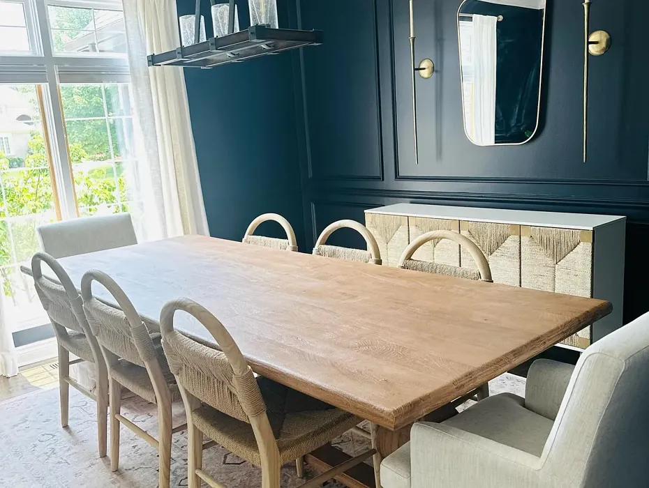
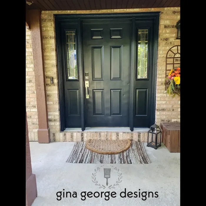
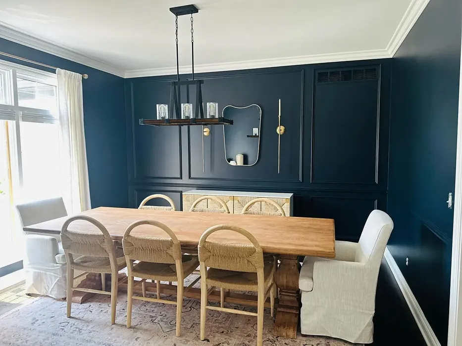
Real rooms painted with After the Storm SW 9685 by Sherwin Williams. Lighting and photography can affect how colors appear — always test a sample swatch in your own space.
Undertones of After the Storm ?
The undertones of After the Storm are a key aspect of its character, leaning towards Blue. These subtle underlying hues are what give the color its depth and complexity. For example, a gray with a blue undertone will feel cooler and more modern, while one with a brown undertone will feel warmer and more traditional. It’s essential to test this paint in your home and observe it next to your existing furniture, flooring, and decor to see how these undertones interact and reveal themselves throughout the day.
HEX value: #2A3037
RGB code: 42, 48, 55
Is After the Storm Cool or Warm?
After the Storm is considered a cool paint color. This characteristic plays a huge role in the overall feel of a room. Cool colors, like this one, tend to create a cozy, inviting, and energetic atmosphere, making them great for social spaces like living rooms and dining rooms. In contrast, warm colors often evoke a sense of calm and serenity, which is why they are popular in bedrooms and bathrooms. The coolth of After the Storm means it will pair beautifully with corresponding decor elements.
Understanding Color Properties and Interior Design Tips
Hue refers to a specific position on the color wheel, measured in degrees from 0 to 360. Each degree represents a different pure color:
- 0° represents red
- 120° represents green
- 240° represents blue
Saturation describes the intensity or purity of a color and is expressed as a percentage:
- At 0%, the color appears completely desaturated—essentially a shade of gray
- At 100%, the color is at its most vivid and vibrant
Lightness indicates how light or dark a color is, also expressed as a percentage:
- 0% lightness results in black
- 100% lightness results in white
Using Warm Colors in Interior Design
Warm hues—such as reds, oranges, yellows, warm beiges, and greiges—are excellent choices for creating inviting and energetic spaces. These colors are particularly well-suited for:
- Kitchens, living rooms, and bathrooms, where warmth enhances comfort and sociability
- Large rooms, where warm tones can help reduce the sense of emptiness and make the space feel more intimate
For example:
- Warm beige shades provide a cozy, inviting atmosphere, ideal for living rooms, bedrooms, and hallways.
- Warm greige (a mix of beige and gray) offers the warmth of beige with the modern appeal of gray, making it a versatile backdrop for dining areas, bedrooms, and living spaces.
However, be mindful when using warm light tones in rooms with limited natural light. These shades may appear muted or even take on an unpleasant yellowish tint. To avoid a dull or flat appearance:
- Add depth by incorporating richer tones like deep greens, charcoal, or chocolate brown
- Use textured elements such as curtains, rugs, or cushions to bring dimension to the space
Pro Tip: Achieving Harmony with Warm and Cool Color Balance
To create a well-balanced and visually interesting interior, mix warm and cool tones strategically. This contrast adds depth and harmony to your design.
- If your walls feature warm hues, introduce cool-colored accents such as blue or green furniture, artwork, or accessories to create contrast.
- For a polished look, consider using a complementary color scheme, which pairs colors opposite each other on the color wheel (e.g., red with green, orange with blue).
This thoughtful mix not only enhances visual appeal but also creates a space that feels both dynamic and cohesive.
Save this color to your Pinterest board to revisit when planning your room.
Light Temperature Affects on After the Storm
Natural Light
Natural daylight changes in color temperature as the sun moves across the sky. At sunrise and sunset, the light tends to have a warm, golden tone with a color temperature around 2000 Kelvin (K). As the day progresses and the sun rises higher, the light becomes cooler and more neutral. Around midday, especially when the sky is clear, natural light typically reaches its peak brightness and shifts to a cooler tone, ranging from 5500 to 6500 Kelvin. This midday light is close to what we perceive as pure white or daylight-balanced light.
These shifts in natural light can significantly influence how colors appear in a space, which is why designers often consider both the time of day and the orientation of windows when planning interior color schemes.
Explore how this color transforms from sunrise through sunset as natural light changes throughout the day. Use the slider to simulate morning light, midday brightness, and warm afternoon tones.
North-facing rooms stay cooler throughout the day and benefit from warmer paint tones to compensate. South-facing rooms receive more direct sunlight, making even deeper shades more workable. East-facing rooms get bright morning light that fades by afternoon, while west-facing rooms glow warmly in the evening.
Artificial Light
When choosing artificial lighting, pay close attention to the color temperature, measured in Kelvin (K). This determines how warm or cool the light will appear. Lower temperatures, around 2700K, give off a warm, yellow glow often used in living rooms or bedrooms. Higher temperatures, above 5000K, create a cool, bluish light similar to daylight, commonly used in kitchens, offices, or task areas.
Use the slider to see how lighting temperature can affect the appearance of a surface or color throughout a space.
See how this color looks under different artificial light temperatures — from warm candlelight (2000K) to cool daylight (7000K). Move the slider to simulate your room's lighting conditions.


4800K
Keep in mind that natural light from windows, the warmth of lamps, and overhead lighting all affect how this color reads on your walls at different times of day. Always observe a sample swatch in your actual space before purchasing.
LRV of After the Storm
The Light Reflectance Value (LRV) of After the Storm is 30%, which places it in the Medium Dark category. This means it reflects very little light. Understanding a paint’s LRV is crucial for predicting how it will look in your space. A higher LRV indicates a lighter color that reflects more light, making rooms feel larger and brighter. A lower LRV signifies a darker color that absorbs more light, creating a cozier, more intimate atmosphere. Always consider the natural and artificial lighting in your room when selecting a paint color based on its LRV.
Detailed Review of After the Storm
Additional Paint Characteristics
Ideal Rooms
Bedroom, Dining Room, Home Office, Living Room
Decor Styles
Contemporary, Industrial, Minimalist, Modern
Coverage
Good (1–2 Coats), Touch-Up Friendly
Ease of Application
Beginner Friendly, Brush Smooth, Roller-Ready
Washability
Scrubbable, Stain Resistant, Washable
VOC Level
Eco-Certified, Low VOC
Best Use
Accent Wall, Furniture, Interior Walls
Room Suitability
Bedroom, Dining Room, Home Office, Living Room
Tone Tag
Cool, Deep, Moody
Finish Type
Eggshell, Matte
Paint Performance
Easy Touch-Up, High Coverage, Low Odor
Use Cases
Best for Low Light Rooms, Best for Small Spaces, Designer Favorite
Mood
Calm, Grounding, Inviting
Trim Pairing
Good with Wood Trim, Matches Pure White, Pairs with White Dove
After the Storm is a stunning choice for those seeking a color that evokes calmness and sophistication. This shade works exceptionally well in spaces designed for relaxation, such as bedrooms and living rooms. It pairs beautifully with both natural light and artificial lighting, enhancing the ambiance of your home. The color’s versatility allows it to be used on walls, furniture, or even as an accent in a more neutral palette. The matte or eggshell finishes can add a touch of elegance, making the color suitable for a variety of decor styles, from modern to industrial. When painting with this color, expect a smooth application and a dramatic yet inviting transformation of your space. Whether you’re going for an all-over wall treatment or an accent, After the Storm will not disappoint.
Pros & Cons of SW 9685 After the Storm
Pros
Cons
Colors that go with Sherwin Williams After the Storm
FAQ on SW 9685 After the Storm
Can After the Storm work in a small room?
Absolutely! While After the Storm is a darker color, it can add depth and character to small spaces. When paired with adequate lighting and lighter accents, it can create a cozy yet sophisticated feel. Just be mindful of your lighting choices to ensure the room feels inviting rather than closed off.
What finishes are best for After the Storm?
For After the Storm, matte and eggshell finishes are popular choices. A matte finish provides a soft, understated look, while eggshell offers a slight sheen that can enhance the color’s depth. Satin is also an option if you prefer a more polished appearance. Choose based on the room’s purpose and desired ambiance.
Comparisons After the Storm with other colors
After the Storm SW 9685 vs Night Owl SW 7061
| Attribute | After the Storm SW 9685 | Night Owl SW 7061 |
|---|---|---|
| Color Name | After the Storm SW 9685 | Night Owl SW 7061 |
| Color | ||
| Hue | Grey | Grey |
| Brightness | Dark | Dark |
| RGB | 42, 48, 55 | 99, 101, 95 |
| LRV | 30% | 24% |
| Finish Type | Eggshell, Matte | Eggshell, Matte, Satin |
| Finish Options | Eggshell, Matte, Satin | Eggshell, Matte, Satin |
| Ideal Rooms | Bedroom, Dining Room, Home Office, Living Room | Bedroom, Dining Room, Hallway, Home Office, Living Room |
| Decor Styles | Contemporary, Industrial, Minimalist, Modern | Industrial, Minimalist, Modern, Rustic, Scandinavian |
| Coverage | Good (1–2 Coats), Touch-Up Friendly | Good (1–2 Coats), Touch-Up Friendly |
| Ease of Application | Beginner Friendly, Brush Smooth, Roller-Ready | Beginner Friendly, Brush Smooth, Fast-Drying, Roller-Ready |
| Washability | Scrubbable, Stain Resistant, Washable | Scrubbable, Washable |
| Room Suitability | Bedroom, Dining Room, Home Office, Living Room | Bedroom, Dining Room, Home Office, Living Room |
| Tone | Cool, Deep, Moody | Balanced, Deep, Earthy, Muted |
| Paint Performance | Easy Touch-Up, High Coverage, Low Odor | Easy Touch-Up, Fade Resistant, High Coverage, Low Odor |
Lighting conditions, wall orientation, and surrounding decor can significantly affect how these colors appear in your space. Always test a sample swatch before committing to a full application.
After the Storm SW 9685 vs Urbane Bronze SW 7048
| Attribute | After the Storm SW 9685 | Urbane Bronze SW 7048 |
|---|---|---|
| Color Name | After the Storm SW 9685 | Urbane Bronze SW 7048 |
| Color | ||
| Hue | Grey | Grey |
| Brightness | Dark | Dark |
| RGB | 42, 48, 55 | 84, 80, 74 |
| LRV | 30% | 20% |
| Finish Type | Eggshell, Matte | Eggshell, Matte, Satin |
| Finish Options | Eggshell, Matte, Satin | Eggshell, Matte, Satin |
| Ideal Rooms | Bedroom, Dining Room, Home Office, Living Room | Bedroom, Dining Room, Home Office, Living Room |
| Decor Styles | Contemporary, Industrial, Minimalist, Modern | Contemporary, Industrial, Modern, Rustic, Transitional |
| Coverage | Good (1–2 Coats), Touch-Up Friendly | Good (1–2 Coats) |
| Ease of Application | Beginner Friendly, Brush Smooth, Roller-Ready | Beginner Friendly, Brush Smooth, Roller-Ready |
| Washability | Scrubbable, Stain Resistant, Washable | Highly Washable, Washable |
| Room Suitability | Bedroom, Dining Room, Home Office, Living Room | Bedroom, Dining Room, Home Office, Living Room |
| Tone | Cool, Deep, Moody | Deep, Earthy, Warm |
| Paint Performance | Easy Touch-Up, High Coverage, Low Odor | Easy Touch-Up, Fade Resistant, High Coverage, Low Odor |
Lighting conditions, wall orientation, and surrounding decor can significantly affect how these colors appear in your space. Always test a sample swatch before committing to a full application.
After the Storm SW 9685 vs Succulent SW 9650
| Attribute | After the Storm SW 9685 | Succulent SW 9650 |
|---|---|---|
| Color Name | After the Storm SW 9685 | Succulent SW 9650 |
| Color | ||
| Hue | Grey | Grey |
| Brightness | Dark | Dark |
| RGB | 42, 48, 55 | 97, 108, 100 |
| LRV | 30% | 30% |
| Finish Type | Eggshell, Matte | Eggshell, Matte, Satin |
| Finish Options | Eggshell, Matte, Satin | Eggshell, Matte, Satin |
| Ideal Rooms | Bedroom, Dining Room, Home Office, Living Room | Bathroom, Bedroom, Dining Room, Entryway, Kitchen, Living Room |
| Decor Styles | Contemporary, Industrial, Minimalist, Modern | Bohemian, Contemporary, Eclectic, Minimalist, Modern Farmhouse |
| Coverage | Good (1–2 Coats), Touch-Up Friendly | Good (1–2 Coats), Touch-Up Friendly |
| Ease of Application | Beginner Friendly, Brush Smooth, Roller-Ready | Beginner Friendly, Brush Smooth, Roller-Ready |
| Washability | Scrubbable, Stain Resistant, Washable | Highly Washable, Washable |
| Room Suitability | Bedroom, Dining Room, Home Office, Living Room | Bathroom, Bedroom, Dining Room, Kitchen, Living Room |
| Tone | Cool, Deep, Moody | Cool, Earthy, Muted |
| Paint Performance | Easy Touch-Up, High Coverage, Low Odor | Easy Touch-Up, Low Odor, Quick Drying, Scuff Resistant |
Lighting conditions, wall orientation, and surrounding decor can significantly affect how these colors appear in your space. Always test a sample swatch before committing to a full application.
After the Storm SW 9685 vs Grizzle Gray SW 7068
| Attribute | After the Storm SW 9685 | Grizzle Gray SW 7068 |
|---|---|---|
| Color Name | After the Storm SW 9685 | Grizzle Gray SW 7068 |
| Color | ||
| Hue | Grey | Grey |
| Brightness | Dark | Dark |
| RGB | 42, 48, 55 | 99, 101, 98 |
| LRV | 30% | 24% |
| Finish Type | Eggshell, Matte | Eggshell, Satin |
| Finish Options | Eggshell, Matte, Satin | Eggshell, Matte, Satin |
| Ideal Rooms | Bedroom, Dining Room, Home Office, Living Room | Bedroom, Dining Room, Home Office, Living Room |
| Decor Styles | Contemporary, Industrial, Minimalist, Modern | Industrial, Modern, Rustic, Scandinavian |
| Coverage | Good (1–2 Coats), Touch-Up Friendly | Good (1–2 Coats), Touch-Up Friendly |
| Ease of Application | Beginner Friendly, Brush Smooth, Roller-Ready | Beginner Friendly, Brush Smooth, Roller-Ready |
| Washability | Scrubbable, Stain Resistant, Washable | Washable, Wipeable |
| Room Suitability | Bedroom, Dining Room, Home Office, Living Room | Bedroom, Dining Room, Home Office, Living Room |
| Tone | Cool, Deep, Moody | Balanced, Cool, Muted |
| Paint Performance | Easy Touch-Up, High Coverage, Low Odor | Easy Touch-Up, High Coverage, Low Odor |
Lighting conditions, wall orientation, and surrounding decor can significantly affect how these colors appear in your space. Always test a sample swatch before committing to a full application.
After the Storm SW 9685 vs Iron Ore SW 7069
| Attribute | After the Storm SW 9685 | Iron Ore SW 7069 |
|---|---|---|
| Color Name | After the Storm SW 9685 | Iron Ore SW 7069 |
| Color | ||
| Hue | Grey | Grey |
| Brightness | Dark | Dark |
| RGB | 42, 48, 55 | 67, 67, 65 |
| LRV | 30% | 6% |
| Finish Type | Eggshell, Matte | Eggshell, Matte, Satin |
| Finish Options | Eggshell, Matte, Satin | Eggshell, Matte, Satin |
| Ideal Rooms | Bedroom, Dining Room, Home Office, Living Room | Bedroom, Dining Room, Entryway, Home Office, Living Room |
| Decor Styles | Contemporary, Industrial, Minimalist, Modern | Contemporary, Industrial, Minimalist, Modern, Rustic |
| Coverage | Good (1–2 Coats), Touch-Up Friendly | Good (1–2 Coats), High Hide |
| Ease of Application | Beginner Friendly, Brush Smooth, Roller-Ready | Brush Smooth, Fast-Drying, Roller-Ready |
| Washability | Scrubbable, Stain Resistant, Washable | Highly Washable, Washable |
| Room Suitability | Bedroom, Dining Room, Home Office, Living Room | Bedroom, Dining Room, Entryway, Home Office, Living Room |
| Tone | Cool, Deep, Moody | Balanced, Deep, Muted, Warm |
| Paint Performance | Easy Touch-Up, High Coverage, Low Odor | Easy Touch-Up, High Coverage, Low Odor |
Lighting conditions, wall orientation, and surrounding decor can significantly affect how these colors appear in your space. Always test a sample swatch before committing to a full application.
After the Storm SW 9685 vs Peppercorn SW 7674
| Attribute | After the Storm SW 9685 | Peppercorn SW 7674 |
|---|---|---|
| Color Name | After the Storm SW 9685 | Peppercorn SW 7674 |
| Color | ||
| Hue | Grey | Grey |
| Brightness | Dark | Dark |
| RGB | 42, 48, 55 | 88, 88, 88 |
| LRV | 30% | 10% |
| Finish Type | Eggshell, Matte | Eggshell, Matte, Satin |
| Finish Options | Eggshell, Matte, Satin | Eggshell, Matte, Satin |
| Ideal Rooms | Bedroom, Dining Room, Home Office, Living Room | Bedroom, Dining Room, Home Office, Living Room |
| Decor Styles | Contemporary, Industrial, Minimalist, Modern | Contemporary, Industrial, Minimalist, Modern |
| Coverage | Good (1–2 Coats), Touch-Up Friendly | Good (1–2 Coats), Touch-Up Friendly |
| Ease of Application | Beginner Friendly, Brush Smooth, Roller-Ready | Beginner Friendly, Brush Smooth, Roller-Ready |
| Washability | Scrubbable, Stain Resistant, Washable | Highly Washable, Washable |
| Room Suitability | Bedroom, Dining Room, Home Office, Living Room | Bedroom, Dining Room, Home Office, Living Room |
| Tone | Cool, Deep, Moody | Balanced, Deep, Moody, Neutral |
| Paint Performance | Easy Touch-Up, High Coverage, Low Odor | Easy Touch-Up, Low Odor, Quick Drying, Scuff Resistant |
Lighting conditions, wall orientation, and surrounding decor can significantly affect how these colors appear in your space. Always test a sample swatch before committing to a full application.
After the Storm SW 9685 vs Slate Tile SW 7624
| Attribute | After the Storm SW 9685 | Slate Tile SW 7624 |
|---|---|---|
| Color Name | After the Storm SW 9685 | Slate Tile SW 7624 |
| Color | ||
| Hue | Grey | Grey |
| Brightness | Dark | Dark |
| RGB | 42, 48, 55 | 96, 110, 116 |
| LRV | 30% | 15% |
| Finish Type | Eggshell, Matte | Eggshell, Matte, Satin |
| Finish Options | Eggshell, Matte, Satin | Eggshell, Matte, Satin |
| Ideal Rooms | Bedroom, Dining Room, Home Office, Living Room | Bathroom, Bedroom, Home Office, Kitchen, Living Room |
| Decor Styles | Contemporary, Industrial, Minimalist, Modern | Industrial, Minimalist, Modern, Rustic |
| Coverage | Good (1–2 Coats), Touch-Up Friendly | Good (1–2 Coats) |
| Ease of Application | Beginner Friendly, Brush Smooth, Roller-Ready | Beginner Friendly, Brush Smooth, Fast-Drying, Roller-Ready |
| Washability | Scrubbable, Stain Resistant, Washable | Scrubbable, Washable |
| Room Suitability | Bedroom, Dining Room, Home Office, Living Room | Bathroom, Bedroom, Kitchen, Living Room |
| Tone | Cool, Deep, Moody | Balanced, Cool, Muted |
| Paint Performance | Easy Touch-Up, High Coverage, Low Odor | Easy Touch-Up, High Coverage, Low Odor, Quick Drying |
Lighting conditions, wall orientation, and surrounding decor can significantly affect how these colors appear in your space. Always test a sample swatch before committing to a full application.
After the Storm SW 9685 vs Blustery Sky SW 9140
| Attribute | After the Storm SW 9685 | Blustery Sky SW 9140 |
|---|---|---|
| Color Name | After the Storm SW 9685 | Blustery Sky SW 9140 |
| Color | ||
| Hue | Grey | Grey |
| Brightness | Dark | Dark |
| RGB | 42, 48, 55 | 111, 132, 140 |
| LRV | 30% | 48% |
| Finish Type | Eggshell, Matte | Eggshell, Matte |
| Finish Options | Eggshell, Matte, Satin | Eggshell, Matte, Satin |
| Ideal Rooms | Bedroom, Dining Room, Home Office, Living Room | Bedroom, Dining Room, Home Office, Living Room, Nursery |
| Decor Styles | Contemporary, Industrial, Minimalist, Modern | Coastal, Modern Farmhouse, Scandinavian, Transitional |
| Coverage | Good (1–2 Coats), Touch-Up Friendly | Good (1–2 Coats), Touch-Up Friendly |
| Ease of Application | Beginner Friendly, Brush Smooth, Roller-Ready | Beginner Friendly, Fast-Drying, Low Splatter, Roller-Ready |
| Washability | Scrubbable, Stain Resistant, Washable | Washable, Wipeable |
| Room Suitability | Bedroom, Dining Room, Home Office, Living Room | Bedroom, Home Office, Living Room, Nursery |
| Tone | Cool, Deep, Moody | Balanced, Cool, Muted |
| Paint Performance | Easy Touch-Up, High Coverage, Low Odor | Easy Touch-Up, Fade Resistant, Low Odor, Quick Drying |
Lighting conditions, wall orientation, and surrounding decor can significantly affect how these colors appear in your space. Always test a sample swatch before committing to a full application.
After the Storm SW 9685 vs Gauntlet Gray SW 7019
| Attribute | After the Storm SW 9685 | Gauntlet Gray SW 7019 |
|---|---|---|
| Color Name | After the Storm SW 9685 | Gauntlet Gray SW 7019 |
| Color | ||
| Hue | Grey | Grey |
| Brightness | Dark | Dark |
| RGB | 42, 48, 55 | 120, 115, 110 |
| LRV | 30% | 24% |
| Finish Type | Eggshell, Matte | Eggshell, Matte, Satin |
| Finish Options | Eggshell, Matte, Satin | Eggshell, Matte, Satin |
| Ideal Rooms | Bedroom, Dining Room, Home Office, Living Room | Bedroom, Dining Room, Hallway, Home Office, Living Room |
| Decor Styles | Contemporary, Industrial, Minimalist, Modern | Industrial, Modern, Rustic, Transitional |
| Coverage | Good (1–2 Coats), Touch-Up Friendly | Good (1–2 Coats), Touch-Up Friendly |
| Ease of Application | Beginner Friendly, Brush Smooth, Roller-Ready | Beginner Friendly, Brush Smooth, Roller-Ready |
| Washability | Scrubbable, Stain Resistant, Washable | Scrubbable, Washable |
| Room Suitability | Bedroom, Dining Room, Home Office, Living Room | Bedroom, Dining Room, Home Office, Living Room |
| Tone | Cool, Deep, Moody | Dusty, Earthy, Muted, Warm |
| Paint Performance | Easy Touch-Up, High Coverage, Low Odor | Easy Touch-Up, High Coverage, Low Odor |
Lighting conditions, wall orientation, and surrounding decor can significantly affect how these colors appear in your space. Always test a sample swatch before committing to a full application.
After the Storm SW 9685 vs Cast Iron SW 6202
| Attribute | After the Storm SW 9685 | Cast Iron SW 6202 |
|---|---|---|
| Color Name | After the Storm SW 9685 | Cast Iron SW 6202 |
| Color | ||
| Hue | Grey | Grey |
| Brightness | Dark | Dark |
| RGB | 42, 48, 55 | 100, 100, 90 |
| LRV | 30% | 6% |
| Finish Type | Eggshell, Matte | Eggshell, Matte, Satin |
| Finish Options | Eggshell, Matte, Satin | Eggshell, Matte, Satin |
| Ideal Rooms | Bedroom, Dining Room, Home Office, Living Room | Bedroom, Dining Room, Hallway, Home Office, Kitchen, Living Room |
| Decor Styles | Contemporary, Industrial, Minimalist, Modern | Contemporary, Farmhouse, Industrial, Minimalist, Modern |
| Coverage | Good (1–2 Coats), Touch-Up Friendly | Good (1–2 Coats), High Hide, Touch-Up Friendly |
| Ease of Application | Beginner Friendly, Brush Smooth, Roller-Ready | Beginner Friendly, Brush Smooth, Fast-Drying, Roller-Ready |
| Washability | Scrubbable, Stain Resistant, Washable | Highly Washable, Washable, Wipeable |
| Room Suitability | Bedroom, Dining Room, Home Office, Living Room | Bedroom, Dining Room, Home Office, Kitchen, Living Room |
| Tone | Cool, Deep, Moody | Balanced, Deep, Dusty, Earthy, Warm |
| Paint Performance | Easy Touch-Up, High Coverage, Low Odor | Easy Touch-Up, High Coverage, Low Odor, Stain Resistant |
Lighting conditions, wall orientation, and surrounding decor can significantly affect how these colors appear in your space. Always test a sample swatch before committing to a full application.
Official Page of Sherwin Williams After the Storm SW 9685