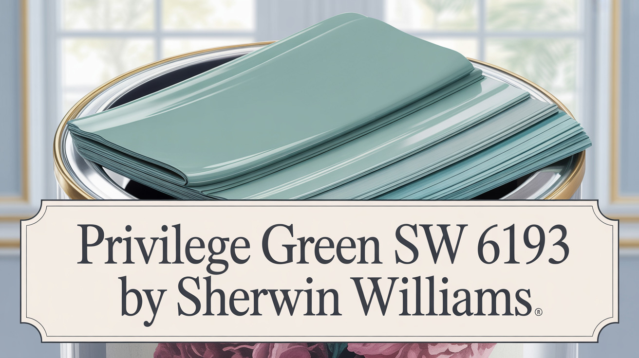
A Fresh Hue for Soothing Spaces
Imagine stepping into a room and immediately feeling calm and balanced. That’s the kind of atmosphere Healing Aloe by Benjamin Moore brings. It’s a lovely combination of soft green and gray that truly creates a soothing environment wherever you use it.
This color is more than just paint; it’s a way to elevate your space. Whether you’re sprucing up a bedroom, kitchen, or even a home office, this shade offers a fresh, airy feel that won’t overpower you. It works beautifully with everything from modern decor to traditional styles and looks great with lots of other colors.
Think about how nature makes you feel. Healing Aloe has those kind of serene, earthy vibes. It’s like bringing a bit of nature’s tranquility indoors, which can be incredibly comforting after a long day. You’ll love the subtle sophistication it adds, helping you create spaces that are both refreshing and incredibly inviting—making your home a true haven of peace.
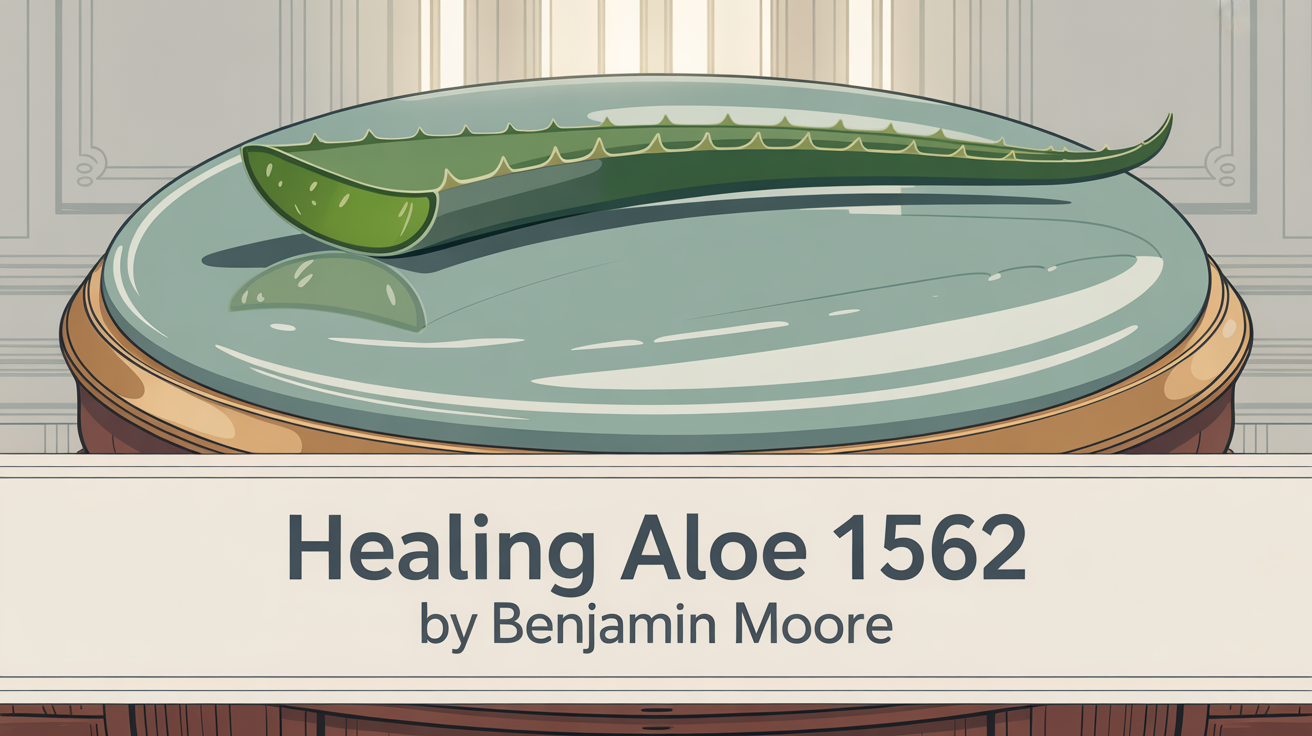
What Color Is Healing Aloe 1562 by Benjamin Moore?
Simply put, Healing Aloe 1562 is a soothing, soft shade of green with a hint of gray. It’s designed to bring a sense of calm to any space. This subtle color creates a peaceful backdrop, making it incredibly adaptable for all sorts of interior styles.
In a modern minimalist setting, it offers a gentle contrast to white and gray, adding interest without being too much. For a coastal or cottage feel, it enhances that airy, relaxed vibe, pairing perfectly with whites, light woods, and natural textures. It even works in transitional and mid-century modern homes, complementing furniture and materials like linen and sisal beautifully. You can also pair it with warm metals like brass or gold for a lovely contrast.
Is Healing Aloe 1562 by Benjamin Moore Warm or Cool?
Healing Aloe 1562 is a soft, light green that includes subtle hints of blue and gray. This combination lends it a distinctly cool undertone.
These cool undertones allow it to blend effortlessly with a wide spectrum of colors. It’s fantastic with neutrals like white, beige, or gray, and it can also complement darker shades for a stylish contrast. Its versatility makes it perfect for both traditional and contemporary decorating styles. This color also helps make smaller rooms feel larger and more open because of its lightness, helping you create a peaceful and refreshing atmosphere.
What is the Masstone of Healing Aloe 1562 by Benjamin Moore?
The primary visual characteristic, or masstone, of Healing Aloe 1562 is often described as a lovely shade of light gray. In fact, it’s often associated with the color #D5D5D5.
This calming, light gray quality helps create a gentle and inviting feel in your home. Its soft, neutral nature means it’s incredibly versatile for different areas like living rooms, bedrooms, or kitchens. This light gray provides a clean, modern, and elegant look. It works well with both cool and warm color schemes, giving you freedom to mix and match your decor. Pairing it with whites and other neutrals makes a room feel brighter and more open, while adding pops of color with accessories or furniture can make the space more lively. Because it reflects light so well, this soothing hue also helps rooms appear larger and more spacious. It’s a beautiful backdrop that really encourages relaxation and comfort.
Coordinating Colors for Healing Aloe 1562 by Benjamin Moore
Choosing colors that coordinate with your main wall color is key to creating a harmonious and pleasing space. They work to enhance the primary color, balancing or contrasting in a way that feels natural and appealing. When you’re working with Healing Aloe, coordinating colors really help bring out its soft, serene qualities.
Here are some colors that pair beautifully:
- AF-15 Steam: A gentle, warm white that adds softness and warmth without overpowering Healing Aloe.
- AF-715 Dolphin: A calm, sophisticated gray with soft undertones that subtly complements Healing Aloe’s cool vibe, adding depth and balance.
- 995 Mocha Cream: A warm, beige tone that introduces coziness and depth, making a room feel inviting and grounded.
- OC-68 Distant Gray: Provides a crisp, clean look and a sharp contrast that highlights Healing Aloe’s soothing tones while keeping the space airy.
Using these colors together helps create beautifully styled environments where the peaceful nature of Healing Aloe is enhanced by the interplay of complementary shades, making your space feel cohesive and unified.
How Does Lighting Affect Healing Aloe 1562 by Benjamin Moore?
Lighting makes a huge difference in how we see color in a room. Both natural and artificial light can significantly change how a color like Healing Aloe appears on your walls. Since it’s a soft, muted green with gray undertones, it’s quite sensitive to these light changes.
- Natural Light: How Healing Aloe looks in natural light really depends on which direction your windows face.
- In north-facing rooms, the light is cooler and pretty consistent, often bringing out more of the gray tones for a softer, more subdued look.
- South-facing rooms get warmer, brighter light, especially midday. This warmer light enhances the green tones, making Healing Aloe seem more vibrant, richer, and warmer, giving the room a fresh feel.
- East-facing rooms have bright, warm light in the morning, which can make the color appear brighter, then cool down in the afternoon, allowing the gray undertones to show more.
- West-facing rooms get warm, golden light late in the day. This can make Healing Aloe appear warmer and emphasize the green, while midday cooler light brings out a softer look.
- Artificial Light: The type of light bulbs you use also changes things. Incandescent bulbs give off a warm light that tends to boost the green tones. Fluorescent or LED bulbs, which are often cooler, might highlight the gray undertones instead.
So, remember that the lighting choices in your room will significantly impact how you perceive Healing Aloe.
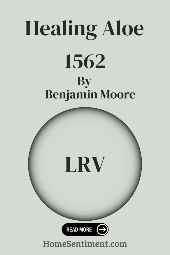
What is the LRV of Healing Aloe 1562 by Benjamin Moore?
Light Reflectance Value, or LRV, is a number that shows how much light a color reflects versus absorbs. The scale runs from 0 (pure black, absorbs all light) to 100 (pure white, reflects nearly all light). This helps you understand how bright a color is and how it will affect the brightness of a room. Colors with a higher LRV reflect more light, making spaces feel brighter and more open. Lower LRV colors absorb more light, which can make rooms feel cozier or smaller.
Healing Aloe by Benjamin Moore has an LRV of 68.25. This number indicates that it reflects a significant amount of light. When you use this color on your walls, it will help make the space feel brighter and more expansive by effectively bouncing light around. It’s a great choice for smaller rooms that could use a little brightening. With its moderate-to-high LRV, Healing Aloe is excellent for creating a calming and airy feel, perfect for areas where you want a relaxed atmosphere. This value means it performs well in different lighting conditions, keeping its gentle, soothing character.
What are the Trim Colors for Healing Aloe 1562 by Benjamin Moore?
Trim colors are important for framing your room and enhancing the overall paint scheme. These are typically used on moldings, baseboards, and other architectural details. When you choose a main wall color like Healing Aloe, which is a soft green-blue with a hint of gray, picking the right trim color can really highlight its soothing quality.
Here are two excellent white options that complement Healing Aloe:
- White Dove (OC-17): This is a warm, soft white with a subtle hint of cream. It adds a cozy feeling and provides a gentle contrast to Healing Aloe, making the green feel more inviting without taking over.
- Decorator’s White (OC-149): This choice is cooler and crisper. It gives a clean, modern edge and works well if you want to emphasize Healing Aloe’s fresh, airy feel.
Using whites like these for your trim adds depth and visual interest by creating crisp lines and borders. They also help make the space appear brighter and larger. These trim colors not only frame your room beautifully but also let the main wall color shine, bringing harmony and balance to your design.
Colors Similar to Healing Aloe 1562 by Benjamin Moore
When you’re decorating, using similar colors can create a wonderful sense of harmony and balance. Placing colors close to Healing Aloe in hue can enhance the calming feeling you’re aiming for.
Here are a few similar shades:
- Gray Cashmere (2138-60): This is a gentle blend of soft green and gray, offering a calming presence that’s easy on the eyes.
- Ice Cap (1576): This adds a touch of lightness, feeling like a cool, fresh breeze that makes everything feel crisp and airy.
- Silver Crest (1583): This color has a slight sheen that reflects more light, adding a subtle glow without being dominant. It’s got a gentle touch that reminds you of the quiet elegance of a dewy morning garden.
- Pearl Gray (863): Offering a more subdued tone, this grounds the palette with its sophisticated quietness.
This collection of similar shades helps create a peaceful and inviting environment where each color enhances the others. They establish a seamless flow, encouraging relaxation and visual comfort, making them ideal for spaces where comfort and ease are desired.
Colors that Go With Healing Aloe 1562 by Benjamin Moore
Choosing colors that complement Healing Aloe 1562 is essential for creating a cohesive and harmonious environment. Healing Aloe is a versatile color because it’s a soothing, soft green with hints of gray.
Pairing it with certain colors can enhance the ambiance:
- Quarry Rock (1568): A deep, grounding charcoal gray that adds depth and contrast, balancing the lighter tones of Healing Aloe.
- Night Train (1567): A muted blue-gray that offers a calming effect, working well with Healing Aloe’s refreshing vibe while keeping things serene.
- Quiet Moments (1563): A gentle mix of blue, gray, and green that complements Healing Aloe perfectly by mirroring its peaceful nature.
- Beach Glass (1564): This introduces a slightly deeper, more complex color inspired by natural seascapes, matching Healing Aloe’s natural feel with a bit more intensity.
- Mount Saint Anne (1565): Features subtle blue undertones, bringing a classic feel that can ground a room while adding a touch of color.
- Stonybrook (1566): A warm gray tone that pairs nicely to create a cozy, inviting space.
Each of these colors brings a distinct look that works in harmony with Healing Aloe, boosting the overall comfort and aesthetic appeal of any room.
How to Use Healing Aloe 1562 by Benjamin Moore In Your Home
Healing Aloe 1562 is a truly soothing paint color, resembling a soft green-grey with just a hint of blue. It’s perfect for bringing a calming vibe to any room in your home.
- In your living room, use it to create a comfortable and peaceful space where everyone can relax.
- For the bedroom, Healing Aloe provides a gentle backdrop that encourages restful sleep without feeling overwhelming.
- Consider it for your bathroom to help achieve that spa-like ambiance, setting a calm tone for your day.
This color is incredibly versatile with different decor styles. You can pair it with crisp white trim for a timeless, classic look, or combine it with natural wood tones to get a warm, inviting feel. It also balances well with brighter accent colors, acting as a neutral base that allows other elements to pop without being too much.
Healing Aloe 1562 vs. Ice Cap 1576 by Benjamin Moore
Comparing Healing Aloe and Ice Cap helps highlight their unique qualities. Healing Aloe 1562 is a soft, soothing shade with a hint of green, evoking the calming feeling of aloe vera. It feels light and airy, perfect for a serene environment that breathes freshness and connects to nature and relaxation. It feels slightly warmer and more nature-inspired.
Ice Cap 1576, on the other hand, has a cooler feel. It leans more towards a pale blue with a gray undertone, creating a crisp and breezy atmosphere. While both colors bring a sense of calmness, Ice Cap feels a bit more modern and crisp compared to the gentle, earthy notes in Healing Aloe. When deciding between them, think about the specific mood you want to create. Healing Aloe is softer and more connected to nature, while Ice Cap offers a cooler, more contemporary touch.
Healing Aloe 1562 vs. Pearl Gray 863 by Benjamin Moore
Let’s look at Healing Aloe next to Pearl Gray. Healing Aloe 1562 is that soft, muted green with subtle blue hints we’ve discussed, bringing a soothing and refreshing feel often associated with calm and relaxation, making it ideal for bedrooms and bathrooms. It carries a hint of nature, like morning dew, providing a serene backdrop. It brings a slight touch of color and nature indoors.
Pearl Gray 863, by contrast, is a light, neutral gray with a touch of warmth. It offers an elegant and adaptable look that easily blends with various decor styles. It provides a clean, sophisticated feel and works well in living rooms or kitchens, maintaining a modern and airy ambiance. Pearl Gray offers a more traditional, understated look that serves as a versatile backdrop for many different color accents and furnishings.
Healing Aloe 1562 vs. Gray Cashmere 2138-60 by Benjamin Moore
Comparing Healing Aloe to Gray Cashmere highlights their subtle differences. Healing Aloe 1562 is the soft, soothing green with blue and gray undertones we know, offering a versatile, calming touch for spaces like bathrooms or bedrooms where peace is desired. Its gentle hue works well with neutrals and other muted tones for a serene look. It leans more towards being a soft green.
Gray Cashmere 2138-60, however, leans more distinctly towards gray, with just a slight hint of green and blue. It brings a bit more depth while still being gentle. It’s a great choice if you want sophistication but prefer to stay closer to a neutral palette. While both are soft and sophisticated, Healing Aloe is primarily a soft green, whereas Gray Cashmere is closer to a muted gray with green undertones and appears slightly richer.
Healing Aloe 1562 vs. Silver Crest 1583 by Benjamin Moore
Let’s compare Healing Aloe with Silver Crest. Healing Aloe 1562 is that soft, muted green with subtle blue undertones that gives it a soothing, gentle appearance. It creates a peaceful atmosphere and works well for calming spaces like bedrooms or bathrooms. Its light, airy feel complements natural light, helping rooms feel more spacious. Healing Aloe tends toward a more relaxed and serene vibe, creating a fresh, restful environment.
Silver Crest 1583 is a soft gray with a hint of green, offering a cool, sophisticated look. It feels more neutral compared to Healing Aloe, making it adaptable for various settings. Silver Crest can anchor a room with its subtle elegance, serving as an ideal backdrop for both modern and classic decor. While Healing Aloe brings a more relaxed feel, Silver Crest provides a slightly more polished and refined ambiance. Both colors are great for creating inviting spaces, but they cater to slightly different moods and styles.
Conclusion
This shade offers a gentle mix of soft green and gray, creating a truly calming and comfortable atmosphere. It evokes feelings of peaceful moments, like being in a quiet garden or experiencing a gentle morning breeze.
I really appreciate how versatile Healing Aloe is, fitting beautifully into all sorts of settings—from a modern living room to a serene bedroom or a welcoming hallway. This adaptability makes it a smart choice for many areas in your home. It introduces a sense of balance and fresh energy without overwhelming your senses.
Choosing Healing Aloe can also enhance other design elements, allowing natural materials like wood and stone to really stand out. It pairs effortlessly with neutrals and can even work with bolder colors if you want to add a pop. Overall, Healing Aloe 1562 just feels comfortable and adds an understated elegance to any space. It’s more than just paint; it’s a way to create a calming environment that feels truly welcoming and harmonious. Using it feels like bringing a touch of nature’s tranquility into your home, making it a wonderful choice for anyone looking to refresh their space.