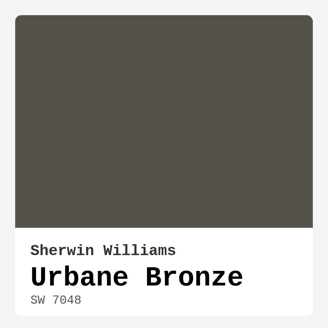
Color Preview & Key Details
| HEX Code | #54504A |
| RGB | 84, 80, 74 |
| LRV | 20% |
| Undertone | Red |
| Finish Options | Eggshell, Matte, Satin |
Picture this: you walk into a room and immediately feel a wave of warmth and comfort wrapping around you. You take a moment to soak in the atmosphere, and it strikes you just how the color of the walls seems to envelop you in a gentle embrace. That’s the magic of Urbane Bronze, a paint color from Sherwin Williams that can transform any space into a haven of sophistication and tranquility.
Urbane Bronze, with its sleek grayish-brown hue, offers a perfect blend of elegance and coziness that many homeowners crave. It’s not just a color; it’s an experience. As an expert in home design, I’ve seen how the right paint choice can elevate a space, and Urbane Bronze does just that. This rich color, designated as SW 7048, has a Light Reflectance Value (LRV) of 20%, meaning it absorbs most of the light around it and creates an inviting atmosphere that feels both intimate and grounded.
When you think about color in your home, it’s essential to consider how it interacts with your existing decor, the natural light in your space, and the mood you wish to create. Urbane Bronze is warm and inviting, and its subtle red undertone gives it a depth that many other grays lack. This characteristic allows it to complement various design styles, from modern to rustic, industrial to contemporary.
Imagine painting your living room with Urbane Bronze. It can serve as a striking backdrop for your furniture, particularly if you opt for lighter pieces. Think soft whites or muted creams that stand out beautifully against the darker walls. The contrast can create a stunning visual impact, making your space feel fresh and stylish. Additionally, its versatility means it can play nicely with both traditional wood accents and sleek, modern lines.
One of the best aspects of Urbane Bronze is its adaptability to different lighting conditions. In bright spaces, it may appear slightly muted, while in dimly lit areas, it reveals its rich depth and warmth. This unique quality can make your rooms feel more dynamic and alive as the light shifts throughout the day.
It’s worth noting that while Urbane Bronze is stunning, it does have its nuances. Given its darker hue, it may not be the best choice for small, cramped spaces unless you’re aiming for a cozy, intimate feel. Lighter colors typically make rooms feel larger, but if you balance Urbane Bronze with lighter decor and furnishings, you can achieve a well-rounded aesthetic that doesn’t feel claustrophobic. Complementing it with whites and soft earth tones can create a serene and harmonious environment.
In terms of finishes, Urbane Bronze is available in matte, satin, and eggshell options, allowing you to choose the right texture for your space. A matte finish can add an understated elegance, while satin or eggshell can bring a subtle sheen that enhances its depth without overwhelming the eye.
Now, let’s talk about practical considerations. Urbane Bronze is beginner-friendly when it comes to application. It’s smooth and easy to work with, offering good coverage in just one to two coats. This means you can tackle a project without feeling overwhelmed. Plus, its washability makes it perfect for high-traffic areas, ensuring your walls stay looking fresh and clean.
If you’re contemplating using Urbane Bronze in your bedroom, dining room, or home office, you’re making a wise choice. These spaces thrive on warmth and comfort, and the color can help foster a cozy and inviting atmosphere. Pair it with brass fixtures or wood accents, and you’ll find that the warmth of Urbane Bronze enhances the overall feel of the space while adding a touch of sophistication.
Thinking about taking it outdoors? While primarily designed for interior use, Urbane Bronze can work outside if properly primed and sealed. Keep in mind that exposure to the elements can alter its appearance over time, so if you opt for exterior projects, consider a weatherproof formula to maintain its beauty.
As for complementary colors, the possibilities are endless. Urbane Bronze pairs beautifully with soft whites, muted greens, and even deeper jewel tones for a more dramatic look. Imagine a rich emerald green or a deep sapphire blue alongside Urbane Bronze. These combinations can create a striking visual feast that enhances the beauty of your space while keeping it grounded.
The undertones play a crucial role in how Urbane Bronze interacts with surrounding colors. Its warm red undertones provide a cozy backdrop, making it easy to pair with earthy hues or even vibrant accents. Testing the paint next to your existing furniture and decor is always a smart move, as it allows you to see how the undertones reveal themselves in your specific lighting conditions throughout the day.
For those with an eye for detail, you might want to explore complementary shades to enhance your design further. Lighter shades like SW 9610 or SW 9620 can create a stunning contrast, while darker shades like SW 7675 can add depth if used thoughtfully, perhaps on an accent wall or in a smaller nook.
In conclusion, Urbane Bronze is more than just a paint color — it’s a versatile, warm, and sophisticated choice that can redefine your space. Whether you’re looking to create a tranquil bedroom, a stylish living room, or a productive home office, this color can help you achieve that perfect balance of comfort and elegance.
So, if you’re ready to immerse yourself in a world of warmth and sophistication, Urbane Bronze might just be the color you’ve been searching for. Embrace its beauty, and allow it to transform your home into a personalized retreat that speaks to your unique style and taste. Remember, the right color can create a lasting impression, and Urbane Bronze is undoubtedly a choice poised to leave a mark.
Save this color to your Pinterest board to revisit when planning your room.
Real Room Photo of Urbane Bronze SW 7048

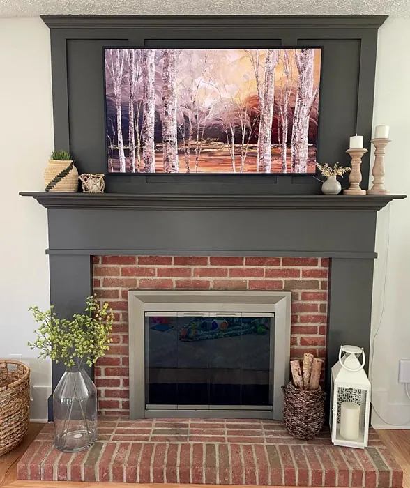

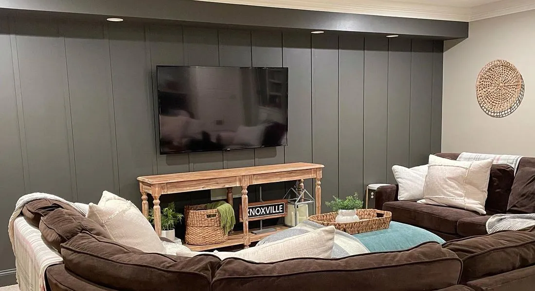
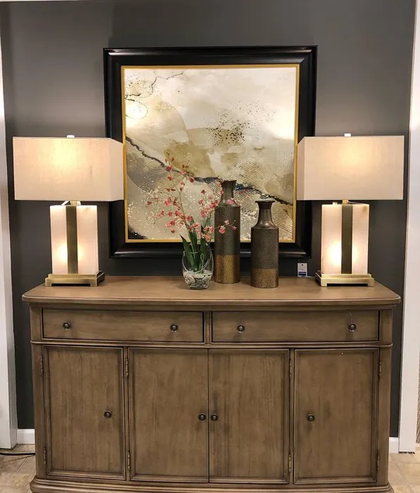
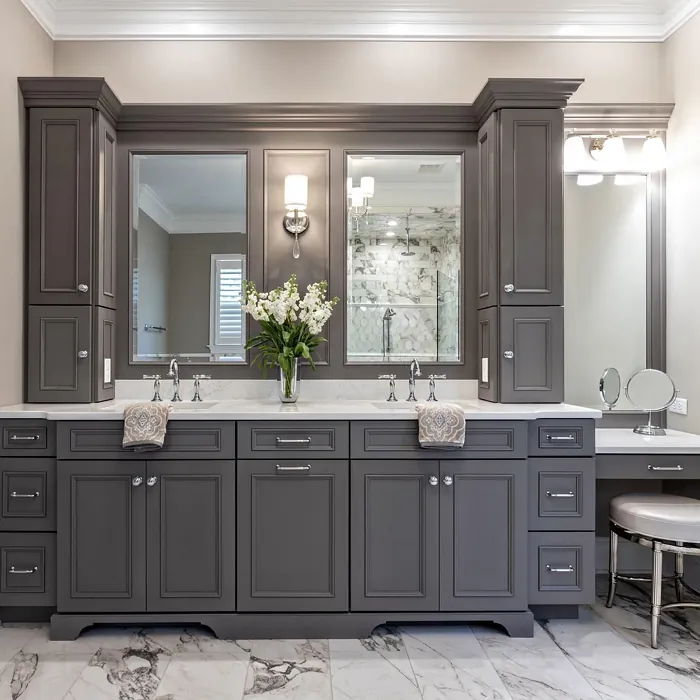
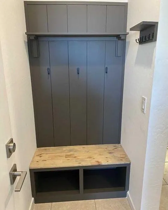
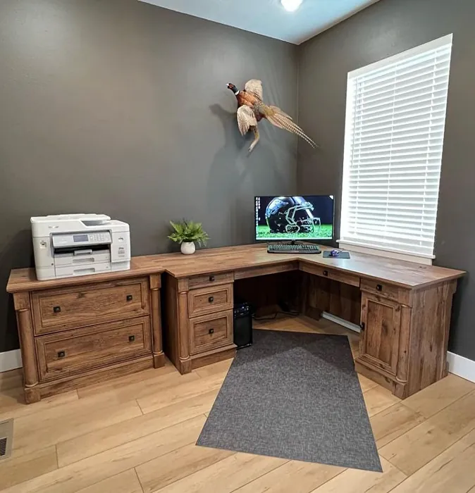

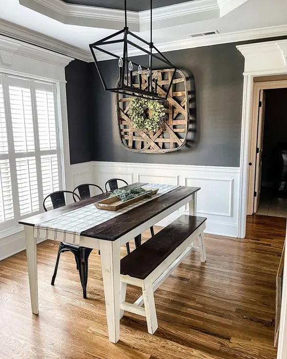
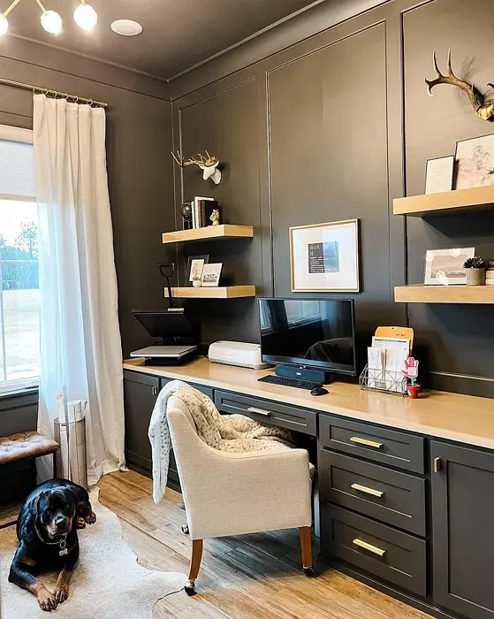

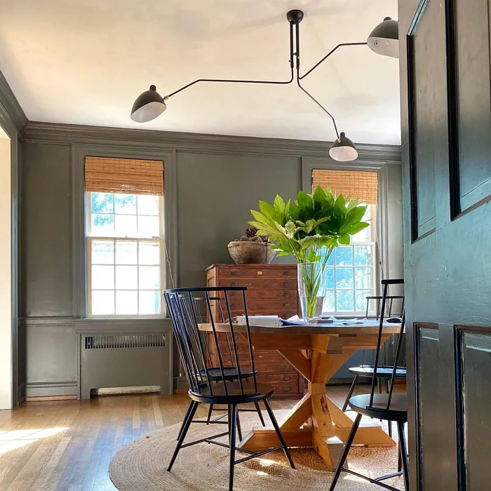

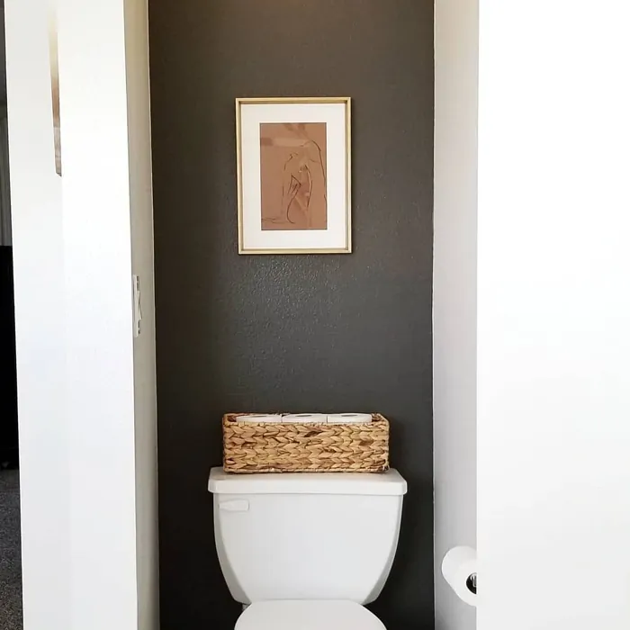
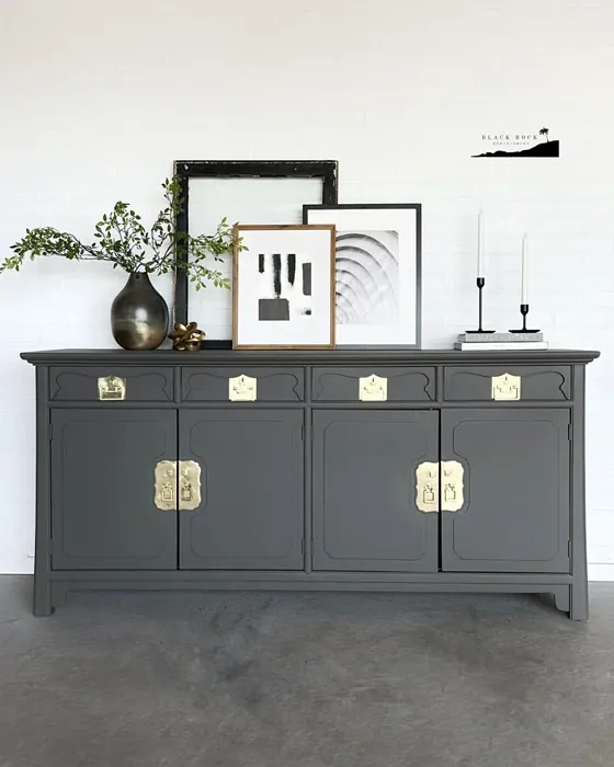
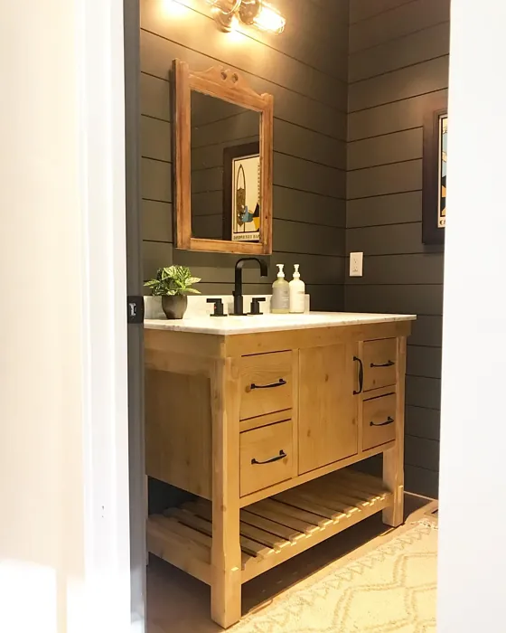

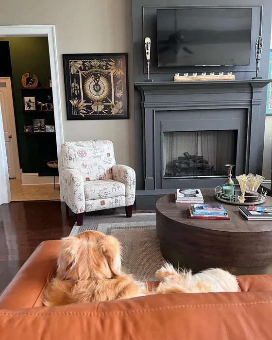
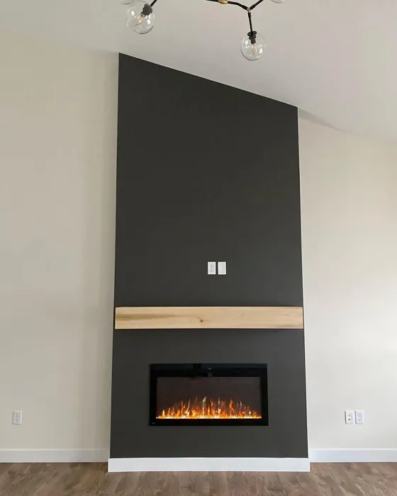

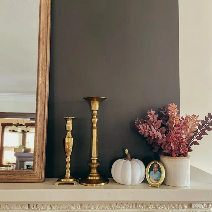
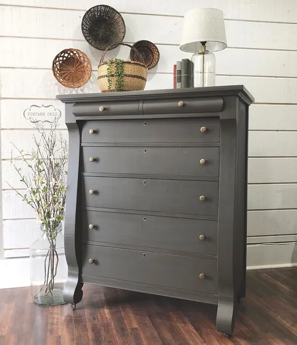
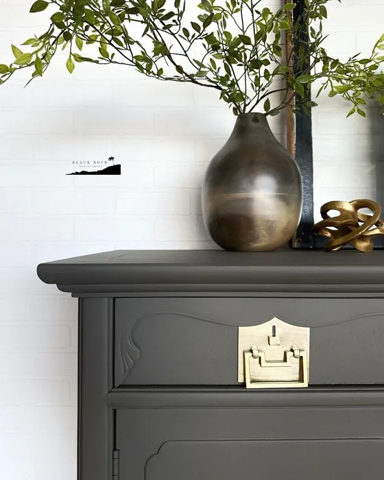

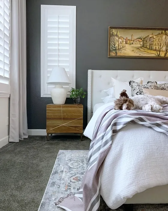
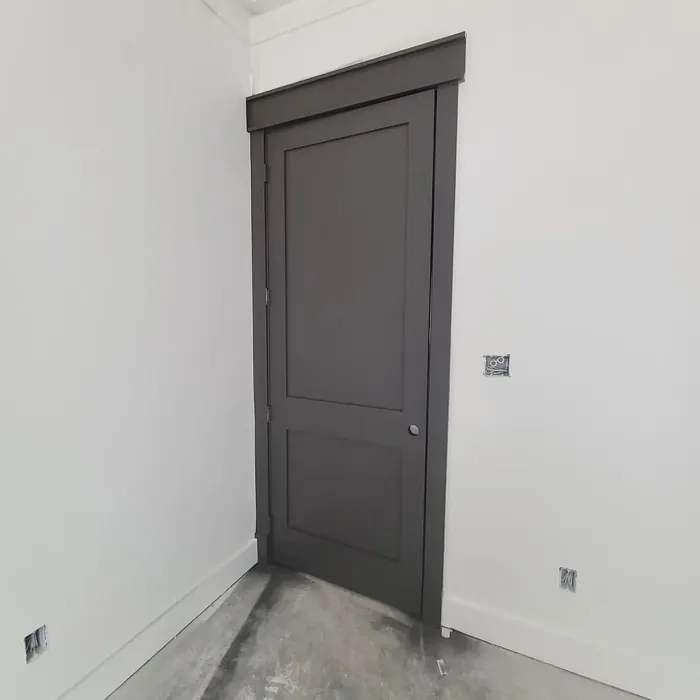
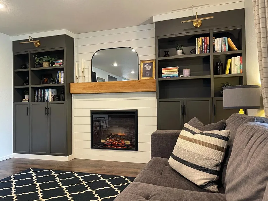
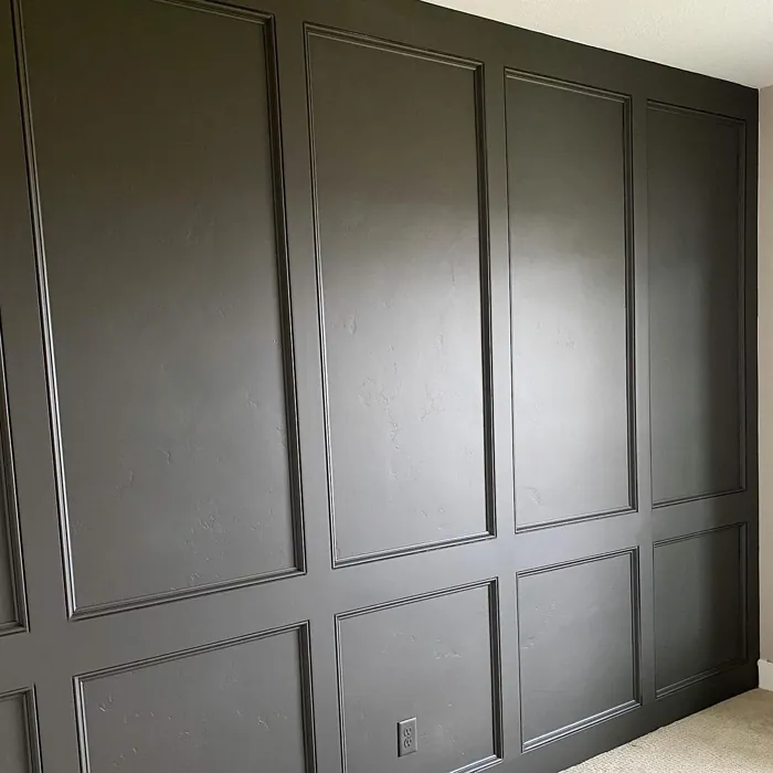

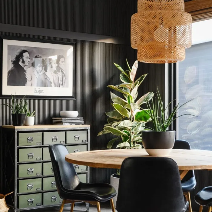

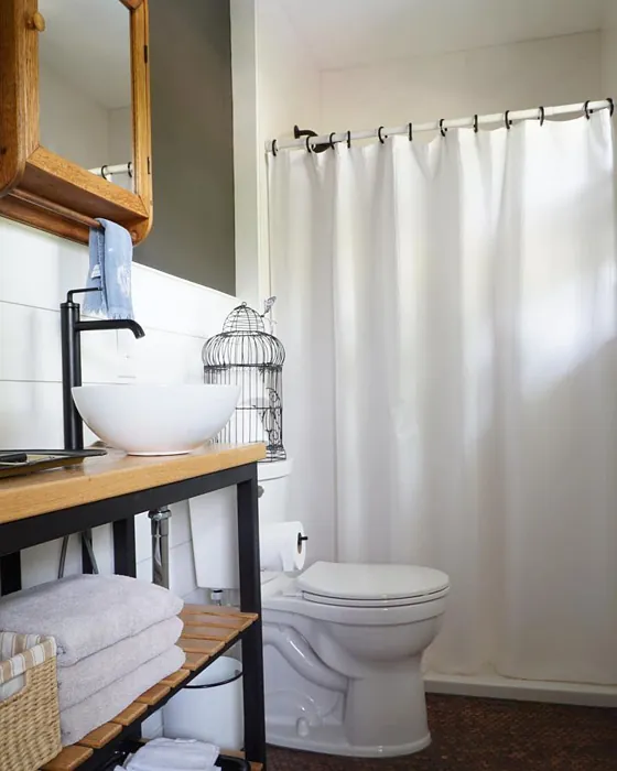
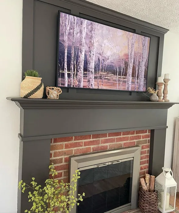

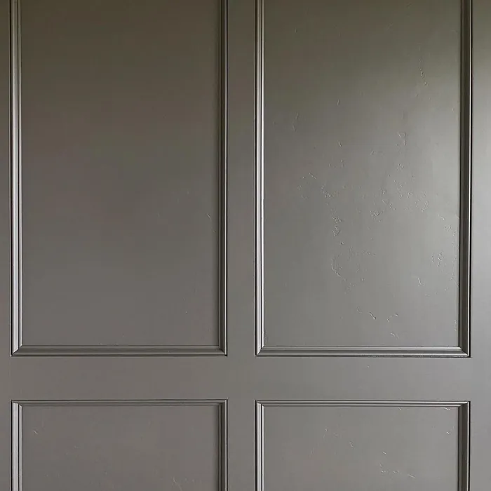
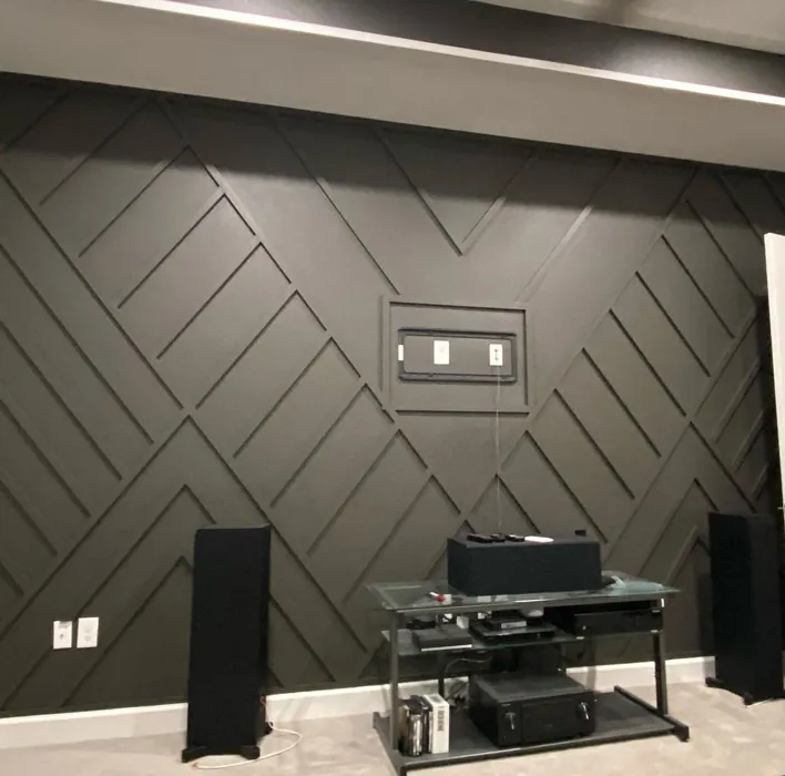
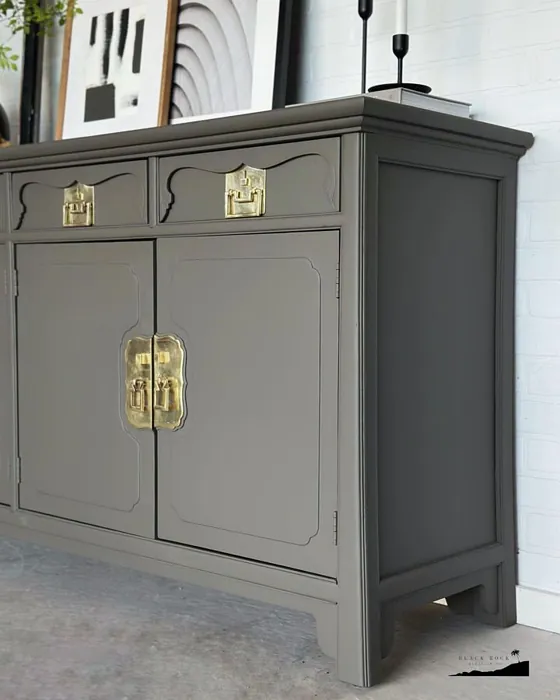
Real rooms painted with Urbane Bronze SW 7048 by Sherwin Williams. Lighting and photography can affect how colors appear — always test a sample swatch in your own space.
Undertones of Urbane Bronze ?
The undertones of Urbane Bronze are a key aspect of its character, leaning towards Red. These subtle underlying hues are what give the color its depth and complexity. For example, a gray with a blue undertone will feel cooler and more modern, while one with a brown undertone will feel warmer and more traditional. It’s essential to test this paint in your home and observe it next to your existing furniture, flooring, and decor to see how these undertones interact and reveal themselves throughout the day.
HEX value: #54504A
RGB code: 84, 80, 74
Is Urbane Bronze Cool or Warm?
Urbane Bronze is considered a warm paint color. This characteristic plays a huge role in the overall feel of a room. Warm colors, like this one, tend to create a cozy, inviting, and energetic atmosphere, making them great for social spaces like living rooms and dining rooms. In contrast, cool colors often evoke a sense of calm and serenity, which is why they are popular in bedrooms and bathrooms. The warmth of Urbane Bronze means it will pair beautifully with corresponding decor elements.
Understanding Color Properties and Interior Design Tips
Hue refers to a specific position on the color wheel, measured in degrees from 0 to 360. Each degree represents a different pure color:
- 0° represents red
- 120° represents green
- 240° represents blue
Saturation describes the intensity or purity of a color and is expressed as a percentage:
- At 0%, the color appears completely desaturated—essentially a shade of gray
- At 100%, the color is at its most vivid and vibrant
Lightness indicates how light or dark a color is, also expressed as a percentage:
- 0% lightness results in black
- 100% lightness results in white
Using Warm Colors in Interior Design
Warm hues—such as reds, oranges, yellows, warm beiges, and greiges—are excellent choices for creating inviting and energetic spaces. These colors are particularly well-suited for:
- Kitchens, living rooms, and bathrooms, where warmth enhances comfort and sociability
- Large rooms, where warm tones can help reduce the sense of emptiness and make the space feel more intimate
For example:
- Warm beige shades provide a cozy, inviting atmosphere, ideal for living rooms, bedrooms, and hallways.
- Warm greige (a mix of beige and gray) offers the warmth of beige with the modern appeal of gray, making it a versatile backdrop for dining areas, bedrooms, and living spaces.
However, be mindful when using warm light tones in rooms with limited natural light. These shades may appear muted or even take on an unpleasant yellowish tint. To avoid a dull or flat appearance:
- Add depth by incorporating richer tones like deep greens, charcoal, or chocolate brown
- Use textured elements such as curtains, rugs, or cushions to bring dimension to the space
Pro Tip: Achieving Harmony with Warm and Cool Color Balance
To create a well-balanced and visually interesting interior, mix warm and cool tones strategically. This contrast adds depth and harmony to your design.
- If your walls feature warm hues, introduce cool-colored accents such as blue or green furniture, artwork, or accessories to create contrast.
- For a polished look, consider using a complementary color scheme, which pairs colors opposite each other on the color wheel (e.g., red with green, orange with blue).
This thoughtful mix not only enhances visual appeal but also creates a space that feels both dynamic and cohesive.
Save this color to your Pinterest board to revisit when planning your room.
Light Temperature Affects on Urbane Bronze
Natural Light
Natural daylight changes in color temperature as the sun moves across the sky. At sunrise and sunset, the light tends to have a warm, golden tone with a color temperature around 2000 Kelvin (K). As the day progresses and the sun rises higher, the light becomes cooler and more neutral. Around midday, especially when the sky is clear, natural light typically reaches its peak brightness and shifts to a cooler tone, ranging from 5500 to 6500 Kelvin. This midday light is close to what we perceive as pure white or daylight-balanced light.
These shifts in natural light can significantly influence how colors appear in a space, which is why designers often consider both the time of day and the orientation of windows when planning interior color schemes.
Explore how this color transforms from sunrise through sunset as natural light changes throughout the day. Use the slider to simulate morning light, midday brightness, and warm afternoon tones.
North-facing rooms stay cooler throughout the day and benefit from warmer paint tones to compensate. South-facing rooms receive more direct sunlight, making even deeper shades more workable. East-facing rooms get bright morning light that fades by afternoon, while west-facing rooms glow warmly in the evening.
Artificial Light
When choosing artificial lighting, pay close attention to the color temperature, measured in Kelvin (K). This determines how warm or cool the light will appear. Lower temperatures, around 2700K, give off a warm, yellow glow often used in living rooms or bedrooms. Higher temperatures, above 5000K, create a cool, bluish light similar to daylight, commonly used in kitchens, offices, or task areas.
Use the slider to see how lighting temperature can affect the appearance of a surface or color throughout a space.
See how this color looks under different artificial light temperatures — from warm candlelight (2000K) to cool daylight (7000K). Move the slider to simulate your room's lighting conditions.


4800K
Keep in mind that natural light from windows, the warmth of lamps, and overhead lighting all affect how this color reads on your walls at different times of day. Always observe a sample swatch in your actual space before purchasing.
LRV of Urbane Bronze
The Light Reflectance Value (LRV) of Urbane Bronze is 20%, which places it in the Medium Dark category. This means it reflects very little light. Understanding a paint’s LRV is crucial for predicting how it will look in your space. A higher LRV indicates a lighter color that reflects more light, making rooms feel larger and brighter. A lower LRV signifies a darker color that absorbs more light, creating a cozier, more intimate atmosphere. Always consider the natural and artificial lighting in your room when selecting a paint color based on its LRV.
Detailed Review of Urbane Bronze
Additional Paint Characteristics
Ideal Rooms
Bedroom, Dining Room, Home Office, Living Room
Decor Styles
Contemporary, Industrial, Modern, Rustic, Transitional
Coverage
Good (1–2 Coats)
Ease of Application
Beginner Friendly, Brush Smooth, Roller-Ready
Washability
Highly Washable, Washable
VOC Level
Low VOC
Best Use
Accent Wall, Furniture, Interior Walls
Room Suitability
Bedroom, Dining Room, Home Office, Living Room
Tone Tag
Deep, Earthy, Warm
Finish Type
Eggshell, Matte, Satin
Paint Performance
Easy Touch-Up, Fade Resistant, High Coverage, Low Odor
Use Cases
Best for Low Light Rooms, Best for Open Concept, Classic Favorite
Mood
Cozy, Grounding, Inviting
Trim Pairing
Complements Brass Fixtures, Good with Wood Trim, Pairs with White Dove
Urbane Bronze is a masterclass in balance. It’s dark enough to create an intimate atmosphere, yet its warm undertones prevent it from feeling oppressive. This color works beautifully in both well-lit and dimly lit spaces, adapting to the light throughout the day. When applied, it showcases a subtle elegance that can elevate traditional and modern interiors alike. Pair it with lighter furniture or accents to create a stunning contrast that truly makes the space pop. Whether you’re painting an accent wall or an entire room, Urbane Bronze delivers a unique charm that is sure to impress. Its versatility makes it a fantastic choice for anyone looking to refresh their home without straying too far from timeless elegance.
Pros & Cons of SW 7048 Urbane Bronze
Pros
Cons
Colors that go with Sherwin Williams Urbane Bronze
FAQ on SW 7048 Urbane Bronze
Can Urbane Bronze be used outdoors?
While Urbane Bronze is primarily designed for interior use, it can be applied to exterior surfaces if properly primed and sealed. However, remember that outdoor exposure can alter its appearance over time due to weathering. If you’re considering it for exterior projects, opting for a weatherproof formula can enhance its durability.
What colors pair best with Urbane Bronze?
Urbane Bronze pairs beautifully with a variety of colors. Lighter shades like soft whites and creams create a stunning contrast, while muted greens and blues can complement its warm undertones. For a bolder look, consider pairing it with deep jewel tones or metallic accents to add depth and elegance to your space.
Comparisons Urbane Bronze with other colors
Urbane Bronze SW 7048 vs Night Owl SW 7061
| Attribute | Urbane Bronze SW 7048 | Night Owl SW 7061 |
|---|---|---|
| Color Name | Urbane Bronze SW 7048 | Night Owl SW 7061 |
| Color | ||
| Hue | Grey | Grey |
| Brightness | Dark | Dark |
| RGB | 84, 80, 74 | 99, 101, 95 |
| LRV | 20% | 24% |
| Finish Type | Eggshell, Matte, Satin | Eggshell, Matte, Satin |
| Finish Options | Eggshell, Matte, Satin | Eggshell, Matte, Satin |
| Ideal Rooms | Bedroom, Dining Room, Home Office, Living Room | Bedroom, Dining Room, Hallway, Home Office, Living Room |
| Decor Styles | Contemporary, Industrial, Modern, Rustic, Transitional | Industrial, Minimalist, Modern, Rustic, Scandinavian |
| Coverage | Good (1–2 Coats) | Good (1–2 Coats), Touch-Up Friendly |
| Ease of Application | Beginner Friendly, Brush Smooth, Roller-Ready | Beginner Friendly, Brush Smooth, Fast-Drying, Roller-Ready |
| Washability | Highly Washable, Washable | Scrubbable, Washable |
| Room Suitability | Bedroom, Dining Room, Home Office, Living Room | Bedroom, Dining Room, Home Office, Living Room |
| Tone | Deep, Earthy, Warm | Balanced, Deep, Earthy, Muted |
| Paint Performance | Easy Touch-Up, Fade Resistant, High Coverage, Low Odor | Easy Touch-Up, Fade Resistant, High Coverage, Low Odor |
Lighting conditions, wall orientation, and surrounding decor can significantly affect how these colors appear in your space. Always test a sample swatch before committing to a full application.
Urbane Bronze SW 7048 vs Succulent SW 9650
| Attribute | Urbane Bronze SW 7048 | Succulent SW 9650 |
|---|---|---|
| Color Name | Urbane Bronze SW 7048 | Succulent SW 9650 |
| Color | ||
| Hue | Grey | Grey |
| Brightness | Dark | Dark |
| RGB | 84, 80, 74 | 97, 108, 100 |
| LRV | 20% | 30% |
| Finish Type | Eggshell, Matte, Satin | Eggshell, Matte, Satin |
| Finish Options | Eggshell, Matte, Satin | Eggshell, Matte, Satin |
| Ideal Rooms | Bedroom, Dining Room, Home Office, Living Room | Bathroom, Bedroom, Dining Room, Entryway, Kitchen, Living Room |
| Decor Styles | Contemporary, Industrial, Modern, Rustic, Transitional | Bohemian, Contemporary, Eclectic, Minimalist, Modern Farmhouse |
| Coverage | Good (1–2 Coats) | Good (1–2 Coats), Touch-Up Friendly |
| Ease of Application | Beginner Friendly, Brush Smooth, Roller-Ready | Beginner Friendly, Brush Smooth, Roller-Ready |
| Washability | Highly Washable, Washable | Highly Washable, Washable |
| Room Suitability | Bedroom, Dining Room, Home Office, Living Room | Bathroom, Bedroom, Dining Room, Kitchen, Living Room |
| Tone | Deep, Earthy, Warm | Cool, Earthy, Muted |
| Paint Performance | Easy Touch-Up, Fade Resistant, High Coverage, Low Odor | Easy Touch-Up, Low Odor, Quick Drying, Scuff Resistant |
Lighting conditions, wall orientation, and surrounding decor can significantly affect how these colors appear in your space. Always test a sample swatch before committing to a full application.
Urbane Bronze SW 7048 vs Grizzle Gray SW 7068
| Attribute | Urbane Bronze SW 7048 | Grizzle Gray SW 7068 |
|---|---|---|
| Color Name | Urbane Bronze SW 7048 | Grizzle Gray SW 7068 |
| Color | ||
| Hue | Grey | Grey |
| Brightness | Dark | Dark |
| RGB | 84, 80, 74 | 99, 101, 98 |
| LRV | 20% | 24% |
| Finish Type | Eggshell, Matte, Satin | Eggshell, Satin |
| Finish Options | Eggshell, Matte, Satin | Eggshell, Matte, Satin |
| Ideal Rooms | Bedroom, Dining Room, Home Office, Living Room | Bedroom, Dining Room, Home Office, Living Room |
| Decor Styles | Contemporary, Industrial, Modern, Rustic, Transitional | Industrial, Modern, Rustic, Scandinavian |
| Coverage | Good (1–2 Coats) | Good (1–2 Coats), Touch-Up Friendly |
| Ease of Application | Beginner Friendly, Brush Smooth, Roller-Ready | Beginner Friendly, Brush Smooth, Roller-Ready |
| Washability | Highly Washable, Washable | Washable, Wipeable |
| Room Suitability | Bedroom, Dining Room, Home Office, Living Room | Bedroom, Dining Room, Home Office, Living Room |
| Tone | Deep, Earthy, Warm | Balanced, Cool, Muted |
| Paint Performance | Easy Touch-Up, Fade Resistant, High Coverage, Low Odor | Easy Touch-Up, High Coverage, Low Odor |
Lighting conditions, wall orientation, and surrounding decor can significantly affect how these colors appear in your space. Always test a sample swatch before committing to a full application.
Urbane Bronze SW 7048 vs Iron Ore SW 7069
| Attribute | Urbane Bronze SW 7048 | Iron Ore SW 7069 |
|---|---|---|
| Color Name | Urbane Bronze SW 7048 | Iron Ore SW 7069 |
| Color | ||
| Hue | Grey | Grey |
| Brightness | Dark | Dark |
| RGB | 84, 80, 74 | 67, 67, 65 |
| LRV | 20% | 6% |
| Finish Type | Eggshell, Matte, Satin | Eggshell, Matte, Satin |
| Finish Options | Eggshell, Matte, Satin | Eggshell, Matte, Satin |
| Ideal Rooms | Bedroom, Dining Room, Home Office, Living Room | Bedroom, Dining Room, Entryway, Home Office, Living Room |
| Decor Styles | Contemporary, Industrial, Modern, Rustic, Transitional | Contemporary, Industrial, Minimalist, Modern, Rustic |
| Coverage | Good (1–2 Coats) | Good (1–2 Coats), High Hide |
| Ease of Application | Beginner Friendly, Brush Smooth, Roller-Ready | Brush Smooth, Fast-Drying, Roller-Ready |
| Washability | Highly Washable, Washable | Highly Washable, Washable |
| Room Suitability | Bedroom, Dining Room, Home Office, Living Room | Bedroom, Dining Room, Entryway, Home Office, Living Room |
| Tone | Deep, Earthy, Warm | Balanced, Deep, Muted, Warm |
| Paint Performance | Easy Touch-Up, Fade Resistant, High Coverage, Low Odor | Easy Touch-Up, High Coverage, Low Odor |
Lighting conditions, wall orientation, and surrounding decor can significantly affect how these colors appear in your space. Always test a sample swatch before committing to a full application.
Urbane Bronze SW 7048 vs Peppercorn SW 7674
| Attribute | Urbane Bronze SW 7048 | Peppercorn SW 7674 |
|---|---|---|
| Color Name | Urbane Bronze SW 7048 | Peppercorn SW 7674 |
| Color | ||
| Hue | Grey | Grey |
| Brightness | Dark | Dark |
| RGB | 84, 80, 74 | 88, 88, 88 |
| LRV | 20% | 10% |
| Finish Type | Eggshell, Matte, Satin | Eggshell, Matte, Satin |
| Finish Options | Eggshell, Matte, Satin | Eggshell, Matte, Satin |
| Ideal Rooms | Bedroom, Dining Room, Home Office, Living Room | Bedroom, Dining Room, Home Office, Living Room |
| Decor Styles | Contemporary, Industrial, Modern, Rustic, Transitional | Contemporary, Industrial, Minimalist, Modern |
| Coverage | Good (1–2 Coats) | Good (1–2 Coats), Touch-Up Friendly |
| Ease of Application | Beginner Friendly, Brush Smooth, Roller-Ready | Beginner Friendly, Brush Smooth, Roller-Ready |
| Washability | Highly Washable, Washable | Highly Washable, Washable |
| Room Suitability | Bedroom, Dining Room, Home Office, Living Room | Bedroom, Dining Room, Home Office, Living Room |
| Tone | Deep, Earthy, Warm | Balanced, Deep, Moody, Neutral |
| Paint Performance | Easy Touch-Up, Fade Resistant, High Coverage, Low Odor | Easy Touch-Up, Low Odor, Quick Drying, Scuff Resistant |
Lighting conditions, wall orientation, and surrounding decor can significantly affect how these colors appear in your space. Always test a sample swatch before committing to a full application.
Urbane Bronze SW 7048 vs Slate Tile SW 7624
| Attribute | Urbane Bronze SW 7048 | Slate Tile SW 7624 |
|---|---|---|
| Color Name | Urbane Bronze SW 7048 | Slate Tile SW 7624 |
| Color | ||
| Hue | Grey | Grey |
| Brightness | Dark | Dark |
| RGB | 84, 80, 74 | 96, 110, 116 |
| LRV | 20% | 15% |
| Finish Type | Eggshell, Matte, Satin | Eggshell, Matte, Satin |
| Finish Options | Eggshell, Matte, Satin | Eggshell, Matte, Satin |
| Ideal Rooms | Bedroom, Dining Room, Home Office, Living Room | Bathroom, Bedroom, Home Office, Kitchen, Living Room |
| Decor Styles | Contemporary, Industrial, Modern, Rustic, Transitional | Industrial, Minimalist, Modern, Rustic |
| Coverage | Good (1–2 Coats) | Good (1–2 Coats) |
| Ease of Application | Beginner Friendly, Brush Smooth, Roller-Ready | Beginner Friendly, Brush Smooth, Fast-Drying, Roller-Ready |
| Washability | Highly Washable, Washable | Scrubbable, Washable |
| Room Suitability | Bedroom, Dining Room, Home Office, Living Room | Bathroom, Bedroom, Kitchen, Living Room |
| Tone | Deep, Earthy, Warm | Balanced, Cool, Muted |
| Paint Performance | Easy Touch-Up, Fade Resistant, High Coverage, Low Odor | Easy Touch-Up, High Coverage, Low Odor, Quick Drying |
Lighting conditions, wall orientation, and surrounding decor can significantly affect how these colors appear in your space. Always test a sample swatch before committing to a full application.
Urbane Bronze SW 7048 vs Blustery Sky SW 9140
| Attribute | Urbane Bronze SW 7048 | Blustery Sky SW 9140 |
|---|---|---|
| Color Name | Urbane Bronze SW 7048 | Blustery Sky SW 9140 |
| Color | ||
| Hue | Grey | Grey |
| Brightness | Dark | Dark |
| RGB | 84, 80, 74 | 111, 132, 140 |
| LRV | 20% | 48% |
| Finish Type | Eggshell, Matte, Satin | Eggshell, Matte |
| Finish Options | Eggshell, Matte, Satin | Eggshell, Matte, Satin |
| Ideal Rooms | Bedroom, Dining Room, Home Office, Living Room | Bedroom, Dining Room, Home Office, Living Room, Nursery |
| Decor Styles | Contemporary, Industrial, Modern, Rustic, Transitional | Coastal, Modern Farmhouse, Scandinavian, Transitional |
| Coverage | Good (1–2 Coats) | Good (1–2 Coats), Touch-Up Friendly |
| Ease of Application | Beginner Friendly, Brush Smooth, Roller-Ready | Beginner Friendly, Fast-Drying, Low Splatter, Roller-Ready |
| Washability | Highly Washable, Washable | Washable, Wipeable |
| Room Suitability | Bedroom, Dining Room, Home Office, Living Room | Bedroom, Home Office, Living Room, Nursery |
| Tone | Deep, Earthy, Warm | Balanced, Cool, Muted |
| Paint Performance | Easy Touch-Up, Fade Resistant, High Coverage, Low Odor | Easy Touch-Up, Fade Resistant, Low Odor, Quick Drying |
Lighting conditions, wall orientation, and surrounding decor can significantly affect how these colors appear in your space. Always test a sample swatch before committing to a full application.
Urbane Bronze SW 7048 vs Gauntlet Gray SW 7019
| Attribute | Urbane Bronze SW 7048 | Gauntlet Gray SW 7019 |
|---|---|---|
| Color Name | Urbane Bronze SW 7048 | Gauntlet Gray SW 7019 |
| Color | ||
| Hue | Grey | Grey |
| Brightness | Dark | Dark |
| RGB | 84, 80, 74 | 120, 115, 110 |
| LRV | 20% | 24% |
| Finish Type | Eggshell, Matte, Satin | Eggshell, Matte, Satin |
| Finish Options | Eggshell, Matte, Satin | Eggshell, Matte, Satin |
| Ideal Rooms | Bedroom, Dining Room, Home Office, Living Room | Bedroom, Dining Room, Hallway, Home Office, Living Room |
| Decor Styles | Contemporary, Industrial, Modern, Rustic, Transitional | Industrial, Modern, Rustic, Transitional |
| Coverage | Good (1–2 Coats) | Good (1–2 Coats), Touch-Up Friendly |
| Ease of Application | Beginner Friendly, Brush Smooth, Roller-Ready | Beginner Friendly, Brush Smooth, Roller-Ready |
| Washability | Highly Washable, Washable | Scrubbable, Washable |
| Room Suitability | Bedroom, Dining Room, Home Office, Living Room | Bedroom, Dining Room, Home Office, Living Room |
| Tone | Deep, Earthy, Warm | Dusty, Earthy, Muted, Warm |
| Paint Performance | Easy Touch-Up, Fade Resistant, High Coverage, Low Odor | Easy Touch-Up, High Coverage, Low Odor |
Lighting conditions, wall orientation, and surrounding decor can significantly affect how these colors appear in your space. Always test a sample swatch before committing to a full application.
Urbane Bronze SW 7048 vs Cast Iron SW 6202
| Attribute | Urbane Bronze SW 7048 | Cast Iron SW 6202 |
|---|---|---|
| Color Name | Urbane Bronze SW 7048 | Cast Iron SW 6202 |
| Color | ||
| Hue | Grey | Grey |
| Brightness | Dark | Dark |
| RGB | 84, 80, 74 | 100, 100, 90 |
| LRV | 20% | 6% |
| Finish Type | Eggshell, Matte, Satin | Eggshell, Matte, Satin |
| Finish Options | Eggshell, Matte, Satin | Eggshell, Matte, Satin |
| Ideal Rooms | Bedroom, Dining Room, Home Office, Living Room | Bedroom, Dining Room, Hallway, Home Office, Kitchen, Living Room |
| Decor Styles | Contemporary, Industrial, Modern, Rustic, Transitional | Contemporary, Farmhouse, Industrial, Minimalist, Modern |
| Coverage | Good (1–2 Coats) | Good (1–2 Coats), High Hide, Touch-Up Friendly |
| Ease of Application | Beginner Friendly, Brush Smooth, Roller-Ready | Beginner Friendly, Brush Smooth, Fast-Drying, Roller-Ready |
| Washability | Highly Washable, Washable | Highly Washable, Washable, Wipeable |
| Room Suitability | Bedroom, Dining Room, Home Office, Living Room | Bedroom, Dining Room, Home Office, Kitchen, Living Room |
| Tone | Deep, Earthy, Warm | Balanced, Deep, Dusty, Earthy, Warm |
| Paint Performance | Easy Touch-Up, Fade Resistant, High Coverage, Low Odor | Easy Touch-Up, High Coverage, Low Odor, Stain Resistant |
Lighting conditions, wall orientation, and surrounding decor can significantly affect how these colors appear in your space. Always test a sample swatch before committing to a full application.
Urbane Bronze SW 7048 vs Portsmouth SW 9644
| Attribute | Urbane Bronze SW 7048 | Portsmouth SW 9644 |
|---|---|---|
| Color Name | Urbane Bronze SW 7048 | Portsmouth SW 9644 |
| Color | ||
| Hue | Grey | Grey |
| Brightness | Dark | Dark |
| RGB | 84, 80, 74 | 118, 132, 130 |
| LRV | 20% | 12% |
| Finish Type | Eggshell, Matte, Satin | Eggshell, Satin |
| Finish Options | Eggshell, Matte, Satin | Eggshell, Flat, Matte, Satin |
| Ideal Rooms | Bedroom, Dining Room, Home Office, Living Room | Bathroom, Bedroom, Home Office, Kitchen, Living Room |
| Decor Styles | Contemporary, Industrial, Modern, Rustic, Transitional | Bohemian, Coastal, Modern Farmhouse, Scandinavian |
| Coverage | Good (1–2 Coats) | Good (1–2 Coats) |
| Ease of Application | Beginner Friendly, Brush Smooth, Roller-Ready | Beginner Friendly, Brush Smooth, Roller-Ready |
| Washability | Highly Washable, Washable | Highly Washable, Washable |
| Room Suitability | Bedroom, Dining Room, Home Office, Living Room | Bathroom, Bedroom, Kitchen, Living Room |
| Tone | Deep, Earthy, Warm | Cool, Earthy, Muted |
| Paint Performance | Easy Touch-Up, Fade Resistant, High Coverage, Low Odor | Easy Touch-Up, Low Odor, Scuff Resistant |
Lighting conditions, wall orientation, and surrounding decor can significantly affect how these colors appear in your space. Always test a sample swatch before committing to a full application.
Official Page of Sherwin Williams Urbane Bronze SW 7048