Ignite Your Space with Bold Warmth
Thinking about painting a room? The right color can totally transform how a space feels the moment you step in. Benjamin Moore’s Dragon’s Breath 1547 is one of those colors that does just that.
It’s a really deep, rich shade that brings warmth and a sense of coziness. Imagine a color that feels like a comfy blanket wrapping around you – that’s Dragon’s Breath.
This isn’t just any brown; it’s sophisticated and unique because it has hints of gray and green mixed in.
You might worry dark colors make rooms feel small, but this one actually adds depth. Picture it on the walls of a small office or bedroom; it feels intimate and inviting.
Pair it with lighter shades, and you’ll see how much it stands out, creating a nice balance. Choosing wall color can be tough, but Dragon’s Breath is a solid choice for lots of spaces.
It works great in living rooms, bedrooms, and kitchens. Use it on all the walls or just for an accent; either way, it gives your home character.
Consider how this shade could change your space.
What Color Is Dragon’s Breath 1547 by Benjamin Moore?
So, what color is Dragon’s Breath 1547? It’s a deep, rich charcoal brown with a really sophisticated feel. This color brings depth and warmth, adding a touch of modern elegance to any room.
It truly shines in spaces that lean towards neutral or minimalist design. Its depth helps create an intimate, cozy vibe.
If you’re into a modern rustic look, Dragon’s Breath is fantastic with natural materials. Think reclaimed wood and stone; their textures really complement the color’s earthy tones. This creates a balanced and inviting space.
For a mid-century modern style, it works well with sleek lines and simple furniture. It adds contrast when paired with light woods and metals like brass or copper. In industrial interiors, it enhances materials like exposed brick, concrete, and metal, giving them a grounded feel.
It also looks seamless with lush fabrics. Velvet and leather add a layer of luxury when used with this color.
When you use Dragon’s Breath as an accent wall, it makes your art and furnishings pop. This adds great visual interest. It pairs beautifully with warm whites and earthy tones, allowing them to stand out.
Whether it’s in a living room, bedroom, or study, Dragon’s Breath adds depth and sophistication without overwhelming the area.
Is Dragon’s Breath 1547 by Benjamin Moore Warm or Cool color?
Dragon’s Breath 1547 is definitely a warm color. It’s a rich, deep brown with gray undertones. This combination creates a cozy and inviting atmosphere in your home.
It’s not overly dark, which means it makes a room feel intimate and warm without being too much. It’s a great choice for places where you want comfort and relaxation. Think living rooms, libraries, or study areas.
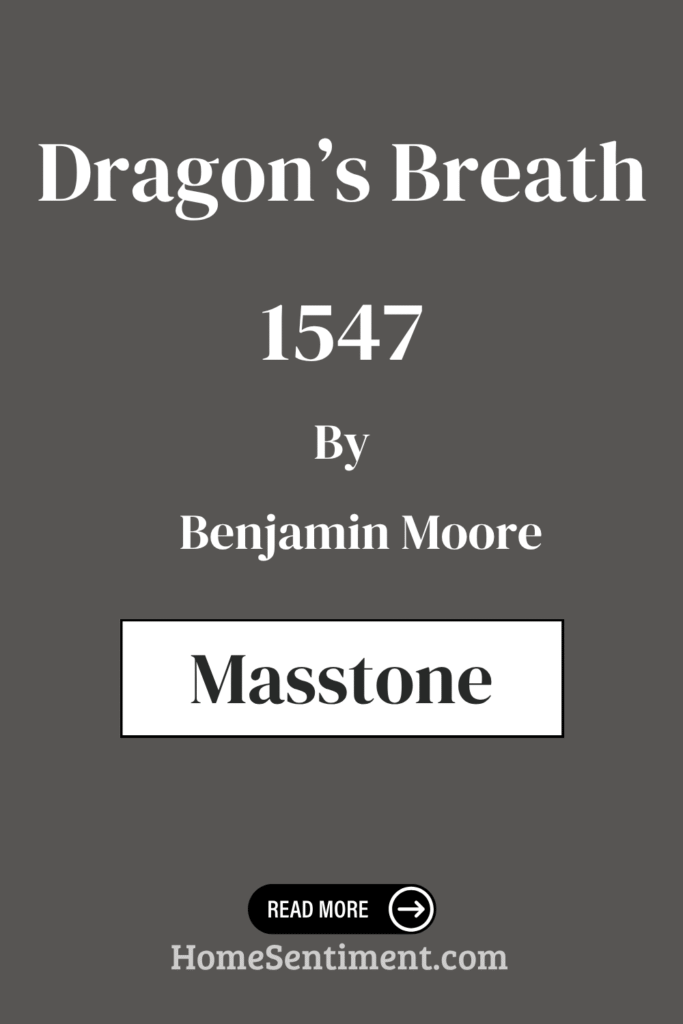
What is the Masstone of the Dragon’s Breath 1547 by Benjamin Moore?
The masstone of Dragon’s Breath 1547 is its core color when you look at it thickly. It’s a deep brown, often described with the color code #802B2B.
This deep brown masstone gives the color its bold, earthy feel. It adds a sense of warmth and stability, which works really well in homes.
Using this color on walls can make a room feel more intimate and comfortable. That makes it perfect for areas like living rooms or bedrooms where relaxation is key.
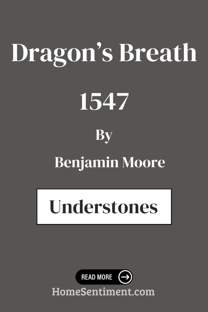
Undertones of Dragon’s Breath 1547 by Benjamin Moore
Dragon’s Breath 1547 is a rich, deep color, and its complex undertones really influence how it looks. The main color is warm and inviting, but it subtly changes depending on its surroundings and how different undertones interact.
Dark grey gives it a grounding and sophisticated feel. Olive and dark green undertones introduce earthy, natural vibes. These undertones help connect the color to nature, making it great for creating cozy, inviting spaces.
You’ll also find hints of purple and navy, adding depth and an unexpected twist. This can give the paint a slightly regal and mysterious feel. A subtle dark turquoise undertone adds a touch of refreshing calmness. Grey tones provide neutrality, helping the color work well with various design elements.
The red and orange undertones inject warmth and a bit of energy. They soften the deeper shades and create an inviting atmosphere. You might even catch hints of pink and pale pink, contributing subtle warmth and a touch of softness and lightness.
These complex undertones are why Dragon’s Breath can look different on your walls. Depending on the lighting and other colors in the room, it might appear more earthy, warm, or even moody. This makes it a really versatile and rich backdrop for many decor styles.
Coordinating Colors of Dragon’s Breath 1547 by Benjamin Moore
Choosing coordinating colors is key to creating a harmonious space. These are colors that complement and enhance Dragon’s Breath, helping to balance its intensity.
Here are some great coordinating colors:
- AF-15, Steam: This is a soft, warm white. It’s a perfect neutral backdrop that creates a peaceful setting without competing with Dragon’s Breath. Its subtle warmth partners beautifully with the richness of the darker color, adding a gentle glow.
- AF-80, Jute: An earthy neutral that feels really grounded. It brings a sense of warmth and calm that pairs gracefully with deeper colors.
- 1500, Sweet Spring: This color introduces a soft whisper of light green. It adds a hint of freshness to the palette. This airy color brings a touch of nature indoors.
- OC-65, Chantilly Lace: A crisp, clean white. It offers brightness and contrast, highlighting the depth of Dragon’s Breath without trying to steal the show.
Using these colors together creates a balanced and inviting atmosphere. Each one enhances the presence of Dragon’s Breath.
How Does Lighting Affect Dragon’s Breath 1547 by Benjamin Moore?
Lighting totally changes how paint colors look, and Dragon’s Breath 1547 is a prime example. This rich, warm brown with hints of gray and green looks different depending on the light source and direction.
In natural light, you’ll see the full complexity of Dragon’s Breath.
If the room faces north, which gets cooler light, the color might look a bit more bluish-gray. It can appear darker and cooler because there’s less direct sun. This might give it a moodier or more subdued look.
South-facing rooms get warm, consistent sun all day. Here, Dragon’s Breath will appear warmer and more inviting. The brown and green tones will likely be more pronounced, making the room feel extra cozy and welcoming.
In east-facing rooms, the bright morning light makes Dragon’s Breath look lively. Its warmer tones show more vividly. As the day goes on, the light becomes more neutral, softening the color by afternoon.
West-facing rooms are the opposite. Mornings might give a cooler impression. But afternoon and evening light will really enhance the warmth, making it appear richer and more intense as the sun sets.
Artificial lighting also makes a big difference.
Under incandescent lighting, which is warmer, the color can seem deeper and more inviting. This enhances its brown and green undertones.
Fluorescent lighting, which is cooler, might bring out more of the gray tones. This could make the color seem a bit duller or muted.
It’s super important to see Dragon’s Breath in various lighting conditions. This way, you’ll know exactly how it will look throughout the day and night in your space.
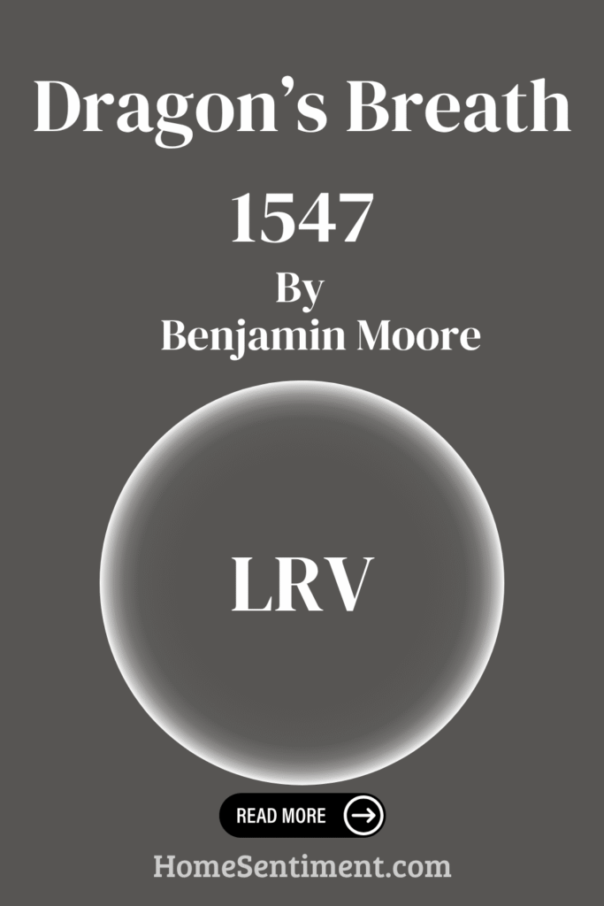
What is the LRV of Dragon’s Breath 1547 by Benjamin Moore?
LRV stands for Light Reflectance Value. It’s a measure of how much light a color reflects. The scale goes from 0 (pure black, no reflection) to 100 (pure white, full reflection). Higher LRV means the color looks lighter because it reflects more light.
Lower LRV means darker colors that absorb more light. These can make a room feel more enclosed. Knowing the LRV helps you pick paints by telling you how a color will appear under different lighting.
Dragon’s Breath by Benjamin Moore has an LRV of 9.18. This tells you it’s a pretty dark color. It reflects very little light and absorbs most of it.
Because of its low LRV, Dragon’s Breath creates a cozy, intimate vibe on the walls. It can help large spaces feel more grounded and make small spaces feel more enveloped.
If you use it in a room without much natural light, it can make the space feel even darker. This color really shines in well-lit areas or as an accent to add depth without overpowering everything. It’s a bold choice that gives you a rich, dramatic backdrop.
What are the Trim colors of Dragon’s Breath 1547 by Benjamin Moore?
Trim colors are those used on things like baseboards, door frames, and window casings. They help define areas, add contrast, and highlight the main wall color. For a rich color like Dragon’s Breath 1547, picking the right trim color is super important.
Here are some recommended trim colors:
- AF-5 Frostine: This is a soft, cool gray. It gives you a crisp, modern finish that balances the depth of Dragon’s Breath without stealing the show. Frostine’s subtle coolness complements the strong undertones of Dragon’s Breath, creating a seamless transition that enhances the room’s overall feel.
- OC-122 Cotton Balls: A fresh and clean white. It’s known for its brightness and neutrality, bringing a classic and timeless feel. It contrasts beautifully with the deep tones of Dragon’s Breath, really highlighting architectural details.
Choosing trim colors like Frostine or Cotton Balls helps create a visually pleasing environment. They either balance or contrast with Dragon’s Breath, enhancing its impact while adding depth and character.
Colors Similar to Dragon’s Breath 1547 by Benjamin Moore
Sometimes you want colors that are similar to your main shade to create depth and interest. Using shades close to Dragon’s Breath 1547 can help maintain a unified feel while adding variety.
Here are a few similar colors:
- 1484 Ashwood Moss: This is a deep, muted green with earthy undertones. It lends a grounded and calming feel. It’s an earth tone that enhances the richness of Dragon’s Breath.
- 2134-30 Iron Mountain: A dark charcoal with a hint of warmth. It offers a bold yet sophisticated contrast that highlights the warmth in Dragon’s Breath. It’s another complementary earth tone.
- 2138-20 Green Grove: This one has a medium green hue with a subtle gray undertone. It brings a natural freshness that pairs well with deeper tones. It adds layers of green that harmonize with Dragon’s Breath.
- 1491 Aegean Olive: A rich olive green with hints of warmth. It enriches the palette, evoking a sense of serene connection to nature. It also adds layers of green that harmonize with Dragon’s Breath.
Using similar colors throughout your home creates a seamless flow. It ties different areas together, making the color scheme feel intentional and well-balanced.
Colors that Go With Dragon’s Breath 1547 by Benjamin Moore
Dragon’s Breath 1547 is a deep, rich color, and picking the right partners is key to complementing its intensity. You want tones that work well alongside it.
Here are some colors that go well with Dragon’s Breath:
- 1544 Waynesboro Taupe: A soft, earthy brown. It gently balances Dragon’s Breath, creating a timeless, grounded look.
- 1541 London Fog: This has a misty, grayish tone. It lightens the atmosphere and adds a touch of elegance without overpowering the main shade.
- 1542 Himalayan Trek: A deeper taupe that pairs effortlessly. It provides depth and a sense of coziness.
- 1545 Iron Gate: A dark, rugged shade that enhances the boldness of Dragon’s Breath. It adds a refined, dramatic contrast.
- 1546 Gargoyle: Has subtle undertones that echo the muted aspect of Dragon’s Breath. It ensures a harmonious transition between spaces.
- 1543 Plymouth Rock: A lighter, warm gray that looks like natural stone. It subtly enhances the classic appeal of this palette.
Together, these colors create a cohesive and inviting environment. They are perfect for expressing a rich and layered interior without feeling overwhelming. Each color brings its own unique touch, allowing for a nuanced and balanced aesthetic.
How to Use Dragon’s Breath 1547 by Benjamin Moore In Your Home?
Dragon’s Breath 1547 is a rich, versatile dark brown that truly brings warmth to any room. Its deep, earthy tone creates a cozy and inviting atmosphere. This makes it ideal for spaces like living rooms or bedrooms.
In a living room, try pairing Dragon’s Breath walls with light, neutral furniture. This creates a striking contrast and adds depth to the space.
For a bedroom, it acts as a grounding color. It’s perfect for an accent wall behind the bed. Its warm undertones work beautifully with both traditional and modern decor styles.
Want to add a bit of drama? Use Dragon’s Breath in a dining room or home office. It pairs really well with metallic accents and natural materials like wood and stone.
Accessories in softer shades or even bold colors will stand out beautifully against this rich hue. This helps create a well-balanced and visually appealing environment.
Dragon’s Breath 1547 by Benjamin Moore vs Green Grove 2138-20 by Benjamin Moore
Let’s compare Dragon’s Breath 1547 and Green Grove 2138-20. Dragon’s Breath is a rich, deep hue. It blends warm brown tones with a hint of gray, creating a sophisticated and cozy vibe. It’s fantastic for adding depth and making spaces feel intimate. It works well where you want warmth and elegance, like living rooms or studies.
Green Grove 2138-20 feels totally different. This green shade is vibrant and lush, like a dense forest. It brings energy and a sense of nature indoors. Green Grove is great for areas where you want freshness and vitality, like kitchens or sunrooms.
Both are bold colors, but in different ways. Dragon’s Breath is more subdued and grounding. Green Grove adds brightness and life. Your choice depends on whether you prefer the warmth of deep brown or the lively feel of green.
Dragon’s Breath 1547 by Benjamin Moore vs Ashwood Moss 1484 by Benjamin Moore
Comparing Dragon’s Breath 1547 and Ashwood Moss 1484 reveals two rich, deep hues with distinct characters. Dragon’s Breath is a warm, earthy brown with gray hints. It creates that cozy, inviting feeling. It’s great for living areas or any room needing warmth and comfort.
Ashwood Moss leans more green. It’s a deep green with gray undertones, giving a natural and calming feel. This color is perfect for spaces aiming for a serene, nature-inspired look, like a study or bedroom. Dragon’s Breath brings warmth, while Ashwood Moss offers a grounded, earthy vibe.
Choosing between them comes down to the mood you want. Dragon’s Breath warms a room and adds coziness. Ashwood Moss provides peace and a connection with nature. Both complement earthy palettes but suit different atmospheres.
Dragon’s Breath 1547 by Benjamin Moore vs Iron Mountain 2134-30 by Benjamin Moore
Dragon’s Breath 1547 is a rich, warm brown. It brings to mind well-worn leather, feeling cozy and inviting. This earthy hue feels grounded and works well in living rooms or libraries. It pairs nicely with lighter neutrals and warm metallics, creating a welcoming atmosphere.
Iron Mountain 2134-30, on the other hand, is a dark, cool gray. It feels strong and sophisticated, ideal for modern or industrial spaces. While Dragon’s Breath is warm, Iron Mountain has a sleek, polished vibe.
This gray works well with bright accents or deep blues and greens, making it versatile. Both colors have depth, but Dragon’s Breath gives a warmer, intimate feel compared to the chic, urban essence of Iron Mountain. Pick based on the mood you want: cozy and grounded, or modern and refined.
Dragon’s Breath 1547 by Benjamin Moore vs Aegean Olive 1491 by Benjamin Moore
Let’s look at Dragon’s Breath 1547 and Aegean Olive 1491. Dragon’s Breath is that deep brown with hints of gray and black. It feels strong and grounding, making a real statement. This color is beautiful in cozy dens or as an accent wall. It pairs well with lighter neutrals or crisp whites for a dramatic, balanced look.
Aegean Olive 1491 is a natural, earthy tone. It’s a warm green with gray hints, like a muted olive. Aegean Olive feels calming and welcoming, perfect for serene spaces like living rooms or bedrooms. It pairs well with soft neutrals or off-whites for a harmonious, relaxed atmosphere.
Both colors offer unique vibes. Dragon’s Breath is bold and grounding. Aegean Olive is soothing and earthy. Each transforms spaces in distinct, yet complementary ways.
Conclusion
Dragon’s Breath 1547 is a really impactful paint choice for your home. Its deep, warm shades add depth and sophistication, making any room feel more intimate and welcoming. Using this color can give a space a unique, bold character that draws the eye and grounds the room.
This rich color is also a great backdrop for artwork, furniture, or other decor, helping them stand out. What’s really striking about Dragon’s Breath is how versatile it is. Whether you’re going for modern and sleek or traditional and cozy, this color works.
It pairs well with lots of other shades, from soft neutrals to bright accents. This makes it easy to experiment with different design choices.
Dragon’s Breath really encourages creativity while giving a room a sense of completeness. Choosing this color lets you define the atmosphere, enriching it with both elegance and boldness. It shows just how much a well-chosen paint color can change the look and feel of your home. Embracing Dragon’s Breath isn’t just about changing a color; it’s about redefining a space.