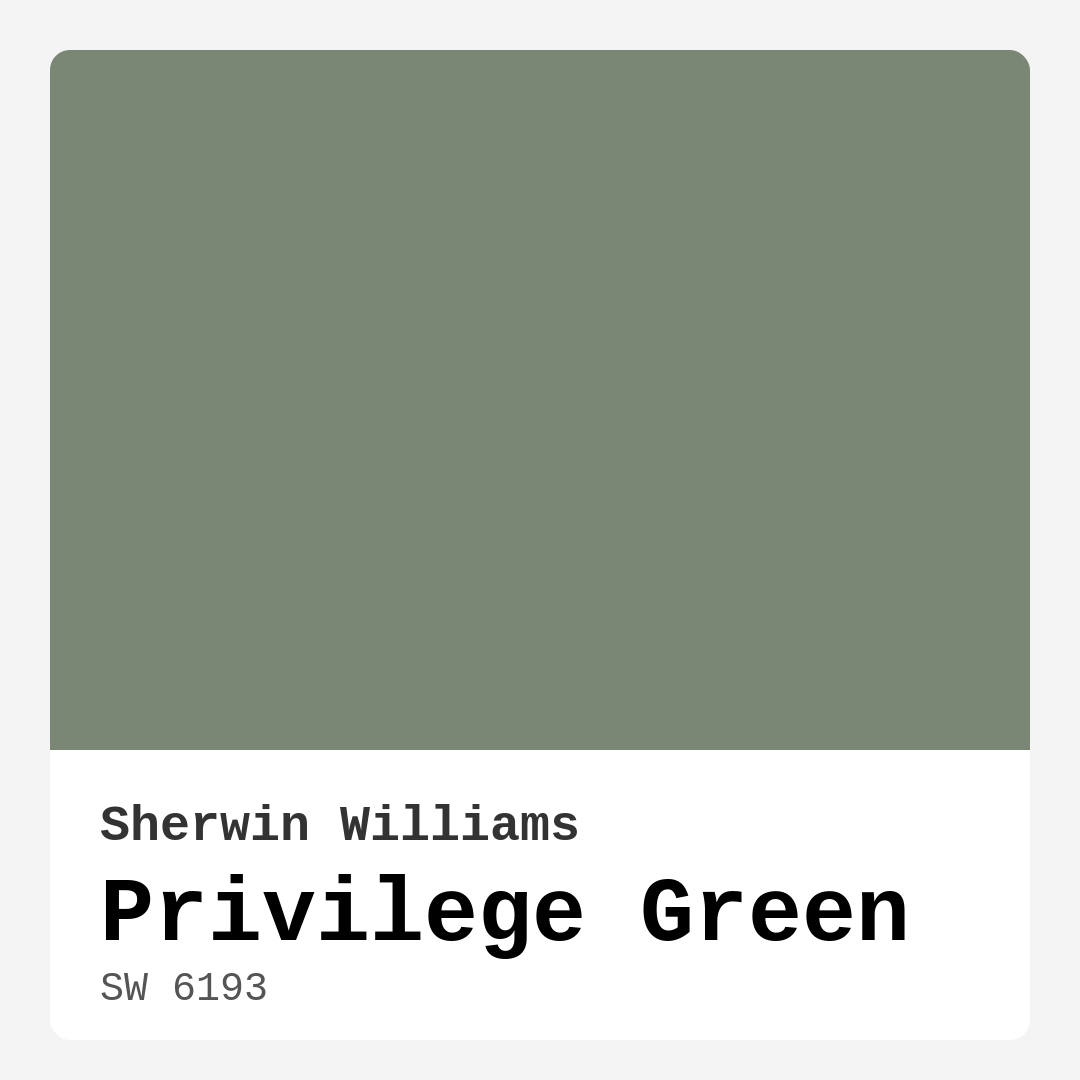
Color Preview & Key Details
| HEX Code | #7A8775 |
| RGB | 122, 135, 117 |
| LRV | 24% |
| Undertone | Green |
| Finish Options | Eggshell, Matte, Satin |
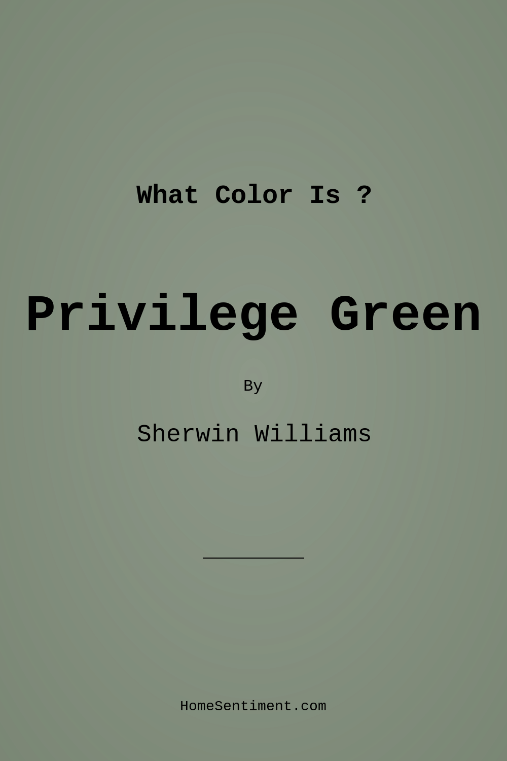
Imagine stepping into a room that feels like a warm embrace, where the soft hues and calming tones invite you to kick back and unwind. That’s the magic of color, and today, I want to introduce you to a shade that embodies tranquility and elegance: Privilege Green by Sherwin Williams. This sophisticated muted green has a way of transforming spaces, creating an atmosphere that is both grounding and inviting.
Privilege Green (SW 6193) is more than just a color; it’s an experience. With its rich, earthy undertones, this hue leans towards warmth, making it perfect for spaces that thrive on comfort and style. Whether you’re reimagining your living room, bedroom, or even your home office, this versatile shade can adapt to a variety of decor styles, from modern to traditional, farmhouse to Scandinavian.
One of the standout features of Privilege Green is its muted quality. While it boasts a rich, dark brightness with an LRV of just 24%, it reflects very little light, which allows it to create cozy, intimate environments. If you’ve ever walked into a space painted in a lighter hue, you know how airy it can feel. Conversely, Privilege Green invites a sense of warmth and calm, which is ideal for areas where relaxation is key.
In my years of experience, I’ve seen how color can make or break a room. The subtle sophistication of Privilege Green makes it a designer favorite. It pairs beautifully with a variety of complementary shades, such as SW 6557 and SW 7141, allowing you to explore your creativity when styling your space. Imagine combining it with crisp whites or soft creams for a balanced look. The contrast of a white dove trim or brass fixtures against the richness of Privilege Green creates a stunning visual appeal that’s hard to resist.
When considering this color, think about the rooms in your home where you want to establish a welcoming atmosphere. Privilege Green shines in living rooms and dining areas, where gatherings take place and memories are made. It works beautifully in bedrooms, offering a serene backdrop for rest and relaxation. In a home office, this color can help you feel grounded and focused, perfect for those long working hours.
But what about small spaces? You might wonder if Privilege Green can work in a cozy nook or a compact room. The answer is yes, but with a bit of caution. In well-lit areas, this color can feel fresh and inviting. If you’re working with less natural light, it may appear darker, potentially making the space feel smaller. If you’re concerned about this, consider using it as an accent wall or pairing it with lighter decor to balance the look.
The versatility of Privilege Green doesn’t stop at just the rooms it can inhabit. It plays nicely with various decor styles. Whether you lean towards a modern aesthetic with clean lines or a more traditional look with ornate details, this color can effortlessly bridge the gap. For a farmhouse vibe, combine it with rustic wood elements and softer textiles to create that cozy, lived-in feeling. If Scandinavian design is more your style, accentuate the simplicity with minimalist decor and light woods to let Privilege Green shine.
Application is a breeze with this color, making it beginner-friendly. It comes in several finishes, including Matte, Eggshell, and Satin, allowing you to choose based on the room’s function. Matte provides a soft, non-reflective look, which is fantastic for a cozy vibe. Eggshell and Satin, with their subtle sheen, offer a bit more durability, making them great for areas that need a washability boost.
As you consider this color for your project, keep in mind its washability and ease of touch-up. After all, life happens, and you want a paint that can hold up to the occasional scuff or mark. Privilege Green is scrubbable and low odor, ensuring that your home remains a healthy environment.
Let’s talk about the undertones—this is where things get truly interesting. Privilege Green leans towards green, but it has a depth that can shift subtly depending on the lighting and surrounding colors. In natural light, it can sparkle with vibrancy, while artificial light may make it feel more subdued. This adaptability is a huge advantage, allowing you to use it confidently in any room.
For those who love to experiment, consider combining Privilege Green with fun accent colors. Think about incorporating rich purples or soft yellows for a playful twist. These complementary hues can add vibrancy and personality to your space, allowing you to express your unique style.
If you’re someone who enjoys staying updated with design trends, you’ll be pleased to know that Privilege Green is a timeless choice that won’t go out of style. Its earthy, muted quality ensures that it remains relevant, combining the best of modern sophistication with classic elegance. It’s a hue that feels grounded yet refined, making it a perfect choice for those who want their homes to reflect their personality.
Remember to test the paint in your own space before fully committing. Observe it at different times of the day to see how the light interacts with the color. This will help you understand how Privilege Green will feel in your home, and how it will work with your existing decor.
In conclusion, Privilege Green is more than just a paint color. It’s a transformative force that can elevate your home’s aesthetic while creating a calming, inviting atmosphere. Whether you’re going for a full room makeover or just an accent wall, this sophisticated hue is sure to impress. With its versatility, ease of application, and timeless charm, Privilege Green may just be the perfect choice for your next home project. So grab that paintbrush and get ready to infuse your space with a touch of elegance and tranquility.
Save this color to your Pinterest board to revisit when planning your room.
Real Room Photo of Privilege Green SW 6193
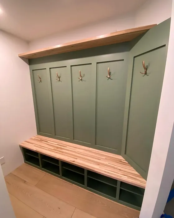
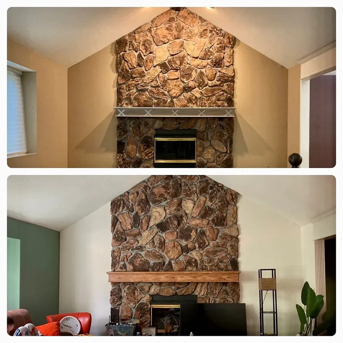
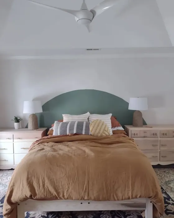
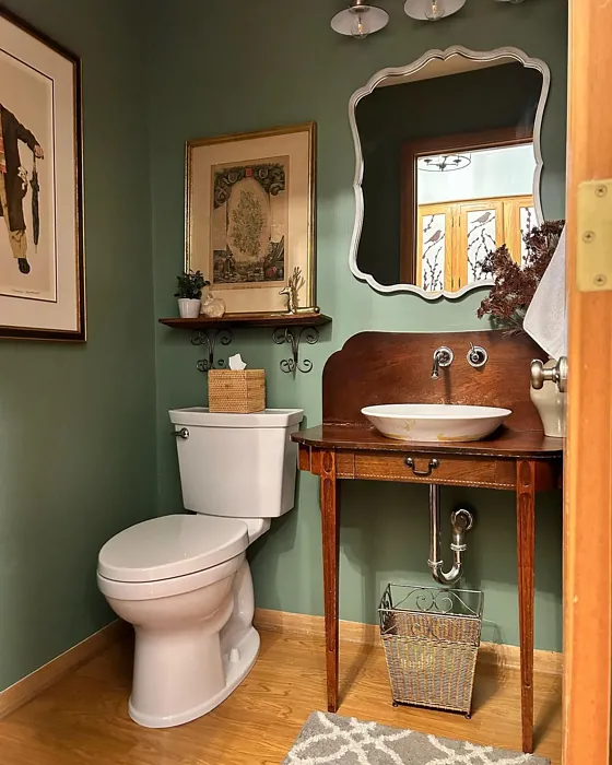
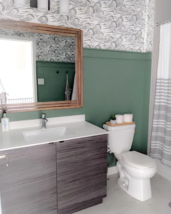
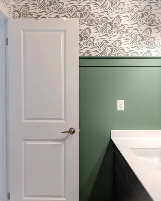
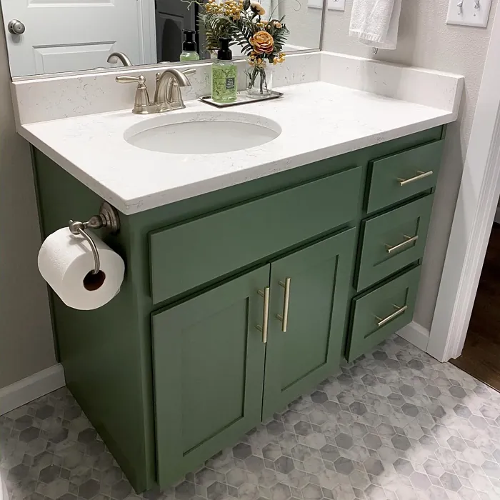
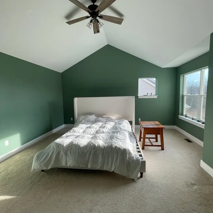
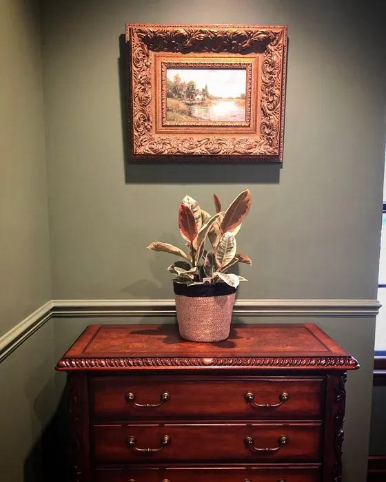
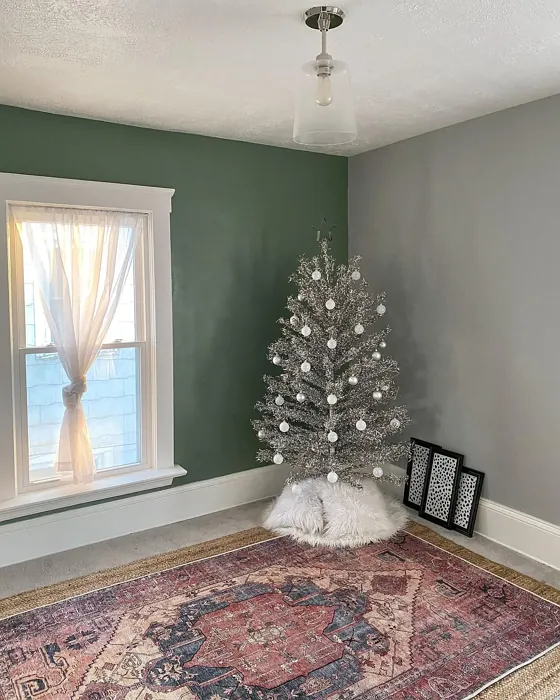
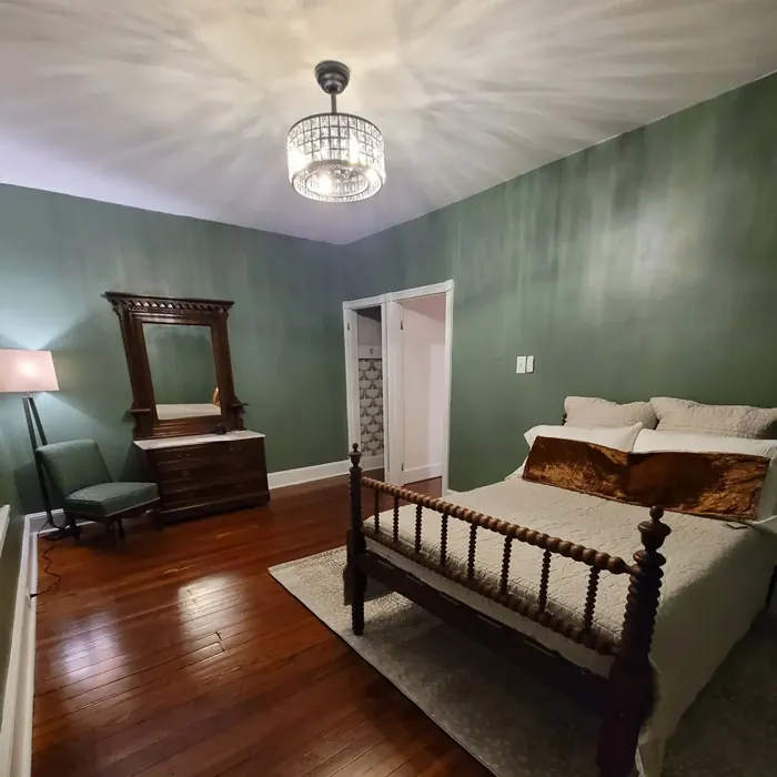
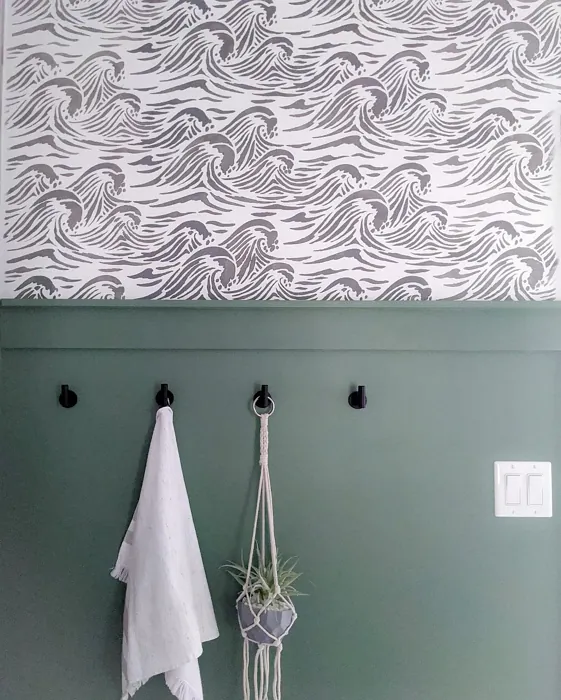
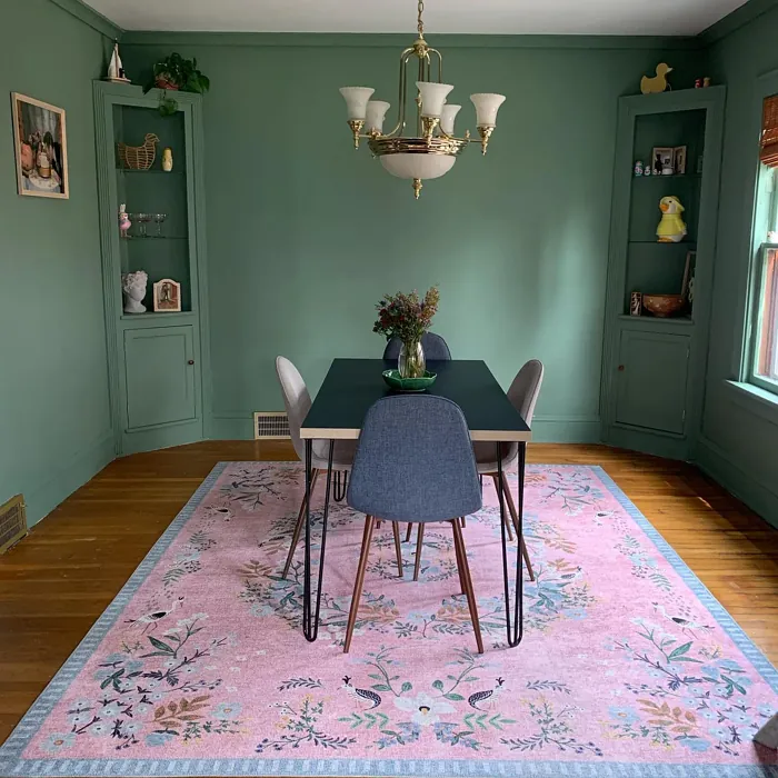
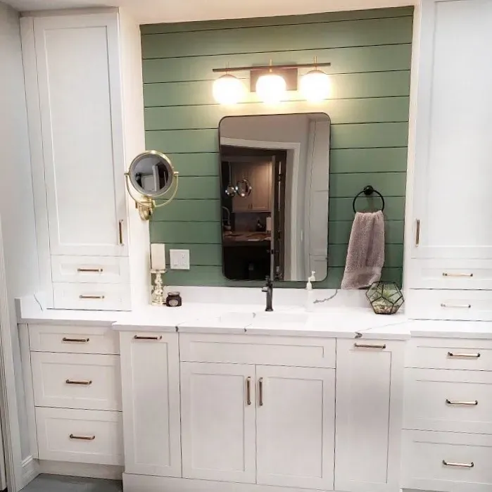
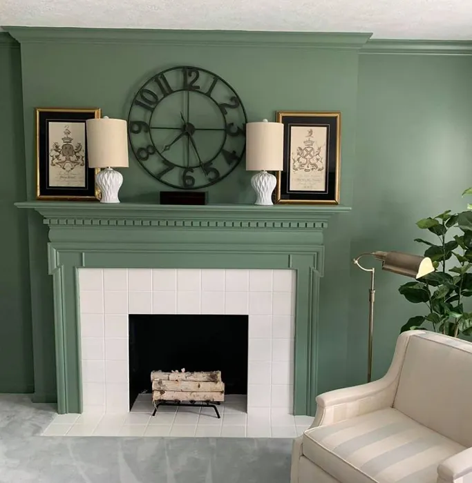
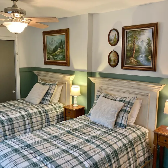
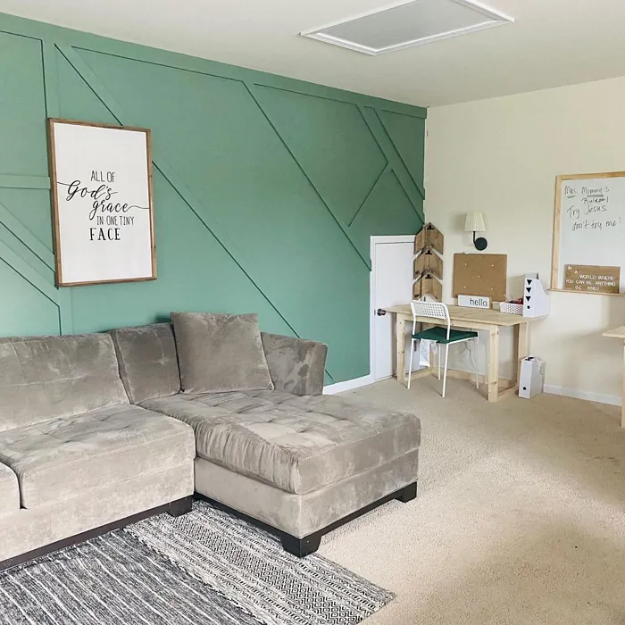
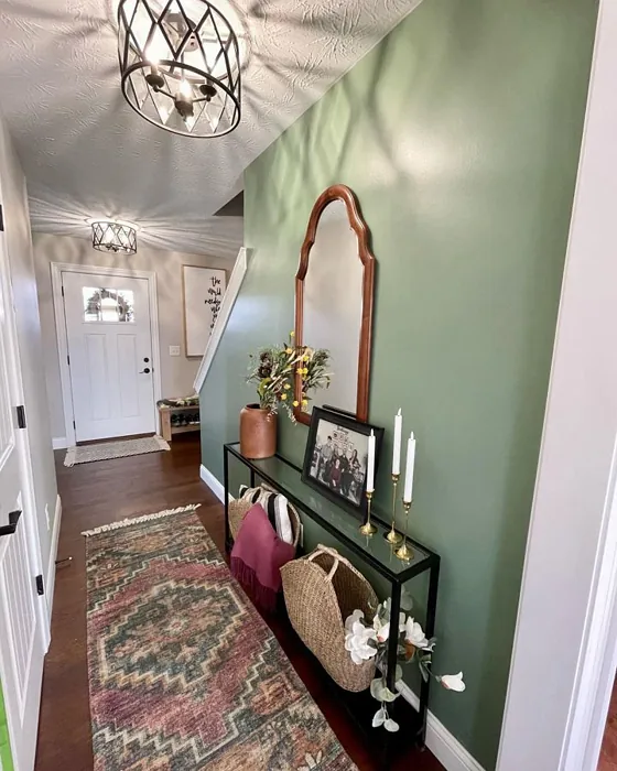
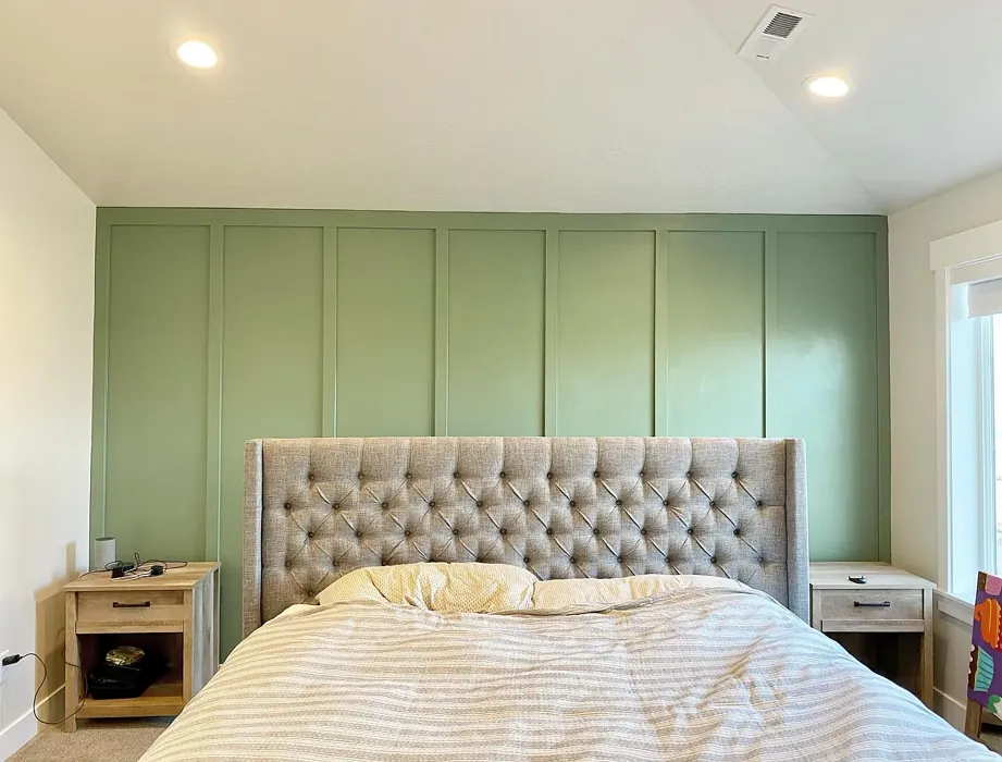
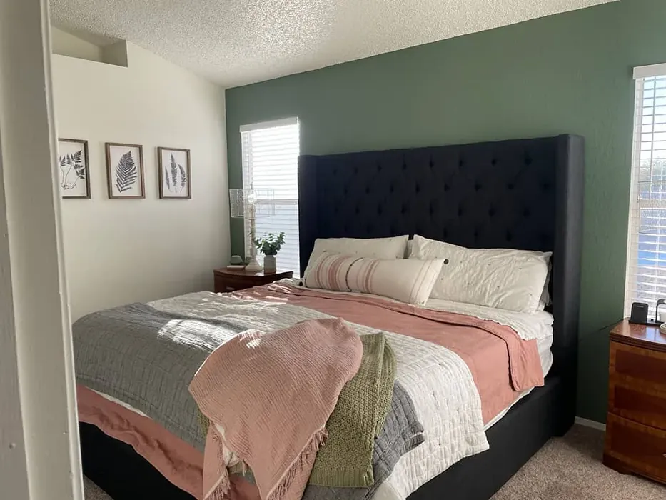
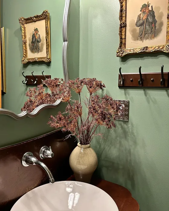
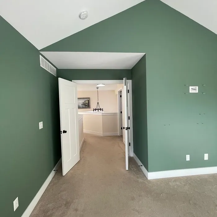
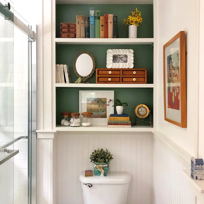
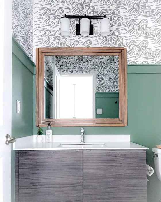
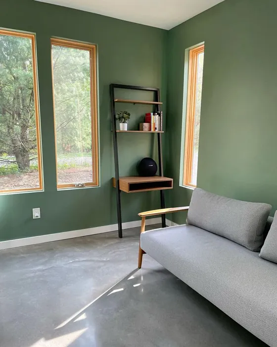
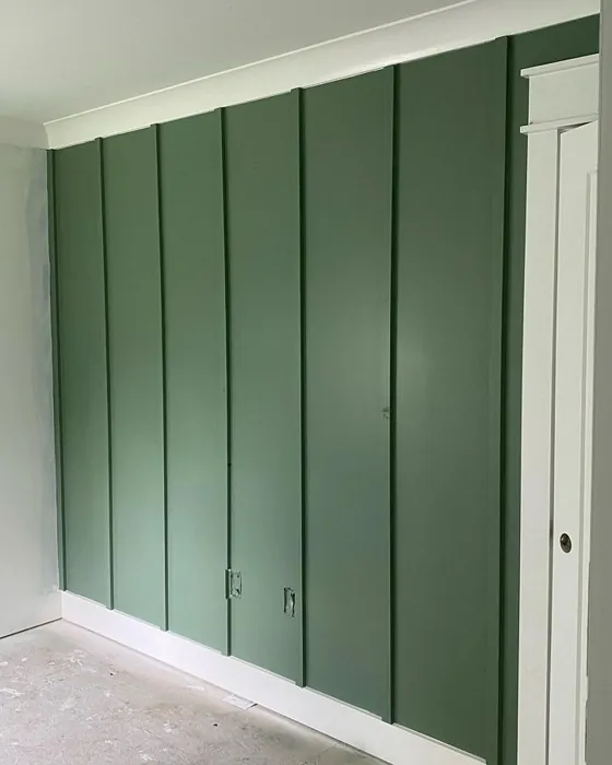
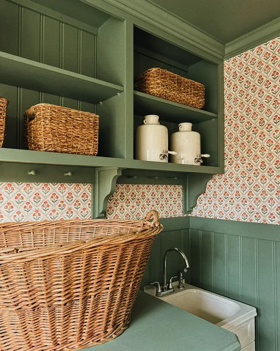
Real rooms painted with Privilege Green SW 6193 by Sherwin Williams. Lighting and photography can affect how colors appear — always test a sample swatch in your own space.
Undertones of Privilege Green ?
The undertones of Privilege Green are a key aspect of its character, leaning towards Green. These subtle underlying hues are what give the color its depth and complexity. For example, a gray with a blue undertone will feel cooler and more modern, while one with a brown undertone will feel warmer and more traditional. It’s essential to test this paint in your home and observe it next to your existing furniture, flooring, and decor to see how these undertones interact and reveal themselves throughout the day.
HEX value: #7A8775
RGB code: 122, 135, 117
Is Privilege Green Cool or Warm?
Privilege Green is considered a warm paint color. This characteristic plays a huge role in the overall feel of a room. Warm colors, like this one, tend to create a cozy, inviting, and energetic atmosphere, making them great for social spaces like living rooms and dining rooms. In contrast, cool colors often evoke a sense of calm and serenity, which is why they are popular in bedrooms and bathrooms. The warmth of Privilege Green means it will pair beautifully with corresponding decor elements.
Understanding Color Properties and Interior Design Tips
Hue refers to a specific position on the color wheel, measured in degrees from 0 to 360. Each degree represents a different pure color:
- 0° represents red
- 120° represents green
- 240° represents blue
Saturation describes the intensity or purity of a color and is expressed as a percentage:
- At 0%, the color appears completely desaturated—essentially a shade of gray
- At 100%, the color is at its most vivid and vibrant
Lightness indicates how light or dark a color is, also expressed as a percentage:
- 0% lightness results in black
- 100% lightness results in white
Using Warm Colors in Interior Design
Warm hues—such as reds, oranges, yellows, warm beiges, and greiges—are excellent choices for creating inviting and energetic spaces. These colors are particularly well-suited for:
- Kitchens, living rooms, and bathrooms, where warmth enhances comfort and sociability
- Large rooms, where warm tones can help reduce the sense of emptiness and make the space feel more intimate
For example:
- Warm beige shades provide a cozy, inviting atmosphere, ideal for living rooms, bedrooms, and hallways.
- Warm greige (a mix of beige and gray) offers the warmth of beige with the modern appeal of gray, making it a versatile backdrop for dining areas, bedrooms, and living spaces.
However, be mindful when using warm light tones in rooms with limited natural light. These shades may appear muted or even take on an unpleasant yellowish tint. To avoid a dull or flat appearance:
- Add depth by incorporating richer tones like deep greens, charcoal, or chocolate brown
- Use textured elements such as curtains, rugs, or cushions to bring dimension to the space
Pro Tip: Achieving Harmony with Warm and Cool Color Balance
To create a well-balanced and visually interesting interior, mix warm and cool tones strategically. This contrast adds depth and harmony to your design.
- If your walls feature warm hues, introduce cool-colored accents such as blue or green furniture, artwork, or accessories to create contrast.
- For a polished look, consider using a complementary color scheme, which pairs colors opposite each other on the color wheel (e.g., red with green, orange with blue).
This thoughtful mix not only enhances visual appeal but also creates a space that feels both dynamic and cohesive.
Save this color to your Pinterest board to revisit when planning your room.
Light Temperature Affects on Privilege Green
Natural Light
Natural daylight changes in color temperature as the sun moves across the sky. At sunrise and sunset, the light tends to have a warm, golden tone with a color temperature around 2000 Kelvin (K). As the day progresses and the sun rises higher, the light becomes cooler and more neutral. Around midday, especially when the sky is clear, natural light typically reaches its peak brightness and shifts to a cooler tone, ranging from 5500 to 6500 Kelvin. This midday light is close to what we perceive as pure white or daylight-balanced light.
These shifts in natural light can significantly influence how colors appear in a space, which is why designers often consider both the time of day and the orientation of windows when planning interior color schemes.
Explore how this color transforms from sunrise through sunset as natural light changes throughout the day. Use the slider to simulate morning light, midday brightness, and warm afternoon tones.
North-facing rooms stay cooler throughout the day and benefit from warmer paint tones to compensate. South-facing rooms receive more direct sunlight, making even deeper shades more workable. East-facing rooms get bright morning light that fades by afternoon, while west-facing rooms glow warmly in the evening.
Artificial Light
When choosing artificial lighting, pay close attention to the color temperature, measured in Kelvin (K). This determines how warm or cool the light will appear. Lower temperatures, around 2700K, give off a warm, yellow glow often used in living rooms or bedrooms. Higher temperatures, above 5000K, create a cool, bluish light similar to daylight, commonly used in kitchens, offices, or task areas.
Use the slider to see how lighting temperature can affect the appearance of a surface or color throughout a space.
See how this color looks under different artificial light temperatures — from warm candlelight (2000K) to cool daylight (7000K). Move the slider to simulate your room's lighting conditions.


4800K
Keep in mind that natural light from windows, the warmth of lamps, and overhead lighting all affect how this color reads on your walls at different times of day. Always observe a sample swatch in your actual space before purchasing.
LRV of Privilege Green
The Light Reflectance Value (LRV) of Privilege Green is 24%, which places it in the Medium Dark category. This means it reflects very little light. Understanding a paint’s LRV is crucial for predicting how it will look in your space. A higher LRV indicates a lighter color that reflects more light, making rooms feel larger and brighter. A lower LRV signifies a darker color that absorbs more light, creating a cozier, more intimate atmosphere. Always consider the natural and artificial lighting in your room when selecting a paint color based on its LRV.
Detailed Review of Privilege Green
Additional Paint Characteristics
Ideal Rooms
Bedroom, Dining Room, Home Office, Living Room
Decor Styles
Farmhouse, Modern, Scandinavian, Traditional
Coverage
Good (1–2 Coats)
Ease of Application
Beginner Friendly, Brush Smooth, Roller-Ready
Washability
Scrubbable, Washable
VOC Level
Eco-Certified, Low VOC
Best Use
Accent Wall, Furniture, Interior Walls
Room Suitability
Bedroom, Dining Room, Home Office, Living Room
Tone Tag
Balanced, Earthy, Muted
Finish Type
Eggshell, Matte, Satin
Paint Performance
Easy Touch-Up, High Coverage, Low Odor
Use Cases
Best for Modern Farmhouse, Best for Rentals, Designer Favorite
Mood
Calm, Grounding, Inviting
Trim Pairing
Complements Brass Fixtures, Pairs with White Dove, Works with Warm Trim
Using Privilege Green in your home can elevate the aesthetic significantly. It’s versatile enough to complement various decor styles, from sleek modern to cozy farmhouse. The muted undertones help create an inviting atmosphere, making it ideal for spaces where you relax or entertain guests. Whether applied to an accent wall or an entire room, it maintains a sense of warmth without overwhelming the senses. When painting, you’ll find the application smooth and consistent, thanks to its good coverage, which allows for touch-ups as needed without fuss. Overall, it strikes a perfect balance between being bold yet understated.
Pros & Cons of SW 6193 Privilege Green
Pros
Cons
Colors that go with Sherwin Williams Privilege Green
FAQ on SW 6193 Privilege Green
What types of finishes are available for Privilege Green?
Privilege Green comes in several finishes, including Matte, Eggshell, and Satin. Each finish offers a different level of sheen and durability, allowing you to choose based on your specific needs and the room’s function. Matte provides a soft, non-reflective look, while Eggshell and Satin offer a bit more sheen, making them preferable for areas that require more washability or durability.
Can Privilege Green be used in small rooms?
Yes, Privilege Green can be used in small rooms, but it’s essential to consider the room’s lighting. In well-lit spaces, the color can feel fresh and inviting. However, in dimly lit areas, it may appear darker, which could make the room feel smaller. To counteract this, consider pairing it with lighter accents or using it as an accent wall to maintain an open feel.
Comparisons Privilege Green with other colors
Privilege Green SW 6193 vs Dried Thyme SW 6186
| Attribute | Privilege Green SW 6193 | Dried Thyme SW 6186 |
|---|---|---|
| Color Name | Privilege Green SW 6193 | Dried Thyme SW 6186 |
| Color | ||
| Hue | Green | Green |
| Brightness | Dark | Dark |
| RGB | 122, 135, 117 | 123, 128, 112 |
| LRV | 24% | 24% |
| Finish Type | Eggshell, Matte, Satin | Eggshell, Satin |
| Finish Options | Eggshell, Matte, Satin | Eggshell, Matte, Satin |
| Ideal Rooms | Bedroom, Dining Room, Home Office, Living Room | Bathroom, Bedroom, Dining Room, Entryway, Home Office, Kitchen, Living Room |
| Decor Styles | Farmhouse, Modern, Scandinavian, Traditional | Bohemian, Industrial, Minimalist, Modern Farmhouse, Rustic |
| Coverage | Good (1–2 Coats) | Good (1–2 Coats), Touch-Up Friendly |
| Ease of Application | Beginner Friendly, Brush Smooth, Roller-Ready | Beginner Friendly, Brush Smooth, Roller-Ready |
| Washability | Scrubbable, Washable | Washable, Wipeable |
| Room Suitability | Bedroom, Dining Room, Home Office, Living Room | Bathroom, Bedroom, Dining Room, Home Office, Kitchen, Living Room |
| Tone | Balanced, Earthy, Muted | Cool, Earthy, Muted |
| Paint Performance | Easy Touch-Up, High Coverage, Low Odor | Easy Touch-Up, Low Odor, Scuff Resistant |
Lighting conditions, wall orientation, and surrounding decor can significantly affect how these colors appear in your space. Always test a sample swatch before committing to a full application.
Privilege Green SW 6193 vs Retreat SW 6207
| Attribute | Privilege Green SW 6193 | Retreat SW 6207 |
|---|---|---|
| Color Name | Privilege Green SW 6193 | Retreat SW 6207 |
| Color | ||
| Hue | Green | Green |
| Brightness | Dark | Dark |
| RGB | 122, 135, 117 | 122, 128, 118 |
| LRV | 24% | 30% |
| Finish Type | Eggshell, Matte, Satin | Eggshell, Matte, Satin |
| Finish Options | Eggshell, Matte, Satin | Eggshell, Matte, Satin |
| Ideal Rooms | Bedroom, Dining Room, Home Office, Living Room | Bathroom, Bedroom, Home Office, Kitchen, Living Room |
| Decor Styles | Farmhouse, Modern, Scandinavian, Traditional | Minimalist, Modern, Rustic, Transitional |
| Coverage | Good (1–2 Coats) | Good (1–2 Coats), Touch-Up Friendly |
| Ease of Application | Beginner Friendly, Brush Smooth, Roller-Ready | Beginner Friendly, Brush Smooth, Roller-Ready |
| Washability | Scrubbable, Washable | Washable, Wipeable |
| Room Suitability | Bedroom, Dining Room, Home Office, Living Room | Bathroom, Bedroom, Home Office, Living Room |
| Tone | Balanced, Earthy, Muted | Cool, Earthy, Muted |
| Paint Performance | Easy Touch-Up, High Coverage, Low Odor | Easy Touch-Up, Low Odor, Scuff Resistant |
Lighting conditions, wall orientation, and surrounding decor can significantly affect how these colors appear in your space. Always test a sample swatch before committing to a full application.
Privilege Green SW 6193 vs Rosemary SW 6187
| Attribute | Privilege Green SW 6193 | Rosemary SW 6187 |
|---|---|---|
| Color Name | Privilege Green SW 6193 | Rosemary SW 6187 |
| Color | ||
| Hue | Green | Green |
| Brightness | Dark | Dark |
| RGB | 122, 135, 117 | 100, 105, 92 |
| LRV | 24% | 45% |
| Finish Type | Eggshell, Matte, Satin | Eggshell, Matte, Satin |
| Finish Options | Eggshell, Matte, Satin | Eggshell, Matte, Satin |
| Ideal Rooms | Bedroom, Dining Room, Home Office, Living Room | Bedroom, Dining Room, Hallway, Home Office, Living Room |
| Decor Styles | Farmhouse, Modern, Scandinavian, Traditional | Bohemian, Coastal, Modern Farmhouse, Rustic |
| Coverage | Good (1–2 Coats) | Good (1–2 Coats), Touch-Up Friendly |
| Ease of Application | Beginner Friendly, Brush Smooth, Roller-Ready | Beginner Friendly, Brush Smooth, Roller-Ready |
| Washability | Scrubbable, Washable | Washable, Wipeable |
| Room Suitability | Bedroom, Dining Room, Home Office, Living Room | Bedroom, Dining Room, Home Office, Living Room |
| Tone | Balanced, Earthy, Muted | Earthy, Muted, Warm |
| Paint Performance | Easy Touch-Up, High Coverage, Low Odor | Fade Resistant, Low Odor, Quick Drying, Stain Resistant |
Lighting conditions, wall orientation, and surrounding decor can significantly affect how these colors appear in your space. Always test a sample swatch before committing to a full application.
Privilege Green SW 6193 vs Basil SW 6194
| Attribute | Privilege Green SW 6193 | Basil SW 6194 |
|---|---|---|
| Color Name | Privilege Green SW 6193 | Basil SW 6194 |
| Color | ||
| Hue | Green | Green |
| Brightness | Dark | Dark |
| RGB | 122, 135, 117 | 98, 110, 96 |
| LRV | 24% | 12% |
| Finish Type | Eggshell, Matte, Satin | Eggshell, Matte, Satin |
| Finish Options | Eggshell, Matte, Satin | Eggshell, Matte, Satin |
| Ideal Rooms | Bedroom, Dining Room, Home Office, Living Room | Bathroom, Bedroom, Dining Room, Home Office, Kitchen, Living Room |
| Decor Styles | Farmhouse, Modern, Scandinavian, Traditional | Bohemian, Contemporary, Modern Farmhouse, Rustic, Transitional |
| Coverage | Good (1–2 Coats) | Good (1–2 Coats), Touch-Up Friendly |
| Ease of Application | Beginner Friendly, Brush Smooth, Roller-Ready | Beginner Friendly, Brush Smooth, Fast-Drying, Roller-Ready |
| Washability | Scrubbable, Washable | Washable, Wipeable |
| Room Suitability | Bedroom, Dining Room, Home Office, Living Room | Bathroom, Bedroom, Dining Room, Kitchen, Living Room |
| Tone | Balanced, Earthy, Muted | Earthy, Muted, Warm |
| Paint Performance | Easy Touch-Up, High Coverage, Low Odor | Easy Touch-Up, Low Odor, Quick Drying |
Lighting conditions, wall orientation, and surrounding decor can significantly affect how these colors appear in your space. Always test a sample swatch before committing to a full application.
Privilege Green SW 6193 vs Artichoke SW 6179
| Attribute | Privilege Green SW 6193 | Artichoke SW 6179 |
|---|---|---|
| Color Name | Privilege Green SW 6193 | Artichoke SW 6179 |
| Color | ||
| Hue | Green | Green |
| Brightness | Dark | Dark |
| RGB | 122, 135, 117 | 127, 130, 102 |
| LRV | 24% | 24% |
| Finish Type | Eggshell, Matte, Satin | Eggshell, Matte, Satin |
| Finish Options | Eggshell, Matte, Satin | Eggshell, Matte, Satin |
| Ideal Rooms | Bedroom, Dining Room, Home Office, Living Room | Bedroom, Dining Room, Home Office, Living Room |
| Decor Styles | Farmhouse, Modern, Scandinavian, Traditional | Eclectic, Modern Farmhouse, Rustic, Transitional |
| Coverage | Good (1–2 Coats) | Good (1–2 Coats), Touch-Up Friendly |
| Ease of Application | Beginner Friendly, Brush Smooth, Roller-Ready | Beginner Friendly, Brush Smooth, Fast-Drying, Roller-Ready |
| Washability | Scrubbable, Washable | Washable, Wipeable |
| Room Suitability | Bedroom, Dining Room, Home Office, Living Room | Bedroom, Dining Room, Home Office, Living Room |
| Tone | Balanced, Earthy, Muted | Earthy, Muted, Warm |
| Paint Performance | Easy Touch-Up, High Coverage, Low Odor | Easy Touch-Up, High Coverage, Low Odor |
Lighting conditions, wall orientation, and surrounding decor can significantly affect how these colors appear in your space. Always test a sample swatch before committing to a full application.
Privilege Green SW 6193 vs Shade-Grown SW 6188
| Attribute | Privilege Green SW 6193 | Shade-Grown SW 6188 |
|---|---|---|
| Color Name | Privilege Green SW 6193 | Shade-Grown SW 6188 |
| Color | ||
| Hue | Green | Green |
| Brightness | Dark | Dark |
| RGB | 122, 135, 117 | 78, 81, 71 |
| LRV | 24% | 24% |
| Finish Type | Eggshell, Matte, Satin | Eggshell, Satin |
| Finish Options | Eggshell, Matte, Satin | Eggshell, Flat, Satin |
| Ideal Rooms | Bedroom, Dining Room, Home Office, Living Room | Bedroom, Dining Room, Home Office, Living Room |
| Decor Styles | Farmhouse, Modern, Scandinavian, Traditional | Bohemian, Modern, Rustic, Scandinavian |
| Coverage | Good (1–2 Coats) | Good (1–2 Coats), Touch-Up Friendly |
| Ease of Application | Beginner Friendly, Brush Smooth, Roller-Ready | Beginner Friendly, Brush Smooth, Fast-Drying, Roller-Ready |
| Washability | Scrubbable, Washable | Highly Washable, Washable |
| Room Suitability | Bedroom, Dining Room, Home Office, Living Room | Bedroom, Dining Room, Home Office, Living Room |
| Tone | Balanced, Earthy, Muted | Deep, Earthy, Muted |
| Paint Performance | Easy Touch-Up, High Coverage, Low Odor | Easy Touch-Up, High Coverage, Low Odor, Scuff Resistant |
Lighting conditions, wall orientation, and surrounding decor can significantly affect how these colors appear in your space. Always test a sample swatch before committing to a full application.
Privilege Green SW 6193 vs Foxhall Green SW 9184
| Attribute | Privilege Green SW 6193 | Foxhall Green SW 9184 |
|---|---|---|
| Color Name | Privilege Green SW 6193 | Foxhall Green SW 9184 |
| Color | ||
| Hue | Green | Green |
| Brightness | Dark | Dark |
| RGB | 122, 135, 117 | 69, 75, 64 |
| LRV | 24% | 12% |
| Finish Type | Eggshell, Matte, Satin | Eggshell, Matte, Satin |
| Finish Options | Eggshell, Matte, Satin | Eggshell, Matte, Satin |
| Ideal Rooms | Bedroom, Dining Room, Home Office, Living Room | Bedroom, Dining Room, Home Office, Living Room |
| Decor Styles | Farmhouse, Modern, Scandinavian, Traditional | Contemporary, Modern Farmhouse, Rustic, Traditional |
| Coverage | Good (1–2 Coats) | Good (1–2 Coats), Touch-Up Friendly |
| Ease of Application | Beginner Friendly, Brush Smooth, Roller-Ready | Beginner Friendly, Brush Smooth, Fast-Drying, Roller-Ready |
| Washability | Scrubbable, Washable | Washable, Wipeable |
| Room Suitability | Bedroom, Dining Room, Home Office, Living Room | Bedroom, Dining Room, Home Office, Living Room |
| Tone | Balanced, Earthy, Muted | Balanced, Deep, Earthy, Muted |
| Paint Performance | Easy Touch-Up, High Coverage, Low Odor | Easy Touch-Up, Fade Resistant, Low Odor, Quick Drying |
Lighting conditions, wall orientation, and surrounding decor can significantly affect how these colors appear in your space. Always test a sample swatch before committing to a full application.
Privilege Green SW 6193 vs Pewter Green SW 6208
| Attribute | Privilege Green SW 6193 | Pewter Green SW 6208 |
|---|---|---|
| Color Name | Privilege Green SW 6193 | Pewter Green SW 6208 |
| Color | ||
| Hue | Green | Green |
| Brightness | Dark | Dark |
| RGB | 122, 135, 117 | 94, 98, 89 |
| LRV | 24% | 24% |
| Finish Type | Eggshell, Matte, Satin | Eggshell, Matte, Satin |
| Finish Options | Eggshell, Matte, Satin | Eggshell, Matte, Satin |
| Ideal Rooms | Bedroom, Dining Room, Home Office, Living Room | Bedroom, Dining Room, Entryway, Home Office, Living Room |
| Decor Styles | Farmhouse, Modern, Scandinavian, Traditional | Contemporary, Modern Farmhouse, Rustic, Scandinavian, Traditional |
| Coverage | Good (1–2 Coats) | Good (1–2 Coats), Touch-Up Friendly |
| Ease of Application | Beginner Friendly, Brush Smooth, Roller-Ready | Beginner Friendly, Brush Smooth, Fast-Drying, Roller-Ready |
| Washability | Scrubbable, Washable | Highly Washable, Washable, Wipeable |
| Room Suitability | Bedroom, Dining Room, Home Office, Living Room | Bathroom, Bedroom, Dining Room, Kitchen, Living Room |
| Tone | Balanced, Earthy, Muted | Balanced, Cool, Earthy, Muted |
| Paint Performance | Easy Touch-Up, High Coverage, Low Odor | Easy Touch-Up, Fade Resistant, Low Odor, Quick Drying |
Lighting conditions, wall orientation, and surrounding decor can significantly affect how these colors appear in your space. Always test a sample swatch before committing to a full application.
Privilege Green SW 6193 vs Rookwood Dark Green SW 2816
| Attribute | Privilege Green SW 6193 | Rookwood Dark Green SW 2816 |
|---|---|---|
| Color Name | Privilege Green SW 6193 | Rookwood Dark Green SW 2816 |
| Color | ||
| Hue | Green | Green |
| Brightness | Dark | Dark |
| RGB | 122, 135, 117 | 86, 92, 74 |
| LRV | 24% | 6% |
| Finish Type | Eggshell, Matte, Satin | Eggshell, Matte, Satin |
| Finish Options | Eggshell, Matte, Satin | Eggshell, Matte, Satin |
| Ideal Rooms | Bedroom, Dining Room, Home Office, Living Room | Bedroom, Dining Room, Home Office, Kitchen, Living Room |
| Decor Styles | Farmhouse, Modern, Scandinavian, Traditional | Contemporary, Modern Farmhouse, Rustic, Traditional |
| Coverage | Good (1–2 Coats) | Good (1–2 Coats), Touch-Up Friendly |
| Ease of Application | Beginner Friendly, Brush Smooth, Roller-Ready | Beginner Friendly, Brush Smooth, Roller-Ready |
| Washability | Scrubbable, Washable | Washable, Wipeable |
| Room Suitability | Bedroom, Dining Room, Home Office, Living Room | Bedroom, Dining Room, Home Office, Living Room |
| Tone | Balanced, Earthy, Muted | Deep, Earthy, Warm |
| Paint Performance | Easy Touch-Up, High Coverage, Low Odor | Easy Touch-Up, High Coverage, Low Odor, Scuff Resistant |
Lighting conditions, wall orientation, and surrounding decor can significantly affect how these colors appear in your space. Always test a sample swatch before committing to a full application.
Privilege Green SW 6193 vs Ripe Olive SW 6209
| Attribute | Privilege Green SW 6193 | Ripe Olive SW 6209 |
|---|---|---|
| Color Name | Privilege Green SW 6193 | Ripe Olive SW 6209 |
| Color | ||
| Hue | Green | Green |
| Brightness | Dark | Dark |
| RGB | 122, 135, 117 | 68, 72, 61 |
| LRV | 24% | 15% |
| Finish Type | Eggshell, Matte, Satin | Eggshell, Matte |
| Finish Options | Eggshell, Matte, Satin | Eggshell, Matte, Satin |
| Ideal Rooms | Bedroom, Dining Room, Home Office, Living Room | Bedroom, Dining Room, Home Office, Living Room |
| Decor Styles | Farmhouse, Modern, Scandinavian, Traditional | Bohemian, Industrial, Modern Farmhouse, Rustic |
| Coverage | Good (1–2 Coats) | Good (1–2 Coats) |
| Ease of Application | Beginner Friendly, Brush Smooth, Roller-Ready | Beginner Friendly, Brush Smooth, Roller-Ready |
| Washability | Scrubbable, Washable | Highly Washable, Washable |
| Room Suitability | Bedroom, Dining Room, Home Office, Living Room | Bedroom, Dining Room, Home Office, Living Room |
| Tone | Balanced, Earthy, Muted | Deep, Earthy, Muted |
| Paint Performance | Easy Touch-Up, High Coverage, Low Odor | Easy Touch-Up, High Coverage, Low Odor |
Lighting conditions, wall orientation, and surrounding decor can significantly affect how these colors appear in your space. Always test a sample swatch before committing to a full application.
Official Page of Sherwin Williams Privilege Green SW 6193