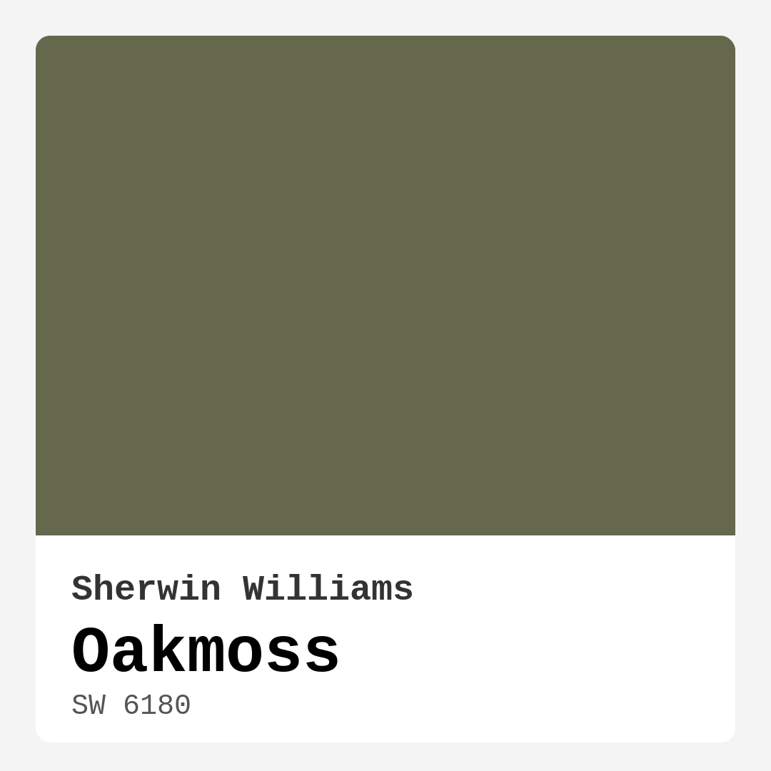
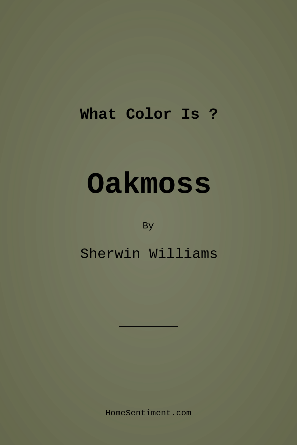
Color Preview & Key Details
| HEX Code | #65684C |
| RGB | 101, 104, 76 |
| LRV | 24% |
| Undertone | Yellow |
| Finish Options | Eggshell, Matte, Satin |
Imagine stepping into a room that instantly makes you feel at ease, a space that wraps you in warmth and comfort like a favorite sweater. That’s the magic of Oakmoss, a stunning paint color from Sherwin Williams. This rich, earthy green exudes a calming vibe that can transform any area into a serene retreat. Have you been on the fence about choosing this color for your home? Let’s dive into the world of Oakmoss and explore why it just might be the perfect fit for your next project.
Oakmoss, with its official code SW 6180, is characterized by a warm, muted green with subtle yellow undertones. This combination creates an elegant depth that draws you in without overwhelming the senses. When you think of Oakmoss, picture the tranquility of a forest, where nature’s beauty invites you to pause and breathe deeply.
One of the first things you’ll notice about Oakmoss is its versatility. It works beautifully in a variety of decor styles—be it modern farmhouse, rustic, bohemian, or contemporary. Whether you’re aiming for a laid-back vibe or a sophisticated atmosphere, this color can adapt. It’s a chameleon of sorts, seamlessly blending with your existing decor while still making a statement.
When it comes to the spaces best suited for Oakmoss, the possibilities are endless. This color shines in living rooms, bedrooms, home offices, and dining rooms. Imagine your living room adorned in this lush hue, creating a warm and inviting gathering space for friends and family. Or picture a cozy bedroom where Oakmoss promotes relaxation and restful sleep. The rich tone encourages an ambiance that feels grounded and welcoming, making it an ideal choice for your personal sanctuary.
Now, let’s talk about application. You don’t need to be a professional painter to work with Oakmoss. It’s beginner-friendly and comes in finishes like matte, eggshell, and satin, allowing you to choose the sheen that best fits your style. The paint goes on smoothly using a roller or brush and dries quickly, minimizing downtime during your project. Plus, it’s touch-up friendly, so if a scuff happens, restoring your walls is a breeze.
One of the most appealing aspects of Oakmoss is its low VOC (volatile organic compound) content. This eco-friendly feature means you can feel good about your choice, knowing you’re contributing to a healthier indoor environment. It’s washable and scrubbable as well, which is great for high-traffic areas or if you have kids or pets. The durability of this paint ensures it will stand the test of time, keeping your space looking fresh and vibrant.
However, like any color, Oakmoss has its nuances. With an LRV (Light Reflectance Value) of 24%, it’s considered medium dark and reflects very little light. This means it can appear darker in low-light conditions, so it’s essential to test it in your space before committing. Good lighting is crucial to showcasing its beauty, so consider how natural light flows through your rooms. In brighter spaces, Oakmoss reveals its vibrant green essence, while in dimmer settings, it adopts a richer, cozier tone—perfect for creating intimate areas.
The undertones of Oakmoss play a vital role in its character. With a leaning towards yellow, these subtle hints contribute to its warmth and complexity. When evaluating how it interacts with your existing furniture and decor, take a moment to observe how these undertones reveal themselves throughout the day. This is where the magic happens; colors can shift and change, creating a dynamic environment that feels alive.
You might be wondering what colors pair well with Oakmoss. You’re in for a treat! Soft whites and creams create a classic, timeless look that highlights the richness of Oakmoss beautifully. If you’re in the mood for a little adventure, warm tones like terracotta or muted blush can add a delightful pop. For a bolder contrast, deep navy or charcoal can create a striking visual effect that adds depth and interest to your space.
What about smaller areas? Can Oakmoss work in those? Absolutely! It can work wonders in small spaces by creating the illusion of depth and tranquility. Just be mindful of your room’s lighting, as it may darken slightly in dim areas. Pair it with lighter accents to keep the space feeling open and airy, and you’ll find that Oakmoss is a fantastic choice even in the coziest of corners.
In terms of mood, Oakmoss brings a sense of calm and grounding. It’s perfect for creating a cozy atmosphere that invites relaxation and connection. Whether you’re curling up with a book or hosting friends for dinner, Oakmoss sets the stage for memorable moments.
For those who love to decorate, Oakmoss is a designer favorite. It’s not just a color; it’s a mood enhancer that can elevate your space. Its earthy, muted tone provides a balanced backdrop that allows your decor to shine. Whether you’re using it as an accent wall or painting entire rooms, Oakmoss delivers a sophisticated finish that’s easy on the eyes.
As you contemplate your paint choices, keep in mind that Oakmoss isn’t just a color—it’s a lifestyle. It encourages you to embrace the beauty of nature indoors, creating a harmonious environment that nurtures the soul. With its versatile applications, ease of use, and warm, inviting hue, Oakmoss makes a compelling case for your next home project.
So, when you’re ready to take the plunge, remember: Oakmoss is not just about coverage or aesthetics; it’s about creating a space that feels authentically you. Embrace the warmth, the calm, and the beauty this color brings to your home. You may just find that Oakmoss becomes the heart of your living space, a beautiful reminder of nature’s soothing presence right within your walls.
Save this color to your Pinterest board to revisit when planning your room.
Real Room Photo of Oakmoss SW 6180
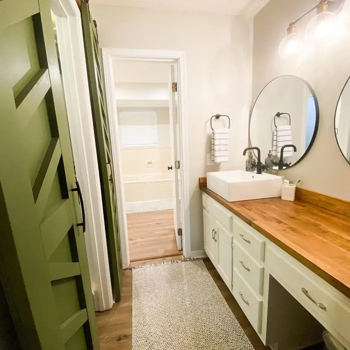
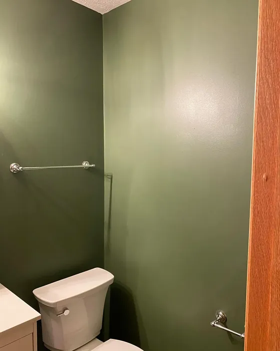

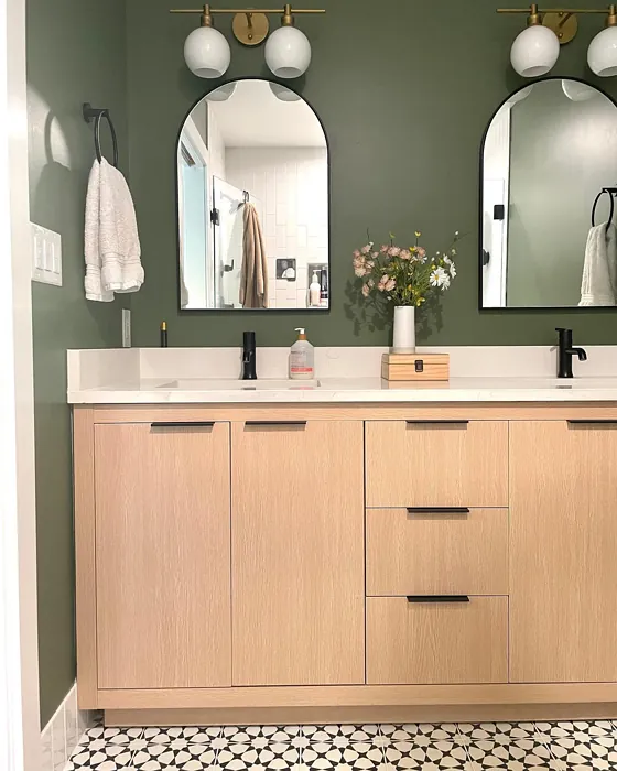
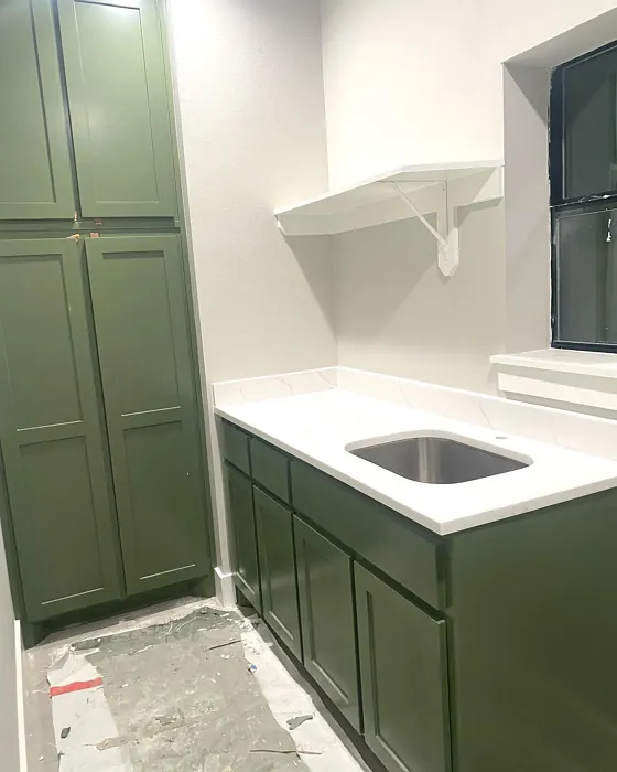
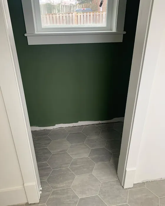
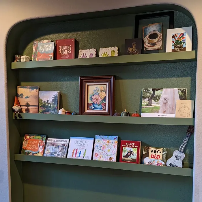
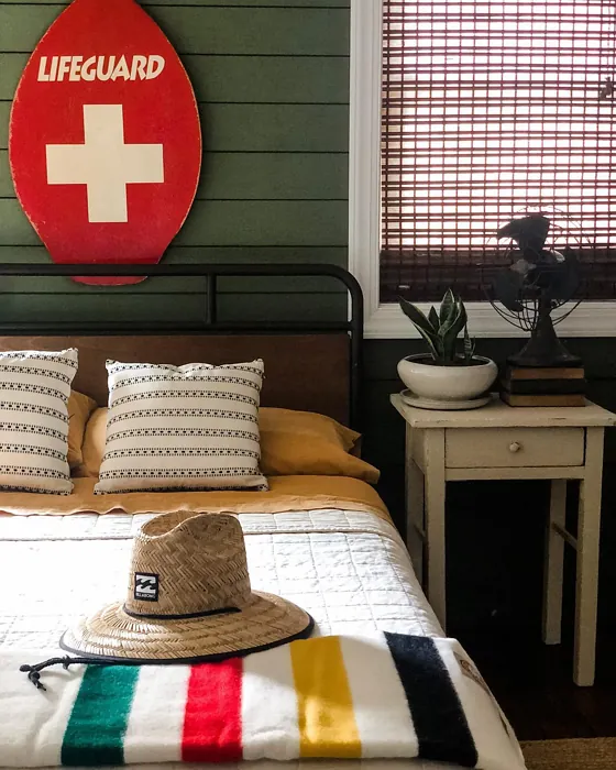
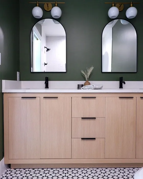


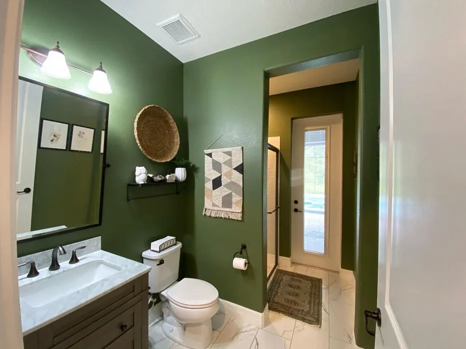
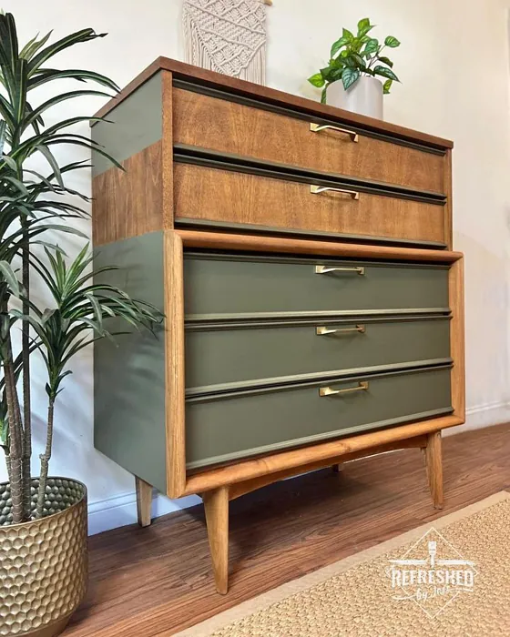
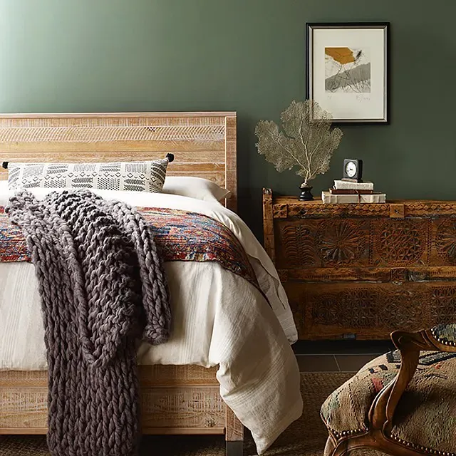
Real rooms painted with Oakmoss SW 6180 by Sherwin Williams. Lighting and photography can affect how colors appear — always test a sample swatch in your own space.
Undertones of Oakmoss ?
The undertones of Oakmoss are a key aspect of its character, leaning towards Yellow. These subtle underlying hues are what give the color its depth and complexity. For example, a gray with a blue undertone will feel cooler and more modern, while one with a brown undertone will feel warmer and more traditional. It’s essential to test this paint in your home and observe it next to your existing furniture, flooring, and decor to see how these undertones interact and reveal themselves throughout the day.
HEX value: #65684C
RGB code: 101, 104, 76
Is Oakmoss Cool or Warm?
Oakmoss is considered a warm paint color. This characteristic plays a huge role in the overall feel of a room. Warm colors, like this one, tend to create a cozy, inviting, and energetic atmosphere, making them great for social spaces like living rooms and dining rooms. In contrast, cool colors often evoke a sense of calm and serenity, which is why they are popular in bedrooms and bathrooms. The warmth of Oakmoss means it will pair beautifully with corresponding decor elements.
Understanding Color Properties and Interior Design Tips
Hue refers to a specific position on the color wheel, measured in degrees from 0 to 360. Each degree represents a different pure color:
- 0° represents red
- 120° represents green
- 240° represents blue
Saturation describes the intensity or purity of a color and is expressed as a percentage:
- At 0%, the color appears completely desaturated—essentially a shade of gray
- At 100%, the color is at its most vivid and vibrant
Lightness indicates how light or dark a color is, also expressed as a percentage:
- 0% lightness results in black
- 100% lightness results in white
Using Warm Colors in Interior Design
Warm hues—such as reds, oranges, yellows, warm beiges, and greiges—are excellent choices for creating inviting and energetic spaces. These colors are particularly well-suited for:
- Kitchens, living rooms, and bathrooms, where warmth enhances comfort and sociability
- Large rooms, where warm tones can help reduce the sense of emptiness and make the space feel more intimate
For example:
- Warm beige shades provide a cozy, inviting atmosphere, ideal for living rooms, bedrooms, and hallways.
- Warm greige (a mix of beige and gray) offers the warmth of beige with the modern appeal of gray, making it a versatile backdrop for dining areas, bedrooms, and living spaces.
However, be mindful when using warm light tones in rooms with limited natural light. These shades may appear muted or even take on an unpleasant yellowish tint. To avoid a dull or flat appearance:
- Add depth by incorporating richer tones like deep greens, charcoal, or chocolate brown
- Use textured elements such as curtains, rugs, or cushions to bring dimension to the space
Pro Tip: Achieving Harmony with Warm and Cool Color Balance
To create a well-balanced and visually interesting interior, mix warm and cool tones strategically. This contrast adds depth and harmony to your design.
- If your walls feature warm hues, introduce cool-colored accents such as blue or green furniture, artwork, or accessories to create contrast.
- For a polished look, consider using a complementary color scheme, which pairs colors opposite each other on the color wheel (e.g., red with green, orange with blue).
This thoughtful mix not only enhances visual appeal but also creates a space that feels both dynamic and cohesive.
Save this color to your Pinterest board to revisit when planning your room.
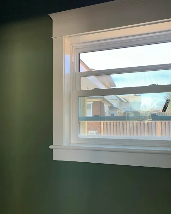
Light Temperature Affects on Oakmoss
Natural Light
Natural daylight changes in color temperature as the sun moves across the sky. At sunrise and sunset, the light tends to have a warm, golden tone with a color temperature around 2000 Kelvin (K). As the day progresses and the sun rises higher, the light becomes cooler and more neutral. Around midday, especially when the sky is clear, natural light typically reaches its peak brightness and shifts to a cooler tone, ranging from 5500 to 6500 Kelvin. This midday light is close to what we perceive as pure white or daylight-balanced light.
These shifts in natural light can significantly influence how colors appear in a space, which is why designers often consider both the time of day and the orientation of windows when planning interior color schemes.
Explore how this color transforms from sunrise through sunset as natural light changes throughout the day. Use the slider to simulate morning light, midday brightness, and warm afternoon tones.
North-facing rooms stay cooler throughout the day and benefit from warmer paint tones to compensate. South-facing rooms receive more direct sunlight, making even deeper shades more workable. East-facing rooms get bright morning light that fades by afternoon, while west-facing rooms glow warmly in the evening.
Artificial Light
When choosing artificial lighting, pay close attention to the color temperature, measured in Kelvin (K). This determines how warm or cool the light will appear. Lower temperatures, around 2700K, give off a warm, yellow glow often used in living rooms or bedrooms. Higher temperatures, above 5000K, create a cool, bluish light similar to daylight, commonly used in kitchens, offices, or task areas.
Use the slider to see how lighting temperature can affect the appearance of a surface or color throughout a space.
See how this color looks under different artificial light temperatures — from warm candlelight (2000K) to cool daylight (7000K). Move the slider to simulate your room's lighting conditions.


4800K
Keep in mind that natural light from windows, the warmth of lamps, and overhead lighting all affect how this color reads on your walls at different times of day. Always observe a sample swatch in your actual space before purchasing.
LRV of Oakmoss
The Light Reflectance Value (LRV) of Oakmoss is 24%, which places it in the Medium Dark category. This means it reflects very little light. Understanding a paint’s LRV is crucial for predicting how it will look in your space. A higher LRV indicates a lighter color that reflects more light, making rooms feel larger and brighter. A lower LRV signifies a darker color that absorbs more light, creating a cozier, more intimate atmosphere. Always consider the natural and artificial lighting in your room when selecting a paint color based on its LRV.
Detailed Review of Oakmoss
Additional Paint Characteristics
Ideal Rooms
Bedroom, Dining Room, Home Office, Kitchen, Living Room
Decor Styles
Bohemian, Contemporary, Modern Farmhouse, Rustic
Coverage
Good (1–2 Coats), Touch-Up Friendly
Ease of Application
Beginner Friendly, Brush Smooth, Fast-Drying, Roller-Ready
Washability
Scrubbable, Washable
VOC Level
Eco-Certified, Low VOC
Best Use
Accent Wall, Furniture, Interior Walls, Trim
Room Suitability
Bedroom, Dining Room, Home Office, Living Room
Tone Tag
Balanced, Earthy, Muted
Finish Type
Eggshell, Matte, Satin
Paint Performance
Easy Touch-Up, Fade Resistant, Low Odor
Use Cases
Best for Modern Farmhouse, Best for Small Spaces, Classic Favorite, Designer Favorite
Mood
Calm, Cozy, Grounding
Trim Pairing
Complements Brass Fixtures, Good with Wood Trim, Pairs with White Dove
Oakmoss is a stunning choice for anyone looking to refresh their space with a natural vibe. It’s not just a color; it’s a mood enhancer, perfect for creating a calming atmosphere in your home. The versatility of Oakmoss allows it to blend seamlessly with various decor styles, from rustic to modern. When applied, it showcases a beautiful depth that can change with the light, making it an interesting choice for different times of the day. Plus, it dries smoothly, leaving you with a sophisticated finish that’s easy on the eyes. Just keep in mind that depending on your lighting, you might want to test it out first to see how it interacts with your space.
Pros & Cons of SW 6180 Oakmoss
Pros
Cons
Colors that go with Sherwin Williams Oakmoss
FAQ on SW 6180 Oakmoss
Can Oakmoss be used in small spaces?
Absolutely! Oakmoss can work wonders in small spaces by creating the illusion of depth and tranquility. Just be mindful of your room’s lighting; it can darken slightly in dim areas. Pair it with lighter accents to keep the space feeling open and airy.
What colors pair well with Oakmoss?
Oakmoss pairs beautifully with soft whites and creams for a classic look. If you want to add a pop of color, consider warm tones like terracotta or muted blush. For a bolder contrast, deep navy or charcoal can create a striking visual effect.
Comparisons Oakmoss with other colors
Oakmoss SW 6180 vs Dried Thyme SW 6186
| Attribute | Oakmoss SW 6180 | Dried Thyme SW 6186 |
|---|---|---|
| Color Name | Oakmoss SW 6180 | Dried Thyme SW 6186 |
| Color | ||
| Hue | Green | Green |
| Brightness | Dark | Dark |
| RGB | 101, 104, 76 | 123, 128, 112 |
| LRV | 24% | 24% |
| Finish Type | Eggshell, Matte, Satin | Eggshell, Satin |
| Finish Options | Eggshell, Matte, Satin | Eggshell, Matte, Satin |
| Ideal Rooms | Bedroom, Dining Room, Home Office, Kitchen, Living Room | Bathroom, Bedroom, Dining Room, Entryway, Home Office, Kitchen, Living Room |
| Decor Styles | Bohemian, Contemporary, Modern Farmhouse, Rustic | Bohemian, Industrial, Minimalist, Modern Farmhouse, Rustic |
| Coverage | Good (1–2 Coats), Touch-Up Friendly | Good (1–2 Coats), Touch-Up Friendly |
| Ease of Application | Beginner Friendly, Brush Smooth, Fast-Drying, Roller-Ready | Beginner Friendly, Brush Smooth, Roller-Ready |
| Washability | Scrubbable, Washable | Washable, Wipeable |
| Room Suitability | Bedroom, Dining Room, Home Office, Living Room | Bathroom, Bedroom, Dining Room, Home Office, Kitchen, Living Room |
| Tone | Balanced, Earthy, Muted | Cool, Earthy, Muted |
| Paint Performance | Easy Touch-Up, Fade Resistant, Low Odor | Easy Touch-Up, Low Odor, Scuff Resistant |
Lighting conditions, wall orientation, and surrounding decor can significantly affect how these colors appear in your space. Always test a sample swatch before committing to a full application.
Oakmoss SW 6180 vs Retreat SW 6207
| Attribute | Oakmoss SW 6180 | Retreat SW 6207 |
|---|---|---|
| Color Name | Oakmoss SW 6180 | Retreat SW 6207 |
| Color | ||
| Hue | Green | Green |
| Brightness | Dark | Dark |
| RGB | 101, 104, 76 | 122, 128, 118 |
| LRV | 24% | 30% |
| Finish Type | Eggshell, Matte, Satin | Eggshell, Matte, Satin |
| Finish Options | Eggshell, Matte, Satin | Eggshell, Matte, Satin |
| Ideal Rooms | Bedroom, Dining Room, Home Office, Kitchen, Living Room | Bathroom, Bedroom, Home Office, Kitchen, Living Room |
| Decor Styles | Bohemian, Contemporary, Modern Farmhouse, Rustic | Minimalist, Modern, Rustic, Transitional |
| Coverage | Good (1–2 Coats), Touch-Up Friendly | Good (1–2 Coats), Touch-Up Friendly |
| Ease of Application | Beginner Friendly, Brush Smooth, Fast-Drying, Roller-Ready | Beginner Friendly, Brush Smooth, Roller-Ready |
| Washability | Scrubbable, Washable | Washable, Wipeable |
| Room Suitability | Bedroom, Dining Room, Home Office, Living Room | Bathroom, Bedroom, Home Office, Living Room |
| Tone | Balanced, Earthy, Muted | Cool, Earthy, Muted |
| Paint Performance | Easy Touch-Up, Fade Resistant, Low Odor | Easy Touch-Up, Low Odor, Scuff Resistant |
Lighting conditions, wall orientation, and surrounding decor can significantly affect how these colors appear in your space. Always test a sample swatch before committing to a full application.
Oakmoss SW 6180 vs Rosemary SW 6187
| Attribute | Oakmoss SW 6180 | Rosemary SW 6187 |
|---|---|---|
| Color Name | Oakmoss SW 6180 | Rosemary SW 6187 |
| Color | ||
| Hue | Green | Green |
| Brightness | Dark | Dark |
| RGB | 101, 104, 76 | 100, 105, 92 |
| LRV | 24% | 45% |
| Finish Type | Eggshell, Matte, Satin | Eggshell, Matte, Satin |
| Finish Options | Eggshell, Matte, Satin | Eggshell, Matte, Satin |
| Ideal Rooms | Bedroom, Dining Room, Home Office, Kitchen, Living Room | Bedroom, Dining Room, Hallway, Home Office, Living Room |
| Decor Styles | Bohemian, Contemporary, Modern Farmhouse, Rustic | Bohemian, Coastal, Modern Farmhouse, Rustic |
| Coverage | Good (1–2 Coats), Touch-Up Friendly | Good (1–2 Coats), Touch-Up Friendly |
| Ease of Application | Beginner Friendly, Brush Smooth, Fast-Drying, Roller-Ready | Beginner Friendly, Brush Smooth, Roller-Ready |
| Washability | Scrubbable, Washable | Washable, Wipeable |
| Room Suitability | Bedroom, Dining Room, Home Office, Living Room | Bedroom, Dining Room, Home Office, Living Room |
| Tone | Balanced, Earthy, Muted | Earthy, Muted, Warm |
| Paint Performance | Easy Touch-Up, Fade Resistant, Low Odor | Fade Resistant, Low Odor, Quick Drying, Stain Resistant |
Lighting conditions, wall orientation, and surrounding decor can significantly affect how these colors appear in your space. Always test a sample swatch before committing to a full application.
Oakmoss SW 6180 vs Basil SW 6194
| Attribute | Oakmoss SW 6180 | Basil SW 6194 |
|---|---|---|
| Color Name | Oakmoss SW 6180 | Basil SW 6194 |
| Color | ||
| Hue | Green | Green |
| Brightness | Dark | Dark |
| RGB | 101, 104, 76 | 98, 110, 96 |
| LRV | 24% | 12% |
| Finish Type | Eggshell, Matte, Satin | Eggshell, Matte, Satin |
| Finish Options | Eggshell, Matte, Satin | Eggshell, Matte, Satin |
| Ideal Rooms | Bedroom, Dining Room, Home Office, Kitchen, Living Room | Bathroom, Bedroom, Dining Room, Home Office, Kitchen, Living Room |
| Decor Styles | Bohemian, Contemporary, Modern Farmhouse, Rustic | Bohemian, Contemporary, Modern Farmhouse, Rustic, Transitional |
| Coverage | Good (1–2 Coats), Touch-Up Friendly | Good (1–2 Coats), Touch-Up Friendly |
| Ease of Application | Beginner Friendly, Brush Smooth, Fast-Drying, Roller-Ready | Beginner Friendly, Brush Smooth, Fast-Drying, Roller-Ready |
| Washability | Scrubbable, Washable | Washable, Wipeable |
| Room Suitability | Bedroom, Dining Room, Home Office, Living Room | Bathroom, Bedroom, Dining Room, Kitchen, Living Room |
| Tone | Balanced, Earthy, Muted | Earthy, Muted, Warm |
| Paint Performance | Easy Touch-Up, Fade Resistant, Low Odor | Easy Touch-Up, Low Odor, Quick Drying |
Lighting conditions, wall orientation, and surrounding decor can significantly affect how these colors appear in your space. Always test a sample swatch before committing to a full application.
Oakmoss SW 6180 vs Artichoke SW 6179
| Attribute | Oakmoss SW 6180 | Artichoke SW 6179 |
|---|---|---|
| Color Name | Oakmoss SW 6180 | Artichoke SW 6179 |
| Color | ||
| Hue | Green | Green |
| Brightness | Dark | Dark |
| RGB | 101, 104, 76 | 127, 130, 102 |
| LRV | 24% | 24% |
| Finish Type | Eggshell, Matte, Satin | Eggshell, Matte, Satin |
| Finish Options | Eggshell, Matte, Satin | Eggshell, Matte, Satin |
| Ideal Rooms | Bedroom, Dining Room, Home Office, Kitchen, Living Room | Bedroom, Dining Room, Home Office, Living Room |
| Decor Styles | Bohemian, Contemporary, Modern Farmhouse, Rustic | Eclectic, Modern Farmhouse, Rustic, Transitional |
| Coverage | Good (1–2 Coats), Touch-Up Friendly | Good (1–2 Coats), Touch-Up Friendly |
| Ease of Application | Beginner Friendly, Brush Smooth, Fast-Drying, Roller-Ready | Beginner Friendly, Brush Smooth, Fast-Drying, Roller-Ready |
| Washability | Scrubbable, Washable | Washable, Wipeable |
| Room Suitability | Bedroom, Dining Room, Home Office, Living Room | Bedroom, Dining Room, Home Office, Living Room |
| Tone | Balanced, Earthy, Muted | Earthy, Muted, Warm |
| Paint Performance | Easy Touch-Up, Fade Resistant, Low Odor | Easy Touch-Up, High Coverage, Low Odor |
Lighting conditions, wall orientation, and surrounding decor can significantly affect how these colors appear in your space. Always test a sample swatch before committing to a full application.
Oakmoss SW 6180 vs Shade-Grown SW 6188
| Attribute | Oakmoss SW 6180 | Shade-Grown SW 6188 |
|---|---|---|
| Color Name | Oakmoss SW 6180 | Shade-Grown SW 6188 |
| Color | ||
| Hue | Green | Green |
| Brightness | Dark | Dark |
| RGB | 101, 104, 76 | 78, 81, 71 |
| LRV | 24% | 24% |
| Finish Type | Eggshell, Matte, Satin | Eggshell, Satin |
| Finish Options | Eggshell, Matte, Satin | Eggshell, Flat, Satin |
| Ideal Rooms | Bedroom, Dining Room, Home Office, Kitchen, Living Room | Bedroom, Dining Room, Home Office, Living Room |
| Decor Styles | Bohemian, Contemporary, Modern Farmhouse, Rustic | Bohemian, Modern, Rustic, Scandinavian |
| Coverage | Good (1–2 Coats), Touch-Up Friendly | Good (1–2 Coats), Touch-Up Friendly |
| Ease of Application | Beginner Friendly, Brush Smooth, Fast-Drying, Roller-Ready | Beginner Friendly, Brush Smooth, Fast-Drying, Roller-Ready |
| Washability | Scrubbable, Washable | Highly Washable, Washable |
| Room Suitability | Bedroom, Dining Room, Home Office, Living Room | Bedroom, Dining Room, Home Office, Living Room |
| Tone | Balanced, Earthy, Muted | Deep, Earthy, Muted |
| Paint Performance | Easy Touch-Up, Fade Resistant, Low Odor | Easy Touch-Up, High Coverage, Low Odor, Scuff Resistant |
Lighting conditions, wall orientation, and surrounding decor can significantly affect how these colors appear in your space. Always test a sample swatch before committing to a full application.
Oakmoss SW 6180 vs Foxhall Green SW 9184
| Attribute | Oakmoss SW 6180 | Foxhall Green SW 9184 |
|---|---|---|
| Color Name | Oakmoss SW 6180 | Foxhall Green SW 9184 |
| Color | ||
| Hue | Green | Green |
| Brightness | Dark | Dark |
| RGB | 101, 104, 76 | 69, 75, 64 |
| LRV | 24% | 12% |
| Finish Type | Eggshell, Matte, Satin | Eggshell, Matte, Satin |
| Finish Options | Eggshell, Matte, Satin | Eggshell, Matte, Satin |
| Ideal Rooms | Bedroom, Dining Room, Home Office, Kitchen, Living Room | Bedroom, Dining Room, Home Office, Living Room |
| Decor Styles | Bohemian, Contemporary, Modern Farmhouse, Rustic | Contemporary, Modern Farmhouse, Rustic, Traditional |
| Coverage | Good (1–2 Coats), Touch-Up Friendly | Good (1–2 Coats), Touch-Up Friendly |
| Ease of Application | Beginner Friendly, Brush Smooth, Fast-Drying, Roller-Ready | Beginner Friendly, Brush Smooth, Fast-Drying, Roller-Ready |
| Washability | Scrubbable, Washable | Washable, Wipeable |
| Room Suitability | Bedroom, Dining Room, Home Office, Living Room | Bedroom, Dining Room, Home Office, Living Room |
| Tone | Balanced, Earthy, Muted | Balanced, Deep, Earthy, Muted |
| Paint Performance | Easy Touch-Up, Fade Resistant, Low Odor | Easy Touch-Up, Fade Resistant, Low Odor, Quick Drying |
Lighting conditions, wall orientation, and surrounding decor can significantly affect how these colors appear in your space. Always test a sample swatch before committing to a full application.
Oakmoss SW 6180 vs Pewter Green SW 6208
| Attribute | Oakmoss SW 6180 | Pewter Green SW 6208 |
|---|---|---|
| Color Name | Oakmoss SW 6180 | Pewter Green SW 6208 |
| Color | ||
| Hue | Green | Green |
| Brightness | Dark | Dark |
| RGB | 101, 104, 76 | 94, 98, 89 |
| LRV | 24% | 24% |
| Finish Type | Eggshell, Matte, Satin | Eggshell, Matte, Satin |
| Finish Options | Eggshell, Matte, Satin | Eggshell, Matte, Satin |
| Ideal Rooms | Bedroom, Dining Room, Home Office, Kitchen, Living Room | Bedroom, Dining Room, Entryway, Home Office, Living Room |
| Decor Styles | Bohemian, Contemporary, Modern Farmhouse, Rustic | Contemporary, Modern Farmhouse, Rustic, Scandinavian, Traditional |
| Coverage | Good (1–2 Coats), Touch-Up Friendly | Good (1–2 Coats), Touch-Up Friendly |
| Ease of Application | Beginner Friendly, Brush Smooth, Fast-Drying, Roller-Ready | Beginner Friendly, Brush Smooth, Fast-Drying, Roller-Ready |
| Washability | Scrubbable, Washable | Highly Washable, Washable, Wipeable |
| Room Suitability | Bedroom, Dining Room, Home Office, Living Room | Bathroom, Bedroom, Dining Room, Kitchen, Living Room |
| Tone | Balanced, Earthy, Muted | Balanced, Cool, Earthy, Muted |
| Paint Performance | Easy Touch-Up, Fade Resistant, Low Odor | Easy Touch-Up, Fade Resistant, Low Odor, Quick Drying |
Lighting conditions, wall orientation, and surrounding decor can significantly affect how these colors appear in your space. Always test a sample swatch before committing to a full application.
Oakmoss SW 6180 vs Rookwood Dark Green SW 2816
| Attribute | Oakmoss SW 6180 | Rookwood Dark Green SW 2816 |
|---|---|---|
| Color Name | Oakmoss SW 6180 | Rookwood Dark Green SW 2816 |
| Color | ||
| Hue | Green | Green |
| Brightness | Dark | Dark |
| RGB | 101, 104, 76 | 86, 92, 74 |
| LRV | 24% | 6% |
| Finish Type | Eggshell, Matte, Satin | Eggshell, Matte, Satin |
| Finish Options | Eggshell, Matte, Satin | Eggshell, Matte, Satin |
| Ideal Rooms | Bedroom, Dining Room, Home Office, Kitchen, Living Room | Bedroom, Dining Room, Home Office, Kitchen, Living Room |
| Decor Styles | Bohemian, Contemporary, Modern Farmhouse, Rustic | Contemporary, Modern Farmhouse, Rustic, Traditional |
| Coverage | Good (1–2 Coats), Touch-Up Friendly | Good (1–2 Coats), Touch-Up Friendly |
| Ease of Application | Beginner Friendly, Brush Smooth, Fast-Drying, Roller-Ready | Beginner Friendly, Brush Smooth, Roller-Ready |
| Washability | Scrubbable, Washable | Washable, Wipeable |
| Room Suitability | Bedroom, Dining Room, Home Office, Living Room | Bedroom, Dining Room, Home Office, Living Room |
| Tone | Balanced, Earthy, Muted | Deep, Earthy, Warm |
| Paint Performance | Easy Touch-Up, Fade Resistant, Low Odor | Easy Touch-Up, High Coverage, Low Odor, Scuff Resistant |
Lighting conditions, wall orientation, and surrounding decor can significantly affect how these colors appear in your space. Always test a sample swatch before committing to a full application.
Oakmoss SW 6180 vs Ripe Olive SW 6209
| Attribute | Oakmoss SW 6180 | Ripe Olive SW 6209 |
|---|---|---|
| Color Name | Oakmoss SW 6180 | Ripe Olive SW 6209 |
| Color | ||
| Hue | Green | Green |
| Brightness | Dark | Dark |
| RGB | 101, 104, 76 | 68, 72, 61 |
| LRV | 24% | 15% |
| Finish Type | Eggshell, Matte, Satin | Eggshell, Matte |
| Finish Options | Eggshell, Matte, Satin | Eggshell, Matte, Satin |
| Ideal Rooms | Bedroom, Dining Room, Home Office, Kitchen, Living Room | Bedroom, Dining Room, Home Office, Living Room |
| Decor Styles | Bohemian, Contemporary, Modern Farmhouse, Rustic | Bohemian, Industrial, Modern Farmhouse, Rustic |
| Coverage | Good (1–2 Coats), Touch-Up Friendly | Good (1–2 Coats) |
| Ease of Application | Beginner Friendly, Brush Smooth, Fast-Drying, Roller-Ready | Beginner Friendly, Brush Smooth, Roller-Ready |
| Washability | Scrubbable, Washable | Highly Washable, Washable |
| Room Suitability | Bedroom, Dining Room, Home Office, Living Room | Bedroom, Dining Room, Home Office, Living Room |
| Tone | Balanced, Earthy, Muted | Deep, Earthy, Muted |
| Paint Performance | Easy Touch-Up, Fade Resistant, Low Odor | Easy Touch-Up, High Coverage, Low Odor |
Lighting conditions, wall orientation, and surrounding decor can significantly affect how these colors appear in your space. Always test a sample swatch before committing to a full application.
Official Page of Sherwin Williams Oakmoss SW 6180