
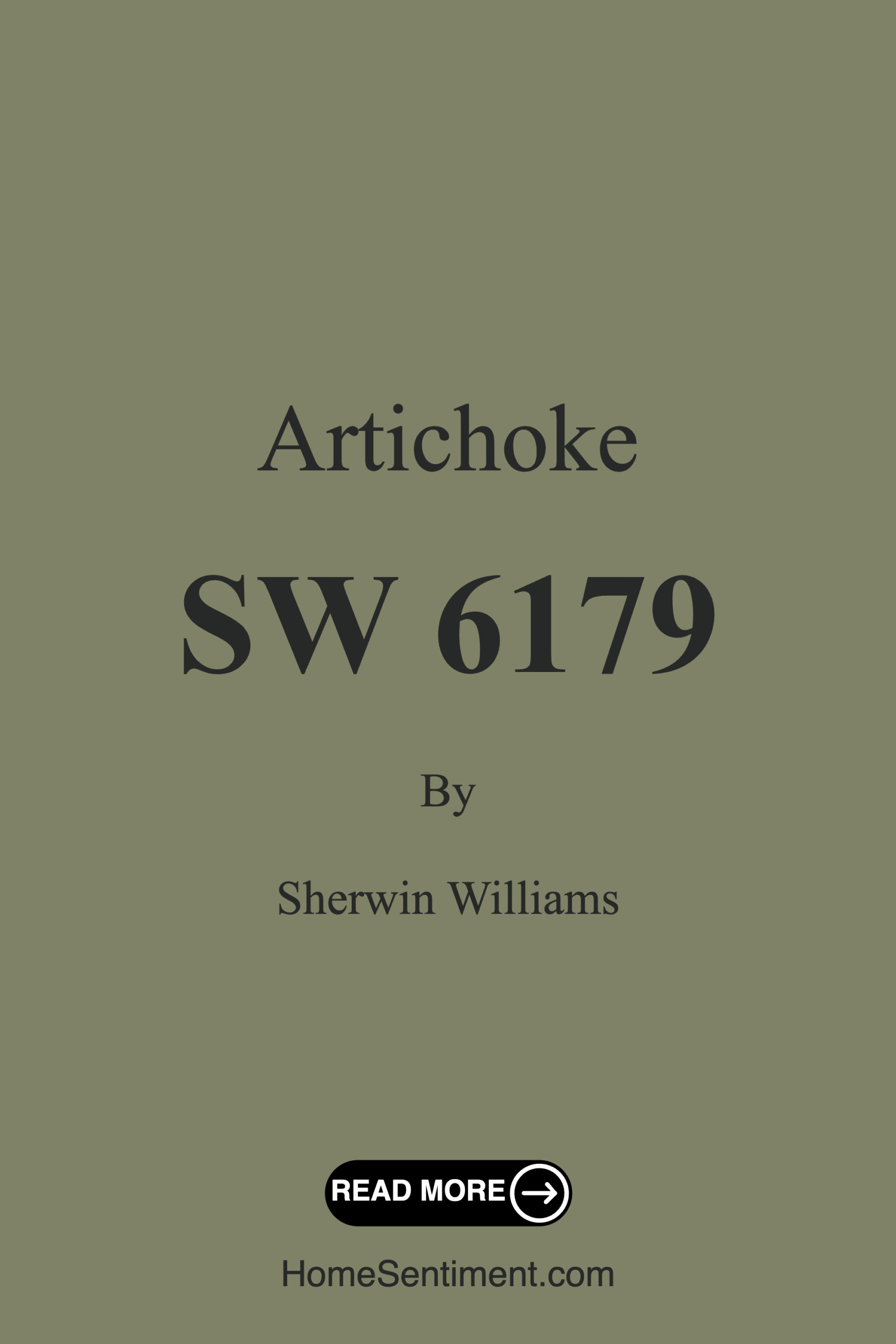
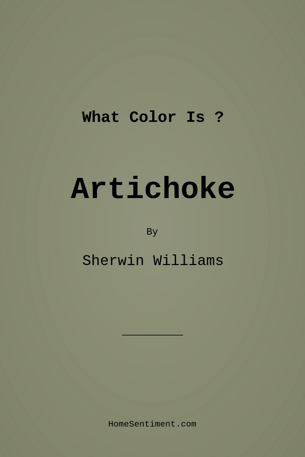
Color Preview & Key Details
| HEX Code | #7F8266 |
| RGB | 127, 130, 102 |
| LRV | 24% |
| Undertone | Yellow |
| Finish Options | Eggshell, Matte, Satin |
Imagine stepping into a room that instantly wraps you in a warm, inviting embrace. That’s the feeling you get when you walk into a space adorned with Sherwin Williams’ Artichoke (SW 6179). This soothing green-gray hue captures the essence of nature, bringing a tranquil yet sophisticated atmosphere into your home. It’s perfect for those moments when you crave comfort and serenity, whether you’re unwinding after a long day or hosting friends for dinner.
Artichoke is more than just a color; it’s a versatile choice that seamlessly fits into various decor styles. Picture it in a modern farmhouse setting, where rustic wooden furniture contrasts beautifully with its muted tones. Or imagine it in a cozy bedroom, creating a peaceful retreat adorned with soft textiles and natural materials. Its earthy, muted quality makes it an excellent fit for eclectic spaces, too, allowing for creative expressions without overwhelming your aesthetic.
One of the standout features of Artichoke is its warm undertone. Leaning towards yellow, this color adds depth and richness to your walls, making it feel alive without being too bold. This warmth is particularly inviting, making it a fantastic choice for social spaces like living rooms and dining rooms. In these areas, Artichoke can foster conversation and connection, enhancing the overall ambiance.
With an LRV (Light Reflectance Value) of 24%, Artichoke falls into the medium dark category, which means it absorbs more light than it reflects. This trait creates a cozy, intimate feel, especially in low-light settings. You can expect it to take on different characteristics throughout the day, shifting from a soft glow in natural light to a more subdued, calming presence in the evenings. Understanding how light interacts with this color is crucial, especially when imagining your space at different times of day.
Artichoke is also incredibly practical. It’s beginner-friendly to apply, whether you choose a brush or roller. Quick-drying and easy to touch up, it’s perfect for anyone looking to refresh their space without the hassle of a complicated project. Plus, its washability means you can maintain that fresh look with minimal effort, making it ideal for high-traffic areas.
When it comes to pairing, Artichoke shines. Its versatility allows it to complement a spectrum of colors. Soft whites, like White Dove or Simply White, create a crisp contrast that brightens the space, while earthy tones such as terracotta or muted yellows enhance its natural charm. If you’re in the mood for a more dramatic effect, consider darker shades like charcoal or navy to add depth and sophistication.
For those wondering about smaller rooms, Artichoke works wonders. Its calming hue can make a compact space feel more open and inviting. When paired with lighter trim and strategic lighting, it creates an illusion of spaciousness. Just keep in mind that darker lighting can make the room feel a bit smaller, so play with your light sources to achieve that perfect balance.
The finish you choose can also influence Artichoke’s overall vibe. Whether you opt for a matte, eggshell, or satin finish, each brings its own unique texture and feel. A matte finish can create a soft, understated elegance, while satin offers a subtle sheen that can make the color pop just a bit more, reflecting light beautifully.
As you start envisioning Artichoke in your own space, don’t forget to consider its undertones and how they interact with your existing decor. These subtle hues can reveal themselves in different lights, creating an ever-changing atmosphere in your home. Testing the paint next to your furniture and flooring is a smart step to ensure that everything harmonizes beautifully.
Artichoke is particularly effective in creating a peaceful environment, which is essential for spaces where relaxation is key, like bedrooms or home offices. The calming influence of this color can help you unwind and recharge, turning your home into a sanctuary from the outside world.
In summary, Sherwin Williams’ Artichoke is a standout choice for anyone looking to infuse their home with warmth and sophistication. Its unique green-gray shade offers a versatile backdrop that enhances the beauty of any room while providing a calming presence. Whether you’re redecorating a cozy bedroom, transforming a stylish home office, or creating an inviting dining area, Artichoke delivers a soothing touch that is sure to impress.
So, are you ready to transform your space with Artichoke? With its comforting tones and practical application, this color could be the perfect choice for your next project. Trust me, once you see how it breathes new life into your home, you’ll wonder how you ever lived without it.
Save this color to your Pinterest board to revisit when planning your room.
Real Room Photo of Artichoke SW 6179
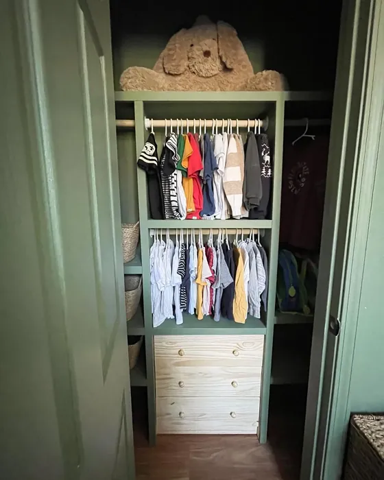
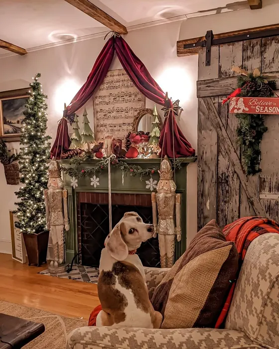

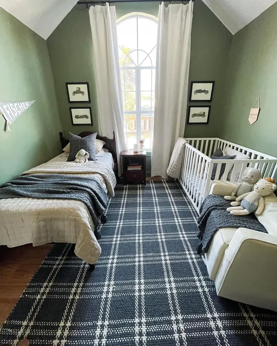


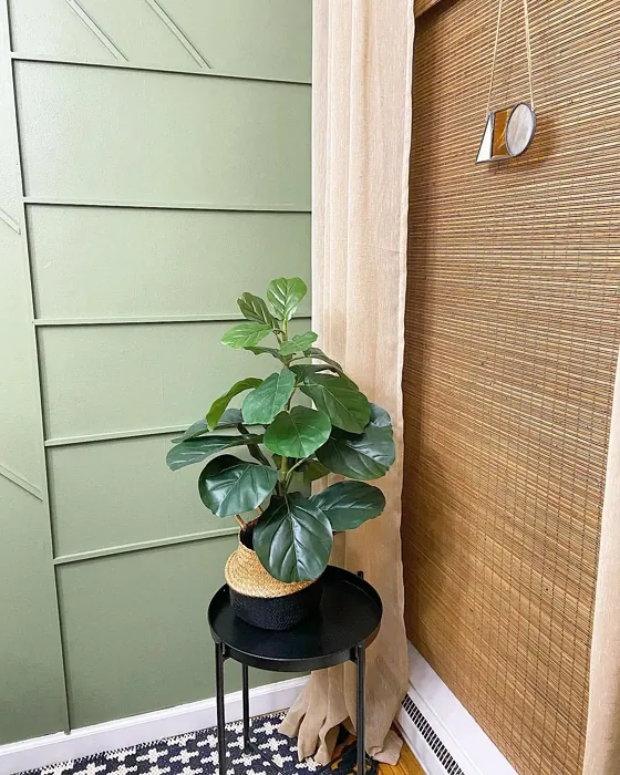
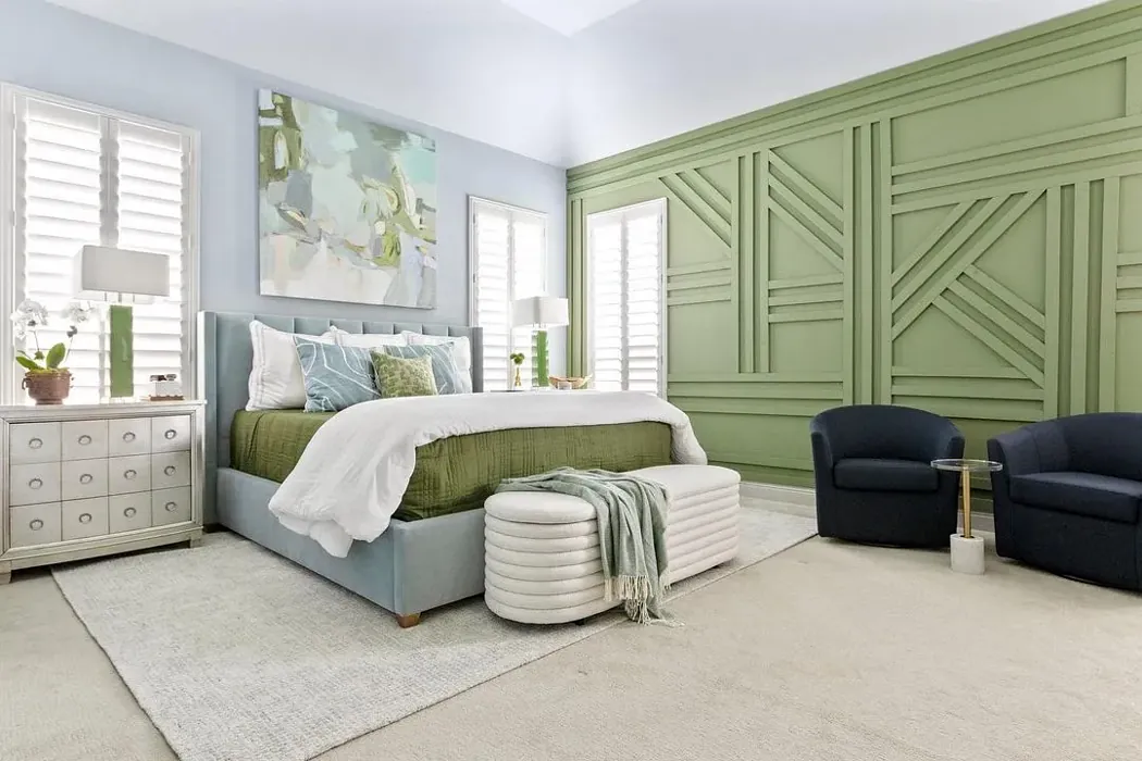
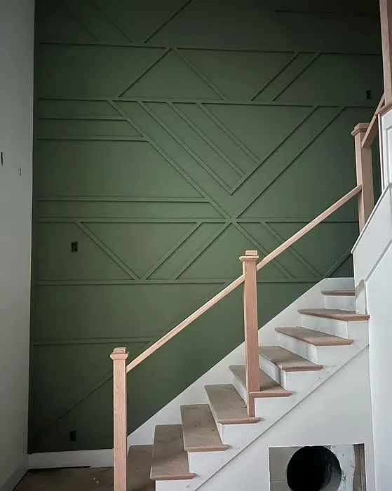

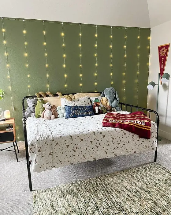
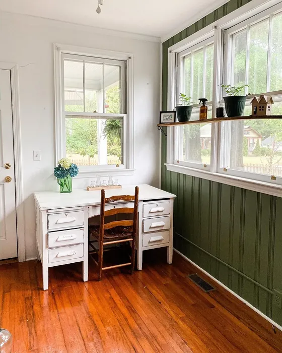
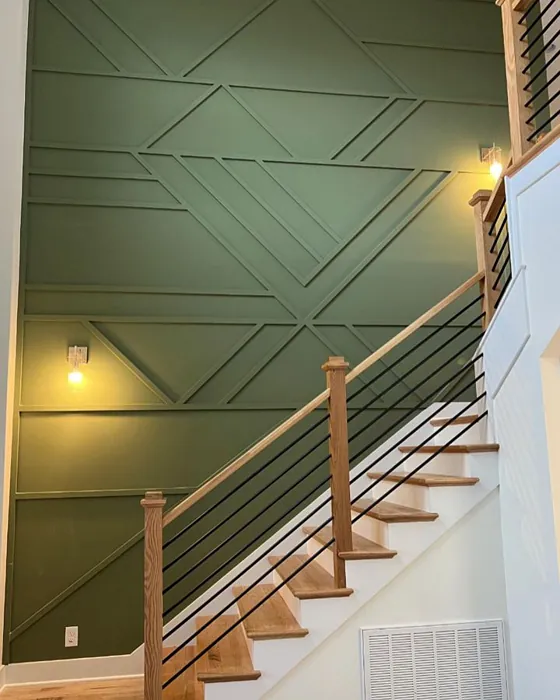
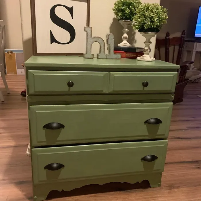
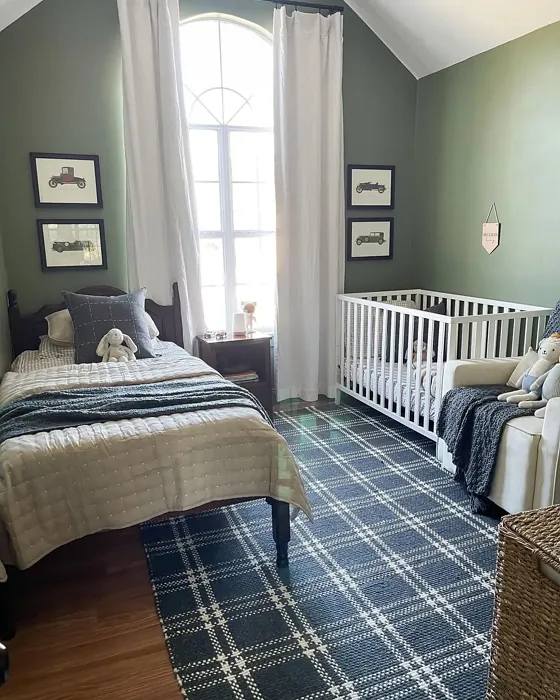
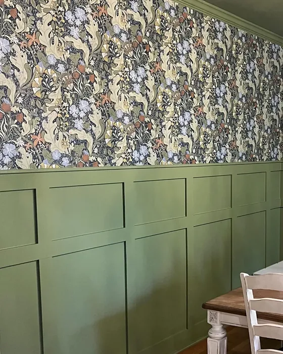
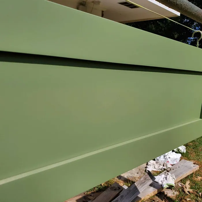
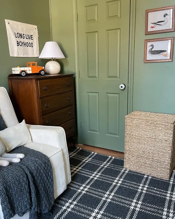
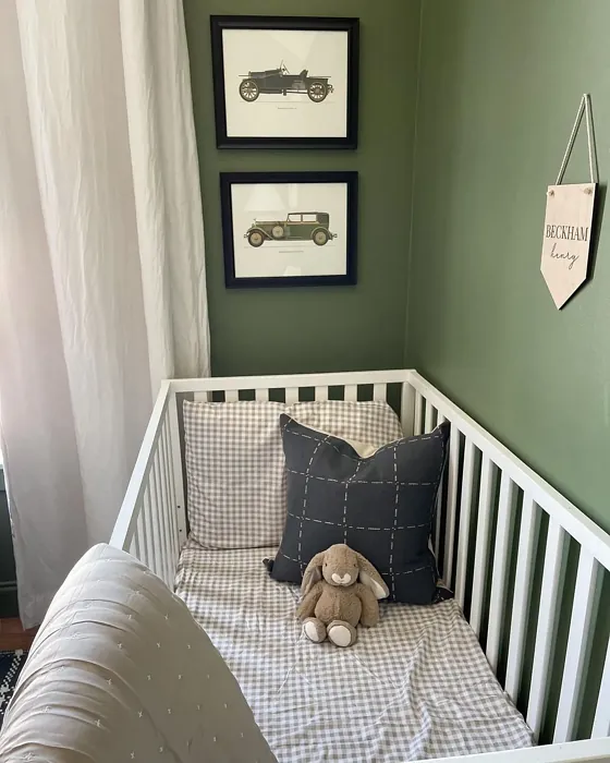
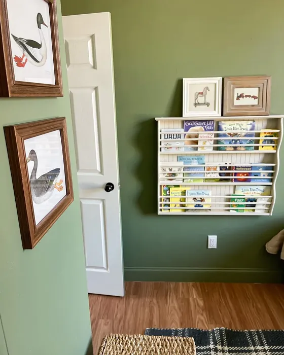

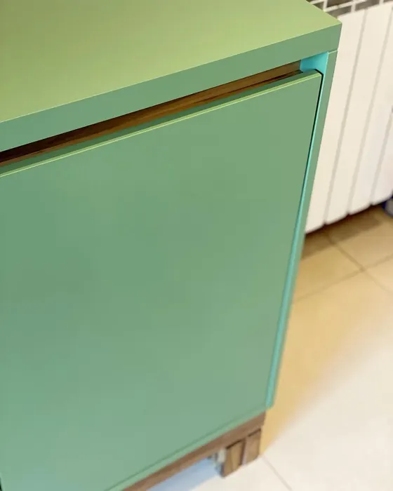
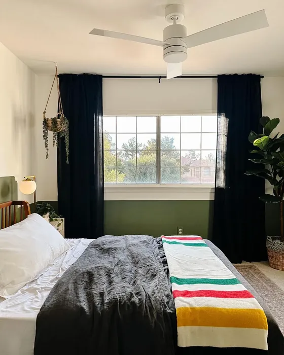
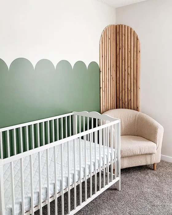
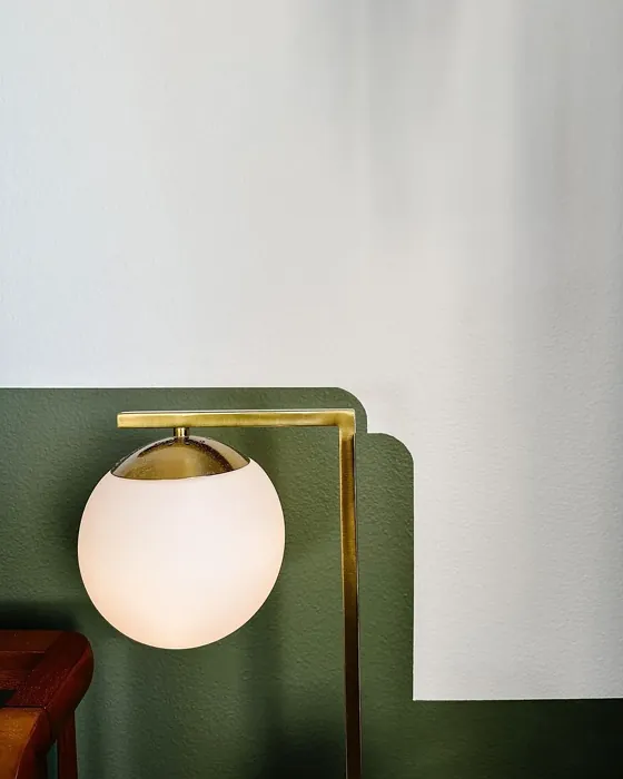
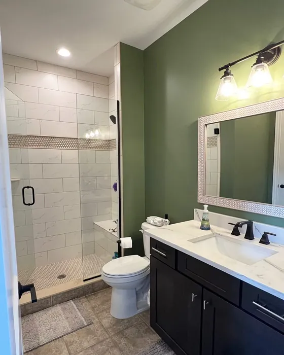

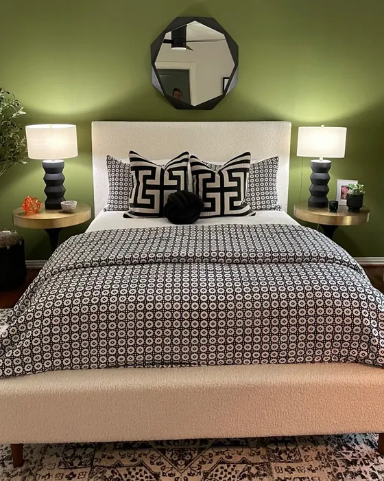
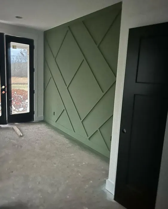
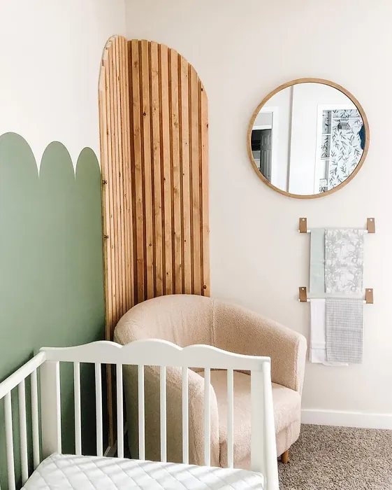
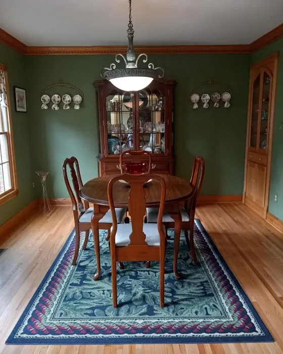
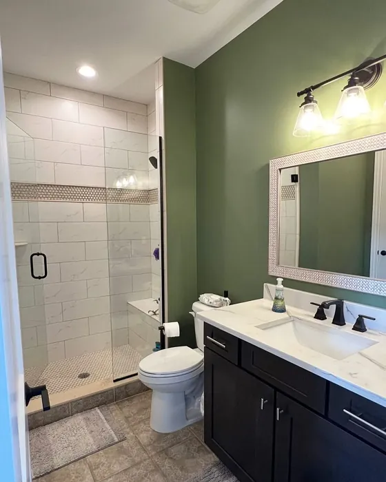

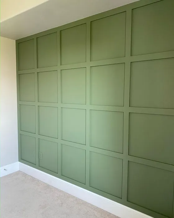
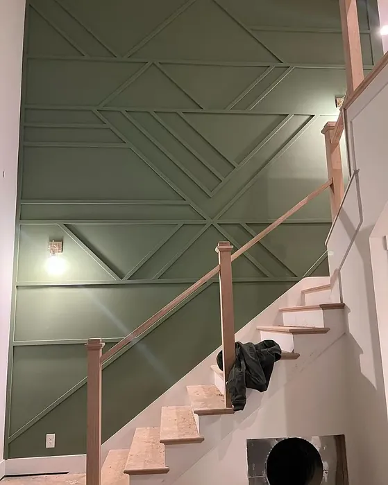
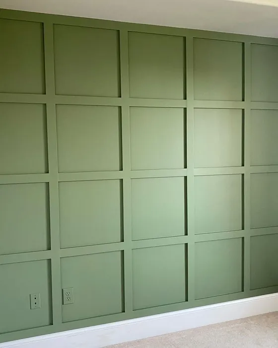
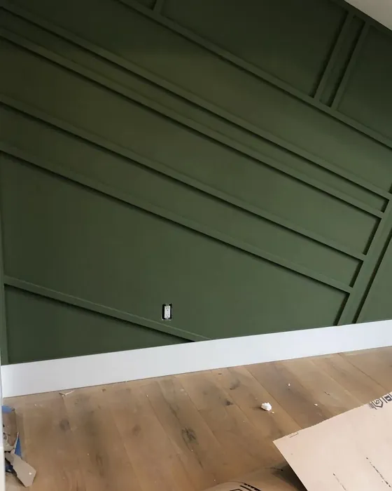

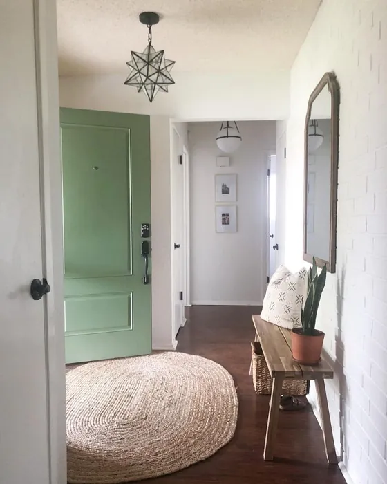
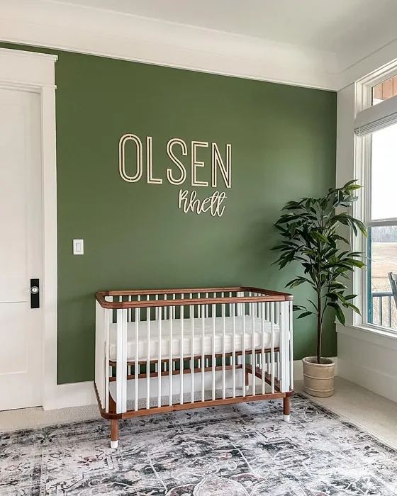

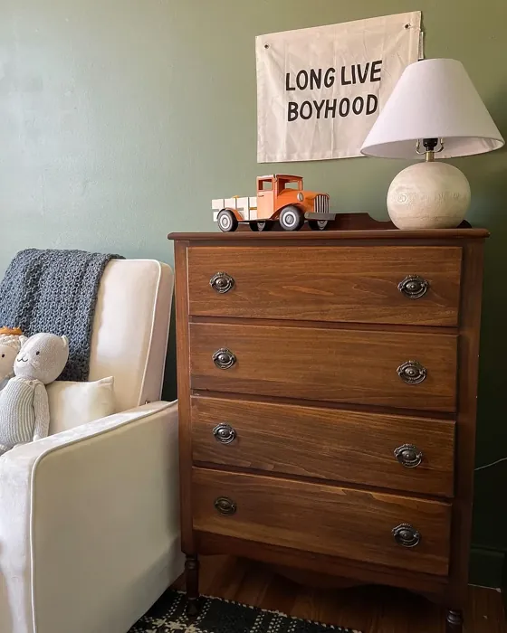
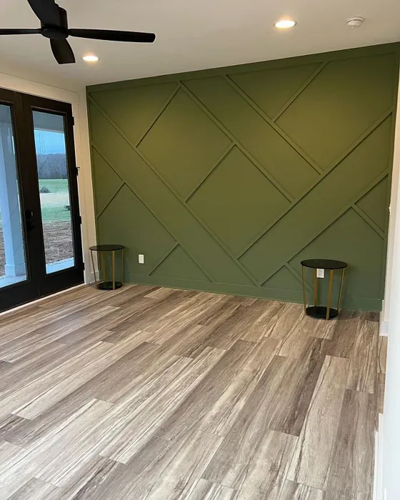


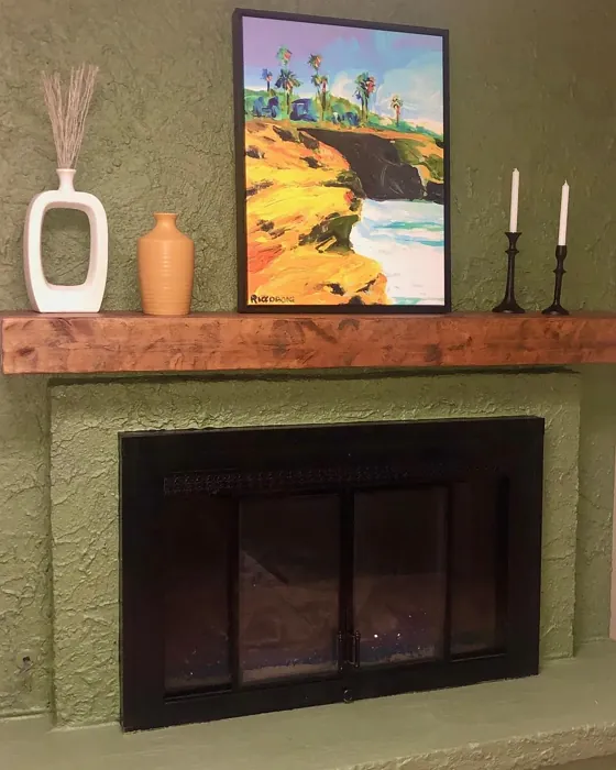
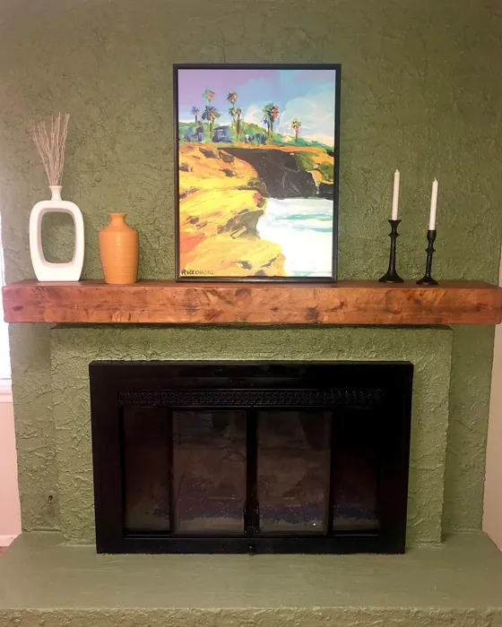
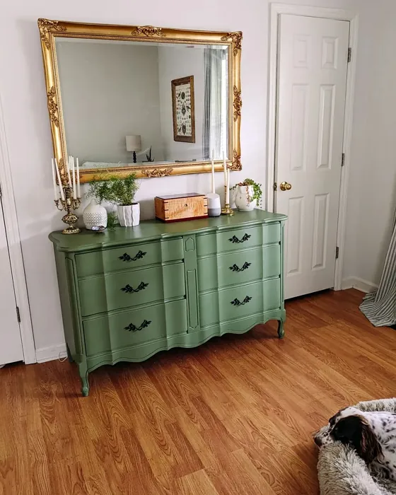
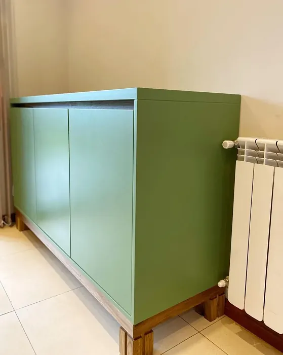
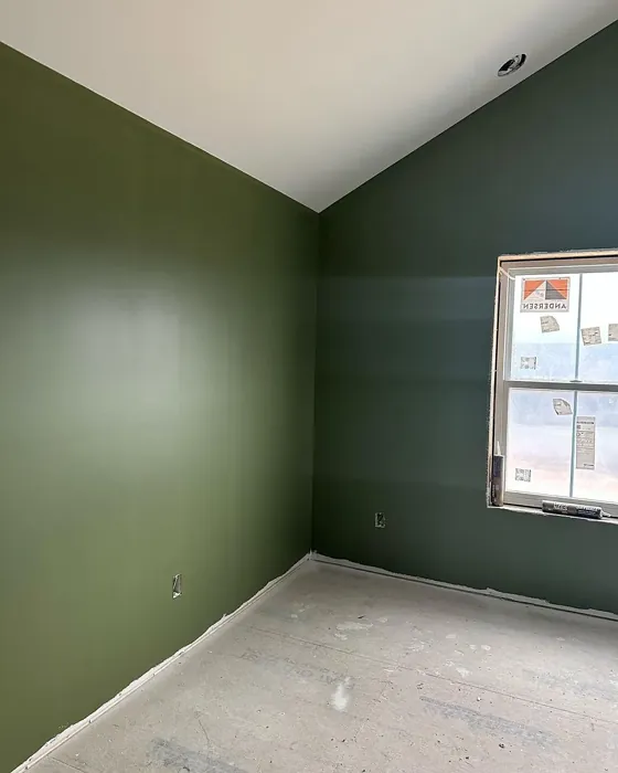
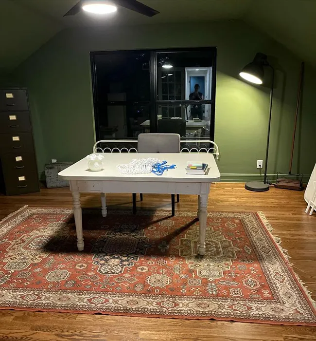
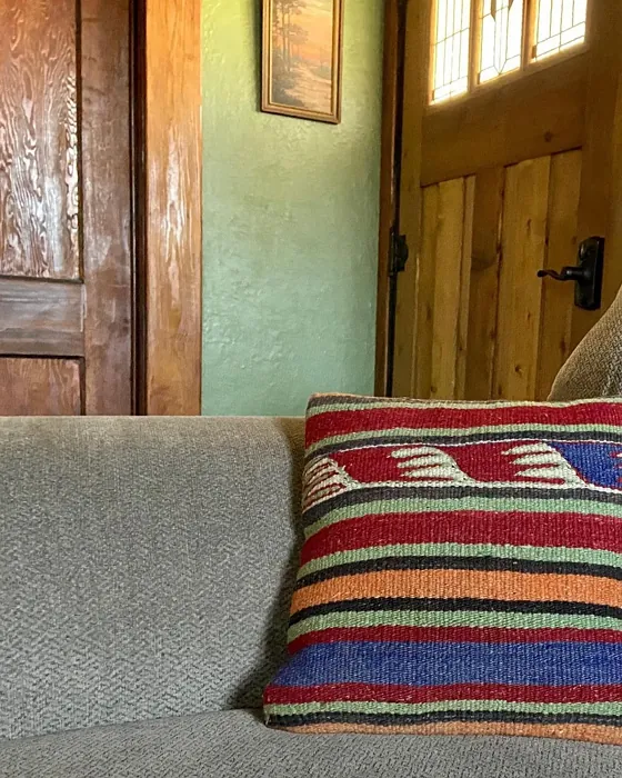
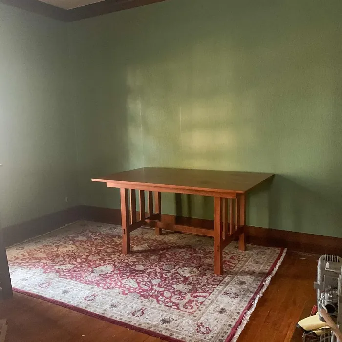
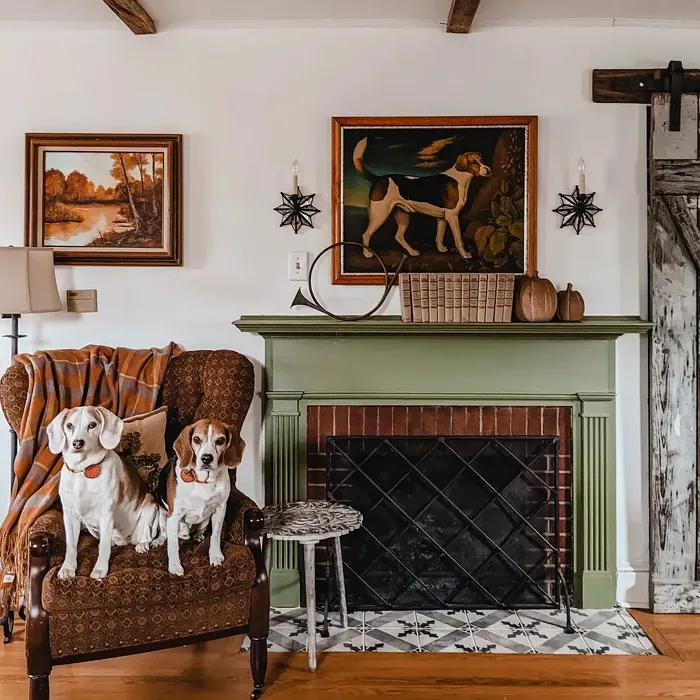
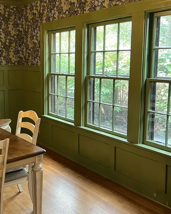
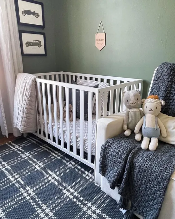

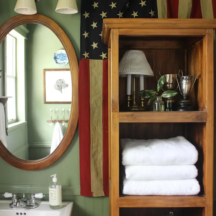
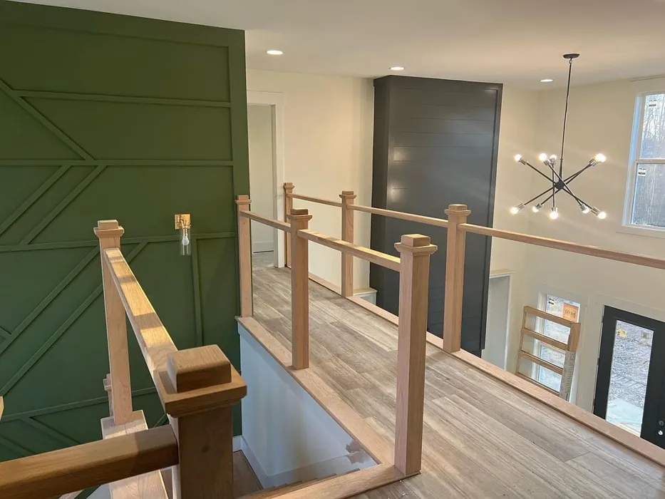
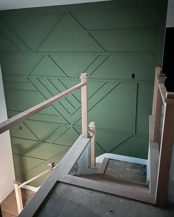
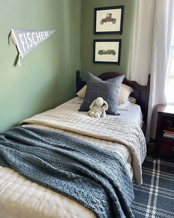
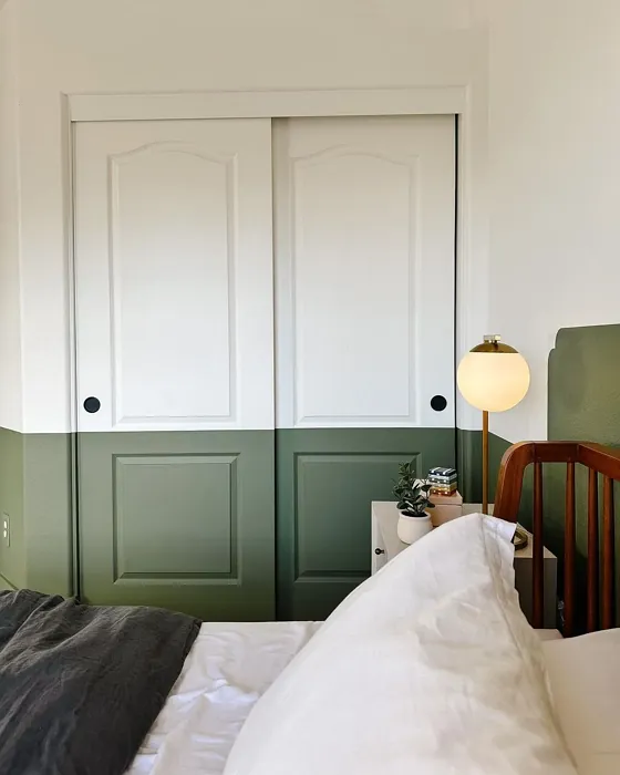
Real rooms painted with Artichoke SW 6179 by Sherwin Williams. Lighting and photography can affect how colors appear — always test a sample swatch in your own space.
Undertones of Artichoke ?
The undertones of Artichoke are a key aspect of its character, leaning towards Yellow. These subtle underlying hues are what give the color its depth and complexity. For example, a gray with a blue undertone will feel cooler and more modern, while one with a brown undertone will feel warmer and more traditional. It’s essential to test this paint in your home and observe it next to your existing furniture, flooring, and decor to see how these undertones interact and reveal themselves throughout the day.
HEX value: #7F8266
RGB code: 127, 130, 102
Is Artichoke Cool or Warm?
Artichoke is considered a warm paint color. This characteristic plays a huge role in the overall feel of a room. Warm colors, like this one, tend to create a cozy, inviting, and energetic atmosphere, making them great for social spaces like living rooms and dining rooms. In contrast, cool colors often evoke a sense of calm and serenity, which is why they are popular in bedrooms and bathrooms. The warmth of Artichoke means it will pair beautifully with corresponding decor elements.
Understanding Color Properties and Interior Design Tips
Hue refers to a specific position on the color wheel, measured in degrees from 0 to 360. Each degree represents a different pure color:
- 0° represents red
- 120° represents green
- 240° represents blue
Saturation describes the intensity or purity of a color and is expressed as a percentage:
- At 0%, the color appears completely desaturated—essentially a shade of gray
- At 100%, the color is at its most vivid and vibrant
Lightness indicates how light or dark a color is, also expressed as a percentage:
- 0% lightness results in black
- 100% lightness results in white
Using Warm Colors in Interior Design
Warm hues—such as reds, oranges, yellows, warm beiges, and greiges—are excellent choices for creating inviting and energetic spaces. These colors are particularly well-suited for:
- Kitchens, living rooms, and bathrooms, where warmth enhances comfort and sociability
- Large rooms, where warm tones can help reduce the sense of emptiness and make the space feel more intimate
For example:
- Warm beige shades provide a cozy, inviting atmosphere, ideal for living rooms, bedrooms, and hallways.
- Warm greige (a mix of beige and gray) offers the warmth of beige with the modern appeal of gray, making it a versatile backdrop for dining areas, bedrooms, and living spaces.
However, be mindful when using warm light tones in rooms with limited natural light. These shades may appear muted or even take on an unpleasant yellowish tint. To avoid a dull or flat appearance:
- Add depth by incorporating richer tones like deep greens, charcoal, or chocolate brown
- Use textured elements such as curtains, rugs, or cushions to bring dimension to the space
Pro Tip: Achieving Harmony with Warm and Cool Color Balance
To create a well-balanced and visually interesting interior, mix warm and cool tones strategically. This contrast adds depth and harmony to your design.
- If your walls feature warm hues, introduce cool-colored accents such as blue or green furniture, artwork, or accessories to create contrast.
- For a polished look, consider using a complementary color scheme, which pairs colors opposite each other on the color wheel (e.g., red with green, orange with blue).
This thoughtful mix not only enhances visual appeal but also creates a space that feels both dynamic and cohesive.
Save this color to your Pinterest board to revisit when planning your room.
Light Temperature Affects on Artichoke
Natural Light
Natural daylight changes in color temperature as the sun moves across the sky. At sunrise and sunset, the light tends to have a warm, golden tone with a color temperature around 2000 Kelvin (K). As the day progresses and the sun rises higher, the light becomes cooler and more neutral. Around midday, especially when the sky is clear, natural light typically reaches its peak brightness and shifts to a cooler tone, ranging from 5500 to 6500 Kelvin. This midday light is close to what we perceive as pure white or daylight-balanced light.
These shifts in natural light can significantly influence how colors appear in a space, which is why designers often consider both the time of day and the orientation of windows when planning interior color schemes.
Explore how this color transforms from sunrise through sunset as natural light changes throughout the day. Use the slider to simulate morning light, midday brightness, and warm afternoon tones.
North-facing rooms stay cooler throughout the day and benefit from warmer paint tones to compensate. South-facing rooms receive more direct sunlight, making even deeper shades more workable. East-facing rooms get bright morning light that fades by afternoon, while west-facing rooms glow warmly in the evening.
Artificial Light
When choosing artificial lighting, pay close attention to the color temperature, measured in Kelvin (K). This determines how warm or cool the light will appear. Lower temperatures, around 2700K, give off a warm, yellow glow often used in living rooms or bedrooms. Higher temperatures, above 5000K, create a cool, bluish light similar to daylight, commonly used in kitchens, offices, or task areas.
Use the slider to see how lighting temperature can affect the appearance of a surface or color throughout a space.
See how this color looks under different artificial light temperatures — from warm candlelight (2000K) to cool daylight (7000K). Move the slider to simulate your room's lighting conditions.


4800K
Keep in mind that natural light from windows, the warmth of lamps, and overhead lighting all affect how this color reads on your walls at different times of day. Always observe a sample swatch in your actual space before purchasing.
LRV of Artichoke
The Light Reflectance Value (LRV) of Artichoke is 24%, which places it in the Medium Dark category. This means it reflects very little light. Understanding a paint’s LRV is crucial for predicting how it will look in your space. A higher LRV indicates a lighter color that reflects more light, making rooms feel larger and brighter. A lower LRV signifies a darker color that absorbs more light, creating a cozier, more intimate atmosphere. Always consider the natural and artificial lighting in your room when selecting a paint color based on its LRV.
Detailed Review of Artichoke
Additional Paint Characteristics
Ideal Rooms
Bedroom, Dining Room, Home Office, Living Room
Decor Styles
Eclectic, Modern Farmhouse, Rustic, Transitional
Coverage
Good (1–2 Coats), Touch-Up Friendly
Ease of Application
Beginner Friendly, Brush Smooth, Fast-Drying, Roller-Ready
Washability
Washable, Wipeable
VOC Level
Eco-Certified, Low VOC
Best Use
Accent Wall, Interior Walls, Trim
Room Suitability
Bedroom, Dining Room, Home Office, Living Room
Tone Tag
Earthy, Muted, Warm
Finish Type
Eggshell, Matte, Satin
Paint Performance
Easy Touch-Up, High Coverage, Low Odor
Use Cases
Best for Modern Farmhouse, Best for Open Concept, Classic Favorite
Mood
Calm, Cozy, Inviting
Trim Pairing
Complements Cool Trim, Pairs with White Dove, Works with Warm Trim
Artichoke (#7F8266) is a standout choice for anyone looking to add a touch of serenity to their space. This color leans towards a soft green with underlying gray tones, making it incredibly versatile. It pairs beautifully with natural materials like wood and stone, enhancing the organic feel of your interior. When applied, Artichoke offers a smooth, even finish that elevates the overall look of your walls. Its unique hue is particularly effective in creating a peaceful environment, perfect for spaces where relaxation is key. Whether you’re redecorating a cozy bedroom or a stylish home office, Artichoke provides the calming influence needed to unwind and recharge. Be mindful of lighting, as it can bring out different shades throughout the day, adding an unexpected depth to your rooms.
Pros & Cons of SW 6179 Artichoke
Pros
Cons
Colors that go with Sherwin Williams Artichoke
FAQ on SW 6179 Artichoke
What colors pair well with Artichoke?
Artichoke pairs wonderfully with a variety of colors, enhancing its natural appeal. Whites, especially soft shades like White Dove or Simply White, create a fresh contrast that brightens the space. Earthy tones like terracotta or muted yellows can also complement it beautifully, adding warmth and depth. For a more dramatic look, consider pairing it with darker shades like charcoal or navy for a striking contrast that still feels harmonious.
Is Artichoke suitable for small rooms?
Absolutely! Artichoke can be an excellent choice for small rooms. Its calming hue can make a compact space feel more spacious and inviting. When paired with lighter trim and strategic lighting, it helps create an illusion of openness. Just be cautious with darker lighting, as it can make the room feel smaller. Overall, it’s a fantastic option for those looking to add a touch of nature without overwhelming the space.
Comparisons Artichoke with other colors
Artichoke SW 6179 vs Dried Thyme SW 6186
| Attribute | Artichoke SW 6179 | Dried Thyme SW 6186 |
|---|---|---|
| Color Name | Artichoke SW 6179 | Dried Thyme SW 6186 |
| Color | ||
| Hue | Green | Green |
| Brightness | Dark | Dark |
| RGB | 127, 130, 102 | 123, 128, 112 |
| LRV | 24% | 24% |
| Finish Type | Eggshell, Matte, Satin | Eggshell, Satin |
| Finish Options | Eggshell, Matte, Satin | Eggshell, Matte, Satin |
| Ideal Rooms | Bedroom, Dining Room, Home Office, Living Room | Bathroom, Bedroom, Dining Room, Entryway, Home Office, Kitchen, Living Room |
| Decor Styles | Eclectic, Modern Farmhouse, Rustic, Transitional | Bohemian, Industrial, Minimalist, Modern Farmhouse, Rustic |
| Coverage | Good (1–2 Coats), Touch-Up Friendly | Good (1–2 Coats), Touch-Up Friendly |
| Ease of Application | Beginner Friendly, Brush Smooth, Fast-Drying, Roller-Ready | Beginner Friendly, Brush Smooth, Roller-Ready |
| Washability | Washable, Wipeable | Washable, Wipeable |
| Room Suitability | Bedroom, Dining Room, Home Office, Living Room | Bathroom, Bedroom, Dining Room, Home Office, Kitchen, Living Room |
| Tone | Earthy, Muted, Warm | Cool, Earthy, Muted |
| Paint Performance | Easy Touch-Up, High Coverage, Low Odor | Easy Touch-Up, Low Odor, Scuff Resistant |
Lighting conditions, wall orientation, and surrounding decor can significantly affect how these colors appear in your space. Always test a sample swatch before committing to a full application.
Artichoke SW 6179 vs Retreat SW 6207
| Attribute | Artichoke SW 6179 | Retreat SW 6207 |
|---|---|---|
| Color Name | Artichoke SW 6179 | Retreat SW 6207 |
| Color | ||
| Hue | Green | Green |
| Brightness | Dark | Dark |
| RGB | 127, 130, 102 | 122, 128, 118 |
| LRV | 24% | 30% |
| Finish Type | Eggshell, Matte, Satin | Eggshell, Matte, Satin |
| Finish Options | Eggshell, Matte, Satin | Eggshell, Matte, Satin |
| Ideal Rooms | Bedroom, Dining Room, Home Office, Living Room | Bathroom, Bedroom, Home Office, Kitchen, Living Room |
| Decor Styles | Eclectic, Modern Farmhouse, Rustic, Transitional | Minimalist, Modern, Rustic, Transitional |
| Coverage | Good (1–2 Coats), Touch-Up Friendly | Good (1–2 Coats), Touch-Up Friendly |
| Ease of Application | Beginner Friendly, Brush Smooth, Fast-Drying, Roller-Ready | Beginner Friendly, Brush Smooth, Roller-Ready |
| Washability | Washable, Wipeable | Washable, Wipeable |
| Room Suitability | Bedroom, Dining Room, Home Office, Living Room | Bathroom, Bedroom, Home Office, Living Room |
| Tone | Earthy, Muted, Warm | Cool, Earthy, Muted |
| Paint Performance | Easy Touch-Up, High Coverage, Low Odor | Easy Touch-Up, Low Odor, Scuff Resistant |
Lighting conditions, wall orientation, and surrounding decor can significantly affect how these colors appear in your space. Always test a sample swatch before committing to a full application.
Artichoke SW 6179 vs Rosemary SW 6187
| Attribute | Artichoke SW 6179 | Rosemary SW 6187 |
|---|---|---|
| Color Name | Artichoke SW 6179 | Rosemary SW 6187 |
| Color | ||
| Hue | Green | Green |
| Brightness | Dark | Dark |
| RGB | 127, 130, 102 | 100, 105, 92 |
| LRV | 24% | 45% |
| Finish Type | Eggshell, Matte, Satin | Eggshell, Matte, Satin |
| Finish Options | Eggshell, Matte, Satin | Eggshell, Matte, Satin |
| Ideal Rooms | Bedroom, Dining Room, Home Office, Living Room | Bedroom, Dining Room, Hallway, Home Office, Living Room |
| Decor Styles | Eclectic, Modern Farmhouse, Rustic, Transitional | Bohemian, Coastal, Modern Farmhouse, Rustic |
| Coverage | Good (1–2 Coats), Touch-Up Friendly | Good (1–2 Coats), Touch-Up Friendly |
| Ease of Application | Beginner Friendly, Brush Smooth, Fast-Drying, Roller-Ready | Beginner Friendly, Brush Smooth, Roller-Ready |
| Washability | Washable, Wipeable | Washable, Wipeable |
| Room Suitability | Bedroom, Dining Room, Home Office, Living Room | Bedroom, Dining Room, Home Office, Living Room |
| Tone | Earthy, Muted, Warm | Earthy, Muted, Warm |
| Paint Performance | Easy Touch-Up, High Coverage, Low Odor | Fade Resistant, Low Odor, Quick Drying, Stain Resistant |
Lighting conditions, wall orientation, and surrounding decor can significantly affect how these colors appear in your space. Always test a sample swatch before committing to a full application.
Artichoke SW 6179 vs Basil SW 6194
| Attribute | Artichoke SW 6179 | Basil SW 6194 |
|---|---|---|
| Color Name | Artichoke SW 6179 | Basil SW 6194 |
| Color | ||
| Hue | Green | Green |
| Brightness | Dark | Dark |
| RGB | 127, 130, 102 | 98, 110, 96 |
| LRV | 24% | 12% |
| Finish Type | Eggshell, Matte, Satin | Eggshell, Matte, Satin |
| Finish Options | Eggshell, Matte, Satin | Eggshell, Matte, Satin |
| Ideal Rooms | Bedroom, Dining Room, Home Office, Living Room | Bathroom, Bedroom, Dining Room, Home Office, Kitchen, Living Room |
| Decor Styles | Eclectic, Modern Farmhouse, Rustic, Transitional | Bohemian, Contemporary, Modern Farmhouse, Rustic, Transitional |
| Coverage | Good (1–2 Coats), Touch-Up Friendly | Good (1–2 Coats), Touch-Up Friendly |
| Ease of Application | Beginner Friendly, Brush Smooth, Fast-Drying, Roller-Ready | Beginner Friendly, Brush Smooth, Fast-Drying, Roller-Ready |
| Washability | Washable, Wipeable | Washable, Wipeable |
| Room Suitability | Bedroom, Dining Room, Home Office, Living Room | Bathroom, Bedroom, Dining Room, Kitchen, Living Room |
| Tone | Earthy, Muted, Warm | Earthy, Muted, Warm |
| Paint Performance | Easy Touch-Up, High Coverage, Low Odor | Easy Touch-Up, Low Odor, Quick Drying |
Lighting conditions, wall orientation, and surrounding decor can significantly affect how these colors appear in your space. Always test a sample swatch before committing to a full application.
Artichoke SW 6179 vs Shade-Grown SW 6188
| Attribute | Artichoke SW 6179 | Shade-Grown SW 6188 |
|---|---|---|
| Color Name | Artichoke SW 6179 | Shade-Grown SW 6188 |
| Color | ||
| Hue | Green | Green |
| Brightness | Dark | Dark |
| RGB | 127, 130, 102 | 78, 81, 71 |
| LRV | 24% | 24% |
| Finish Type | Eggshell, Matte, Satin | Eggshell, Satin |
| Finish Options | Eggshell, Matte, Satin | Eggshell, Flat, Satin |
| Ideal Rooms | Bedroom, Dining Room, Home Office, Living Room | Bedroom, Dining Room, Home Office, Living Room |
| Decor Styles | Eclectic, Modern Farmhouse, Rustic, Transitional | Bohemian, Modern, Rustic, Scandinavian |
| Coverage | Good (1–2 Coats), Touch-Up Friendly | Good (1–2 Coats), Touch-Up Friendly |
| Ease of Application | Beginner Friendly, Brush Smooth, Fast-Drying, Roller-Ready | Beginner Friendly, Brush Smooth, Fast-Drying, Roller-Ready |
| Washability | Washable, Wipeable | Highly Washable, Washable |
| Room Suitability | Bedroom, Dining Room, Home Office, Living Room | Bedroom, Dining Room, Home Office, Living Room |
| Tone | Earthy, Muted, Warm | Deep, Earthy, Muted |
| Paint Performance | Easy Touch-Up, High Coverage, Low Odor | Easy Touch-Up, High Coverage, Low Odor, Scuff Resistant |
Lighting conditions, wall orientation, and surrounding decor can significantly affect how these colors appear in your space. Always test a sample swatch before committing to a full application.
Artichoke SW 6179 vs Foxhall Green SW 9184
| Attribute | Artichoke SW 6179 | Foxhall Green SW 9184 |
|---|---|---|
| Color Name | Artichoke SW 6179 | Foxhall Green SW 9184 |
| Color | ||
| Hue | Green | Green |
| Brightness | Dark | Dark |
| RGB | 127, 130, 102 | 69, 75, 64 |
| LRV | 24% | 12% |
| Finish Type | Eggshell, Matte, Satin | Eggshell, Matte, Satin |
| Finish Options | Eggshell, Matte, Satin | Eggshell, Matte, Satin |
| Ideal Rooms | Bedroom, Dining Room, Home Office, Living Room | Bedroom, Dining Room, Home Office, Living Room |
| Decor Styles | Eclectic, Modern Farmhouse, Rustic, Transitional | Contemporary, Modern Farmhouse, Rustic, Traditional |
| Coverage | Good (1–2 Coats), Touch-Up Friendly | Good (1–2 Coats), Touch-Up Friendly |
| Ease of Application | Beginner Friendly, Brush Smooth, Fast-Drying, Roller-Ready | Beginner Friendly, Brush Smooth, Fast-Drying, Roller-Ready |
| Washability | Washable, Wipeable | Washable, Wipeable |
| Room Suitability | Bedroom, Dining Room, Home Office, Living Room | Bedroom, Dining Room, Home Office, Living Room |
| Tone | Earthy, Muted, Warm | Balanced, Deep, Earthy, Muted |
| Paint Performance | Easy Touch-Up, High Coverage, Low Odor | Easy Touch-Up, Fade Resistant, Low Odor, Quick Drying |
Lighting conditions, wall orientation, and surrounding decor can significantly affect how these colors appear in your space. Always test a sample swatch before committing to a full application.
Artichoke SW 6179 vs Pewter Green SW 6208
| Attribute | Artichoke SW 6179 | Pewter Green SW 6208 |
|---|---|---|
| Color Name | Artichoke SW 6179 | Pewter Green SW 6208 |
| Color | ||
| Hue | Green | Green |
| Brightness | Dark | Dark |
| RGB | 127, 130, 102 | 94, 98, 89 |
| LRV | 24% | 24% |
| Finish Type | Eggshell, Matte, Satin | Eggshell, Matte, Satin |
| Finish Options | Eggshell, Matte, Satin | Eggshell, Matte, Satin |
| Ideal Rooms | Bedroom, Dining Room, Home Office, Living Room | Bedroom, Dining Room, Entryway, Home Office, Living Room |
| Decor Styles | Eclectic, Modern Farmhouse, Rustic, Transitional | Contemporary, Modern Farmhouse, Rustic, Scandinavian, Traditional |
| Coverage | Good (1–2 Coats), Touch-Up Friendly | Good (1–2 Coats), Touch-Up Friendly |
| Ease of Application | Beginner Friendly, Brush Smooth, Fast-Drying, Roller-Ready | Beginner Friendly, Brush Smooth, Fast-Drying, Roller-Ready |
| Washability | Washable, Wipeable | Highly Washable, Washable, Wipeable |
| Room Suitability | Bedroom, Dining Room, Home Office, Living Room | Bathroom, Bedroom, Dining Room, Kitchen, Living Room |
| Tone | Earthy, Muted, Warm | Balanced, Cool, Earthy, Muted |
| Paint Performance | Easy Touch-Up, High Coverage, Low Odor | Easy Touch-Up, Fade Resistant, Low Odor, Quick Drying |
Lighting conditions, wall orientation, and surrounding decor can significantly affect how these colors appear in your space. Always test a sample swatch before committing to a full application.
Artichoke SW 6179 vs Rookwood Dark Green SW 2816
| Attribute | Artichoke SW 6179 | Rookwood Dark Green SW 2816 |
|---|---|---|
| Color Name | Artichoke SW 6179 | Rookwood Dark Green SW 2816 |
| Color | ||
| Hue | Green | Green |
| Brightness | Dark | Dark |
| RGB | 127, 130, 102 | 86, 92, 74 |
| LRV | 24% | 6% |
| Finish Type | Eggshell, Matte, Satin | Eggshell, Matte, Satin |
| Finish Options | Eggshell, Matte, Satin | Eggshell, Matte, Satin |
| Ideal Rooms | Bedroom, Dining Room, Home Office, Living Room | Bedroom, Dining Room, Home Office, Kitchen, Living Room |
| Decor Styles | Eclectic, Modern Farmhouse, Rustic, Transitional | Contemporary, Modern Farmhouse, Rustic, Traditional |
| Coverage | Good (1–2 Coats), Touch-Up Friendly | Good (1–2 Coats), Touch-Up Friendly |
| Ease of Application | Beginner Friendly, Brush Smooth, Fast-Drying, Roller-Ready | Beginner Friendly, Brush Smooth, Roller-Ready |
| Washability | Washable, Wipeable | Washable, Wipeable |
| Room Suitability | Bedroom, Dining Room, Home Office, Living Room | Bedroom, Dining Room, Home Office, Living Room |
| Tone | Earthy, Muted, Warm | Deep, Earthy, Warm |
| Paint Performance | Easy Touch-Up, High Coverage, Low Odor | Easy Touch-Up, High Coverage, Low Odor, Scuff Resistant |
Lighting conditions, wall orientation, and surrounding decor can significantly affect how these colors appear in your space. Always test a sample swatch before committing to a full application.
Artichoke SW 6179 vs Ripe Olive SW 6209
| Attribute | Artichoke SW 6179 | Ripe Olive SW 6209 |
|---|---|---|
| Color Name | Artichoke SW 6179 | Ripe Olive SW 6209 |
| Color | ||
| Hue | Green | Green |
| Brightness | Dark | Dark |
| RGB | 127, 130, 102 | 68, 72, 61 |
| LRV | 24% | 15% |
| Finish Type | Eggshell, Matte, Satin | Eggshell, Matte |
| Finish Options | Eggshell, Matte, Satin | Eggshell, Matte, Satin |
| Ideal Rooms | Bedroom, Dining Room, Home Office, Living Room | Bedroom, Dining Room, Home Office, Living Room |
| Decor Styles | Eclectic, Modern Farmhouse, Rustic, Transitional | Bohemian, Industrial, Modern Farmhouse, Rustic |
| Coverage | Good (1–2 Coats), Touch-Up Friendly | Good (1–2 Coats) |
| Ease of Application | Beginner Friendly, Brush Smooth, Fast-Drying, Roller-Ready | Beginner Friendly, Brush Smooth, Roller-Ready |
| Washability | Washable, Wipeable | Highly Washable, Washable |
| Room Suitability | Bedroom, Dining Room, Home Office, Living Room | Bedroom, Dining Room, Home Office, Living Room |
| Tone | Earthy, Muted, Warm | Deep, Earthy, Muted |
| Paint Performance | Easy Touch-Up, High Coverage, Low Odor | Easy Touch-Up, High Coverage, Low Odor |
Lighting conditions, wall orientation, and surrounding decor can significantly affect how these colors appear in your space. Always test a sample swatch before committing to a full application.
Artichoke SW 6179 vs Laurel Woods SW 7749
| Attribute | Artichoke SW 6179 | Laurel Woods SW 7749 |
|---|---|---|
| Color Name | Artichoke SW 6179 | Laurel Woods SW 7749 |
| Color | ||
| Hue | Green | Green |
| Brightness | Dark | Dark |
| RGB | 127, 130, 102 | 68, 73, 61 |
| LRV | 24% | 12% |
| Finish Type | Eggshell, Matte, Satin | Eggshell, Matte, Satin |
| Finish Options | Eggshell, Matte, Satin | Eggshell, Matte, Satin |
| Ideal Rooms | Bedroom, Dining Room, Home Office, Living Room | Bedroom, Dining Room, Home Office, Living Room |
| Decor Styles | Eclectic, Modern Farmhouse, Rustic, Transitional | Bohemian, Contemporary, Modern Farmhouse, Rustic |
| Coverage | Good (1–2 Coats), Touch-Up Friendly | Good (1–2 Coats), Touch-Up Friendly |
| Ease of Application | Beginner Friendly, Brush Smooth, Fast-Drying, Roller-Ready | Beginner Friendly, Brush Smooth, Roller-Ready |
| Washability | Washable, Wipeable | Washable, Wipeable |
| Room Suitability | Bedroom, Dining Room, Home Office, Living Room | Bedroom, Dining Room, Home Office, Living Room |
| Tone | Earthy, Muted, Warm | Deep, Earthy, Warm |
| Paint Performance | Easy Touch-Up, High Coverage, Low Odor | Easy Touch-Up, High Coverage, Low Odor |
Lighting conditions, wall orientation, and surrounding decor can significantly affect how these colors appear in your space. Always test a sample swatch before committing to a full application.
Official Page of Sherwin Williams Artichoke SW 6179