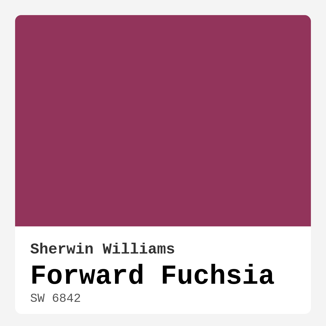
Color Preview & Key Details
| HEX Code | #92345B |
| RGB | 146, 52, 91 |
| LRV | 15% |
| Undertone | Red |
| Finish Options | Matte, Satin, Semi-Gloss |
Imagine walking into a room that’s bursting with personality, a place that feels both vibrant and inviting. You glance around and your eyes are drawn to the walls painted in a stunning shade of Forward Fuchsia from Sherwin Williams. The deep magenta hue envelops the space, creating an atmosphere that’s not only energizing but also sophisticated. You can’t help but feel that this color breathes life into the room, making it a perfect candidate for your next home project.
Forward Fuchsia (SW 6842) is a bold color that commands attention while still maintaining an air of elegance. With its rich undertones of red and a Light Reflectance Value (LRV) of 15%, it reflects very little light, giving it a cozy, intimate feel. This warmth is what makes it so appealing, especially for areas where you want to create a welcoming ambiance, such as the living room, dining area, or even a home office.
One of the first things you’ll notice about Forward Fuchsia is its versatility. This color isn’t just for the daring decorator; it harmonizes beautifully with a variety of styles. Whether your home leans towards modern, eclectic, bohemian, or contemporary, Forward Fuchsia can effortlessly integrate into your design scheme. Pair it with neutral shades for a balanced look, or go all out with bold patterns to make a statement. The options are endless.
When considering how to apply Forward Fuchsia, you’ll find that it glides on smoothly, making the painting process straightforward and enjoyable. The coverage is good, often requiring just one to two coats, and it’s touch-up friendly, which is a huge plus for the DIY enthusiast. Its washable nature means that maintaining its vibrant look is quite easy, and you can feel good about using a low VOC formula that’s eco-certified.
While the color is undoubtedly striking, it does require a bit of thought when it comes to coordination with other colors in your space. The red undertones can influence how it interacts with your existing furnishings, so it’s a good idea to test it out in your home before making a final decision. This is especially true if you’re working with lighter colors or cool-toned elements. The beauty of Forward Fuchsia is that it can adapt and change throughout the day, responding beautifully to natural light, which enhances its vibrancy during the day while creating a cozy, intimate ambiance in the evening.
Now, you might be wondering if Forward Fuchsia is suitable for smaller rooms. The answer is a resounding yes! While its boldness can be overwhelming in a compact space, using it as an accent wall can create a stunning focal point without making the room feel cramped. Pair it thoughtfully with lighter colors and adequate lighting, and you’ll find that the energy it brings can actually enhance the sense of space.
Forward Fuchsia shines in various finishes, too. Satin and semi-gloss finishes can elevate its vibrancy, adding a touch of sheen that makes the color pop even more. If you’re looking for a softer vibe, a matte finish can work wonders, especially in cozy settings. The choice of finish can dramatically alter the overall feel of the room, so consider your desired atmosphere when deciding.
Complementary shades are another area where Forward Fuchsia excels. It pairs beautifully with a range of colors, from soft whites like White Dove to deeper tones that can either contrast or complement its warmth. Think about using shades like SW 6224 or SW 6476 to create a harmonious palette that enhances the beauty of Forward Fuchsia. When you take the time to coordinate carefully, you’ll find that it can create a sense of unity throughout your home.
As an expert in home design, I can’t emphasize enough how important it is to understand the undertones of any paint color. Forward Fuchsia leans into its red undertones, which add depth and complexity. This is what sets it apart from similar shades like Raspberry Sorbet or Magenta Mist. Testing this color in your home will allow you to see how it reacts with your existing decor and lighting, ensuring that it’s the right fit for your vision.
Another key aspect to consider is the atmosphere you want to create in your home. Forward Fuchsia is not just a color; it’s a mood. It invites energy and warmth, making it ideal for social spaces where you want to engage with family and friends. The sophistication it carries means it can also work well in more private areas, like a luxurious bedroom or an inspiring home office.
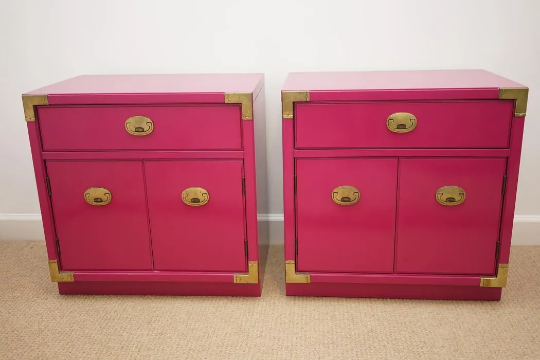
When you think about incorporating Forward Fuchsia into your decor, consider using it on interior walls, as an accent wall, or even on furniture for a unique twist. Imagine a chic accent chair or a vibrant side table painted in this striking hue. The possibilities are abundant, and your home will reflect your personal style in a way that feels fresh and exciting.
As you move forward with your project, keep in mind the importance of lighting. Forward Fuchsia can transform under different lighting conditions, making it crucial to observe how it interacts with both natural and artificial light throughout the day. This understanding will help you anticipate how the color will settle into your space, ensuring that it remains a delight to your senses.
In summary, Forward Fuchsia (SW 6842) is a fantastic choice for anyone looking to elevate their home decor with a bold yet sophisticated color. Its warm undertones, versatility across various decor styles, and smooth application make it a designer favorite. Whether you’re painting a feature wall in your living room, refreshing your dining area, or creating an inspiring workspace, Forward Fuchsia brings life and personality to any space. So go ahead, take the plunge, and let this vibrant hue transform your home into a stunning sanctuary that reflects your unique style!
Save this color to your Pinterest board to revisit when planning your room.
Real Room Photo of Forward Fuchsia SW 6842
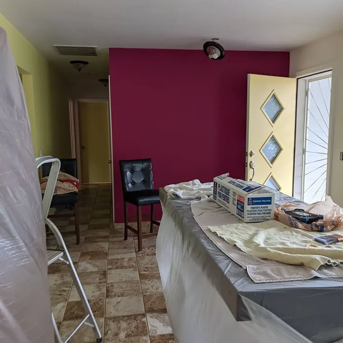
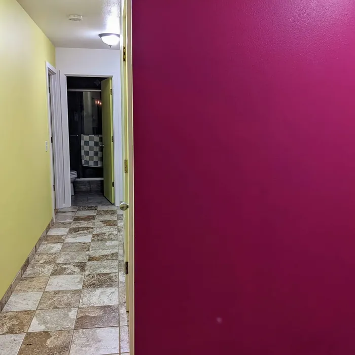
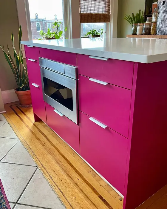
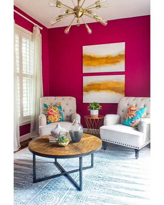
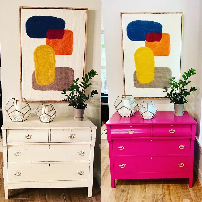
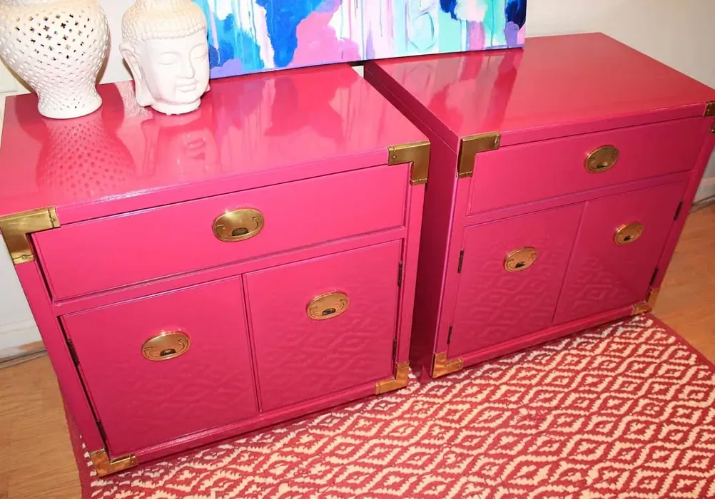
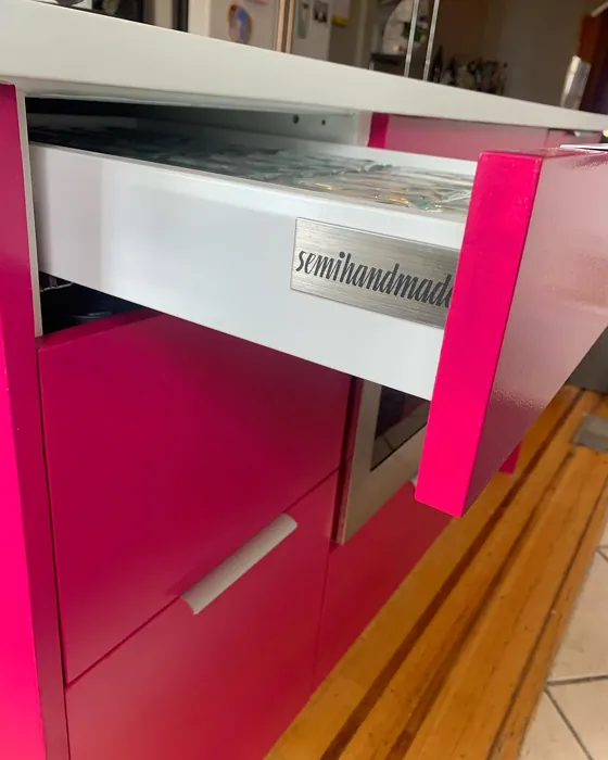
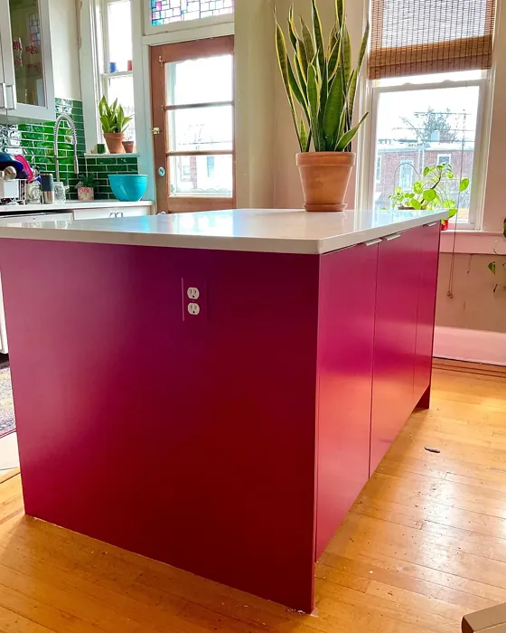
Real rooms painted with Forward Fuchsia SW 6842 by Sherwin Williams. Lighting and photography can affect how colors appear — always test a sample swatch in your own space.
Undertones of Forward Fuchsia ?
The undertones of Forward Fuchsia are a key aspect of its character, leaning towards Red. These subtle underlying hues are what give the color its depth and complexity. For example, a gray with a blue undertone will feel cooler and more modern, while one with a brown undertone will feel warmer and more traditional. It’s essential to test this paint in your home and observe it next to your existing furniture, flooring, and decor to see how these undertones interact and reveal themselves throughout the day.
HEX value: #92345B
RGB code: 146, 52, 91
Is Forward Fuchsia Cool or Warm?
Forward Fuchsia is considered a warm paint color. This characteristic plays a huge role in the overall feel of a room. Warm colors, like this one, tend to create a cozy, inviting, and energetic atmosphere, making them great for social spaces like living rooms and dining rooms. In contrast, cool colors often evoke a sense of calm and serenity, which is why they are popular in bedrooms and bathrooms. The warmth of Forward Fuchsia means it will pair beautifully with corresponding decor elements.
Understanding Color Properties and Interior Design Tips
Hue refers to a specific position on the color wheel, measured in degrees from 0 to 360. Each degree represents a different pure color:
- 0° represents red
- 120° represents green
- 240° represents blue
Saturation describes the intensity or purity of a color and is expressed as a percentage:
- At 0%, the color appears completely desaturated—essentially a shade of gray
- At 100%, the color is at its most vivid and vibrant
Lightness indicates how light or dark a color is, also expressed as a percentage:
- 0% lightness results in black
- 100% lightness results in white
Using Warm Colors in Interior Design
Warm hues—such as reds, oranges, yellows, warm beiges, and greiges—are excellent choices for creating inviting and energetic spaces. These colors are particularly well-suited for:
- Kitchens, living rooms, and bathrooms, where warmth enhances comfort and sociability
- Large rooms, where warm tones can help reduce the sense of emptiness and make the space feel more intimate
For example:
- Warm beige shades provide a cozy, inviting atmosphere, ideal for living rooms, bedrooms, and hallways.
- Warm greige (a mix of beige and gray) offers the warmth of beige with the modern appeal of gray, making it a versatile backdrop for dining areas, bedrooms, and living spaces.
However, be mindful when using warm light tones in rooms with limited natural light. These shades may appear muted or even take on an unpleasant yellowish tint. To avoid a dull or flat appearance:
- Add depth by incorporating richer tones like deep greens, charcoal, or chocolate brown
- Use textured elements such as curtains, rugs, or cushions to bring dimension to the space
Pro Tip: Achieving Harmony with Warm and Cool Color Balance
To create a well-balanced and visually interesting interior, mix warm and cool tones strategically. This contrast adds depth and harmony to your design.
- If your walls feature warm hues, introduce cool-colored accents such as blue or green furniture, artwork, or accessories to create contrast.
- For a polished look, consider using a complementary color scheme, which pairs colors opposite each other on the color wheel (e.g., red with green, orange with blue).
This thoughtful mix not only enhances visual appeal but also creates a space that feels both dynamic and cohesive.
Save this color to your Pinterest board to revisit when planning your room.
Light Temperature Affects on Forward Fuchsia
Natural Light
Natural daylight changes in color temperature as the sun moves across the sky. At sunrise and sunset, the light tends to have a warm, golden tone with a color temperature around 2000 Kelvin (K). As the day progresses and the sun rises higher, the light becomes cooler and more neutral. Around midday, especially when the sky is clear, natural light typically reaches its peak brightness and shifts to a cooler tone, ranging from 5500 to 6500 Kelvin. This midday light is close to what we perceive as pure white or daylight-balanced light.
These shifts in natural light can significantly influence how colors appear in a space, which is why designers often consider both the time of day and the orientation of windows when planning interior color schemes.
Explore how this color transforms from sunrise through sunset as natural light changes throughout the day. Use the slider to simulate morning light, midday brightness, and warm afternoon tones.
North-facing rooms stay cooler throughout the day and benefit from warmer paint tones to compensate. South-facing rooms receive more direct sunlight, making even deeper shades more workable. East-facing rooms get bright morning light that fades by afternoon, while west-facing rooms glow warmly in the evening.
Artificial Light
When choosing artificial lighting, pay close attention to the color temperature, measured in Kelvin (K). This determines how warm or cool the light will appear. Lower temperatures, around 2700K, give off a warm, yellow glow often used in living rooms or bedrooms. Higher temperatures, above 5000K, create a cool, bluish light similar to daylight, commonly used in kitchens, offices, or task areas.
Use the slider to see how lighting temperature can affect the appearance of a surface or color throughout a space.
See how this color looks under different artificial light temperatures — from warm candlelight (2000K) to cool daylight (7000K). Move the slider to simulate your room's lighting conditions.


4800K
Keep in mind that natural light from windows, the warmth of lamps, and overhead lighting all affect how this color reads on your walls at different times of day. Always observe a sample swatch in your actual space before purchasing.
LRV of Forward Fuchsia
The Light Reflectance Value (LRV) of Forward Fuchsia is 15%, which places it in the Medium Dark category. This means it reflects very little light. Understanding a paint’s LRV is crucial for predicting how it will look in your space. A higher LRV indicates a lighter color that reflects more light, making rooms feel larger and brighter. A lower LRV signifies a darker color that absorbs more light, creating a cozier, more intimate atmosphere. Always consider the natural and artificial lighting in your room when selecting a paint color based on its LRV.
Detailed Review of Forward Fuchsia
Additional Paint Characteristics
Ideal Rooms
Bedroom, Dining Room, Home Office, Living Room
Decor Styles
Bohemian, Contemporary, Eclectic, Modern
Coverage
Good (1–2 Coats), High Hide, Touch-Up Friendly
Ease of Application
Brush Smooth, Fast-Drying, Roller-Ready
Washability
Highly Washable, Washable
VOC Level
Eco-Certified, Low VOC
Best Use
Accent Wall, Furniture, Interior Walls
Room Suitability
Bedroom, Dining Room, Home Office, Living Room
Tone Tag
Bold, Deep, Warm
Finish Type
Matte, Satin, Semi-Gloss
Paint Performance
Easy Touch-Up, Fade Resistant, High Coverage
Use Cases
Best for Modern Farmhouse, Best for Open Concept, Designer Favorite
Mood
Energizing, Inviting, Sophisticated
Trim Pairing
Complements Cool Trim, Pairs with White Dove, Works with Warm Trim
Forward Fuchsia is truly a standout choice for anyone looking to infuse energy and elegance into their home. This color works beautifully in a variety of settings, from a chic living room to a cozy bedroom. One of its standout features is its versatility; it pairs well with both neutral and bold decor styles, allowing homeowners to get creative with their furnishings and accents.
When applying Forward Fuchsia, you can expect a smooth application experience. It glides on effortlessly, whether you’re using a brush or roller. The finish is rich and saturated, giving walls a luxurious appearance that can transform any space. Just keep in mind, lighter undertones in the room may influence the final look, so testing a sample is always a good idea before committing.
Pros & Cons of SW 6842 Forward Fuchsia
Pros
Cons
Colors that go with Sherwin Williams Forward Fuchsia
FAQ on SW 6842 Forward Fuchsia
Can I use Forward Fuchsia in a small room?
Absolutely! While Forward Fuchsia is a bold choice, it can work well in small rooms if paired thoughtfully with lighter colors and adequate lighting. Consider using it as an accent wall to draw the eye and create a vibrant focal point without overwhelming the space. Just balance it with softer hues in your decor to maintain a sense of openness.
What finishes work best with Forward Fuchsia?
Forward Fuchsia looks stunning in various finishes, but for a smooth and elegant appearance, consider using it in a satin or semi-gloss finish. These can enhance the color’s vibrancy and add a bit of sheen, making it pop even more. Matte finishes can also work well for a softer look, especially in cozy settings.
Comparisons Forward Fuchsia with other colors
Forward Fuchsia SW 6842 vs Exclusive Plum SW 6263
| Attribute | Forward Fuchsia SW 6842 | Exclusive Plum SW 6263 |
|---|---|---|
| Color Name | Forward Fuchsia SW 6842 | Exclusive Plum SW 6263 |
| Color | ||
| Hue | Purple | Purple |
| Brightness | Dark | Dark |
| RGB | 146, 52, 91 | 115, 111, 120 |
| LRV | 15% | 15% |
| Finish Type | Matte, Satin, Semi-Gloss | Eggshell, Matte, Satin |
| Finish Options | Matte, Satin, Semi-Gloss | Eggshell, Matte, Satin |
| Ideal Rooms | Bedroom, Dining Room, Home Office, Living Room | Bedroom, Dining Room, Home Office, Living Room |
| Decor Styles | Bohemian, Contemporary, Eclectic, Modern | Contemporary, Eclectic, Modern, Traditional |
| Coverage | Good (1–2 Coats), High Hide, Touch-Up Friendly | Good (1–2 Coats), Touch-Up Friendly |
| Ease of Application | Brush Smooth, Fast-Drying, Roller-Ready | Beginner Friendly, Brush Smooth, Fast-Drying, Roller-Ready |
| Washability | Highly Washable, Washable | Washable, Wipeable |
| Room Suitability | Bedroom, Dining Room, Home Office, Living Room | Bedroom, Dining Room, Home Office, Living Room |
| Tone | Bold, Deep, Warm | Deep, Dusty, Warm |
| Paint Performance | Easy Touch-Up, Fade Resistant, High Coverage | Easy Touch-Up, High Coverage, Low Odor |
Lighting conditions, wall orientation, and surrounding decor can significantly affect how these colors appear in your space. Always test a sample swatch before committing to a full application.
Forward Fuchsia SW 6842 vs Blackberry SW 7577
| Attribute | Forward Fuchsia SW 6842 | Blackberry SW 7577 |
|---|---|---|
| Color Name | Forward Fuchsia SW 6842 | Blackberry SW 7577 |
| Color | ||
| Hue | Purple | Purple |
| Brightness | Dark | Dark |
| RGB | 146, 52, 91 | 83, 54, 64 |
| LRV | 15% | 5% |
| Finish Type | Matte, Satin, Semi-Gloss | Eggshell, Matte |
| Finish Options | Matte, Satin, Semi-Gloss | Eggshell, Matte, Satin |
| Ideal Rooms | Bedroom, Dining Room, Home Office, Living Room | Bedroom, Dining Room, Home Office, Living Room |
| Decor Styles | Bohemian, Contemporary, Eclectic, Modern | Bohemian, Contemporary, Modern, Rustic |
| Coverage | Good (1–2 Coats), High Hide, Touch-Up Friendly | Good (1–2 Coats), Touch-Up Friendly |
| Ease of Application | Brush Smooth, Fast-Drying, Roller-Ready | Beginner Friendly, Brush Smooth, Roller-Ready |
| Washability | Highly Washable, Washable | Washable, Wipeable |
| Room Suitability | Bedroom, Dining Room, Home Office, Living Room | Bedroom, Dining Room, Home Office, Living Room |
| Tone | Bold, Deep, Warm | Deep, Moody, Warm |
| Paint Performance | Easy Touch-Up, Fade Resistant, High Coverage | Easy Touch-Up, High Coverage, Low Odor |
Lighting conditions, wall orientation, and surrounding decor can significantly affect how these colors appear in your space. Always test a sample swatch before committing to a full application.
Forward Fuchsia SW 6842 vs Expressive Plum SW 6271
| Attribute | Forward Fuchsia SW 6842 | Expressive Plum SW 6271 |
|---|---|---|
| Color Name | Forward Fuchsia SW 6842 | Expressive Plum SW 6271 |
| Color | ||
| Hue | Purple | Purple |
| Brightness | Dark | Dark |
| RGB | 146, 52, 91 | 105, 92, 98 |
| LRV | 15% | 15% |
| Finish Type | Matte, Satin, Semi-Gloss | Eggshell, Matte, Satin |
| Finish Options | Matte, Satin, Semi-Gloss | Eggshell, Matte, Satin |
| Ideal Rooms | Bedroom, Dining Room, Home Office, Living Room | Bedroom, Dining Room, Home Office, Living Room |
| Decor Styles | Bohemian, Contemporary, Eclectic, Modern | Eclectic, Modern, Traditional, Transitional |
| Coverage | Good (1–2 Coats), High Hide, Touch-Up Friendly | Good (1–2 Coats) |
| Ease of Application | Brush Smooth, Fast-Drying, Roller-Ready | Beginner Friendly, Brush Smooth, Roller-Ready |
| Washability | Highly Washable, Washable | Washable, Wipeable |
| Room Suitability | Bedroom, Dining Room, Home Office, Living Room | Bedroom, Dining Room, Home Office, Living Room |
| Tone | Bold, Deep, Warm | Deep, Muted, Warm |
| Paint Performance | Easy Touch-Up, Fade Resistant, High Coverage | Easy Touch-Up, High Coverage, Low Odor |
Lighting conditions, wall orientation, and surrounding decor can significantly affect how these colors appear in your space. Always test a sample swatch before committing to a full application.
Forward Fuchsia SW 6842 vs Plum Brown SW 6272
| Attribute | Forward Fuchsia SW 6842 | Plum Brown SW 6272 |
|---|---|---|
| Color Name | Forward Fuchsia SW 6842 | Plum Brown SW 6272 |
| Color | ||
| Hue | Purple | Purple |
| Brightness | Dark | Dark |
| RGB | 146, 52, 91 | 78, 66, 71 |
| LRV | 15% | 6% |
| Finish Type | Matte, Satin, Semi-Gloss | Eggshell, Matte, Satin |
| Finish Options | Matte, Satin, Semi-Gloss | Eggshell, Matte, Satin |
| Ideal Rooms | Bedroom, Dining Room, Home Office, Living Room | Bedroom, Dining Room, Home Office, Living Room |
| Decor Styles | Bohemian, Contemporary, Eclectic, Modern | Eclectic, Modern, Rustic, Traditional |
| Coverage | Good (1–2 Coats), High Hide, Touch-Up Friendly | Good (1–2 Coats), Touch-Up Friendly |
| Ease of Application | Brush Smooth, Fast-Drying, Roller-Ready | Beginner Friendly, Brush Smooth, Roller-Ready |
| Washability | Highly Washable, Washable | Washable, Wipeable |
| Room Suitability | Bedroom, Dining Room, Home Office, Living Room | Bedroom, Dining Room, Home Office, Living Room |
| Tone | Bold, Deep, Warm | Deep, Earthy, Warm |
| Paint Performance | Easy Touch-Up, Fade Resistant, High Coverage | Easy Touch-Up, High Coverage, Low Odor |
Lighting conditions, wall orientation, and surrounding decor can significantly affect how these colors appear in your space. Always test a sample swatch before committing to a full application.
Forward Fuchsia SW 6842 vs Soulmate SW 6270
| Attribute | Forward Fuchsia SW 6842 | Soulmate SW 6270 |
|---|---|---|
| Color Name | Forward Fuchsia SW 6842 | Soulmate SW 6270 |
| Color | ||
| Hue | Purple | Purple |
| Brightness | Dark | Dark |
| RGB | 146, 52, 91 | 133, 119, 123 |
| LRV | 15% | 24% |
| Finish Type | Matte, Satin, Semi-Gloss | Eggshell, Matte, Satin |
| Finish Options | Matte, Satin, Semi-Gloss | Eggshell, Matte, Satin |
| Ideal Rooms | Bedroom, Dining Room, Home Office, Living Room | Bedroom, Hallway, Home Office, Living Room |
| Decor Styles | Bohemian, Contemporary, Eclectic, Modern | Bohemian, Modern, Rustic, Transitional |
| Coverage | Good (1–2 Coats), High Hide, Touch-Up Friendly | Good (1–2 Coats), Touch-Up Friendly |
| Ease of Application | Brush Smooth, Fast-Drying, Roller-Ready | Beginner Friendly, Brush Smooth, Roller-Ready |
| Washability | Highly Washable, Washable | Washable, Wipeable |
| Room Suitability | Bedroom, Dining Room, Home Office, Living Room | Bedroom, Hallway, Home Office, Living Room |
| Tone | Bold, Deep, Warm | Earthy, Muted, Warm |
| Paint Performance | Easy Touch-Up, Fade Resistant, High Coverage | Easy Touch-Up, Low Odor, Quick Drying |
Lighting conditions, wall orientation, and surrounding decor can significantly affect how these colors appear in your space. Always test a sample swatch before committing to a full application.
Forward Fuchsia SW 6842 vs Quixotic Plum SW 6265
| Attribute | Forward Fuchsia SW 6842 | Quixotic Plum SW 6265 |
|---|---|---|
| Color Name | Forward Fuchsia SW 6842 | Quixotic Plum SW 6265 |
| Color | ||
| Hue | Purple | Purple |
| Brightness | Dark | Dark |
| RGB | 146, 52, 91 | 74, 70, 83 |
| LRV | 15% | 12% |
| Finish Type | Matte, Satin, Semi-Gloss | Eggshell, Matte, Satin |
| Finish Options | Matte, Satin, Semi-Gloss | Eggshell, Matte, Satin |
| Ideal Rooms | Bedroom, Dining Room, Home Office, Living Room | Bedroom, Dining Room, Home Office, Living Room |
| Decor Styles | Bohemian, Contemporary, Eclectic, Modern | Bohemian, Contemporary, Eclectic, Modern, Traditional |
| Coverage | Good (1–2 Coats), High Hide, Touch-Up Friendly | Good (1–2 Coats), Touch-Up Friendly |
| Ease of Application | Brush Smooth, Fast-Drying, Roller-Ready | Brush Smooth, Fast-Drying, Roller-Ready |
| Washability | Highly Washable, Washable | Highly Washable, Washable |
| Room Suitability | Bedroom, Dining Room, Home Office, Living Room | Bedroom, Dining Room, Home Office, Living Room |
| Tone | Bold, Deep, Warm | Deep, Moody, Warm |
| Paint Performance | Easy Touch-Up, Fade Resistant, High Coverage | High Coverage, Low Odor, Scuff Resistant |
Lighting conditions, wall orientation, and surrounding decor can significantly affect how these colors appear in your space. Always test a sample swatch before committing to a full application.
Forward Fuchsia SW 6842 vs Midnight SW 6264
| Attribute | Forward Fuchsia SW 6842 | Midnight SW 6264 |
|---|---|---|
| Color Name | Forward Fuchsia SW 6842 | Midnight SW 6264 |
| Color | ||
| Hue | Purple | Purple |
| Brightness | Dark | Dark |
| RGB | 146, 52, 91 | 93, 89, 98 |
| LRV | 15% | 6% |
| Finish Type | Matte, Satin, Semi-Gloss | Eggshell, Matte, Satin |
| Finish Options | Matte, Satin, Semi-Gloss | Eggshell, Matte, Satin |
| Ideal Rooms | Bedroom, Dining Room, Home Office, Living Room | Bedroom, Dining Room, Hallway, Home Office, Living Room |
| Decor Styles | Bohemian, Contemporary, Eclectic, Modern | Bohemian, Contemporary, Industrial, Modern |
| Coverage | Good (1–2 Coats), High Hide, Touch-Up Friendly | Good (1–2 Coats), High Hide, Touch-Up Friendly |
| Ease of Application | Brush Smooth, Fast-Drying, Roller-Ready | Beginner Friendly, Brush Smooth, Roller-Ready |
| Washability | Highly Washable, Washable | Scrubbable, Stain Resistant, Washable |
| Room Suitability | Bedroom, Dining Room, Home Office, Living Room | Bedroom, Dining Room, Home Office, Living Room |
| Tone | Bold, Deep, Warm | Balanced, Deep, Moody |
| Paint Performance | Easy Touch-Up, Fade Resistant, High Coverage | Easy Touch-Up, Long Lasting, Low Odor, Scuff Resistant |
Lighting conditions, wall orientation, and surrounding decor can significantly affect how these colors appear in your space. Always test a sample swatch before committing to a full application.
Forward Fuchsia SW 6842 vs Framboise SW 6566
| Attribute | Forward Fuchsia SW 6842 | Framboise SW 6566 |
|---|---|---|
| Color Name | Forward Fuchsia SW 6842 | Framboise SW 6566 |
| Color | ||
| Hue | Purple | Purple |
| Brightness | Dark | Dark |
| RGB | 146, 52, 91 | 124, 54, 85 |
| LRV | 15% | 6% |
| Finish Type | Matte, Satin, Semi-Gloss | Matte, Satin, Semi-Gloss |
| Finish Options | Matte, Satin, Semi-Gloss | Matte, Satin, Semi-Gloss |
| Ideal Rooms | Bedroom, Dining Room, Home Office, Living Room | Bedroom, Dining Room, Home Office, Living Room |
| Decor Styles | Bohemian, Contemporary, Eclectic, Modern | Bohemian, Contemporary, Eclectic, Modern |
| Coverage | Good (1–2 Coats), High Hide, Touch-Up Friendly | Good (1–2 Coats), Touch-Up Friendly |
| Ease of Application | Brush Smooth, Fast-Drying, Roller-Ready | Beginner Friendly, Brush Smooth, Fast-Drying, Roller-Ready |
| Washability | Highly Washable, Washable | Highly Washable, Washable |
| Room Suitability | Bedroom, Dining Room, Home Office, Living Room | Bedroom, Dining Room, Home Office, Living Room |
| Tone | Bold, Deep, Warm | Bold, Deep, Warm |
| Paint Performance | Easy Touch-Up, Fade Resistant, High Coverage | Easy Touch-Up, High Coverage, Low Odor, Quick Drying |
Lighting conditions, wall orientation, and surrounding decor can significantly affect how these colors appear in your space. Always test a sample swatch before committing to a full application.
Forward Fuchsia SW 6842 vs Poetry Plum SW 6019
| Attribute | Forward Fuchsia SW 6842 | Poetry Plum SW 6019 |
|---|---|---|
| Color Name | Forward Fuchsia SW 6842 | Poetry Plum SW 6019 |
| Color | ||
| Hue | Purple | Purple |
| Brightness | Dark | Dark |
| RGB | 146, 52, 91 | 111, 92, 95 |
| LRV | 15% | 10% |
| Finish Type | Matte, Satin, Semi-Gloss | Eggshell, Matte, Satin |
| Finish Options | Matte, Satin, Semi-Gloss | Eggshell, Matte, Satin |
| Ideal Rooms | Bedroom, Dining Room, Home Office, Living Room | Bedroom, Dining Room, Home Office, Living Room |
| Decor Styles | Bohemian, Contemporary, Eclectic, Modern | Bohemian, Modern, Rustic, Transitional |
| Coverage | Good (1–2 Coats), High Hide, Touch-Up Friendly | Good (1–2 Coats), Touch-Up Friendly |
| Ease of Application | Brush Smooth, Fast-Drying, Roller-Ready | Beginner Friendly, Brush Smooth, Roller-Ready |
| Washability | Highly Washable, Washable | Highly Washable, Washable |
| Room Suitability | Bedroom, Dining Room, Home Office, Living Room | Bedroom, Dining Room, Home Office, Living Room |
| Tone | Bold, Deep, Warm | Deep, Muted, Warm |
| Paint Performance | Easy Touch-Up, Fade Resistant, High Coverage | Easy Touch-Up, High Coverage, Low Odor |
Lighting conditions, wall orientation, and surrounding decor can significantly affect how these colors appear in your space. Always test a sample swatch before committing to a full application.
Forward Fuchsia SW 6842 vs Mature Grape SW 6286
| Attribute | Forward Fuchsia SW 6842 | Mature Grape SW 6286 |
|---|---|---|
| Color Name | Forward Fuchsia SW 6842 | Mature Grape SW 6286 |
| Color | ||
| Hue | Purple | Purple |
| Brightness | Dark | Dark |
| RGB | 146, 52, 91 | 95, 63, 84 |
| LRV | 15% | 15% |
| Finish Type | Matte, Satin, Semi-Gloss | Eggshell, Matte, Satin |
| Finish Options | Matte, Satin, Semi-Gloss | Eggshell, Matte, Satin |
| Ideal Rooms | Bedroom, Dining Room, Home Office, Living Room | Bedroom, Dining Room, Home Office, Living Room |
| Decor Styles | Bohemian, Contemporary, Eclectic, Modern | Art Deco, Bohemian, Modern, Rustic |
| Coverage | Good (1–2 Coats), High Hide, Touch-Up Friendly | Good (1–2 Coats), Touch-Up Friendly |
| Ease of Application | Brush Smooth, Fast-Drying, Roller-Ready | Brush Smooth, Fast-Drying, Roller-Ready |
| Washability | Highly Washable, Washable | Stain Resistant, Washable, Wipeable |
| Room Suitability | Bedroom, Dining Room, Home Office, Living Room | Bedroom, Dining Room, Home Office, Living Room |
| Tone | Bold, Deep, Warm | Deep, Earthy, Warm |
| Paint Performance | Easy Touch-Up, Fade Resistant, High Coverage | Easy Touch-Up, Low Odor, Stain Resistant |
Lighting conditions, wall orientation, and surrounding decor can significantly affect how these colors appear in your space. Always test a sample swatch before committing to a full application.
Official Page of Sherwin Williams Forward Fuchsia SW 6842