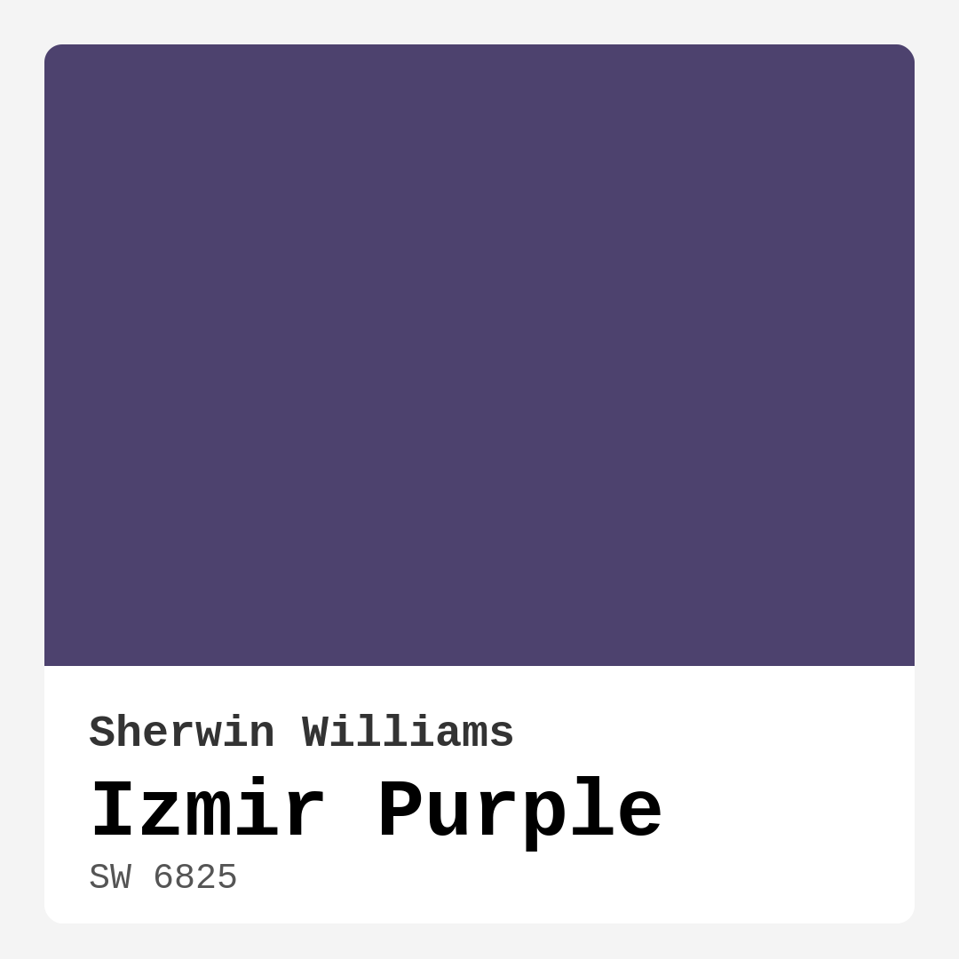
Color Preview & Key Details
| HEX Code | #4D426E |
| RGB | 77, 66, 110 |
| LRV | 15% |
| Undertone | Purple |
| Finish Options | Eggshell, Matte, Satin |
Imagine walking into a room that instantly wraps you in its warmth and sophistication. You glance around, noticing how the walls promote a sense of calm, yet they also invigorate the space with their subtle depth. That’s the beauty of Izmir Purple from Sherwin Williams—a color that strikes the perfect balance between being a bold statement and a serene backdrop.
Let’s dive into what makes Izmir Purple such a compelling choice for your home. This dark, muted hue brings a captivating blend of soft lavender and gray, creating an atmosphere that feels both cozy and elegant. With a hex code of #4D426E and an LRV (Light Reflectance Value) of 15%, it reflects very little light, making it ideal for spaces where intimate vibes are desired.
When it comes to application, Izmir Purple is beginner-friendly, rolling on smoothly and drying evenly. You won’t need to be a painting pro to achieve that professional finish. Plus, it’s highly washable and stain-resistant—perfect for those high-traffic areas or homes with kids and pets. You’ll appreciate how it holds up over time, ensuring your walls look as stunning as the day you painted them.
Now, let’s talk about where you might want to use this enchanting color. Izmir Purple shines in living rooms and bedrooms, creating a soothing oasis where you can unwind. It’s also a great fit for home offices, where its calming qualities can enhance focus and creativity. Picture a dining room adorned with this shade; it invites conversation and connection while still maintaining a touch of sophistication.
One of the best aspects of Izmir Purple is its versatility. It pairs wonderfully with a range of decor styles, from modern to bohemian and everything in between. If you’re leaning towards a more eclectic vibe, you’ll find that this color complements a mix of textures, patterns, and furnishings beautifully. It even works well in transitional spaces, bridging the gap between traditional and contemporary design.
When decorating with Izmir Purple, consider the undertones that give it its character. The purple undertone is essential to its depth and complexity. It’s key to test this paint in your home, observing how it interacts with your existing furniture and decor throughout the day. The light will change the color perception, making it cooler in some lights and warmer in others.
Speaking of light, keep in mind that Izmir Purple is at its best in well-lit rooms. In spaces with plenty of natural light, it radiates a soft, calming glow that uplifts the environment without overwhelming it. Conversely, in low-light conditions, this hue can appear darker than you might expect. So, if you’re considering it for a smaller or dimly lit area, ensure you have adequate lighting in place to keep the space feeling open and inviting.
When it comes to finishes, Izmir Purple is available in matte, eggshell, and satin. A matte finish offers a more understated look, providing a velvety texture that can soften the color, while satin gives a slight sheen, adding depth and dimension. The finish you choose can dramatically affect the overall aesthetic of your space, so think about the mood you want to create.
One of the most delightful aspects of this color is how well it pairs with other shades. If you’re thinking about complementary colors, consider using whites and creams like Sherwin Williams’ White Dove for trim. This combination can elevate the overall look, creating a clean and sophisticated contrast. If you want to add a touch of glam, brass fixtures beautifully complement Izmir Purple, adding warmth and a hint of luxury.
For those seeking a more natural feel, wood tones can also enhance the charm of this color. Whether you have wooden furniture, flooring, or accents, the combination will ground the space while still allowing the purple to shine.
As you ponder your decision, let’s address some common questions. Can you use Izmir Purple in a small room? Absolutely! While it’s a deeper hue, it can work wonders in smaller spaces. Just ensure you have good lighting and pair it with lighter elements to keep the area feeling open.
Another common question is about the finish options. Whether you choose a matte, eggshell, or satin finish will influence how the color comes to life in your space. Each finish brings its own character, so take into account the existing decor and the overall feel you want to achieve.
In terms of mood, Izmir Purple creates an inviting and calm atmosphere. It’s sophisticated yet approachable, a perfect blend for a home that welcomes guests while providing a sanctuary for its inhabitants.
The application process is also a breeze. With good coverage in just one to two coats, you won’t be spending your whole weekend painting. Plus, the touch-up friendly nature means you can maintain its beauty with ease over time.
When considering the best uses for Izmir Purple, think about it as an accent wall to create a focal point that draws the eye. It can also transform interior walls, making your spaces feel more cohesive. You might even consider using it on furniture for a unique, custom look that showcases your personal style.
So, if you’re looking for a way to elevate your home decor, look no further than Izmir Purple. Its versatility, ease of application, and sophisticated vibe make it an excellent choice for any room. Whether you’re creating a cozy bedroom retreat or a stylish living space that encourages socializing, this color is sure to impress.
In conclusion, Izmir Purple isn’t just a paint color; it’s an invitation to create a space that reflects who you are. It’s about crafting an environment that feels just right—welcoming, sophisticated, and timeless. So grab that paintbrush, and let Izmir Purple bring your vision to life. You won’t regret it!
Save this color to your Pinterest board to revisit when planning your room.
Real Room Photo of Izmir Purple SW 6825
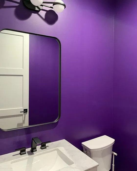
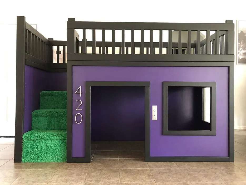
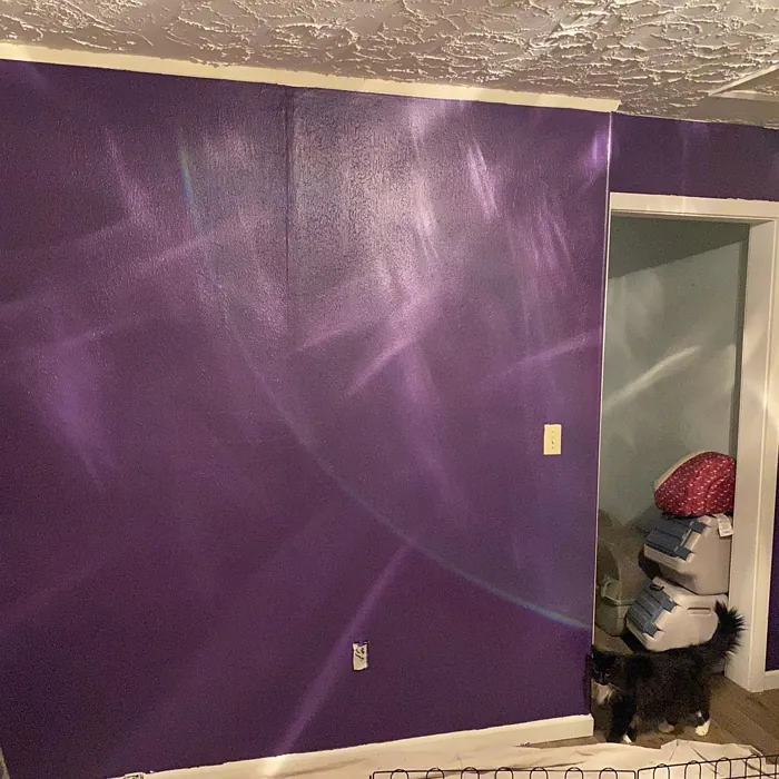
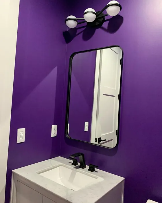
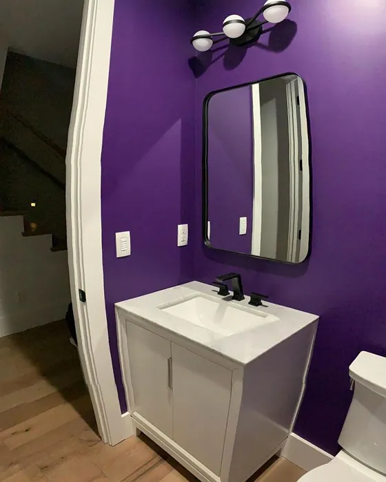
Real rooms painted with Izmir Purple SW 6825 by Sherwin Williams. Lighting and photography can affect how colors appear — always test a sample swatch in your own space.
Undertones of Izmir Purple ?
The undertones of Izmir Purple are a key aspect of its character, leaning towards Purple. These subtle underlying hues are what give the color its depth and complexity. For example, a gray with a blue undertone will feel cooler and more modern, while one with a brown undertone will feel warmer and more traditional. It’s essential to test this paint in your home and observe it next to your existing furniture, flooring, and decor to see how these undertones interact and reveal themselves throughout the day.
HEX value: #4D426E
RGB code: 77, 66, 110
Is Izmir Purple Cool or Warm?
Izmir Purple is considered a cool paint color. This characteristic plays a huge role in the overall feel of a room. Cool colors, like this one, tend to create a cozy, inviting, and energetic atmosphere, making them great for social spaces like living rooms and dining rooms. In contrast, warm colors often evoke a sense of calm and serenity, which is why they are popular in bedrooms and bathrooms. The coolth of Izmir Purple means it will pair beautifully with corresponding decor elements.
Understanding Color Properties and Interior Design Tips
Hue refers to a specific position on the color wheel, measured in degrees from 0 to 360. Each degree represents a different pure color:
- 0° represents red
- 120° represents green
- 240° represents blue
Saturation describes the intensity or purity of a color and is expressed as a percentage:
- At 0%, the color appears completely desaturated—essentially a shade of gray
- At 100%, the color is at its most vivid and vibrant
Lightness indicates how light or dark a color is, also expressed as a percentage:
- 0% lightness results in black
- 100% lightness results in white
Using Warm Colors in Interior Design
Warm hues—such as reds, oranges, yellows, warm beiges, and greiges—are excellent choices for creating inviting and energetic spaces. These colors are particularly well-suited for:
- Kitchens, living rooms, and bathrooms, where warmth enhances comfort and sociability
- Large rooms, where warm tones can help reduce the sense of emptiness and make the space feel more intimate
For example:
- Warm beige shades provide a cozy, inviting atmosphere, ideal for living rooms, bedrooms, and hallways.
- Warm greige (a mix of beige and gray) offers the warmth of beige with the modern appeal of gray, making it a versatile backdrop for dining areas, bedrooms, and living spaces.
However, be mindful when using warm light tones in rooms with limited natural light. These shades may appear muted or even take on an unpleasant yellowish tint. To avoid a dull or flat appearance:
- Add depth by incorporating richer tones like deep greens, charcoal, or chocolate brown
- Use textured elements such as curtains, rugs, or cushions to bring dimension to the space
Pro Tip: Achieving Harmony with Warm and Cool Color Balance
To create a well-balanced and visually interesting interior, mix warm and cool tones strategically. This contrast adds depth and harmony to your design.
- If your walls feature warm hues, introduce cool-colored accents such as blue or green furniture, artwork, or accessories to create contrast.
- For a polished look, consider using a complementary color scheme, which pairs colors opposite each other on the color wheel (e.g., red with green, orange with blue).
This thoughtful mix not only enhances visual appeal but also creates a space that feels both dynamic and cohesive.
Save this color to your Pinterest board to revisit when planning your room.
Light Temperature Affects on Izmir Purple
Natural Light
Natural daylight changes in color temperature as the sun moves across the sky. At sunrise and sunset, the light tends to have a warm, golden tone with a color temperature around 2000 Kelvin (K). As the day progresses and the sun rises higher, the light becomes cooler and more neutral. Around midday, especially when the sky is clear, natural light typically reaches its peak brightness and shifts to a cooler tone, ranging from 5500 to 6500 Kelvin. This midday light is close to what we perceive as pure white or daylight-balanced light.
These shifts in natural light can significantly influence how colors appear in a space, which is why designers often consider both the time of day and the orientation of windows when planning interior color schemes.
Explore how this color transforms from sunrise through sunset as natural light changes throughout the day. Use the slider to simulate morning light, midday brightness, and warm afternoon tones.
North-facing rooms stay cooler throughout the day and benefit from warmer paint tones to compensate. South-facing rooms receive more direct sunlight, making even deeper shades more workable. East-facing rooms get bright morning light that fades by afternoon, while west-facing rooms glow warmly in the evening.
Artificial Light
When choosing artificial lighting, pay close attention to the color temperature, measured in Kelvin (K). This determines how warm or cool the light will appear. Lower temperatures, around 2700K, give off a warm, yellow glow often used in living rooms or bedrooms. Higher temperatures, above 5000K, create a cool, bluish light similar to daylight, commonly used in kitchens, offices, or task areas.
Use the slider to see how lighting temperature can affect the appearance of a surface or color throughout a space.
See how this color looks under different artificial light temperatures — from warm candlelight (2000K) to cool daylight (7000K). Move the slider to simulate your room's lighting conditions.


4800K
Keep in mind that natural light from windows, the warmth of lamps, and overhead lighting all affect how this color reads on your walls at different times of day. Always observe a sample swatch in your actual space before purchasing.
LRV of Izmir Purple
The Light Reflectance Value (LRV) of Izmir Purple is 15%, which places it in the Medium Dark category. This means it reflects very little light. Understanding a paint’s LRV is crucial for predicting how it will look in your space. A higher LRV indicates a lighter color that reflects more light, making rooms feel larger and brighter. A lower LRV signifies a darker color that absorbs more light, creating a cozier, more intimate atmosphere. Always consider the natural and artificial lighting in your room when selecting a paint color based on its LRV.
Detailed Review of Izmir Purple
Additional Paint Characteristics
Ideal Rooms
Bedroom, Dining Room, Home Office, Living Room
Decor Styles
Bohemian, Eclectic, Modern, Transitional
Coverage
Good (1–2 Coats), Touch-Up Friendly
Ease of Application
Beginner Friendly, Brush Smooth, Roller-Ready
Washability
Highly Washable, Stain Resistant, Washable
VOC Level
Eco-Certified, Low VOC
Best Use
Accent Wall, Furniture, Interior Walls
Room Suitability
Bedroom, Dining Room, Home Office, Living Room
Tone Tag
Dusty, Muted, Sophisticated
Finish Type
Eggshell, Matte, Satin
Paint Performance
High Coverage, Low Odor, Quick Drying
Use Cases
Best for Low Light Rooms, Best for Rentals, Classic Favorite
Mood
Calm, Cozy, Sophisticated
Trim Pairing
Complements Brass Fixtures, Good with Wood Trim, Pairs with White Dove
Izmir Purple offers a unique aesthetic that strikes a balance between bold and understated. Its muted tones make it incredibly versatile, allowing it to blend seamlessly with various decor styles, from modern to bohemian. When applied, it exudes a calming vibe that can make spaces feel more inviting and restful. The paint’s application is smooth, and it dries evenly, creating a professional finish. This color works especially well in living rooms and bedrooms, where a soothing atmosphere is desired. If you’re considering a fresh coat, Izmir Purple could be the transformative choice you’ve been searching for.
Pros & Cons of SW 6825 Izmir Purple
Pros
Cons
Colors that go with Sherwin Williams Izmir Purple
FAQ on SW 6825 Izmir Purple
Can I use Izmir Purple in a small room?
Absolutely! While Izmir Purple is a deeper hue, it can still work well in small spaces. Just ensure the room has adequate natural light to prevent it from feeling too enclosed. Pair it with lighter trim or decor to enhance the openness of the room.
What finishes are available for Izmir Purple?
Izmir Purple is available in a variety of finishes, including matte, eggshell, and satin. Choose a matte finish for a more understated look or satin for a slight sheen that adds depth to the color. Each finish can dramatically affect the overall aesthetic, so consider your space’s lighting and decor when choosing.
Comparisons Izmir Purple with other colors
Izmir Purple SW 6825 vs Exclusive Plum SW 6263
| Attribute | Izmir Purple SW 6825 | Exclusive Plum SW 6263 |
|---|---|---|
| Color Name | Izmir Purple SW 6825 | Exclusive Plum SW 6263 |
| Color | ||
| Hue | Purple | Purple |
| Brightness | Dark | Dark |
| RGB | 77, 66, 110 | 115, 111, 120 |
| LRV | 15% | 15% |
| Finish Type | Eggshell, Matte, Satin | Eggshell, Matte, Satin |
| Finish Options | Eggshell, Matte, Satin | Eggshell, Matte, Satin |
| Ideal Rooms | Bedroom, Dining Room, Home Office, Living Room | Bedroom, Dining Room, Home Office, Living Room |
| Decor Styles | Bohemian, Eclectic, Modern, Transitional | Contemporary, Eclectic, Modern, Traditional |
| Coverage | Good (1–2 Coats), Touch-Up Friendly | Good (1–2 Coats), Touch-Up Friendly |
| Ease of Application | Beginner Friendly, Brush Smooth, Roller-Ready | Beginner Friendly, Brush Smooth, Fast-Drying, Roller-Ready |
| Washability | Highly Washable, Stain Resistant, Washable | Washable, Wipeable |
| Room Suitability | Bedroom, Dining Room, Home Office, Living Room | Bedroom, Dining Room, Home Office, Living Room |
| Tone | Dusty, Muted, Sophisticated | Deep, Dusty, Warm |
| Paint Performance | High Coverage, Low Odor, Quick Drying | Easy Touch-Up, High Coverage, Low Odor |
Lighting conditions, wall orientation, and surrounding decor can significantly affect how these colors appear in your space. Always test a sample swatch before committing to a full application.
Izmir Purple SW 6825 vs Blackberry SW 7577
| Attribute | Izmir Purple SW 6825 | Blackberry SW 7577 |
|---|---|---|
| Color Name | Izmir Purple SW 6825 | Blackberry SW 7577 |
| Color | ||
| Hue | Purple | Purple |
| Brightness | Dark | Dark |
| RGB | 77, 66, 110 | 83, 54, 64 |
| LRV | 15% | 5% |
| Finish Type | Eggshell, Matte, Satin | Eggshell, Matte |
| Finish Options | Eggshell, Matte, Satin | Eggshell, Matte, Satin |
| Ideal Rooms | Bedroom, Dining Room, Home Office, Living Room | Bedroom, Dining Room, Home Office, Living Room |
| Decor Styles | Bohemian, Eclectic, Modern, Transitional | Bohemian, Contemporary, Modern, Rustic |
| Coverage | Good (1–2 Coats), Touch-Up Friendly | Good (1–2 Coats), Touch-Up Friendly |
| Ease of Application | Beginner Friendly, Brush Smooth, Roller-Ready | Beginner Friendly, Brush Smooth, Roller-Ready |
| Washability | Highly Washable, Stain Resistant, Washable | Washable, Wipeable |
| Room Suitability | Bedroom, Dining Room, Home Office, Living Room | Bedroom, Dining Room, Home Office, Living Room |
| Tone | Dusty, Muted, Sophisticated | Deep, Moody, Warm |
| Paint Performance | High Coverage, Low Odor, Quick Drying | Easy Touch-Up, High Coverage, Low Odor |
Lighting conditions, wall orientation, and surrounding decor can significantly affect how these colors appear in your space. Always test a sample swatch before committing to a full application.
Izmir Purple SW 6825 vs Expressive Plum SW 6271
| Attribute | Izmir Purple SW 6825 | Expressive Plum SW 6271 |
|---|---|---|
| Color Name | Izmir Purple SW 6825 | Expressive Plum SW 6271 |
| Color | ||
| Hue | Purple | Purple |
| Brightness | Dark | Dark |
| RGB | 77, 66, 110 | 105, 92, 98 |
| LRV | 15% | 15% |
| Finish Type | Eggshell, Matte, Satin | Eggshell, Matte, Satin |
| Finish Options | Eggshell, Matte, Satin | Eggshell, Matte, Satin |
| Ideal Rooms | Bedroom, Dining Room, Home Office, Living Room | Bedroom, Dining Room, Home Office, Living Room |
| Decor Styles | Bohemian, Eclectic, Modern, Transitional | Eclectic, Modern, Traditional, Transitional |
| Coverage | Good (1–2 Coats), Touch-Up Friendly | Good (1–2 Coats) |
| Ease of Application | Beginner Friendly, Brush Smooth, Roller-Ready | Beginner Friendly, Brush Smooth, Roller-Ready |
| Washability | Highly Washable, Stain Resistant, Washable | Washable, Wipeable |
| Room Suitability | Bedroom, Dining Room, Home Office, Living Room | Bedroom, Dining Room, Home Office, Living Room |
| Tone | Dusty, Muted, Sophisticated | Deep, Muted, Warm |
| Paint Performance | High Coverage, Low Odor, Quick Drying | Easy Touch-Up, High Coverage, Low Odor |
Lighting conditions, wall orientation, and surrounding decor can significantly affect how these colors appear in your space. Always test a sample swatch before committing to a full application.
Izmir Purple SW 6825 vs Plum Brown SW 6272
| Attribute | Izmir Purple SW 6825 | Plum Brown SW 6272 |
|---|---|---|
| Color Name | Izmir Purple SW 6825 | Plum Brown SW 6272 |
| Color | ||
| Hue | Purple | Purple |
| Brightness | Dark | Dark |
| RGB | 77, 66, 110 | 78, 66, 71 |
| LRV | 15% | 6% |
| Finish Type | Eggshell, Matte, Satin | Eggshell, Matte, Satin |
| Finish Options | Eggshell, Matte, Satin | Eggshell, Matte, Satin |
| Ideal Rooms | Bedroom, Dining Room, Home Office, Living Room | Bedroom, Dining Room, Home Office, Living Room |
| Decor Styles | Bohemian, Eclectic, Modern, Transitional | Eclectic, Modern, Rustic, Traditional |
| Coverage | Good (1–2 Coats), Touch-Up Friendly | Good (1–2 Coats), Touch-Up Friendly |
| Ease of Application | Beginner Friendly, Brush Smooth, Roller-Ready | Beginner Friendly, Brush Smooth, Roller-Ready |
| Washability | Highly Washable, Stain Resistant, Washable | Washable, Wipeable |
| Room Suitability | Bedroom, Dining Room, Home Office, Living Room | Bedroom, Dining Room, Home Office, Living Room |
| Tone | Dusty, Muted, Sophisticated | Deep, Earthy, Warm |
| Paint Performance | High Coverage, Low Odor, Quick Drying | Easy Touch-Up, High Coverage, Low Odor |
Lighting conditions, wall orientation, and surrounding decor can significantly affect how these colors appear in your space. Always test a sample swatch before committing to a full application.
Izmir Purple SW 6825 vs Soulmate SW 6270
| Attribute | Izmir Purple SW 6825 | Soulmate SW 6270 |
|---|---|---|
| Color Name | Izmir Purple SW 6825 | Soulmate SW 6270 |
| Color | ||
| Hue | Purple | Purple |
| Brightness | Dark | Dark |
| RGB | 77, 66, 110 | 133, 119, 123 |
| LRV | 15% | 24% |
| Finish Type | Eggshell, Matte, Satin | Eggshell, Matte, Satin |
| Finish Options | Eggshell, Matte, Satin | Eggshell, Matte, Satin |
| Ideal Rooms | Bedroom, Dining Room, Home Office, Living Room | Bedroom, Hallway, Home Office, Living Room |
| Decor Styles | Bohemian, Eclectic, Modern, Transitional | Bohemian, Modern, Rustic, Transitional |
| Coverage | Good (1–2 Coats), Touch-Up Friendly | Good (1–2 Coats), Touch-Up Friendly |
| Ease of Application | Beginner Friendly, Brush Smooth, Roller-Ready | Beginner Friendly, Brush Smooth, Roller-Ready |
| Washability | Highly Washable, Stain Resistant, Washable | Washable, Wipeable |
| Room Suitability | Bedroom, Dining Room, Home Office, Living Room | Bedroom, Hallway, Home Office, Living Room |
| Tone | Dusty, Muted, Sophisticated | Earthy, Muted, Warm |
| Paint Performance | High Coverage, Low Odor, Quick Drying | Easy Touch-Up, Low Odor, Quick Drying |
Lighting conditions, wall orientation, and surrounding decor can significantly affect how these colors appear in your space. Always test a sample swatch before committing to a full application.
Izmir Purple SW 6825 vs Quixotic Plum SW 6265
| Attribute | Izmir Purple SW 6825 | Quixotic Plum SW 6265 |
|---|---|---|
| Color Name | Izmir Purple SW 6825 | Quixotic Plum SW 6265 |
| Color | ||
| Hue | Purple | Purple |
| Brightness | Dark | Dark |
| RGB | 77, 66, 110 | 74, 70, 83 |
| LRV | 15% | 12% |
| Finish Type | Eggshell, Matte, Satin | Eggshell, Matte, Satin |
| Finish Options | Eggshell, Matte, Satin | Eggshell, Matte, Satin |
| Ideal Rooms | Bedroom, Dining Room, Home Office, Living Room | Bedroom, Dining Room, Home Office, Living Room |
| Decor Styles | Bohemian, Eclectic, Modern, Transitional | Bohemian, Contemporary, Eclectic, Modern, Traditional |
| Coverage | Good (1–2 Coats), Touch-Up Friendly | Good (1–2 Coats), Touch-Up Friendly |
| Ease of Application | Beginner Friendly, Brush Smooth, Roller-Ready | Brush Smooth, Fast-Drying, Roller-Ready |
| Washability | Highly Washable, Stain Resistant, Washable | Highly Washable, Washable |
| Room Suitability | Bedroom, Dining Room, Home Office, Living Room | Bedroom, Dining Room, Home Office, Living Room |
| Tone | Dusty, Muted, Sophisticated | Deep, Moody, Warm |
| Paint Performance | High Coverage, Low Odor, Quick Drying | High Coverage, Low Odor, Scuff Resistant |
Lighting conditions, wall orientation, and surrounding decor can significantly affect how these colors appear in your space. Always test a sample swatch before committing to a full application.
Izmir Purple SW 6825 vs Midnight SW 6264
| Attribute | Izmir Purple SW 6825 | Midnight SW 6264 |
|---|---|---|
| Color Name | Izmir Purple SW 6825 | Midnight SW 6264 |
| Color | ||
| Hue | Purple | Purple |
| Brightness | Dark | Dark |
| RGB | 77, 66, 110 | 93, 89, 98 |
| LRV | 15% | 6% |
| Finish Type | Eggshell, Matte, Satin | Eggshell, Matte, Satin |
| Finish Options | Eggshell, Matte, Satin | Eggshell, Matte, Satin |
| Ideal Rooms | Bedroom, Dining Room, Home Office, Living Room | Bedroom, Dining Room, Hallway, Home Office, Living Room |
| Decor Styles | Bohemian, Eclectic, Modern, Transitional | Bohemian, Contemporary, Industrial, Modern |
| Coverage | Good (1–2 Coats), Touch-Up Friendly | Good (1–2 Coats), High Hide, Touch-Up Friendly |
| Ease of Application | Beginner Friendly, Brush Smooth, Roller-Ready | Beginner Friendly, Brush Smooth, Roller-Ready |
| Washability | Highly Washable, Stain Resistant, Washable | Scrubbable, Stain Resistant, Washable |
| Room Suitability | Bedroom, Dining Room, Home Office, Living Room | Bedroom, Dining Room, Home Office, Living Room |
| Tone | Dusty, Muted, Sophisticated | Balanced, Deep, Moody |
| Paint Performance | High Coverage, Low Odor, Quick Drying | Easy Touch-Up, Long Lasting, Low Odor, Scuff Resistant |
Lighting conditions, wall orientation, and surrounding decor can significantly affect how these colors appear in your space. Always test a sample swatch before committing to a full application.
Izmir Purple SW 6825 vs Framboise SW 6566
| Attribute | Izmir Purple SW 6825 | Framboise SW 6566 |
|---|---|---|
| Color Name | Izmir Purple SW 6825 | Framboise SW 6566 |
| Color | ||
| Hue | Purple | Purple |
| Brightness | Dark | Dark |
| RGB | 77, 66, 110 | 124, 54, 85 |
| LRV | 15% | 6% |
| Finish Type | Eggshell, Matte, Satin | Matte, Satin, Semi-Gloss |
| Finish Options | Eggshell, Matte, Satin | Matte, Satin, Semi-Gloss |
| Ideal Rooms | Bedroom, Dining Room, Home Office, Living Room | Bedroom, Dining Room, Home Office, Living Room |
| Decor Styles | Bohemian, Eclectic, Modern, Transitional | Bohemian, Contemporary, Eclectic, Modern |
| Coverage | Good (1–2 Coats), Touch-Up Friendly | Good (1–2 Coats), Touch-Up Friendly |
| Ease of Application | Beginner Friendly, Brush Smooth, Roller-Ready | Beginner Friendly, Brush Smooth, Fast-Drying, Roller-Ready |
| Washability | Highly Washable, Stain Resistant, Washable | Highly Washable, Washable |
| Room Suitability | Bedroom, Dining Room, Home Office, Living Room | Bedroom, Dining Room, Home Office, Living Room |
| Tone | Dusty, Muted, Sophisticated | Bold, Deep, Warm |
| Paint Performance | High Coverage, Low Odor, Quick Drying | Easy Touch-Up, High Coverage, Low Odor, Quick Drying |
Lighting conditions, wall orientation, and surrounding decor can significantly affect how these colors appear in your space. Always test a sample swatch before committing to a full application.
Izmir Purple SW 6825 vs Poetry Plum SW 6019
| Attribute | Izmir Purple SW 6825 | Poetry Plum SW 6019 |
|---|---|---|
| Color Name | Izmir Purple SW 6825 | Poetry Plum SW 6019 |
| Color | ||
| Hue | Purple | Purple |
| Brightness | Dark | Dark |
| RGB | 77, 66, 110 | 111, 92, 95 |
| LRV | 15% | 10% |
| Finish Type | Eggshell, Matte, Satin | Eggshell, Matte, Satin |
| Finish Options | Eggshell, Matte, Satin | Eggshell, Matte, Satin |
| Ideal Rooms | Bedroom, Dining Room, Home Office, Living Room | Bedroom, Dining Room, Home Office, Living Room |
| Decor Styles | Bohemian, Eclectic, Modern, Transitional | Bohemian, Modern, Rustic, Transitional |
| Coverage | Good (1–2 Coats), Touch-Up Friendly | Good (1–2 Coats), Touch-Up Friendly |
| Ease of Application | Beginner Friendly, Brush Smooth, Roller-Ready | Beginner Friendly, Brush Smooth, Roller-Ready |
| Washability | Highly Washable, Stain Resistant, Washable | Highly Washable, Washable |
| Room Suitability | Bedroom, Dining Room, Home Office, Living Room | Bedroom, Dining Room, Home Office, Living Room |
| Tone | Dusty, Muted, Sophisticated | Deep, Muted, Warm |
| Paint Performance | High Coverage, Low Odor, Quick Drying | Easy Touch-Up, High Coverage, Low Odor |
Lighting conditions, wall orientation, and surrounding decor can significantly affect how these colors appear in your space. Always test a sample swatch before committing to a full application.
Izmir Purple SW 6825 vs Mature Grape SW 6286
| Attribute | Izmir Purple SW 6825 | Mature Grape SW 6286 |
|---|---|---|
| Color Name | Izmir Purple SW 6825 | Mature Grape SW 6286 |
| Color | ||
| Hue | Purple | Purple |
| Brightness | Dark | Dark |
| RGB | 77, 66, 110 | 95, 63, 84 |
| LRV | 15% | 15% |
| Finish Type | Eggshell, Matte, Satin | Eggshell, Matte, Satin |
| Finish Options | Eggshell, Matte, Satin | Eggshell, Matte, Satin |
| Ideal Rooms | Bedroom, Dining Room, Home Office, Living Room | Bedroom, Dining Room, Home Office, Living Room |
| Decor Styles | Bohemian, Eclectic, Modern, Transitional | Art Deco, Bohemian, Modern, Rustic |
| Coverage | Good (1–2 Coats), Touch-Up Friendly | Good (1–2 Coats), Touch-Up Friendly |
| Ease of Application | Beginner Friendly, Brush Smooth, Roller-Ready | Brush Smooth, Fast-Drying, Roller-Ready |
| Washability | Highly Washable, Stain Resistant, Washable | Stain Resistant, Washable, Wipeable |
| Room Suitability | Bedroom, Dining Room, Home Office, Living Room | Bedroom, Dining Room, Home Office, Living Room |
| Tone | Dusty, Muted, Sophisticated | Deep, Earthy, Warm |
| Paint Performance | High Coverage, Low Odor, Quick Drying | Easy Touch-Up, Low Odor, Stain Resistant |
Lighting conditions, wall orientation, and surrounding decor can significantly affect how these colors appear in your space. Always test a sample swatch before committing to a full application.
Official Page of Sherwin Williams Izmir Purple SW 6825