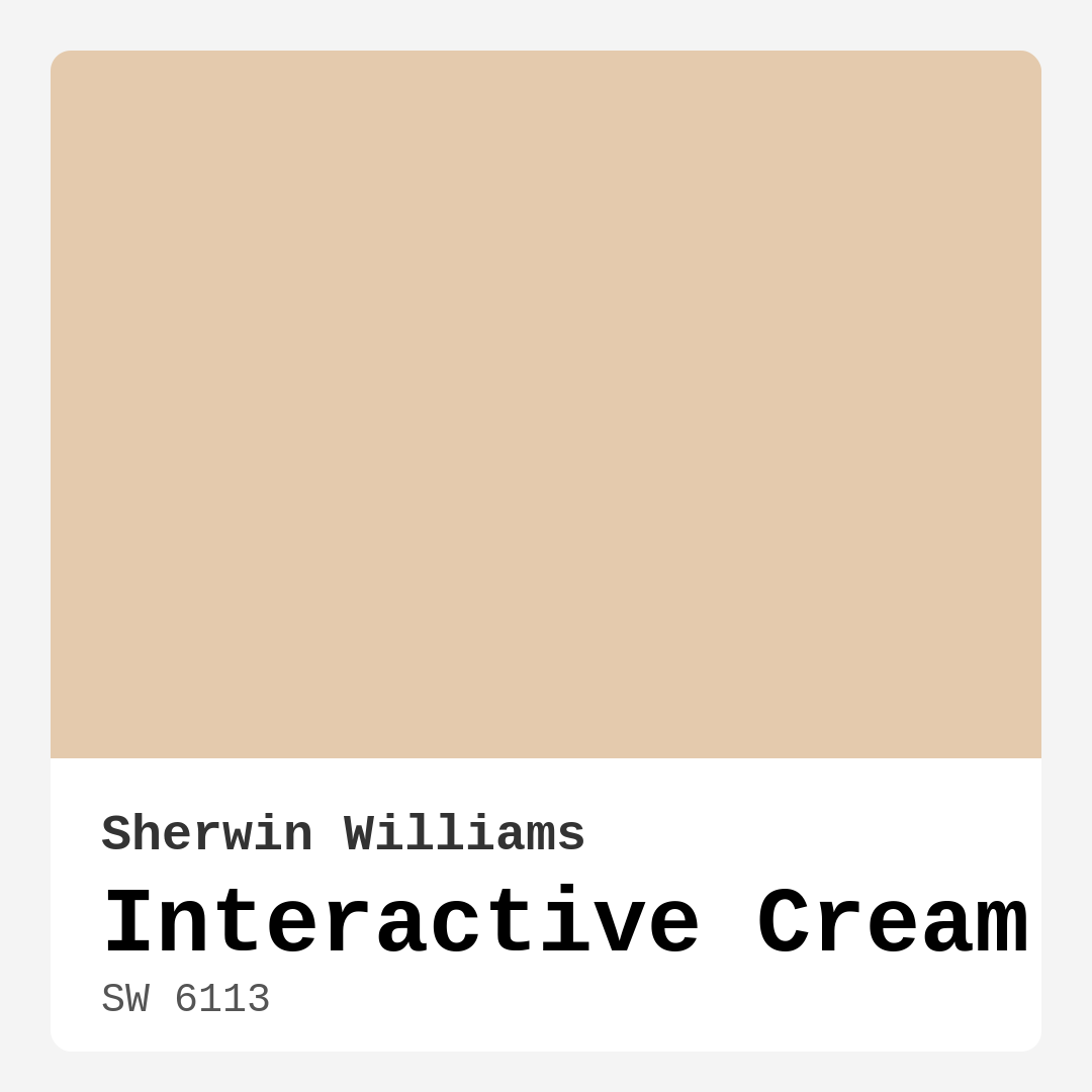
Color Preview & Key Details
| HEX Code | #E4CAAD |
| RGB | 228, 202, 173 |
| LRV | 75% |
| Undertone | Red |
| Finish Options | Eggshell, Matte, Satin |
Imagine walking into a room that wraps you in warmth and comfort, like a soft blanket on a chilly evening. That’s the magic of Interactive Cream from Sherwin Williams. With its inviting hue, this paint color isn’t just a choice; it’s an experience that elevates your space and transforms it into a sanctuary.
Interactive Cream boasts a light, creamy beige that strikes the perfect balance between warmth and neutrality. Its hex code, #E4CAAD, tells you it’s a soft shade, and the RGB values of 228, 202, and 173 reinforce its delicate nature. This is a color that reflects a high amount of light with an impressive Light Reflectance Value (LRV) of 75%, creating an airy feel that can make even the coziest corners seem more expansive.
Whether you’re sprucing up your living room, bedroom, kitchen, dining area, or hallway, Interactive Cream fits seamlessly into any space. It’s versatile enough to complement a range of decor styles, from Modern Farmhouse to Scandinavian, Coastal, and even Traditional. The subtle red undertones add depth and character, making it a perfect backdrop for both contemporary and classic furnishings.
Let’s talk about application. Interactive Cream is beginner-friendly. You’ll find it applies beautifully, whether you’re using a brush or a roller. Most homeowners report that achieving a perfect finish takes just one or two coats, making it a dream for DIY projects. Plus, its washability ensures that maintaining its pristine look is hassle-free. No one wants to spend time worrying about stains or marks, and with this paint, you won’t have to.
One of the highlights of Interactive Cream is its ability to adapt to various lighting scenarios. In natural light, it radiates a soft glow that brightens up your space, creating a welcoming atmosphere. Under artificial lighting, it maintains its warm tones, perfect for cozy evenings. However, keep in mind that every room has different lighting nuances. It’s wise to test a sample in your specific environment to see how the color shifts throughout the day.
While it’s a fantastic choice for many, there are a couple of considerations. If your space has poor lighting, Interactive Cream may show imperfections more than darker colors would. Additionally, pairing it with too many cool tones can be tricky; the warmth of the cream may clash with cooler hues. But when you find the right complementary colors, the results can be stunning.
Speaking of complementary shades, Interactive Cream plays beautifully with a variety of colors. Think about pairing it with whites, such as White Dove, for a polished look. Consider incorporating brass fixtures, which can add a touch of elegance and contrast nicely with the warmth of the cream. For a more harmonious palette, shades like SW 7625, SW 9139, and SW 9660 can create a delightful balance.
If you’re drawn to lighter colors, you might also want to explore shades like SW 6336 or SW 6343. On the flip side, if you want to deepen the drama in your space, consider darker shades like SW 6128 or SW 6388. The possibilities are endless, allowing you to create a truly personalized look.
Interactive Cream isn’t just a trendy choice; it’s a timeless one. Its warm and inviting nature makes it a favorite among designers and homeowners alike. It’s especially beneficial if you’re preparing to sell your home. Neutral yet sophisticated, this color can appeal to a wide range of potential buyers, making it easier for them to envision themselves in your space.
You might be wondering if Interactive Cream is suitable for smaller areas. The answer is a resounding yes! Its light-reflective property creates a sense of openness and airiness, which can help even the coziest rooms feel more spacious. Pair it with lighter furniture and decor to amplify this effect even further.
In conclusion, Interactive Cream is more than just a paint color. It’s a versatile, warm hue that can transform any room into a cozy retreat. Whether you’re looking to refresh your living room, update your kitchen, or create a serene bedroom, this color adapts beautifully. Its ease of application, washability, and ability to harmonize with various styles make it an excellent choice for both experienced DIYers and novices.
So, as you embark on your next project, consider the inviting charm of Interactive Cream. It’s more than just a shade on the wall; it’s a feeling, a mood, and a perfect starting point for creating a home that reflects your personal style. With the right planning and creativity, your space can become a warm, welcoming haven that brings joy to all who enter.
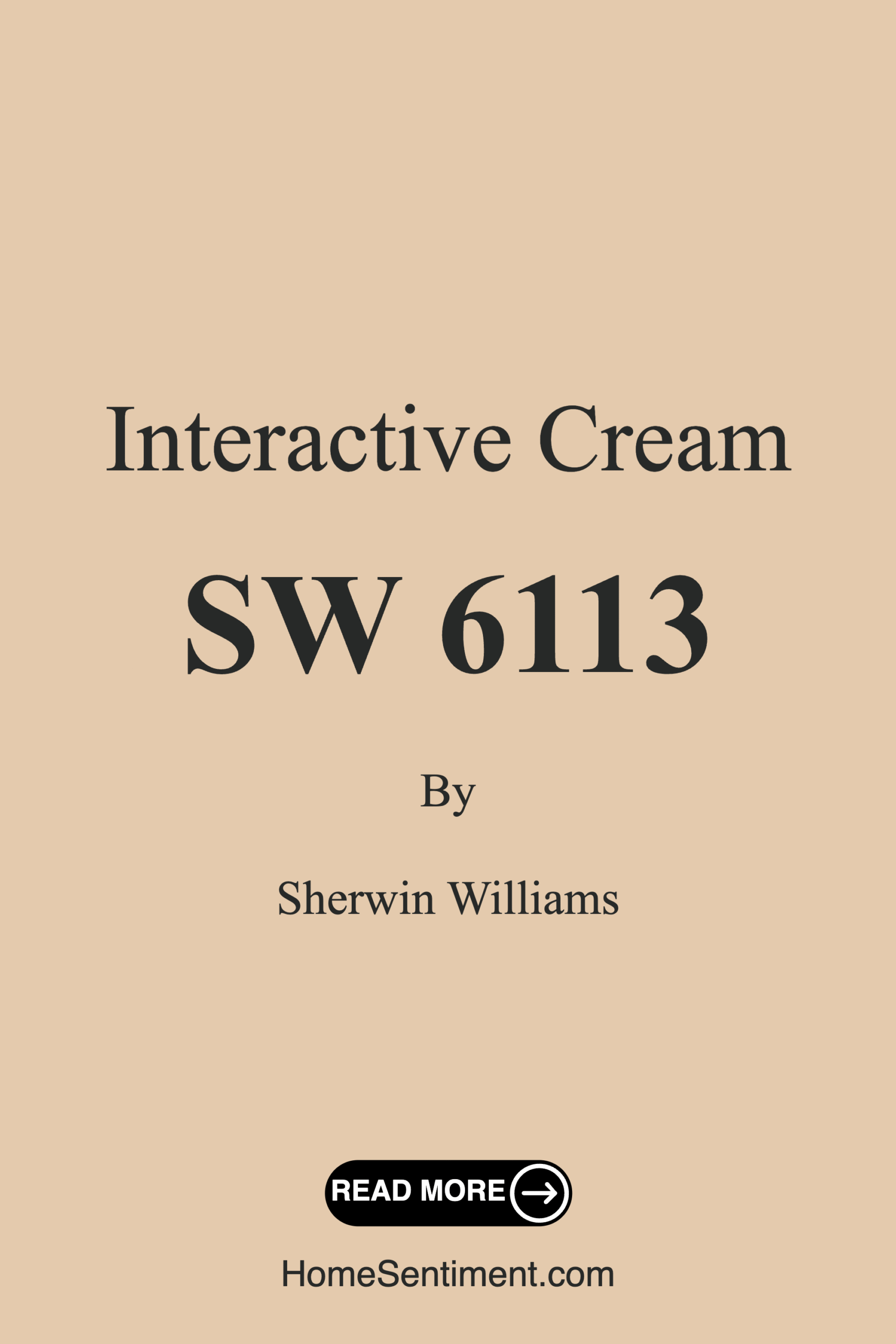
Save this color to your Pinterest board to revisit when planning your room.
Real Room Photo of Interactive Cream SW 6113
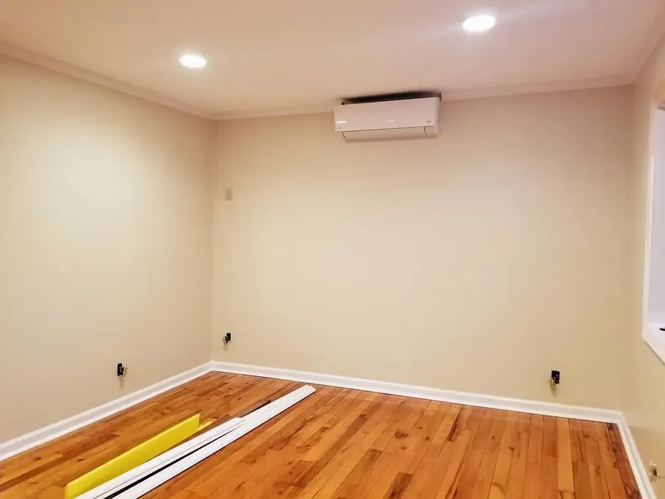
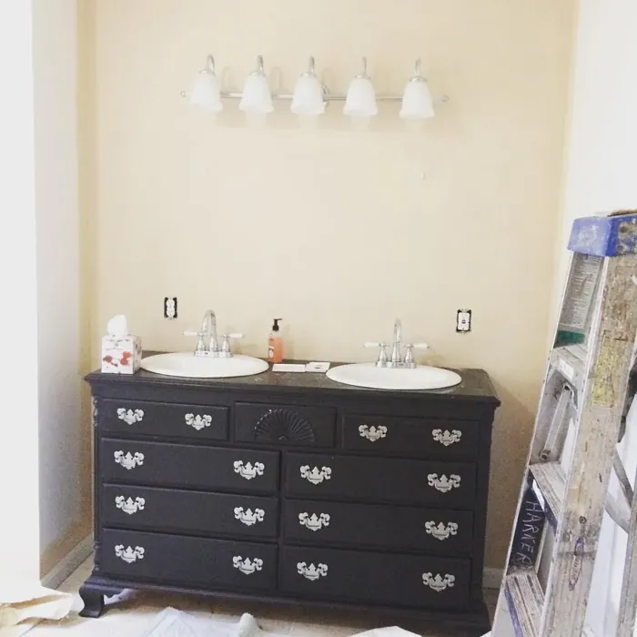
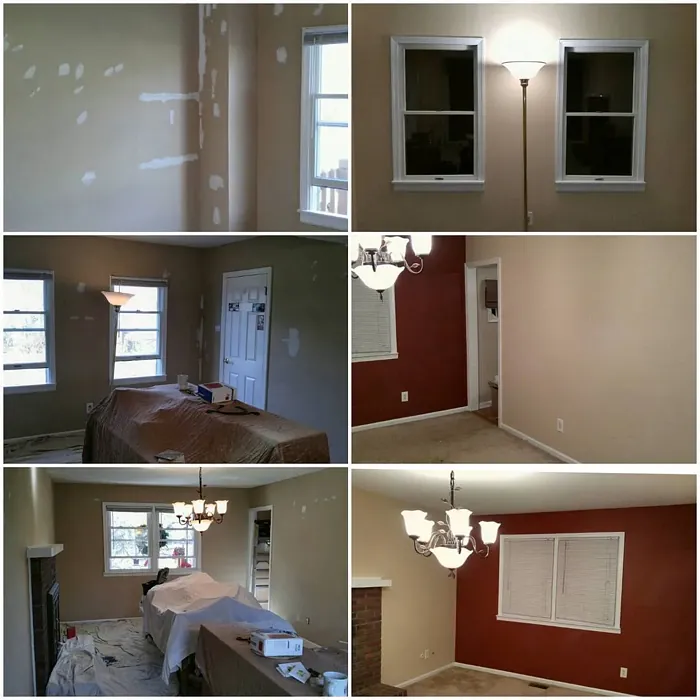
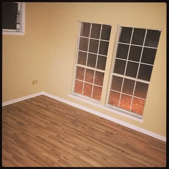
Real rooms painted with Interactive Cream SW 6113 by Sherwin Williams. Lighting and photography can affect how colors appear — always test a sample swatch in your own space.
Undertones of Interactive Cream ?
The undertones of Interactive Cream are a key aspect of its character, leaning towards Red. These subtle underlying hues are what give the color its depth and complexity. For example, a gray with a blue undertone will feel cooler and more modern, while one with a brown undertone will feel warmer and more traditional. It’s essential to test this paint in your home and observe it next to your existing furniture, flooring, and decor to see how these undertones interact and reveal themselves throughout the day.
HEX value: #E4CAAD
RGB code: 228, 202, 173
Is Interactive Cream Cool or Warm?
Interactive Cream leans towards the warm side of the spectrum, creating a cozy environment. Its warmth makes it ideal for spaces where comfort and relaxation are priorities.
Understanding Color Properties and Interior Design Tips
Hue refers to a specific position on the color wheel, measured in degrees from 0 to 360. Each degree represents a different pure color:
- 0° represents red
- 120° represents green
- 240° represents blue
Saturation describes the intensity or purity of a color and is expressed as a percentage:
- At 0%, the color appears completely desaturated—essentially a shade of gray
- At 100%, the color is at its most vivid and vibrant
Lightness indicates how light or dark a color is, also expressed as a percentage:
- 0% lightness results in black
- 100% lightness results in white
Using Warm Colors in Interior Design
Warm hues—such as reds, oranges, yellows, warm beiges, and greiges—are excellent choices for creating inviting and energetic spaces. These colors are particularly well-suited for:
- Kitchens, living rooms, and bathrooms, where warmth enhances comfort and sociability
- Large rooms, where warm tones can help reduce the sense of emptiness and make the space feel more intimate
For example:
- Warm beige shades provide a cozy, inviting atmosphere, ideal for living rooms, bedrooms, and hallways.
- Warm greige (a mix of beige and gray) offers the warmth of beige with the modern appeal of gray, making it a versatile backdrop for dining areas, bedrooms, and living spaces.
However, be mindful when using warm light tones in rooms with limited natural light. These shades may appear muted or even take on an unpleasant yellowish tint. To avoid a dull or flat appearance:
- Add depth by incorporating richer tones like deep greens, charcoal, or chocolate brown
- Use textured elements such as curtains, rugs, or cushions to bring dimension to the space
Pro Tip: Achieving Harmony with Warm and Cool Color Balance
To create a well-balanced and visually interesting interior, mix warm and cool tones strategically. This contrast adds depth and harmony to your design.
- If your walls feature warm hues, introduce cool-colored accents such as blue or green furniture, artwork, or accessories to create contrast.
- For a polished look, consider using a complementary color scheme, which pairs colors opposite each other on the color wheel (e.g., red with green, orange with blue).
This thoughtful mix not only enhances visual appeal but also creates a space that feels both dynamic and cohesive.
Save this color to your Pinterest board to revisit when planning your room.
Light Temperature Affects on Interactive Cream
Natural Light
Natural daylight changes in color temperature as the sun moves across the sky. At sunrise and sunset, the light tends to have a warm, golden tone with a color temperature around 2000 Kelvin (K). As the day progresses and the sun rises higher, the light becomes cooler and more neutral. Around midday, especially when the sky is clear, natural light typically reaches its peak brightness and shifts to a cooler tone, ranging from 5500 to 6500 Kelvin. This midday light is close to what we perceive as pure white or daylight-balanced light.
These shifts in natural light can significantly influence how colors appear in a space, which is why designers often consider both the time of day and the orientation of windows when planning interior color schemes.
Explore how this color transforms from sunrise through sunset as natural light changes throughout the day. Use the slider to simulate morning light, midday brightness, and warm afternoon tones.
North-facing rooms stay cooler throughout the day and benefit from warmer paint tones to compensate. South-facing rooms receive more direct sunlight, making even deeper shades more workable. East-facing rooms get bright morning light that fades by afternoon, while west-facing rooms glow warmly in the evening.
Artificial Light
When choosing artificial lighting, pay close attention to the color temperature, measured in Kelvin (K). This determines how warm or cool the light will appear. Lower temperatures, around 2700K, give off a warm, yellow glow often used in living rooms or bedrooms. Higher temperatures, above 5000K, create a cool, bluish light similar to daylight, commonly used in kitchens, offices, or task areas.
Use the slider to see how lighting temperature can affect the appearance of a surface or color throughout a space.
See how this color looks under different artificial light temperatures — from warm candlelight (2000K) to cool daylight (7000K). Move the slider to simulate your room's lighting conditions.


4800K
Keep in mind that natural light from windows, the warmth of lamps, and overhead lighting all affect how this color reads on your walls at different times of day. Always observe a sample swatch in your actual space before purchasing.
LRV of Interactive Cream
The Light Reflectance Value (LRV) of Interactive Cream is 75%, which places it in the Light category. This means it Reflects a high amount of light. Understanding a paint’s LRV is crucial for predicting how it will look in your space. A higher LRV indicates a lighter color that reflects more light, making rooms feel larger and brighter. A lower LRV signifies a darker color that absorbs more light, creating a cozier, more intimate atmosphere. Always consider the natural and artificial lighting in your room when selecting a paint color based on its LRV.
Detailed Review of Interactive Cream
Additional Paint Characteristics
Ideal Rooms
Bedroom, Dining Room, Hallway, Kitchen, Living Room
Decor Styles
Coastal, Modern Farmhouse, Scandinavian, Traditional, Transitional
Coverage
Good (1–2 Coats)
Ease of Application
Beginner Friendly, Brush Smooth, Roller-Ready
Washability
Highly Washable, Washable
VOC Level
Low VOC
Best Use
Accent Wall, Furniture, Interior Walls
Room Suitability
Bedroom, Dining Room, Hallway, Kitchen, Living Room
Tone Tag
Creamy, Neutral, Warm
Finish Type
Eggshell, Matte, Satin
Paint Performance
High Coverage, Low Odor, Quick Drying
Use Cases
Best for Rentals, Best for Selling Your Home, Designer Favorite, Trending in 2025
Mood
Cozy, Inviting, Restful
Trim Pairing
Complements Brass Fixtures, Good with Wood Trim, Pairs with White Dove
Interactive Cream is not just a paint color; it’s an experience. When applied, it transforms spaces into warm, inviting havens. The creamy undertones provide a soft glow, making rooms feel larger and more open without being stark. Whether it’s in a cozy living room or a bright kitchen, this paint adapts beautifully, harmonizing with both light and dark furnishings. It also performs well in terms of coverage; most users find that 1-2 coats are sufficient for a flawless finish. If you’re looking for a versatile, warm hue that works well in various lighting conditions, Interactive Cream is an excellent choice. Its ability to blend into different decor styles while still making a statement is truly remarkable.
Pros & Cons of SW 6113 Interactive Cream
Pros
Cons
Colors that go with Sherwin Williams Interactive Cream
FAQ on SW 6113 Interactive Cream
Is Interactive Cream suitable for small spaces?
Absolutely! Interactive Cream is perfect for small spaces. Its light-reflective quality helps create a sense of openness and airiness, making even the coziest areas feel more spacious. This warmth adds an inviting touch, ensuring that small rooms feel comfortable rather than cramped. Pair it with lighter furnishings and decor for an even more expansive effect.
How does Interactive Cream perform in different lighting?
Interactive Cream holds up well in various lighting conditions. In natural light, it radiates a soft creaminess that can brighten a space, while under artificial light, it retains its warm undertones, creating a cozy ambiance. However, it’s worth noting that the perceived color may slightly shift based on the type of light, so it’s always a good idea to test it in your specific environment before committing.
Comparisons Interactive Cream with other colors
Interactive Cream SW 6113 vs Natural Linen SW 9109
| Attribute | Interactive Cream SW 6113 | Natural Linen SW 9109 |
|---|---|---|
| Color Name | Interactive Cream SW 6113 | Natural Linen SW 9109 |
| Color | ||
| Hue | Beige | Beige |
| Brightness | Light | Light |
| RGB | 228, 202, 173 | 223, 211, 195 |
| LRV | 75% | 74% |
| Finish Type | Eggshell, Matte, Satin | Eggshell, Matte, Satin |
| Finish Options | Eggshell, Matte, Satin | Eggshell, Matte, Satin |
| Ideal Rooms | Bedroom, Dining Room, Hallway, Kitchen, Living Room | Bedroom, Dining Room, Hallway, Home Office, Kitchen, Living Room |
| Decor Styles | Coastal, Modern Farmhouse, Scandinavian, Traditional, Transitional | Bohemian, Modern Farmhouse, Scandinavian, Transitional |
| Coverage | Good (1–2 Coats) | Good (1–2 Coats), Touch-Up Friendly |
| Ease of Application | Beginner Friendly, Brush Smooth, Roller-Ready | Beginner Friendly, Brush Smooth, Fast-Drying, Roller-Ready |
| Washability | Highly Washable, Washable | Highly Washable, Washable, Wipeable |
| Room Suitability | Bedroom, Dining Room, Hallway, Kitchen, Living Room | Bedroom, Dining Room, Home Office, Kitchen, Living Room |
| Tone | Creamy, Neutral, Warm | Earthy, Neutral, Warm |
| Paint Performance | High Coverage, Low Odor, Quick Drying | Easy Touch-Up, Low Odor, Quick Drying, Scuff Resistant |
Lighting conditions, wall orientation, and surrounding decor can significantly affect how these colors appear in your space. Always test a sample swatch before committing to a full application.
Interactive Cream SW 6113 vs Alabaster SW 7008
| Attribute | Interactive Cream SW 6113 | Alabaster SW 7008 |
|---|---|---|
| Color Name | Interactive Cream SW 6113 | Alabaster SW 7008 |
| Color | ||
| Hue | Beige | Beige |
| Brightness | Light | Light |
| RGB | 228, 202, 173 | 237, 234, 224 |
| LRV | 75% | 82% |
| Finish Type | Eggshell, Matte, Satin | Eggshell, Matte, Satin |
| Finish Options | Eggshell, Matte, Satin | Eggshell, Matte, Satin |
| Ideal Rooms | Bedroom, Dining Room, Hallway, Kitchen, Living Room | Bathroom, Bedroom, Dining Room, Entryway, Home Office, Kitchen, Living Room, Nursery |
| Decor Styles | Coastal, Modern Farmhouse, Scandinavian, Traditional, Transitional | Coastal, Contemporary, Minimalist, Modern Farmhouse, Traditional, Transitional |
| Coverage | Good (1–2 Coats) | Good (1–2 Coats), Touch-Up Friendly |
| Ease of Application | Beginner Friendly, Brush Smooth, Roller-Ready | Beginner Friendly, Brush Smooth, Fast-Drying, Low Splatter, Roller-Ready |
| Washability | Highly Washable, Washable | Washable, Wipeable |
| Room Suitability | Bedroom, Dining Room, Hallway, Kitchen, Living Room | Bathroom, Bedroom, Dining Room, Hallway, Home Office, Kitchen, Living Room, Nursery |
| Tone | Creamy, Neutral, Warm | Creamy, Neutral, Warm |
| Paint Performance | High Coverage, Low Odor, Quick Drying | Easy Touch-Up, High Coverage, Low Odor, Quick Drying |
Lighting conditions, wall orientation, and surrounding decor can significantly affect how these colors appear in your space. Always test a sample swatch before committing to a full application.
Interactive Cream SW 6113 vs White Duck SW 7010
| Attribute | Interactive Cream SW 6113 | White Duck SW 7010 |
|---|---|---|
| Color Name | Interactive Cream SW 6113 | White Duck SW 7010 |
| Color | ||
| Hue | Beige | Beige |
| Brightness | Light | Light |
| RGB | 228, 202, 173 | 229, 223, 210 |
| LRV | 75% | 75% |
| Finish Type | Eggshell, Matte, Satin | Eggshell, Matte, Satin |
| Finish Options | Eggshell, Matte, Satin | Eggshell, Matte, Satin |
| Ideal Rooms | Bedroom, Dining Room, Hallway, Kitchen, Living Room | Bedroom, Dining Room, Home Office, Kitchen, Living Room, Nursery |
| Decor Styles | Coastal, Modern Farmhouse, Scandinavian, Traditional, Transitional | Farmhouse, Modern, Scandinavian, Traditional, Transitional |
| Coverage | Good (1–2 Coats) | Good (1–2 Coats), Touch-Up Friendly |
| Ease of Application | Beginner Friendly, Brush Smooth, Roller-Ready | Beginner Friendly, Brush Smooth, Fast-Drying, Roller-Ready |
| Washability | Highly Washable, Washable | Highly Washable, Washable |
| Room Suitability | Bedroom, Dining Room, Hallway, Kitchen, Living Room | Bedroom, Dining Room, Home Office, Kitchen, Living Room |
| Tone | Creamy, Neutral, Warm | Creamy, Neutral, Warm |
| Paint Performance | High Coverage, Low Odor, Quick Drying | Easy Touch-Up, Fade Resistant, Low Odor, Quick Drying |
Lighting conditions, wall orientation, and surrounding decor can significantly affect how these colors appear in your space. Always test a sample swatch before committing to a full application.
Interactive Cream SW 6113 vs Greek Villa SW 7551
| Attribute | Interactive Cream SW 6113 | Greek Villa SW 7551 |
|---|---|---|
| Color Name | Interactive Cream SW 6113 | Greek Villa SW 7551 |
| Color | ||
| Hue | Beige | Beige |
| Brightness | Light | Light |
| RGB | 228, 202, 173 | 240, 236, 226 |
| LRV | 75% | 82% |
| Finish Type | Eggshell, Matte, Satin | Eggshell, Satin |
| Finish Options | Eggshell, Matte, Satin | Eggshell, Flat, Satin |
| Ideal Rooms | Bedroom, Dining Room, Hallway, Kitchen, Living Room | Bedroom, Dining Room, Hallway, Home Office, Kitchen, Living Room |
| Decor Styles | Coastal, Modern Farmhouse, Scandinavian, Traditional, Transitional | Coastal, Minimalist, Modern Farmhouse, Traditional, Transitional |
| Coverage | Good (1–2 Coats) | Good (1–2 Coats), Touch-Up Friendly |
| Ease of Application | Beginner Friendly, Brush Smooth, Roller-Ready | Beginner Friendly, Brush Smooth, Roller-Ready |
| Washability | Highly Washable, Washable | Washable, Wipeable |
| Room Suitability | Bedroom, Dining Room, Hallway, Kitchen, Living Room | Bedroom, Dining Room, Hallway, Kitchen, Living Room |
| Tone | Creamy, Neutral, Warm | Creamy, Neutral, Warm |
| Paint Performance | High Coverage, Low Odor, Quick Drying | Easy Touch-Up, High Coverage, Low Odor, Quick Drying |
Lighting conditions, wall orientation, and surrounding decor can significantly affect how these colors appear in your space. Always test a sample swatch before committing to a full application.
Interactive Cream SW 6113 vs City Loft SW 7631
| Attribute | Interactive Cream SW 6113 | City Loft SW 7631 |
|---|---|---|
| Color Name | Interactive Cream SW 6113 | City Loft SW 7631 |
| Color | ||
| Hue | Beige | Beige |
| Brightness | Light | Light |
| RGB | 228, 202, 173 | 223, 218, 209 |
| LRV | 75% | 66% |
| Finish Type | Eggshell, Matte, Satin | Eggshell, Matte, Satin |
| Finish Options | Eggshell, Matte, Satin | Eggshell, Matte, Satin |
| Ideal Rooms | Bedroom, Dining Room, Hallway, Kitchen, Living Room | Bedroom, Hallway, Home Office, Kitchen, Living Room |
| Decor Styles | Coastal, Modern Farmhouse, Scandinavian, Traditional, Transitional | Minimalist, Modern, Scandinavian, Transitional |
| Coverage | Good (1–2 Coats) | Good (1–2 Coats), Touch-Up Friendly |
| Ease of Application | Beginner Friendly, Brush Smooth, Roller-Ready | Beginner Friendly, Brush Smooth, Fast-Drying, Low Splatter, Roller-Ready |
| Washability | Highly Washable, Washable | Highly Washable, Washable |
| Room Suitability | Bedroom, Dining Room, Hallway, Kitchen, Living Room | Bedroom, Hallway, Home Office, Living Room |
| Tone | Creamy, Neutral, Warm | Balanced, Muted, Neutral, Warm |
| Paint Performance | High Coverage, Low Odor, Quick Drying | Easy Touch-Up, High Coverage, Low Odor, Quick Drying, Scuff Resistant |
Lighting conditions, wall orientation, and surrounding decor can significantly affect how these colors appear in your space. Always test a sample swatch before committing to a full application.
Interactive Cream SW 6113 vs Shoji White SW 7042
| Attribute | Interactive Cream SW 6113 | Shoji White SW 7042 |
|---|---|---|
| Color Name | Interactive Cream SW 6113 | Shoji White SW 7042 |
| Color | ||
| Hue | Beige | Beige |
| Brightness | Light | Light |
| RGB | 228, 202, 173 | 230, 223, 211 |
| LRV | 75% | 74% |
| Finish Type | Eggshell, Matte, Satin | Eggshell, Matte, Satin |
| Finish Options | Eggshell, Matte, Satin | Eggshell, Matte, Satin |
| Ideal Rooms | Bedroom, Dining Room, Hallway, Kitchen, Living Room | Bedroom, Dining Room, Home Office, Living Room, Nursery |
| Decor Styles | Coastal, Modern Farmhouse, Scandinavian, Traditional, Transitional | Farmhouse, Japanese, Minimalist, Modern, Transitional |
| Coverage | Good (1–2 Coats) | Good (1–2 Coats), Touch-Up Friendly |
| Ease of Application | Beginner Friendly, Brush Smooth, Roller-Ready | Beginner Friendly, Brush Smooth, Roller-Ready |
| Washability | Highly Washable, Washable | Washable, Wipeable |
| Room Suitability | Bedroom, Dining Room, Hallway, Kitchen, Living Room | Bedroom, Dining Room, Home Office, Living Room, Nursery |
| Tone | Creamy, Neutral, Warm | Creamy, Neutral, Warm |
| Paint Performance | High Coverage, Low Odor, Quick Drying | Easy Touch-Up, High Coverage, Low Odor |
Lighting conditions, wall orientation, and surrounding decor can significantly affect how these colors appear in your space. Always test a sample swatch before committing to a full application.
Interactive Cream SW 6113 vs Neutral Ground SW 7568
| Attribute | Interactive Cream SW 6113 | Neutral Ground SW 7568 |
|---|---|---|
| Color Name | Interactive Cream SW 6113 | Neutral Ground SW 7568 |
| Color | ||
| Hue | Beige | Beige |
| Brightness | Light | Light |
| RGB | 228, 202, 173 | 226, 218, 202 |
| LRV | 75% | 40% |
| Finish Type | Eggshell, Matte, Satin | Eggshell, Matte, Satin |
| Finish Options | Eggshell, Matte, Satin | Eggshell, Matte, Satin |
| Ideal Rooms | Bedroom, Dining Room, Hallway, Kitchen, Living Room | Bedroom, Dining Room, Hallway, Home Office, Kitchen, Living Room |
| Decor Styles | Coastal, Modern Farmhouse, Scandinavian, Traditional, Transitional | Farmhouse, Modern, Scandinavian, Traditional, Transitional |
| Coverage | Good (1–2 Coats) | Good (1–2 Coats) |
| Ease of Application | Beginner Friendly, Brush Smooth, Roller-Ready | Beginner Friendly, Brush Smooth, Roller-Ready |
| Washability | Highly Washable, Washable | Highly Washable, Washable |
| Room Suitability | Bedroom, Dining Room, Hallway, Kitchen, Living Room | Bedroom, Dining Room, Home Office, Kitchen, Living Room |
| Tone | Creamy, Neutral, Warm | Earthy, Neutral, Warm |
| Paint Performance | High Coverage, Low Odor, Quick Drying | Easy Touch-Up, Low Odor, Quick Drying, Scuff Resistant |
Lighting conditions, wall orientation, and surrounding decor can significantly affect how these colors appear in your space. Always test a sample swatch before committing to a full application.
Interactive Cream SW 6113 vs Limewash SW 9589
| Attribute | Interactive Cream SW 6113 | Limewash SW 9589 |
|---|---|---|
| Color Name | Interactive Cream SW 6113 | Limewash SW 9589 |
| Color | ||
| Hue | Beige | Beige |
| Brightness | Light | Light |
| RGB | 228, 202, 173 | 219, 213, 203 |
| LRV | 75% | 75% |
| Finish Type | Eggshell, Matte, Satin | Flat, Matte |
| Finish Options | Eggshell, Matte, Satin | Flat, Matte |
| Ideal Rooms | Bedroom, Dining Room, Hallway, Kitchen, Living Room | Bedroom, Dining Room, Hallway, Kitchen, Living Room |
| Decor Styles | Coastal, Modern Farmhouse, Scandinavian, Traditional, Transitional | Bohemian, Contemporary, Modern Farmhouse, Rustic |
| Coverage | Good (1–2 Coats) | Good (1–2 Coats), Touch-Up Friendly |
| Ease of Application | Beginner Friendly, Brush Smooth, Roller-Ready | Beginner Friendly, Brush Smooth, Roller-Ready, Thin Formula |
| Washability | Highly Washable, Washable | Washable, Wipeable |
| Room Suitability | Bedroom, Dining Room, Hallway, Kitchen, Living Room | Bathroom, Bedroom, Dining Room, Kitchen, Living Room |
| Tone | Creamy, Neutral, Warm | Earthy, Muted, Warm |
| Paint Performance | High Coverage, Low Odor, Quick Drying | Easy Touch-Up, Long Lasting, Low Odor |
Lighting conditions, wall orientation, and surrounding decor can significantly affect how these colors appear in your space. Always test a sample swatch before committing to a full application.
Interactive Cream SW 6113 vs Creamy SW 7012
| Attribute | Interactive Cream SW 6113 | Creamy SW 7012 |
|---|---|---|
| Color Name | Interactive Cream SW 6113 | Creamy SW 7012 |
| Color | ||
| Hue | Beige | Beige |
| Brightness | Light | Light |
| RGB | 228, 202, 173 | 239, 232, 219 |
| LRV | 75% | 75% |
| Finish Type | Eggshell, Matte, Satin | Eggshell, Satin |
| Finish Options | Eggshell, Matte, Satin | Eggshell, Flat, Satin |
| Ideal Rooms | Bedroom, Dining Room, Hallway, Kitchen, Living Room | Bedroom, Dining Room, Hallway, Home Office, Kitchen, Living Room |
| Decor Styles | Coastal, Modern Farmhouse, Scandinavian, Traditional, Transitional | Contemporary, Minimalist, Modern Farmhouse, Rustic, Traditional |
| Coverage | Good (1–2 Coats) | Good (1–2 Coats), Touch-Up Friendly |
| Ease of Application | Beginner Friendly, Brush Smooth, Roller-Ready | Beginner Friendly, Fast-Drying, Low Splatter |
| Washability | Highly Washable, Washable | Washable, Wipeable |
| Room Suitability | Bedroom, Dining Room, Hallway, Kitchen, Living Room | Bedroom, Dining Room, Hallway, Kitchen, Living Room |
| Tone | Creamy, Neutral, Warm | Creamy, Neutral, Warm |
| Paint Performance | High Coverage, Low Odor, Quick Drying | High Coverage, Low Odor, Quick Drying |
Lighting conditions, wall orientation, and surrounding decor can significantly affect how these colors appear in your space. Always test a sample swatch before committing to a full application.
Interactive Cream SW 6113 vs White Sesame SW 9586
| Attribute | Interactive Cream SW 6113 | White Sesame SW 9586 |
|---|---|---|
| Color Name | Interactive Cream SW 6113 | White Sesame SW 9586 |
| Color | ||
| Hue | Beige | Beige |
| Brightness | Light | Light |
| RGB | 228, 202, 173 | 227, 219, 205 |
| LRV | 75% | 75% |
| Finish Type | Eggshell, Matte, Satin | Eggshell, Matte, Satin |
| Finish Options | Eggshell, Matte, Satin | Eggshell, Matte, Satin |
| Ideal Rooms | Bedroom, Dining Room, Hallway, Kitchen, Living Room | Bedroom, Home Office, Kitchen, Living Room, Nursery |
| Decor Styles | Coastal, Modern Farmhouse, Scandinavian, Traditional, Transitional | Minimalist, Modern Farmhouse, Rustic, Scandinavian, Transitional |
| Coverage | Good (1–2 Coats) | Good (1–2 Coats), Touch-Up Friendly |
| Ease of Application | Beginner Friendly, Brush Smooth, Roller-Ready | Beginner Friendly, Brush Smooth, Roller-Ready |
| Washability | Highly Washable, Washable | Highly Washable, Washable |
| Room Suitability | Bedroom, Dining Room, Hallway, Kitchen, Living Room | Bedroom, Dining Room, Home Office, Living Room, Nursery |
| Tone | Creamy, Neutral, Warm | Creamy, Earthy, Neutral, Warm |
| Paint Performance | High Coverage, Low Odor, Quick Drying | Easy Touch-Up, High Coverage, Low Odor, Quick Drying |
Lighting conditions, wall orientation, and surrounding decor can significantly affect how these colors appear in your space. Always test a sample swatch before committing to a full application.
Official Page of Sherwin Williams Interactive Cream SW 6113