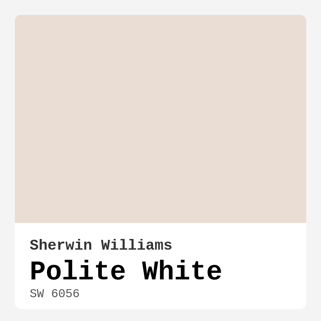
Color Preview & Key Details
| HEX Code | #E9DDD4 |
| RGB | 233, 221, 212 |
| LRV | 75% |
| Undertone | Red |
| Finish Options | Eggshell, Matte, Satin |
Have you ever walked into a room and felt an immediate sense of calm wash over you? That warm embrace of comfort is often a result of the right paint color. Let’s talk about a hue that brings all of that and more—Sherwin Williams’ Polite White. Imagine this soft, warm beige enveloping your space, effortlessly creating an inviting atmosphere that welcomes you and your guests alike.
Polite White (SW 6056) is not just another off-white color; it’s a unique blend of warmth and sophistication. With a Light Reflectance Value (LRV) of 75%, this shade reflects a high amount of light, making it perfect for brightening up any room. Whether you’re in a cozy living room, a serene bedroom, or a bustling kitchen, Polite White offers an elegant backdrop that enhances your decor rather than competing with it.
One of the most beautiful aspects of Polite White is its versatility. It adapts beautifully to various decor styles, from modern and minimalist to traditional and farmhouse. Picture it in a chic dining room, paired with rustic wooden furniture, or gracing the walls of a bright, airy hallway. In every scenario, it creates a sense of cohesion and tranquility.
Its warm undertones lean towards red, giving Polite White a depth that sets it apart from cooler whites. This warmth helps foster a friendly environment, making it especially suitable for spaces where family and friends gather. And if you’re worried about how it might look in different lighting—don’t be. In natural light, it maintains a bright, airy quality, while artificial light enhances its cozy warmth, ensuring you feel right at home, even in the evening.
When it comes to application, Polite White shines. It’s beginner-friendly and rolls on smoothly, thanks to its excellent coverage. Most projects will only require one to two coats, making it a dream for DIY enthusiasts. Plus, it’s touch-up friendly, meaning if a little scuff appears over time, it won’t be a hassle to keep your walls looking fresh.
However, it’s essential to consider where you plan to use this color. While Polite White is a lovely choice for many rooms, it may require a little more maintenance in high-traffic areas. Its light tones can show dirt more readily than darker shades, so be prepared for some regular touch-ups. But don’t let that deter you; regular cleaning will keep it vibrant and inviting.
Thinking about how it pairs with other colors? Polite White works wonderfully with a range of complementary hues. Consider shades like SW 6805 or SW 9634 for a harmonious palette. For trim, pairing it with White Dove or Pure White creates a striking contrast that enhances its warmth while maintaining a clean, sophisticated look.
If you’re feeling adventurous, Polite White also plays well with brass fixtures, bringing a touch of elegance to kitchens and bathrooms. This friendly hue can be easily integrated into any design scheme. No matter your style—be it transitional, modern, or even traditional—Polite White provides a base that allows your personal touches to shine through.
What about smaller spaces? You might be wondering if Polite White is suitable for a compact room. Absolutely! In fact, its light-reflective quality can help create the illusion of more space, making a small area feel larger and more open. The warm undertones ensure that it remains inviting, avoiding that stark, cold feel often associated with lighter colors.
While we’re on the subject of versatility, let’s not forget that Polite White can also be a fantastic choice when selling your home. Its neutral and inviting nature appeals to a broad audience, making it easier for potential buyers to envision themselves in the space. A fresh coat of this lovely hue could be just what you need to boost your home’s appeal.
With Polite White, you’re not just choosing a color; you’re selecting a mood. Its calming essence creates a cozy, inviting atmosphere perfect for relaxation and social gatherings. Whether you’re entertaining friends in your living room or enjoying a quiet evening in your bedroom, this color wraps your space in warmth and serenity.
Be mindful of the fact that Polite White can appear different under varying light conditions. Always test a small area before making a final decision. This will allow you to see how it interacts with your existing furniture and decor throughout the day. It’s those subtle shifts that can make all the difference in how a space feels.
When it comes to finishes, Polite White offers options like matte, eggshell, and satin, giving you the flexibility to choose the look that best suits your space. Whether you want a more modern matte finish or a soft sheen that catches the light just right, there’s a finish that will accentuate this hue perfectly.
In conclusion, Sherwin Williams’ Polite White is a classic choice for anyone looking to infuse their home with warmth and elegance. Its soft, inviting hue adapts to any decor style while creating a serene atmosphere that feels both cozy and sophisticated. So, if you’re ready to transform your space, consider Polite White. It may just be the perfect touch to create the beautiful, personalized interior you’ve always dreamed of.
Take the leap, and experience the magic of Polite White for yourself. You might find it’s not just a color; it’s the warmth and calm your home has been missing.
Save this color to your Pinterest board to revisit when planning your room.
Real Room Photo of Polite White SW 6056
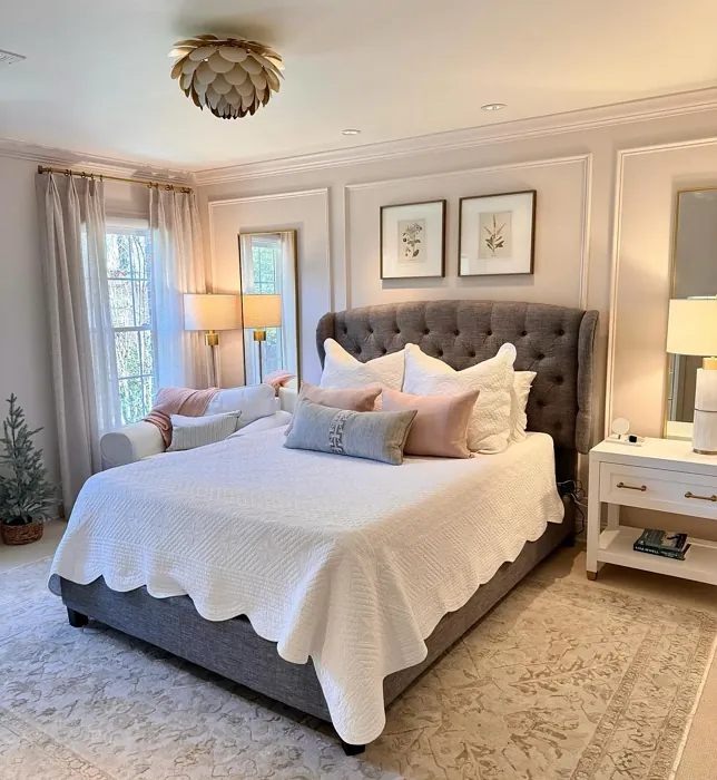
Real rooms painted with Polite White SW 6056 by Sherwin Williams. Lighting and photography can affect how colors appear — always test a sample swatch in your own space.
Undertones of Polite White ?
The undertones of Polite White are a key aspect of its character, leaning towards Red. These subtle underlying hues are what give the color its depth and complexity. For example, a gray with a blue undertone will feel cooler and more modern, while one with a brown undertone will feel warmer and more traditional. It’s essential to test this paint in your home and observe it next to your existing furniture, flooring, and decor to see how these undertones interact and reveal themselves throughout the day.
HEX value: #E9DDD4
RGB code: 233, 221, 212
Is Polite White Cool or Warm?
This paint leans towards warm, soft tones, which helps to create a welcoming and friendly environment in your home. Its warmth makes it ideal for spaces meant for relaxation and social gathering.
Understanding Color Properties and Interior Design Tips
Hue refers to a specific position on the color wheel, measured in degrees from 0 to 360. Each degree represents a different pure color:
- 0° represents red
- 120° represents green
- 240° represents blue
Saturation describes the intensity or purity of a color and is expressed as a percentage:
- At 0%, the color appears completely desaturated—essentially a shade of gray
- At 100%, the color is at its most vivid and vibrant
Lightness indicates how light or dark a color is, also expressed as a percentage:
- 0% lightness results in black
- 100% lightness results in white
Using Warm Colors in Interior Design
Warm hues—such as reds, oranges, yellows, warm beiges, and greiges—are excellent choices for creating inviting and energetic spaces. These colors are particularly well-suited for:
- Kitchens, living rooms, and bathrooms, where warmth enhances comfort and sociability
- Large rooms, where warm tones can help reduce the sense of emptiness and make the space feel more intimate
For example:
- Warm beige shades provide a cozy, inviting atmosphere, ideal for living rooms, bedrooms, and hallways.
- Warm greige (a mix of beige and gray) offers the warmth of beige with the modern appeal of gray, making it a versatile backdrop for dining areas, bedrooms, and living spaces.
However, be mindful when using warm light tones in rooms with limited natural light. These shades may appear muted or even take on an unpleasant yellowish tint. To avoid a dull or flat appearance:
- Add depth by incorporating richer tones like deep greens, charcoal, or chocolate brown
- Use textured elements such as curtains, rugs, or cushions to bring dimension to the space
Pro Tip: Achieving Harmony with Warm and Cool Color Balance
To create a well-balanced and visually interesting interior, mix warm and cool tones strategically. This contrast adds depth and harmony to your design.
- If your walls feature warm hues, introduce cool-colored accents such as blue or green furniture, artwork, or accessories to create contrast.
- For a polished look, consider using a complementary color scheme, which pairs colors opposite each other on the color wheel (e.g., red with green, orange with blue).
This thoughtful mix not only enhances visual appeal but also creates a space that feels both dynamic and cohesive.
Save this color to your Pinterest board to revisit when planning your room.
Light Temperature Affects on Polite White
Natural Light
Natural daylight changes in color temperature as the sun moves across the sky. At sunrise and sunset, the light tends to have a warm, golden tone with a color temperature around 2000 Kelvin (K). As the day progresses and the sun rises higher, the light becomes cooler and more neutral. Around midday, especially when the sky is clear, natural light typically reaches its peak brightness and shifts to a cooler tone, ranging from 5500 to 6500 Kelvin. This midday light is close to what we perceive as pure white or daylight-balanced light.
These shifts in natural light can significantly influence how colors appear in a space, which is why designers often consider both the time of day and the orientation of windows when planning interior color schemes.
Explore how this color transforms from sunrise through sunset as natural light changes throughout the day. Use the slider to simulate morning light, midday brightness, and warm afternoon tones.
North-facing rooms stay cooler throughout the day and benefit from warmer paint tones to compensate. South-facing rooms receive more direct sunlight, making even deeper shades more workable. East-facing rooms get bright morning light that fades by afternoon, while west-facing rooms glow warmly in the evening.
Artificial Light
When choosing artificial lighting, pay close attention to the color temperature, measured in Kelvin (K). This determines how warm or cool the light will appear. Lower temperatures, around 2700K, give off a warm, yellow glow often used in living rooms or bedrooms. Higher temperatures, above 5000K, create a cool, bluish light similar to daylight, commonly used in kitchens, offices, or task areas.
Use the slider to see how lighting temperature can affect the appearance of a surface or color throughout a space.
See how this color looks under different artificial light temperatures — from warm candlelight (2000K) to cool daylight (7000K). Move the slider to simulate your room's lighting conditions.


4800K
Keep in mind that natural light from windows, the warmth of lamps, and overhead lighting all affect how this color reads on your walls at different times of day. Always observe a sample swatch in your actual space before purchasing.
LRV of Polite White
The Light Reflectance Value (LRV) of Polite White is 75%, which places it in the Light category. This means it Reflects a high amount of light. Understanding a paint’s LRV is crucial for predicting how it will look in your space. A higher LRV indicates a lighter color that reflects more light, making rooms feel larger and brighter. A lower LRV signifies a darker color that absorbs more light, creating a cozier, more intimate atmosphere. Always consider the natural and artificial lighting in your room when selecting a paint color based on its LRV.
Detailed Review of Polite White
Additional Paint Characteristics
Ideal Rooms
Bedroom, Dining Room, Hallway, Home Office, Kitchen, Living Room
Decor Styles
Farmhouse, Minimalist, Modern, Traditional, Transitional
Coverage
Good (1–2 Coats), Touch-Up Friendly
Ease of Application
Beginner Friendly, Brush Smooth, Fast-Drying, Roller-Ready
Washability
Highly Washable, Washable
VOC Level
Low VOC
Best Use
Accent Wall, Ceiling, Interior Walls, Trim
Room Suitability
Bedroom, Dining Room, Hallway, Kitchen, Living Room
Tone Tag
Creamy, Neutral, Warm
Finish Type
Eggshell, Matte, Satin
Paint Performance
Easy Touch-Up, Low Odor, Quick Drying, Scuff Resistant
Use Cases
Best for Rentals, Best for Selling Your Home, Best for Small Spaces, Classic Favorite
Mood
Calm, Cozy, Inviting, Warm
Trim Pairing
Complements Brass Fixtures, Matches Pure White, Pairs with White Dove, Works with Warm Trim
Polite White is a lovely choice for those seeking a soft and inviting atmosphere in their home. Its warm undertones create a sense of calm, making it ideal for spaces where relaxation is key, like bedrooms and living rooms. The hue adapts beautifully to various lighting conditions, shifting slightly throughout the day to maintain its charm. When applied, it provides excellent coverage, typically requiring only one to two coats, which is a bonus for DIY enthusiasts. However, it’s advisable to test a small area first, as whites can sometimes look different based on surrounding colors. Overall, Polite White stands out for its versatility and charm, making it a go-to choice for a wide range of design projects.
Pros & Cons of SW 6056 Polite White
Pros
Cons
Colors that go with Sherwin Williams Polite White
FAQ on SW 6056 Polite White
Is Polite White suitable for a small room?
Absolutely! Polite White is an excellent choice for small rooms. Its light, reflective quality helps to create the illusion of space, making a small area feel much larger and more open. The warm undertones also add a cozy feel, ensuring the room remains inviting rather than stark or cold.
How does Polite White perform in high-traffic areas?
While Polite White is a lovely hue, in high-traffic areas, it may require more frequent touch-ups compared to darker colors. It’s washable and highly durable, but be mindful that dirt and scuffs can become visible over time. Regular cleaning and maintenance will help keep it looking fresh and vibrant.
Comparisons Polite White with other colors
Polite White SW 6056 vs Natural Linen SW 9109
| Attribute | Polite White SW 6056 | Natural Linen SW 9109 |
|---|---|---|
| Color Name | Polite White SW 6056 | Natural Linen SW 9109 |
| Color | ||
| Hue | Beige | Beige |
| Brightness | Light | Light |
| RGB | 233, 221, 212 | 223, 211, 195 |
| LRV | 75% | 74% |
| Finish Type | Eggshell, Matte, Satin | Eggshell, Matte, Satin |
| Finish Options | Eggshell, Matte, Satin | Eggshell, Matte, Satin |
| Ideal Rooms | Bedroom, Dining Room, Hallway, Home Office, Kitchen, Living Room | Bedroom, Dining Room, Hallway, Home Office, Kitchen, Living Room |
| Decor Styles | Farmhouse, Minimalist, Modern, Traditional, Transitional | Bohemian, Modern Farmhouse, Scandinavian, Transitional |
| Coverage | Good (1–2 Coats), Touch-Up Friendly | Good (1–2 Coats), Touch-Up Friendly |
| Ease of Application | Beginner Friendly, Brush Smooth, Fast-Drying, Roller-Ready | Beginner Friendly, Brush Smooth, Fast-Drying, Roller-Ready |
| Washability | Highly Washable, Washable | Highly Washable, Washable, Wipeable |
| Room Suitability | Bedroom, Dining Room, Hallway, Kitchen, Living Room | Bedroom, Dining Room, Home Office, Kitchen, Living Room |
| Tone | Creamy, Neutral, Warm | Earthy, Neutral, Warm |
| Paint Performance | Easy Touch-Up, Low Odor, Quick Drying, Scuff Resistant | Easy Touch-Up, Low Odor, Quick Drying, Scuff Resistant |
Lighting conditions, wall orientation, and surrounding decor can significantly affect how these colors appear in your space. Always test a sample swatch before committing to a full application.
Polite White SW 6056 vs Alabaster SW 7008
| Attribute | Polite White SW 6056 | Alabaster SW 7008 |
|---|---|---|
| Color Name | Polite White SW 6056 | Alabaster SW 7008 |
| Color | ||
| Hue | Beige | Beige |
| Brightness | Light | Light |
| RGB | 233, 221, 212 | 237, 234, 224 |
| LRV | 75% | 82% |
| Finish Type | Eggshell, Matte, Satin | Eggshell, Matte, Satin |
| Finish Options | Eggshell, Matte, Satin | Eggshell, Matte, Satin |
| Ideal Rooms | Bedroom, Dining Room, Hallway, Home Office, Kitchen, Living Room | Bathroom, Bedroom, Dining Room, Entryway, Home Office, Kitchen, Living Room, Nursery |
| Decor Styles | Farmhouse, Minimalist, Modern, Traditional, Transitional | Coastal, Contemporary, Minimalist, Modern Farmhouse, Traditional, Transitional |
| Coverage | Good (1–2 Coats), Touch-Up Friendly | Good (1–2 Coats), Touch-Up Friendly |
| Ease of Application | Beginner Friendly, Brush Smooth, Fast-Drying, Roller-Ready | Beginner Friendly, Brush Smooth, Fast-Drying, Low Splatter, Roller-Ready |
| Washability | Highly Washable, Washable | Washable, Wipeable |
| Room Suitability | Bedroom, Dining Room, Hallway, Kitchen, Living Room | Bathroom, Bedroom, Dining Room, Hallway, Home Office, Kitchen, Living Room, Nursery |
| Tone | Creamy, Neutral, Warm | Creamy, Neutral, Warm |
| Paint Performance | Easy Touch-Up, Low Odor, Quick Drying, Scuff Resistant | Easy Touch-Up, High Coverage, Low Odor, Quick Drying |
Lighting conditions, wall orientation, and surrounding decor can significantly affect how these colors appear in your space. Always test a sample swatch before committing to a full application.
Polite White SW 6056 vs White Duck SW 7010
| Attribute | Polite White SW 6056 | White Duck SW 7010 |
|---|---|---|
| Color Name | Polite White SW 6056 | White Duck SW 7010 |
| Color | ||
| Hue | Beige | Beige |
| Brightness | Light | Light |
| RGB | 233, 221, 212 | 229, 223, 210 |
| LRV | 75% | 75% |
| Finish Type | Eggshell, Matte, Satin | Eggshell, Matte, Satin |
| Finish Options | Eggshell, Matte, Satin | Eggshell, Matte, Satin |
| Ideal Rooms | Bedroom, Dining Room, Hallway, Home Office, Kitchen, Living Room | Bedroom, Dining Room, Home Office, Kitchen, Living Room, Nursery |
| Decor Styles | Farmhouse, Minimalist, Modern, Traditional, Transitional | Farmhouse, Modern, Scandinavian, Traditional, Transitional |
| Coverage | Good (1–2 Coats), Touch-Up Friendly | Good (1–2 Coats), Touch-Up Friendly |
| Ease of Application | Beginner Friendly, Brush Smooth, Fast-Drying, Roller-Ready | Beginner Friendly, Brush Smooth, Fast-Drying, Roller-Ready |
| Washability | Highly Washable, Washable | Highly Washable, Washable |
| Room Suitability | Bedroom, Dining Room, Hallway, Kitchen, Living Room | Bedroom, Dining Room, Home Office, Kitchen, Living Room |
| Tone | Creamy, Neutral, Warm | Creamy, Neutral, Warm |
| Paint Performance | Easy Touch-Up, Low Odor, Quick Drying, Scuff Resistant | Easy Touch-Up, Fade Resistant, Low Odor, Quick Drying |
Lighting conditions, wall orientation, and surrounding decor can significantly affect how these colors appear in your space. Always test a sample swatch before committing to a full application.
Polite White SW 6056 vs Greek Villa SW 7551
| Attribute | Polite White SW 6056 | Greek Villa SW 7551 |
|---|---|---|
| Color Name | Polite White SW 6056 | Greek Villa SW 7551 |
| Color | ||
| Hue | Beige | Beige |
| Brightness | Light | Light |
| RGB | 233, 221, 212 | 240, 236, 226 |
| LRV | 75% | 82% |
| Finish Type | Eggshell, Matte, Satin | Eggshell, Satin |
| Finish Options | Eggshell, Matte, Satin | Eggshell, Flat, Satin |
| Ideal Rooms | Bedroom, Dining Room, Hallway, Home Office, Kitchen, Living Room | Bedroom, Dining Room, Hallway, Home Office, Kitchen, Living Room |
| Decor Styles | Farmhouse, Minimalist, Modern, Traditional, Transitional | Coastal, Minimalist, Modern Farmhouse, Traditional, Transitional |
| Coverage | Good (1–2 Coats), Touch-Up Friendly | Good (1–2 Coats), Touch-Up Friendly |
| Ease of Application | Beginner Friendly, Brush Smooth, Fast-Drying, Roller-Ready | Beginner Friendly, Brush Smooth, Roller-Ready |
| Washability | Highly Washable, Washable | Washable, Wipeable |
| Room Suitability | Bedroom, Dining Room, Hallway, Kitchen, Living Room | Bedroom, Dining Room, Hallway, Kitchen, Living Room |
| Tone | Creamy, Neutral, Warm | Creamy, Neutral, Warm |
| Paint Performance | Easy Touch-Up, Low Odor, Quick Drying, Scuff Resistant | Easy Touch-Up, High Coverage, Low Odor, Quick Drying |
Lighting conditions, wall orientation, and surrounding decor can significantly affect how these colors appear in your space. Always test a sample swatch before committing to a full application.
Polite White SW 6056 vs City Loft SW 7631
| Attribute | Polite White SW 6056 | City Loft SW 7631 |
|---|---|---|
| Color Name | Polite White SW 6056 | City Loft SW 7631 |
| Color | ||
| Hue | Beige | Beige |
| Brightness | Light | Light |
| RGB | 233, 221, 212 | 223, 218, 209 |
| LRV | 75% | 66% |
| Finish Type | Eggshell, Matte, Satin | Eggshell, Matte, Satin |
| Finish Options | Eggshell, Matte, Satin | Eggshell, Matte, Satin |
| Ideal Rooms | Bedroom, Dining Room, Hallway, Home Office, Kitchen, Living Room | Bedroom, Hallway, Home Office, Kitchen, Living Room |
| Decor Styles | Farmhouse, Minimalist, Modern, Traditional, Transitional | Minimalist, Modern, Scandinavian, Transitional |
| Coverage | Good (1–2 Coats), Touch-Up Friendly | Good (1–2 Coats), Touch-Up Friendly |
| Ease of Application | Beginner Friendly, Brush Smooth, Fast-Drying, Roller-Ready | Beginner Friendly, Brush Smooth, Fast-Drying, Low Splatter, Roller-Ready |
| Washability | Highly Washable, Washable | Highly Washable, Washable |
| Room Suitability | Bedroom, Dining Room, Hallway, Kitchen, Living Room | Bedroom, Hallway, Home Office, Living Room |
| Tone | Creamy, Neutral, Warm | Balanced, Muted, Neutral, Warm |
| Paint Performance | Easy Touch-Up, Low Odor, Quick Drying, Scuff Resistant | Easy Touch-Up, High Coverage, Low Odor, Quick Drying, Scuff Resistant |
Lighting conditions, wall orientation, and surrounding decor can significantly affect how these colors appear in your space. Always test a sample swatch before committing to a full application.
Polite White SW 6056 vs Shoji White SW 7042
| Attribute | Polite White SW 6056 | Shoji White SW 7042 |
|---|---|---|
| Color Name | Polite White SW 6056 | Shoji White SW 7042 |
| Color | ||
| Hue | Beige | Beige |
| Brightness | Light | Light |
| RGB | 233, 221, 212 | 230, 223, 211 |
| LRV | 75% | 74% |
| Finish Type | Eggshell, Matte, Satin | Eggshell, Matte, Satin |
| Finish Options | Eggshell, Matte, Satin | Eggshell, Matte, Satin |
| Ideal Rooms | Bedroom, Dining Room, Hallway, Home Office, Kitchen, Living Room | Bedroom, Dining Room, Home Office, Living Room, Nursery |
| Decor Styles | Farmhouse, Minimalist, Modern, Traditional, Transitional | Farmhouse, Japanese, Minimalist, Modern, Transitional |
| Coverage | Good (1–2 Coats), Touch-Up Friendly | Good (1–2 Coats), Touch-Up Friendly |
| Ease of Application | Beginner Friendly, Brush Smooth, Fast-Drying, Roller-Ready | Beginner Friendly, Brush Smooth, Roller-Ready |
| Washability | Highly Washable, Washable | Washable, Wipeable |
| Room Suitability | Bedroom, Dining Room, Hallway, Kitchen, Living Room | Bedroom, Dining Room, Home Office, Living Room, Nursery |
| Tone | Creamy, Neutral, Warm | Creamy, Neutral, Warm |
| Paint Performance | Easy Touch-Up, Low Odor, Quick Drying, Scuff Resistant | Easy Touch-Up, High Coverage, Low Odor |
Lighting conditions, wall orientation, and surrounding decor can significantly affect how these colors appear in your space. Always test a sample swatch before committing to a full application.
Polite White SW 6056 vs Neutral Ground SW 7568
| Attribute | Polite White SW 6056 | Neutral Ground SW 7568 |
|---|---|---|
| Color Name | Polite White SW 6056 | Neutral Ground SW 7568 |
| Color | ||
| Hue | Beige | Beige |
| Brightness | Light | Light |
| RGB | 233, 221, 212 | 226, 218, 202 |
| LRV | 75% | 40% |
| Finish Type | Eggshell, Matte, Satin | Eggshell, Matte, Satin |
| Finish Options | Eggshell, Matte, Satin | Eggshell, Matte, Satin |
| Ideal Rooms | Bedroom, Dining Room, Hallway, Home Office, Kitchen, Living Room | Bedroom, Dining Room, Hallway, Home Office, Kitchen, Living Room |
| Decor Styles | Farmhouse, Minimalist, Modern, Traditional, Transitional | Farmhouse, Modern, Scandinavian, Traditional, Transitional |
| Coverage | Good (1–2 Coats), Touch-Up Friendly | Good (1–2 Coats) |
| Ease of Application | Beginner Friendly, Brush Smooth, Fast-Drying, Roller-Ready | Beginner Friendly, Brush Smooth, Roller-Ready |
| Washability | Highly Washable, Washable | Highly Washable, Washable |
| Room Suitability | Bedroom, Dining Room, Hallway, Kitchen, Living Room | Bedroom, Dining Room, Home Office, Kitchen, Living Room |
| Tone | Creamy, Neutral, Warm | Earthy, Neutral, Warm |
| Paint Performance | Easy Touch-Up, Low Odor, Quick Drying, Scuff Resistant | Easy Touch-Up, Low Odor, Quick Drying, Scuff Resistant |
Lighting conditions, wall orientation, and surrounding decor can significantly affect how these colors appear in your space. Always test a sample swatch before committing to a full application.
Polite White SW 6056 vs Limewash SW 9589
| Attribute | Polite White SW 6056 | Limewash SW 9589 |
|---|---|---|
| Color Name | Polite White SW 6056 | Limewash SW 9589 |
| Color | ||
| Hue | Beige | Beige |
| Brightness | Light | Light |
| RGB | 233, 221, 212 | 219, 213, 203 |
| LRV | 75% | 75% |
| Finish Type | Eggshell, Matte, Satin | Flat, Matte |
| Finish Options | Eggshell, Matte, Satin | Flat, Matte |
| Ideal Rooms | Bedroom, Dining Room, Hallway, Home Office, Kitchen, Living Room | Bedroom, Dining Room, Hallway, Kitchen, Living Room |
| Decor Styles | Farmhouse, Minimalist, Modern, Traditional, Transitional | Bohemian, Contemporary, Modern Farmhouse, Rustic |
| Coverage | Good (1–2 Coats), Touch-Up Friendly | Good (1–2 Coats), Touch-Up Friendly |
| Ease of Application | Beginner Friendly, Brush Smooth, Fast-Drying, Roller-Ready | Beginner Friendly, Brush Smooth, Roller-Ready, Thin Formula |
| Washability | Highly Washable, Washable | Washable, Wipeable |
| Room Suitability | Bedroom, Dining Room, Hallway, Kitchen, Living Room | Bathroom, Bedroom, Dining Room, Kitchen, Living Room |
| Tone | Creamy, Neutral, Warm | Earthy, Muted, Warm |
| Paint Performance | Easy Touch-Up, Low Odor, Quick Drying, Scuff Resistant | Easy Touch-Up, Long Lasting, Low Odor |
Lighting conditions, wall orientation, and surrounding decor can significantly affect how these colors appear in your space. Always test a sample swatch before committing to a full application.
Polite White SW 6056 vs Creamy SW 7012
| Attribute | Polite White SW 6056 | Creamy SW 7012 |
|---|---|---|
| Color Name | Polite White SW 6056 | Creamy SW 7012 |
| Color | ||
| Hue | Beige | Beige |
| Brightness | Light | Light |
| RGB | 233, 221, 212 | 239, 232, 219 |
| LRV | 75% | 75% |
| Finish Type | Eggshell, Matte, Satin | Eggshell, Satin |
| Finish Options | Eggshell, Matte, Satin | Eggshell, Flat, Satin |
| Ideal Rooms | Bedroom, Dining Room, Hallway, Home Office, Kitchen, Living Room | Bedroom, Dining Room, Hallway, Home Office, Kitchen, Living Room |
| Decor Styles | Farmhouse, Minimalist, Modern, Traditional, Transitional | Contemporary, Minimalist, Modern Farmhouse, Rustic, Traditional |
| Coverage | Good (1–2 Coats), Touch-Up Friendly | Good (1–2 Coats), Touch-Up Friendly |
| Ease of Application | Beginner Friendly, Brush Smooth, Fast-Drying, Roller-Ready | Beginner Friendly, Fast-Drying, Low Splatter |
| Washability | Highly Washable, Washable | Washable, Wipeable |
| Room Suitability | Bedroom, Dining Room, Hallway, Kitchen, Living Room | Bedroom, Dining Room, Hallway, Kitchen, Living Room |
| Tone | Creamy, Neutral, Warm | Creamy, Neutral, Warm |
| Paint Performance | Easy Touch-Up, Low Odor, Quick Drying, Scuff Resistant | High Coverage, Low Odor, Quick Drying |
Lighting conditions, wall orientation, and surrounding decor can significantly affect how these colors appear in your space. Always test a sample swatch before committing to a full application.
Polite White SW 6056 vs White Sesame SW 9586
| Attribute | Polite White SW 6056 | White Sesame SW 9586 |
|---|---|---|
| Color Name | Polite White SW 6056 | White Sesame SW 9586 |
| Color | ||
| Hue | Beige | Beige |
| Brightness | Light | Light |
| RGB | 233, 221, 212 | 227, 219, 205 |
| LRV | 75% | 75% |
| Finish Type | Eggshell, Matte, Satin | Eggshell, Matte, Satin |
| Finish Options | Eggshell, Matte, Satin | Eggshell, Matte, Satin |
| Ideal Rooms | Bedroom, Dining Room, Hallway, Home Office, Kitchen, Living Room | Bedroom, Home Office, Kitchen, Living Room, Nursery |
| Decor Styles | Farmhouse, Minimalist, Modern, Traditional, Transitional | Minimalist, Modern Farmhouse, Rustic, Scandinavian, Transitional |
| Coverage | Good (1–2 Coats), Touch-Up Friendly | Good (1–2 Coats), Touch-Up Friendly |
| Ease of Application | Beginner Friendly, Brush Smooth, Fast-Drying, Roller-Ready | Beginner Friendly, Brush Smooth, Roller-Ready |
| Washability | Highly Washable, Washable | Highly Washable, Washable |
| Room Suitability | Bedroom, Dining Room, Hallway, Kitchen, Living Room | Bedroom, Dining Room, Home Office, Living Room, Nursery |
| Tone | Creamy, Neutral, Warm | Creamy, Earthy, Neutral, Warm |
| Paint Performance | Easy Touch-Up, Low Odor, Quick Drying, Scuff Resistant | Easy Touch-Up, High Coverage, Low Odor, Quick Drying |
Lighting conditions, wall orientation, and surrounding decor can significantly affect how these colors appear in your space. Always test a sample swatch before committing to a full application.
Official Page of Sherwin Williams Polite White SW 6056