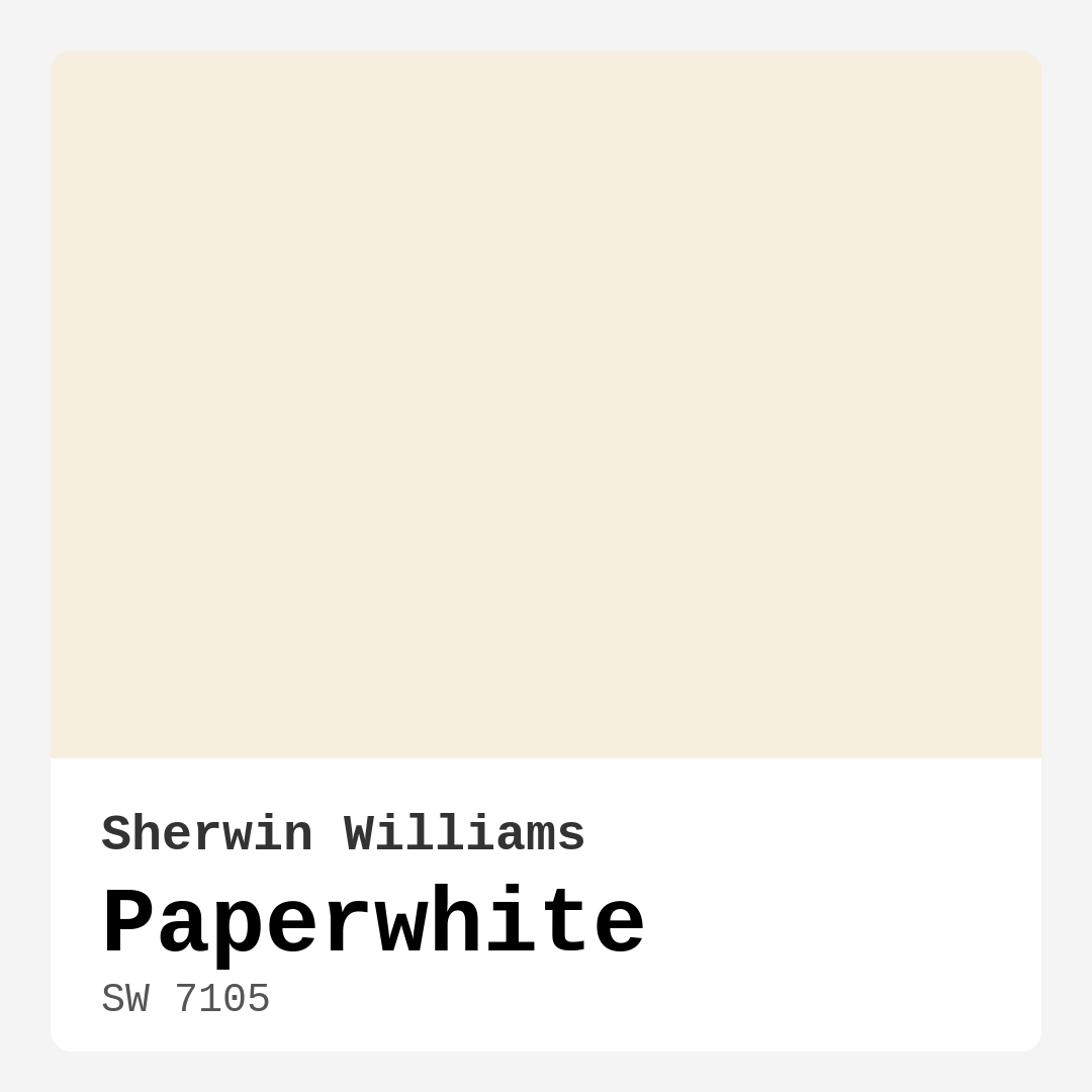
Color Preview & Key Details
| HEX Code | #F7EFDE |
| RGB | 247, 239, 222 |
| LRV | 83% |
| Undertone | Red |
| Finish Options | Eggshell, Matte, Satin |
Imagine stepping into a room that instantly feels warm and welcoming, a space that brings a smile to your face and a sense of calm to your heart. That’s the magic of paint color, and today, let’s talk about a particularly enchanting choice: Sherwin Williams’ Paperwhite (SW 7105). This soft, delicate hue isn’t just a color; it’s a feeling—one that can transform your home into a serene sanctuary.
Paperwhite is a light beige that reflects a high amount of light, boasting an impressive Light Reflectance Value (LRV) of 83%. This means that it can brighten up any room, creating an airy ambiance that is both inviting and refreshing. Its delightful undertones lean slightly red, adding warmth that makes it suitable for various spaces. From living rooms to nurseries, this versatile color can fit seamlessly into any setting.
One of the most appealing aspects of Paperwhite is its adaptability. It beautifully complements a range of decor styles, whether you’re aiming for a modern, Scandinavian, farmhouse, minimalist, or transitional aesthetic. Imagine it gracing the walls of a cozy living room, paired with natural wood accents and soft textiles, or as a soothing backdrop in a nursery, where its gentle tone fosters a calming atmosphere for little ones. It’s an ideal choice for kitchens and dining rooms too, where warm gatherings often take place.
When it comes to application, Paperwhite is incredibly user-friendly. It’s designed to be beginner-friendly, with smooth brush and roller application, making it accessible for DIY enthusiasts. You won’t have to wrestle with streaks or uneven coverage, and its good coverage means that one to two coats will usually do the trick. Plus, it dries quickly, allowing you to enjoy your freshly painted room without a lengthy wait.
And let’s not overlook its practicality. The paint is washability-friendly, so any spills or marks can be easily wiped away, which is particularly beneficial for high-traffic areas or homes with kids. Its low VOC (volatile organic compound) levels ensure a healthier indoor environment, making it a smart choice for families and health-conscious homeowners alike.
Now, you might wonder how Paperwhite will behave in different lighting conditions. In bright light, it shines brilliantly, enhancing the openness of a space. Conversely, in softer, duller lighting, it softens into a more muted tone, creating an inviting warmth. This duality means you can enjoy its beauty no matter how the light dances across your walls throughout the day.
While the color is undeniably lovely, it’s essential to consider the overall lighting in your room. If you’re working with a space that lacks natural light, Paperwhite can still work wonders, but you might need to enhance it with ample artificial lighting to maintain its brightness. Firmly positioned in the light category, it can still provide a fresh and open feel compared to darker shades.
Speaking of decor, Paperwhite plays well with a variety of complementary colors and finishes. Pair it with crisp whites, like Sherwin Williams’ White Dove, for a classic, timeless look, or introduce some brass fixtures for a touch of elegance. It also works beautifully alongside wooden trims, enhancing a rustic charm while still maintaining its soft, modern appeal.
If you’re considering a more layered color palette, Paperwhite can serve as a beautiful base. Think of using lighter shades like SW 6672 (Sea Salt) or SW 7556 for accents. For a more dramatic contrast, darker shades like SW 6813 (Dovetail) can create stunning visual interest without overpowering the gentle essence of Paperwhite.
For those of you contemplating paint for kids’ rooms, Paperwhite shines again. Its soft hue not only creates a calming atmosphere for play and rest but is also easy to transition as children grow. You can easily match it with whimsical themes or more sophisticated designs, ensuring it remains relevant throughout the years.
As an expert in home design, I often stress the importance of testing paint colors in your space before making a final decision. The undertones of Paperwhite are vital to its character, and it’s crucial to see how it interacts with your furniture and decor. Take the time to sample it in different light conditions, and observe how it changes throughout the day.
Ultimately, choosing the right color for your space is about more than aesthetics; it’s about the mood you want to create. Paperwhite radiates calm, inviting warmth that encourages relaxation and connection. Whether you’re hosting friends or curling up with a good book, this color sets the stage for memorable moments.
In conclusion, Sherwin Williams’ Paperwhite is more than just a pretty paint color. It’s a versatile, inviting choice that can elevate any room with its soothing warmth and bright reflections. With its easy application, washability, and low VOC levels, it stands out as a favorite among homeowners and designers alike. So, if you’re looking to create a space that feels both fresh and cozy, give Paperwhite a try—you might just find it’s the perfect addition to your home.
Save this color to your Pinterest board to revisit when planning your room.
Real Room Photo of Paperwhite SW 7105
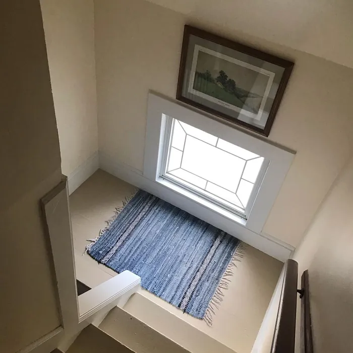
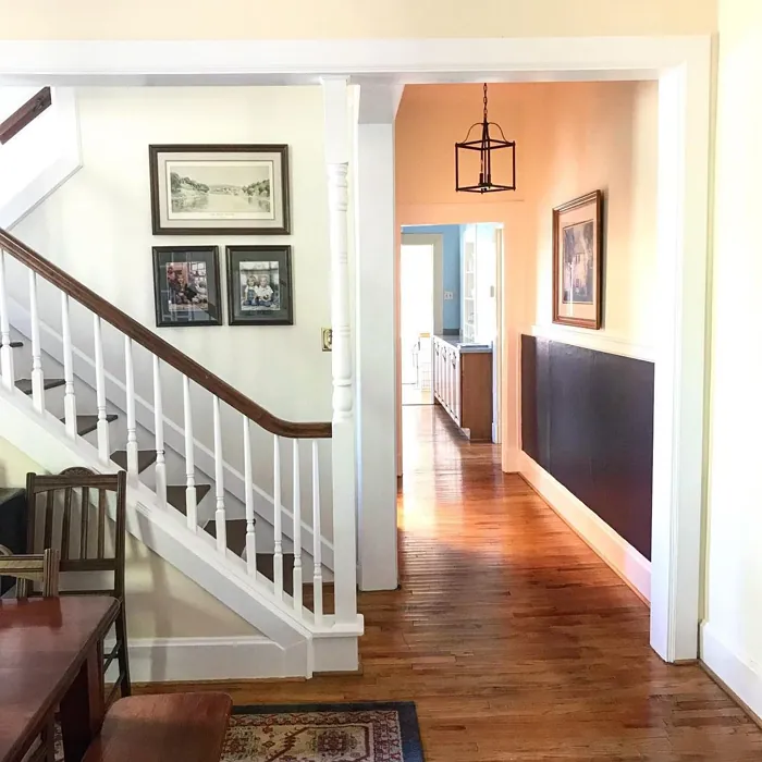
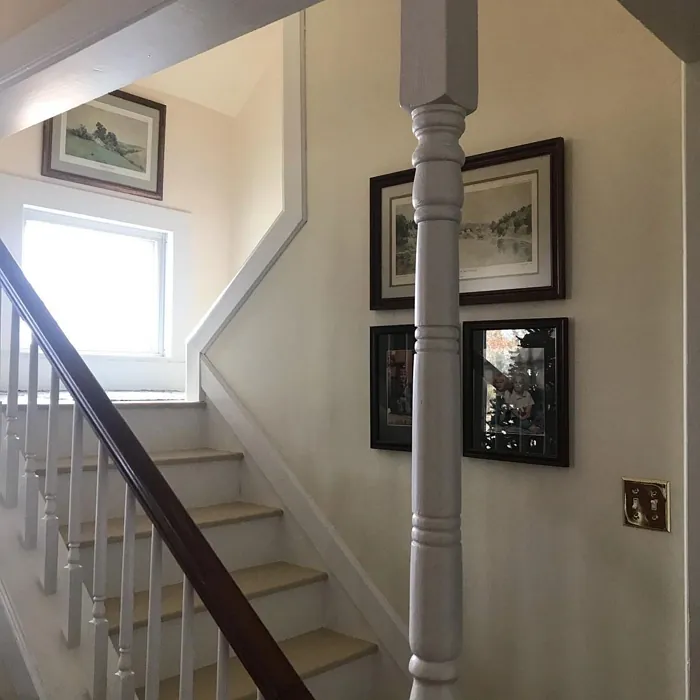
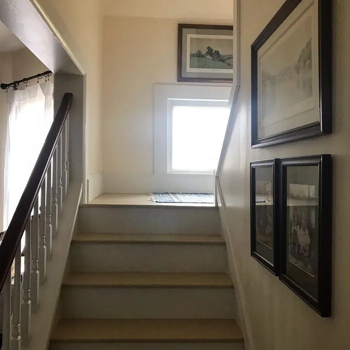
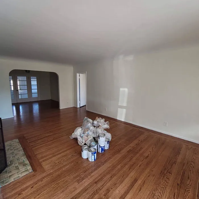
Real rooms painted with Paperwhite SW 7105 by Sherwin Williams. Lighting and photography can affect how colors appear — always test a sample swatch in your own space.
Undertones of Paperwhite ?
The undertones of Paperwhite are a key aspect of its character, leaning towards Red. These subtle underlying hues are what give the color its depth and complexity. For example, a gray with a blue undertone will feel cooler and more modern, while one with a brown undertone will feel warmer and more traditional. It’s essential to test this paint in your home and observe it next to your existing furniture, flooring, and decor to see how these undertones interact and reveal themselves throughout the day.
HEX value: #F7EFDE
RGB code: 247, 239, 222
Is Paperwhite Cool or Warm?
This color leans slightly warm, making it ideal for spaces where you want to foster a sense of comfort and relaxation. It’s particularly effective in rooms where you gather with family and friends.
Understanding Color Properties and Interior Design Tips
Hue refers to a specific position on the color wheel, measured in degrees from 0 to 360. Each degree represents a different pure color:
- 0° represents red
- 120° represents green
- 240° represents blue
Saturation describes the intensity or purity of a color and is expressed as a percentage:
- At 0%, the color appears completely desaturated—essentially a shade of gray
- At 100%, the color is at its most vivid and vibrant
Lightness indicates how light or dark a color is, also expressed as a percentage:
- 0% lightness results in black
- 100% lightness results in white
Using Warm Colors in Interior Design
Warm hues—such as reds, oranges, yellows, warm beiges, and greiges—are excellent choices for creating inviting and energetic spaces. These colors are particularly well-suited for:
- Kitchens, living rooms, and bathrooms, where warmth enhances comfort and sociability
- Large rooms, where warm tones can help reduce the sense of emptiness and make the space feel more intimate
For example:
- Warm beige shades provide a cozy, inviting atmosphere, ideal for living rooms, bedrooms, and hallways.
- Warm greige (a mix of beige and gray) offers the warmth of beige with the modern appeal of gray, making it a versatile backdrop for dining areas, bedrooms, and living spaces.
However, be mindful when using warm light tones in rooms with limited natural light. These shades may appear muted or even take on an unpleasant yellowish tint. To avoid a dull or flat appearance:
- Add depth by incorporating richer tones like deep greens, charcoal, or chocolate brown
- Use textured elements such as curtains, rugs, or cushions to bring dimension to the space
Pro Tip: Achieving Harmony with Warm and Cool Color Balance
To create a well-balanced and visually interesting interior, mix warm and cool tones strategically. This contrast adds depth and harmony to your design.
- If your walls feature warm hues, introduce cool-colored accents such as blue or green furniture, artwork, or accessories to create contrast.
- For a polished look, consider using a complementary color scheme, which pairs colors opposite each other on the color wheel (e.g., red with green, orange with blue).
This thoughtful mix not only enhances visual appeal but also creates a space that feels both dynamic and cohesive.
Save this color to your Pinterest board to revisit when planning your room.
Light Temperature Affects on Paperwhite
Natural Light
Natural daylight changes in color temperature as the sun moves across the sky. At sunrise and sunset, the light tends to have a warm, golden tone with a color temperature around 2000 Kelvin (K). As the day progresses and the sun rises higher, the light becomes cooler and more neutral. Around midday, especially when the sky is clear, natural light typically reaches its peak brightness and shifts to a cooler tone, ranging from 5500 to 6500 Kelvin. This midday light is close to what we perceive as pure white or daylight-balanced light.
These shifts in natural light can significantly influence how colors appear in a space, which is why designers often consider both the time of day and the orientation of windows when planning interior color schemes.
Explore how this color transforms from sunrise through sunset as natural light changes throughout the day. Use the slider to simulate morning light, midday brightness, and warm afternoon tones.
North-facing rooms stay cooler throughout the day and benefit from warmer paint tones to compensate. South-facing rooms receive more direct sunlight, making even deeper shades more workable. East-facing rooms get bright morning light that fades by afternoon, while west-facing rooms glow warmly in the evening.
Artificial Light
When choosing artificial lighting, pay close attention to the color temperature, measured in Kelvin (K). This determines how warm or cool the light will appear. Lower temperatures, around 2700K, give off a warm, yellow glow often used in living rooms or bedrooms. Higher temperatures, above 5000K, create a cool, bluish light similar to daylight, commonly used in kitchens, offices, or task areas.
Use the slider to see how lighting temperature can affect the appearance of a surface or color throughout a space.
See how this color looks under different artificial light temperatures — from warm candlelight (2000K) to cool daylight (7000K). Move the slider to simulate your room's lighting conditions.


4800K
Keep in mind that natural light from windows, the warmth of lamps, and overhead lighting all affect how this color reads on your walls at different times of day. Always observe a sample swatch in your actual space before purchasing.
LRV of Paperwhite
The Light Reflectance Value (LRV) of Paperwhite is 83%, which places it in the Light category. This means it Reflects a high amount of light. Understanding a paint’s LRV is crucial for predicting how it will look in your space. A higher LRV indicates a lighter color that reflects more light, making rooms feel larger and brighter. A lower LRV signifies a darker color that absorbs more light, creating a cozier, more intimate atmosphere. Always consider the natural and artificial lighting in your room when selecting a paint color based on its LRV.
Detailed Review of Paperwhite
Additional Paint Characteristics
Ideal Rooms
Bedroom, Dining Room, Kitchen, Living Room, Nursery
Decor Styles
Farmhouse, Minimalist, Modern, Scandinavian, Transitional
Coverage
Good (1–2 Coats), Touch-Up Friendly
Ease of Application
Beginner Friendly, Brush Smooth, Fast-Drying, Roller-Ready
Washability
Washable, Wipeable
VOC Level
Low VOC, Ultra Low VOC
Best Use
Accent Wall, Furniture, Interior Walls, Trim
Room Suitability
Bedroom, Dining Room, Kitchen, Living Room, Nursery
Tone Tag
Neutral, Soft, Warm
Finish Type
Eggshell, Matte
Paint Performance
Easy Touch-Up, Low Odor, Quick Drying
Use Cases
Best for Rentals, Best for Selling Your Home, Classic Favorite, Designer Favorite
Mood
Brightening, Calm, Inviting
Trim Pairing
Complements Brass Fixtures, Good with Wood Trim, Pairs with White Dove
When it comes to choosing a color that feels both fresh and inviting, Paperwhite stands out. Its soft, warm undertones make it a fantastic choice for those looking to create a serene environment. Whether you’re painting a large living area or a cozy bedroom, this color adapts beautifully. It works exceptionally well in spaces filled with natural light, amplifying brightness and enhancing the overall mood. The application process is smooth, and it offers good coverage, meaning you won’t need to wrestle with multiple coats. If you’re aiming for a tranquil aesthetic, Paperwhite is an excellent option to consider.
Pros & Cons of SW 7105 Paperwhite
Pros
Cons
Colors that go with Sherwin Williams Paperwhite
FAQ on SW 7105 Paperwhite
Can Paperwhite be used in dark rooms?
Absolutely! While Paperwhite is a light color, it can still work in darker rooms. However, it’s essential to consider the natural light available. In spaces with little light, the color may not reflect as vividly, but it can still provide a fresh and open feel compared to darker shades. To enhance its brightness, consider using ample lighting or pairing it with brighter accents.
Is Paperwhite suitable for kids’ rooms?
Yes, Paperwhite is a great choice for kids’ rooms! Its soft and inviting hue creates a calming atmosphere, perfect for play and rest. The color is also easy to match with various decor themes, from whimsical designs to more mature styles as kids grow. Plus, with its washability, you can easily wipe off any marks or stains that come with child-friendly spaces.
Comparisons Paperwhite with other colors
Paperwhite SW 7105 vs Natural Linen SW 9109
| Attribute | Paperwhite SW 7105 | Natural Linen SW 9109 |
|---|---|---|
| Color Name | Paperwhite SW 7105 | Natural Linen SW 9109 |
| Color | ||
| Hue | Beige | Beige |
| Brightness | Light | Light |
| RGB | 247, 239, 222 | 223, 211, 195 |
| LRV | 83% | 74% |
| Finish Type | Eggshell, Matte | Eggshell, Matte, Satin |
| Finish Options | Eggshell, Matte, Satin | Eggshell, Matte, Satin |
| Ideal Rooms | Bedroom, Dining Room, Kitchen, Living Room, Nursery | Bedroom, Dining Room, Hallway, Home Office, Kitchen, Living Room |
| Decor Styles | Farmhouse, Minimalist, Modern, Scandinavian, Transitional | Bohemian, Modern Farmhouse, Scandinavian, Transitional |
| Coverage | Good (1–2 Coats), Touch-Up Friendly | Good (1–2 Coats), Touch-Up Friendly |
| Ease of Application | Beginner Friendly, Brush Smooth, Fast-Drying, Roller-Ready | Beginner Friendly, Brush Smooth, Fast-Drying, Roller-Ready |
| Washability | Washable, Wipeable | Highly Washable, Washable, Wipeable |
| Room Suitability | Bedroom, Dining Room, Kitchen, Living Room, Nursery | Bedroom, Dining Room, Home Office, Kitchen, Living Room |
| Tone | Neutral, Soft, Warm | Earthy, Neutral, Warm |
| Paint Performance | Easy Touch-Up, Low Odor, Quick Drying | Easy Touch-Up, Low Odor, Quick Drying, Scuff Resistant |
Lighting conditions, wall orientation, and surrounding decor can significantly affect how these colors appear in your space. Always test a sample swatch before committing to a full application.
Paperwhite SW 7105 vs Alabaster SW 7008
| Attribute | Paperwhite SW 7105 | Alabaster SW 7008 |
|---|---|---|
| Color Name | Paperwhite SW 7105 | Alabaster SW 7008 |
| Color | ||
| Hue | Beige | Beige |
| Brightness | Light | Light |
| RGB | 247, 239, 222 | 237, 234, 224 |
| LRV | 83% | 82% |
| Finish Type | Eggshell, Matte | Eggshell, Matte, Satin |
| Finish Options | Eggshell, Matte, Satin | Eggshell, Matte, Satin |
| Ideal Rooms | Bedroom, Dining Room, Kitchen, Living Room, Nursery | Bathroom, Bedroom, Dining Room, Entryway, Home Office, Kitchen, Living Room, Nursery |
| Decor Styles | Farmhouse, Minimalist, Modern, Scandinavian, Transitional | Coastal, Contemporary, Minimalist, Modern Farmhouse, Traditional, Transitional |
| Coverage | Good (1–2 Coats), Touch-Up Friendly | Good (1–2 Coats), Touch-Up Friendly |
| Ease of Application | Beginner Friendly, Brush Smooth, Fast-Drying, Roller-Ready | Beginner Friendly, Brush Smooth, Fast-Drying, Low Splatter, Roller-Ready |
| Washability | Washable, Wipeable | Washable, Wipeable |
| Room Suitability | Bedroom, Dining Room, Kitchen, Living Room, Nursery | Bathroom, Bedroom, Dining Room, Hallway, Home Office, Kitchen, Living Room, Nursery |
| Tone | Neutral, Soft, Warm | Creamy, Neutral, Warm |
| Paint Performance | Easy Touch-Up, Low Odor, Quick Drying | Easy Touch-Up, High Coverage, Low Odor, Quick Drying |
Lighting conditions, wall orientation, and surrounding decor can significantly affect how these colors appear in your space. Always test a sample swatch before committing to a full application.
Paperwhite SW 7105 vs White Duck SW 7010
| Attribute | Paperwhite SW 7105 | White Duck SW 7010 |
|---|---|---|
| Color Name | Paperwhite SW 7105 | White Duck SW 7010 |
| Color | ||
| Hue | Beige | Beige |
| Brightness | Light | Light |
| RGB | 247, 239, 222 | 229, 223, 210 |
| LRV | 83% | 75% |
| Finish Type | Eggshell, Matte | Eggshell, Matte, Satin |
| Finish Options | Eggshell, Matte, Satin | Eggshell, Matte, Satin |
| Ideal Rooms | Bedroom, Dining Room, Kitchen, Living Room, Nursery | Bedroom, Dining Room, Home Office, Kitchen, Living Room, Nursery |
| Decor Styles | Farmhouse, Minimalist, Modern, Scandinavian, Transitional | Farmhouse, Modern, Scandinavian, Traditional, Transitional |
| Coverage | Good (1–2 Coats), Touch-Up Friendly | Good (1–2 Coats), Touch-Up Friendly |
| Ease of Application | Beginner Friendly, Brush Smooth, Fast-Drying, Roller-Ready | Beginner Friendly, Brush Smooth, Fast-Drying, Roller-Ready |
| Washability | Washable, Wipeable | Highly Washable, Washable |
| Room Suitability | Bedroom, Dining Room, Kitchen, Living Room, Nursery | Bedroom, Dining Room, Home Office, Kitchen, Living Room |
| Tone | Neutral, Soft, Warm | Creamy, Neutral, Warm |
| Paint Performance | Easy Touch-Up, Low Odor, Quick Drying | Easy Touch-Up, Fade Resistant, Low Odor, Quick Drying |
Lighting conditions, wall orientation, and surrounding decor can significantly affect how these colors appear in your space. Always test a sample swatch before committing to a full application.
Paperwhite SW 7105 vs Greek Villa SW 7551
| Attribute | Paperwhite SW 7105 | Greek Villa SW 7551 |
|---|---|---|
| Color Name | Paperwhite SW 7105 | Greek Villa SW 7551 |
| Color | ||
| Hue | Beige | Beige |
| Brightness | Light | Light |
| RGB | 247, 239, 222 | 240, 236, 226 |
| LRV | 83% | 82% |
| Finish Type | Eggshell, Matte | Eggshell, Satin |
| Finish Options | Eggshell, Matte, Satin | Eggshell, Flat, Satin |
| Ideal Rooms | Bedroom, Dining Room, Kitchen, Living Room, Nursery | Bedroom, Dining Room, Hallway, Home Office, Kitchen, Living Room |
| Decor Styles | Farmhouse, Minimalist, Modern, Scandinavian, Transitional | Coastal, Minimalist, Modern Farmhouse, Traditional, Transitional |
| Coverage | Good (1–2 Coats), Touch-Up Friendly | Good (1–2 Coats), Touch-Up Friendly |
| Ease of Application | Beginner Friendly, Brush Smooth, Fast-Drying, Roller-Ready | Beginner Friendly, Brush Smooth, Roller-Ready |
| Washability | Washable, Wipeable | Washable, Wipeable |
| Room Suitability | Bedroom, Dining Room, Kitchen, Living Room, Nursery | Bedroom, Dining Room, Hallway, Kitchen, Living Room |
| Tone | Neutral, Soft, Warm | Creamy, Neutral, Warm |
| Paint Performance | Easy Touch-Up, Low Odor, Quick Drying | Easy Touch-Up, High Coverage, Low Odor, Quick Drying |
Lighting conditions, wall orientation, and surrounding decor can significantly affect how these colors appear in your space. Always test a sample swatch before committing to a full application.
Paperwhite SW 7105 vs City Loft SW 7631
| Attribute | Paperwhite SW 7105 | City Loft SW 7631 |
|---|---|---|
| Color Name | Paperwhite SW 7105 | City Loft SW 7631 |
| Color | ||
| Hue | Beige | Beige |
| Brightness | Light | Light |
| RGB | 247, 239, 222 | 223, 218, 209 |
| LRV | 83% | 66% |
| Finish Type | Eggshell, Matte | Eggshell, Matte, Satin |
| Finish Options | Eggshell, Matte, Satin | Eggshell, Matte, Satin |
| Ideal Rooms | Bedroom, Dining Room, Kitchen, Living Room, Nursery | Bedroom, Hallway, Home Office, Kitchen, Living Room |
| Decor Styles | Farmhouse, Minimalist, Modern, Scandinavian, Transitional | Minimalist, Modern, Scandinavian, Transitional |
| Coverage | Good (1–2 Coats), Touch-Up Friendly | Good (1–2 Coats), Touch-Up Friendly |
| Ease of Application | Beginner Friendly, Brush Smooth, Fast-Drying, Roller-Ready | Beginner Friendly, Brush Smooth, Fast-Drying, Low Splatter, Roller-Ready |
| Washability | Washable, Wipeable | Highly Washable, Washable |
| Room Suitability | Bedroom, Dining Room, Kitchen, Living Room, Nursery | Bedroom, Hallway, Home Office, Living Room |
| Tone | Neutral, Soft, Warm | Balanced, Muted, Neutral, Warm |
| Paint Performance | Easy Touch-Up, Low Odor, Quick Drying | Easy Touch-Up, High Coverage, Low Odor, Quick Drying, Scuff Resistant |
Lighting conditions, wall orientation, and surrounding decor can significantly affect how these colors appear in your space. Always test a sample swatch before committing to a full application.
Paperwhite SW 7105 vs Shoji White SW 7042
| Attribute | Paperwhite SW 7105 | Shoji White SW 7042 |
|---|---|---|
| Color Name | Paperwhite SW 7105 | Shoji White SW 7042 |
| Color | ||
| Hue | Beige | Beige |
| Brightness | Light | Light |
| RGB | 247, 239, 222 | 230, 223, 211 |
| LRV | 83% | 74% |
| Finish Type | Eggshell, Matte | Eggshell, Matte, Satin |
| Finish Options | Eggshell, Matte, Satin | Eggshell, Matte, Satin |
| Ideal Rooms | Bedroom, Dining Room, Kitchen, Living Room, Nursery | Bedroom, Dining Room, Home Office, Living Room, Nursery |
| Decor Styles | Farmhouse, Minimalist, Modern, Scandinavian, Transitional | Farmhouse, Japanese, Minimalist, Modern, Transitional |
| Coverage | Good (1–2 Coats), Touch-Up Friendly | Good (1–2 Coats), Touch-Up Friendly |
| Ease of Application | Beginner Friendly, Brush Smooth, Fast-Drying, Roller-Ready | Beginner Friendly, Brush Smooth, Roller-Ready |
| Washability | Washable, Wipeable | Washable, Wipeable |
| Room Suitability | Bedroom, Dining Room, Kitchen, Living Room, Nursery | Bedroom, Dining Room, Home Office, Living Room, Nursery |
| Tone | Neutral, Soft, Warm | Creamy, Neutral, Warm |
| Paint Performance | Easy Touch-Up, Low Odor, Quick Drying | Easy Touch-Up, High Coverage, Low Odor |
Lighting conditions, wall orientation, and surrounding decor can significantly affect how these colors appear in your space. Always test a sample swatch before committing to a full application.
Paperwhite SW 7105 vs Neutral Ground SW 7568
| Attribute | Paperwhite SW 7105 | Neutral Ground SW 7568 |
|---|---|---|
| Color Name | Paperwhite SW 7105 | Neutral Ground SW 7568 |
| Color | ||
| Hue | Beige | Beige |
| Brightness | Light | Light |
| RGB | 247, 239, 222 | 226, 218, 202 |
| LRV | 83% | 40% |
| Finish Type | Eggshell, Matte | Eggshell, Matte, Satin |
| Finish Options | Eggshell, Matte, Satin | Eggshell, Matte, Satin |
| Ideal Rooms | Bedroom, Dining Room, Kitchen, Living Room, Nursery | Bedroom, Dining Room, Hallway, Home Office, Kitchen, Living Room |
| Decor Styles | Farmhouse, Minimalist, Modern, Scandinavian, Transitional | Farmhouse, Modern, Scandinavian, Traditional, Transitional |
| Coverage | Good (1–2 Coats), Touch-Up Friendly | Good (1–2 Coats) |
| Ease of Application | Beginner Friendly, Brush Smooth, Fast-Drying, Roller-Ready | Beginner Friendly, Brush Smooth, Roller-Ready |
| Washability | Washable, Wipeable | Highly Washable, Washable |
| Room Suitability | Bedroom, Dining Room, Kitchen, Living Room, Nursery | Bedroom, Dining Room, Home Office, Kitchen, Living Room |
| Tone | Neutral, Soft, Warm | Earthy, Neutral, Warm |
| Paint Performance | Easy Touch-Up, Low Odor, Quick Drying | Easy Touch-Up, Low Odor, Quick Drying, Scuff Resistant |
Lighting conditions, wall orientation, and surrounding decor can significantly affect how these colors appear in your space. Always test a sample swatch before committing to a full application.
Paperwhite SW 7105 vs Limewash SW 9589
| Attribute | Paperwhite SW 7105 | Limewash SW 9589 |
|---|---|---|
| Color Name | Paperwhite SW 7105 | Limewash SW 9589 |
| Color | ||
| Hue | Beige | Beige |
| Brightness | Light | Light |
| RGB | 247, 239, 222 | 219, 213, 203 |
| LRV | 83% | 75% |
| Finish Type | Eggshell, Matte | Flat, Matte |
| Finish Options | Eggshell, Matte, Satin | Flat, Matte |
| Ideal Rooms | Bedroom, Dining Room, Kitchen, Living Room, Nursery | Bedroom, Dining Room, Hallway, Kitchen, Living Room |
| Decor Styles | Farmhouse, Minimalist, Modern, Scandinavian, Transitional | Bohemian, Contemporary, Modern Farmhouse, Rustic |
| Coverage | Good (1–2 Coats), Touch-Up Friendly | Good (1–2 Coats), Touch-Up Friendly |
| Ease of Application | Beginner Friendly, Brush Smooth, Fast-Drying, Roller-Ready | Beginner Friendly, Brush Smooth, Roller-Ready, Thin Formula |
| Washability | Washable, Wipeable | Washable, Wipeable |
| Room Suitability | Bedroom, Dining Room, Kitchen, Living Room, Nursery | Bathroom, Bedroom, Dining Room, Kitchen, Living Room |
| Tone | Neutral, Soft, Warm | Earthy, Muted, Warm |
| Paint Performance | Easy Touch-Up, Low Odor, Quick Drying | Easy Touch-Up, Long Lasting, Low Odor |
Lighting conditions, wall orientation, and surrounding decor can significantly affect how these colors appear in your space. Always test a sample swatch before committing to a full application.
Paperwhite SW 7105 vs Creamy SW 7012
| Attribute | Paperwhite SW 7105 | Creamy SW 7012 |
|---|---|---|
| Color Name | Paperwhite SW 7105 | Creamy SW 7012 |
| Color | ||
| Hue | Beige | Beige |
| Brightness | Light | Light |
| RGB | 247, 239, 222 | 239, 232, 219 |
| LRV | 83% | 75% |
| Finish Type | Eggshell, Matte | Eggshell, Satin |
| Finish Options | Eggshell, Matte, Satin | Eggshell, Flat, Satin |
| Ideal Rooms | Bedroom, Dining Room, Kitchen, Living Room, Nursery | Bedroom, Dining Room, Hallway, Home Office, Kitchen, Living Room |
| Decor Styles | Farmhouse, Minimalist, Modern, Scandinavian, Transitional | Contemporary, Minimalist, Modern Farmhouse, Rustic, Traditional |
| Coverage | Good (1–2 Coats), Touch-Up Friendly | Good (1–2 Coats), Touch-Up Friendly |
| Ease of Application | Beginner Friendly, Brush Smooth, Fast-Drying, Roller-Ready | Beginner Friendly, Fast-Drying, Low Splatter |
| Washability | Washable, Wipeable | Washable, Wipeable |
| Room Suitability | Bedroom, Dining Room, Kitchen, Living Room, Nursery | Bedroom, Dining Room, Hallway, Kitchen, Living Room |
| Tone | Neutral, Soft, Warm | Creamy, Neutral, Warm |
| Paint Performance | Easy Touch-Up, Low Odor, Quick Drying | High Coverage, Low Odor, Quick Drying |
Lighting conditions, wall orientation, and surrounding decor can significantly affect how these colors appear in your space. Always test a sample swatch before committing to a full application.
Paperwhite SW 7105 vs White Sesame SW 9586
| Attribute | Paperwhite SW 7105 | White Sesame SW 9586 |
|---|---|---|
| Color Name | Paperwhite SW 7105 | White Sesame SW 9586 |
| Color | ||
| Hue | Beige | Beige |
| Brightness | Light | Light |
| RGB | 247, 239, 222 | 227, 219, 205 |
| LRV | 83% | 75% |
| Finish Type | Eggshell, Matte | Eggshell, Matte, Satin |
| Finish Options | Eggshell, Matte, Satin | Eggshell, Matte, Satin |
| Ideal Rooms | Bedroom, Dining Room, Kitchen, Living Room, Nursery | Bedroom, Home Office, Kitchen, Living Room, Nursery |
| Decor Styles | Farmhouse, Minimalist, Modern, Scandinavian, Transitional | Minimalist, Modern Farmhouse, Rustic, Scandinavian, Transitional |
| Coverage | Good (1–2 Coats), Touch-Up Friendly | Good (1–2 Coats), Touch-Up Friendly |
| Ease of Application | Beginner Friendly, Brush Smooth, Fast-Drying, Roller-Ready | Beginner Friendly, Brush Smooth, Roller-Ready |
| Washability | Washable, Wipeable | Highly Washable, Washable |
| Room Suitability | Bedroom, Dining Room, Kitchen, Living Room, Nursery | Bedroom, Dining Room, Home Office, Living Room, Nursery |
| Tone | Neutral, Soft, Warm | Creamy, Earthy, Neutral, Warm |
| Paint Performance | Easy Touch-Up, Low Odor, Quick Drying | Easy Touch-Up, High Coverage, Low Odor, Quick Drying |
Lighting conditions, wall orientation, and surrounding decor can significantly affect how these colors appear in your space. Always test a sample swatch before committing to a full application.
Official Page of Sherwin Williams Paperwhite SW 7105