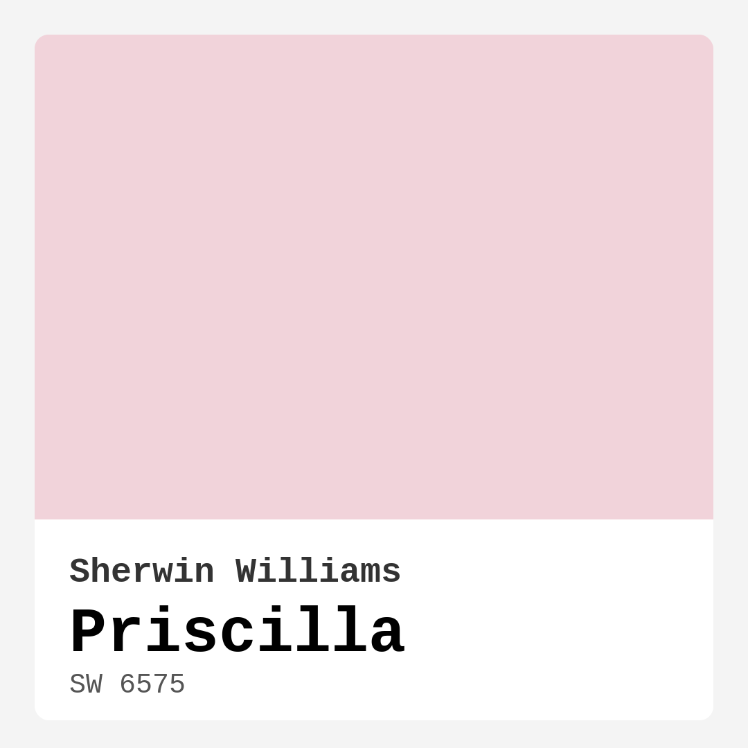
Color Preview & Key Details
| HEX Code | #F1D3DA |
| RGB | 241, 211, 218 |
| LRV | 30% |
| Undertone | Red |
| Finish Options | Eggshell, Matte, Satin |
Imagine stepping into a cozy room that instantly wraps you in warmth and tranquility, where every corner whispers comfort. This is the magic of using a paint color like Priscilla from Sherwin Williams. If you’re on the hunt for a shade that offers both elegance and a gentle pop of color, then this soft blush pink is worth considering. Let’s dive into everything you need to know about Priscilla, from its unique characteristics to practical tips for incorporating it into your home.
Priscilla, color code SW 6575, is a delightful shade of pink that carries a subtle warmth due to its red undertones. With an LRV (Light Reflectance Value) of 30%, it falls into the medium dark category, absorbing some light while still managing to keep spaces feeling inviting and cozy. You might be wondering how this translates to your walls. Well, Priscilla works beautifully in a variety of settings, from bedrooms that need a serene retreat to living rooms where you want to create a charming focal point. Its versatility makes it a favorite for many decor styles, including shabby chic, modern farmhouse, and romantic transitional themes.
You don’t need to be a professional designer to apply Priscilla. Its beginner-friendly formula is a joy to work with, drying quickly and leaving a smooth finish with minimal streaking. It’s roller-ready, so you can tackle your project with ease, whether you’re painting a whole room or just an accent wall. And if you’re worried about cleanup, rest easy knowing that Priscilla is highly washable. You can wipe down scuffs and marks without losing its soft charm, making it a practical choice for family spaces.
One question I often get is whether Priscilla is suitable for small areas. Absolutely! This color’s light and airy quality helps make tight spaces feel more expansive. It reflects just enough light to brighten a room without being overwhelming. For instance, in a nursery, it can create a nurturing environment, while in a small living room, it can add warmth and style. Just keep in mind that this subtle hue may require a second coat to achieve full coverage, but the effort is well worth it when you see the finished result.
Now, let’s talk about lighting. Priscilla shines in natural light, offering a soft glow that makes rooms feel airy and inviting. Under artificial lighting, it maintains its warmth, creating a cozy ambiance perfect for relaxing after a long day. If you’re planning to paint a space, think about how the light in that room changes throughout the day. Testing the color on your walls is crucial; you want to see how it interacts with your existing decor and how the undertones evolve under different lighting conditions.
When it comes to decor pairing, Priscilla is incredibly versatile. It looks stunning alongside whites like White Dove or Pure White, providing a beautiful contrast that highlights its delicate hue. You can also add brass fixtures for a touch of elegance, enhancing the overall warmth of the space. If you’re looking to make a statement, consider pairing it with complementary shades like SW 9679, a soft green that balances Priscilla’s warmth, or other pastel shades to create a harmonious palette.
While Priscilla is a fantastic choice for lower-traffic areas like bedrooms and nurseries, you might wonder about its application in more active spaces. While it’s highly washable and can withstand some wear, I recommend using it in places where you want to cultivate a serene atmosphere rather than in bustling hallways or family rooms. If you do decide to use it in a high-traffic area, make sure to apply a protective finish to maintain its beauty over time.
Now, let’s address a common concern: will Priscilla work for bold decor preferences? Its gentle blush might not be everyone’s cup of tea, especially if you’re leaning toward vibrant, eye-catching colors. However, think of Priscilla as a canvas that allows bold accents to shine. Imagine a lively piece of art or bright throw pillows against its soft backdrop. It can serve as a beautiful foundation for more vibrant decor, allowing you to play with textures and colors while still feeling cohesive.
As you consider Priscilla for your home, remember that it truly is a mood enhancer. Its soft tones create a serene environment, encouraging relaxation, making it an excellent choice for spaces dedicated to unwinding. Whether you’re painting a calming bedroom retreat or a stylish accent wall in your living room, this color captures the essence of comfort and sophistication.
In conclusion, Priscilla is more than just a paint color; it’s an opportunity to create a warm, inviting atmosphere that feels uniquely yours. With its ease of application, high washability, and timeless appeal, it fits seamlessly into various decor themes. So go ahead and embrace the soft blush of Priscilla. It might just be the perfect touch your home has been craving. Whether you’re embarking on a full renovation or simply refreshing a room, Priscilla can transform your space into a cozy haven you’ll love coming home to.

Save this color to your Pinterest board to revisit when planning your room.
Real Room Photo of Priscilla SW 6575
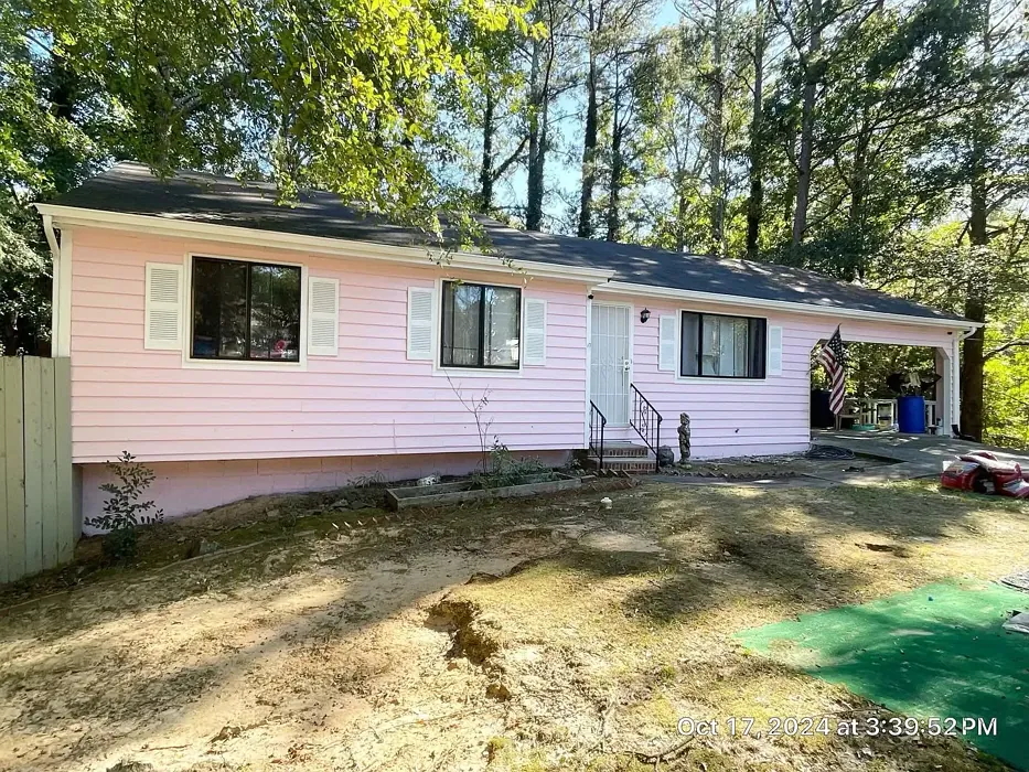
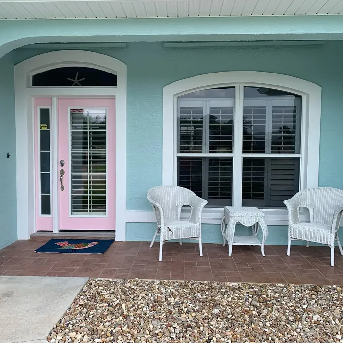
Real rooms painted with Priscilla SW 6575 by Sherwin Williams. Lighting and photography can affect how colors appear — always test a sample swatch in your own space.
Undertones of Priscilla ?
The undertones of Priscilla are a key aspect of its character, leaning towards Red. These subtle underlying hues are what give the color its depth and complexity. For example, a gray with a blue undertone will feel cooler and more modern, while one with a brown undertone will feel warmer and more traditional. It’s essential to test this paint in your home and observe it next to your existing furniture, flooring, and decor to see how these undertones interact and reveal themselves throughout the day.
HEX value: #F1D3DA
RGB code: 241, 211, 218
Is Priscilla Cool or Warm?
Priscilla is predominantly warm, with its soft pink tones radiating a cozy vibe. This warmth can brighten up a room and create an inviting atmosphere.
Understanding Color Properties and Interior Design Tips
Hue refers to a specific position on the color wheel, measured in degrees from 0 to 360. Each degree represents a different pure color:
- 0° represents red
- 120° represents green
- 240° represents blue
Saturation describes the intensity or purity of a color and is expressed as a percentage:
- At 0%, the color appears completely desaturated—essentially a shade of gray
- At 100%, the color is at its most vivid and vibrant
Lightness indicates how light or dark a color is, also expressed as a percentage:
- 0% lightness results in black
- 100% lightness results in white
Using Warm Colors in Interior Design
Warm hues—such as reds, oranges, yellows, warm beiges, and greiges—are excellent choices for creating inviting and energetic spaces. These colors are particularly well-suited for:
- Kitchens, living rooms, and bathrooms, where warmth enhances comfort and sociability
- Large rooms, where warm tones can help reduce the sense of emptiness and make the space feel more intimate
For example:
- Warm beige shades provide a cozy, inviting atmosphere, ideal for living rooms, bedrooms, and hallways.
- Warm greige (a mix of beige and gray) offers the warmth of beige with the modern appeal of gray, making it a versatile backdrop for dining areas, bedrooms, and living spaces.
However, be mindful when using warm light tones in rooms with limited natural light. These shades may appear muted or even take on an unpleasant yellowish tint. To avoid a dull or flat appearance:
- Add depth by incorporating richer tones like deep greens, charcoal, or chocolate brown
- Use textured elements such as curtains, rugs, or cushions to bring dimension to the space
Pro Tip: Achieving Harmony with Warm and Cool Color Balance
To create a well-balanced and visually interesting interior, mix warm and cool tones strategically. This contrast adds depth and harmony to your design.
- If your walls feature warm hues, introduce cool-colored accents such as blue or green furniture, artwork, or accessories to create contrast.
- For a polished look, consider using a complementary color scheme, which pairs colors opposite each other on the color wheel (e.g., red with green, orange with blue).
This thoughtful mix not only enhances visual appeal but also creates a space that feels both dynamic and cohesive.
Save this color to your Pinterest board to revisit when planning your room.
Light Temperature Affects on Priscilla
Natural Light
Natural daylight changes in color temperature as the sun moves across the sky. At sunrise and sunset, the light tends to have a warm, golden tone with a color temperature around 2000 Kelvin (K). As the day progresses and the sun rises higher, the light becomes cooler and more neutral. Around midday, especially when the sky is clear, natural light typically reaches its peak brightness and shifts to a cooler tone, ranging from 5500 to 6500 Kelvin. This midday light is close to what we perceive as pure white or daylight-balanced light.
These shifts in natural light can significantly influence how colors appear in a space, which is why designers often consider both the time of day and the orientation of windows when planning interior color schemes.
Explore how this color transforms from sunrise through sunset as natural light changes throughout the day. Use the slider to simulate morning light, midday brightness, and warm afternoon tones.
North-facing rooms stay cooler throughout the day and benefit from warmer paint tones to compensate. South-facing rooms receive more direct sunlight, making even deeper shades more workable. East-facing rooms get bright morning light that fades by afternoon, while west-facing rooms glow warmly in the evening.
Artificial Light
When choosing artificial lighting, pay close attention to the color temperature, measured in Kelvin (K). This determines how warm or cool the light will appear. Lower temperatures, around 2700K, give off a warm, yellow glow often used in living rooms or bedrooms. Higher temperatures, above 5000K, create a cool, bluish light similar to daylight, commonly used in kitchens, offices, or task areas.
Use the slider to see how lighting temperature can affect the appearance of a surface or color throughout a space.
See how this color looks under different artificial light temperatures — from warm candlelight (2000K) to cool daylight (7000K). Move the slider to simulate your room's lighting conditions.


4800K
Keep in mind that natural light from windows, the warmth of lamps, and overhead lighting all affect how this color reads on your walls at different times of day. Always observe a sample swatch in your actual space before purchasing.
LRV of Priscilla
The Light Reflectance Value (LRV) of Priscilla is 30%, which places it in the Medium Dark category. This means it reflects very little light. Understanding a paint’s LRV is crucial for predicting how it will look in your space. A higher LRV indicates a lighter color that reflects more light, making rooms feel larger and brighter. A lower LRV signifies a darker color that absorbs more light, creating a cozier, more intimate atmosphere. Always consider the natural and artificial lighting in your room when selecting a paint color based on its LRV.
Detailed Review of Priscilla
Additional Paint Characteristics
Ideal Rooms
Bathroom, Bedroom, Living Room, Nursery
Decor Styles
Modern Farmhouse, Romantic, Shabby Chic, Transitional
Coverage
Good (1–2 Coats)
Ease of Application
Beginner Friendly, Fast-Drying, Roller-Ready
Washability
Highly Washable, Washable, Wipeable
VOC Level
Low VOC
Best Use
Accent Wall, Bedroom, Interior Walls, Nursery
Room Suitability
Bathroom, Bedroom, Living Room, Nursery
Tone Tag
Pastel, Soft, Warm
Finish Type
Eggshell, Matte
Paint Performance
Easy Touch-Up, High Coverage, Low Odor, Quick Drying
Use Cases
Best for Small Spaces, Classic Favorite, Designer Favorite
Mood
Cozy, Inviting, Restful
Trim Pairing
Complements Brass Fixtures, Matches Pure White, Pairs with White Dove
Priscilla is not just a paint color; it’s a mood enhancer. Its soft blush undertones create a serene environment, making it an excellent choice for spaces where you want to relax and unwind. Whether used in a nursery to promote warmth or on an accent wall in the living room, it encapsulates the essence of comfort and style. The application process is straightforward, and the finish is smooth with minimal streaking, which many users appreciate. It dries quickly, allowing you to enjoy your freshly painted space sooner. Overall, Priscilla stands out for its versatility and timeless appeal, fitting seamlessly into various decor themes.
Pros & Cons of SW 6575 Priscilla
Pros
Cons
Colors that go with Sherwin Williams Priscilla
FAQ on SW 6575 Priscilla
Is Priscilla suitable for small spaces?
Absolutely! Priscilla’s light and airy quality makes it perfect for small spaces. It reflects light beautifully, creating an illusion of more space while adding warmth and charm. Just keep in mind that it might require a second coat for the best results.
Can I use Priscilla in a high-traffic area?
While Priscilla is highly washable and can stand up to some wear and tear, it’s best suited for lower-traffic areas like bedrooms or living rooms. If you’re considering using it in a high-traffic space, ensure to apply a high-quality protective finish to maintain its beauty.
Comparisons Priscilla with other colors
Priscilla SW 6575 vs Malted Milk SW 6057
| Attribute | Priscilla SW 6575 | Malted Milk SW 6057 |
|---|---|---|
| Color Name | Priscilla SW 6575 | Malted Milk SW 6057 |
| Color | ||
| Hue | Pink | Pink |
| Brightness | Light | Light |
| RGB | 241, 211, 218 | 222, 202, 189 |
| LRV | 30% | 74% |
| Finish Type | Eggshell, Matte | Eggshell, Satin |
| Finish Options | Eggshell, Matte, Satin | Eggshell, Matte, Satin |
| Ideal Rooms | Bathroom, Bedroom, Living Room, Nursery | Bedroom, Dining Room, Kitchen, Living Room, Nursery |
| Decor Styles | Modern Farmhouse, Romantic, Shabby Chic, Transitional | Coastal, Farmhouse, Modern, Scandinavian, Transitional |
| Coverage | Good (1–2 Coats) | Good (1–2 Coats), Touch-Up Friendly |
| Ease of Application | Beginner Friendly, Fast-Drying, Roller-Ready | Beginner Friendly, Brush Smooth, Fast-Drying, Roller-Ready |
| Washability | Highly Washable, Washable, Wipeable | Washable, Wipeable |
| Room Suitability | Bathroom, Bedroom, Living Room, Nursery | Bedroom, Dining Room, Kitchen, Living Room, Nursery |
| Tone | Pastel, Soft, Warm | Creamy, Neutral, Warm |
| Paint Performance | Easy Touch-Up, High Coverage, Low Odor, Quick Drying | High Coverage, Low Odor, Quick Drying |
Lighting conditions, wall orientation, and surrounding decor can significantly affect how these colors appear in your space. Always test a sample swatch before committing to a full application.
Priscilla SW 6575 vs Intimate White SW 6322
| Attribute | Priscilla SW 6575 | Intimate White SW 6322 |
|---|---|---|
| Color Name | Priscilla SW 6575 | Intimate White SW 6322 |
| Color | ||
| Hue | Pink | Pink |
| Brightness | Light | Light |
| RGB | 241, 211, 218 | 240, 225, 216 |
| LRV | 30% | 75% |
| Finish Type | Eggshell, Matte | Eggshell, Matte, Satin |
| Finish Options | Eggshell, Matte, Satin | Eggshell, Matte, Satin |
| Ideal Rooms | Bathroom, Bedroom, Living Room, Nursery | Bedroom, Hallway, Home Office, Living Room, Nursery |
| Decor Styles | Modern Farmhouse, Romantic, Shabby Chic, Transitional | Farmhouse, Minimalist, Modern, Traditional |
| Coverage | Good (1–2 Coats) | Good (1–2 Coats) |
| Ease of Application | Beginner Friendly, Fast-Drying, Roller-Ready | Beginner Friendly, Brush Smooth, Roller-Ready |
| Washability | Highly Washable, Washable, Wipeable | Highly Washable, Washable |
| Room Suitability | Bathroom, Bedroom, Living Room, Nursery | Bedroom, Hallway, Living Room, Nursery |
| Tone | Pastel, Soft, Warm | Creamy, Muted, Warm |
| Paint Performance | Easy Touch-Up, High Coverage, Low Odor, Quick Drying | Easy Touch-Up, Fade Resistant, Low Odor |
Lighting conditions, wall orientation, and surrounding decor can significantly affect how these colors appear in your space. Always test a sample swatch before committing to a full application.
Priscilla SW 6575 vs Abalone Shell SW 6050
| Attribute | Priscilla SW 6575 | Abalone Shell SW 6050 |
|---|---|---|
| Color Name | Priscilla SW 6575 | Abalone Shell SW 6050 |
| Color | ||
| Hue | Pink | Pink |
| Brightness | Light | Light |
| RGB | 241, 211, 218 | 219, 199, 189 |
| LRV | 30% | 30% |
| Finish Type | Eggshell, Matte | Eggshell, Matte, Satin |
| Finish Options | Eggshell, Matte, Satin | Eggshell, Matte, Satin |
| Ideal Rooms | Bathroom, Bedroom, Living Room, Nursery | Bedroom, Dining Room, Home Office, Living Room |
| Decor Styles | Modern Farmhouse, Romantic, Shabby Chic, Transitional | Coastal, Farmhouse, Minimalist, Modern, Traditional |
| Coverage | Good (1–2 Coats) | Good (1–2 Coats), Touch-Up Friendly |
| Ease of Application | Beginner Friendly, Fast-Drying, Roller-Ready | Beginner Friendly, Brush Smooth, Fast-Drying, Roller-Ready |
| Washability | Highly Washable, Washable, Wipeable | Washable, Wipeable |
| Room Suitability | Bathroom, Bedroom, Living Room, Nursery | Bedroom, Dining Room, Home Office, Living Room |
| Tone | Pastel, Soft, Warm | Balanced, Muted, Warm |
| Paint Performance | Easy Touch-Up, High Coverage, Low Odor, Quick Drying | Easy Touch-Up, Fade Resistant, Low Odor, Quick Drying |
Lighting conditions, wall orientation, and surrounding decor can significantly affect how these colors appear in your space. Always test a sample swatch before committing to a full application.
Priscilla SW 6575 vs White Truffle SW 6029
| Attribute | Priscilla SW 6575 | White Truffle SW 6029 |
|---|---|---|
| Color Name | Priscilla SW 6575 | White Truffle SW 6029 |
| Color | ||
| Hue | Pink | Pink |
| Brightness | Light | Light |
| RGB | 241, 211, 218 | 215, 200, 194 |
| LRV | 30% | 48% |
| Finish Type | Eggshell, Matte | Eggshell, Satin |
| Finish Options | Eggshell, Matte, Satin | Eggshell, Flat, Matte, Satin |
| Ideal Rooms | Bathroom, Bedroom, Living Room, Nursery | Bedroom, Dining Room, Hallway, Kitchen, Living Room |
| Decor Styles | Modern Farmhouse, Romantic, Shabby Chic, Transitional | Eclectic, Farmhouse, Modern, Traditional |
| Coverage | Good (1–2 Coats) | Good (1–2 Coats), Touch-Up Friendly |
| Ease of Application | Beginner Friendly, Fast-Drying, Roller-Ready | Beginner Friendly, Brush Smooth, Roller-Ready |
| Washability | Highly Washable, Washable, Wipeable | Washable, Wipeable |
| Room Suitability | Bathroom, Bedroom, Living Room, Nursery | Bedroom, Dining Room, Hallway, Living Room |
| Tone | Pastel, Soft, Warm | Earthy, Neutral, Warm |
| Paint Performance | Easy Touch-Up, High Coverage, Low Odor, Quick Drying | Easy Touch-Up, Low Odor, Scuff Resistant |
Lighting conditions, wall orientation, and surrounding decor can significantly affect how these colors appear in your space. Always test a sample swatch before committing to a full application.
Priscilla SW 6575 vs Faint Coral SW 6329
| Attribute | Priscilla SW 6575 | Faint Coral SW 6329 |
|---|---|---|
| Color Name | Priscilla SW 6575 | Faint Coral SW 6329 |
| Color | ||
| Hue | Pink | Pink |
| Brightness | Light | Light |
| RGB | 241, 211, 218 | 238, 222, 213 |
| LRV | 30% | 66% |
| Finish Type | Eggshell, Matte | Eggshell, Matte, Satin |
| Finish Options | Eggshell, Matte, Satin | Eggshell, Matte, Satin |
| Ideal Rooms | Bathroom, Bedroom, Living Room, Nursery | Bedroom, Dining Room, Hallway, Living Room, Nursery |
| Decor Styles | Modern Farmhouse, Romantic, Shabby Chic, Transitional | Bohemian, Coastal, Modern Farmhouse, Scandinavian, Vintage |
| Coverage | Good (1–2 Coats) | Good (1–2 Coats), Touch-Up Friendly |
| Ease of Application | Beginner Friendly, Fast-Drying, Roller-Ready | Beginner Friendly, Brush Smooth, Fast-Drying, Roller-Ready |
| Washability | Highly Washable, Washable, Wipeable | Washable, Wipeable |
| Room Suitability | Bathroom, Bedroom, Living Room, Nursery | Bedroom, Dining Room, Hallway, Living Room, Nursery |
| Tone | Pastel, Soft, Warm | Airy, Muted, Pastel, Warm |
| Paint Performance | Easy Touch-Up, High Coverage, Low Odor, Quick Drying | Easy Touch-Up, Low Odor, Quick Drying |
Lighting conditions, wall orientation, and surrounding decor can significantly affect how these colors appear in your space. Always test a sample swatch before committing to a full application.
Priscilla SW 6575 vs Romance SW 6323
| Attribute | Priscilla SW 6575 | Romance SW 6323 |
|---|---|---|
| Color Name | Priscilla SW 6575 | Romance SW 6323 |
| Color | ||
| Hue | Pink | Pink |
| Brightness | Light | Light |
| RGB | 241, 211, 218 | 235, 207, 195 |
| LRV | 30% | 69% |
| Finish Type | Eggshell, Matte | Eggshell, Matte |
| Finish Options | Eggshell, Matte, Satin | Eggshell, Flat, Matte, Satin |
| Ideal Rooms | Bathroom, Bedroom, Living Room, Nursery | Bedroom, Dining Room, Living Room, Nursery |
| Decor Styles | Modern Farmhouse, Romantic, Shabby Chic, Transitional | Bohemian, Modern, Shabby Chic, Vintage |
| Coverage | Good (1–2 Coats) | Good (1–2 Coats), Touch-Up Friendly |
| Ease of Application | Beginner Friendly, Fast-Drying, Roller-Ready | Beginner Friendly, Brush Smooth, Fast-Drying, Roller-Ready |
| Washability | Highly Washable, Washable, Wipeable | Washable, Wipeable |
| Room Suitability | Bathroom, Bedroom, Living Room, Nursery | Bedroom, Dining Room, Living Room, Nursery |
| Tone | Pastel, Soft, Warm | Pastel, Soft, Warm |
| Paint Performance | Easy Touch-Up, High Coverage, Low Odor, Quick Drying | Easy Touch-Up, Low Odor, Quick Drying |
Lighting conditions, wall orientation, and surrounding decor can significantly affect how these colors appear in your space. Always test a sample swatch before committing to a full application.
Priscilla SW 6575 vs Innocence SW 6302
| Attribute | Priscilla SW 6575 | Innocence SW 6302 |
|---|---|---|
| Color Name | Priscilla SW 6575 | Innocence SW 6302 |
| Color | ||
| Hue | Pink | Pink |
| Brightness | Light | Light |
| RGB | 241, 211, 218 | 235, 209, 207 |
| LRV | 30% | 75% |
| Finish Type | Eggshell, Matte | Eggshell, Matte |
| Finish Options | Eggshell, Matte, Satin | Eggshell, Matte, Satin |
| Ideal Rooms | Bathroom, Bedroom, Living Room, Nursery | Bedroom, Dining Room, Living Room, Nursery |
| Decor Styles | Modern Farmhouse, Romantic, Shabby Chic, Transitional | Bohemian, Modern Farmhouse, Scandinavian, Shabby Chic |
| Coverage | Good (1–2 Coats) | Good (1–2 Coats), Touch-Up Friendly |
| Ease of Application | Beginner Friendly, Fast-Drying, Roller-Ready | Beginner Friendly, Brush Smooth, Roller-Ready |
| Washability | Highly Washable, Washable, Wipeable | Washable, Wipeable |
| Room Suitability | Bathroom, Bedroom, Living Room, Nursery | Bedroom, Dining Room, Living Room, Nursery |
| Tone | Pastel, Soft, Warm | Pastel, Soft, Warm |
| Paint Performance | Easy Touch-Up, High Coverage, Low Odor, Quick Drying | Easy Touch-Up, Fade Resistant, Low Odor |
Lighting conditions, wall orientation, and surrounding decor can significantly affect how these colors appear in your space. Always test a sample swatch before committing to a full application.
Priscilla SW 6575 vs Angelic SW 6602
| Attribute | Priscilla SW 6575 | Angelic SW 6602 |
|---|---|---|
| Color Name | Priscilla SW 6575 | Angelic SW 6602 |
| Color | ||
| Hue | Pink | Pink |
| Brightness | Light | Light |
| RGB | 241, 211, 218 | 242, 220, 215 |
| LRV | 30% | 75% |
| Finish Type | Eggshell, Matte | Eggshell, Satin |
| Finish Options | Eggshell, Matte, Satin | Eggshell, Flat, Matte, Satin |
| Ideal Rooms | Bathroom, Bedroom, Living Room, Nursery | Bedroom, Dining Room, Home Office, Living Room, Nursery |
| Decor Styles | Modern Farmhouse, Romantic, Shabby Chic, Transitional | Bohemian, Farmhouse, Modern, Transitional |
| Coverage | Good (1–2 Coats) | Good (1–2 Coats), Touch-Up Friendly |
| Ease of Application | Beginner Friendly, Fast-Drying, Roller-Ready | Beginner Friendly, Brush Smooth, Roller-Ready |
| Washability | Highly Washable, Washable, Wipeable | Washable, Wipeable |
| Room Suitability | Bathroom, Bedroom, Living Room, Nursery | Bedroom, Home Office, Living Room, Nursery |
| Tone | Pastel, Soft, Warm | Airy, Pastel, Warm |
| Paint Performance | Easy Touch-Up, High Coverage, Low Odor, Quick Drying | Easy Touch-Up, Fade Resistant, Low Odor |
Lighting conditions, wall orientation, and surrounding decor can significantly affect how these colors appear in your space. Always test a sample swatch before committing to a full application.
Priscilla SW 6575 vs Rosy Outlook SW 6316
| Attribute | Priscilla SW 6575 | Rosy Outlook SW 6316 |
|---|---|---|
| Color Name | Priscilla SW 6575 | Rosy Outlook SW 6316 |
| Color | ||
| Hue | Pink | Pink |
| Brightness | Light | Light |
| RGB | 241, 211, 218 | 235, 206, 203 |
| LRV | 30% | 45% |
| Finish Type | Eggshell, Matte | Eggshell, Matte, Satin |
| Finish Options | Eggshell, Matte, Satin | Eggshell, Matte, Satin |
| Ideal Rooms | Bathroom, Bedroom, Living Room, Nursery | Bedroom, Home Office, Living Room, Nursery |
| Decor Styles | Modern Farmhouse, Romantic, Shabby Chic, Transitional | Bohemian, Cottage, Modern, Traditional |
| Coverage | Good (1–2 Coats) | Good (1–2 Coats), Touch-Up Friendly |
| Ease of Application | Beginner Friendly, Fast-Drying, Roller-Ready | Beginner Friendly, Brush Smooth, Roller-Ready |
| Washability | Highly Washable, Washable, Wipeable | Scuff Resistant, Washable, Wipeable |
| Room Suitability | Bathroom, Bedroom, Living Room, Nursery | Bedroom, Home Office, Living Room, Nursery |
| Tone | Pastel, Soft, Warm | Muted, Pastel, Warm |
| Paint Performance | Easy Touch-Up, High Coverage, Low Odor, Quick Drying | High Coverage, Low Odor, Quick Drying |
Lighting conditions, wall orientation, and surrounding decor can significantly affect how these colors appear in your space. Always test a sample swatch before committing to a full application.
Priscilla SW 6575 vs Demure SW 6295
| Attribute | Priscilla SW 6575 | Demure SW 6295 |
|---|---|---|
| Color Name | Priscilla SW 6575 | Demure SW 6295 |
| Color | ||
| Hue | Pink | Pink |
| Brightness | Light | Light |
| RGB | 241, 211, 218 | 232, 212, 213 |
| LRV | 30% | 50% |
| Finish Type | Eggshell, Matte | Eggshell, Matte |
| Finish Options | Eggshell, Matte, Satin | Eggshell, Matte, Satin |
| Ideal Rooms | Bathroom, Bedroom, Living Room, Nursery | Bedroom, Home Office, Living Room, Nursery |
| Decor Styles | Modern Farmhouse, Romantic, Shabby Chic, Transitional | Minimalist, Modern, Shabby Chic, Transitional |
| Coverage | Good (1–2 Coats) | Good (1–2 Coats), Touch-Up Friendly |
| Ease of Application | Beginner Friendly, Fast-Drying, Roller-Ready | Beginner Friendly, Brush Smooth, Roller-Ready |
| Washability | Highly Washable, Washable, Wipeable | Washable, Wipeable |
| Room Suitability | Bathroom, Bedroom, Living Room, Nursery | Bedroom, Home Office, Living Room, Nursery |
| Tone | Pastel, Soft, Warm | Muted, Pastel, Warm |
| Paint Performance | Easy Touch-Up, High Coverage, Low Odor, Quick Drying | Easy Touch-Up, Low Odor, Quick Drying |
Lighting conditions, wall orientation, and surrounding decor can significantly affect how these colors appear in your space. Always test a sample swatch before committing to a full application.
Official Page of Sherwin Williams Priscilla SW 6575