Color Preview & Key Details
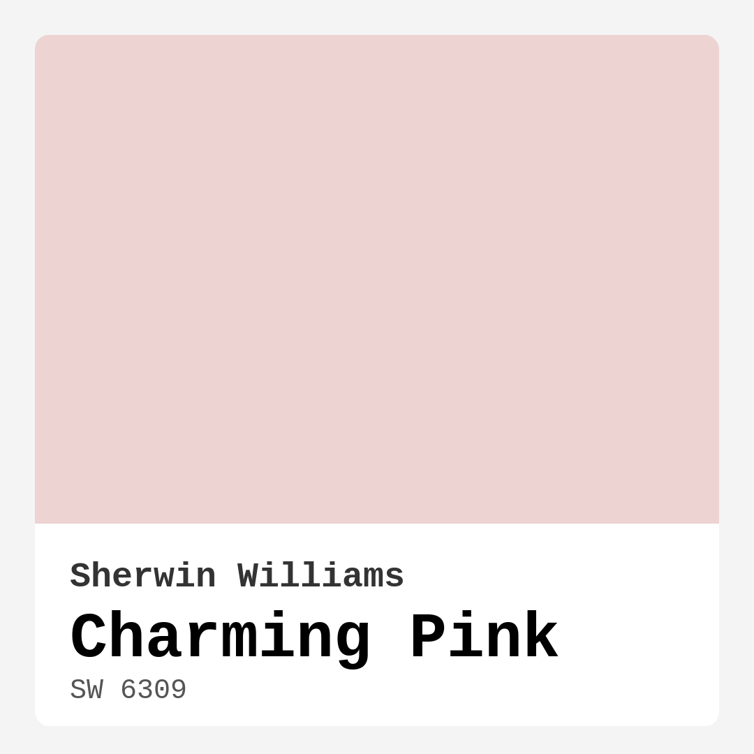
| HEX Code | #EDD3D2 |
| RGB | 237, 211, 210 |
| LRV | 69% |
| Undertone | Red |
| Finish Options | Eggshell, Matte, Satin |
Imagine walking into a room that instantly wraps you in warmth and comfort, like a cozy hug on a chilly day. That’s the magic of Charming Pink, a delightful soft pink hue from Sherwin Williams that brings a breath of fresh air into any space. If you’re considering a color that adds both charm and sophistication to your home, this could be the perfect choice for you.
Charming Pink is not just any pink; it’s a muted, light shade with a gentle, inviting nature. With an LRV (Light Reflectance Value) of 69%, it reflects a significant amount of light, making your room feel airy and expansive. The undertone of red adds depth, giving it a romantic touch that suits various decor styles. Whether you’re leaning towards a shabby chic vibe, a modern farmhouse aesthetic, or something more vintage, Charming Pink can fit right in.
When choosing a paint color, think about the mood you want to create. Charming Pink strikes a beautiful balance between playful and sophisticated. It’s perfect for spaces where you want to foster relaxation, like a cozy bedroom or a nurturing nursery. It’s also an excellent choice for living rooms and dining rooms, where you want guests to feel welcome and at home.
The beauty of Charming Pink lies in its versatility. It pairs beautifully with a variety of complementary shades. If you’re looking to create a harmonious palette, consider using it alongside whites, light greens, or even deeper shades of pink. For a striking contrast, think about adding accents in darker colors like navy or charcoal. These combinations can elevate the entire aesthetic, bringing out the warmth and charm of this lovely pink.
One of my favorite aspects of Charming Pink is how it adapts to different lighting conditions. In natural light, it emits a soft glow that brightens the space without being overpowering. However, do keep in mind that artificial lighting can bring out its warmer undertones, adding even more depth to the color. This means you might want to test it out at different times of the day to see how it interacts with the light in your home.
Now, let’s talk practicality. If you’re a beginner at painting, you’ll appreciate how easy it is to work with Charming Pink. It’s roller-ready and brush smooth, which means you won’t struggle with application. Plus, it dries quickly, allowing you to move on to the fun part of decorating sooner rather than later. Most homeowners find that it offers good coverage with just one coat, though two coats are often recommended for the best finish, especially if you’re covering darker walls.
One concern many people have with lighter colors is maintenance. The good news is that Charming Pink is wipeable and washable, making it easy to keep looking fresh. This makes it a suitable option for lower-traffic areas, although I would advise against using it in high-traffic spots like hallways or children’s playrooms. For those areas, consider paints that are more durable and scuff-resistant.
Choosing the right finish can enhance the beauty of Charming Pink. An eggshell or satin finish works wonderfully as they provide a soft sheen that complements the warmth of the color. These finishes are not only aesthetically pleasing but also practical; they are easier to clean while still delivering that inviting look you’re after.
If you’re still on the fence about whether this is the right color for you, here’s a little tip: always test it in your space before committing. Paint a small section of the wall and observe how it looks at different times of the day. This will give you a better sense of how its undertones play with your existing furniture and decor. Remember, the undertones are what give colors their character. In the case of Charming Pink, the subtle red undertone enhances its warmth, while cooler colors nearby can create a beautiful contrast.
As you consider your decor style, think about how Charming Pink can adapt to various themes. For a shabby chic look, pair it with vintage furniture and soft textures. For a more modern farmhouse vibe, combine it with natural wood tones and simple, clean lines. If you’re feeling adventurous, a bohemian style can also be achieved by layering it with colorful textiles and eclectic accessories.
In terms of trends, Charming Pink is timeless. While certain colors come and go, soft pinks like this one remain a classic choice that never feels dated. It’s a shade that evokes feelings of comfort and love, making it perfect for spaces where you gather with family and friends.
When it comes to accenting, think about the trim. Charming Pink pairs beautifully with crisp whites and can also complement warm trim tones. This can add an extra layer of sophistication to your space, making it feel well thought out and intentional.
If you’re leaning towards using Charming Pink but feel hesitant about its application, let me reassure you. Even if you’re not an expert painter, the ease of application and its touch-up friendly nature makes this color a fantastic choice for any homeowner looking to refresh their space.
In summary, Charming Pink is more than just a paint color; it’s a way to create a warm, inviting atmosphere that resonates with charm and comfort. The versatility and adaptability of this hue make it suitable for a variety of decor styles and rooms, from cozy bedrooms to welcoming living areas. With its ease of application and maintenance, Charming Pink could be the perfect addition to your home. So, why not embrace the warmth and charm of this delightful pink? It just might be the touch your space has been craving.

Save this color to your Pinterest board to revisit when planning your room.
Real Room Photo of Charming Pink SW 6309


Real rooms painted with Charming Pink SW 6309 by Sherwin Williams. Lighting and photography can affect how colors appear — always test a sample swatch in your own space.
Undertones of Charming Pink ?
The undertones of Charming Pink are a key aspect of its character, leaning towards Red. These subtle underlying hues are what give the color its depth and complexity. For example, a gray with a blue undertone will feel cooler and more modern, while one with a brown undertone will feel warmer and more traditional. It’s essential to test this paint in your home and observe it next to your existing furniture, flooring, and decor to see how these undertones interact and reveal themselves throughout the day.
HEX value: #EDD3D2
RGB code: 237, 211, 210
Is Charming Pink Cool or Warm?
This paint leans warm, with its soft pink tones creating a cozy and inviting ambiance.
Understanding Color Properties and Interior Design Tips
Hue refers to a specific position on the color wheel, measured in degrees from 0 to 360. Each degree represents a different pure color:
- 0° represents red
- 120° represents green
- 240° represents blue
Saturation describes the intensity or purity of a color and is expressed as a percentage:
- At 0%, the color appears completely desaturated—essentially a shade of gray
- At 100%, the color is at its most vivid and vibrant
Lightness indicates how light or dark a color is, also expressed as a percentage:
- 0% lightness results in black
- 100% lightness results in white
Using Warm Colors in Interior Design
Warm hues—such as reds, oranges, yellows, warm beiges, and greiges—are excellent choices for creating inviting and energetic spaces. These colors are particularly well-suited for:
- Kitchens, living rooms, and bathrooms, where warmth enhances comfort and sociability
- Large rooms, where warm tones can help reduce the sense of emptiness and make the space feel more intimate
For example:
- Warm beige shades provide a cozy, inviting atmosphere, ideal for living rooms, bedrooms, and hallways.
- Warm greige (a mix of beige and gray) offers the warmth of beige with the modern appeal of gray, making it a versatile backdrop for dining areas, bedrooms, and living spaces.
However, be mindful when using warm light tones in rooms with limited natural light. These shades may appear muted or even take on an unpleasant yellowish tint. To avoid a dull or flat appearance:
- Add depth by incorporating richer tones like deep greens, charcoal, or chocolate brown
- Use textured elements such as curtains, rugs, or cushions to bring dimension to the space
Pro Tip: Achieving Harmony with Warm and Cool Color Balance
To create a well-balanced and visually interesting interior, mix warm and cool tones strategically. This contrast adds depth and harmony to your design.
- If your walls feature warm hues, introduce cool-colored accents such as blue or green furniture, artwork, or accessories to create contrast.
- For a polished look, consider using a complementary color scheme, which pairs colors opposite each other on the color wheel (e.g., red with green, orange with blue).
This thoughtful mix not only enhances visual appeal but also creates a space that feels both dynamic and cohesive.

Save this color to your Pinterest board to revisit when planning your room.
Light Temperature Affects on Charming Pink
Natural Light
Natural daylight changes in color temperature as the sun moves across the sky. At sunrise and sunset, the light tends to have a warm, golden tone with a color temperature around 2000 Kelvin (K). As the day progresses and the sun rises higher, the light becomes cooler and more neutral. Around midday, especially when the sky is clear, natural light typically reaches its peak brightness and shifts to a cooler tone, ranging from 5500 to 6500 Kelvin. This midday light is close to what we perceive as pure white or daylight-balanced light.
These shifts in natural light can significantly influence how colors appear in a space, which is why designers often consider both the time of day and the orientation of windows when planning interior color schemes.
Explore how this color transforms from sunrise through sunset as natural light changes throughout the day. Use the slider to simulate morning light, midday brightness, and warm afternoon tones.
North-facing rooms stay cooler throughout the day and benefit from warmer paint tones to compensate. South-facing rooms receive more direct sunlight, making even deeper shades more workable. East-facing rooms get bright morning light that fades by afternoon, while west-facing rooms glow warmly in the evening.
Artificial Light
When choosing artificial lighting, pay close attention to the color temperature, measured in Kelvin (K). This determines how warm or cool the light will appear. Lower temperatures, around 2700K, give off a warm, yellow glow often used in living rooms or bedrooms. Higher temperatures, above 5000K, create a cool, bluish light similar to daylight, commonly used in kitchens, offices, or task areas.
Use the slider to see how lighting temperature can affect the appearance of a surface or color throughout a space.
See how this color looks under different artificial light temperatures — from warm candlelight (2000K) to cool daylight (7000K). Move the slider to simulate your room's lighting conditions.


4800K
Keep in mind that natural light from windows, the warmth of lamps, and overhead lighting all affect how this color reads on your walls at different times of day. Always observe a sample swatch in your actual space before purchasing.
LRV of Charming Pink
The Light Reflectance Value (LRV) of Charming Pink is 69%, which places it in the Light category. This means it Reflects a high amount of light. Understanding a paint’s LRV is crucial for predicting how it will look in your space. A higher LRV indicates a lighter color that reflects more light, making rooms feel larger and brighter. A lower LRV signifies a darker color that absorbs more light, creating a cozier, more intimate atmosphere. Always consider the natural and artificial lighting in your room when selecting a paint color based on its LRV.
Detailed Review of Charming Pink
Additional Paint Characteristics
Ideal Rooms
Bedroom, Dining Room, Living Room, Nursery
Decor Styles
Bohemian, Contemporary, Modern Farmhouse, Shabby Chic, Vintage
Coverage
Good (1–2 Coats), Touch-Up Friendly
Ease of Application
Beginner Friendly, Brush Smooth, Fast-Drying, Roller-Ready
Washability
Washable, Wipeable
VOC Level
Low VOC
Best Use
Accent Wall, Interior Walls, Living Room, Nursery
Room Suitability
Bedroom, Dining Room, Living Room, Nursery
Tone Tag
Muted, Pastel, Warm
Finish Type
Eggshell, Matte
Paint Performance
Easy Touch-Up, Low Odor, Quick Drying
Use Cases
Best for Small Spaces, Classic Favorite, Designer Favorite
Mood
Cozy, Inviting, Romantic
Trim Pairing
Complements Cool Trim, Pairs with White Dove, Works with Warm Trim
Charming Pink is a color that truly lives up to its name. It’s soft and inviting, making it ideal for spaces where you want to foster relaxation and warmth. Whether you’re painting a nursery or refreshing your living room, this hue offers a delicate balance that complements numerous decor styles. The application is smooth, and it dries evenly, ensuring a flawless finish. You’ll find that it reflects light beautifully, creating a sense of airiness in the room. However, be prepared to apply two coats for optimal coverage, especially if you’re painting over darker shades. Overall, Charming Pink is a versatile option that can breathe new life into your home.
Pros & Cons of SW 6309 Charming Pink
Pros
Cons
Colors that go with Sherwin Williams Charming Pink
FAQ on SW 6309 Charming Pink
Can Charming Pink be used in high-traffic areas?
While Charming Pink is a beautiful choice, it’s best suited for lower-traffic areas like bedrooms or living rooms. In high-traffic spaces, consider a more durable paint with scuff-resistant features to maintain its lovely appearance.
What type of finish should I choose for Charming Pink?
For Charming Pink, an eggshell or satin finish works wonderfully. These finishes offer a nice balance between durability and a soft sheen, enhancing the warmth of the color while being easy to clean.
Comparisons Charming Pink with other colors
Charming Pink SW 6309 vs Malted Milk SW 6057
| Attribute | Charming Pink SW 6309 | Malted Milk SW 6057 |
|---|---|---|
| Color Name | Charming Pink SW 6309 | Malted Milk SW 6057 |
| Color | ||
| Hue | Pink | Pink |
| Brightness | Light | Light |
| RGB | 237, 211, 210 | 222, 202, 189 |
| LRV | 69% | 74% |
| Finish Type | Eggshell, Matte | Eggshell, Satin |
| Finish Options | Eggshell, Matte, Satin | Eggshell, Matte, Satin |
| Ideal Rooms | Bedroom, Dining Room, Living Room, Nursery | Bedroom, Dining Room, Kitchen, Living Room, Nursery |
| Decor Styles | Bohemian, Contemporary, Modern Farmhouse, Shabby Chic, Vintage | Coastal, Farmhouse, Modern, Scandinavian, Transitional |
| Coverage | Good (1–2 Coats), Touch-Up Friendly | Good (1–2 Coats), Touch-Up Friendly |
| Ease of Application | Beginner Friendly, Brush Smooth, Fast-Drying, Roller-Ready | Beginner Friendly, Brush Smooth, Fast-Drying, Roller-Ready |
| Washability | Washable, Wipeable | Washable, Wipeable |
| Room Suitability | Bedroom, Dining Room, Living Room, Nursery | Bedroom, Dining Room, Kitchen, Living Room, Nursery |
| Tone | Muted, Pastel, Warm | Creamy, Neutral, Warm |
| Paint Performance | Easy Touch-Up, Low Odor, Quick Drying | High Coverage, Low Odor, Quick Drying |
Lighting conditions, wall orientation, and surrounding decor can significantly affect how these colors appear in your space. Always test a sample swatch before committing to a full application.
Charming Pink SW 6309 vs Intimate White SW 6322
| Attribute | Charming Pink SW 6309 | Intimate White SW 6322 |
|---|---|---|
| Color Name | Charming Pink SW 6309 | Intimate White SW 6322 |
| Color | ||
| Hue | Pink | Pink |
| Brightness | Light | Light |
| RGB | 237, 211, 210 | 240, 225, 216 |
| LRV | 69% | 75% |
| Finish Type | Eggshell, Matte | Eggshell, Matte, Satin |
| Finish Options | Eggshell, Matte, Satin | Eggshell, Matte, Satin |
| Ideal Rooms | Bedroom, Dining Room, Living Room, Nursery | Bedroom, Hallway, Home Office, Living Room, Nursery |
| Decor Styles | Bohemian, Contemporary, Modern Farmhouse, Shabby Chic, Vintage | Farmhouse, Minimalist, Modern, Traditional |
| Coverage | Good (1–2 Coats), Touch-Up Friendly | Good (1–2 Coats) |
| Ease of Application | Beginner Friendly, Brush Smooth, Fast-Drying, Roller-Ready | Beginner Friendly, Brush Smooth, Roller-Ready |
| Washability | Washable, Wipeable | Highly Washable, Washable |
| Room Suitability | Bedroom, Dining Room, Living Room, Nursery | Bedroom, Hallway, Living Room, Nursery |
| Tone | Muted, Pastel, Warm | Creamy, Muted, Warm |
| Paint Performance | Easy Touch-Up, Low Odor, Quick Drying | Easy Touch-Up, Fade Resistant, Low Odor |
Lighting conditions, wall orientation, and surrounding decor can significantly affect how these colors appear in your space. Always test a sample swatch before committing to a full application.
Charming Pink SW 6309 vs Abalone Shell SW 6050
| Attribute | Charming Pink SW 6309 | Abalone Shell SW 6050 |
|---|---|---|
| Color Name | Charming Pink SW 6309 | Abalone Shell SW 6050 |
| Color | ||
| Hue | Pink | Pink |
| Brightness | Light | Light |
| RGB | 237, 211, 210 | 219, 199, 189 |
| LRV | 69% | 30% |
| Finish Type | Eggshell, Matte | Eggshell, Matte, Satin |
| Finish Options | Eggshell, Matte, Satin | Eggshell, Matte, Satin |
| Ideal Rooms | Bedroom, Dining Room, Living Room, Nursery | Bedroom, Dining Room, Home Office, Living Room |
| Decor Styles | Bohemian, Contemporary, Modern Farmhouse, Shabby Chic, Vintage | Coastal, Farmhouse, Minimalist, Modern, Traditional |
| Coverage | Good (1–2 Coats), Touch-Up Friendly | Good (1–2 Coats), Touch-Up Friendly |
| Ease of Application | Beginner Friendly, Brush Smooth, Fast-Drying, Roller-Ready | Beginner Friendly, Brush Smooth, Fast-Drying, Roller-Ready |
| Washability | Washable, Wipeable | Washable, Wipeable |
| Room Suitability | Bedroom, Dining Room, Living Room, Nursery | Bedroom, Dining Room, Home Office, Living Room |
| Tone | Muted, Pastel, Warm | Balanced, Muted, Warm |
| Paint Performance | Easy Touch-Up, Low Odor, Quick Drying | Easy Touch-Up, Fade Resistant, Low Odor, Quick Drying |
Lighting conditions, wall orientation, and surrounding decor can significantly affect how these colors appear in your space. Always test a sample swatch before committing to a full application.
Charming Pink SW 6309 vs White Truffle SW 6029
| Attribute | Charming Pink SW 6309 | White Truffle SW 6029 |
|---|---|---|
| Color Name | Charming Pink SW 6309 | White Truffle SW 6029 |
| Color | ||
| Hue | Pink | Pink |
| Brightness | Light | Light |
| RGB | 237, 211, 210 | 215, 200, 194 |
| LRV | 69% | 48% |
| Finish Type | Eggshell, Matte | Eggshell, Satin |
| Finish Options | Eggshell, Matte, Satin | Eggshell, Flat, Matte, Satin |
| Ideal Rooms | Bedroom, Dining Room, Living Room, Nursery | Bedroom, Dining Room, Hallway, Kitchen, Living Room |
| Decor Styles | Bohemian, Contemporary, Modern Farmhouse, Shabby Chic, Vintage | Eclectic, Farmhouse, Modern, Traditional |
| Coverage | Good (1–2 Coats), Touch-Up Friendly | Good (1–2 Coats), Touch-Up Friendly |
| Ease of Application | Beginner Friendly, Brush Smooth, Fast-Drying, Roller-Ready | Beginner Friendly, Brush Smooth, Roller-Ready |
| Washability | Washable, Wipeable | Washable, Wipeable |
| Room Suitability | Bedroom, Dining Room, Living Room, Nursery | Bedroom, Dining Room, Hallway, Living Room |
| Tone | Muted, Pastel, Warm | Earthy, Neutral, Warm |
| Paint Performance | Easy Touch-Up, Low Odor, Quick Drying | Easy Touch-Up, Low Odor, Scuff Resistant |
Lighting conditions, wall orientation, and surrounding decor can significantly affect how these colors appear in your space. Always test a sample swatch before committing to a full application.
Charming Pink SW 6309 vs Faint Coral SW 6329
| Attribute | Charming Pink SW 6309 | Faint Coral SW 6329 |
|---|---|---|
| Color Name | Charming Pink SW 6309 | Faint Coral SW 6329 |
| Color | ||
| Hue | Pink | Pink |
| Brightness | Light | Light |
| RGB | 237, 211, 210 | 238, 222, 213 |
| LRV | 69% | 66% |
| Finish Type | Eggshell, Matte | Eggshell, Matte, Satin |
| Finish Options | Eggshell, Matte, Satin | Eggshell, Matte, Satin |
| Ideal Rooms | Bedroom, Dining Room, Living Room, Nursery | Bedroom, Dining Room, Hallway, Living Room, Nursery |
| Decor Styles | Bohemian, Contemporary, Modern Farmhouse, Shabby Chic, Vintage | Bohemian, Coastal, Modern Farmhouse, Scandinavian, Vintage |
| Coverage | Good (1–2 Coats), Touch-Up Friendly | Good (1–2 Coats), Touch-Up Friendly |
| Ease of Application | Beginner Friendly, Brush Smooth, Fast-Drying, Roller-Ready | Beginner Friendly, Brush Smooth, Fast-Drying, Roller-Ready |
| Washability | Washable, Wipeable | Washable, Wipeable |
| Room Suitability | Bedroom, Dining Room, Living Room, Nursery | Bedroom, Dining Room, Hallway, Living Room, Nursery |
| Tone | Muted, Pastel, Warm | Airy, Muted, Pastel, Warm |
| Paint Performance | Easy Touch-Up, Low Odor, Quick Drying | Easy Touch-Up, Low Odor, Quick Drying |
Lighting conditions, wall orientation, and surrounding decor can significantly affect how these colors appear in your space. Always test a sample swatch before committing to a full application.
Charming Pink SW 6309 vs Romance SW 6323
| Attribute | Charming Pink SW 6309 | Romance SW 6323 |
|---|---|---|
| Color Name | Charming Pink SW 6309 | Romance SW 6323 |
| Color | ||
| Hue | Pink | Pink |
| Brightness | Light | Light |
| RGB | 237, 211, 210 | 235, 207, 195 |
| LRV | 69% | 69% |
| Finish Type | Eggshell, Matte | Eggshell, Matte |
| Finish Options | Eggshell, Matte, Satin | Eggshell, Flat, Matte, Satin |
| Ideal Rooms | Bedroom, Dining Room, Living Room, Nursery | Bedroom, Dining Room, Living Room, Nursery |
| Decor Styles | Bohemian, Contemporary, Modern Farmhouse, Shabby Chic, Vintage | Bohemian, Modern, Shabby Chic, Vintage |
| Coverage | Good (1–2 Coats), Touch-Up Friendly | Good (1–2 Coats), Touch-Up Friendly |
| Ease of Application | Beginner Friendly, Brush Smooth, Fast-Drying, Roller-Ready | Beginner Friendly, Brush Smooth, Fast-Drying, Roller-Ready |
| Washability | Washable, Wipeable | Washable, Wipeable |
| Room Suitability | Bedroom, Dining Room, Living Room, Nursery | Bedroom, Dining Room, Living Room, Nursery |
| Tone | Muted, Pastel, Warm | Pastel, Soft, Warm |
| Paint Performance | Easy Touch-Up, Low Odor, Quick Drying | Easy Touch-Up, Low Odor, Quick Drying |
Lighting conditions, wall orientation, and surrounding decor can significantly affect how these colors appear in your space. Always test a sample swatch before committing to a full application.
Charming Pink SW 6309 vs Innocence SW 6302
| Attribute | Charming Pink SW 6309 | Innocence SW 6302 |
|---|---|---|
| Color Name | Charming Pink SW 6309 | Innocence SW 6302 |
| Color | ||
| Hue | Pink | Pink |
| Brightness | Light | Light |
| RGB | 237, 211, 210 | 235, 209, 207 |
| LRV | 69% | 75% |
| Finish Type | Eggshell, Matte | Eggshell, Matte |
| Finish Options | Eggshell, Matte, Satin | Eggshell, Matte, Satin |
| Ideal Rooms | Bedroom, Dining Room, Living Room, Nursery | Bedroom, Dining Room, Living Room, Nursery |
| Decor Styles | Bohemian, Contemporary, Modern Farmhouse, Shabby Chic, Vintage | Bohemian, Modern Farmhouse, Scandinavian, Shabby Chic |
| Coverage | Good (1–2 Coats), Touch-Up Friendly | Good (1–2 Coats), Touch-Up Friendly |
| Ease of Application | Beginner Friendly, Brush Smooth, Fast-Drying, Roller-Ready | Beginner Friendly, Brush Smooth, Roller-Ready |
| Washability | Washable, Wipeable | Washable, Wipeable |
| Room Suitability | Bedroom, Dining Room, Living Room, Nursery | Bedroom, Dining Room, Living Room, Nursery |
| Tone | Muted, Pastel, Warm | Pastel, Soft, Warm |
| Paint Performance | Easy Touch-Up, Low Odor, Quick Drying | Easy Touch-Up, Fade Resistant, Low Odor |
Lighting conditions, wall orientation, and surrounding decor can significantly affect how these colors appear in your space. Always test a sample swatch before committing to a full application.
Charming Pink SW 6309 vs Angelic SW 6602
| Attribute | Charming Pink SW 6309 | Angelic SW 6602 |
|---|---|---|
| Color Name | Charming Pink SW 6309 | Angelic SW 6602 |
| Color | ||
| Hue | Pink | Pink |
| Brightness | Light | Light |
| RGB | 237, 211, 210 | 242, 220, 215 |
| LRV | 69% | 75% |
| Finish Type | Eggshell, Matte | Eggshell, Satin |
| Finish Options | Eggshell, Matte, Satin | Eggshell, Flat, Matte, Satin |
| Ideal Rooms | Bedroom, Dining Room, Living Room, Nursery | Bedroom, Dining Room, Home Office, Living Room, Nursery |
| Decor Styles | Bohemian, Contemporary, Modern Farmhouse, Shabby Chic, Vintage | Bohemian, Farmhouse, Modern, Transitional |
| Coverage | Good (1–2 Coats), Touch-Up Friendly | Good (1–2 Coats), Touch-Up Friendly |
| Ease of Application | Beginner Friendly, Brush Smooth, Fast-Drying, Roller-Ready | Beginner Friendly, Brush Smooth, Roller-Ready |
| Washability | Washable, Wipeable | Washable, Wipeable |
| Room Suitability | Bedroom, Dining Room, Living Room, Nursery | Bedroom, Home Office, Living Room, Nursery |
| Tone | Muted, Pastel, Warm | Airy, Pastel, Warm |
| Paint Performance | Easy Touch-Up, Low Odor, Quick Drying | Easy Touch-Up, Fade Resistant, Low Odor |
Lighting conditions, wall orientation, and surrounding decor can significantly affect how these colors appear in your space. Always test a sample swatch before committing to a full application.
Charming Pink SW 6309 vs Rosy Outlook SW 6316
| Attribute | Charming Pink SW 6309 | Rosy Outlook SW 6316 |
|---|---|---|
| Color Name | Charming Pink SW 6309 | Rosy Outlook SW 6316 |
| Color | ||
| Hue | Pink | Pink |
| Brightness | Light | Light |
| RGB | 237, 211, 210 | 235, 206, 203 |
| LRV | 69% | 45% |
| Finish Type | Eggshell, Matte | Eggshell, Matte, Satin |
| Finish Options | Eggshell, Matte, Satin | Eggshell, Matte, Satin |
| Ideal Rooms | Bedroom, Dining Room, Living Room, Nursery | Bedroom, Home Office, Living Room, Nursery |
| Decor Styles | Bohemian, Contemporary, Modern Farmhouse, Shabby Chic, Vintage | Bohemian, Cottage, Modern, Traditional |
| Coverage | Good (1–2 Coats), Touch-Up Friendly | Good (1–2 Coats), Touch-Up Friendly |
| Ease of Application | Beginner Friendly, Brush Smooth, Fast-Drying, Roller-Ready | Beginner Friendly, Brush Smooth, Roller-Ready |
| Washability | Washable, Wipeable | Scuff Resistant, Washable, Wipeable |
| Room Suitability | Bedroom, Dining Room, Living Room, Nursery | Bedroom, Home Office, Living Room, Nursery |
| Tone | Muted, Pastel, Warm | Muted, Pastel, Warm |
| Paint Performance | Easy Touch-Up, Low Odor, Quick Drying | High Coverage, Low Odor, Quick Drying |
Lighting conditions, wall orientation, and surrounding decor can significantly affect how these colors appear in your space. Always test a sample swatch before committing to a full application.
Charming Pink SW 6309 vs Demure SW 6295
| Attribute | Charming Pink SW 6309 | Demure SW 6295 |
|---|---|---|
| Color Name | Charming Pink SW 6309 | Demure SW 6295 |
| Color | ||
| Hue | Pink | Pink |
| Brightness | Light | Light |
| RGB | 237, 211, 210 | 232, 212, 213 |
| LRV | 69% | 50% |
| Finish Type | Eggshell, Matte | Eggshell, Matte |
| Finish Options | Eggshell, Matte, Satin | Eggshell, Matte, Satin |
| Ideal Rooms | Bedroom, Dining Room, Living Room, Nursery | Bedroom, Home Office, Living Room, Nursery |
| Decor Styles | Bohemian, Contemporary, Modern Farmhouse, Shabby Chic, Vintage | Minimalist, Modern, Shabby Chic, Transitional |
| Coverage | Good (1–2 Coats), Touch-Up Friendly | Good (1–2 Coats), Touch-Up Friendly |
| Ease of Application | Beginner Friendly, Brush Smooth, Fast-Drying, Roller-Ready | Beginner Friendly, Brush Smooth, Roller-Ready |
| Washability | Washable, Wipeable | Washable, Wipeable |
| Room Suitability | Bedroom, Dining Room, Living Room, Nursery | Bedroom, Home Office, Living Room, Nursery |
| Tone | Muted, Pastel, Warm | Muted, Pastel, Warm |
| Paint Performance | Easy Touch-Up, Low Odor, Quick Drying | Easy Touch-Up, Low Odor, Quick Drying |
Lighting conditions, wall orientation, and surrounding decor can significantly affect how these colors appear in your space. Always test a sample swatch before committing to a full application.
Official Page of Sherwin Williams Charming Pink SW 6309