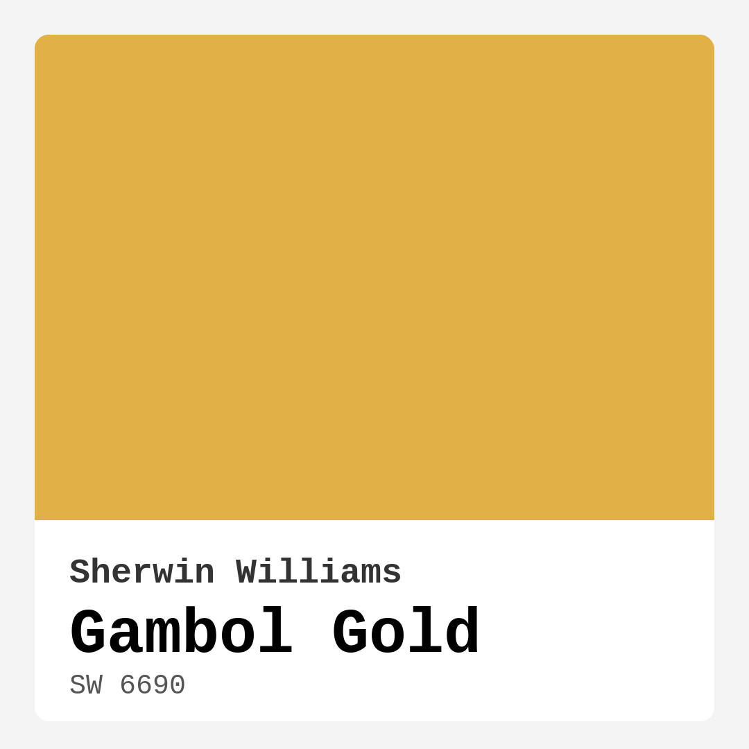
Color Preview & Key Details
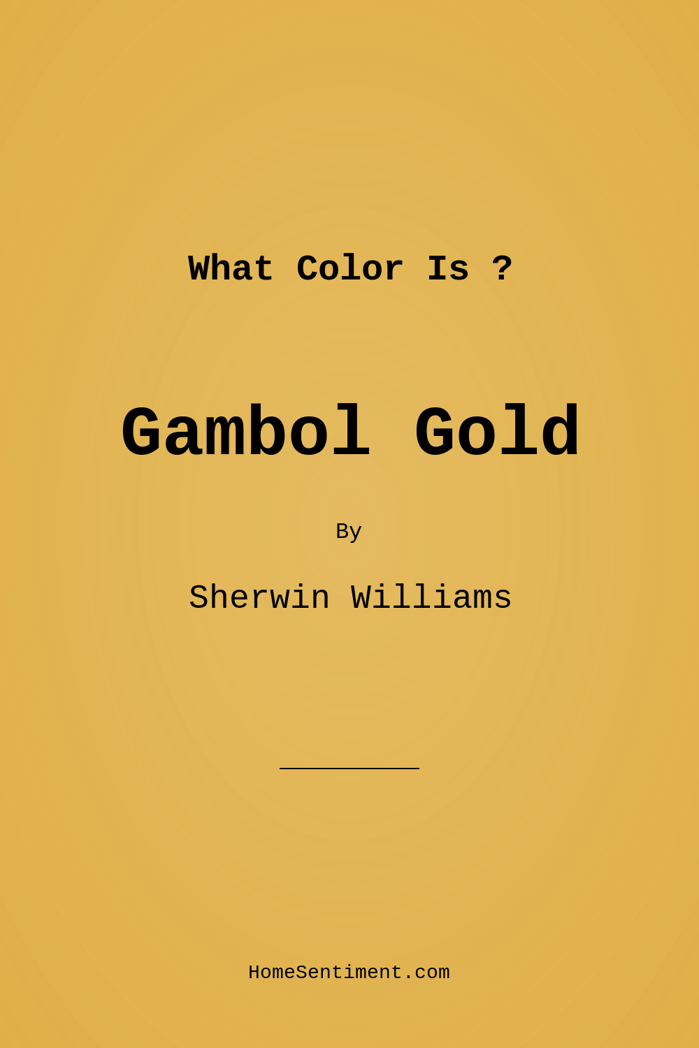
| HEX Code | #E1B047 |
| RGB | 225, 176, 71 |
| LRV | 75% |
| Undertone | Red |
| Finish Options | Eggshell, Satin, Semi-Gloss |
Imagine stepping into your kitchen or living room, and the first thing that greets you is a warm, inviting glow that instantly lifts your spirits. You know that feeling? It’s what Gambol Gold by Sherwin Williams brings to the table. With its rich, golden hue that leans toward a vibrant warmth, this paint color can transform any space into a welcoming retreat that feels both cozy and energizing.
Gambol Gold (SW 6690) is not your everyday yellow; it’s something special. This medium-brightness color shines with an LRV of 75%, which means it reflects a significant amount of light. As a result, it can make a room feel more spacious and inviting. Whether you’re painting a large wall or adding it as an accent, you can’t go wrong with this cheerful shade.
One of the first things you’ll notice about Gambol Gold is its undertone. It has a subtle red undertone that adds depth and complexity to the color. This isn’t just a flat, one-dimensional yellow. The rich undertones create a nuanced warmth that breathes life into your interiors. It’s perfect for spaces where you want to encourage conversations and create a sense of togetherness. Picture it in a dining room, where friends and family gather, or in a living room, where you unwind after a long day. It’s a color that invites you to stay a while.
If you’re considering using Gambol Gold, think about the rooms where it will shine the most. This color is particularly well-suited for living rooms, kitchens, dining rooms, and even bedrooms. It fits beautifully into a variety of decor styles, from modern and eclectic to traditional and farmhouse. This versatility is one of its standout features. You can pair it with white trim for a classic look or incorporate it into a more eclectic scheme with vibrant accents.
Let’s talk about application. Gambol Gold is beginner-friendly, which means even if this is your first DIY paint project, you’ll find it easy to work with. The paint goes on smoothly, whether you’re using a roller or a brush. It’s designed to provide good coverage—typically requiring only 1 to 2 coats—and it’s touch-up friendly, making it easy to keep your walls looking fresh over time. Plus, its washability means you can wipe away those inevitable marks and scuffs without worry.
Of course, choosing a paint color isn’t just about picking a pretty shade. It’s essential to consider how it interacts with the space. In natural light, Gambol Gold radiates cheeriness, making rooms feel expansive and lively. Under artificial light, it retains its warm glow, creating an inviting atmosphere perfect for evening gatherings. So, be sure to observe how it changes throughout the day in your specific lighting conditions.
If you’re wondering how Gambol Gold can fit into smaller spaces, don’t fret. While it’s a bold choice, it can work wonders in cozy areas if you pair it thoughtfully. Lighter trims and decor can help maintain an airy feel, and adding mirrors can enhance the light, making the space feel larger while still basking in the warmth of this lovely hue.
When it comes to finishes, Gambol Gold shines in eggshell and satin. These finishes provide a subtle sheen that enhances the color’s warmth without being overly shiny. If you’re using it in high-traffic areas, like kitchens and dining rooms, consider a semi-gloss finish for added durability. It’s all about finding that right balance between aesthetic and practicality.
Now, let’s delve into some color pairing ideas. Gambol Gold can harmonize beautifully with plenty of complementary shades. Think of soft whites like White Dove for your trim—this combo can create a crisp, clean contrast that elevates the space. If you’re feeling a bit more adventurous, consider pairing it with brass fixtures or wood trim, which can enhance its warm, earthy vibes. You can also introduce deeper tones like rich browns or deep blues to create depth and interest.
The overall mood that Gambol Gold creates is cozy and inviting. It’s a color that seems to wrap you in warmth, making it perfect for gathering spaces. Whether you’re hosting dinner parties or enjoying quiet evenings with loved ones, this color sets the stage for connection and comfort. It offers not just beauty but also a sense of emotional well-being.
Testing paint colors in your home is crucial. What looks stunning in a paint chip can often shift dramatically once applied to your walls. Take the time to sample Gambol Gold in the actual space where you plan to use it, observing how it interacts with your furniture and decor throughout the day. This will help you see the undertones come alive and help you make more informed decisions.
To wrap it all up, Gambol Gold is more than just a paint color; it’s a mood enhancer and a versatile design tool. Whether you’re painting a feature wall or refreshing the entire room, this golden hue can bring warmth and cheer into your home. It’s perfect for those looking to create a personalized, beautiful interior that feels both inviting and stylish. So why not take the plunge? Your walls deserve a little sunshine, and Gambol Gold might just be the perfect fit for your next project.
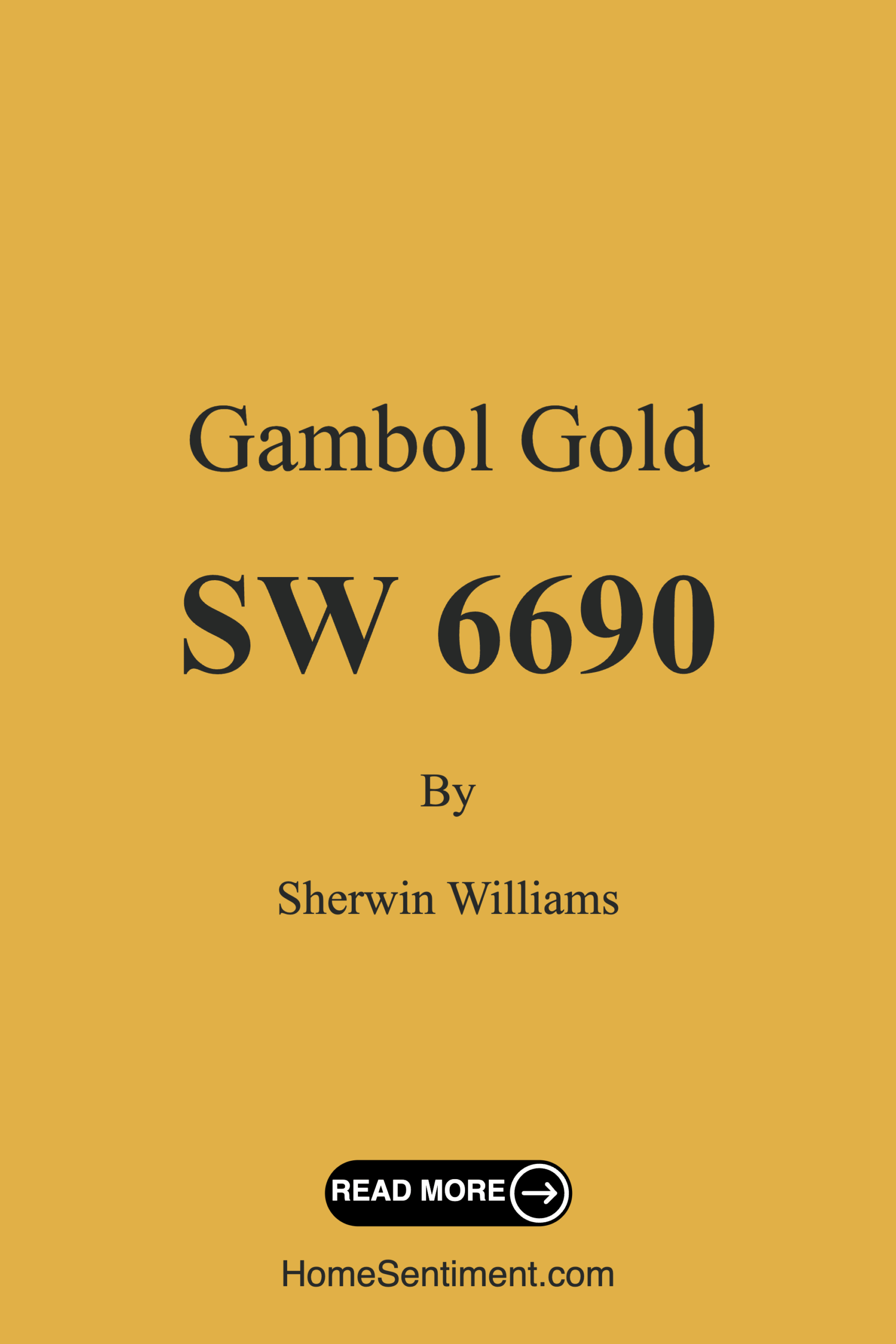
Save this color to your Pinterest board to revisit when planning your room.
Real Room Photo of Gambol Gold SW 6690
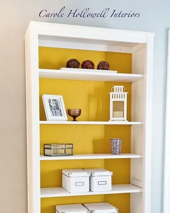
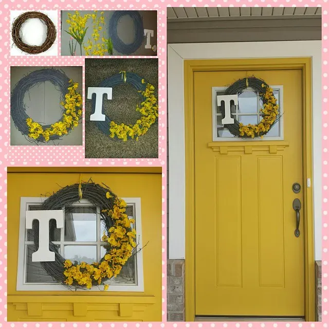
Real rooms painted with Gambol Gold SW 6690 by Sherwin Williams. Lighting and photography can affect how colors appear — always test a sample swatch in your own space.
Undertones of Gambol Gold ?
The undertones of Gambol Gold are a key aspect of its character, leaning towards Red. These subtle underlying hues are what give the color its depth and complexity. For example, a gray with a blue undertone will feel cooler and more modern, while one with a brown undertone will feel warmer and more traditional. It’s essential to test this paint in your home and observe it next to your existing furniture, flooring, and decor to see how these undertones interact and reveal themselves throughout the day.
HEX value: #E1B047
RGB code: 225, 176, 71
Is Gambol Gold Cool or Warm?
This paint is decidedly warm, bringing a golden glow to your walls. Its warmth creates a cozy environment, perfect for gathering spaces where comfort is key.
Understanding Color Properties and Interior Design Tips
Hue refers to a specific position on the color wheel, measured in degrees from 0 to 360. Each degree represents a different pure color:
- 0° represents red
- 120° represents green
- 240° represents blue
Saturation describes the intensity or purity of a color and is expressed as a percentage:
- At 0%, the color appears completely desaturated—essentially a shade of gray
- At 100%, the color is at its most vivid and vibrant
Lightness indicates how light or dark a color is, also expressed as a percentage:
- 0% lightness results in black
- 100% lightness results in white
Using Warm Colors in Interior Design
Warm hues—such as reds, oranges, yellows, warm beiges, and greiges—are excellent choices for creating inviting and energetic spaces. These colors are particularly well-suited for:
- Kitchens, living rooms, and bathrooms, where warmth enhances comfort and sociability
- Large rooms, where warm tones can help reduce the sense of emptiness and make the space feel more intimate
For example:
- Warm beige shades provide a cozy, inviting atmosphere, ideal for living rooms, bedrooms, and hallways.
- Warm greige (a mix of beige and gray) offers the warmth of beige with the modern appeal of gray, making it a versatile backdrop for dining areas, bedrooms, and living spaces.
However, be mindful when using warm light tones in rooms with limited natural light. These shades may appear muted or even take on an unpleasant yellowish tint. To avoid a dull or flat appearance:
- Add depth by incorporating richer tones like deep greens, charcoal, or chocolate brown
- Use textured elements such as curtains, rugs, or cushions to bring dimension to the space
Pro Tip: Achieving Harmony with Warm and Cool Color Balance
To create a well-balanced and visually interesting interior, mix warm and cool tones strategically. This contrast adds depth and harmony to your design.
- If your walls feature warm hues, introduce cool-colored accents such as blue or green furniture, artwork, or accessories to create contrast.
- For a polished look, consider using a complementary color scheme, which pairs colors opposite each other on the color wheel (e.g., red with green, orange with blue).
This thoughtful mix not only enhances visual appeal but also creates a space that feels both dynamic and cohesive.
Save this color to your Pinterest board to revisit when planning your room.
Light Temperature Affects on Gambol Gold
Natural Light
Natural daylight changes in color temperature as the sun moves across the sky. At sunrise and sunset, the light tends to have a warm, golden tone with a color temperature around 2000 Kelvin (K). As the day progresses and the sun rises higher, the light becomes cooler and more neutral. Around midday, especially when the sky is clear, natural light typically reaches its peak brightness and shifts to a cooler tone, ranging from 5500 to 6500 Kelvin. This midday light is close to what we perceive as pure white or daylight-balanced light.
These shifts in natural light can significantly influence how colors appear in a space, which is why designers often consider both the time of day and the orientation of windows when planning interior color schemes.
Explore how this color transforms from sunrise through sunset as natural light changes throughout the day. Use the slider to simulate morning light, midday brightness, and warm afternoon tones.
North-facing rooms stay cooler throughout the day and benefit from warmer paint tones to compensate. South-facing rooms receive more direct sunlight, making even deeper shades more workable. East-facing rooms get bright morning light that fades by afternoon, while west-facing rooms glow warmly in the evening.
Artificial Light
When choosing artificial lighting, pay close attention to the color temperature, measured in Kelvin (K). This determines how warm or cool the light will appear. Lower temperatures, around 2700K, give off a warm, yellow glow often used in living rooms or bedrooms. Higher temperatures, above 5000K, create a cool, bluish light similar to daylight, commonly used in kitchens, offices, or task areas.
Use the slider to see how lighting temperature can affect the appearance of a surface or color throughout a space.
See how this color looks under different artificial light temperatures — from warm candlelight (2000K) to cool daylight (7000K). Move the slider to simulate your room's lighting conditions.


4800K
Keep in mind that natural light from windows, the warmth of lamps, and overhead lighting all affect how this color reads on your walls at different times of day. Always observe a sample swatch in your actual space before purchasing.
LRV of Gambol Gold
The Light Reflectance Value (LRV) of Gambol Gold is 75%, which places it in the Light category. This means it Reflects a high amount of light. Understanding a paint’s LRV is crucial for predicting how it will look in your space. A higher LRV indicates a lighter color that reflects more light, making rooms feel larger and brighter. A lower LRV signifies a darker color that absorbs more light, creating a cozier, more intimate atmosphere. Always consider the natural and artificial lighting in your room when selecting a paint color based on its LRV.
Detailed Review of Gambol Gold
Additional Paint Characteristics
Ideal Rooms
Bedroom, Dining Room, Home Office, Kitchen, Living Room
Decor Styles
Eclectic, Farmhouse, Modern, Traditional
Coverage
Good (1–2 Coats), Touch-Up Friendly
Ease of Application
Beginner Friendly, Brush Smooth, Roller-Ready
Washability
Highly Washable, Washable
VOC Level
Low VOC
Best Use
Accent Wall, Furniture, Interior Walls
Room Suitability
Bedroom, Dining Room, Kitchen, Living Room
Tone Tag
Brightening, Earthy, Warm
Finish Type
Eggshell, Satin
Paint Performance
Easy Touch-Up, High Coverage, Low Odor
Use Cases
Best for Modern Farmhouse, Best for Open Concept, Best for Rentals, Designer Favorite
Mood
Brightening, Cozy, Inviting
Trim Pairing
Complements Brass Fixtures, Good with Wood Trim, Pairs with White Dove
Gambol Gold is more than just a color; it’s a mood enhancer. The rich, golden tones effortlessly brighten up your space, creating an uplifting atmosphere that’s hard to resist. Whether you’re looking to transform a cozy nook into a sunlit retreat or create an open, welcoming living area, this paint does the job splendidly. It pairs well with both warm and cool accents, allowing for versatility in decor. The application is smooth, and the finish options available help you achieve the desired look, whether that’s a subtle sheen or a striking gloss. If you want a color that brings energy and light into your home, Gambol Gold is a fantastic choice.
Pros & Cons of SW 6690 Gambol Gold
Pros
Cons
Colors that go with Sherwin Williams Gambol Gold
FAQ on SW 6690 Gambol Gold
Can Gambol Gold work in a small room?
Absolutely! While Gambol Gold is a bold choice, it can work beautifully in smaller spaces if used thoughtfully. Consider pairing it with lighter trims and decor to maintain an airy feel. Adding mirrors can also enhance the light, making the room feel larger while still enjoying the warmth of this lovely hue.
What finishes are best for Gambol Gold?
Gambol Gold shines in various finishes, but eggshell and satin finishes are particularly popular for interior walls. These options provide a soft sheen that enhances the color’s warmth without being overly shiny. If you’re using it in high-traffic areas like kitchens or dining rooms, a semi-gloss finish can offer added durability and washability.
Comparisons Gambol Gold with other colors
Gambol Gold SW 6690 vs Hearts of Palm SW 6415
| Attribute | Gambol Gold SW 6690 | Hearts of Palm SW 6415 |
|---|---|---|
| Color Name | Gambol Gold SW 6690 | Hearts of Palm SW 6415 |
| Color | ||
| Hue | Yellow | Yellow |
| Brightness | Medium | Medium |
| RGB | 225, 176, 71 | 207, 194, 145 |
| LRV | 75% | 75% |
| Finish Type | Eggshell, Satin | Eggshell, Matte, Satin |
| Finish Options | Eggshell, Satin, Semi-Gloss | Eggshell, Matte, Satin |
| Ideal Rooms | Bedroom, Dining Room, Home Office, Kitchen, Living Room | Bathroom, Bedroom, Dining Room, Home Office, Kitchen, Living Room |
| Decor Styles | Eclectic, Farmhouse, Modern, Traditional | Bohemian, Coastal, Eclectic, Modern Farmhouse, Tropical |
| Coverage | Good (1–2 Coats), Touch-Up Friendly | Good (1–2 Coats), Touch-Up Friendly |
| Ease of Application | Beginner Friendly, Brush Smooth, Roller-Ready | Beginner Friendly, Brush Smooth, Roller-Ready |
| Washability | Highly Washable, Washable | Scrubbable, Washable |
| Room Suitability | Bedroom, Dining Room, Kitchen, Living Room | Bathroom, Bedroom, Dining Room, Home Office, Kitchen, Living Room |
| Tone | Brightening, Earthy, Warm | Earthy, Muted, Warm |
| Paint Performance | Easy Touch-Up, High Coverage, Low Odor | Easy Touch-Up, Low Odor, Scuff Resistant |
Lighting conditions, wall orientation, and surrounding decor can significantly affect how these colors appear in your space. Always test a sample swatch before committing to a full application.
Gambol Gold SW 6690 vs Blonde SW 6128
| Attribute | Gambol Gold SW 6690 | Blonde SW 6128 |
|---|---|---|
| Color Name | Gambol Gold SW 6690 | Blonde SW 6128 |
| Color | ||
| Hue | Yellow | Yellow |
| Brightness | Medium | Medium |
| RGB | 225, 176, 71 | 220, 189, 146 |
| LRV | 75% | 64% |
| Finish Type | Eggshell, Satin | Eggshell, Satin |
| Finish Options | Eggshell, Satin, Semi-Gloss | Eggshell, Matte, Satin |
| Ideal Rooms | Bedroom, Dining Room, Home Office, Kitchen, Living Room | Bedroom, Dining Room, Home Office, Kitchen, Living Room |
| Decor Styles | Eclectic, Farmhouse, Modern, Traditional | Bohemian, Coastal, Modern Farmhouse, Scandinavian, Transitional |
| Coverage | Good (1–2 Coats), Touch-Up Friendly | Good (1–2 Coats), Touch-Up Friendly |
| Ease of Application | Beginner Friendly, Brush Smooth, Roller-Ready | Beginner Friendly, Fast-Drying, Roller-Ready |
| Washability | Highly Washable, Washable | Highly Washable, Washable |
| Room Suitability | Bedroom, Dining Room, Kitchen, Living Room | Bedroom, Dining Room, Home Office, Kitchen, Living Room, Nursery |
| Tone | Brightening, Earthy, Warm | Earthy, Neutral, Warm |
| Paint Performance | Easy Touch-Up, High Coverage, Low Odor | Easy Touch-Up, Fade Resistant, Low Odor, Quick Drying |
Lighting conditions, wall orientation, and surrounding decor can significantly affect how these colors appear in your space. Always test a sample swatch before committing to a full application.
Gambol Gold SW 6690 vs Ruskin Room Green SW 0042
| Attribute | Gambol Gold SW 6690 | Ruskin Room Green SW 0042 |
|---|---|---|
| Color Name | Gambol Gold SW 6690 | Ruskin Room Green SW 0042 |
| Color | ||
| Hue | Yellow | Yellow |
| Brightness | Medium | Medium |
| RGB | 225, 176, 71 | 172, 161, 125 |
| LRV | 75% | 24% |
| Finish Type | Eggshell, Satin | Eggshell, Matte |
| Finish Options | Eggshell, Satin, Semi-Gloss | Eggshell, Flat, Matte, Satin |
| Ideal Rooms | Bedroom, Dining Room, Home Office, Kitchen, Living Room | Bedroom, Dining Room, Home Office, Living Room |
| Decor Styles | Eclectic, Farmhouse, Modern, Traditional | Farmhouse, Modern, Rustic, Traditional |
| Coverage | Good (1–2 Coats), Touch-Up Friendly | Good (1–2 Coats), Touch-Up Friendly |
| Ease of Application | Beginner Friendly, Brush Smooth, Roller-Ready | Beginner Friendly, Brush Smooth, Roller-Ready |
| Washability | Highly Washable, Washable | Scrubbable, Washable |
| Room Suitability | Bedroom, Dining Room, Kitchen, Living Room | Bedroom, Dining Room, Home Office, Living Room |
| Tone | Brightening, Earthy, Warm | Earthy, Muted, Warm |
| Paint Performance | Easy Touch-Up, High Coverage, Low Odor | Easy Touch-Up, High Coverage, Low Odor |
Lighting conditions, wall orientation, and surrounding decor can significantly affect how these colors appear in your space. Always test a sample swatch before committing to a full application.
Gambol Gold SW 6690 vs Bosc Pear SW 6390
| Attribute | Gambol Gold SW 6690 | Bosc Pear SW 6390 |
|---|---|---|
| Color Name | Gambol Gold SW 6690 | Bosc Pear SW 6390 |
| Color | ||
| Hue | Yellow | Yellow |
| Brightness | Medium | Medium |
| RGB | 225, 176, 71 | 192, 144, 86 |
| LRV | 75% | 60% |
| Finish Type | Eggshell, Satin | Satin, Semi-Gloss |
| Finish Options | Eggshell, Satin, Semi-Gloss | Flat, Satin, Semi-Gloss |
| Ideal Rooms | Bedroom, Dining Room, Home Office, Kitchen, Living Room | Bedroom, Dining Room, Home Office, Kitchen, Living Room |
| Decor Styles | Eclectic, Farmhouse, Modern, Traditional | Modern Farmhouse, Rustic, Traditional, Transitional |
| Coverage | Good (1–2 Coats), Touch-Up Friendly | Good (1–2 Coats) |
| Ease of Application | Beginner Friendly, Brush Smooth, Roller-Ready | Beginner Friendly, Brush Smooth, Fast-Drying, Roller-Ready |
| Washability | Highly Washable, Washable | Highly Washable, Washable |
| Room Suitability | Bedroom, Dining Room, Kitchen, Living Room | Bedroom, Dining Room, Home Office, Living Room |
| Tone | Brightening, Earthy, Warm | Balanced, Earthy, Warm |
| Paint Performance | Easy Touch-Up, High Coverage, Low Odor | Easy Touch-Up, High Coverage, Low Odor, Quick Drying |
Lighting conditions, wall orientation, and surrounding decor can significantly affect how these colors appear in your space. Always test a sample swatch before committing to a full application.
Gambol Gold SW 6690 vs Lemongrass SW 7732
| Attribute | Gambol Gold SW 6690 | Lemongrass SW 7732 |
|---|---|---|
| Color Name | Gambol Gold SW 6690 | Lemongrass SW 7732 |
| Color | ||
| Hue | Yellow | Yellow |
| Brightness | Medium | Medium |
| RGB | 225, 176, 71 | 200, 189, 152 |
| LRV | 75% | 48% |
| Finish Type | Eggshell, Satin | Eggshell, Matte, Satin |
| Finish Options | Eggshell, Satin, Semi-Gloss | Eggshell, Matte, Satin |
| Ideal Rooms | Bedroom, Dining Room, Home Office, Kitchen, Living Room | Bathroom, Bedroom, Home Office, Kitchen, Living Room, Nursery |
| Decor Styles | Eclectic, Farmhouse, Modern, Traditional | Bohemian, Modern Farmhouse, Scandinavian, Transitional |
| Coverage | Good (1–2 Coats), Touch-Up Friendly | Good (1–2 Coats) |
| Ease of Application | Beginner Friendly, Brush Smooth, Roller-Ready | Beginner Friendly, Brush Smooth, Roller-Ready |
| Washability | Highly Washable, Washable | Highly Washable, Washable |
| Room Suitability | Bedroom, Dining Room, Kitchen, Living Room | Bedroom, Home Office, Kitchen, Living Room |
| Tone | Brightening, Earthy, Warm | Earthy, Muted, Warm |
| Paint Performance | Easy Touch-Up, High Coverage, Low Odor | Easy Touch-Up, Low Odor, Scuff Resistant |
Lighting conditions, wall orientation, and surrounding decor can significantly affect how these colors appear in your space. Always test a sample swatch before committing to a full application.
Gambol Gold SW 6690 vs Garden Sage SW 7736
| Attribute | Gambol Gold SW 6690 | Garden Sage SW 7736 |
|---|---|---|
| Color Name | Gambol Gold SW 6690 | Garden Sage SW 7736 |
| Color | ||
| Hue | Yellow | Yellow |
| Brightness | Medium | Medium |
| RGB | 225, 176, 71 | 177, 165, 132 |
| LRV | 75% | 24% |
| Finish Type | Eggshell, Satin | Eggshell, Matte, Satin |
| Finish Options | Eggshell, Satin, Semi-Gloss | Eggshell, Matte, Satin |
| Ideal Rooms | Bedroom, Dining Room, Home Office, Kitchen, Living Room | Bedroom, Dining Room, Home Office, Kitchen, Living Room, Nursery |
| Decor Styles | Eclectic, Farmhouse, Modern, Traditional | Bohemian, Cottage, Minimalist, Modern Farmhouse, Traditional |
| Coverage | Good (1–2 Coats), Touch-Up Friendly | Good (1–2 Coats), Touch-Up Friendly |
| Ease of Application | Beginner Friendly, Brush Smooth, Roller-Ready | Beginner Friendly, Brush Smooth, Roller-Ready |
| Washability | Highly Washable, Washable | Highly Washable, Washable |
| Room Suitability | Bedroom, Dining Room, Kitchen, Living Room | Bedroom, Dining Room, Home Office, Kitchen, Living Room |
| Tone | Brightening, Earthy, Warm | Balanced, Earthy, Muted, Warm |
| Paint Performance | Easy Touch-Up, High Coverage, Low Odor | Easy Touch-Up, Fade Resistant, Low Odor |
Lighting conditions, wall orientation, and surrounding decor can significantly affect how these colors appear in your space. Always test a sample swatch before committing to a full application.
Gambol Gold SW 6690 vs Tassel SW 6369
| Attribute | Gambol Gold SW 6690 | Tassel SW 6369 |
|---|---|---|
| Color Name | Gambol Gold SW 6690 | Tassel SW 6369 |
| Color | ||
| Hue | Yellow | Yellow |
| Brightness | Medium | Medium |
| RGB | 225, 176, 71 | 198, 136, 74 |
| LRV | 75% | 45% |
| Finish Type | Eggshell, Satin | Matte, Satin |
| Finish Options | Eggshell, Satin, Semi-Gloss | Matte, Satin, Semi-Gloss |
| Ideal Rooms | Bedroom, Dining Room, Home Office, Kitchen, Living Room | Bedroom, Dining Room, Home Office, Living Room |
| Decor Styles | Eclectic, Farmhouse, Modern, Traditional | Bohemian, Modern Farmhouse, Rustic, Transitional |
| Coverage | Good (1–2 Coats), Touch-Up Friendly | Good (1–2 Coats) |
| Ease of Application | Beginner Friendly, Brush Smooth, Roller-Ready | Beginner Friendly, Brush Smooth, Fast-Drying, Roller-Ready |
| Washability | Highly Washable, Washable | Scrubbable, Washable |
| Room Suitability | Bedroom, Dining Room, Kitchen, Living Room | Bedroom, Dining Room, Home Office, Living Room |
| Tone | Brightening, Earthy, Warm | Earthy, Inviting, Warm |
| Paint Performance | Easy Touch-Up, High Coverage, Low Odor | Easy Touch-Up, Low Odor, Quick Drying, Scuff Resistant |
Lighting conditions, wall orientation, and surrounding decor can significantly affect how these colors appear in your space. Always test a sample swatch before committing to a full application.
Gambol Gold SW 6690 vs Sunflower SW 6678
| Attribute | Gambol Gold SW 6690 | Sunflower SW 6678 |
|---|---|---|
| Color Name | Gambol Gold SW 6690 | Sunflower SW 6678 |
| Color | ||
| Hue | Yellow | Yellow |
| Brightness | Medium | Medium |
| RGB | 225, 176, 71 | 227, 154, 51 |
| LRV | 75% | 75% |
| Finish Type | Eggshell, Satin | Eggshell, Satin |
| Finish Options | Eggshell, Satin, Semi-Gloss | Eggshell, Satin, Semi-Gloss |
| Ideal Rooms | Bedroom, Dining Room, Home Office, Kitchen, Living Room | Dining Room, Entryway, Home Office, Kitchen, Living Room |
| Decor Styles | Eclectic, Farmhouse, Modern, Traditional | Bohemian, Eclectic, Modern Farmhouse, Traditional |
| Coverage | Good (1–2 Coats), Touch-Up Friendly | Good (1–2 Coats), Touch-Up Friendly |
| Ease of Application | Beginner Friendly, Brush Smooth, Roller-Ready | Beginner Friendly, Brush Smooth, Fast-Drying, Roller-Ready |
| Washability | Highly Washable, Washable | Highly Washable, Washable |
| Room Suitability | Bedroom, Dining Room, Kitchen, Living Room | Dining Room, Entryway, Kitchen, Living Room |
| Tone | Brightening, Earthy, Warm | Bold, Earthy, Warm |
| Paint Performance | Easy Touch-Up, High Coverage, Low Odor | Fade Resistant, High Coverage, Quick Drying |
Lighting conditions, wall orientation, and surrounding decor can significantly affect how these colors appear in your space. Always test a sample swatch before committing to a full application.
Gambol Gold SW 6690 vs Bee's Wax SW 7682
| Attribute | Gambol Gold SW 6690 | Bee's Wax SW 7682 |
|---|---|---|
| Color Name | Gambol Gold SW 6690 | Bee's Wax SW 7682 |
| Color | ||
| Hue | Yellow | Yellow |
| Brightness | Medium | Medium |
| RGB | 225, 176, 71 | 234, 191, 134 |
| LRV | 75% | 50% |
| Finish Type | Eggshell, Satin | Eggshell, Matte, Satin |
| Finish Options | Eggshell, Satin, Semi-Gloss | Eggshell, Matte, Satin |
| Ideal Rooms | Bedroom, Dining Room, Home Office, Kitchen, Living Room | Bedroom, Dining Room, Entryway, Kitchen, Living Room |
| Decor Styles | Eclectic, Farmhouse, Modern, Traditional | Bohemian, Coastal, Modern Farmhouse, Traditional, Transitional |
| Coverage | Good (1–2 Coats), Touch-Up Friendly | Good (1–2 Coats), Touch-Up Friendly |
| Ease of Application | Beginner Friendly, Brush Smooth, Roller-Ready | Beginner Friendly, Brush Smooth, Roller-Ready |
| Washability | Highly Washable, Washable | Washable, Wipeable |
| Room Suitability | Bedroom, Dining Room, Kitchen, Living Room | Bedroom, Dining Room, Entryway, Kitchen, Living Room |
| Tone | Brightening, Earthy, Warm | Creamy, Earthy, Warm |
| Paint Performance | Easy Touch-Up, High Coverage, Low Odor | Easy Touch-Up, High Coverage, Low Odor |
Lighting conditions, wall orientation, and surrounding decor can significantly affect how these colors appear in your space. Always test a sample swatch before committing to a full application.
Gambol Gold SW 6690 vs Downing Straw SW 2813
| Attribute | Gambol Gold SW 6690 | Downing Straw SW 2813 |
|---|---|---|
| Color Name | Gambol Gold SW 6690 | Downing Straw SW 2813 |
| Color | ||
| Hue | Yellow | Yellow |
| Brightness | Medium | Medium |
| RGB | 225, 176, 71 | 202, 171, 125 |
| LRV | 75% | 48% |
| Finish Type | Eggshell, Satin | Eggshell, Matte, Satin |
| Finish Options | Eggshell, Satin, Semi-Gloss | Eggshell, Matte, Satin |
| Ideal Rooms | Bedroom, Dining Room, Home Office, Kitchen, Living Room | Bedroom, Dining Room, Home Office, Kitchen, Living Room |
| Decor Styles | Eclectic, Farmhouse, Modern, Traditional | Contemporary, Eclectic, Modern Farmhouse, Rustic, Traditional |
| Coverage | Good (1–2 Coats), Touch-Up Friendly | Good (1–2 Coats), Touch-Up Friendly |
| Ease of Application | Beginner Friendly, Brush Smooth, Roller-Ready | Beginner Friendly, Brush Smooth, Roller-Ready |
| Washability | Highly Washable, Washable | Washable, Wipeable |
| Room Suitability | Bedroom, Dining Room, Kitchen, Living Room | Bedroom, Dining Room, Home Office, Kitchen, Living Room |
| Tone | Brightening, Earthy, Warm | Earthy, Muted, Warm |
| Paint Performance | Easy Touch-Up, High Coverage, Low Odor | Easy Touch-Up, High Coverage, Low Odor |
Lighting conditions, wall orientation, and surrounding decor can significantly affect how these colors appear in your space. Always test a sample swatch before committing to a full application.
Official Page of Sherwin Williams Gambol Gold SW 6690