A Timeless Hue for Unmatched Elegance
Alright, let’s talk about a truly special color that can transform your home. You’re probably looking for something that feels both classic and fresh, right? Well, there’s a particular blue that might be exactly what you need.
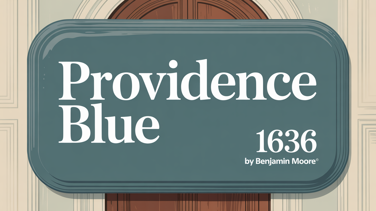
Imagine stepping into a room that instantly feels calm and stylish. That’s the magic of Providence Blue 1636. It’s a beautiful mix that brings elegance and tranquility straight into your home.
This isn’t just any blue. It sits perfectly between blue and green, creating a soft, soothing quality that makes any space feel incredibly inviting. Whether it’s a cozy bedroom or a busy kitchen, this color just works.
It adapts wonderfully, offering a backdrop that’s both refreshing and grounding. It pairs effortlessly with different decor styles. Think clean modern looks or warm, traditional vibes. Its subtle sophistication fits anywhere, updating a space without feeling overwhelming.
Using this blue is a simple way to refresh things. If you’re thinking about a new color for walls, furniture, or accents, it could be the perfect pick. It complements various materials and finishes, letting you customize your space exactly how you like. Choosing this color can bring a real sense of peace and harmony. It helps create an environment where you can truly relax.
What Color Is Providence Blue 1636 by Benjamin Moore?
So, what exactly is Providence Blue 1636? It’s a charming, muted shade of blue. It gives off a feeling of calm and sophistication. This versatile color balances warmth and coolness nicely, making it great for all sorts of interior styles.
It looks fantastic with nautical themes, coastal cottage feels, and even modern farmhouse designs. Its subtle elegance adds serenity to any room.
When you’re picking materials and textures to go with it, consider natural wood. Light oak or pine furniture and flooring really complement its gentle nature. Soft textiles like linen or cotton also boost the room’s warmth and comfort.
Using white or cream fabrics provides a lovely contrast, giving the color space to shine. Metallic accents like brushed nickel or antique brass can add a touch of elegance to fixtures or decor. Wicker or rattan textures can bring a cozy, inviting feel. It also works beautifully in a classic setting, especially with white trim for a crisp look. Its adaptability makes it a top choice for blending tradition and modernity.
Is Providence Blue 1636 by Benjamin Moore Warm or Cool color?
This is a great question. Providence Blue 1636 is generally considered a cool color. It’s a soft, muted blue with a touch of grey, which gives it a calm and balanced appearance.
This quality helps it create a serene and relaxing atmosphere that most people find really appealing.
What is the Masstone of the Providence Blue 1636 by Benjamin Moore?
Understanding a color’s masstone helps you know how it will behave. For Providence Blue 1636, the masstone is grey. This specific grey is noted as #808080.
Having a grey masstone is key because grey is neutral. This neutrality helps Providence Blue 1636 offer a balanced and serene environment. It’s why it fits so well in various spaces, from living rooms to bedrooms.
The grey undertones really soften the blue. This makes it incredibly versatile and easy to work with. It doesn’t take over a room, allowing it to pair seamlessly with other colors and decor. When you use it with white trim or light furniture, it feels refreshing and open, creating a peaceful vibe.
Plus, that grey masstone means it adjusts well to different lighting. Natural light might bring out the blue during the day. But artificial light at night can reveal those warmer grey aspects, keeping things cozy.
Undertones of Providence Blue 1636 by Benjamin Moore
Color isn’t just what you see on the surface. Undertones are the subtle hues hiding within a color, and they really influence how a shade looks in different light and settings. Providence Blue 1636 has a complex mix.
It combines elements like dark turquoise, purple, olive, and lilac, among others. The dark turquoise and blue hint at that calm, sophisticated feeling. Purple and violet add a rich depth. Olive and dark green bring in an earthy vibe.
Lilac and light turquoise provide a soft, airy feel, balancing those deeper shades. Each undertone can pop more or less depending on the lighting, room size, and nearby colors.
In your home, Providence Blue can actually look different throughout the day. Natural light might highlight its blue and green undertones for a fresh look. Under artificial light, you might see more of the purples and darker shades, creating a warmer, cozier atmosphere. Knowing these nuances helps you pick the perfect complementary decor.
Coordinating Colors of Providence Blue 1636 by Benjamin Moore
Choosing coordinating colors means finding shades that enhance your main color and create a harmonious look. They should complement the primary shade, whether you’re aiming for a serene or lively space.
Providence Blue pairs beautifully with several shades.
Here are some recommended coordinating colors:
- Barren Plain (2111-60): A soft, muted gray with a hint of warmth. It’s a neutral backdrop that lets Providence Blue really stand out.
- Beach Glass (1564): A calming greenish-blue tone. It aligns nicely with the coolness of Providence Blue, adding a soothing element.
- Horizon (OC-53): A light, airy gray. It offers a gentle contrast without overwhelming the blue, keeping the environment light and open.
- Simply White (OC-117): A pure, clean white. This brings brightness and clarity, accentuating the crispness of surrounding hues.
Together, these colors with Providence Blue create a balanced palette. They blend serenity with elegance, giving any setting a sophisticated vibe.
How Does Lighting Affect Providence Blue 1636 by Benjamin Moore?
Lighting is a huge factor in how any color appears, and it’s especially true for Providence Blue 1636. The type of light, its direction, and intensity can really shift how you see this blue-green shade.
In natural light, the direction matters.
- North-facing rooms have cooler, softer light. This can make Providence Blue look a bit more muted, perhaps showing more green undertones. It feels more subdued here.
- South-facing rooms get brighter, warmer light. This boosts Providence Blue’s brightness and can bring out the blue tones more strongly. It looks more vibrant and lively in these conditions.
- East-facing rooms catch bright, soft morning light. Providence Blue might show a softer blue tone in the morning, gently shifting as the day goes on. As the sun moves, it could take on a more balanced hue.
- West-facing rooms get warm afternoon and evening light. Here, Providence Blue can appear warmer later in the day, potentially highlighting its blue shades. It might look more neutral during the daytime before warming up.
Under artificial light, things change again. Standard warm-toned bulbs can bring out more green undertones, making the color feel cozier. Cool white bulbs, however, might highlight the blue aspects, making it look crisper.
Colors like Providence Blue are quite sensitive to light. How you see it really depends on the room’s lighting. That’s why considering lighting is crucial when picking colors for different spaces.
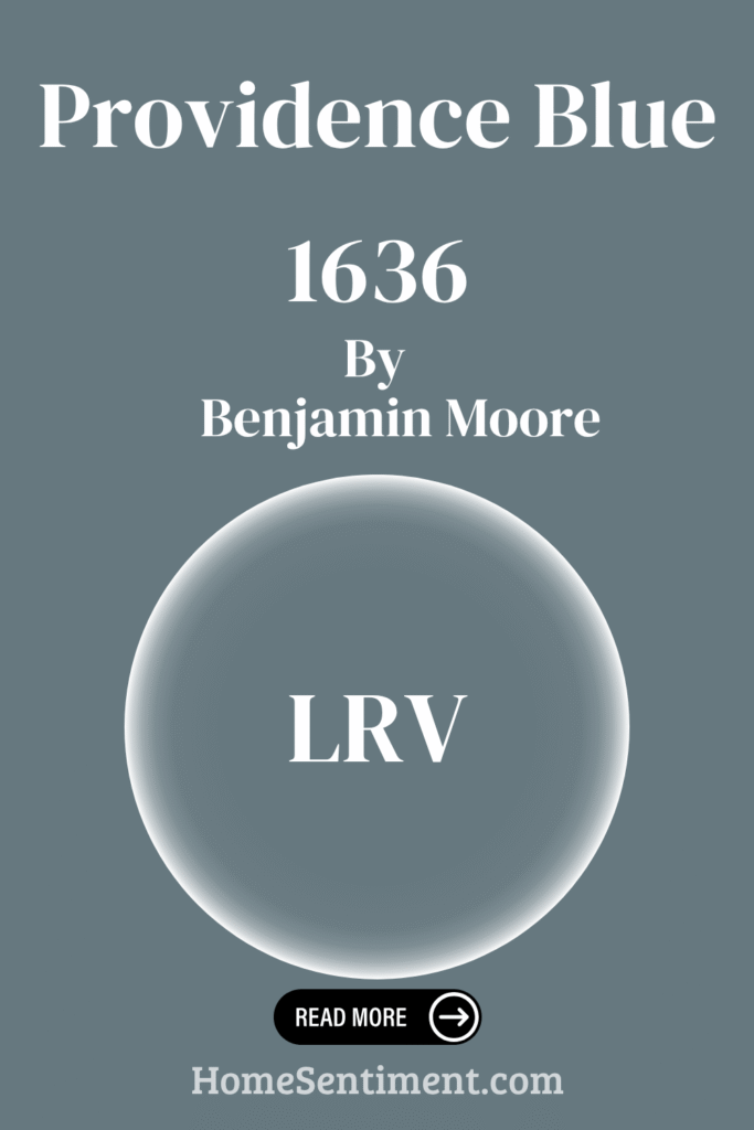
What is the LRV of Providence Blue 1636 by Benjamin Moore?
LRV stands for Light Reflectance Value. It measures how much light a paint color bounces back into a room. The scale goes from 0% (absorbs all light, like black) to 100% (reflects all light, like white).
Providence Blue 1636 has an LRV of 19.23.
This number tells you it’s a darker color. It absorbs more light than it reflects. A lower LRV like this tends to make a room feel more intimate and can add depth. On walls, it creates a cozy atmosphere because it doesn’t bounce a lot of light around.
With an LRV of 19.23, Providence Blue 1636 appears as a rich, deep hue. This low LRV means it absorbs significant light. It might make smaller rooms feel cozier, or it could make large spaces feel more inviting. If you use it in a room with lots of natural light, it might seem brighter. In dimly lit areas, it could look darker and more intense. This makes it a great choice for accent walls or spaces where you want a subdued, warm ambiance. Understanding LRV helps you pick colors to get the exact effect you’re after.
What are the Trim colors of Providence Blue 1636 by Benjamin Moore?
Trim colors are used on moldings, baseboards, and window frames to highlight edges and add dimension. When Providence Blue 1636 is your main wall color, picking the right trim color is essential for a cohesive design.
The right trim really enhances Providence Blue’s depth and charm. It makes the space feel well-coordinated.
Here are some recommended trim colors:
- AF-5 Frostine: This is a cool, soft white with a hint of gray. It provides a clean, subtle contrast to the rich blue. It brings lightness without overwhelming the main color.
- OC-128 Minced Onion: A slightly warmer, gentler off-white. This introduces a cozy, inviting feel. Its delicate creaminess balances Providence Blue’s depth with warmth, creating a harmonious space.
Using these trim colors can create a fresh, balanced atmosphere. They enhance the room’s look and feel while keeping its character.
Colors Similar to Providence Blue 1636 by Benjamin Moore
Using similar colors in your design can create harmony and cohesion. These are hues close to each other on the color wheel. They work well together because subtle differences add depth without chaos.
Several Benjamin Moore colors are similar to Providence Blue 1636.
Consider these shades:
- Thousand Oceans (1645): A rich, deep blue with hints of peace and endlessness.
- Blue Spruce (1637): Offers a touch of green, like lush forests. It adds an earthy depth.
- Stillwater (1650): A gentle, muted blue with a hint of calm. Perfect for creating a serene environment.
- Steep Cliff Gray (2122-20): A mix of blue and gray tones that offer strength and subtle elegance.
These similar colors work in harmony. They craft spaces that feel intentional, letting each one enhance the overall look without overpowering the others.
Colors that Go With Providence Blue 1636 by Benjamin Moore
Beyond similar shades, certain colors just go with Providence Blue, complementing its rich tone beautifully.
Here are some suggested pairing colors:
- Blue Spruce (1637): A deep, earthy shade that brings a sense of grounded calmness and creates a cozy feel.
- Brittany Blue (1633): Adds a light, airy touch, offering a sense of open space when combined with Providence Blue.
- Santorini Blue (1634): Has a bright, fresh quality that energizes. It makes the area feel vibrant and lively.
- Water’s Edge (1635): A peaceful and serene vibe that enhances the tranquil aspect of Providence Blue. It creates an atmosphere ideal for relaxation.
- Midnight Blue (1638): A mystery-filled, darker shade. It adds depth and drama, providing an elegant contrast.
- Glass Slipper (1632): Introduces a soft and subtle hint of color. It offers a delicate balance to the heavier tones.
These combinations work because each color adds its unique character while maintaining harmony. This ensures the space feels well-composed and inviting.
How to Use Providence Blue 1636 by Benjamin Moore In Your Home?
Providence Blue 1636 is a fantastic, versatile color. It really adds character to any home. Its rich, muted tone balances classic and modern styles perfectly.
Think about using it for accent walls in your living room or bedroom. This shade can also create a super cozy atmosphere in dining areas.
Pair it with neutral tones like soft grays or whites for a balanced look. Or, mix it with warm wood finishes to bring out its depth. In well-lit rooms, it reflects light beautifully, adding depth without being overwhelming. In more intimate spaces, it offers a lovely sense of calm and sophistication.
Whether you paint your walls, cabinetry, or even use it as a backdrop for artwork, this blue provides a versatile option. It effortlessly balances elegance and comfort.
Providence Blue 1636 by Benjamin Moore vs Thousand Oceans 1645 by Benjamin Moore
Let’s look at how Providence Blue stacks up against another shade. Providence Blue 1636 and Thousand Oceans 1645 are both rich, but they’re definitely different.
Providence Blue 1636 is a deep, slightly muted blue with a touch of gray. This gives it that sophisticated and calm feel. It’s ideal for rooms where you want a cozy, intimate atmosphere. It brings depth, making it perfect for a study or living room.
Thousand Oceans 1645 is more of a classic, rich blue. It has a clean, vibrant look and is brighter than Providence Blue. It evokes a more energetic and refreshing vibe. This makes it better suited for spaces that need a bit of liveliness, like a kitchen or bathroom.
Both colors are versatile, but they create different moods. Providence Blue feels more grounding, fitting traditional or elegant spaces. Thousand Oceans feels fresh and dynamic, great for adding brightness. Choosing between them depends on the mood you want.
Providence Blue 1636 by Benjamin Moore vs Blue Spruce 1637 by Benjamin Moore
Comparing Providence Blue 1636 and Blue Spruce 1637 shows how subtle shifts can make a big difference.
Providence Blue 1636 is a rich, deep color that brings the calm of twilight. It’s classic yet versatile. It fits spaces needing depth and composure. This blue leans a little green, giving it a subtle hint of teal that boosts its sophisticated look.
Blue Spruce 1637 is deeper and more muted than Providence Blue. It’s like a forest shade, with a stronger green tone that makes it earthier and more nature-inspired. Blue Spruce tends to feel cozier and warmer, great for creating an inviting atmosphere.
While both are blue-based, their secondary tones differ. Providence Blue balances with its hint of teal. Blue Spruce is more grounded in natural hues with its green undertone. Both work beautifully for elegance. Providence Blue fits modern settings well, while Blue Spruce adapts more to rustic or traditional themes.
Providence Blue 1636 by Benjamin Moore vs Steep Cliff Gray 2122-20 by Benjamin Moore
Here’s another interesting comparison. Providence Blue 1636 and Steep Cliff Gray 2122-20 offer very different feels.
Providence Blue 1636 is that calming, muted blue with hints of green. It brings a touch of the sea and sky indoors. It gives off peace and serenity, making it perfect for bedrooms or living areas where relaxation is key. It has enough depth to add character without overwhelming the room, making it versatile for different styles.
Steep Cliff Gray 2122-20 is quite different. It’s a rich, deep gray with cool undertones. It evokes a sense of strength and modernity. It works wonderfully in contemporary or minimalist spaces, providing a strong backdrop for art and decor. This color adds sophistication and elegance. It’s suitable for dining rooms or offices where you want a more dramatic statement.
Both colors bring unique qualities to the table. They allow for diverse design possibilities depending on the mood you want to create.
Providence Blue 1636 by Benjamin Moore vs Stillwater 1650 by Benjamin Moore
Comparing Providence Blue 1636 and Stillwater 1650 shows how different shades of blue can vary in impact.
Providence Blue 1636 is a classic blue with a hint of gray. This creates a subtle and versatile look. It brings a calm and sophisticated feel, working great in both traditional and modern spaces. It’s perfect for bedrooms or living areas, offering a refreshing yet composed atmosphere.
Stillwater 1650 is a deeper, richer tone. It’s a darker blue with strong green undertones, giving it a more dramatic effect. This color adds depth and can create a cozy space, especially in larger rooms or open areas with lots of light. It’s ideal for accent walls or where you want to make a statement.
Both colors have unique characters. Providence Blue leans towards a softer, understated elegance. Stillwater makes a bolder impact with its darker, moodier hue. Choosing between them depends on whether you prefer subtlety or depth in your color scheme.
Conclusion
Thinking about Providence Blue 1636, you can see why it’s such a great choice. It strikes that perfect balance between classic and modern. Its versatility is amazing – it works well in so many settings, bringing calm and sophistication.
This color can truly change the mood of a room. Whether it’s on walls, furniture, or accents, it’s a backdrop that encourages creativity and warmth. It adds depth without overwhelming the space. It’s ideal for highlighting other design elements.
It also works beautifully with other shades. It pairs wonderfully with neutrals like whites and grays for a soft palette. Or, it can provide a striking contrast to brighter colors.
Choosing a color for your home can feel tough, but Providence Blue makes it easier. Its timeless appeal and adaptability mean it stays a favorite across different styles. Incorporating it can help create a space that truly reflects your personal style.