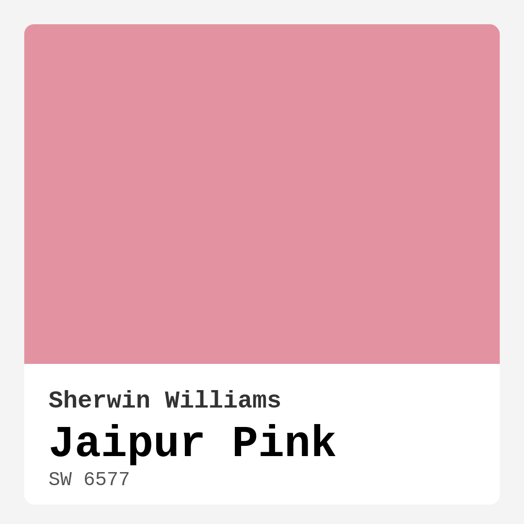
Color Preview & Key Details
| HEX Code | #E392A1 |
| RGB | 227, 146, 161 |
| LRV | 30% |
| Undertone | Red |
| Finish Options | Eggshell, Matte, Satin |
Picture this: you walk into a room bathed in a warm, inviting glow, and suddenly, you feel at home. The walls are painted in a hue that perfectly balances playfulness and sophistication. That’s the magic of Jaipur Pink, a color that effortlessly transforms spaces into cozy retreats. It’s not just paint; it’s a statement, a mood, and an experience all rolled into one.
Jaipur Pink, Sherwin Williams SW 6577, captures the vibrant spirit of India, offering a stunning blend of warmth and charm. With an RGB value of 227, 146, and 161, this soft pink is imbued with red undertones, giving it depth and character that can elevate any room. It’s a color that speaks to the heart, making it perfect for living rooms, bedrooms, nurseries, and dining rooms.
One of the most remarkable aspects of Jaipur Pink is its versatility. Whether your style leans towards bohemian, modern, eclectic, or contemporary, this color can seamlessly fit in. You’ll find it works beautifully with both light and dark decor, providing a perfect backdrop that allows your furnishings and accessories to shine. Imagine pairing it with white trim for a fresh contrast or accentuating it with wooden tones for a more rustic feel. The options are endless.
But let’s talk about how this color actually performs. With a Light Reflectance Value (LRV) of 30%, Jaipur Pink sits in the medium dark category, meaning it reflects very little light. This quality can create a more intimate atmosphere, making it ideal for spaces where you want to foster connection and relaxation. You might think that a lower LRV could make a room feel smaller, but don’t worry. In rooms filled with natural light, Jaipur Pink can take on a bright, vibrant character, transforming even the gloomiest spaces into cozy retreats.
You’ll love how quickly it dries, making it a dream for DIY enthusiasts. Plus, it’s beginner-friendly, so whether you’re using a roller or a brush, you’re going to appreciate how smoothly it goes on. And if your walls need a little touch-up later, this paint makes that hassle-free.
Now, let’s consider how Jaipur Pink looks in different lighting. This color tends to shine brightest in natural light, appearing more vibrant and cheerful. When the sun sets and artificial light takes over, it softens to a gentle blush, creating a serene evening ambiance. This quality makes it fantastic for bedrooms or reading nooks, where you want to cultivate a calming atmosphere.
You might be wondering, can Jaipur Pink work in low light conditions? Absolutely! It retains its warmth and inviting feel, even when the lights are dim. So, if you’re thinking about a cozy corner or a snug bedroom, this color can still deliver that comforting glow.
For those with little ones, you’ll be pleased to know that Jaipur Pink is also a fantastic choice for kids’ rooms. Its playful yet sophisticated tone can create an imaginative environment while being easy on the eyes. Plus, its washability makes it practical for active spaces where kids will be running around and getting their hands on the walls.
When it comes to application, you’ll want to keep in mind that Jaipur Pink may require two coats for full coverage, especially if you’re transitioning from a darker color. But trust me, the end result is worth the effort. The rich warmth of this color can bring joy and comfort to your home, and you’ll find yourself smiling every time you walk into the room.
Now, let’s touch on the undertones. Jaipur Pink leans towards red, which is essential to understand when selecting complementary colors. These subtle undertones can significantly affect how the color interacts with your existing decor. Want a cooler look? Combine it with greens or blues. Looking for something warmer? Pair it with earthy tones or richer reds. Always test the paint in your space to see how it plays with your furniture and flooring throughout the day. Lighting can change everything!
For those seeking inspiration, think about using Jaipur Pink on an accent wall to create a focal point. It works beautifully as an interior wall color, but don’t stop there—consider it for furniture pieces too. A Jaipur Pink dresser or bookshelf can add a unique touch that draws the eye and sparks conversation.
As you’re planning, remember that Jaipur Pink pairs beautifully with a range of complementary shades. Consider colors like SW 6477 or SW 7133 for a harmonious look, or go bolder with colors like SW 0060 for a striking contrast. This color’s adaptability makes it a designer favorite, allowing for endless possibilities.
While Jaipur Pink is a warm, muted pastel that radiates comfort, it’s crucial to note that in small, enclosed areas, it could appear too bright. You may want to use it strategically in larger rooms or as an accent to ensure it maintains its inviting vibe without overwhelming the senses.
In terms of finishes, you have options! Matte, satin, or eggshell finishes can all work well, depending on your desired aesthetic. A matte finish offers a more subdued, sophisticated look, while satin provides a slight sheen that can enhance the color’s warmth.
With its low VOC levels, you can feel good about using Jaipur Pink in your home, knowing it contributes to healthier indoor air quality. Plus, its wipeable and washable qualities make upkeep easy, so you can maintain that fresh look without much hassle.
In summary, Jaipur Pink is not just a paint color; it’s an experience waiting to unfold in your home. Its warm, inviting hue can transform any room into a cozy haven, whether you’re entertaining guests or curling up with a good book. Its versatility means it fits seamlessly into various decor styles, while its performance and ease of application make it a practical choice for homeowners and designers alike.
So, as you embark on your home decor journey, consider Jaipur Pink. It’s a color that promises to bring joy, comfort, and a touch of sophistication to your space. I can’t wait to see how you make it your own!
Save this color to your Pinterest board to revisit when planning your room.
Real Room Photo of Jaipur Pink SW 6577
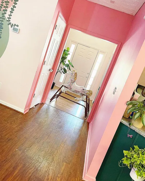
Real rooms painted with Jaipur Pink SW 6577 by Sherwin Williams. Lighting and photography can affect how colors appear — always test a sample swatch in your own space.
Undertones of Jaipur Pink ?
The undertones of Jaipur Pink are a key aspect of its character, leaning towards Red. These subtle underlying hues are what give the color its depth and complexity. For example, a gray with a blue undertone will feel cooler and more modern, while one with a brown undertone will feel warmer and more traditional. It’s essential to test this paint in your home and observe it next to your existing furniture, flooring, and decor to see how these undertones interact and reveal themselves throughout the day.
HEX value: #E392A1
RGB code: 227, 146, 161
Is Jaipur Pink Cool or Warm?
This color is decidedly warm, radiating a comforting glow that can make any room feel inviting. Its warmth makes it an excellent choice for areas where you want to foster connection and relaxation.
Understanding Color Properties and Interior Design Tips
Hue refers to a specific position on the color wheel, measured in degrees from 0 to 360. Each degree represents a different pure color:
- 0° represents red
- 120° represents green
- 240° represents blue
Saturation describes the intensity or purity of a color and is expressed as a percentage:
- At 0%, the color appears completely desaturated—essentially a shade of gray
- At 100%, the color is at its most vivid and vibrant
Lightness indicates how light or dark a color is, also expressed as a percentage:
- 0% lightness results in black
- 100% lightness results in white
Using Warm Colors in Interior Design
Warm hues—such as reds, oranges, yellows, warm beiges, and greiges—are excellent choices for creating inviting and energetic spaces. These colors are particularly well-suited for:
- Kitchens, living rooms, and bathrooms, where warmth enhances comfort and sociability
- Large rooms, where warm tones can help reduce the sense of emptiness and make the space feel more intimate
For example:
- Warm beige shades provide a cozy, inviting atmosphere, ideal for living rooms, bedrooms, and hallways.
- Warm greige (a mix of beige and gray) offers the warmth of beige with the modern appeal of gray, making it a versatile backdrop for dining areas, bedrooms, and living spaces.
However, be mindful when using warm light tones in rooms with limited natural light. These shades may appear muted or even take on an unpleasant yellowish tint. To avoid a dull or flat appearance:
- Add depth by incorporating richer tones like deep greens, charcoal, or chocolate brown
- Use textured elements such as curtains, rugs, or cushions to bring dimension to the space
Pro Tip: Achieving Harmony with Warm and Cool Color Balance
To create a well-balanced and visually interesting interior, mix warm and cool tones strategically. This contrast adds depth and harmony to your design.
- If your walls feature warm hues, introduce cool-colored accents such as blue or green furniture, artwork, or accessories to create contrast.
- For a polished look, consider using a complementary color scheme, which pairs colors opposite each other on the color wheel (e.g., red with green, orange with blue).
This thoughtful mix not only enhances visual appeal but also creates a space that feels both dynamic and cohesive.
Save this color to your Pinterest board to revisit when planning your room.
Light Temperature Affects on Jaipur Pink
Natural Light
Natural daylight changes in color temperature as the sun moves across the sky. At sunrise and sunset, the light tends to have a warm, golden tone with a color temperature around 2000 Kelvin (K). As the day progresses and the sun rises higher, the light becomes cooler and more neutral. Around midday, especially when the sky is clear, natural light typically reaches its peak brightness and shifts to a cooler tone, ranging from 5500 to 6500 Kelvin. This midday light is close to what we perceive as pure white or daylight-balanced light.
These shifts in natural light can significantly influence how colors appear in a space, which is why designers often consider both the time of day and the orientation of windows when planning interior color schemes.
Explore how this color transforms from sunrise through sunset as natural light changes throughout the day. Use the slider to simulate morning light, midday brightness, and warm afternoon tones.
North-facing rooms stay cooler throughout the day and benefit from warmer paint tones to compensate. South-facing rooms receive more direct sunlight, making even deeper shades more workable. East-facing rooms get bright morning light that fades by afternoon, while west-facing rooms glow warmly in the evening.
Artificial Light
When choosing artificial lighting, pay close attention to the color temperature, measured in Kelvin (K). This determines how warm or cool the light will appear. Lower temperatures, around 2700K, give off a warm, yellow glow often used in living rooms or bedrooms. Higher temperatures, above 5000K, create a cool, bluish light similar to daylight, commonly used in kitchens, offices, or task areas.
Use the slider to see how lighting temperature can affect the appearance of a surface or color throughout a space.
See how this color looks under different artificial light temperatures — from warm candlelight (2000K) to cool daylight (7000K). Move the slider to simulate your room's lighting conditions.


4800K
Keep in mind that natural light from windows, the warmth of lamps, and overhead lighting all affect how this color reads on your walls at different times of day. Always observe a sample swatch in your actual space before purchasing.
LRV of Jaipur Pink
The Light Reflectance Value (LRV) of Jaipur Pink is 30%, which places it in the Medium Dark category. This means it reflects very little light. Understanding a paint’s LRV is crucial for predicting how it will look in your space. A higher LRV indicates a lighter color that reflects more light, making rooms feel larger and brighter. A lower LRV signifies a darker color that absorbs more light, creating a cozier, more intimate atmosphere. Always consider the natural and artificial lighting in your room when selecting a paint color based on its LRV.
Detailed Review of Jaipur Pink
Additional Paint Characteristics
Ideal Rooms
Bedroom, Dining Room, Living Room, Nursery
Decor Styles
Bohemian, Contemporary, Eclectic, Modern
Coverage
Good (1–2 Coats), Touch-Up Friendly
Ease of Application
Beginner Friendly, Brush Smooth, Roller-Ready
Washability
Washable, Wipeable
VOC Level
Low VOC
Best Use
Accent Wall, Furniture, Interior Walls
Room Suitability
Bedroom, Dining Room, Living Room, Nursery
Tone Tag
Muted, Pastel, Warm
Finish Type
Matte, Satin
Paint Performance
Easy Touch-Up, Low Odor, Quick Drying
Use Cases
Best for Small Spaces, Classic Favorite, Designer Favorite
Mood
Cozy, Inviting, Restful
Trim Pairing
Complements Cool Trim, Good with Wood Trim, Pairs with White Dove
Jaipur Pink is truly a delightful choice for those looking to inject some warmth and character into their home. This color shines brightest in spaces where you want to create a welcoming vibe, such as living rooms and bedrooms. Its versatility allows it to be paired with both modern and traditional decor, making it a favorite among homeowners and designers alike. The soft pink undertones can brighten up even the gloomiest of rooms, transforming them into a cozy retreat. While it does require a couple of coats for full coverage, the end result is worth the effort. Plus, its ability to adapt to various lighting conditions—appearing more vibrant in natural light and softening under artificial light—adds to its charm.
Pros & Cons of SW 6577 Jaipur Pink
Pros
Cons
Colors that go with Sherwin Williams Jaipur Pink
FAQ on SW 6577 Jaipur Pink
How does Jaipur Pink work in low light conditions?
Jaipur Pink performs surprisingly well in low light. While it may not reflect as much brightness as it does in natural light, it retains its warmth and inviting feel. This quality makes it suitable for cozy spaces like bedrooms or reading nooks, where you want a soft and calming atmosphere.
Can Jaipur Pink be used in kids’ rooms?
Absolutely! Jaipur Pink is a fantastic choice for kids’ rooms. Its playful yet sophisticated tone can create a fun and imaginative environment while still being easy on the eyes. Plus, its durability and washability make it practical for spaces where kids will be active.
Comparisons Jaipur Pink with other colors
Jaipur Pink SW 6577 vs Realist Beige SW 6078
| Attribute | Jaipur Pink SW 6577 | Realist Beige SW 6078 |
|---|---|---|
| Color Name | Jaipur Pink SW 6577 | Realist Beige SW 6078 |
| Color | ||
| Hue | Pink | Pink |
| Brightness | Medium | Medium |
| RGB | 227, 146, 161 | 211, 200, 189 |
| LRV | 30% | 34% |
| Finish Type | Matte, Satin | Eggshell, Matte, Satin |
| Finish Options | Eggshell, Matte, Satin | Eggshell, Matte, Satin |
| Ideal Rooms | Bedroom, Dining Room, Living Room, Nursery | Bedroom, Dining Room, Entryway, Home Office, Kitchen, Living Room |
| Decor Styles | Bohemian, Contemporary, Eclectic, Modern | Contemporary, Minimalist, Modern Farmhouse, Rustic, Traditional |
| Coverage | Good (1–2 Coats), Touch-Up Friendly | Good (1–2 Coats), Touch-Up Friendly |
| Ease of Application | Beginner Friendly, Brush Smooth, Roller-Ready | Beginner Friendly, Brush Smooth, Fast-Drying, Roller-Ready |
| Washability | Washable, Wipeable | Washable, Wipeable |
| Room Suitability | Bedroom, Dining Room, Living Room, Nursery | Bedroom, Dining Room, Home Office, Kitchen, Living Room |
| Tone | Muted, Pastel, Warm | Earthy, Neutral, Warm |
| Paint Performance | Easy Touch-Up, Low Odor, Quick Drying | High Coverage, Low Odor, Quick Drying |
Lighting conditions, wall orientation, and surrounding decor can significantly affect how these colors appear in your space. Always test a sample swatch before committing to a full application.
Jaipur Pink SW 6577 vs Rosaline Pearl SW 9077
| Attribute | Jaipur Pink SW 6577 | Rosaline Pearl SW 9077 |
|---|---|---|
| Color Name | Jaipur Pink SW 6577 | Rosaline Pearl SW 9077 |
| Color | ||
| Hue | Pink | Pink |
| Brightness | Medium | Medium |
| RGB | 227, 146, 161 | 163, 136, 135 |
| LRV | 30% | 69% |
| Finish Type | Matte, Satin | Eggshell, Matte |
| Finish Options | Eggshell, Matte, Satin | Eggshell, Matte, Satin |
| Ideal Rooms | Bedroom, Dining Room, Living Room, Nursery | Bedroom, Dining Room, Home Office, Living Room |
| Decor Styles | Bohemian, Contemporary, Eclectic, Modern | Bohemian, Contemporary, Modern, Transitional |
| Coverage | Good (1–2 Coats), Touch-Up Friendly | Good (1–2 Coats) |
| Ease of Application | Beginner Friendly, Brush Smooth, Roller-Ready | Beginner Friendly, Brush Smooth, Fast-Drying, Roller-Ready |
| Washability | Washable, Wipeable | Washable, Wipeable |
| Room Suitability | Bedroom, Dining Room, Living Room, Nursery | Bedroom, Dining Room, Home Office, Living Room |
| Tone | Muted, Pastel, Warm | Dusty, Muted, Warm |
| Paint Performance | Easy Touch-Up, Low Odor, Quick Drying | Easy Touch-Up, Fade Resistant, Low Odor |
Lighting conditions, wall orientation, and surrounding decor can significantly affect how these colors appear in your space. Always test a sample swatch before committing to a full application.
Jaipur Pink SW 6577 vs Cabbage Rose SW 0003
| Attribute | Jaipur Pink SW 6577 | Cabbage Rose SW 0003 |
|---|---|---|
| Color Name | Jaipur Pink SW 6577 | Cabbage Rose SW 0003 |
| Color | ||
| Hue | Pink | Pink |
| Brightness | Medium | Medium |
| RGB | 227, 146, 161 | 197, 159, 145 |
| LRV | 30% | 15% |
| Finish Type | Matte, Satin | Eggshell, Matte, Satin |
| Finish Options | Eggshell, Matte, Satin | Eggshell, Matte, Satin |
| Ideal Rooms | Bedroom, Dining Room, Living Room, Nursery | Bedroom, Dining Room, Hallway, Living Room, Nursery |
| Decor Styles | Bohemian, Contemporary, Eclectic, Modern | Cottage, Modern Farmhouse, Romantic, Shabby Chic, Vintage |
| Coverage | Good (1–2 Coats), Touch-Up Friendly | Good (1–2 Coats), Touch-Up Friendly |
| Ease of Application | Beginner Friendly, Brush Smooth, Roller-Ready | Beginner Friendly, Brush Smooth, Roller-Ready |
| Washability | Washable, Wipeable | Washable, Wipeable |
| Room Suitability | Bedroom, Dining Room, Living Room, Nursery | Bedroom, Dining Room, Hallway, Living Room, Nursery |
| Tone | Muted, Pastel, Warm | Earthy, Muted, Warm |
| Paint Performance | Easy Touch-Up, Low Odor, Quick Drying | Easy Touch-Up, Low Odor |
Lighting conditions, wall orientation, and surrounding decor can significantly affect how these colors appear in your space. Always test a sample swatch before committing to a full application.
Jaipur Pink SW 6577 vs Sashay Sand SW 6051
| Attribute | Jaipur Pink SW 6577 | Sashay Sand SW 6051 |
|---|---|---|
| Color Name | Jaipur Pink SW 6577 | Sashay Sand SW 6051 |
| Color | ||
| Hue | Pink | Pink |
| Brightness | Medium | Medium |
| RGB | 227, 146, 161 | 207, 180, 168 |
| LRV | 30% | 64% |
| Finish Type | Matte, Satin | Eggshell, Matte, Satin |
| Finish Options | Eggshell, Matte, Satin | Eggshell, Matte, Satin |
| Ideal Rooms | Bedroom, Dining Room, Living Room, Nursery | Bedroom, Dining Room, Home Office, Kitchen, Living Room |
| Decor Styles | Bohemian, Contemporary, Eclectic, Modern | Bohemian, Contemporary, Modern Farmhouse, Scandinavian, Transitional |
| Coverage | Good (1–2 Coats), Touch-Up Friendly | Good (1–2 Coats), Touch-Up Friendly |
| Ease of Application | Beginner Friendly, Brush Smooth, Roller-Ready | Beginner Friendly, Fast-Drying, Roller-Ready |
| Washability | Washable, Wipeable | Highly Washable, Washable |
| Room Suitability | Bedroom, Dining Room, Living Room, Nursery | Bedroom, Dining Room, Home Office, Kitchen, Living Room |
| Tone | Muted, Pastel, Warm | Earthy, Muted, Warm |
| Paint Performance | Easy Touch-Up, Low Odor, Quick Drying | Easy Touch-Up, Low Odor, Quick Drying, Scuff Resistant |
Lighting conditions, wall orientation, and surrounding decor can significantly affect how these colors appear in your space. Always test a sample swatch before committing to a full application.
Jaipur Pink SW 6577 vs Touch of Sand SW 9085
| Attribute | Jaipur Pink SW 6577 | Touch of Sand SW 9085 |
|---|---|---|
| Color Name | Jaipur Pink SW 6577 | Touch of Sand SW 9085 |
| Color | ||
| Hue | Pink | Pink |
| Brightness | Medium | Medium |
| RGB | 227, 146, 161 | 213, 199, 186 |
| LRV | 30% | 66% |
| Finish Type | Matte, Satin | Eggshell, Matte, Satin |
| Finish Options | Eggshell, Matte, Satin | Eggshell, Matte, Satin |
| Ideal Rooms | Bedroom, Dining Room, Living Room, Nursery | Bathroom, Bedroom, Dining Room, Home Office, Kitchen, Living Room |
| Decor Styles | Bohemian, Contemporary, Eclectic, Modern | Bohemian, Coastal, Contemporary, Modern Farmhouse, Rustic |
| Coverage | Good (1–2 Coats), Touch-Up Friendly | Good (1–2 Coats), Touch-Up Friendly |
| Ease of Application | Beginner Friendly, Brush Smooth, Roller-Ready | Beginner Friendly, Brush Smooth, Fast-Drying, Roller-Ready |
| Washability | Washable, Wipeable | Washable, Wipeable |
| Room Suitability | Bedroom, Dining Room, Living Room, Nursery | Bathroom, Bedroom, Dining Room, Home Office, Kitchen, Living Room |
| Tone | Muted, Pastel, Warm | Earthy, Muted, Neutral, Warm |
| Paint Performance | Easy Touch-Up, Low Odor, Quick Drying | Easy Touch-Up, Low Odor, Quick Drying, Scuff Resistant |
Lighting conditions, wall orientation, and surrounding decor can significantly affect how these colors appear in your space. Always test a sample swatch before committing to a full application.
Jaipur Pink SW 6577 vs Pink Shadow SW 0070
| Attribute | Jaipur Pink SW 6577 | Pink Shadow SW 0070 |
|---|---|---|
| Color Name | Jaipur Pink SW 6577 | Pink Shadow SW 0070 |
| Color | ||
| Hue | Pink | Pink |
| Brightness | Medium | Medium |
| RGB | 227, 146, 161 | 222, 195, 185 |
| LRV | 30% | 45% |
| Finish Type | Matte, Satin | Eggshell, Matte, Satin |
| Finish Options | Eggshell, Matte, Satin | Eggshell, Matte, Satin |
| Ideal Rooms | Bedroom, Dining Room, Living Room, Nursery | Bedroom, Dining Room, Home Office, Living Room, Nursery |
| Decor Styles | Bohemian, Contemporary, Eclectic, Modern | Bohemian, Minimalist, Modern Farmhouse, Scandinavian, Traditional |
| Coverage | Good (1–2 Coats), Touch-Up Friendly | Good (1–2 Coats) |
| Ease of Application | Beginner Friendly, Brush Smooth, Roller-Ready | Beginner Friendly, Brush Smooth, Fast-Drying, Roller-Ready |
| Washability | Washable, Wipeable | Washable, Wipeable |
| Room Suitability | Bedroom, Dining Room, Living Room, Nursery | Bedroom, Dining Room, Living Room, Nursery |
| Tone | Muted, Pastel, Warm | Muted, Pastel, Warm |
| Paint Performance | Easy Touch-Up, Low Odor, Quick Drying | Easy Touch-Up, High Coverage, Low Odor |
Lighting conditions, wall orientation, and surrounding decor can significantly affect how these colors appear in your space. Always test a sample swatch before committing to a full application.
Jaipur Pink SW 6577 vs Hushed Auburn SW 9080
| Attribute | Jaipur Pink SW 6577 | Hushed Auburn SW 9080 |
|---|---|---|
| Color Name | Jaipur Pink SW 6577 | Hushed Auburn SW 9080 |
| Color | ||
| Hue | Pink | Pink |
| Brightness | Medium | Medium |
| RGB | 227, 146, 161 | 168, 133, 122 |
| LRV | 30% | 12% |
| Finish Type | Matte, Satin | Eggshell, Matte, Satin |
| Finish Options | Eggshell, Matte, Satin | Eggshell, Matte, Satin |
| Ideal Rooms | Bedroom, Dining Room, Living Room, Nursery | Bedroom, Dining Room, Home Office, Living Room |
| Decor Styles | Bohemian, Contemporary, Eclectic, Modern | Contemporary, Modern Farmhouse, Rustic, Transitional |
| Coverage | Good (1–2 Coats), Touch-Up Friendly | Good (1–2 Coats), Touch-Up Friendly |
| Ease of Application | Beginner Friendly, Brush Smooth, Roller-Ready | Beginner Friendly, Brush Smooth, Fast-Drying, Roller-Ready |
| Washability | Washable, Wipeable | Washable, Wipeable |
| Room Suitability | Bedroom, Dining Room, Living Room, Nursery | Bedroom, Dining Room, Home Office, Living Room |
| Tone | Muted, Pastel, Warm | Earthy, Muted, Warm |
| Paint Performance | Easy Touch-Up, Low Odor, Quick Drying | Easy Touch-Up, High Coverage, Low Odor |
Lighting conditions, wall orientation, and surrounding decor can significantly affect how these colors appear in your space. Always test a sample swatch before committing to a full application.
Jaipur Pink SW 6577 vs Likeable Sand SW 6058
| Attribute | Jaipur Pink SW 6577 | Likeable Sand SW 6058 |
|---|---|---|
| Color Name | Jaipur Pink SW 6577 | Likeable Sand SW 6058 |
| Color | ||
| Hue | Pink | Pink |
| Brightness | Medium | Medium |
| RGB | 227, 146, 161 | 209, 183, 168 |
| LRV | 30% | 61% |
| Finish Type | Matte, Satin | Eggshell, Matte, Satin |
| Finish Options | Eggshell, Matte, Satin | Eggshell, Matte, Satin |
| Ideal Rooms | Bedroom, Dining Room, Living Room, Nursery | Bedroom, Dining Room, Home Office, Kitchen, Living Room |
| Decor Styles | Bohemian, Contemporary, Eclectic, Modern | Bohemian, Coastal, Contemporary, Modern Farmhouse, Rustic |
| Coverage | Good (1–2 Coats), Touch-Up Friendly | Good (1–2 Coats), Touch-Up Friendly |
| Ease of Application | Beginner Friendly, Brush Smooth, Roller-Ready | Beginner Friendly, Brush Smooth, Fast-Drying, Roller-Ready |
| Washability | Washable, Wipeable | Washable, Wipeable |
| Room Suitability | Bedroom, Dining Room, Living Room, Nursery | Bedroom, Dining Room, Home Office, Kitchen, Living Room |
| Tone | Muted, Pastel, Warm | Earthy, Muted, Warm |
| Paint Performance | Easy Touch-Up, Low Odor, Quick Drying | Easy Touch-Up, Low Odor, Quick Drying |
Lighting conditions, wall orientation, and surrounding decor can significantly affect how these colors appear in your space. Always test a sample swatch before committing to a full application.
Jaipur Pink SW 6577 vs Glamour SW 6031
| Attribute | Jaipur Pink SW 6577 | Glamour SW 6031 |
|---|---|---|
| Color Name | Jaipur Pink SW 6577 | Glamour SW 6031 |
| Color | ||
| Hue | Pink | Pink |
| Brightness | Medium | Medium |
| RGB | 227, 146, 161 | 182, 160, 154 |
| LRV | 30% | 30% |
| Finish Type | Matte, Satin | Eggshell, Matte, Satin |
| Finish Options | Eggshell, Matte, Satin | Eggshell, Matte, Satin |
| Ideal Rooms | Bedroom, Dining Room, Living Room, Nursery | Bedroom, Dining Room, Home Office, Living Room |
| Decor Styles | Bohemian, Contemporary, Eclectic, Modern | Bohemian, Classic, Modern, Transitional |
| Coverage | Good (1–2 Coats), Touch-Up Friendly | Good (1–2 Coats) |
| Ease of Application | Beginner Friendly, Brush Smooth, Roller-Ready | Beginner Friendly, Brush Smooth, Fast-Drying, Roller-Ready |
| Washability | Washable, Wipeable | Scrubbable, Washable |
| Room Suitability | Bedroom, Dining Room, Living Room, Nursery | Bedroom, Dining Room, Home Office, Living Room |
| Tone | Muted, Pastel, Warm | Balanced, Neutral, Warm |
| Paint Performance | Easy Touch-Up, Low Odor, Quick Drying | Easy Touch-Up, Low Odor, Quick Drying |
Lighting conditions, wall orientation, and surrounding decor can significantly affect how these colors appear in your space. Always test a sample swatch before committing to a full application.
Jaipur Pink SW 6577 vs Temperate Taupe SW 6037
| Attribute | Jaipur Pink SW 6577 | Temperate Taupe SW 6037 |
|---|---|---|
| Color Name | Jaipur Pink SW 6577 | Temperate Taupe SW 6037 |
| Color | ||
| Hue | Pink | Pink |
| Brightness | Medium | Medium |
| RGB | 227, 146, 161 | 191, 177, 170 |
| LRV | 30% | 34% |
| Finish Type | Matte, Satin | Eggshell, Matte, Satin |
| Finish Options | Eggshell, Matte, Satin | Eggshell, Matte, Satin |
| Ideal Rooms | Bedroom, Dining Room, Living Room, Nursery | Bedroom, Dining Room, Home Office, Kitchen, Living Room |
| Decor Styles | Bohemian, Contemporary, Eclectic, Modern | Bohemian, Modern Farmhouse, Rustic, Transitional |
| Coverage | Good (1–2 Coats), Touch-Up Friendly | Good (1–2 Coats), Touch-Up Friendly |
| Ease of Application | Beginner Friendly, Brush Smooth, Roller-Ready | Beginner Friendly, Brush Smooth, Fast-Drying, Roller-Ready |
| Washability | Washable, Wipeable | Highly Washable, Washable |
| Room Suitability | Bedroom, Dining Room, Living Room, Nursery | Bedroom, Dining Room, Home Office, Living Room |
| Tone | Muted, Pastel, Warm | Earthy, Neutral, Warm |
| Paint Performance | Easy Touch-Up, Low Odor, Quick Drying | Long Lasting, Low Odor, Quick Drying, Scuff Resistant |
Lighting conditions, wall orientation, and surrounding decor can significantly affect how these colors appear in your space. Always test a sample swatch before committing to a full application.
Official Page of Sherwin Williams Jaipur Pink SW 6577