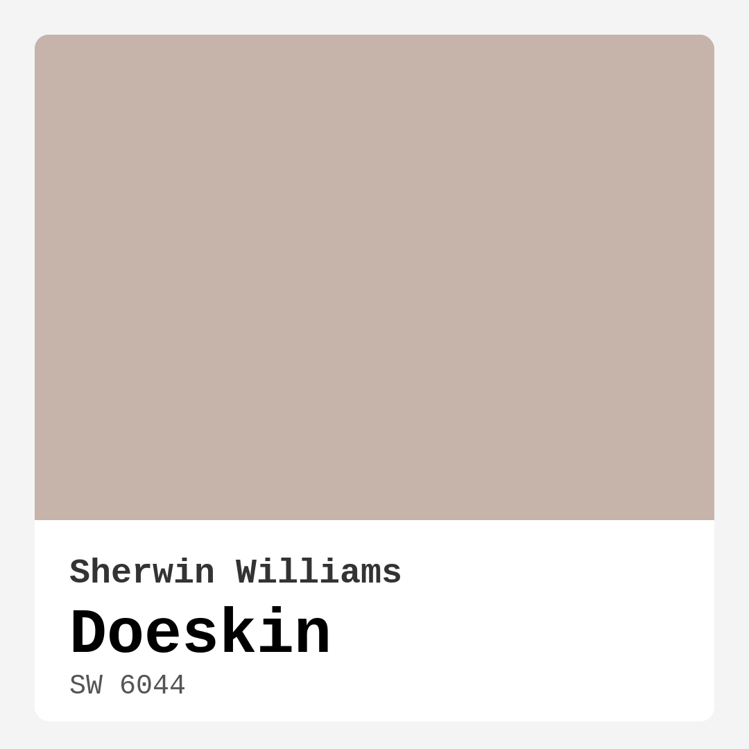
Color Preview & Key Details
| HEX Code | #C6B3A9 |
| RGB | 198, 179, 169 |
| LRV | 30% |
| Undertone | Red |
| Finish Options | Eggshell, Matte, Satin |
Imagine walking into a room that instantly wraps you in warmth and comfort. You feel at home, surrounded by a color that embraces you without overpowering the space. This is the magic of Doeskin by Sherwin Williams. With its soft, muted taupe hue, Doeskin is more than just a paint color—it’s an experience waiting to happen in your home.
At first glance, Doeskin (SW 6044) seems to straddle the line between beige and taupe, but it’s the subtle warmth of its red undertones that truly sets it apart. This gentle pinkish hue brings a level of sophistication that can elevate any room. It’s versatile enough to complement various decor styles—think modern farmhouse, rustic, or even contemporary. Whether you’re working with a cozy living room or a bright, airy home office, Doeskin can seamlessly adapt, providing a perfect backdrop for your personal aesthetic.
When considering Doeskin, it’s essential to understand its qualities. With a Light Reflectance Value (LRV) of 30%, it falls into the medium dark category, meaning it absorbs more light than it reflects. This characteristic creates a warm and intimate atmosphere, making it an ideal choice for spaces where you want to foster connection—like a dining room or a bedroom. However, be mindful that in poorly lit areas, it may appear darker, so pairing it with lighter accents can help brighten the space.
Applying Doeskin is a breeze, even if you’re a beginner. Its smooth application makes it roller-ready and brush-friendly, which means you can achieve that professional finish without stress. Plus, cleanup is simple, as it’s highly washable, allowing you to maintain that fresh look for years to come. With good coverage requiring just one to two coats, you’ll be amazed at how quickly you can transform your room.
The beauty of Doeskin lies not just in its warmth but in its versatility. You can use it as a primary wall color or as an accent. Picture a Doeskin accent wall behind a sleek modern sofa, paired with light, airy curtains that flutter gently in the breeze. It opens up the space while keeping that cozy vibe intact. This color also complements a variety of trim colors beautifully. For a classic touch, opt for white or off-white trim. If rustic is more your style, natural wood trim will harmonize perfectly, enhancing the earthy feel of Doeskin.
Now, let’s talk about the mood Doeskin sets in a room. With its warm, earthy tones, it evokes feelings of comfort and tranquility. Imagine stepping into a bedroom adorned with Doeskin; the soft hue creates a sanctuary, a place where you can unwind and recharge. It’s cozy yet sophisticated, grounding you in the present moment. This is especially true in the evenings when Doeskin deepens slightly, casting a serene glow that invites relaxation.
One of the best features of Doeskin is its adaptability to lighting. In natural light, it shines softly, reflecting a warm glow that brightens a space. But as the day progresses and the sun sets, you’ll notice how it transforms, taking on a richer, deeper quality that enhances its inviting nature. This quality is perfect for transitional spaces where the light changes dramatically throughout the day.
If you’re considering using Doeskin in a smaller room, you’re in luck. This color works wonders in cozy spaces, creating an intimate atmosphere without feeling confining. To keep the room feeling open, consider pairing it with lighter accents and decor elements. This thoughtful approach ensures that the warmth of Doeskin enhances the space rather than overshadowing it.
Now, when it comes to accessories and decor, Doeskin’s neutral yet warm palette allows it to play well with many colors. For instance, if you’re looking to introduce a pop of color, consider shades of green or soft blues. These colors create a beautiful contrast, allowing Doeskin’s warmth to shine while providing visual interest. For a more monochromatic look, stick with similar earthy tones, which can create a harmonious and cohesive design.
We can’t forget about the practical side of choosing paint. Doeskin comes with a low VOC formula, making it a safer choice for your home. You can breathe easy knowing that you’re not compromising on health for beauty. Plus, its easy touch-up capabilities mean you won’t have to stress over maintaining its fresh look.
As with any paint, testing before committing is crucial. Grab a sample of Doeskin and apply it to a small area in your home to see how it interacts with your existing furnishings and lighting. Observing how it shifts throughout the day will give you a clearer picture of how it will feel in your space.
To create a stunning environment, remember to think about the finishing touches. Whether you choose a matte, eggshell, or satin finish, Doeskin will exude elegance. Each finish will reflect light differently, so choose based on the ambiance you want to create.
In summary, Doeskin is a beautifully understated paint color that can transform any room into a cozy retreat. Its warm undertones invite comfort while its muted quality ensures it won’t overwhelm the senses. Whether you’re painting an entire room or just an accent wall, Doeskin’s versatile nature and rich depth make it an excellent choice for any homeowner looking to create a welcoming space.
So, if you’re ready to embrace warmth and sophistication in your home, Doeskin could be the perfect color for you. Bring it into your space, and watch as it transforms your surroundings into a haven of comfort and style. You won’t just be painting; you’ll be creating an atmosphere that speaks to your soul.
Save this color to your Pinterest board to revisit when planning your room.
Real Room Photo of Doeskin SW 6044
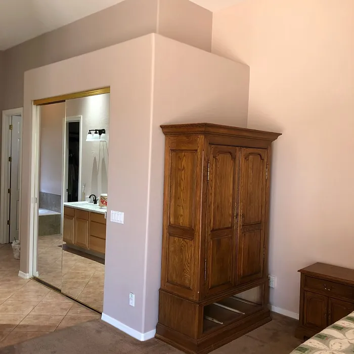
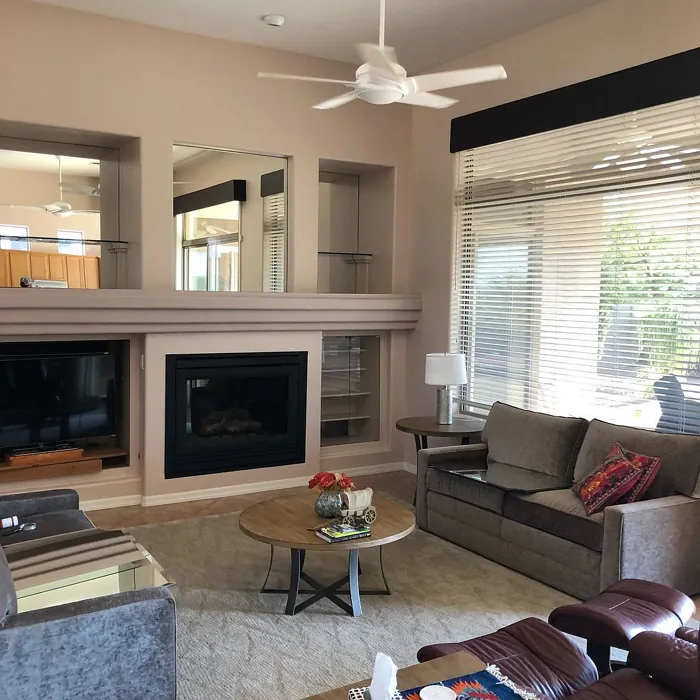
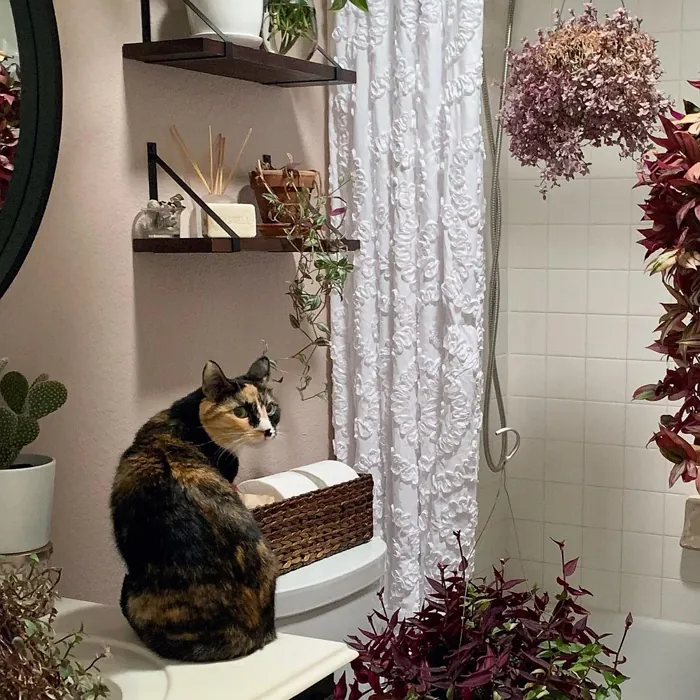
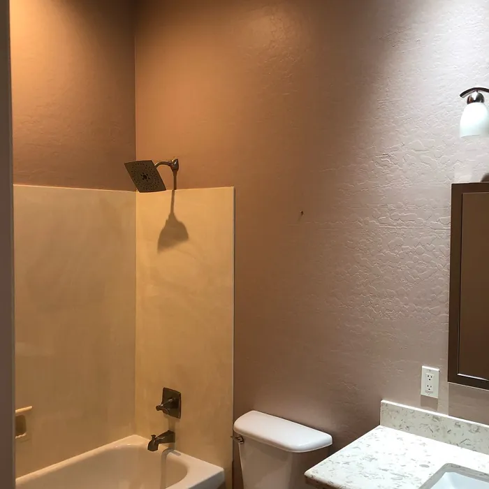
Real rooms painted with Doeskin SW 6044 by Sherwin Williams. Lighting and photography can affect how colors appear — always test a sample swatch in your own space.
Undertones of Doeskin ?
The undertones of Doeskin are a key aspect of its character, leaning towards Red. These subtle underlying hues are what give the color its depth and complexity. For example, a gray with a blue undertone will feel cooler and more modern, while one with a brown undertone will feel warmer and more traditional. It’s essential to test this paint in your home and observe it next to your existing furniture, flooring, and decor to see how these undertones interact and reveal themselves throughout the day.
HEX value: #C6B3A9
RGB code: 198, 179, 169
Is Doeskin Cool or Warm?
Doeskin is predominantly warm, with its beige and taupe qualities that create a welcoming atmosphere. It’s perfect for spaces where you want a comforting vibe, as it embraces warmth without becoming too heavy.
Understanding Color Properties and Interior Design Tips
Hue refers to a specific position on the color wheel, measured in degrees from 0 to 360. Each degree represents a different pure color:
- 0° represents red
- 120° represents green
- 240° represents blue
Saturation describes the intensity or purity of a color and is expressed as a percentage:
- At 0%, the color appears completely desaturated—essentially a shade of gray
- At 100%, the color is at its most vivid and vibrant
Lightness indicates how light or dark a color is, also expressed as a percentage:
- 0% lightness results in black
- 100% lightness results in white
Using Warm Colors in Interior Design
Warm hues—such as reds, oranges, yellows, warm beiges, and greiges—are excellent choices for creating inviting and energetic spaces. These colors are particularly well-suited for:
- Kitchens, living rooms, and bathrooms, where warmth enhances comfort and sociability
- Large rooms, where warm tones can help reduce the sense of emptiness and make the space feel more intimate
For example:
- Warm beige shades provide a cozy, inviting atmosphere, ideal for living rooms, bedrooms, and hallways.
- Warm greige (a mix of beige and gray) offers the warmth of beige with the modern appeal of gray, making it a versatile backdrop for dining areas, bedrooms, and living spaces.
However, be mindful when using warm light tones in rooms with limited natural light. These shades may appear muted or even take on an unpleasant yellowish tint. To avoid a dull or flat appearance:
- Add depth by incorporating richer tones like deep greens, charcoal, or chocolate brown
- Use textured elements such as curtains, rugs, or cushions to bring dimension to the space
Pro Tip: Achieving Harmony with Warm and Cool Color Balance
To create a well-balanced and visually interesting interior, mix warm and cool tones strategically. This contrast adds depth and harmony to your design.
- If your walls feature warm hues, introduce cool-colored accents such as blue or green furniture, artwork, or accessories to create contrast.
- For a polished look, consider using a complementary color scheme, which pairs colors opposite each other on the color wheel (e.g., red with green, orange with blue).
This thoughtful mix not only enhances visual appeal but also creates a space that feels both dynamic and cohesive.

Save this color to your Pinterest board to revisit when planning your room.
Light Temperature Affects on Doeskin
Natural Light
Natural daylight changes in color temperature as the sun moves across the sky. At sunrise and sunset, the light tends to have a warm, golden tone with a color temperature around 2000 Kelvin (K). As the day progresses and the sun rises higher, the light becomes cooler and more neutral. Around midday, especially when the sky is clear, natural light typically reaches its peak brightness and shifts to a cooler tone, ranging from 5500 to 6500 Kelvin. This midday light is close to what we perceive as pure white or daylight-balanced light.
These shifts in natural light can significantly influence how colors appear in a space, which is why designers often consider both the time of day and the orientation of windows when planning interior color schemes.
Explore how this color transforms from sunrise through sunset as natural light changes throughout the day. Use the slider to simulate morning light, midday brightness, and warm afternoon tones.
North-facing rooms stay cooler throughout the day and benefit from warmer paint tones to compensate. South-facing rooms receive more direct sunlight, making even deeper shades more workable. East-facing rooms get bright morning light that fades by afternoon, while west-facing rooms glow warmly in the evening.
Artificial Light
When choosing artificial lighting, pay close attention to the color temperature, measured in Kelvin (K). This determines how warm or cool the light will appear. Lower temperatures, around 2700K, give off a warm, yellow glow often used in living rooms or bedrooms. Higher temperatures, above 5000K, create a cool, bluish light similar to daylight, commonly used in kitchens, offices, or task areas.
Use the slider to see how lighting temperature can affect the appearance of a surface or color throughout a space.
See how this color looks under different artificial light temperatures — from warm candlelight (2000K) to cool daylight (7000K). Move the slider to simulate your room's lighting conditions.


4800K
Keep in mind that natural light from windows, the warmth of lamps, and overhead lighting all affect how this color reads on your walls at different times of day. Always observe a sample swatch in your actual space before purchasing.
LRV of Doeskin
The Light Reflectance Value (LRV) of Doeskin is 30%, which places it in the Medium Dark category. This means it reflects very little light. Understanding a paint’s LRV is crucial for predicting how it will look in your space. A higher LRV indicates a lighter color that reflects more light, making rooms feel larger and brighter. A lower LRV signifies a darker color that absorbs more light, creating a cozier, more intimate atmosphere. Always consider the natural and artificial lighting in your room when selecting a paint color based on its LRV.
Detailed Review of Doeskin
Additional Paint Characteristics
Ideal Rooms
Bedroom, Dining Room, Home Office, Kitchen, Living Room
Decor Styles
Contemporary, Modern Farmhouse, Rustic, Transitional
Coverage
Good (1–2 Coats), Touch-Up Friendly
Ease of Application
Beginner Friendly, Brush Smooth, Roller-Ready
Washability
Highly Washable, Washable
VOC Level
Low VOC
Best Use
Accent Wall, Interior Walls, Trim
Room Suitability
Bedroom, Dining Room, Home Office, Living Room
Tone Tag
Earthy, Neutral, Warm
Finish Type
Eggshell, Matte, Satin
Paint Performance
Easy Touch-Up, High Coverage, Low Odor
Use Cases
Best for Modern Farmhouse, Best for Rentals, Best for Small Spaces, Designer Favorite
Mood
Cozy, Grounding, Inviting
Trim Pairing
Complements Brass Fixtures, Pairs with White Dove, Works with Warm Trim
Doeskin is a beautifully understated paint color that can transform any room into a cozy retreat. Its warm undertones make it particularly inviting, while its muted quality ensures it won’t overwhelm the senses. When applied, Doeskin offers a smooth, even finish that enhances the natural light in your space, giving it a bright yet grounded feel. Whether you’re painting a feature wall or an entire room, this color adapts well to changing light throughout the day, appearing richer in the evening and softer during the day. This versatility makes it an ideal choice for living rooms or bedrooms where ambiance is key.
Pros & Cons of SW 6044 Doeskin
Pros
Cons
Colors that go with Sherwin Williams Doeskin
FAQ on SW 6044 Doeskin
Can Doeskin be used in a small room?
Absolutely! Doeskin is an excellent choice for small spaces. Its warm undertones can make a small room feel cozier while still maintaining an open feel. Just be mindful of lighting, as it may appear darker in poorly lit areas. Pairing it with lighter accents can also help enhance the room’s brightness.
What trim colors work best with Doeskin?
Doeskin pairs beautifully with a variety of trim colors. For a classic look, consider using white or off-white trims. If you’re aiming for a more rustic feel, natural wood trim can complement Doeskin nicely. It’s all about creating contrast while maintaining that warm, inviting ambiance.
Comparisons Doeskin with other colors
Doeskin SW 6044 vs Realist Beige SW 6078
| Attribute | Doeskin SW 6044 | Realist Beige SW 6078 |
|---|---|---|
| Color Name | Doeskin SW 6044 | Realist Beige SW 6078 |
| Color | ||
| Hue | Pink | Pink |
| Brightness | Medium | Medium |
| RGB | 198, 179, 169 | 211, 200, 189 |
| LRV | 30% | 34% |
| Finish Type | Eggshell, Matte, Satin | Eggshell, Matte, Satin |
| Finish Options | Eggshell, Matte, Satin | Eggshell, Matte, Satin |
| Ideal Rooms | Bedroom, Dining Room, Home Office, Kitchen, Living Room | Bedroom, Dining Room, Entryway, Home Office, Kitchen, Living Room |
| Decor Styles | Contemporary, Modern Farmhouse, Rustic, Transitional | Contemporary, Minimalist, Modern Farmhouse, Rustic, Traditional |
| Coverage | Good (1–2 Coats), Touch-Up Friendly | Good (1–2 Coats), Touch-Up Friendly |
| Ease of Application | Beginner Friendly, Brush Smooth, Roller-Ready | Beginner Friendly, Brush Smooth, Fast-Drying, Roller-Ready |
| Washability | Highly Washable, Washable | Washable, Wipeable |
| Room Suitability | Bedroom, Dining Room, Home Office, Living Room | Bedroom, Dining Room, Home Office, Kitchen, Living Room |
| Tone | Earthy, Neutral, Warm | Earthy, Neutral, Warm |
| Paint Performance | Easy Touch-Up, High Coverage, Low Odor | High Coverage, Low Odor, Quick Drying |
Lighting conditions, wall orientation, and surrounding decor can significantly affect how these colors appear in your space. Always test a sample swatch before committing to a full application.
Doeskin SW 6044 vs Rosaline Pearl SW 9077
| Attribute | Doeskin SW 6044 | Rosaline Pearl SW 9077 |
|---|---|---|
| Color Name | Doeskin SW 6044 | Rosaline Pearl SW 9077 |
| Color | ||
| Hue | Pink | Pink |
| Brightness | Medium | Medium |
| RGB | 198, 179, 169 | 163, 136, 135 |
| LRV | 30% | 69% |
| Finish Type | Eggshell, Matte, Satin | Eggshell, Matte |
| Finish Options | Eggshell, Matte, Satin | Eggshell, Matte, Satin |
| Ideal Rooms | Bedroom, Dining Room, Home Office, Kitchen, Living Room | Bedroom, Dining Room, Home Office, Living Room |
| Decor Styles | Contemporary, Modern Farmhouse, Rustic, Transitional | Bohemian, Contemporary, Modern, Transitional |
| Coverage | Good (1–2 Coats), Touch-Up Friendly | Good (1–2 Coats) |
| Ease of Application | Beginner Friendly, Brush Smooth, Roller-Ready | Beginner Friendly, Brush Smooth, Fast-Drying, Roller-Ready |
| Washability | Highly Washable, Washable | Washable, Wipeable |
| Room Suitability | Bedroom, Dining Room, Home Office, Living Room | Bedroom, Dining Room, Home Office, Living Room |
| Tone | Earthy, Neutral, Warm | Dusty, Muted, Warm |
| Paint Performance | Easy Touch-Up, High Coverage, Low Odor | Easy Touch-Up, Fade Resistant, Low Odor |
Lighting conditions, wall orientation, and surrounding decor can significantly affect how these colors appear in your space. Always test a sample swatch before committing to a full application.
Doeskin SW 6044 vs Cabbage Rose SW 0003
| Attribute | Doeskin SW 6044 | Cabbage Rose SW 0003 |
|---|---|---|
| Color Name | Doeskin SW 6044 | Cabbage Rose SW 0003 |
| Color | ||
| Hue | Pink | Pink |
| Brightness | Medium | Medium |
| RGB | 198, 179, 169 | 197, 159, 145 |
| LRV | 30% | 15% |
| Finish Type | Eggshell, Matte, Satin | Eggshell, Matte, Satin |
| Finish Options | Eggshell, Matte, Satin | Eggshell, Matte, Satin |
| Ideal Rooms | Bedroom, Dining Room, Home Office, Kitchen, Living Room | Bedroom, Dining Room, Hallway, Living Room, Nursery |
| Decor Styles | Contemporary, Modern Farmhouse, Rustic, Transitional | Cottage, Modern Farmhouse, Romantic, Shabby Chic, Vintage |
| Coverage | Good (1–2 Coats), Touch-Up Friendly | Good (1–2 Coats), Touch-Up Friendly |
| Ease of Application | Beginner Friendly, Brush Smooth, Roller-Ready | Beginner Friendly, Brush Smooth, Roller-Ready |
| Washability | Highly Washable, Washable | Washable, Wipeable |
| Room Suitability | Bedroom, Dining Room, Home Office, Living Room | Bedroom, Dining Room, Hallway, Living Room, Nursery |
| Tone | Earthy, Neutral, Warm | Earthy, Muted, Warm |
| Paint Performance | Easy Touch-Up, High Coverage, Low Odor | Easy Touch-Up, Low Odor |
Lighting conditions, wall orientation, and surrounding decor can significantly affect how these colors appear in your space. Always test a sample swatch before committing to a full application.
Doeskin SW 6044 vs Sashay Sand SW 6051
| Attribute | Doeskin SW 6044 | Sashay Sand SW 6051 |
|---|---|---|
| Color Name | Doeskin SW 6044 | Sashay Sand SW 6051 |
| Color | ||
| Hue | Pink | Pink |
| Brightness | Medium | Medium |
| RGB | 198, 179, 169 | 207, 180, 168 |
| LRV | 30% | 64% |
| Finish Type | Eggshell, Matte, Satin | Eggshell, Matte, Satin |
| Finish Options | Eggshell, Matte, Satin | Eggshell, Matte, Satin |
| Ideal Rooms | Bedroom, Dining Room, Home Office, Kitchen, Living Room | Bedroom, Dining Room, Home Office, Kitchen, Living Room |
| Decor Styles | Contemporary, Modern Farmhouse, Rustic, Transitional | Bohemian, Contemporary, Modern Farmhouse, Scandinavian, Transitional |
| Coverage | Good (1–2 Coats), Touch-Up Friendly | Good (1–2 Coats), Touch-Up Friendly |
| Ease of Application | Beginner Friendly, Brush Smooth, Roller-Ready | Beginner Friendly, Fast-Drying, Roller-Ready |
| Washability | Highly Washable, Washable | Highly Washable, Washable |
| Room Suitability | Bedroom, Dining Room, Home Office, Living Room | Bedroom, Dining Room, Home Office, Kitchen, Living Room |
| Tone | Earthy, Neutral, Warm | Earthy, Muted, Warm |
| Paint Performance | Easy Touch-Up, High Coverage, Low Odor | Easy Touch-Up, Low Odor, Quick Drying, Scuff Resistant |
Lighting conditions, wall orientation, and surrounding decor can significantly affect how these colors appear in your space. Always test a sample swatch before committing to a full application.
Doeskin SW 6044 vs Touch of Sand SW 9085
| Attribute | Doeskin SW 6044 | Touch of Sand SW 9085 |
|---|---|---|
| Color Name | Doeskin SW 6044 | Touch of Sand SW 9085 |
| Color | ||
| Hue | Pink | Pink |
| Brightness | Medium | Medium |
| RGB | 198, 179, 169 | 213, 199, 186 |
| LRV | 30% | 66% |
| Finish Type | Eggshell, Matte, Satin | Eggshell, Matte, Satin |
| Finish Options | Eggshell, Matte, Satin | Eggshell, Matte, Satin |
| Ideal Rooms | Bedroom, Dining Room, Home Office, Kitchen, Living Room | Bathroom, Bedroom, Dining Room, Home Office, Kitchen, Living Room |
| Decor Styles | Contemporary, Modern Farmhouse, Rustic, Transitional | Bohemian, Coastal, Contemporary, Modern Farmhouse, Rustic |
| Coverage | Good (1–2 Coats), Touch-Up Friendly | Good (1–2 Coats), Touch-Up Friendly |
| Ease of Application | Beginner Friendly, Brush Smooth, Roller-Ready | Beginner Friendly, Brush Smooth, Fast-Drying, Roller-Ready |
| Washability | Highly Washable, Washable | Washable, Wipeable |
| Room Suitability | Bedroom, Dining Room, Home Office, Living Room | Bathroom, Bedroom, Dining Room, Home Office, Kitchen, Living Room |
| Tone | Earthy, Neutral, Warm | Earthy, Muted, Neutral, Warm |
| Paint Performance | Easy Touch-Up, High Coverage, Low Odor | Easy Touch-Up, Low Odor, Quick Drying, Scuff Resistant |
Lighting conditions, wall orientation, and surrounding decor can significantly affect how these colors appear in your space. Always test a sample swatch before committing to a full application.
Doeskin SW 6044 vs Pink Shadow SW 0070
| Attribute | Doeskin SW 6044 | Pink Shadow SW 0070 |
|---|---|---|
| Color Name | Doeskin SW 6044 | Pink Shadow SW 0070 |
| Color | ||
| Hue | Pink | Pink |
| Brightness | Medium | Medium |
| RGB | 198, 179, 169 | 222, 195, 185 |
| LRV | 30% | 45% |
| Finish Type | Eggshell, Matte, Satin | Eggshell, Matte, Satin |
| Finish Options | Eggshell, Matte, Satin | Eggshell, Matte, Satin |
| Ideal Rooms | Bedroom, Dining Room, Home Office, Kitchen, Living Room | Bedroom, Dining Room, Home Office, Living Room, Nursery |
| Decor Styles | Contemporary, Modern Farmhouse, Rustic, Transitional | Bohemian, Minimalist, Modern Farmhouse, Scandinavian, Traditional |
| Coverage | Good (1–2 Coats), Touch-Up Friendly | Good (1–2 Coats) |
| Ease of Application | Beginner Friendly, Brush Smooth, Roller-Ready | Beginner Friendly, Brush Smooth, Fast-Drying, Roller-Ready |
| Washability | Highly Washable, Washable | Washable, Wipeable |
| Room Suitability | Bedroom, Dining Room, Home Office, Living Room | Bedroom, Dining Room, Living Room, Nursery |
| Tone | Earthy, Neutral, Warm | Muted, Pastel, Warm |
| Paint Performance | Easy Touch-Up, High Coverage, Low Odor | Easy Touch-Up, High Coverage, Low Odor |
Lighting conditions, wall orientation, and surrounding decor can significantly affect how these colors appear in your space. Always test a sample swatch before committing to a full application.
Doeskin SW 6044 vs Hushed Auburn SW 9080
| Attribute | Doeskin SW 6044 | Hushed Auburn SW 9080 |
|---|---|---|
| Color Name | Doeskin SW 6044 | Hushed Auburn SW 9080 |
| Color | ||
| Hue | Pink | Pink |
| Brightness | Medium | Medium |
| RGB | 198, 179, 169 | 168, 133, 122 |
| LRV | 30% | 12% |
| Finish Type | Eggshell, Matte, Satin | Eggshell, Matte, Satin |
| Finish Options | Eggshell, Matte, Satin | Eggshell, Matte, Satin |
| Ideal Rooms | Bedroom, Dining Room, Home Office, Kitchen, Living Room | Bedroom, Dining Room, Home Office, Living Room |
| Decor Styles | Contemporary, Modern Farmhouse, Rustic, Transitional | Contemporary, Modern Farmhouse, Rustic, Transitional |
| Coverage | Good (1–2 Coats), Touch-Up Friendly | Good (1–2 Coats), Touch-Up Friendly |
| Ease of Application | Beginner Friendly, Brush Smooth, Roller-Ready | Beginner Friendly, Brush Smooth, Fast-Drying, Roller-Ready |
| Washability | Highly Washable, Washable | Washable, Wipeable |
| Room Suitability | Bedroom, Dining Room, Home Office, Living Room | Bedroom, Dining Room, Home Office, Living Room |
| Tone | Earthy, Neutral, Warm | Earthy, Muted, Warm |
| Paint Performance | Easy Touch-Up, High Coverage, Low Odor | Easy Touch-Up, High Coverage, Low Odor |
Lighting conditions, wall orientation, and surrounding decor can significantly affect how these colors appear in your space. Always test a sample swatch before committing to a full application.
Doeskin SW 6044 vs Likeable Sand SW 6058
| Attribute | Doeskin SW 6044 | Likeable Sand SW 6058 |
|---|---|---|
| Color Name | Doeskin SW 6044 | Likeable Sand SW 6058 |
| Color | ||
| Hue | Pink | Pink |
| Brightness | Medium | Medium |
| RGB | 198, 179, 169 | 209, 183, 168 |
| LRV | 30% | 61% |
| Finish Type | Eggshell, Matte, Satin | Eggshell, Matte, Satin |
| Finish Options | Eggshell, Matte, Satin | Eggshell, Matte, Satin |
| Ideal Rooms | Bedroom, Dining Room, Home Office, Kitchen, Living Room | Bedroom, Dining Room, Home Office, Kitchen, Living Room |
| Decor Styles | Contemporary, Modern Farmhouse, Rustic, Transitional | Bohemian, Coastal, Contemporary, Modern Farmhouse, Rustic |
| Coverage | Good (1–2 Coats), Touch-Up Friendly | Good (1–2 Coats), Touch-Up Friendly |
| Ease of Application | Beginner Friendly, Brush Smooth, Roller-Ready | Beginner Friendly, Brush Smooth, Fast-Drying, Roller-Ready |
| Washability | Highly Washable, Washable | Washable, Wipeable |
| Room Suitability | Bedroom, Dining Room, Home Office, Living Room | Bedroom, Dining Room, Home Office, Kitchen, Living Room |
| Tone | Earthy, Neutral, Warm | Earthy, Muted, Warm |
| Paint Performance | Easy Touch-Up, High Coverage, Low Odor | Easy Touch-Up, Low Odor, Quick Drying |
Lighting conditions, wall orientation, and surrounding decor can significantly affect how these colors appear in your space. Always test a sample swatch before committing to a full application.
Doeskin SW 6044 vs Glamour SW 6031
| Attribute | Doeskin SW 6044 | Glamour SW 6031 |
|---|---|---|
| Color Name | Doeskin SW 6044 | Glamour SW 6031 |
| Color | ||
| Hue | Pink | Pink |
| Brightness | Medium | Medium |
| RGB | 198, 179, 169 | 182, 160, 154 |
| LRV | 30% | 30% |
| Finish Type | Eggshell, Matte, Satin | Eggshell, Matte, Satin |
| Finish Options | Eggshell, Matte, Satin | Eggshell, Matte, Satin |
| Ideal Rooms | Bedroom, Dining Room, Home Office, Kitchen, Living Room | Bedroom, Dining Room, Home Office, Living Room |
| Decor Styles | Contemporary, Modern Farmhouse, Rustic, Transitional | Bohemian, Classic, Modern, Transitional |
| Coverage | Good (1–2 Coats), Touch-Up Friendly | Good (1–2 Coats) |
| Ease of Application | Beginner Friendly, Brush Smooth, Roller-Ready | Beginner Friendly, Brush Smooth, Fast-Drying, Roller-Ready |
| Washability | Highly Washable, Washable | Scrubbable, Washable |
| Room Suitability | Bedroom, Dining Room, Home Office, Living Room | Bedroom, Dining Room, Home Office, Living Room |
| Tone | Earthy, Neutral, Warm | Balanced, Neutral, Warm |
| Paint Performance | Easy Touch-Up, High Coverage, Low Odor | Easy Touch-Up, Low Odor, Quick Drying |
Lighting conditions, wall orientation, and surrounding decor can significantly affect how these colors appear in your space. Always test a sample swatch before committing to a full application.
Doeskin SW 6044 vs Temperate Taupe SW 6037
| Attribute | Doeskin SW 6044 | Temperate Taupe SW 6037 |
|---|---|---|
| Color Name | Doeskin SW 6044 | Temperate Taupe SW 6037 |
| Color | ||
| Hue | Pink | Pink |
| Brightness | Medium | Medium |
| RGB | 198, 179, 169 | 191, 177, 170 |
| LRV | 30% | 34% |
| Finish Type | Eggshell, Matte, Satin | Eggshell, Matte, Satin |
| Finish Options | Eggshell, Matte, Satin | Eggshell, Matte, Satin |
| Ideal Rooms | Bedroom, Dining Room, Home Office, Kitchen, Living Room | Bedroom, Dining Room, Home Office, Kitchen, Living Room |
| Decor Styles | Contemporary, Modern Farmhouse, Rustic, Transitional | Bohemian, Modern Farmhouse, Rustic, Transitional |
| Coverage | Good (1–2 Coats), Touch-Up Friendly | Good (1–2 Coats), Touch-Up Friendly |
| Ease of Application | Beginner Friendly, Brush Smooth, Roller-Ready | Beginner Friendly, Brush Smooth, Fast-Drying, Roller-Ready |
| Washability | Highly Washable, Washable | Highly Washable, Washable |
| Room Suitability | Bedroom, Dining Room, Home Office, Living Room | Bedroom, Dining Room, Home Office, Living Room |
| Tone | Earthy, Neutral, Warm | Earthy, Neutral, Warm |
| Paint Performance | Easy Touch-Up, High Coverage, Low Odor | Long Lasting, Low Odor, Quick Drying, Scuff Resistant |
Lighting conditions, wall orientation, and surrounding decor can significantly affect how these colors appear in your space. Always test a sample swatch before committing to a full application.
Official Page of Sherwin Williams Doeskin SW 6044