
Color Preview & Key Details
| HEX Code | #CD8C5D |
| RGB | 205, 140, 93 |
| LRV | 24% |
| Undertone | Red |
| Finish Options | Eggshell, Flat, Matte, Satin |
Imagine walking into a room that instantly feels like a warm embrace, where the colors wrap around you like a cozy blanket. That’s the magic of Autumnal, a beautifully rich paint color from Sherwin Williams. With its earthy, muted red hue, Autumnal captures the very essence of fall, evoking feelings of comfort and nostalgia. If you’ve ever wanted to infuse your space with a touch of nature’s beauty, this is the color that will do just that.
Autumnal (SW 6361) is more than just a shade; it’s an experience. It invites warmth into your home, making any room feel welcoming and restful. The color code tells you it’s a medium brightness with an LRV of 24%, which means it reflects very little light. This makes it ideal for creating intimate spaces, whether you’re curling up with a book in your living room or enjoying dinner with loved ones in the dining area.
When you first apply Autumnal, you’ll notice how smoothly it glides on. Its consistency is perfect for any beginner DIY project. With good coverage requiring just one to two coats, you can transform a room quickly. And let’s not forget its washability; it’s easily wipeable, which is a must-have in any home, especially with kids or pets around. You’ll appreciate the low VOC levels too, ensuring that your painting experience is as pleasant as the color itself.
You might wonder, “Can I use Autumnal in a small room without it feeling cramped?” Absolutely! While the rich tones of Autumnal can be bold, they also create a cozy atmosphere that invites you in rather than shutting you out. To keep a small space airy, pair it with lighter trim or incorporate plenty of natural light. Mirrors and light-colored decor can help enhance the space, ensuring that it feels inviting without becoming overwhelming.
Autumnal shines in a variety of settings. It’s an excellent choice for living rooms and bedrooms, but it also works wonders in dining rooms and home offices. Think about how nice it would be to enjoy a meal surrounded by such warmth, or to work in a space that feels both calming and inspiring. The versatility of this color allows it to blend seamlessly with many decor styles—rustic, modern farmhouse, traditional, or even bohemian.
When it comes to finishes, Autumnal plays well with many options. For a more polished and sophisticated look, consider using an eggshell or satin finish. These choices offer a subtle sheen that enhances the warmth of the color. If your style leans toward rustic or traditional, a matte or flat finish can add depth and character. Remember, the finish you choose will influence the overall ambiance of the room, so select one that complements your decor style.
The beauty of Autumnal is further enhanced by its complementary colors. Imagine pairing it with light, airy shades like SW 6227 or SW 0032 to create contrast. These lighter hues can help balance the richness of Autumnal, ensuring that your space feels harmonious. When looking for accents, consider brass fixtures or warm trim colors that will pop against the earthy backdrop of Autumnal.
Don’t forget that colors have undertones that play a significant role in how they come across in your space. Autumnal leans toward red, which adds a layer of warmth and depth. Testing this paint next to your existing furniture and decor is crucial. As the light shifts throughout the day, the undertones will reveal themselves differently, making your space feel alive and dynamic.
Now, let’s talk about the mood that Autumnal sets. This color is all about creating cozy, inviting environments where you can truly relax. It encourages you to take a breath and unwind, making it perfect for spaces designed for comfort. Whether you choose to paint an accent wall or go all-in with an entire room, the result will be a sanctuary that feels both personal and welcoming.
In bright light, Autumnal shines gloriously, illuminating the room with its rich tones. It creates a soft glow that enhances your decor, making it even more inviting. In contrast, in dim lighting, it maintains a cozy feel, ideal for intimate evenings spent with friends or family. This duality makes Autumnal incredibly versatile, fitting in beautifully from sunrise to sunset.
If you’re contemplating a project, remember that Autumnal is not just a color; it’s a lifestyle choice. It represents warmth, connection, and the beauty of nature. Its earthy, muted tone can transform any space into a haven of comfort. Whether you’re working on a modern farmhouse aesthetic or leaning towards a classic traditional look, Autumnal is a shade that will resonate with you deeply.
As you venture into your painting project, keep in mind that the application process is beginner-friendly. With smooth application and fast-drying properties, you won’t have to worry about long wait times before enjoying your freshly painted space. Just be mindful of your strokes to avoid streaks, and you’ll be left with a stunning finish that you can be proud of.
To sum it up, Autumnal is a fantastic choice for anyone looking to add warmth and charm to their home. Its inviting color, coupled with its versatility and ease of use, makes it a standout option for a variety of spaces. The key is to test it in your home, observe how it interacts with your existing decor, and allow it to inspire you as you create your perfect sanctuary. Embrace the warmth and comfort of Autumnal, and watch as your home transforms into a beautiful refuge that you’ll cherish for years to come.
Save this color to your Pinterest board to revisit when planning your room.
Real Room Photo of Autumnal SW 6361
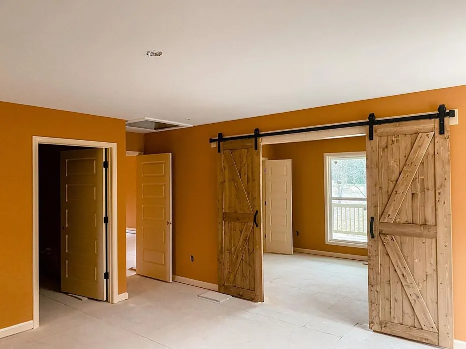
Real rooms painted with Autumnal SW 6361 by Sherwin Williams. Lighting and photography can affect how colors appear — always test a sample swatch in your own space.
Undertones of Autumnal ?
The undertones of Autumnal are a key aspect of its character, leaning towards Red. These subtle underlying hues are what give the color its depth and complexity. For example, a gray with a blue undertone will feel cooler and more modern, while one with a brown undertone will feel warmer and more traditional. It’s essential to test this paint in your home and observe it next to your existing furniture, flooring, and decor to see how these undertones interact and reveal themselves throughout the day.
HEX value: #CD8C5D
RGB code: 205, 140, 93
Is Autumnal Cool or Warm?
This paint is warm, perfect for creating inviting environments that feel like a warm hug. It’s ideal for spaces where relaxation and comfort are key.
Understanding Color Properties and Interior Design Tips
Hue refers to a specific position on the color wheel, measured in degrees from 0 to 360. Each degree represents a different pure color:
- 0° represents red
- 120° represents green
- 240° represents blue
Saturation describes the intensity or purity of a color and is expressed as a percentage:
- At 0%, the color appears completely desaturated—essentially a shade of gray
- At 100%, the color is at its most vivid and vibrant
Lightness indicates how light or dark a color is, also expressed as a percentage:
- 0% lightness results in black
- 100% lightness results in white
Using Warm Colors in Interior Design
Warm hues—such as reds, oranges, yellows, warm beiges, and greiges—are excellent choices for creating inviting and energetic spaces. These colors are particularly well-suited for:
- Kitchens, living rooms, and bathrooms, where warmth enhances comfort and sociability
- Large rooms, where warm tones can help reduce the sense of emptiness and make the space feel more intimate
For example:
- Warm beige shades provide a cozy, inviting atmosphere, ideal for living rooms, bedrooms, and hallways.
- Warm greige (a mix of beige and gray) offers the warmth of beige with the modern appeal of gray, making it a versatile backdrop for dining areas, bedrooms, and living spaces.
However, be mindful when using warm light tones in rooms with limited natural light. These shades may appear muted or even take on an unpleasant yellowish tint. To avoid a dull or flat appearance:
- Add depth by incorporating richer tones like deep greens, charcoal, or chocolate brown
- Use textured elements such as curtains, rugs, or cushions to bring dimension to the space
Pro Tip: Achieving Harmony with Warm and Cool Color Balance
To create a well-balanced and visually interesting interior, mix warm and cool tones strategically. This contrast adds depth and harmony to your design.
- If your walls feature warm hues, introduce cool-colored accents such as blue or green furniture, artwork, or accessories to create contrast.
- For a polished look, consider using a complementary color scheme, which pairs colors opposite each other on the color wheel (e.g., red with green, orange with blue).
This thoughtful mix not only enhances visual appeal but also creates a space that feels both dynamic and cohesive.
Save this color to your Pinterest board to revisit when planning your room.
Light Temperature Affects on Autumnal
Natural Light
Natural daylight changes in color temperature as the sun moves across the sky. At sunrise and sunset, the light tends to have a warm, golden tone with a color temperature around 2000 Kelvin (K). As the day progresses and the sun rises higher, the light becomes cooler and more neutral. Around midday, especially when the sky is clear, natural light typically reaches its peak brightness and shifts to a cooler tone, ranging from 5500 to 6500 Kelvin. This midday light is close to what we perceive as pure white or daylight-balanced light.
These shifts in natural light can significantly influence how colors appear in a space, which is why designers often consider both the time of day and the orientation of windows when planning interior color schemes.
Explore how this color transforms from sunrise through sunset as natural light changes throughout the day. Use the slider to simulate morning light, midday brightness, and warm afternoon tones.
North-facing rooms stay cooler throughout the day and benefit from warmer paint tones to compensate. South-facing rooms receive more direct sunlight, making even deeper shades more workable. East-facing rooms get bright morning light that fades by afternoon, while west-facing rooms glow warmly in the evening.
Artificial Light
When choosing artificial lighting, pay close attention to the color temperature, measured in Kelvin (K). This determines how warm or cool the light will appear. Lower temperatures, around 2700K, give off a warm, yellow glow often used in living rooms or bedrooms. Higher temperatures, above 5000K, create a cool, bluish light similar to daylight, commonly used in kitchens, offices, or task areas.
Use the slider to see how lighting temperature can affect the appearance of a surface or color throughout a space.
See how this color looks under different artificial light temperatures — from warm candlelight (2000K) to cool daylight (7000K). Move the slider to simulate your room's lighting conditions.


4800K
Keep in mind that natural light from windows, the warmth of lamps, and overhead lighting all affect how this color reads on your walls at different times of day. Always observe a sample swatch in your actual space before purchasing.
LRV of Autumnal
The Light Reflectance Value (LRV) of Autumnal is 24%, which places it in the Medium Dark category. This means it reflects very little light. Understanding a paint’s LRV is crucial for predicting how it will look in your space. A higher LRV indicates a lighter color that reflects more light, making rooms feel larger and brighter. A lower LRV signifies a darker color that absorbs more light, creating a cozier, more intimate atmosphere. Always consider the natural and artificial lighting in your room when selecting a paint color based on its LRV.
Detailed Review of Autumnal
Additional Paint Characteristics
Ideal Rooms
Bedroom, Dining Room, Home Office, Living Room
Decor Styles
Bohemian, Modern Farmhouse, Rustic, Traditional
Coverage
Good (1–2 Coats)
Ease of Application
Beginner Friendly, Brush Smooth, Fast-Drying, Roller-Ready
Washability
Washable, Wipeable
VOC Level
Low VOC
Best Use
Accent Wall, Furniture, Interior Walls
Room Suitability
Bedroom, Dining Room, Home Office, Living Room
Tone Tag
Earthy, Muted, Warm
Finish Type
Eggshell, Matte
Paint Performance
Easy Touch-Up, Low Odor, Quick Drying
Use Cases
Best for Cozy Spaces, Best for Modern Farmhouse, Classic Favorite
Mood
Cozy, Inviting, Restful
Trim Pairing
Complements Brass Fixtures, Pairs with White Dove, Works with Warm Trim
When you first apply Autumnal, you’ll notice its smooth consistency that glides on effortlessly. The warm undertones make it a versatile choice, perfect for both contemporary and traditional settings. Whether you’re painting an accent wall or refreshing an entire room, Autumnal provides excellent coverage, requiring just one or two coats for a beautiful finish. It’s especially stunning in natural light, where it creates a soft glow that enhances your decor. Plus, it pairs wonderfully with various trim colors, ensuring a polished look. If you’re after a shade that evokes comfort and warmth, Autumnal is a fantastic choice.
Pros & Cons of SW 6361 Autumnal
Pros
Cons
Colors that go with Sherwin Williams Autumnal
FAQ on SW 6361 Autumnal
Can I use Autumnal in a small room without it feeling cramped?
Absolutely! While Autumnal is a warm and rich color, it can actually create a cozy and inviting atmosphere in smaller rooms. To prevent it from feeling too dark, consider pairing it with lighter trim or incorporating plenty of natural light through windows. Use mirrors or light-colored decor to enhance the space further.
What finishes work best with Autumnal?
Autumnal pairs beautifully with various finishes. For a sophisticated look, try an eggshell or satin finish, which provide a subtle sheen and enhance the warmth of the color. If you’re aiming for a more rustic or traditional vibe, a matte or flat finish can add character and depth. Just keep in mind that the finish will affect the overall look, so choose one that complements your decor style.
Comparisons Autumnal with other colors
Autumnal SW 6361 vs Coral Clay SW 9005
| Attribute | Autumnal SW 6361 | Coral Clay SW 9005 |
|---|---|---|
| Color Name | Autumnal SW 6361 | Coral Clay SW 9005 |
| Color | ||
| Hue | Red | Red |
| Brightness | Medium | Medium |
| RGB | 205, 140, 93 | 191, 121, 110 |
| LRV | 24% | 6% |
| Finish Type | Eggshell, Matte | Eggshell, Matte, Satin |
| Finish Options | Eggshell, Flat, Matte, Satin | Eggshell, Matte, Satin |
| Ideal Rooms | Bedroom, Dining Room, Home Office, Living Room | Bedroom, Dining Room, Home Office, Living Room |
| Decor Styles | Bohemian, Modern Farmhouse, Rustic, Traditional | Bohemian, Coastal, Modern Farmhouse, Rustic |
| Coverage | Good (1–2 Coats) | Good (1–2 Coats) |
| Ease of Application | Beginner Friendly, Brush Smooth, Fast-Drying, Roller-Ready | Beginner Friendly, Brush Smooth, Roller-Ready |
| Washability | Washable, Wipeable | Washable, Wipeable |
| Room Suitability | Bedroom, Dining Room, Home Office, Living Room | Bedroom, Dining Room, Home Office, Living Room |
| Tone | Earthy, Muted, Warm | Earthy, Muted, Warm |
| Paint Performance | Easy Touch-Up, Low Odor, Quick Drying | Easy Touch-Up, High Coverage, Low Odor |
Lighting conditions, wall orientation, and surrounding decor can significantly affect how these colors appear in your space. Always test a sample swatch before committing to a full application.
Autumnal SW 6361 vs Baked Clay SW 6340
| Attribute | Autumnal SW 6361 | Baked Clay SW 6340 |
|---|---|---|
| Color Name | Autumnal SW 6361 | Baked Clay SW 6340 |
| Color | ||
| Hue | Red | Red |
| Brightness | Medium | Medium |
| RGB | 205, 140, 93 | 193, 120, 92 |
| LRV | 24% | 30% |
| Finish Type | Eggshell, Matte | Matte, Satin |
| Finish Options | Eggshell, Flat, Matte, Satin | Eggshell, Matte, Satin |
| Ideal Rooms | Bedroom, Dining Room, Home Office, Living Room | Bedroom, Dining Room, Entryway, Home Office, Kitchen, Living Room |
| Decor Styles | Bohemian, Modern Farmhouse, Rustic, Traditional | Bohemian, Mediterranean, Modern Farmhouse, Rustic, Transitional |
| Coverage | Good (1–2 Coats) | Good (1–2 Coats), Touch-Up Friendly |
| Ease of Application | Beginner Friendly, Brush Smooth, Fast-Drying, Roller-Ready | Beginner Friendly, Brush Smooth, Fast-Drying, Roller-Ready |
| Washability | Washable, Wipeable | Washable, Wipeable |
| Room Suitability | Bedroom, Dining Room, Home Office, Living Room | Bedroom, Dining Room, Entryway, Home Office, Living Room |
| Tone | Earthy, Muted, Warm | Earthy, Muted, Warm |
| Paint Performance | Easy Touch-Up, Low Odor, Quick Drying | Easy Touch-Up, Low Odor, Quick Drying |
Lighting conditions, wall orientation, and surrounding decor can significantly affect how these colors appear in your space. Always test a sample swatch before committing to a full application.
Autumnal SW 6361 vs Mellow Mauve SW 0039
| Attribute | Autumnal SW 6361 | Mellow Mauve SW 0039 |
|---|---|---|
| Color Name | Autumnal SW 6361 | Mellow Mauve SW 0039 |
| Color | ||
| Hue | Red | Red |
| Brightness | Medium | Medium |
| RGB | 205, 140, 93 | 196, 149, 122 |
| LRV | 24% | 24% |
| Finish Type | Eggshell, Matte | Eggshell, Matte, Satin |
| Finish Options | Eggshell, Flat, Matte, Satin | Eggshell, Matte, Satin |
| Ideal Rooms | Bedroom, Dining Room, Home Office, Living Room | Bedroom, Dining Room, Kitchen, Living Room, Nursery |
| Decor Styles | Bohemian, Modern Farmhouse, Rustic, Traditional | Bohemian, Modern, Rustic, Traditional |
| Coverage | Good (1–2 Coats) | Good (1–2 Coats), Touch-Up Friendly |
| Ease of Application | Beginner Friendly, Brush Smooth, Fast-Drying, Roller-Ready | Beginner Friendly, Brush Smooth, Roller-Ready |
| Washability | Washable, Wipeable | Scrubbable, Washable, Wipeable |
| Room Suitability | Bedroom, Dining Room, Home Office, Living Room | Bedroom, Dining Room, Living Room, Nursery |
| Tone | Earthy, Muted, Warm | Dusty, Earthy, Muted, Warm |
| Paint Performance | Easy Touch-Up, Low Odor, Quick Drying | Easy Touch-Up, Low Odor, Quick Drying |
Lighting conditions, wall orientation, and surrounding decor can significantly affect how these colors appear in your space. Always test a sample swatch before committing to a full application.
Autumnal SW 6361 vs Chivalry Copper SW 6353
| Attribute | Autumnal SW 6361 | Chivalry Copper SW 6353 |
|---|---|---|
| Color Name | Autumnal SW 6361 | Chivalry Copper SW 6353 |
| Color | ||
| Hue | Red | Red |
| Brightness | Medium | Medium |
| RGB | 205, 140, 93 | 212, 150, 110 |
| LRV | 24% | 24% |
| Finish Type | Eggshell, Matte | Eggshell, Satin |
| Finish Options | Eggshell, Flat, Matte, Satin | Eggshell, Satin, Semi-Gloss |
| Ideal Rooms | Bedroom, Dining Room, Home Office, Living Room | Bedroom, Dining Room, Entryway, Home Office, Living Room |
| Decor Styles | Bohemian, Modern Farmhouse, Rustic, Traditional | Farmhouse, Modern, Rustic, Transitional |
| Coverage | Good (1–2 Coats) | Good (1–2 Coats), Touch-Up Friendly |
| Ease of Application | Beginner Friendly, Brush Smooth, Fast-Drying, Roller-Ready | Beginner Friendly, Brush Smooth, Fast-Drying, Roller-Ready |
| Washability | Washable, Wipeable | Washable, Wipeable |
| Room Suitability | Bedroom, Dining Room, Home Office, Living Room | Bedroom, Dining Room, Home Office, Living Room |
| Tone | Earthy, Muted, Warm | Earthy, Muted, Warm |
| Paint Performance | Easy Touch-Up, Low Odor, Quick Drying | Easy Touch-Up, High Coverage, Low Odor, Quick Drying |
Lighting conditions, wall orientation, and surrounding decor can significantly affect how these colors appear in your space. Always test a sample swatch before committing to a full application.
Autumnal SW 6361 vs Windswept Canyon SW 9010
| Attribute | Autumnal SW 6361 | Windswept Canyon SW 9010 |
|---|---|---|
| Color Name | Autumnal SW 6361 | Windswept Canyon SW 9010 |
| Color | ||
| Hue | Red | Red |
| Brightness | Medium | Medium |
| RGB | 205, 140, 93 | 219, 164, 128 |
| LRV | 24% | 0% |
| Finish Type | Eggshell, Matte | Eggshell, Matte, Satin |
| Finish Options | Eggshell, Flat, Matte, Satin | Eggshell, Matte, Satin |
| Ideal Rooms | Bedroom, Dining Room, Home Office, Living Room | Bedroom, Dining Room, Home Office, Kitchen, Living Room |
| Decor Styles | Bohemian, Modern Farmhouse, Rustic, Traditional | Bohemian, Coastal, Modern Farmhouse, Rustic, Transitional |
| Coverage | Good (1–2 Coats) | Good (1–2 Coats) |
| Ease of Application | Beginner Friendly, Brush Smooth, Fast-Drying, Roller-Ready | Beginner Friendly, Brush Smooth, Fast-Drying, Roller-Ready |
| Washability | Washable, Wipeable | Highly Washable, Washable |
| Room Suitability | Bedroom, Dining Room, Home Office, Living Room | Bedroom, Dining Room, Home Office, Kitchen, Living Room |
| Tone | Earthy, Muted, Warm | Earthy, Muted, Warm |
| Paint Performance | Easy Touch-Up, Low Odor, Quick Drying | High Coverage, Low Odor, Quick Drying |
Lighting conditions, wall orientation, and surrounding decor can significantly affect how these colors appear in your space. Always test a sample swatch before committing to a full application.
Autumnal SW 6361 vs Navel SW 6887
| Attribute | Autumnal SW 6361 | Navel SW 6887 |
|---|---|---|
| Color Name | Autumnal SW 6361 | Navel SW 6887 |
| Color | ||
| Hue | Red | Red |
| Brightness | Medium | Medium |
| RGB | 205, 140, 93 | 236, 132, 48 |
| LRV | 24% | 4% |
| Finish Type | Eggshell, Matte | Satin, Semi-Gloss |
| Finish Options | Eggshell, Flat, Matte, Satin | Eggshell, Satin, Semi-Gloss |
| Ideal Rooms | Bedroom, Dining Room, Home Office, Living Room | Dining Room, Entryway, Home Office, Kitchen, Living Room |
| Decor Styles | Bohemian, Modern Farmhouse, Rustic, Traditional | Bohemian, Contemporary, Modern, Rustic |
| Coverage | Good (1–2 Coats) | Good (1–2 Coats), Touch-Up Friendly |
| Ease of Application | Beginner Friendly, Brush Smooth, Fast-Drying, Roller-Ready | Beginner Friendly, Brush Smooth, Fast-Drying, Roller-Ready |
| Washability | Washable, Wipeable | Washable, Wipeable |
| Room Suitability | Bedroom, Dining Room, Home Office, Living Room | Dining Room, Home Office, Kitchen, Living Room |
| Tone | Earthy, Muted, Warm | Bold, Earthy, Warm |
| Paint Performance | Easy Touch-Up, Low Odor, Quick Drying | Low Odor, Quick Drying, Scuff Resistant |
Lighting conditions, wall orientation, and surrounding decor can significantly affect how these colors appear in your space. Always test a sample swatch before committing to a full application.
Autumnal SW 6361 vs Invigorate SW 6886
| Attribute | Autumnal SW 6361 | Invigorate SW 6886 |
|---|---|---|
| Color Name | Autumnal SW 6361 | Invigorate SW 6886 |
| Color | ||
| Hue | Red | Red |
| Brightness | Medium | Medium |
| RGB | 205, 140, 93 | 228, 114, 55 |
| LRV | 24% | 40% |
| Finish Type | Eggshell, Matte | Satin, Semi-Gloss |
| Finish Options | Eggshell, Flat, Matte, Satin | Matte, Satin, Semi-Gloss |
| Ideal Rooms | Bedroom, Dining Room, Home Office, Living Room | Dining Room, Entryway, Home Office, Kitchen, Living Room |
| Decor Styles | Bohemian, Modern Farmhouse, Rustic, Traditional | Bohemian, Eclectic, Modern, Transitional |
| Coverage | Good (1–2 Coats) | Good (1–2 Coats), Touch-Up Friendly |
| Ease of Application | Beginner Friendly, Brush Smooth, Fast-Drying, Roller-Ready | Beginner Friendly, Brush Smooth, Fast-Drying, Roller-Ready |
| Washability | Washable, Wipeable | Highly Washable, Washable |
| Room Suitability | Bedroom, Dining Room, Home Office, Living Room | Dining Room, Home Office, Kitchen, Living Room |
| Tone | Earthy, Muted, Warm | Bold, Earthy, Warm |
| Paint Performance | Easy Touch-Up, Low Odor, Quick Drying | Easy Touch-Up, High Coverage, Low Odor, Quick Drying |
Lighting conditions, wall orientation, and surrounding decor can significantly affect how these colors appear in your space. Always test a sample swatch before committing to a full application.
Autumnal SW 6361 vs Knockout Orange SW 6885
| Attribute | Autumnal SW 6361 | Knockout Orange SW 6885 |
|---|---|---|
| Color Name | Autumnal SW 6361 | Knockout Orange SW 6885 |
| Color | ||
| Hue | Red | Red |
| Brightness | Medium | Medium |
| RGB | 205, 140, 93 | 225, 111, 62 |
| LRV | 24% | 45% |
| Finish Type | Eggshell, Matte | Matte, Satin, Semi-Gloss |
| Finish Options | Eggshell, Flat, Matte, Satin | Matte, Satin, Semi-Gloss |
| Ideal Rooms | Bedroom, Dining Room, Home Office, Living Room | Dining Room, Home Office, Kids Room, Kitchen, Living Room |
| Decor Styles | Bohemian, Modern Farmhouse, Rustic, Traditional | Contemporary, Eclectic, Industrial, Modern, Transitional |
| Coverage | Good (1–2 Coats) | Good (1–2 Coats), High Hide, Touch-Up Friendly |
| Ease of Application | Beginner Friendly, Brush Smooth, Fast-Drying, Roller-Ready | Beginner Friendly, Brush Smooth, Fast-Drying, Low Splatter, Roller-Ready |
| Washability | Washable, Wipeable | Scrubbable, Stain Resistant, Washable |
| Room Suitability | Bedroom, Dining Room, Home Office, Living Room | Dining Room, Entryway, Kids Room, Kitchen, Living Room |
| Tone | Earthy, Muted, Warm | Bold, Inviting, Warm |
| Paint Performance | Easy Touch-Up, Low Odor, Quick Drying | Easy Touch-Up, High Coverage, Long Lasting, Scuff Resistant |
Lighting conditions, wall orientation, and surrounding decor can significantly affect how these colors appear in your space. Always test a sample swatch before committing to a full application.
Autumnal SW 6361 vs Outgoing Orange SW 6641
| Attribute | Autumnal SW 6361 | Outgoing Orange SW 6641 |
|---|---|---|
| Color Name | Autumnal SW 6361 | Outgoing Orange SW 6641 |
| Color | ||
| Hue | Red | Red |
| Brightness | Medium | Medium |
| RGB | 205, 140, 93 | 230, 149, 95 |
| LRV | 24% | 45% |
| Finish Type | Eggshell, Matte | Satin, Semi-Gloss |
| Finish Options | Eggshell, Flat, Matte, Satin | Eggshell, Flat, Satin, Semi-Gloss |
| Ideal Rooms | Bedroom, Dining Room, Home Office, Living Room | Dining Room, Entryway, Kitchen, Living Room |
| Decor Styles | Bohemian, Modern Farmhouse, Rustic, Traditional | Bohemian, Eclectic, Modern, Transitional |
| Coverage | Good (1–2 Coats) | Good (1–2 Coats), Touch-Up Friendly |
| Ease of Application | Beginner Friendly, Brush Smooth, Fast-Drying, Roller-Ready | Beginner Friendly, Brush Smooth, Fast-Drying, Roller-Ready |
| Washability | Washable, Wipeable | Highly Washable, Washable |
| Room Suitability | Bedroom, Dining Room, Home Office, Living Room | Dining Room, Entryway, Kitchen, Living Room |
| Tone | Earthy, Muted, Warm | Bold, Warm |
| Paint Performance | Easy Touch-Up, Low Odor, Quick Drying | High Coverage, Low Odor, Quick Drying |
Lighting conditions, wall orientation, and surrounding decor can significantly affect how these colors appear in your space. Always test a sample swatch before committing to a full application.
Autumnal SW 6361 vs English Ochre CW-290
| Attribute | Autumnal SW 6361 | English Ochre CW-290 |
|---|---|---|
| Color Name | Autumnal SW 6361 | English Ochre CW-290 |
| Color | ||
| Hue | Red | Red |
| Brightness | Medium | Medium |
| RGB | 205, 140, 93 | 189, 125, 72 |
| LRV | 24% | 26.32% |
| Finish Type | Eggshell, Matte | Eggshell, Satin |
| Finish Options | Eggshell, Flat, Matte, Satin | Eggshell, Flat, Matte, Satin |
| Ideal Rooms | Bedroom, Dining Room, Home Office, Living Room | Bedroom, Dining Room, Entryway, Home Office, Living Room |
| Decor Styles | Bohemian, Modern Farmhouse, Rustic, Traditional | Bohemian, Contemporary, Farmhouse, Rustic, Traditional |
| Coverage | Good (1–2 Coats) | Good (1–2 Coats), Touch-Up Friendly |
| Ease of Application | Beginner Friendly, Brush Smooth, Fast-Drying, Roller-Ready | Beginner Friendly, Brush Smooth, Roller-Ready |
| Washability | Washable, Wipeable | Washable, Wipeable |
| Room Suitability | Bedroom, Dining Room, Home Office, Living Room | Bedroom, Dining Room, Entryway, Home Office, Living Room |
| Tone | Earthy, Muted, Warm | Earthy, Muted, Warm |
| Paint Performance | Easy Touch-Up, Low Odor, Quick Drying | Easy Touch-Up, High Coverage, Low Odor |
Lighting conditions, wall orientation, and surrounding decor can significantly affect how these colors appear in your space. Always test a sample swatch before committing to a full application.
Official Page of Sherwin Williams Autumnal SW 6361