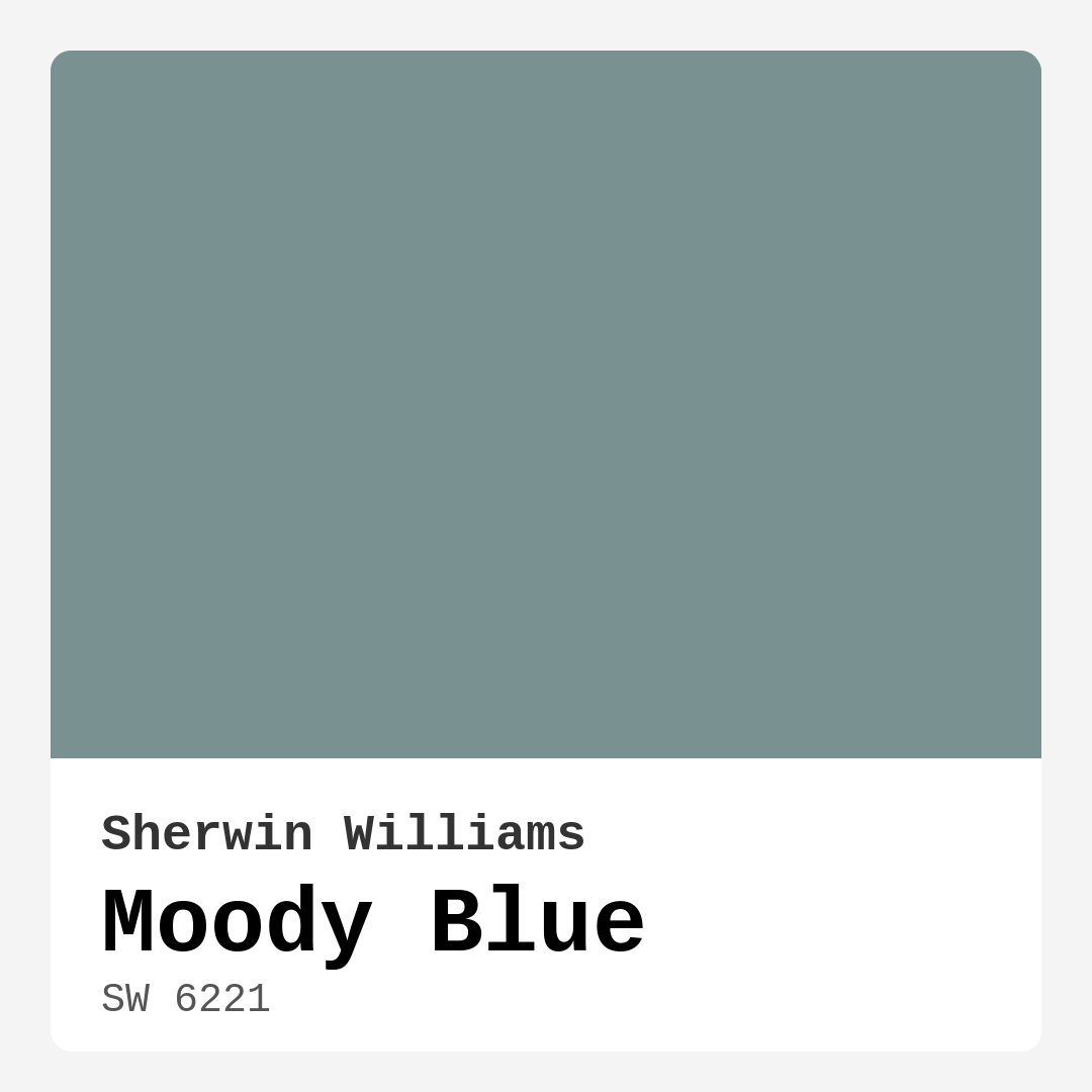
Color Preview & Key Details
| HEX Code | #7A9192 |
| RGB | 122, 145, 146 |
| LRV | 10% |
| Undertone | Blue |
| Finish Options | Eggshell, Matte, Satin |
Imagine stepping into a room that instantly wraps you in a cozy embrace, a soothing atmosphere that invites relaxation and calm. That’s the magic of Moody Blue by Sherwin Williams. This enchanting blue-gray hue is more than just a paint color; it’s a mood-setter, a design statement, and a versatile choice that can elevate any space in your home.
Moody Blue, with its color code SW 6221, boasts a captivating blend of tranquility and sophistication. Its medium brightness and low light reflectance value of 10% mean that it doesn’t bounce light around the room, creating an intimate, cozy vibe. This is especially appealing in spaces where you want to unwind, such as a bedroom or living room. But don’t let its darker nature fool you—this color can be a star in well-lit areas, where it can brighten up without overwhelming the senses.
You’ll find that Moody Blue has a subtle blue undertone that gives it depth and character. This means it can adapt beautifully to various lighting conditions. In bright daylight, it often appears more vibrant, while in the evening, it can transform into a deeper, more subdued tone. This shifting quality makes it a dynamic choice for those who want a color that evolves with the time of day.
Thinking of using Moody Blue in a smaller room? You might be pleasantly surprised! While it can appear darker in cozy spaces, if you have ample natural light, it creates an inviting atmosphere. If your room lacks windows, consider pairing it with bright white trim to keep the area feeling open and airy. White Dove or Simply White are fantastic options that provide a crisp contrast and keep the look fresh and modern.
When it comes to decor styles, Moody Blue is incredibly versatile. It can seamlessly blend into coastal, modern farmhouse, contemporary, and transitional aesthetics. Whether you’re decorating a serene bedroom retreat or a stylish home office, this color serves as a delightful backdrop. Imagine it on your walls, contrasted with warm wood tones or modern metallic fixtures, creating an inviting yet sophisticated ambiance.
Now, let’s talk finishes. Moody Blue comes in matte, eggshell, and satin options, allowing you to choose the right sheen for your project. Matte offers a smooth, non-reflective look, which can further enhance the depth of the color. Eggshell provides a slight sheen that’s easy to clean, perfect for high-traffic areas. Satin adds a soft glow, making it an excellent choice for spaces where you want a bit more polish.
Coverage is another plus. Moody Blue applies beautifully, easily covering surfaces with just one to two coats, making it beginner-friendly. Whether you’re using a brush or roller, you’ll appreciate how smoothly it goes on. And for those with kids or pets, you’ll be pleased to know it’s highly washable, so keeping your walls looking fresh is a breeze.
If you’re considering complementing Moody Blue with other colors, you’ve got plenty of options. It pairs well with a range of shades, including the subtle greens of SW 6280 and SW 6013, as well as richer tones like SW 6015. If you’re leaning toward a more dramatic look, try it with blacks or dark woods for a striking effect. You can also incorporate brass fixtures to add a touch of warmth and sophistication, making the entire space feel curated and intentional.
On the flip side, it’s good to know that Moody Blue may be perceived as too muted or dark for some people, especially in small or poorly lit rooms. To counteract this, consider using ample white accents, mirrors, or light-colored furniture to create a balanced look. This will help you maintain that inviting atmosphere without feeling cramped.
One of the best uses for Moody Blue is as an accent wall. Imagine one wall in your living room or bedroom drenched in this deep, calming shade, while the others remain lighter to keep the room feeling open. It draws the eye and creates a focal point that’s both inviting and sophisticated. It also works well on furniture pieces, like a dresser or a coffee table, allowing you to incorporate this gorgeous hue without committing to an entire room.
Before diving in, don’t forget to test the paint in your actual space. Observing how the color interacts with your existing furnishings and decor is crucial. Paint swatches on your walls and see how the light changes its appearance throughout the day. Trust me; this step can save you from potential buyer’s remorse.
With low VOC levels, you can breathe easy knowing Moody Blue is a safe choice for your home. It’s an eco-friendly option that keeps air quality in mind, making it ideal for families. The low odor also means you won’t be overwhelmed by paint fumes, allowing you to enjoy your freshly painted space sooner.
In summary, Moody Blue is a captivating color that combines depth, sophistication, and versatility. Whether you’re redesigning your living room, bedroom, or home office, it provides a beautiful backdrop that adapts to various decor styles. Its rich undertones and shifting qualities make it a dynamic choice that feels both modern and timeless. As you embark on your painting journey, keep these tips in mind, and let the transformative power of Moody Blue work its magic in your home. You’ll create a space that feels uniquely yours, inviting and calming, yet undeniably stylish. So, are you ready to embrace the mood of Moody Blue? Let’s get started!
Save this color to your Pinterest board to revisit when planning your room.
Real Room Photo of Moody Blue SW 6221
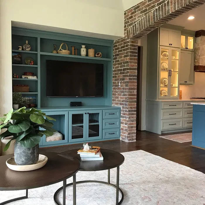
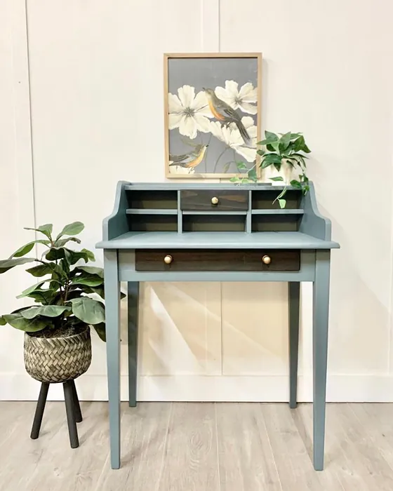
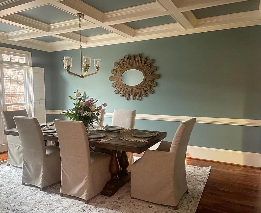
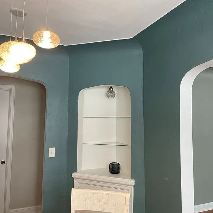
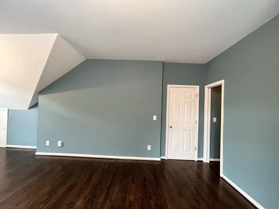
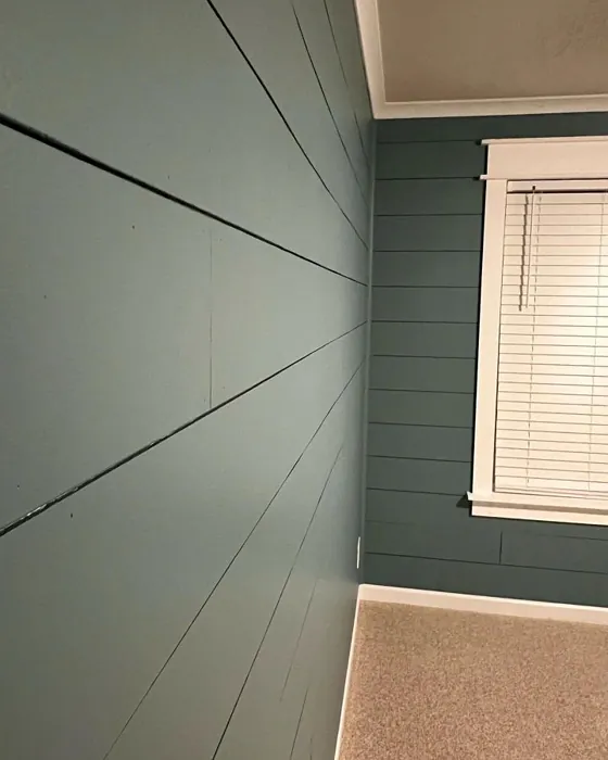
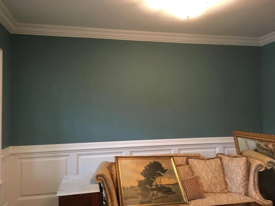
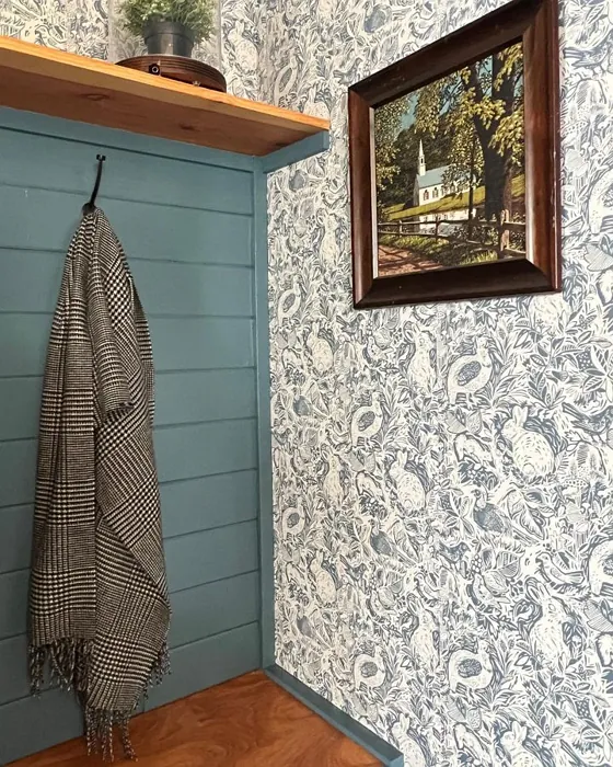
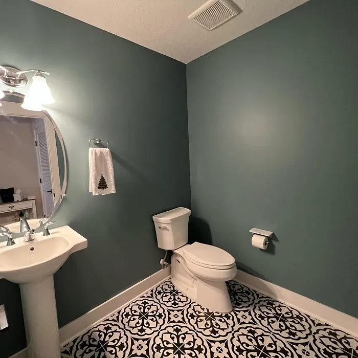
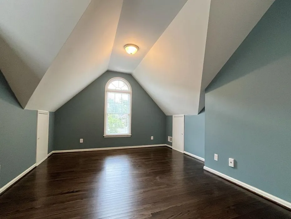
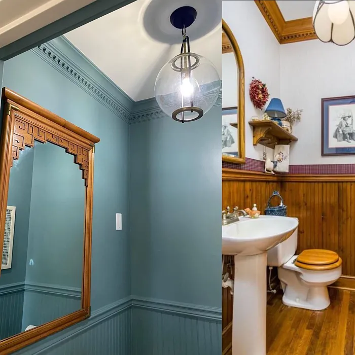
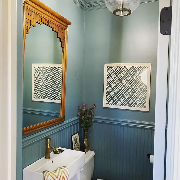
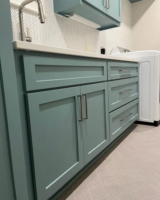
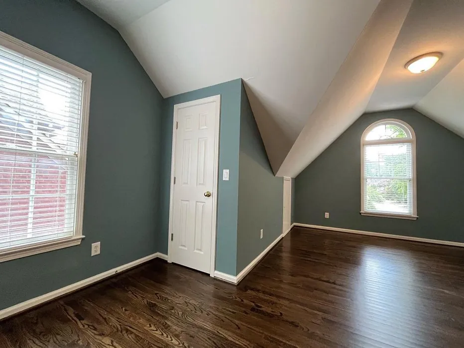
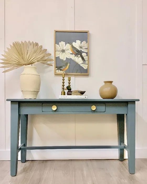
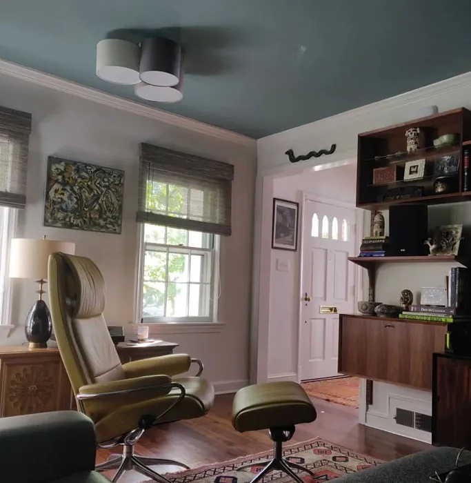
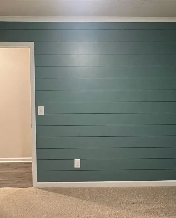
Real rooms painted with Moody Blue SW 6221 by Sherwin Williams. Lighting and photography can affect how colors appear — always test a sample swatch in your own space.
Undertones of Moody Blue ?
The undertones of Moody Blue are a key aspect of its character, leaning towards Blue. These subtle underlying hues are what give the color its depth and complexity. For example, a gray with a blue undertone will feel cooler and more modern, while one with a brown undertone will feel warmer and more traditional. It’s essential to test this paint in your home and observe it next to your existing furniture, flooring, and decor to see how these undertones interact and reveal themselves throughout the day.
HEX value: #7A9192
RGB code: 122, 145, 146
Is Moody Blue Cool or Warm?
This color leans toward the cool side of the spectrum, ideal for creating a refreshing and calming atmosphere.
Understanding Color Properties and Interior Design Tips
Hue refers to a specific position on the color wheel, measured in degrees from 0 to 360. Each degree represents a different pure color:
- 0° represents red
- 120° represents green
- 240° represents blue
Saturation describes the intensity or purity of a color and is expressed as a percentage:
- At 0%, the color appears completely desaturated—essentially a shade of gray
- At 100%, the color is at its most vivid and vibrant
Lightness indicates how light or dark a color is, also expressed as a percentage:
- 0% lightness results in black
- 100% lightness results in white
Using Warm Colors in Interior Design
Warm hues—such as reds, oranges, yellows, warm beiges, and greiges—are excellent choices for creating inviting and energetic spaces. These colors are particularly well-suited for:
- Kitchens, living rooms, and bathrooms, where warmth enhances comfort and sociability
- Large rooms, where warm tones can help reduce the sense of emptiness and make the space feel more intimate
For example:
- Warm beige shades provide a cozy, inviting atmosphere, ideal for living rooms, bedrooms, and hallways.
- Warm greige (a mix of beige and gray) offers the warmth of beige with the modern appeal of gray, making it a versatile backdrop for dining areas, bedrooms, and living spaces.
However, be mindful when using warm light tones in rooms with limited natural light. These shades may appear muted or even take on an unpleasant yellowish tint. To avoid a dull or flat appearance:
- Add depth by incorporating richer tones like deep greens, charcoal, or chocolate brown
- Use textured elements such as curtains, rugs, or cushions to bring dimension to the space
Pro Tip: Achieving Harmony with Warm and Cool Color Balance
To create a well-balanced and visually interesting interior, mix warm and cool tones strategically. This contrast adds depth and harmony to your design.
- If your walls feature warm hues, introduce cool-colored accents such as blue or green furniture, artwork, or accessories to create contrast.
- For a polished look, consider using a complementary color scheme, which pairs colors opposite each other on the color wheel (e.g., red with green, orange with blue).
This thoughtful mix not only enhances visual appeal but also creates a space that feels both dynamic and cohesive.
Save this color to your Pinterest board to revisit when planning your room.
Light Temperature Affects on Moody Blue
Natural Light
Natural daylight changes in color temperature as the sun moves across the sky. At sunrise and sunset, the light tends to have a warm, golden tone with a color temperature around 2000 Kelvin (K). As the day progresses and the sun rises higher, the light becomes cooler and more neutral. Around midday, especially when the sky is clear, natural light typically reaches its peak brightness and shifts to a cooler tone, ranging from 5500 to 6500 Kelvin. This midday light is close to what we perceive as pure white or daylight-balanced light.
These shifts in natural light can significantly influence how colors appear in a space, which is why designers often consider both the time of day and the orientation of windows when planning interior color schemes.
Explore how this color transforms from sunrise through sunset as natural light changes throughout the day. Use the slider to simulate morning light, midday brightness, and warm afternoon tones.
North-facing rooms stay cooler throughout the day and benefit from warmer paint tones to compensate. South-facing rooms receive more direct sunlight, making even deeper shades more workable. East-facing rooms get bright morning light that fades by afternoon, while west-facing rooms glow warmly in the evening.
Artificial Light
When choosing artificial lighting, pay close attention to the color temperature, measured in Kelvin (K). This determines how warm or cool the light will appear. Lower temperatures, around 2700K, give off a warm, yellow glow often used in living rooms or bedrooms. Higher temperatures, above 5000K, create a cool, bluish light similar to daylight, commonly used in kitchens, offices, or task areas.
Use the slider to see how lighting temperature can affect the appearance of a surface or color throughout a space.
See how this color looks under different artificial light temperatures — from warm candlelight (2000K) to cool daylight (7000K). Move the slider to simulate your room's lighting conditions.


4800K
Keep in mind that natural light from windows, the warmth of lamps, and overhead lighting all affect how this color reads on your walls at different times of day. Always observe a sample swatch in your actual space before purchasing.
LRV of Moody Blue
The Light Reflectance Value (LRV) of Moody Blue is 10%, which places it in the Dark colors category. This means it does not reflect light. Understanding a paint’s LRV is crucial for predicting how it will look in your space. A higher LRV indicates a lighter color that reflects more light, making rooms feel larger and brighter. A lower LRV signifies a darker color that absorbs more light, creating a cozier, more intimate atmosphere. Always consider the natural and artificial lighting in your room when selecting a paint color based on its LRV.
Detailed Review of Moody Blue
Additional Paint Characteristics
Ideal Rooms
Bedroom, Dining Room, Hallway, Home Office, Living Room
Decor Styles
Coastal, Contemporary, Modern Farmhouse, Transitional
Coverage
Good (1–2 Coats)
Ease of Application
Beginner Friendly, Brush Smooth, Roller-Ready
Washability
Highly Washable, Washable
VOC Level
Low VOC, Ultra Low VOC
Best Use
Accent Wall, Furniture, Interior Walls
Room Suitability
Bedroom, Dining Room, Home Office, Living Room
Tone Tag
Cool, Deep, Moody, Muted
Finish Type
Eggshell, Matte, Satin
Paint Performance
Easy Touch-Up, Fade Resistant, High Coverage, Low Odor
Use Cases
Best for Low Light Rooms, Best for Rentals, Designer Favorite, Trending in 2025
Mood
Calm, Cozy, Inviting, Sophisticated
Trim Pairing
Complements Brass Fixtures, Matches Pure White, Pairs with White Dove, Works with Warm Trim
When it comes to transforming a room, Moody Blue is truly a standout choice. This color isn’t just beautiful; it’s incredibly versatile. Whether you’re looking to create a serene bedroom retreat or a stylish home office, Moody Blue provides the perfect backdrop. The color shifts slightly with changing light, sometimes appearing more blue in daylight and taking on a deeper gray tone in the evening. It pairs wonderfully with both warm and cool accents, allowing for a range of decor styles from coastal chic to modern elegance. Plus, its finish options—matte, eggshell, and satin—give you the flexibility to choose the right sheen for your space. Overall, this paint delivers a rich, inviting atmosphere that feels both sophisticated and comfortable.
Pros & Cons of SW 6221 Moody Blue
Pros
Cons
Colors that go with Sherwin Williams Moody Blue
FAQ on SW 6221 Moody Blue
Can I use Moody Blue in a small room?
Absolutely! Moody Blue can work in smaller spaces, but it’s essential to consider the amount of natural light. In well-lit areas, it creates a cozy vibe without feeling cramped. If the room is dim, you might find it a bit darker than expected, so pairing it with plenty of white accents can help maintain an open feel.
What trim colors work best with Moody Blue?
Moody Blue pairs beautifully with a range of trim colors. White Dove or Simply White creates a crisp contrast, while warmer woods add a cozy touch. For a modern look, consider pairing it with black windows or brass fixtures for a striking effect.
Comparisons Moody Blue with other colors
Moody Blue SW 6221 vs Dutch Tile Blue SW 0031
| Attribute | Moody Blue SW 6221 | Dutch Tile Blue SW 0031 |
|---|---|---|
| Color Name | Moody Blue SW 6221 | Dutch Tile Blue SW 0031 |
| Color | ||
| Hue | Blue | Blue |
| Brightness | Medium | Medium |
| RGB | 122, 145, 146 | 154, 171, 171 |
| LRV | 10% | 24% |
| Finish Type | Eggshell, Matte, Satin | Eggshell, Matte, Satin |
| Finish Options | Eggshell, Matte, Satin | Eggshell, Flat, Matte, Satin |
| Ideal Rooms | Bedroom, Dining Room, Hallway, Home Office, Living Room | Bathroom, Bedroom, Dining Room, Hallway, Home Office, Kitchen, Living Room |
| Decor Styles | Coastal, Contemporary, Modern Farmhouse, Transitional | Coastal, Modern Farmhouse, Scandinavian, Traditional, Transitional |
| Coverage | Good (1–2 Coats) | Good (1–2 Coats) |
| Ease of Application | Beginner Friendly, Brush Smooth, Roller-Ready | Beginner Friendly, Brush Smooth, Fast-Drying, Roller-Ready |
| Washability | Highly Washable, Washable | Highly Washable, Washable |
| Room Suitability | Bedroom, Dining Room, Home Office, Living Room | Bathroom, Bedroom, Dining Room, Kitchen, Living Room |
| Tone | Cool, Deep, Moody, Muted | Balanced, Cool, Muted |
| Paint Performance | Easy Touch-Up, Fade Resistant, High Coverage, Low Odor | Easy Touch-Up, High Coverage, Low Odor, Quick Drying |
Lighting conditions, wall orientation, and surrounding decor can significantly affect how these colors appear in your space. Always test a sample swatch before committing to a full application.
Moody Blue SW 6221 vs Debonair SW 9139
| Attribute | Moody Blue SW 6221 | Debonair SW 9139 |
|---|---|---|
| Color Name | Moody Blue SW 6221 | Debonair SW 9139 |
| Color | ||
| Hue | Blue | Blue |
| Brightness | Medium | Medium |
| RGB | 122, 145, 146 | 144, 160, 166 |
| LRV | 10% | 30% |
| Finish Type | Eggshell, Matte, Satin | Eggshell, Matte, Satin |
| Finish Options | Eggshell, Matte, Satin | Eggshell, Matte, Satin |
| Ideal Rooms | Bedroom, Dining Room, Hallway, Home Office, Living Room | Bedroom, Dining Room, Home Office, Living Room |
| Decor Styles | Coastal, Contemporary, Modern Farmhouse, Transitional | Coastal, Industrial, Modern, Transitional |
| Coverage | Good (1–2 Coats) | Good (1–2 Coats) |
| Ease of Application | Beginner Friendly, Brush Smooth, Roller-Ready | Beginner Friendly, Brush Smooth, Roller-Ready |
| Washability | Highly Washable, Washable | Washable, Wipeable |
| Room Suitability | Bedroom, Dining Room, Home Office, Living Room | Bedroom, Dining Room, Home Office, Living Room |
| Tone | Cool, Deep, Moody, Muted | Balanced, Cool, Muted |
| Paint Performance | Easy Touch-Up, Fade Resistant, High Coverage, Low Odor | Easy Touch-Up, Low Odor, Quick Drying |
Lighting conditions, wall orientation, and surrounding decor can significantly affect how these colors appear in your space. Always test a sample swatch before committing to a full application.
Moody Blue SW 6221 vs Stardew SW 9138
| Attribute | Moody Blue SW 6221 | Stardew SW 9138 |
|---|---|---|
| Color Name | Moody Blue SW 6221 | Stardew SW 9138 |
| Color | ||
| Hue | Blue | Blue |
| Brightness | Medium | Medium |
| RGB | 122, 145, 146 | 166, 178, 181 |
| LRV | 10% | 30% |
| Finish Type | Eggshell, Matte, Satin | Eggshell, Satin |
| Finish Options | Eggshell, Matte, Satin | Eggshell, Matte, Satin |
| Ideal Rooms | Bedroom, Dining Room, Hallway, Home Office, Living Room | Bathroom, Bedroom, Home Office, Living Room, Nursery |
| Decor Styles | Coastal, Contemporary, Modern Farmhouse, Transitional | Coastal, Farmhouse, Modern, Scandinavian |
| Coverage | Good (1–2 Coats) | Good (1–2 Coats) |
| Ease of Application | Beginner Friendly, Brush Smooth, Roller-Ready | Beginner Friendly, Brush Smooth, Roller-Ready |
| Washability | Highly Washable, Washable | Highly Washable, Washable, Wipeable |
| Room Suitability | Bedroom, Dining Room, Home Office, Living Room | Bathroom, Bedroom, Home Office, Living Room |
| Tone | Cool, Deep, Moody, Muted | Calm, Cool, Muted |
| Paint Performance | Easy Touch-Up, Fade Resistant, High Coverage, Low Odor | Easy Touch-Up, High Coverage, Low Odor |
Lighting conditions, wall orientation, and surrounding decor can significantly affect how these colors appear in your space. Always test a sample swatch before committing to a full application.
Moody Blue SW 6221 vs Niebla Azul SW 9137
| Attribute | Moody Blue SW 6221 | Niebla Azul SW 9137 |
|---|---|---|
| Color Name | Moody Blue SW 6221 | Niebla Azul SW 9137 |
| Color | ||
| Hue | Blue | Blue |
| Brightness | Medium | Medium |
| RGB | 122, 145, 146 | 182, 195, 196 |
| LRV | 10% | 48% |
| Finish Type | Eggshell, Matte, Satin | Eggshell, Matte, Satin |
| Finish Options | Eggshell, Matte, Satin | Eggshell, Matte, Satin |
| Ideal Rooms | Bedroom, Dining Room, Hallway, Home Office, Living Room | Bedroom, Home Office, Living Room, Nursery |
| Decor Styles | Coastal, Contemporary, Modern Farmhouse, Transitional | Coastal, Modern, Scandinavian, Transitional |
| Coverage | Good (1–2 Coats) | Good (1–2 Coats), Touch-Up Friendly |
| Ease of Application | Beginner Friendly, Brush Smooth, Roller-Ready | Beginner Friendly, Brush Smooth, Roller-Ready |
| Washability | Highly Washable, Washable | Highly Washable, Washable |
| Room Suitability | Bedroom, Dining Room, Home Office, Living Room | Bedroom, Home Office, Living Room, Nursery |
| Tone | Cool, Deep, Moody, Muted | Airy, Cool, Muted |
| Paint Performance | Easy Touch-Up, Fade Resistant, High Coverage, Low Odor | Easy Touch-Up, Fade Resistant, Low Odor, Scuff Resistant |
Lighting conditions, wall orientation, and surrounding decor can significantly affect how these colors appear in your space. Always test a sample swatch before committing to a full application.
Moody Blue SW 6221 vs Rain SW 6219
| Attribute | Moody Blue SW 6221 | Rain SW 6219 |
|---|---|---|
| Color Name | Moody Blue SW 6221 | Rain SW 6219 |
| Color | ||
| Hue | Blue | Blue |
| Brightness | Medium | Medium |
| RGB | 122, 145, 146 | 171, 190, 191 |
| LRV | 10% | 50% |
| Finish Type | Eggshell, Matte, Satin | Eggshell, Matte, Satin |
| Finish Options | Eggshell, Matte, Satin | Eggshell, Matte, Satin |
| Ideal Rooms | Bedroom, Dining Room, Hallway, Home Office, Living Room | Bathroom, Bedroom, Home Office, Living Room, Nursery |
| Decor Styles | Coastal, Contemporary, Modern Farmhouse, Transitional | Coastal, Minimalist, Modern, Scandinavian, Transitional |
| Coverage | Good (1–2 Coats) | Good (1–2 Coats), Touch-Up Friendly |
| Ease of Application | Beginner Friendly, Brush Smooth, Roller-Ready | Beginner Friendly, Brush Smooth, Fast-Drying, Roller-Ready |
| Washability | Highly Washable, Washable | Scrubbable, Stain Resistant, Washable |
| Room Suitability | Bedroom, Dining Room, Home Office, Living Room | Bathroom, Bedroom, Home Office, Living Room, Nursery |
| Tone | Cool, Deep, Moody, Muted | Balanced, Cool, Muted |
| Paint Performance | Easy Touch-Up, Fade Resistant, High Coverage, Low Odor | Easy Touch-Up, Low Odor, Quick Drying, Stain Resistant |
Lighting conditions, wall orientation, and surrounding decor can significantly affect how these colors appear in your space. Always test a sample swatch before committing to a full application.
Moody Blue SW 6221 vs Morning at Sea SW 9634
| Attribute | Moody Blue SW 6221 | Morning at Sea SW 9634 |
|---|---|---|
| Color Name | Moody Blue SW 6221 | Morning at Sea SW 9634 |
| Color | ||
| Hue | Blue | Blue |
| Brightness | Medium | Medium |
| RGB | 122, 145, 146 | 130, 151, 155 |
| LRV | 10% | 50% |
| Finish Type | Eggshell, Matte, Satin | Eggshell, Matte |
| Finish Options | Eggshell, Matte, Satin | Eggshell, Matte, Satin |
| Ideal Rooms | Bedroom, Dining Room, Hallway, Home Office, Living Room | Bathroom, Bedroom, Home Office, Living Room |
| Decor Styles | Coastal, Contemporary, Modern Farmhouse, Transitional | Coastal, Minimalist, Modern, Scandinavian |
| Coverage | Good (1–2 Coats) | Good (1–2 Coats), Touch-Up Friendly |
| Ease of Application | Beginner Friendly, Brush Smooth, Roller-Ready | Beginner Friendly, Brush Smooth, Roller-Ready |
| Washability | Highly Washable, Washable | Washable, Wipeable |
| Room Suitability | Bedroom, Dining Room, Home Office, Living Room | Bathroom, Bedroom, Home Office, Living Room |
| Tone | Cool, Deep, Moody, Muted | Airy, Cool, Muted |
| Paint Performance | Easy Touch-Up, Fade Resistant, High Coverage, Low Odor | Easy Touch-Up, Fade Resistant, Low Odor |
Lighting conditions, wall orientation, and surrounding decor can significantly affect how these colors appear in your space. Always test a sample swatch before committing to a full application.
Moody Blue SW 6221 vs Sleepy Blue SW 6225
| Attribute | Moody Blue SW 6221 | Sleepy Blue SW 6225 |
|---|---|---|
| Color Name | Moody Blue SW 6221 | Sleepy Blue SW 6225 |
| Color | ||
| Hue | Blue | Blue |
| Brightness | Medium | Medium |
| RGB | 122, 145, 146 | 188, 203, 206 |
| LRV | 10% | 50% |
| Finish Type | Eggshell, Matte, Satin | Eggshell, Matte, Satin |
| Finish Options | Eggshell, Matte, Satin | Eggshell, Matte, Satin |
| Ideal Rooms | Bedroom, Dining Room, Hallway, Home Office, Living Room | Bedroom, Home Office, Living Room, Nursery |
| Decor Styles | Coastal, Contemporary, Modern Farmhouse, Transitional | Coastal, Minimalist, Modern Farmhouse, Scandinavian |
| Coverage | Good (1–2 Coats) | Good (1–2 Coats) |
| Ease of Application | Beginner Friendly, Brush Smooth, Roller-Ready | Beginner Friendly, Brush Smooth, Fast-Drying, Roller-Ready |
| Washability | Highly Washable, Washable | Highly Washable, Washable |
| Room Suitability | Bedroom, Dining Room, Home Office, Living Room | Bedroom, Home Office, Living Room, Nursery |
| Tone | Cool, Deep, Moody, Muted | Airy, Cool, Muted |
| Paint Performance | Easy Touch-Up, Fade Resistant, High Coverage, Low Odor | Easy Touch-Up, Low Odor, Quick Drying, Scuff Resistant |
Lighting conditions, wall orientation, and surrounding decor can significantly affect how these colors appear in your space. Always test a sample swatch before committing to a full application.
Moody Blue SW 6221 vs Lakeside SW 9683
| Attribute | Moody Blue SW 6221 | Lakeside SW 9683 |
|---|---|---|
| Color Name | Moody Blue SW 6221 | Lakeside SW 9683 |
| Color | ||
| Hue | Blue | Blue |
| Brightness | Medium | Medium |
| RGB | 122, 145, 146 | 173, 184, 192 |
| LRV | 10% | 24% |
| Finish Type | Eggshell, Matte, Satin | Eggshell, Matte, Satin |
| Finish Options | Eggshell, Matte, Satin | Eggshell, Matte, Satin |
| Ideal Rooms | Bedroom, Dining Room, Hallway, Home Office, Living Room | Bathroom, Bedroom, Home Office, Living Room |
| Decor Styles | Coastal, Contemporary, Modern Farmhouse, Transitional | Coastal, Minimalist, Modern, Rustic |
| Coverage | Good (1–2 Coats) | Good (1–2 Coats) |
| Ease of Application | Beginner Friendly, Brush Smooth, Roller-Ready | Beginner Friendly, Brush Smooth, Roller-Ready |
| Washability | Highly Washable, Washable | Scrubbable, Washable |
| Room Suitability | Bedroom, Dining Room, Home Office, Living Room | Bathroom, Bedroom, Home Office, Living Room |
| Tone | Cool, Deep, Moody, Muted | Balanced, Cool, Muted |
| Paint Performance | Easy Touch-Up, Fade Resistant, High Coverage, Low Odor | Easy Touch-Up, Fade Resistant, High Coverage, Low Odor |
Lighting conditions, wall orientation, and surrounding decor can significantly affect how these colors appear in your space. Always test a sample swatch before committing to a full application.
Moody Blue SW 6221 vs Upward SW 6239
| Attribute | Moody Blue SW 6221 | Upward SW 6239 |
|---|---|---|
| Color Name | Moody Blue SW 6221 | Upward SW 6239 |
| Color | ||
| Hue | Blue | Blue |
| Brightness | Medium | Medium |
| RGB | 122, 145, 146 | 191, 201, 208 |
| LRV | 10% | 75% |
| Finish Type | Eggshell, Matte, Satin | Eggshell, Satin |
| Finish Options | Eggshell, Matte, Satin | Eggshell, Flat, Satin |
| Ideal Rooms | Bedroom, Dining Room, Hallway, Home Office, Living Room | Bedroom, Dining Room, Home Office, Living Room, Nursery |
| Decor Styles | Coastal, Contemporary, Modern Farmhouse, Transitional | Coastal, Minimalist, Modern, Scandinavian |
| Coverage | Good (1–2 Coats) | Good (1–2 Coats), Touch-Up Friendly |
| Ease of Application | Beginner Friendly, Brush Smooth, Roller-Ready | Beginner Friendly, Brush Smooth, Fast-Drying, Roller-Ready |
| Washability | Highly Washable, Washable | Washable, Wipeable |
| Room Suitability | Bedroom, Dining Room, Home Office, Living Room | Bedroom, Home Office, Living Room, Nursery |
| Tone | Cool, Deep, Moody, Muted | Cool, Crisp, Muted |
| Paint Performance | Easy Touch-Up, Fade Resistant, High Coverage, Low Odor | High Coverage, Low Odor, Quick Drying |
Lighting conditions, wall orientation, and surrounding decor can significantly affect how these colors appear in your space. Always test a sample swatch before committing to a full application.
Moody Blue SW 6221 vs Aleutian SW 6241
| Attribute | Moody Blue SW 6221 | Aleutian SW 6241 |
|---|---|---|
| Color Name | Moody Blue SW 6221 | Aleutian SW 6241 |
| Color | ||
| Hue | Blue | Blue |
| Brightness | Medium | Medium |
| RGB | 122, 145, 146 | 152, 169, 183 |
| LRV | 10% | 24% |
| Finish Type | Eggshell, Matte, Satin | Eggshell, Matte, Satin |
| Finish Options | Eggshell, Matte, Satin | Eggshell, Matte, Satin |
| Ideal Rooms | Bedroom, Dining Room, Hallway, Home Office, Living Room | Bathroom, Bedroom, Home Office, Kitchen, Living Room, Nursery |
| Decor Styles | Coastal, Contemporary, Modern Farmhouse, Transitional | Coastal, Minimalist, Modern, Scandinavian, Transitional |
| Coverage | Good (1–2 Coats) | Good (1–2 Coats), Touch-Up Friendly |
| Ease of Application | Beginner Friendly, Brush Smooth, Roller-Ready | Beginner Friendly, Brush Smooth, Fast-Drying, Roller-Ready |
| Washability | Highly Washable, Washable | Scrubbable, Stain Resistant, Washable |
| Room Suitability | Bedroom, Dining Room, Home Office, Living Room | Bathroom, Bedroom, Home Office, Living Room, Nursery |
| Tone | Cool, Deep, Moody, Muted | Airy, Balanced, Cool, Muted |
| Paint Performance | Easy Touch-Up, Fade Resistant, High Coverage, Low Odor | Easy Touch-Up, Fade Resistant, Low Odor, Quick Drying |
Lighting conditions, wall orientation, and surrounding decor can significantly affect how these colors appear in your space. Always test a sample swatch before committing to a full application.
Official Page of Sherwin Williams Moody Blue SW 6221