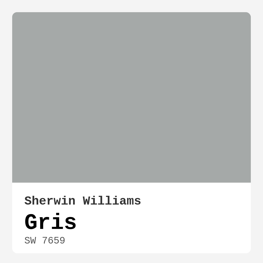
Color Preview & Key Details
| HEX Code | #A5A9A8 |
| RGB | 165, 169, 168 |
| LRV | 30% |
| Undertone | Green |
| Finish Options | Eggshell, Matte, Satin |
Imagine stepping into a room that feels instantly calm and inviting, as if it wraps you in a gentle embrace. That’s the magic of Gris (SW 7659) from Sherwin-Williams. This sophisticated gray strikes a perfect balance between warmth and coolness, making it one of those versatile colors that can transform a space into something truly special. But is this color right for your project? Let’s dive into the nuances of Gris and explore how it might just be the ideal choice for your home.
Gris is a soft, muted gray with a hint of green undertones that add depth without overwhelming the senses. At first glance, it appears like a classic gray, but as natural light plays across its surface, those subtle green hues emerge, creating a complex color experience. This is why Gris is so appealing. It adapts beautifully to different lighting conditions, appearing lighter and airier in natural light and more grounded under artificial illumination.
One of the key aspects of Gris is its Light Reflectance Value (LRV) of 30%. This means it reflects very little light, landing it comfortably in the medium dark category. What this does for your space is create a cozy, intimate atmosphere, perfect for spaces where you want to unwind or gather with friends and family. Think of a living room that feels both stylish and welcoming, or a bedroom that invites relaxation after a long day.
When you consider using Gris, think about the rooms where it can shine. It’s a fantastic choice for living rooms, bedrooms, dining rooms, home offices, and even entryways. No matter where you place it, Gris will provide a chic backdrop that allows other elements of your decor to pop. It’s especially suited for modern, Scandinavian, industrial, contemporary, and minimalist styles, enhancing each of these aesthetics with its understated elegance.
Now, let’s talk about application. You’re probably wondering about the practicalities of painting with Gris. The good news is that it’s beginner-friendly. It glides on smoothly and offers good coverage, often requiring just one to two coats for a rich finish. Whether you opt for a matte, eggshell, or satin finish, Gris performs well, providing you with options depending on the look and feel you want to achieve. Plus, it’s washable and wipeable, making it a smart choice for high-traffic areas.
But what about pairing Gris with other colors? That’s where the fun really begins. Gris pairs beautifully with various trim colors. For a classic look, you can’t go wrong with whites like Pure White or Simply White, which will create a crisp contrast. If you’re after something more dramatic, consider black trims or warm wood finishes. These choices can add depth and character to your space while maintaining the inviting atmosphere that Gris naturally brings.
If you’re wondering about the best companion colors to enhance Gris, look no further. It complements shades like SW 6826, SW 6016, and SW 9076 beautifully, among others. These colors can create a harmonious palette that feels cohesive and thoughtfully designed. When planning your space, take the time to visualize how these complementary colors will interact with Gris, especially in terms of natural lighting throughout the day.
Now, some might think that using Gris in small spaces could be a challenge, but I’m here to tell you otherwise! Gris works wonders in compact areas, thanks to its balanced LRV and soft hue. It can reflect light effectively, making a small room feel larger and more open. Just keep in mind that applying two coats may be necessary for a richer finish, especially in spaces lacking natural light. Pair it with lighter decor and furnishings to really enhance that feeling of openness.
As for mood, Gris creates a calm, grounded environment. It’s perfect for spaces where you want to foster creativity, like a home office, or where relaxation is key, such as in your bedroom. You’ll find that the understated elegance of Gris allows it to be both stylish and timeless, making your home feel current without the pressure of trendy colors that may fade in popularity.
When selecting a paint color, it’s vital to consider not just the color itself but how it will interact with your existing furnishings and decor. The undertones of Gris are particularly important to observe in your own space. Since it leans towards green, you’ll want to test it out next to your furniture and flooring to see how these hues reveal themselves. This practice ensures that the finish is cohesive and enhances the overall aesthetic of your home.
One of the most impressive features of Gris is its adaptability. Whether you’re going for a soft and serene ambiance or a more dynamic, modern vibe, Gris has the flexibility to meet your needs. It pairs well with both warm and cool tones, making it a chameleon of sorts in the paint world.
Of course, every color has its pros and cons. While Gris is a versatile shade, it may require two coats for full coverage, particularly in darker rooms. Also, in poorly lit spaces, it can appear dull, so it’s essential to consider your lighting before making a final decision. However, if you’re after a muted yet sophisticated color, the benefits of Gris far outweigh these minor drawbacks.
In the grand scheme of home design, Gris is more than just a paint color; it’s a transformative experience. You’re not just choosing a shade for your walls; you’re creating an atmosphere that feels inviting and stylish. So, if you’re ready to embrace a color that offers tranquility and timeless elegance, look no further than Gris. It’s a decision you won’t regret, and it might just become the backdrop for your most cherished memories at home.
Save this color to your Pinterest board to revisit when planning your room.
Real Room Photo of Gris SW 7659
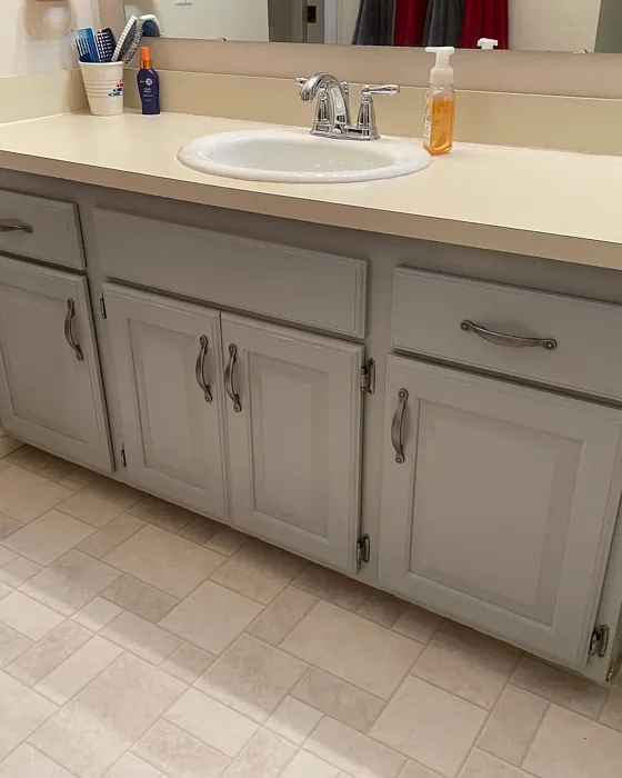
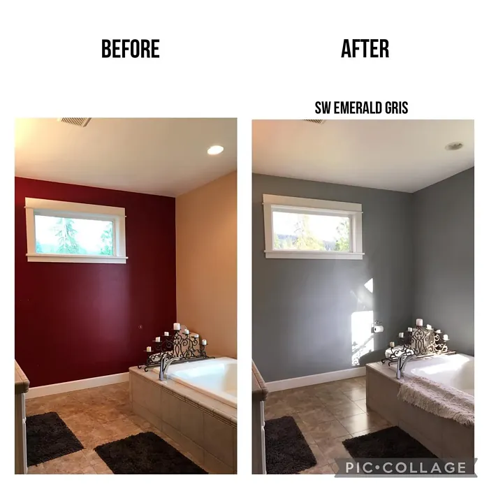
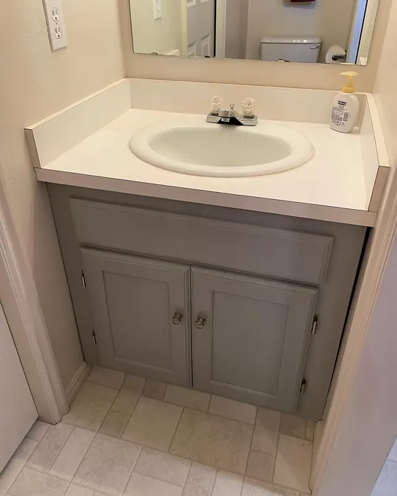
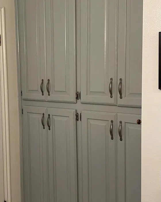
Real rooms painted with Gris SW 7659 by Sherwin Williams. Lighting and photography can affect how colors appear — always test a sample swatch in your own space.
Undertones of Gris ?
The undertones of Gris are a key aspect of its character, leaning towards Green. These subtle underlying hues are what give the color its depth and complexity. For example, a gray with a blue undertone will feel cooler and more modern, while one with a brown undertone will feel warmer and more traditional. It’s essential to test this paint in your home and observe it next to your existing furniture, flooring, and decor to see how these undertones interact and reveal themselves throughout the day.
HEX value: #A5A9A8
RGB code: 165, 169, 168
Is Gris Cool or Warm?
While primarily a cool gray, Gris’s warmth gives it an inviting quality. It’s perfect for spaces where you want a modern look without the chill that can sometimes accompany cooler tones.
Understanding Color Properties and Interior Design Tips
Hue refers to a specific position on the color wheel, measured in degrees from 0 to 360. Each degree represents a different pure color:
- 0° represents red
- 120° represents green
- 240° represents blue
Saturation describes the intensity or purity of a color and is expressed as a percentage:
- At 0%, the color appears completely desaturated—essentially a shade of gray
- At 100%, the color is at its most vivid and vibrant
Lightness indicates how light or dark a color is, also expressed as a percentage:
- 0% lightness results in black
- 100% lightness results in white
Using Warm Colors in Interior Design
Warm hues—such as reds, oranges, yellows, warm beiges, and greiges—are excellent choices for creating inviting and energetic spaces. These colors are particularly well-suited for:
- Kitchens, living rooms, and bathrooms, where warmth enhances comfort and sociability
- Large rooms, where warm tones can help reduce the sense of emptiness and make the space feel more intimate
For example:
- Warm beige shades provide a cozy, inviting atmosphere, ideal for living rooms, bedrooms, and hallways.
- Warm greige (a mix of beige and gray) offers the warmth of beige with the modern appeal of gray, making it a versatile backdrop for dining areas, bedrooms, and living spaces.
However, be mindful when using warm light tones in rooms with limited natural light. These shades may appear muted or even take on an unpleasant yellowish tint. To avoid a dull or flat appearance:
- Add depth by incorporating richer tones like deep greens, charcoal, or chocolate brown
- Use textured elements such as curtains, rugs, or cushions to bring dimension to the space
Pro Tip: Achieving Harmony with Warm and Cool Color Balance
To create a well-balanced and visually interesting interior, mix warm and cool tones strategically. This contrast adds depth and harmony to your design.
- If your walls feature warm hues, introduce cool-colored accents such as blue or green furniture, artwork, or accessories to create contrast.
- For a polished look, consider using a complementary color scheme, which pairs colors opposite each other on the color wheel (e.g., red with green, orange with blue).
This thoughtful mix not only enhances visual appeal but also creates a space that feels both dynamic and cohesive.
Save this color to your Pinterest board to revisit when planning your room.
Light Temperature Affects on Gris
Natural Light
Natural daylight changes in color temperature as the sun moves across the sky. At sunrise and sunset, the light tends to have a warm, golden tone with a color temperature around 2000 Kelvin (K). As the day progresses and the sun rises higher, the light becomes cooler and more neutral. Around midday, especially when the sky is clear, natural light typically reaches its peak brightness and shifts to a cooler tone, ranging from 5500 to 6500 Kelvin. This midday light is close to what we perceive as pure white or daylight-balanced light.
These shifts in natural light can significantly influence how colors appear in a space, which is why designers often consider both the time of day and the orientation of windows when planning interior color schemes.
Explore how this color transforms from sunrise through sunset as natural light changes throughout the day. Use the slider to simulate morning light, midday brightness, and warm afternoon tones.
North-facing rooms stay cooler throughout the day and benefit from warmer paint tones to compensate. South-facing rooms receive more direct sunlight, making even deeper shades more workable. East-facing rooms get bright morning light that fades by afternoon, while west-facing rooms glow warmly in the evening.
Artificial Light
When choosing artificial lighting, pay close attention to the color temperature, measured in Kelvin (K). This determines how warm or cool the light will appear. Lower temperatures, around 2700K, give off a warm, yellow glow often used in living rooms or bedrooms. Higher temperatures, above 5000K, create a cool, bluish light similar to daylight, commonly used in kitchens, offices, or task areas.
Use the slider to see how lighting temperature can affect the appearance of a surface or color throughout a space.
See how this color looks under different artificial light temperatures — from warm candlelight (2000K) to cool daylight (7000K). Move the slider to simulate your room's lighting conditions.


4800K
Keep in mind that natural light from windows, the warmth of lamps, and overhead lighting all affect how this color reads on your walls at different times of day. Always observe a sample swatch in your actual space before purchasing.
LRV of Gris
The Light Reflectance Value (LRV) of Gris is 30%, which places it in the Medium Dark category. This means it reflects very little light. Understanding a paint’s LRV is crucial for predicting how it will look in your space. A higher LRV indicates a lighter color that reflects more light, making rooms feel larger and brighter. A lower LRV signifies a darker color that absorbs more light, creating a cozier, more intimate atmosphere. Always consider the natural and artificial lighting in your room when selecting a paint color based on its LRV.
Detailed Review of Gris
Additional Paint Characteristics
Ideal Rooms
Bedroom, Dining Room, Entryway, Home Office, Living Room
Decor Styles
Contemporary, Industrial, Minimalist, Modern, Scandinavian
Coverage
Good (1–2 Coats), Touch-Up Friendly
Ease of Application
Beginner Friendly, Brush Smooth, Roller-Ready
Washability
Washable, Wipeable
VOC Level
Low VOC, Ultra Low VOC
Best Use
Accent Wall, Doors, Interior Walls, Trim
Room Suitability
Bedroom, Dining Room, Entryway, Home Office, Living Room
Tone Tag
Balanced, Cool, Muted
Finish Type
Eggshell, Matte, Satin
Paint Performance
Easy Touch-Up, Low Odor, Quick Drying, Scuff Resistant
Use Cases
Best for Modern Farmhouse, Best for Open Concept, Best for Small Spaces
Mood
Calm, Grounding, Inviting
Trim Pairing
Complements Cool Trim, Good with Wood Trim, Pairs with White Dove
Gris is more than just a color; it’s a transformative experience for your home. Its soft gray hue adapts beautifully to different lighting conditions, enhancing or softening the mood as needed. Whether used in a cozy living room or a sleek home office, Gris creates an inviting atmosphere that feels both modern and timeless.
Applying Gris is a breeze, as it glides on smoothly and covers well, often requiring just one to two coats. The finish options of matte, eggshell, or satin allow for customization based on your specific needs. If you’re looking for a paint that can stand up to the test of time while remaining stylish, Gris is a fantastic choice that will elevate your space effortlessly.
Pros & Cons of SW 7659 Gris
Pros
Cons
Colors that go with Sherwin Williams Gris
FAQ on SW 7659 Gris
Can Gris be used in small spaces?
Absolutely! Gris works wonderfully in small spaces due to its balanced LRV and soft hue. It reflects light effectively, making the area feel larger and more open. Pair it with light decor and furnishings to enhance the effect further. Just be mindful of applying two coats for a richer finish, especially in rooms with limited natural light.
What trim colors pair well with Gris?
Gris pairs beautifully with a variety of trim colors. For a classic look, consider white trims like Pure White or Simply White. If you want a more dramatic contrast, black trims or warm wood finishes can add depth and character to your space. The key is to balance the tones to maintain the inviting atmosphere that Gris brings.
Comparisons Gris with other colors
Gris SW 7659 vs Repose Gray SW 7015
| Attribute | Gris SW 7659 | Repose Gray SW 7015 |
|---|---|---|
| Color Name | Gris SW 7659 | Repose Gray SW 7015 |
| Color | ||
| Hue | Grey | Grey |
| Brightness | Medium | Medium |
| RGB | 165, 169, 168 | 204, 201, 192 |
| LRV | 30% | 58% |
| Finish Type | Eggshell, Matte, Satin | Eggshell, Matte, Satin |
| Finish Options | Eggshell, Matte, Satin | Eggshell, Matte, Satin |
| Ideal Rooms | Bedroom, Dining Room, Entryway, Home Office, Living Room | Bedroom, Dining Room, Hallway, Home Office, Living Room |
| Decor Styles | Contemporary, Industrial, Minimalist, Modern, Scandinavian | Contemporary, Farmhouse, Minimalist, Modern, Transitional |
| Coverage | Good (1–2 Coats), Touch-Up Friendly | Good (1–2 Coats), Touch-Up Friendly |
| Ease of Application | Beginner Friendly, Brush Smooth, Roller-Ready | Beginner Friendly, Brush Smooth, Fast-Drying, Roller-Ready |
| Washability | Washable, Wipeable | Highly Washable, Washable |
| Room Suitability | Bedroom, Dining Room, Entryway, Home Office, Living Room | Bedroom, Dining Room, Hallway, Home Office, Living Room |
| Tone | Balanced, Cool, Muted | Muted, Neutral, Warm |
| Paint Performance | Easy Touch-Up, Low Odor, Quick Drying, Scuff Resistant | Low Odor, Quick Drying, Scuff Resistant |
Lighting conditions, wall orientation, and surrounding decor can significantly affect how these colors appear in your space. Always test a sample swatch before committing to a full application.
Gris SW 7659 vs Light French Gray SW 0055
| Attribute | Gris SW 7659 | Light French Gray SW 0055 |
|---|---|---|
| Color Name | Gris SW 7659 | Light French Gray SW 0055 |
| Color | ||
| Hue | Grey | Grey |
| Brightness | Medium | Medium |
| RGB | 165, 169, 168 | 194, 192, 187 |
| LRV | 30% | 53% |
| Finish Type | Eggshell, Matte, Satin | Eggshell, Matte, Satin |
| Finish Options | Eggshell, Matte, Satin | Eggshell, Matte, Satin |
| Ideal Rooms | Bedroom, Dining Room, Entryway, Home Office, Living Room | Bedroom, Dining Room, Home Office, Kitchen, Living Room |
| Decor Styles | Contemporary, Industrial, Minimalist, Modern, Scandinavian | Contemporary, Farmhouse, Modern, Scandinavian, Transitional |
| Coverage | Good (1–2 Coats), Touch-Up Friendly | Good (1–2 Coats), Touch-Up Friendly |
| Ease of Application | Beginner Friendly, Brush Smooth, Roller-Ready | Beginner Friendly, Brush Smooth, Roller-Ready |
| Washability | Washable, Wipeable | Highly Washable, Washable |
| Room Suitability | Bedroom, Dining Room, Entryway, Home Office, Living Room | Bedroom, Dining Room, Home Office, Kitchen, Living Room |
| Tone | Balanced, Cool, Muted | Balanced, Muted, Neutral, Warm |
| Paint Performance | Easy Touch-Up, Low Odor, Quick Drying, Scuff Resistant | Easy Touch-Up, High Coverage, Low Odor |
Lighting conditions, wall orientation, and surrounding decor can significantly affect how these colors appear in your space. Always test a sample swatch before committing to a full application.
Gris SW 7659 vs Wordly Gray SW 7043
| Attribute | Gris SW 7659 | Wordly Gray SW 7043 |
|---|---|---|
| Color Name | Gris SW 7659 | Wordly Gray SW 7043 |
| Color | ||
| Hue | Grey | Grey |
| Brightness | Medium | Medium |
| RGB | 165, 169, 168 | 206, 198, 187 |
| LRV | 30% | 58% |
| Finish Type | Eggshell, Matte, Satin | Eggshell, Satin |
| Finish Options | Eggshell, Matte, Satin | Eggshell, Flat, Satin |
| Ideal Rooms | Bedroom, Dining Room, Entryway, Home Office, Living Room | Bedroom, Home Office, Kitchen, Living Room |
| Decor Styles | Contemporary, Industrial, Minimalist, Modern, Scandinavian | Minimalist, Modern, Scandi, Transitional |
| Coverage | Good (1–2 Coats), Touch-Up Friendly | Good (1–2 Coats) |
| Ease of Application | Beginner Friendly, Brush Smooth, Roller-Ready | Beginner Friendly, Brush Smooth, Fast-Drying, Roller-Ready |
| Washability | Washable, Wipeable | Highly Washable, Washable |
| Room Suitability | Bedroom, Dining Room, Entryway, Home Office, Living Room | Bedroom, Dining Room, Home Office, Living Room |
| Tone | Balanced, Cool, Muted | Muted, Neutral, Warm |
| Paint Performance | Easy Touch-Up, Low Odor, Quick Drying, Scuff Resistant | Easy Touch-Up, Low Odor, Scuff Resistant |
Lighting conditions, wall orientation, and surrounding decor can significantly affect how these colors appear in your space. Always test a sample swatch before committing to a full application.
Gris SW 7659 vs Illusive Green SW 9164
| Attribute | Gris SW 7659 | Illusive Green SW 9164 |
|---|---|---|
| Color Name | Gris SW 7659 | Illusive Green SW 9164 |
| Color | ||
| Hue | Grey | Grey |
| Brightness | Medium | Medium |
| RGB | 165, 169, 168 | 146, 148, 141 |
| LRV | 30% | 24% |
| Finish Type | Eggshell, Matte, Satin | Eggshell, Matte, Satin |
| Finish Options | Eggshell, Matte, Satin | Eggshell, Matte, Satin |
| Ideal Rooms | Bedroom, Dining Room, Entryway, Home Office, Living Room | Bedroom, Dining Room, Home Office, Living Room, Nursery |
| Decor Styles | Contemporary, Industrial, Minimalist, Modern, Scandinavian | Coastal, Minimalist, Modern, Rustic, Scandinavian |
| Coverage | Good (1–2 Coats), Touch-Up Friendly | Good (1–2 Coats), Touch-Up Friendly |
| Ease of Application | Beginner Friendly, Brush Smooth, Roller-Ready | Beginner Friendly, Brush Smooth, Fast-Drying, Roller-Ready |
| Washability | Washable, Wipeable | Highly Washable, Washable, Wipeable |
| Room Suitability | Bedroom, Dining Room, Entryway, Home Office, Living Room | Bedroom, Dining Room, Home Office, Living Room, Nursery |
| Tone | Balanced, Cool, Muted | Balanced, Earthy, Muted |
| Paint Performance | Easy Touch-Up, Low Odor, Quick Drying, Scuff Resistant | Easy Touch-Up, Low Odor, Quick Drying, Scuff Resistant |
Lighting conditions, wall orientation, and surrounding decor can significantly affect how these colors appear in your space. Always test a sample swatch before committing to a full application.
Gris SW 7659 vs Fawn Brindle SW 7640
| Attribute | Gris SW 7659 | Fawn Brindle SW 7640 |
|---|---|---|
| Color Name | Gris SW 7659 | Fawn Brindle SW 7640 |
| Color | ||
| Hue | Grey | Grey |
| Brightness | Medium | Medium |
| RGB | 165, 169, 168 | 167, 160, 148 |
| LRV | 30% | 24% |
| Finish Type | Eggshell, Matte, Satin | Eggshell, Matte |
| Finish Options | Eggshell, Matte, Satin | Eggshell, Matte, Satin |
| Ideal Rooms | Bedroom, Dining Room, Entryway, Home Office, Living Room | Bedroom, Dining Room, Hallway, Home Office, Living Room |
| Decor Styles | Contemporary, Industrial, Minimalist, Modern, Scandinavian | Bohemian, Minimalist, Modern Farmhouse, Transitional |
| Coverage | Good (1–2 Coats), Touch-Up Friendly | Good (1–2 Coats) |
| Ease of Application | Beginner Friendly, Brush Smooth, Roller-Ready | Brush Smooth, Fast-Drying, Roller-Ready |
| Washability | Washable, Wipeable | Stain Resistant, Washable |
| Room Suitability | Bedroom, Dining Room, Entryway, Home Office, Living Room | Bedroom, Dining Room, Home Office, Living Room |
| Tone | Balanced, Cool, Muted | Earthy, Neutral, Warm |
| Paint Performance | Easy Touch-Up, Low Odor, Quick Drying, Scuff Resistant | Easy Touch-Up, Fade Resistant, Low Odor |
Lighting conditions, wall orientation, and surrounding decor can significantly affect how these colors appear in your space. Always test a sample swatch before committing to a full application.
Gris SW 7659 vs Balanced Beige SW 7037
| Attribute | Gris SW 7659 | Balanced Beige SW 7037 |
|---|---|---|
| Color Name | Gris SW 7659 | Balanced Beige SW 7037 |
| Color | ||
| Hue | Grey | Grey |
| Brightness | Medium | Medium |
| RGB | 165, 169, 168 | 192, 178, 162 |
| LRV | 30% | 44% |
| Finish Type | Eggshell, Matte, Satin | Eggshell, Matte, Satin |
| Finish Options | Eggshell, Matte, Satin | Eggshell, Matte, Satin |
| Ideal Rooms | Bedroom, Dining Room, Entryway, Home Office, Living Room | Bedroom, Dining Room, Home Office, Kitchen, Living Room |
| Decor Styles | Contemporary, Industrial, Minimalist, Modern, Scandinavian | Contemporary, Minimalist, Modern Farmhouse, Rustic, Transitional |
| Coverage | Good (1–2 Coats), Touch-Up Friendly | Good (1–2 Coats), Touch-Up Friendly |
| Ease of Application | Beginner Friendly, Brush Smooth, Roller-Ready | Beginner Friendly, Brush Smooth, Roller-Ready |
| Washability | Washable, Wipeable | Washable, Wipeable |
| Room Suitability | Bedroom, Dining Room, Entryway, Home Office, Living Room | Bedroom, Dining Room, Hallway, Kitchen, Living Room |
| Tone | Balanced, Cool, Muted | Balanced, Earthy, Warm |
| Paint Performance | Easy Touch-Up, Low Odor, Quick Drying, Scuff Resistant | Easy Touch-Up, High Coverage, Low Odor |
Lighting conditions, wall orientation, and surrounding decor can significantly affect how these colors appear in your space. Always test a sample swatch before committing to a full application.
Gris SW 7659 vs Mushroom SW 9587
| Attribute | Gris SW 7659 | Mushroom SW 9587 |
|---|---|---|
| Color Name | Gris SW 7659 | Mushroom SW 9587 |
| Color | ||
| Hue | Grey | Grey |
| Brightness | Medium | Medium |
| RGB | 165, 169, 168 | 208, 199, 183 |
| LRV | 30% | 24% |
| Finish Type | Eggshell, Matte, Satin | Eggshell, Satin |
| Finish Options | Eggshell, Matte, Satin | Eggshell, Flat, Matte, Satin |
| Ideal Rooms | Bedroom, Dining Room, Entryway, Home Office, Living Room | Bedroom, Dining Room, Hallway, Home Office, Living Room |
| Decor Styles | Contemporary, Industrial, Minimalist, Modern, Scandinavian | Bohemian, Contemporary, Modern Farmhouse, Traditional |
| Coverage | Good (1–2 Coats), Touch-Up Friendly | Good (1–2 Coats) |
| Ease of Application | Beginner Friendly, Brush Smooth, Roller-Ready | Beginner Friendly, Brush Smooth, Roller-Ready |
| Washability | Washable, Wipeable | Highly Washable, Washable |
| Room Suitability | Bedroom, Dining Room, Entryway, Home Office, Living Room | Bedroom, Dining Room, Home Office, Living Room |
| Tone | Balanced, Cool, Muted | Earthy, Neutral, Warm |
| Paint Performance | Easy Touch-Up, Low Odor, Quick Drying, Scuff Resistant | Easy Touch-Up, Long Lasting, Low Odor, Scuff Resistant |
Lighting conditions, wall orientation, and surrounding decor can significantly affect how these colors appear in your space. Always test a sample swatch before committing to a full application.
Gris SW 7659 vs Silver Strand SW 7057
| Attribute | Gris SW 7659 | Silver Strand SW 7057 |
|---|---|---|
| Color Name | Gris SW 7659 | Silver Strand SW 7057 |
| Color | ||
| Hue | Grey | Grey |
| Brightness | Medium | Medium |
| RGB | 165, 169, 168 | 200, 203, 196 |
| LRV | 30% | 66% |
| Finish Type | Eggshell, Matte, Satin | Eggshell, Satin |
| Finish Options | Eggshell, Matte, Satin | Eggshell, Matte, Satin |
| Ideal Rooms | Bedroom, Dining Room, Entryway, Home Office, Living Room | Bedroom, Dining Room, Hallway, Home Office, Living Room |
| Decor Styles | Contemporary, Industrial, Minimalist, Modern, Scandinavian | Coastal, Minimalist, Modern, Traditional, Transitional |
| Coverage | Good (1–2 Coats), Touch-Up Friendly | Good (1–2 Coats), Touch-Up Friendly |
| Ease of Application | Beginner Friendly, Brush Smooth, Roller-Ready | Beginner Friendly, Brush Smooth, Roller-Ready |
| Washability | Washable, Wipeable | Highly Washable, Washable |
| Room Suitability | Bedroom, Dining Room, Entryway, Home Office, Living Room | Bathroom, Bedroom, Home Office, Kitchen, Living Room |
| Tone | Balanced, Cool, Muted | Balanced, Neutral, Warm |
| Paint Performance | Easy Touch-Up, Low Odor, Quick Drying, Scuff Resistant | Easy Touch-Up, High Coverage, Low Odor |
Lighting conditions, wall orientation, and surrounding decor can significantly affect how these colors appear in your space. Always test a sample swatch before committing to a full application.
Gris SW 7659 vs Cadet SW 9143
| Attribute | Gris SW 7659 | Cadet SW 9143 |
|---|---|---|
| Color Name | Gris SW 7659 | Cadet SW 9143 |
| Color | ||
| Hue | Grey | Grey |
| Brightness | Medium | Medium |
| RGB | 165, 169, 168 | 145, 153, 156 |
| LRV | 30% | 12% |
| Finish Type | Eggshell, Matte, Satin | Eggshell, Matte, Satin |
| Finish Options | Eggshell, Matte, Satin | Eggshell, Matte, Satin |
| Ideal Rooms | Bedroom, Dining Room, Entryway, Home Office, Living Room | Bathroom, Bedroom, Hallway, Home Office, Kitchen, Living Room |
| Decor Styles | Contemporary, Industrial, Minimalist, Modern, Scandinavian | Coastal, Industrial, Minimalist, Modern, Scandinavian |
| Coverage | Good (1–2 Coats), Touch-Up Friendly | Good (1–2 Coats), Touch-Up Friendly |
| Ease of Application | Beginner Friendly, Brush Smooth, Roller-Ready | Beginner Friendly, Brush Smooth, Roller-Ready |
| Washability | Washable, Wipeable | Washable, Wipeable |
| Room Suitability | Bedroom, Dining Room, Entryway, Home Office, Living Room | Bathroom, Bedroom, Hallway, Home Office, Living Room |
| Tone | Balanced, Cool, Muted | Balanced, Cool, Muted |
| Paint Performance | Easy Touch-Up, Low Odor, Quick Drying, Scuff Resistant | Easy Touch-Up, High Coverage, Low Odor |
Lighting conditions, wall orientation, and surrounding decor can significantly affect how these colors appear in your space. Always test a sample swatch before committing to a full application.
Gris SW 7659 vs Dovetail SW 7018
| Attribute | Gris SW 7659 | Dovetail SW 7018 |
|---|---|---|
| Color Name | Gris SW 7659 | Dovetail SW 7018 |
| Color | ||
| Hue | Grey | Grey |
| Brightness | Medium | Medium |
| RGB | 165, 169, 168 | 144, 138, 131 |
| LRV | 30% | 24% |
| Finish Type | Eggshell, Matte, Satin | Eggshell, Matte, Satin |
| Finish Options | Eggshell, Matte, Satin | Eggshell, Matte, Satin |
| Ideal Rooms | Bedroom, Dining Room, Entryway, Home Office, Living Room | Bedroom, Dining Room, Hallway, Home Office, Living Room |
| Decor Styles | Contemporary, Industrial, Minimalist, Modern, Scandinavian | Minimalist, Modern Farmhouse, Rustic, Transitional |
| Coverage | Good (1–2 Coats), Touch-Up Friendly | Good (1–2 Coats), Touch-Up Friendly |
| Ease of Application | Beginner Friendly, Brush Smooth, Roller-Ready | Beginner Friendly, Brush Smooth, Roller-Ready |
| Washability | Washable, Wipeable | Washable, Wipeable |
| Room Suitability | Bedroom, Dining Room, Entryway, Home Office, Living Room | Bedroom, Dining Room, Home Office, Living Room |
| Tone | Balanced, Cool, Muted | Earthy, Neutral, Warm |
| Paint Performance | Easy Touch-Up, Low Odor, Quick Drying, Scuff Resistant | Easy Touch-Up, Fade Resistant, Low Odor |
Lighting conditions, wall orientation, and surrounding decor can significantly affect how these colors appear in your space. Always test a sample swatch before committing to a full application.
Official Page of Sherwin Williams Gris SW 7659