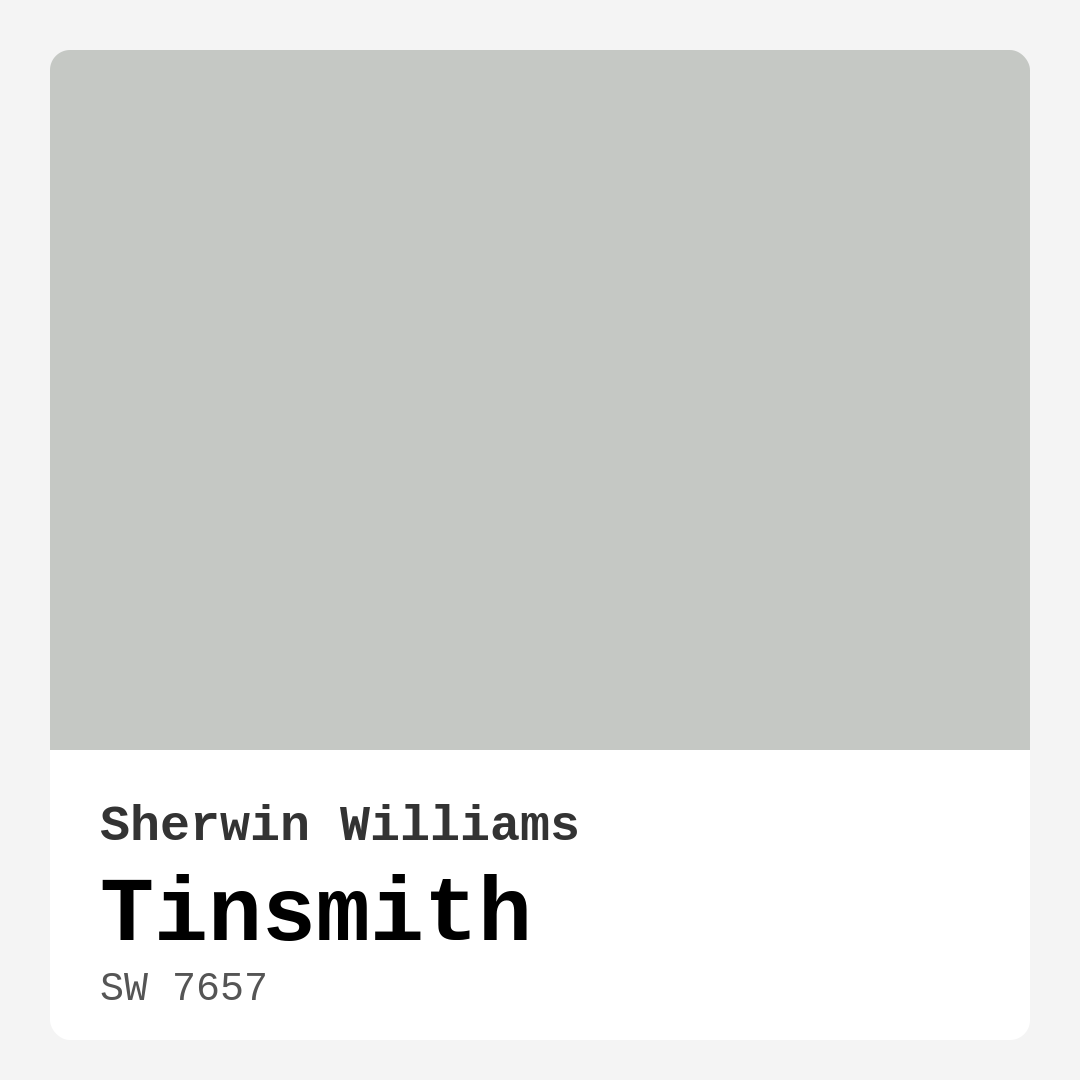
Color Preview & Key Details
| HEX Code | #C5C8C4 |
| RGB | 197, 200, 196 |
| LRV | 48% |
| Undertone | Green |
| Finish Options | Eggshell, Matte, Satin |
Imagine walking into a room where the air feels calm, and the surroundings whisper sophistication, almost inviting you to take a deep breath and relax. That’s the magic of Sherwin Williams’ Tinsmith (SW 7657). This soft gray color, with its understated elegance, can transform any space into a serene oasis. But is it the right choice for your home? Let’s dive deep into what makes Tinsmith not just a color, but a versatile tool for creating the perfect ambiance.
Tinsmith is a medium gray that’s not just another neutral in the sea of paint options. With an LRV of 48%, it reflects a moderate amount of light, striking a balance between bright and cozy. This means it works beautifully in various lighting conditions, adapting throughout the day. In the morning, it’s airy and light, while in the evening, it shifts to a more intimate, warm gray, wrapping your space in comfort.
What sets Tinsmith apart is its subtle green undertone. This is an important detail; it’s what gives the color depth and complexity. When you pair it with the right accents, Tinsmith can either lean towards a cool, modern aesthetic or embrace a more traditional warmth. Picture this: a room painted Tinsmith, adorned with warm wood tones and soft textiles. The green undertones can subtly play off these elements, creating a harmonious balance that feels both fresh and inviting.
Now, let’s talk about where Tinsmith shines best. This color is perfect for a variety of rooms including living rooms, bedrooms, dining areas, home offices, and hallways. It can create a seamless flow in an open-concept space, offering a cohesive backdrop that allows your decor to take center stage. Whether you’re aiming for a modern, industrial vibe or a cozy farmhouse feel, Tinsmith is adaptable enough to fulfill both visions.
Application is a breeze with Tinsmith. Designed to be beginner-friendly, it rolls and brushes on smoothly, typically requiring just one to two coats for full coverage. You won’t be wrestling with touch-ups, either; its washability ensures that any marks or fingerprints can be easily cleaned without a hassle. Plus, with its low VOC levels, you can breathe easy knowing it’s a healthier choice for your home.
When considering trim colors, Tinsmith pairs beautifully with whites and off-whites like White Dove or Chantilly Lace. These options enhance its soft elegance, creating a fresh, airy look. If you’re in the mood for something bolder, dark trims can make a dramatic statement, providing striking contrast that elevates the overall design.
Now, let’s address a common concern: can Tinsmith work in smaller rooms? Absolutely! Its light-reflective qualities can actually help open up a small space, making it feel larger and more airy. Just keep in mind that in dimly lit areas, Tinsmith might lean cooler, so consider incorporating warmer accents nearby to achieve a well-balanced look.
While Tinsmith’s soft hue is its strong suit, be aware of how it interacts with other colors. When pairing it with warm tones, you’ll want to choose carefully to avoid a stark contrast that could clash. Consider colors that complement its undertone, such as rich greens or soft blushes, which can create a beautiful, layered effect without overwhelming the space.
Lighting is another factor that plays a significant role in how Tinsmith will look in your home. It adapts beautifully to changing light throughout the day. In bright natural light, it can appear lighter and more refreshing, while in the evening glow of lamps, it takes on a cozier vibe. This adaptability makes it a fantastic choice for various rooms, as it can create the desired mood for different times of day.
Let’s not forget about its versatility in decor styles. Whether you lean towards modern, industrial, transitional, or Scandinavian aesthetics, Tinsmith can seamlessly blend in. It’s a color that makes statement pieces stand out while still providing a calm backdrop. Incorporate it into a modern farmhouse design with rustic furniture and soft textiles, or pair it with sleek industrial elements for a more contemporary look.
For those interested in exploring similar shades, Tinsmith has equivalents like Benjamin Moore’s Silver Mist or Sherwin Williams’ Repose Gray. These colors share that balanced gray quality but might offer different undertones or intensities to suit your specific taste.
To sum it all up, Tinsmith isn’t just a soft gray; it’s a versatile design tool that can elevate your space with its sophisticated charm. It offers a calming atmosphere while still allowing for personal expression through decor. Its adaptability to different lighting conditions and ease of application make it a practical choice for any homeowner, whether you’re a DIY novice or an experienced designer.
Before making your final decision, I encourage you to sample Tinsmith in your own home. Observe how it responds to your unique lighting and surroundings, and consider how you want to pair it with your existing furnishings and decor. With Tinsmith, you’re not just painting a wall; you’re creating an inviting, harmonious space that reflects your personal style. So go ahead, embrace the elegance of Tinsmith and let it work its magic on your home. You might just find it’s the perfect shade to bring your vision to life.
Save this color to your Pinterest board to revisit when planning your room.
Real Room Photo of Tinsmith SW 7657
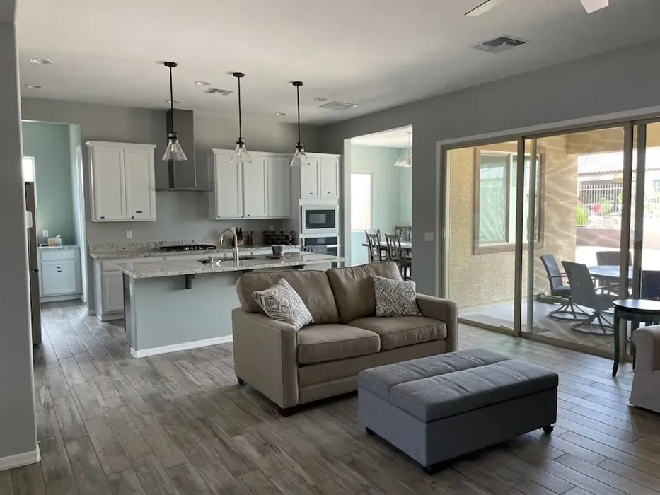
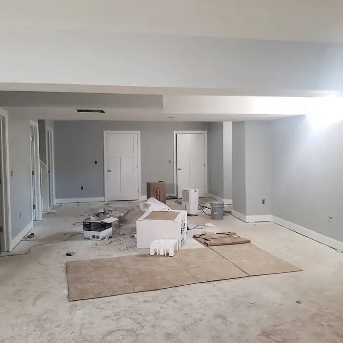
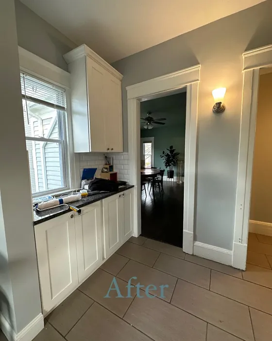
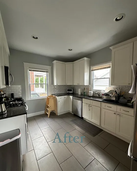
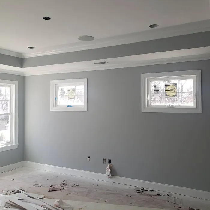
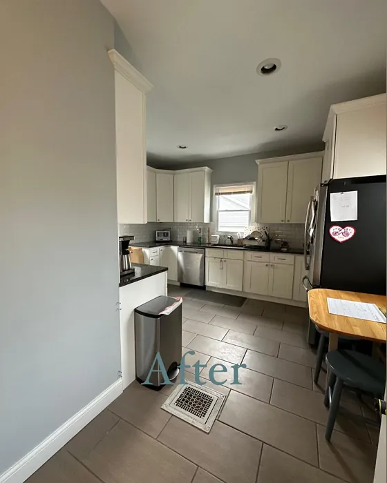
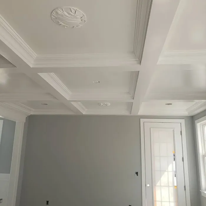
Real rooms painted with Tinsmith SW 7657 by Sherwin Williams. Lighting and photography can affect how colors appear — always test a sample swatch in your own space.
Undertones of Tinsmith ?
The undertones of Tinsmith are a key aspect of its character, leaning towards Green. These subtle underlying hues are what give the color its depth and complexity. For example, a gray with a blue undertone will feel cooler and more modern, while one with a brown undertone will feel warmer and more traditional. It’s essential to test this paint in your home and observe it next to your existing furniture, flooring, and decor to see how these undertones interact and reveal themselves throughout the day.
HEX value: #C5C8C4
RGB code: 197, 200, 196
Is Tinsmith Cool or Warm?
Tinsmith leans slightly cool, making it an excellent choice for those looking to create a refreshing atmosphere in their rooms. However, its balance allows it to work harmoniously with warmer accents.
Understanding Color Properties and Interior Design Tips
Hue refers to a specific position on the color wheel, measured in degrees from 0 to 360. Each degree represents a different pure color:
- 0° represents red
- 120° represents green
- 240° represents blue
Saturation describes the intensity or purity of a color and is expressed as a percentage:
- At 0%, the color appears completely desaturated—essentially a shade of gray
- At 100%, the color is at its most vivid and vibrant
Lightness indicates how light or dark a color is, also expressed as a percentage:
- 0% lightness results in black
- 100% lightness results in white
Using Warm Colors in Interior Design
Warm hues—such as reds, oranges, yellows, warm beiges, and greiges—are excellent choices for creating inviting and energetic spaces. These colors are particularly well-suited for:
- Kitchens, living rooms, and bathrooms, where warmth enhances comfort and sociability
- Large rooms, where warm tones can help reduce the sense of emptiness and make the space feel more intimate
For example:
- Warm beige shades provide a cozy, inviting atmosphere, ideal for living rooms, bedrooms, and hallways.
- Warm greige (a mix of beige and gray) offers the warmth of beige with the modern appeal of gray, making it a versatile backdrop for dining areas, bedrooms, and living spaces.
However, be mindful when using warm light tones in rooms with limited natural light. These shades may appear muted or even take on an unpleasant yellowish tint. To avoid a dull or flat appearance:
- Add depth by incorporating richer tones like deep greens, charcoal, or chocolate brown
- Use textured elements such as curtains, rugs, or cushions to bring dimension to the space
Pro Tip: Achieving Harmony with Warm and Cool Color Balance
To create a well-balanced and visually interesting interior, mix warm and cool tones strategically. This contrast adds depth and harmony to your design.
- If your walls feature warm hues, introduce cool-colored accents such as blue or green furniture, artwork, or accessories to create contrast.
- For a polished look, consider using a complementary color scheme, which pairs colors opposite each other on the color wheel (e.g., red with green, orange with blue).
This thoughtful mix not only enhances visual appeal but also creates a space that feels both dynamic and cohesive.
Save this color to your Pinterest board to revisit when planning your room.
Light Temperature Affects on Tinsmith
Natural Light
Natural daylight changes in color temperature as the sun moves across the sky. At sunrise and sunset, the light tends to have a warm, golden tone with a color temperature around 2000 Kelvin (K). As the day progresses and the sun rises higher, the light becomes cooler and more neutral. Around midday, especially when the sky is clear, natural light typically reaches its peak brightness and shifts to a cooler tone, ranging from 5500 to 6500 Kelvin. This midday light is close to what we perceive as pure white or daylight-balanced light.
These shifts in natural light can significantly influence how colors appear in a space, which is why designers often consider both the time of day and the orientation of windows when planning interior color schemes.
Explore how this color transforms from sunrise through sunset as natural light changes throughout the day. Use the slider to simulate morning light, midday brightness, and warm afternoon tones.
North-facing rooms stay cooler throughout the day and benefit from warmer paint tones to compensate. South-facing rooms receive more direct sunlight, making even deeper shades more workable. East-facing rooms get bright morning light that fades by afternoon, while west-facing rooms glow warmly in the evening.
Artificial Light
When choosing artificial lighting, pay close attention to the color temperature, measured in Kelvin (K). This determines how warm or cool the light will appear. Lower temperatures, around 2700K, give off a warm, yellow glow often used in living rooms or bedrooms. Higher temperatures, above 5000K, create a cool, bluish light similar to daylight, commonly used in kitchens, offices, or task areas.
Use the slider to see how lighting temperature can affect the appearance of a surface or color throughout a space.
See how this color looks under different artificial light temperatures — from warm candlelight (2000K) to cool daylight (7000K). Move the slider to simulate your room's lighting conditions.


4800K
Keep in mind that natural light from windows, the warmth of lamps, and overhead lighting all affect how this color reads on your walls at different times of day. Always observe a sample swatch in your actual space before purchasing.
LRV of Tinsmith
The Light Reflectance Value (LRV) of Tinsmith is 48%, which places it in the Medium category. This means it Reflects a moderate amount of light. Understanding a paint’s LRV is crucial for predicting how it will look in your space. A higher LRV indicates a lighter color that reflects more light, making rooms feel larger and brighter. A lower LRV signifies a darker color that absorbs more light, creating a cozier, more intimate atmosphere. Always consider the natural and artificial lighting in your room when selecting a paint color based on its LRV.
Detailed Review of Tinsmith
Additional Paint Characteristics
Ideal Rooms
Bedroom, Dining Room, Hallway, Home Office, Living Room
Decor Styles
Farmhouse, Industrial, Modern, Scandinavian, Transitional
Coverage
Good (1–2 Coats), Touch-Up Friendly
Ease of Application
Beginner Friendly, Brush Smooth, Roller-Ready
Washability
Highly Washable, Washable
VOC Level
Low VOC
Best Use
Accent Wall, Interior Walls, Trim
Room Suitability
Bedroom, Dining Room, Hallway, Home Office, Living Room
Tone Tag
Balanced, Cool, Muted
Finish Type
Eggshell, Matte
Paint Performance
Easy Touch-Up, Low Odor, Quick Drying
Use Cases
Best for Modern Farmhouse, Best for Open Concept, Best for Small Spaces
Mood
Calm, Inviting, Restful
Trim Pairing
Complements Cool Trim, Matches Pure White, Pairs with White Dove
Tinsmith is not just another gray; it’s a sophisticated choice that brings a touch of elegance to your space. Its soft hue makes it incredibly versatile, allowing it to blend seamlessly with various decor styles, from industrial to farmhouse. When applied, Tinsmith offers great coverage, typically requiring just one to two coats for a flawless finish. It’s perfect for open-concept spaces, creating a cohesive look throughout your home. The color adapts beautifully to different lighting conditions, appearing lighter and airier in natural light while maintaining a cozy feel in the evenings. Overall, Tinsmith strikes a perfect balance between being a neutral backdrop and a statement color.
Pros & Cons of SW 7657 Tinsmith
Pros
Cons
Colors that go with Sherwin Williams Tinsmith
FAQ on SW 7657 Tinsmith
Can I use Tinsmith in a small room?
Absolutely! Tinsmith can make a small room feel more spacious due to its light-reflective qualities. Its soft gray tone can open up the space, giving it an airy feel. Just be mindful of the lighting; in dim areas, it might appear cooler, so consider pairing it with warmer accents for balance.
What trim colors work best with Tinsmith?
Tinsmith pairs beautifully with white or off-white trim, such as White Dove or Chantilly Lace, enhancing its soft elegance. If you prefer a bolder look, consider contrasting it with dark trims like black or deep wood tones for a more dramatic effect.
Comparisons Tinsmith with other colors
Tinsmith SW 7657 vs Repose Gray SW 7015
| Attribute | Tinsmith SW 7657 | Repose Gray SW 7015 |
|---|---|---|
| Color Name | Tinsmith SW 7657 | Repose Gray SW 7015 |
| Color | ||
| Hue | Grey | Grey |
| Brightness | Medium | Medium |
| RGB | 197, 200, 196 | 204, 201, 192 |
| LRV | 48% | 58% |
| Finish Type | Eggshell, Matte | Eggshell, Matte, Satin |
| Finish Options | Eggshell, Matte, Satin | Eggshell, Matte, Satin |
| Ideal Rooms | Bedroom, Dining Room, Hallway, Home Office, Living Room | Bedroom, Dining Room, Hallway, Home Office, Living Room |
| Decor Styles | Farmhouse, Industrial, Modern, Scandinavian, Transitional | Contemporary, Farmhouse, Minimalist, Modern, Transitional |
| Coverage | Good (1–2 Coats), Touch-Up Friendly | Good (1–2 Coats), Touch-Up Friendly |
| Ease of Application | Beginner Friendly, Brush Smooth, Roller-Ready | Beginner Friendly, Brush Smooth, Fast-Drying, Roller-Ready |
| Washability | Highly Washable, Washable | Highly Washable, Washable |
| Room Suitability | Bedroom, Dining Room, Hallway, Home Office, Living Room | Bedroom, Dining Room, Hallway, Home Office, Living Room |
| Tone | Balanced, Cool, Muted | Muted, Neutral, Warm |
| Paint Performance | Easy Touch-Up, Low Odor, Quick Drying | Low Odor, Quick Drying, Scuff Resistant |
Lighting conditions, wall orientation, and surrounding decor can significantly affect how these colors appear in your space. Always test a sample swatch before committing to a full application.
Tinsmith SW 7657 vs Light French Gray SW 0055
| Attribute | Tinsmith SW 7657 | Light French Gray SW 0055 |
|---|---|---|
| Color Name | Tinsmith SW 7657 | Light French Gray SW 0055 |
| Color | ||
| Hue | Grey | Grey |
| Brightness | Medium | Medium |
| RGB | 197, 200, 196 | 194, 192, 187 |
| LRV | 48% | 53% |
| Finish Type | Eggshell, Matte | Eggshell, Matte, Satin |
| Finish Options | Eggshell, Matte, Satin | Eggshell, Matte, Satin |
| Ideal Rooms | Bedroom, Dining Room, Hallway, Home Office, Living Room | Bedroom, Dining Room, Home Office, Kitchen, Living Room |
| Decor Styles | Farmhouse, Industrial, Modern, Scandinavian, Transitional | Contemporary, Farmhouse, Modern, Scandinavian, Transitional |
| Coverage | Good (1–2 Coats), Touch-Up Friendly | Good (1–2 Coats), Touch-Up Friendly |
| Ease of Application | Beginner Friendly, Brush Smooth, Roller-Ready | Beginner Friendly, Brush Smooth, Roller-Ready |
| Washability | Highly Washable, Washable | Highly Washable, Washable |
| Room Suitability | Bedroom, Dining Room, Hallway, Home Office, Living Room | Bedroom, Dining Room, Home Office, Kitchen, Living Room |
| Tone | Balanced, Cool, Muted | Balanced, Muted, Neutral, Warm |
| Paint Performance | Easy Touch-Up, Low Odor, Quick Drying | Easy Touch-Up, High Coverage, Low Odor |
Lighting conditions, wall orientation, and surrounding decor can significantly affect how these colors appear in your space. Always test a sample swatch before committing to a full application.
Tinsmith SW 7657 vs Wordly Gray SW 7043
| Attribute | Tinsmith SW 7657 | Wordly Gray SW 7043 |
|---|---|---|
| Color Name | Tinsmith SW 7657 | Wordly Gray SW 7043 |
| Color | ||
| Hue | Grey | Grey |
| Brightness | Medium | Medium |
| RGB | 197, 200, 196 | 206, 198, 187 |
| LRV | 48% | 58% |
| Finish Type | Eggshell, Matte | Eggshell, Satin |
| Finish Options | Eggshell, Matte, Satin | Eggshell, Flat, Satin |
| Ideal Rooms | Bedroom, Dining Room, Hallway, Home Office, Living Room | Bedroom, Home Office, Kitchen, Living Room |
| Decor Styles | Farmhouse, Industrial, Modern, Scandinavian, Transitional | Minimalist, Modern, Scandi, Transitional |
| Coverage | Good (1–2 Coats), Touch-Up Friendly | Good (1–2 Coats) |
| Ease of Application | Beginner Friendly, Brush Smooth, Roller-Ready | Beginner Friendly, Brush Smooth, Fast-Drying, Roller-Ready |
| Washability | Highly Washable, Washable | Highly Washable, Washable |
| Room Suitability | Bedroom, Dining Room, Hallway, Home Office, Living Room | Bedroom, Dining Room, Home Office, Living Room |
| Tone | Balanced, Cool, Muted | Muted, Neutral, Warm |
| Paint Performance | Easy Touch-Up, Low Odor, Quick Drying | Easy Touch-Up, Low Odor, Scuff Resistant |
Lighting conditions, wall orientation, and surrounding decor can significantly affect how these colors appear in your space. Always test a sample swatch before committing to a full application.
Tinsmith SW 7657 vs Illusive Green SW 9164
| Attribute | Tinsmith SW 7657 | Illusive Green SW 9164 |
|---|---|---|
| Color Name | Tinsmith SW 7657 | Illusive Green SW 9164 |
| Color | ||
| Hue | Grey | Grey |
| Brightness | Medium | Medium |
| RGB | 197, 200, 196 | 146, 148, 141 |
| LRV | 48% | 24% |
| Finish Type | Eggshell, Matte | Eggshell, Matte, Satin |
| Finish Options | Eggshell, Matte, Satin | Eggshell, Matte, Satin |
| Ideal Rooms | Bedroom, Dining Room, Hallway, Home Office, Living Room | Bedroom, Dining Room, Home Office, Living Room, Nursery |
| Decor Styles | Farmhouse, Industrial, Modern, Scandinavian, Transitional | Coastal, Minimalist, Modern, Rustic, Scandinavian |
| Coverage | Good (1–2 Coats), Touch-Up Friendly | Good (1–2 Coats), Touch-Up Friendly |
| Ease of Application | Beginner Friendly, Brush Smooth, Roller-Ready | Beginner Friendly, Brush Smooth, Fast-Drying, Roller-Ready |
| Washability | Highly Washable, Washable | Highly Washable, Washable, Wipeable |
| Room Suitability | Bedroom, Dining Room, Hallway, Home Office, Living Room | Bedroom, Dining Room, Home Office, Living Room, Nursery |
| Tone | Balanced, Cool, Muted | Balanced, Earthy, Muted |
| Paint Performance | Easy Touch-Up, Low Odor, Quick Drying | Easy Touch-Up, Low Odor, Quick Drying, Scuff Resistant |
Lighting conditions, wall orientation, and surrounding decor can significantly affect how these colors appear in your space. Always test a sample swatch before committing to a full application.
Tinsmith SW 7657 vs Fawn Brindle SW 7640
| Attribute | Tinsmith SW 7657 | Fawn Brindle SW 7640 |
|---|---|---|
| Color Name | Tinsmith SW 7657 | Fawn Brindle SW 7640 |
| Color | ||
| Hue | Grey | Grey |
| Brightness | Medium | Medium |
| RGB | 197, 200, 196 | 167, 160, 148 |
| LRV | 48% | 24% |
| Finish Type | Eggshell, Matte | Eggshell, Matte |
| Finish Options | Eggshell, Matte, Satin | Eggshell, Matte, Satin |
| Ideal Rooms | Bedroom, Dining Room, Hallway, Home Office, Living Room | Bedroom, Dining Room, Hallway, Home Office, Living Room |
| Decor Styles | Farmhouse, Industrial, Modern, Scandinavian, Transitional | Bohemian, Minimalist, Modern Farmhouse, Transitional |
| Coverage | Good (1–2 Coats), Touch-Up Friendly | Good (1–2 Coats) |
| Ease of Application | Beginner Friendly, Brush Smooth, Roller-Ready | Brush Smooth, Fast-Drying, Roller-Ready |
| Washability | Highly Washable, Washable | Stain Resistant, Washable |
| Room Suitability | Bedroom, Dining Room, Hallway, Home Office, Living Room | Bedroom, Dining Room, Home Office, Living Room |
| Tone | Balanced, Cool, Muted | Earthy, Neutral, Warm |
| Paint Performance | Easy Touch-Up, Low Odor, Quick Drying | Easy Touch-Up, Fade Resistant, Low Odor |
Lighting conditions, wall orientation, and surrounding decor can significantly affect how these colors appear in your space. Always test a sample swatch before committing to a full application.
Tinsmith SW 7657 vs Balanced Beige SW 7037
| Attribute | Tinsmith SW 7657 | Balanced Beige SW 7037 |
|---|---|---|
| Color Name | Tinsmith SW 7657 | Balanced Beige SW 7037 |
| Color | ||
| Hue | Grey | Grey |
| Brightness | Medium | Medium |
| RGB | 197, 200, 196 | 192, 178, 162 |
| LRV | 48% | 44% |
| Finish Type | Eggshell, Matte | Eggshell, Matte, Satin |
| Finish Options | Eggshell, Matte, Satin | Eggshell, Matte, Satin |
| Ideal Rooms | Bedroom, Dining Room, Hallway, Home Office, Living Room | Bedroom, Dining Room, Home Office, Kitchen, Living Room |
| Decor Styles | Farmhouse, Industrial, Modern, Scandinavian, Transitional | Contemporary, Minimalist, Modern Farmhouse, Rustic, Transitional |
| Coverage | Good (1–2 Coats), Touch-Up Friendly | Good (1–2 Coats), Touch-Up Friendly |
| Ease of Application | Beginner Friendly, Brush Smooth, Roller-Ready | Beginner Friendly, Brush Smooth, Roller-Ready |
| Washability | Highly Washable, Washable | Washable, Wipeable |
| Room Suitability | Bedroom, Dining Room, Hallway, Home Office, Living Room | Bedroom, Dining Room, Hallway, Kitchen, Living Room |
| Tone | Balanced, Cool, Muted | Balanced, Earthy, Warm |
| Paint Performance | Easy Touch-Up, Low Odor, Quick Drying | Easy Touch-Up, High Coverage, Low Odor |
Lighting conditions, wall orientation, and surrounding decor can significantly affect how these colors appear in your space. Always test a sample swatch before committing to a full application.
Tinsmith SW 7657 vs Mushroom SW 9587
| Attribute | Tinsmith SW 7657 | Mushroom SW 9587 |
|---|---|---|
| Color Name | Tinsmith SW 7657 | Mushroom SW 9587 |
| Color | ||
| Hue | Grey | Grey |
| Brightness | Medium | Medium |
| RGB | 197, 200, 196 | 208, 199, 183 |
| LRV | 48% | 24% |
| Finish Type | Eggshell, Matte | Eggshell, Satin |
| Finish Options | Eggshell, Matte, Satin | Eggshell, Flat, Matte, Satin |
| Ideal Rooms | Bedroom, Dining Room, Hallway, Home Office, Living Room | Bedroom, Dining Room, Hallway, Home Office, Living Room |
| Decor Styles | Farmhouse, Industrial, Modern, Scandinavian, Transitional | Bohemian, Contemporary, Modern Farmhouse, Traditional |
| Coverage | Good (1–2 Coats), Touch-Up Friendly | Good (1–2 Coats) |
| Ease of Application | Beginner Friendly, Brush Smooth, Roller-Ready | Beginner Friendly, Brush Smooth, Roller-Ready |
| Washability | Highly Washable, Washable | Highly Washable, Washable |
| Room Suitability | Bedroom, Dining Room, Hallway, Home Office, Living Room | Bedroom, Dining Room, Home Office, Living Room |
| Tone | Balanced, Cool, Muted | Earthy, Neutral, Warm |
| Paint Performance | Easy Touch-Up, Low Odor, Quick Drying | Easy Touch-Up, Long Lasting, Low Odor, Scuff Resistant |
Lighting conditions, wall orientation, and surrounding decor can significantly affect how these colors appear in your space. Always test a sample swatch before committing to a full application.
Tinsmith SW 7657 vs Silver Strand SW 7057
| Attribute | Tinsmith SW 7657 | Silver Strand SW 7057 |
|---|---|---|
| Color Name | Tinsmith SW 7657 | Silver Strand SW 7057 |
| Color | ||
| Hue | Grey | Grey |
| Brightness | Medium | Medium |
| RGB | 197, 200, 196 | 200, 203, 196 |
| LRV | 48% | 66% |
| Finish Type | Eggshell, Matte | Eggshell, Satin |
| Finish Options | Eggshell, Matte, Satin | Eggshell, Matte, Satin |
| Ideal Rooms | Bedroom, Dining Room, Hallway, Home Office, Living Room | Bedroom, Dining Room, Hallway, Home Office, Living Room |
| Decor Styles | Farmhouse, Industrial, Modern, Scandinavian, Transitional | Coastal, Minimalist, Modern, Traditional, Transitional |
| Coverage | Good (1–2 Coats), Touch-Up Friendly | Good (1–2 Coats), Touch-Up Friendly |
| Ease of Application | Beginner Friendly, Brush Smooth, Roller-Ready | Beginner Friendly, Brush Smooth, Roller-Ready |
| Washability | Highly Washable, Washable | Highly Washable, Washable |
| Room Suitability | Bedroom, Dining Room, Hallway, Home Office, Living Room | Bathroom, Bedroom, Home Office, Kitchen, Living Room |
| Tone | Balanced, Cool, Muted | Balanced, Neutral, Warm |
| Paint Performance | Easy Touch-Up, Low Odor, Quick Drying | Easy Touch-Up, High Coverage, Low Odor |
Lighting conditions, wall orientation, and surrounding decor can significantly affect how these colors appear in your space. Always test a sample swatch before committing to a full application.
Tinsmith SW 7657 vs Cadet SW 9143
| Attribute | Tinsmith SW 7657 | Cadet SW 9143 |
|---|---|---|
| Color Name | Tinsmith SW 7657 | Cadet SW 9143 |
| Color | ||
| Hue | Grey | Grey |
| Brightness | Medium | Medium |
| RGB | 197, 200, 196 | 145, 153, 156 |
| LRV | 48% | 12% |
| Finish Type | Eggshell, Matte | Eggshell, Matte, Satin |
| Finish Options | Eggshell, Matte, Satin | Eggshell, Matte, Satin |
| Ideal Rooms | Bedroom, Dining Room, Hallway, Home Office, Living Room | Bathroom, Bedroom, Hallway, Home Office, Kitchen, Living Room |
| Decor Styles | Farmhouse, Industrial, Modern, Scandinavian, Transitional | Coastal, Industrial, Minimalist, Modern, Scandinavian |
| Coverage | Good (1–2 Coats), Touch-Up Friendly | Good (1–2 Coats), Touch-Up Friendly |
| Ease of Application | Beginner Friendly, Brush Smooth, Roller-Ready | Beginner Friendly, Brush Smooth, Roller-Ready |
| Washability | Highly Washable, Washable | Washable, Wipeable |
| Room Suitability | Bedroom, Dining Room, Hallway, Home Office, Living Room | Bathroom, Bedroom, Hallway, Home Office, Living Room |
| Tone | Balanced, Cool, Muted | Balanced, Cool, Muted |
| Paint Performance | Easy Touch-Up, Low Odor, Quick Drying | Easy Touch-Up, High Coverage, Low Odor |
Lighting conditions, wall orientation, and surrounding decor can significantly affect how these colors appear in your space. Always test a sample swatch before committing to a full application.
Tinsmith SW 7657 vs Dovetail SW 7018
| Attribute | Tinsmith SW 7657 | Dovetail SW 7018 |
|---|---|---|
| Color Name | Tinsmith SW 7657 | Dovetail SW 7018 |
| Color | ||
| Hue | Grey | Grey |
| Brightness | Medium | Medium |
| RGB | 197, 200, 196 | 144, 138, 131 |
| LRV | 48% | 24% |
| Finish Type | Eggshell, Matte | Eggshell, Matte, Satin |
| Finish Options | Eggshell, Matte, Satin | Eggshell, Matte, Satin |
| Ideal Rooms | Bedroom, Dining Room, Hallway, Home Office, Living Room | Bedroom, Dining Room, Hallway, Home Office, Living Room |
| Decor Styles | Farmhouse, Industrial, Modern, Scandinavian, Transitional | Minimalist, Modern Farmhouse, Rustic, Transitional |
| Coverage | Good (1–2 Coats), Touch-Up Friendly | Good (1–2 Coats), Touch-Up Friendly |
| Ease of Application | Beginner Friendly, Brush Smooth, Roller-Ready | Beginner Friendly, Brush Smooth, Roller-Ready |
| Washability | Highly Washable, Washable | Washable, Wipeable |
| Room Suitability | Bedroom, Dining Room, Hallway, Home Office, Living Room | Bedroom, Dining Room, Home Office, Living Room |
| Tone | Balanced, Cool, Muted | Earthy, Neutral, Warm |
| Paint Performance | Easy Touch-Up, Low Odor, Quick Drying | Easy Touch-Up, Fade Resistant, Low Odor |
Lighting conditions, wall orientation, and surrounding decor can significantly affect how these colors appear in your space. Always test a sample swatch before committing to a full application.
Official Page of Sherwin Williams Tinsmith SW 7657