Are you on the hunt for that just-right gray? That perfect shade that feels classic but totally works with your modern vibe? Look no further than HC-146 Wedgewood Gray by Benjamin Moore.
This color is a homeowner favorite, and honestly, it’s easy to see why. It hits that sweet spot between feeling cozy and cool.
Classic Style with a Modern Touch
Seriously, imagine a color that effortlessly transitions from traditional to modern spaces. That’s Wedgewood Gray for you.
Updating your living room? Want to make your bedroom a sanctuary? This color can just do that.
Its gentle blue undertones bring this lovely calm feeling, while the gray base keeps things feeling elegant and grounded.
Think about how colors impact your mood. Wedgewood Gray provides a really soothing backdrop. It’s ideal for unwinding with a book or finding focus when you need to get things done.
It also plays exceptionally well with other colors. Whites, creams, and even darker shades are perfect partners, giving you tons of flexibility to show off your personal style. Feel free to splash some bold accent colors around too!
If you’re considering a refresh, you should definitely give Wedgewood Gray a try. It could be exactly what your home needs.
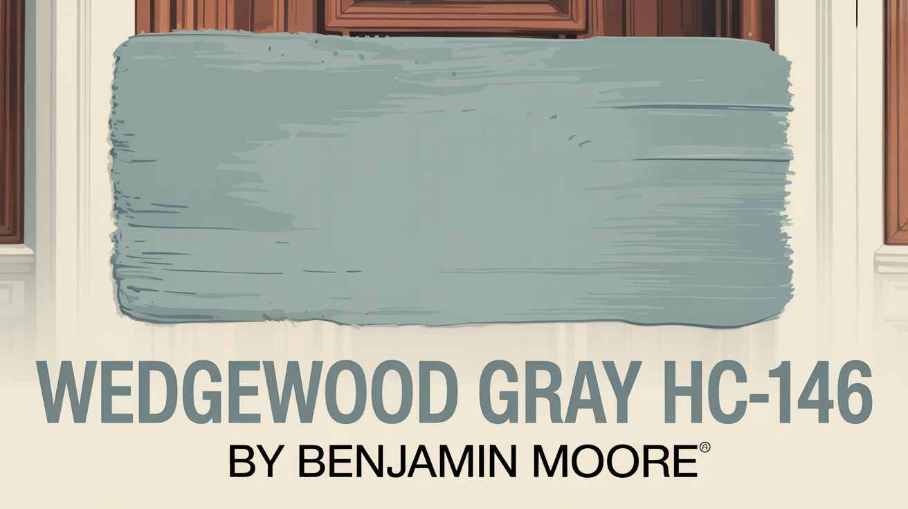
What Color Is Wedgewood Gray HC-146 by Benjamin Moore?
Let’s break it down. Wedgewood Gray HC-146 is a calming mix of blue and gray.
It even has a little hint of green in there, which gives it this lovely muted quality. It brings a sense of serenity to a space.
Whether your home leans traditional or modern, it just works. It’s the perfect pick if you want a cool-toned room that still feels welcoming, not cold.
Is Wedgewood Gray HC-146 by Benjamin Moore Warm or Cool color?
Here’s where this color really shines – it’s incredibly versatile. It blends blue undertones with soft gray.
This combination creates a balanced shade that feels both calming and elegant. It’s great in living rooms, bedrooms, or even kitchens.
Plus, it has this knack for enhancing natural light, making rooms feel brighter while keeping that cozy vibe.
When you use it on walls, Wedgewood Gray provides a soothing backdrop. It beautifully complements both modern and traditional decor styles.
For living areas, try pairing it with whites and creams for a crisp look. Adding darker accents like navy or charcoal brings in depth.
In bedrooms, it’s all about relaxation. It mixes easily with soft pastels for a gentle, restful feel. And in the kitchen? It adds a classic touch, looking fantastic with stainless steel appliances and wood cabinets.
Its adaptability is truly why homeowners love it. It helps create a harmonious, timeless space.
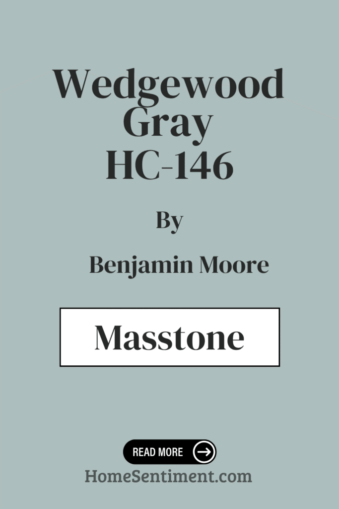
What is the Masstone of the Wedgewood Gray HC-146 by Benjamin Moore?
So, what exactly is the core color you see? The masstone of Wedgewood Gray HC-146 is a soothing light gray.
Its masstone code is #D5D5D5, which tells you it appears as a very balanced, neutral gray. This is why it feels so calm and peaceful in a room – it doesn’t scream for attention.
Because it’s a light gray tone, it reflects natural light really well. This helps rooms feel brighter and more open. It can even make smaller spaces seem larger and airier.
It’s fantastic because it pairs well with both warm and cool colors. This gives you incredible flexibility when you’re choosing furniture, fabrics, or accessories.
Its neutrality makes it an amazing base color. It lets other colors in your decor really pop. If you’re aiming for a modern, understated look, this gray is ideal. It suits everything from traditional to contemporary styles.
Undertones of Wedgewood Gray HC-146 by Benjamin Moore
Here’s where Wedgewood Gray gets interesting. It has complex undertones that subtly change how it looks on your walls.
While it’s primarily a gentle grayish-blue, you might catch hints of light blue, pale yellow, and mint. These undertones are key to whether the color feels a bit warmer or cooler in your space.
Light blue and mint undertones give it a fresh, calming feel, helping rooms feel more open and airy. This lightness creates a truly inviting atmosphere, perfect for living areas or bedrooms.
On the flip side, undertones like pale yellow add warmth. This can make a space feel cozier and more comfortable, which is especially nice if a room doesn’t get a lot of direct natural light.
You might also notice light purple and lilac undertones. These add a soft touch of sophistication and elegance. These tones can become more noticeable in the evening light.
And sometimes, you might see a hint of pale pink, which can subtly bring a romantic feel to a room.
Lastly, the gray undertones keep it grounded and neutral. This allows your furniture and décor to stand out without the wall color overpowering them. This chameleon-like quality lets Wedgewood Gray adapt beautifully to many styles, from modern minimalist to classic traditional.
Coordinating Colors of Wedgewood Gray HC-146 by Benjamin Moore
Choosing coordinating colors is about finding shades that work together to create a balanced, harmonious look. For Wedgewood Gray HC-146, there are some fantastic options that enhance its muted blue-gray tone.
Consider AF-15 Steam. It’s a soft, warm white that provides a gentle contrast without stealing the spotlight. It adds a delicate touch and pairs beautifully for a light, airy feel.
Another great pick is 866 Winter Ice. This is a cool, pale blue. It really brings out the subtle blue notes in Wedgewood Gray, creating a cohesive and refreshing palette.
If you want something grounding, HC-72 Branchport Brown offers a rich, earthy contrast. Its deep brown undertones add depth and sophistication, balancing the cooler shades with warmth.
And for a clean, bright element, OC-151 White is perfect. It helps highlight architectural details and makes the space feel crisp and light.
These colors together form a pleasing combination that works in many different settings, giving you a balanced and inviting look.
Here are some recommended coordinating paint colors:
- AF-15 Steam
- 866 Winter Ice
- HC-72 Branchport Brown
- OC-151 White
How Does Lighting Affect Wedgewood Gray HC-146 by Benjamin Moore?
Lighting is a huge factor in how paint colors look. The same color can appear quite different depending on the light source, affecting its brightness, depth, and even its perceived hue.
Wedgewood Gray HC-146 is particularly interesting because it changes based on whether you see it under artificial or natural light.
Under artificial light, like from LED or incandescent bulbs, Wedgewood Gray might lean warmer or cooler depending on the bulb. Incandescent bulbs with their warm, yellow light can make the color look softer. LED lights, which are cooler or more neutral, might make the color appear crisper.
Natural light provides even more variation. Wedgewood Gray takes on a more dynamic character throughout the day as the sun’s intensity and angle shift.
In north-facing rooms, which get less direct sun, it often appears cooler and a bit more subdued. The indirect light tends to bring out the blue undertones.
In south-facing rooms, filled with direct sunlight, it can look brighter and warmer. The intense light can enhance any warmer undertones.
East-facing rooms see it look light and fresh in the morning when the light is warm. But as the day goes on, the light cools down, emphasizing the gray and blue tones.
West-facing rooms are the opposite. Early in the day, it might seem cooler and more muted. Then in the afternoon and evening, as the sun warms up, the color warms up too.
This is actually a great thing! It highlights just how versatile and deep Wedgewood Gray HC-146 is.
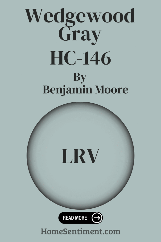
What is the LRV of Wedgewood Gray HC-146 by Benjamin Moore?
Let’s talk LRV. That stands for Light Reflectance Value. It’s a scale from 0 (total black, no reflection) to 100 (pure white, total reflection) that measures how much light a color bounces back.
Why does this matter? It gives you an idea of how light or dark a color will feel in a room.
Colors with higher LRV values reflect more light, helping spaces feel larger and more open. Colors with lower LRV values absorb more light, creating a cozier, more intimate feel.
Wedgewood Gray HC-146 has an LRV of 49.59. This puts it squarely in the middle range.
What does that mean for your room? It won’t be too dark, and it won’t be overly bright either. It reflects enough light to keep the room feeling open, but has enough depth to add character and warmth.
This balance makes Wedgewood Gray really adaptable. It interacts gently with both natural and artificial lighting, subtly shifting throughout the day.
What are the Trim colors of Wedgewood Gray HC-146 by Benjamin Moore?
Trim colors are those paints you use for the edges and details – your baseboards, window frames, door frames. They’re essential for highlighting architectural features and creating definition.
For a soft, muted blue-gray like Wedgewood Gray HC-146, choosing the right trim color can really make its calming elegance stand out.
Two recommended trim colors work wonderfully: OC-128 Minced Onion and OC-54 White Wisp.
Minced Onion OC-128 is a warm, creamy white. It adds a touch of coziness and perfectly complements the cool undertones of Wedgewood Gray. This pairing brings a lovely, balanced warmth to a room, making it feel truly inviting.
White Wisp OC-54 is a gentle, clean off-white. This option introduces a crisper, more airy feel. White Wisp reflects light beautifully, adding brightness and making those trim details look fresh and clean.
Both options are great choices. They enhance the subtle elegance of Wedgewood Gray and help define your space beautifully.
Here are some recommended trim colors:
- OC-128 Minced Onion
- OC-54 White Wisp
Colors Similar to Wedgewood Gray HC-146 by Benjamin Moore
Sometimes you want a look that flows smoothly from room to room, maybe with just a slight variation. Similar colors help create these harmonious spaces.
Wedgewood Gray HC-146, with its soft, muted gray-blue and calming feel, works wonderfully with shades that share a similar vibe.
717 Paradiso is a similar shade that adds a hint of green. It feels refreshing, like a tranquil outdoor scene.
689 Rhine River leans a bit deeper blue. It offers a sense of depth and coolness that pairs beautifully with Wedgewood Gray.
These similar colors help maintain a cohesive theme throughout your home.
2123-40 Gossamer Blue is lighter and airier. It adds a sense of spaciousness and openness, complementing the palette well.
Finally, HC-150 Yarmouth Blue provides a classic, clean look. It has a nice balance of blue and gray.
Using these colors together ensures a pleasing and balanced environment. They’re perfect for spaces where you want relaxation and comfort, offering subtle differences for visual interest without being overwhelming.
Here are some similar paint colors:
- 717 Paradiso
- 689 Rhine River
- 2123-40 Gossamer Blue
- HC-150 Yarmouth Blue
Colors that Go With Wedgewood Gray HC-146 by Benjamin Moore
Wedgewood Gray HC-146 is a truly versatile and elegant color. It serves as a beautiful backdrop that lets other colors really shine.
Its soft, muted undertones mean it pairs seamlessly with a wide range of other shades.
Pairing it with 1584 Pale Smoke creates a soothing, calming environment. Pale Smoke’s gentle lightness balances Wedgewood Gray’s depth.
Adding 712 Fort Pierce Green brings the outdoors in. It lends an earthy richness, great for spaces where you want warmth and comfort.
For a burst of energy, 678 Pacific Rim is fantastic next to Wedgewood Gray. This lively hue adds dynamism, making it perfect for accent pieces or a statement wall.
2050-30 Newport Green infuses sophistication and luxury. Its deeper green tones resonate beautifully with Wedgewood Gray’s understated elegance.
Looking for a refreshing contrast? 704 Del Mar Blue provides a sea-inspired breeziness, perfect for coastal styles.
Finally, 2135-70 Patriotic White offers a clean, bright touch. It enhances Wedgewood Gray’s unique tones by providing crisp contrast and adding light.
These colors together help rooms feel welcoming and beautifully coordinated.
Here are some recommended colors that go well with Wedgewood Gray:
- 1584 Pale Smoke
- 712 Fort Pierce Green
- 678 Pacific Rim
- 2050-30 Newport Green
- 704 Del Mar Blue
- 2135-70 Patriotic White
How to Use Wedgewood Gray HC-146 by Benjamin Moore In Your Home?
Using Wedgewood Gray HC-146 in your home is incredibly easy because it’s so versatile. It sits comfortably between blue and green with that essential touch of gray.
It brings a calm, soothing atmosphere to any room. If you want to introduce subtle color without it being too much, this is your answer.
In a living room or bedroom, it’s perfect for creating a cozy and inviting space. It pairs beautifully with soft whites and creams. Use it on the walls with white trim for that classic, clean look.
For kitchens, it looks wonderful with light cabinets and stainless-steel appliances. It gives the space a fresh, modern feel.
Need a focused home office? This color can help make the space feel more serene. It definitely supports better concentration.
Plus, it beautifully complements natural elements like wood and stone. This makes it a great choice for homes with a rustic or traditional decorating style.
Wedgewood Gray HC-146 by Benjamin Moore vs Paradiso 717 by Benjamin Moore
Let’s compare Wedgewood Gray to a few other popular shades. First up, Paradiso 717.
Wedgewood Gray HC-146 is that soft, muted gray-blue we’ve been talking about. It feels cool, calming, and reminds you of gentle skies or serene seas. It has this light, airy quality that can make spaces feel larger. It’s subtle and tranquil, adapting to different lighting while keeping its peaceful ambiance.
Paradiso 717 is a different story. It’s a much bolder, deeper teal shade. Paradiso brings richness and drama, creating a cozy, intimate atmosphere.
Compared to the understated Wedgewood Gray, Paradiso has more intensity. It injects vigor and depth into a space.
While Wedgewood Gray leans towards a soft, subtle vibe, Paradiso is striking and vibrant. They both have their charm but play very different roles in design.
Here is Paradiso 717:
- 717 Paradiso
Wedgewood Gray HC-146 by Benjamin Moore vs Gossamer Blue 2123-40 by Benjamin Moore
Next, let’s look at Gossamer Blue 2123-40.
Wedgewood Gray HC-146 is our familiar soft, muted gray with blue undertones. It gives a subtle, sophisticated look, kind of like a gentle morning mist. It’s versatile and excellent for creating a calming atmosphere in living rooms or bedrooms. It has an understated elegance that pairs easily with both light and dark accents.
Gossamer Blue 2123-40 is lighter and more vibrant. It feels airy and fresh, bringing to mind clear skies on a sunny day. This color is fantastic for brightening up a space.
It’s ideal for places like bathrooms, kitchens, or kids’ rooms. It has a cheerful, uplifting vibe that adds energy without being overwhelming.
Putting them side-by-side, you get a balanced palette. Wedgewood Gray offers sophistication and calm, while Gossamer Blue introduces lightness and joy. This gives you great flexibility for a cohesive look throughout your home.
Here is Gossamer Blue 2123-40:
- 2123-40 Gossamer Blue
Wedgewood Gray HC-146 by Benjamin Moore vs Rhine River 689 by Benjamin Moore
How about Rhine River 689? Both it and Wedgewood Gray HC-146 share a calm, serene feel but have unique personalities.
Wedgewood Gray HC-146 is that soft blue-gray, perfect for evoking a calm, soothing atmosphere. It pairs well with modern and traditional decor and adds elegance. It has enough depth to be used on its own but also works perfectly as a backdrop for bolder accents.
Rhine River 689, however, is a deeper, richer blue-green. This color brings more drama and depth. It offers a sense of coziness and warmth.
While Rhine River is great for creating a more intimate environment, it might not be quite as versatile as Wedgewood Gray because of its stronger presence.
Choosing between the two depends on the mood you want to set. Wedgewood Gray offers a lighter, airier feel, while Rhine River provides richness and comfort. Both are serene, just in different ways.
Here is Rhine River 689:
- 689 Rhine River
Wedgewood Gray HC-146 by Benjamin Moore vs Yarmouth Blue HC-150 by Benjamin Moore
Finally, let’s compare Wedgewood Gray to Yarmouth Blue HC-150. Both share calm tones but differ in their undertones and brightness.
Wedgewood Gray is primarily gray with those subtle blue and green hints. It has a sophisticated, muted vibe. This balanced mix makes it incredibly versatile for various home settings.
Yarmouth Blue tilts more towards blue. It has gentle green undertones. This gives it a slightly brighter, more playful feel.
Yarmouth Blue can lighten and energize spaces while still feeling calm. Wedgewood Gray is better suited for elegant, understated environments – think living rooms or bedrooms where you want a quiet, refined backdrop.
Yarmouth Blue, with its cheerful touch, works well in areas that need a fresh, airy atmosphere, like bathrooms or kitchens. They both feel serene, but their distinct undertones help them enhance a room’s personality differently.
Here is Yarmouth Blue HC-150:
- HC-150 Yarmouth Blue
Conclusion
So, what’s the takeaway on Wedgewood Gray HC-146 by Benjamin Moore? It’s a fantastically versatile choice for anyone looking to refresh their space.
Its subtle blend of blue and gray creates a serene yet sophisticated backdrop. It genuinely works with a wide range of design styles.
This color’s soft undertones make rooms feel airy and open. Crucially, it also adds a touch of warmth, preventing spaces from feeling cold or stark.
It looks lovely with crisp whites for a clean look. You can also pair it with deeper tones like navy and charcoal for something more dramatic.
It also beautifully complements natural materials. If you have wooden elements or stone accents, this color will likely look great.
Remember that lighting will influence how it appears. Natural light might bring out the blue tones, while artificial light might highlight the gray. This is a feature, not a bug! It just shows how well it adapts to different times of day and varying light conditions.
Think of Wedgewood Gray as a neutral color with character. It serves as a beautiful canvas for your personal style, allowing other decor elements to shine while maintaining a cohesive and calming atmosphere.
Its timeless quality makes it a perennial favorite. Give it a try!