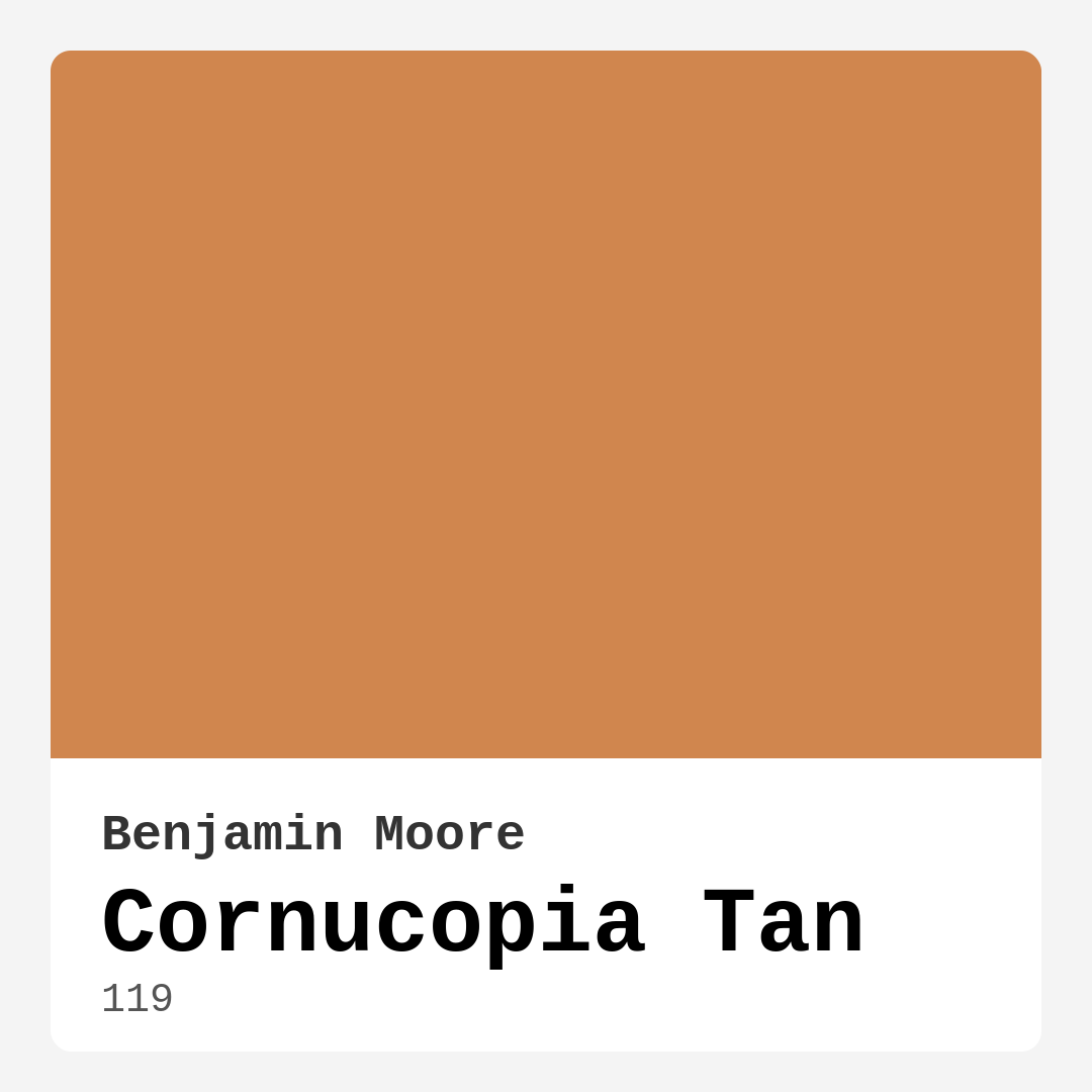
Color Preview & Key Details
| HEX Code | #D0864E |
| RGB | 208, 134, 78 |
| LRV | 29.92% |
| Undertone | Red |
Imagine stepping into your home after a long day, the warmth of the space wrapping around you like a cozy blanket. The color that greets you is Cornucopia Tan, a delightful warm hue from Benjamin Moore that feels like a gentle embrace. This isn’t just any paint color; it’s a transformative shade that can elevate your space, making it feel inviting and alive.
Cornucopia Tan (color code: 119) is a rich, earthy tone that radiates warmth, perfect for creating a welcoming atmosphere in any room. With its undertones of red, this paint color brings a depth and complexity that can harmonize beautifully with various decor styles. Whether your aesthetic leans toward modern farmhouse, rustic charm, or contemporary elegance, Cornucopia Tan can adapt and enhance your vision.
One of the most appealing aspects of Cornucopia Tan is its versatility. It shines in living rooms, bedrooms, kitchens, dining rooms, and even hallways. Imagine a cozy living room where Cornucopia Tan envelops you in comfort, inviting friends and family to gather and share stories. In a bedroom, it sets a serene and restful tone, making it the perfect backdrop for relaxation. And in the kitchen, it can create a warm and inviting space where meals are shared and memories are made.
When you consider this color for your project, you’ll appreciate its ability to reflect light. With a Light Reflectance Value (LRV) of 29.92%, it strikes a balance that allows it to reflect a good amount of light while still enveloping you in its warmth. This quality is particularly beneficial in larger spaces where you want to create a lively yet cozy ambiance. You might find that one to two coats deliver excellent coverage, ensuring a beautiful finish with minimal effort.
As you think about applying Cornucopia Tan, it’s essential to consider the lighting in your home. This color thrives in natural light, exuding a golden glow that enhances its inviting qualities. Under artificial lighting, it retains its warmth but may appear slightly more subdued, which is perfect for creating an intimate atmosphere in the evenings. To make the most of this color, it’s a good idea to test it in your space first. Observe how it interacts with your furnishings and the changing light throughout the day.
One of the joys of choosing Cornucopia Tan is how easily it pairs with other colors. It works wonderfully with warm trim colors like White Dove, complementing brass fixtures beautifully. Consider adding accents in greens to balance the warmth of Cornucopia Tan. This can create a lovely contrast that adds interest to your space while keeping the overall feel cozy and inviting.
When thinking about finishes, Cornucopia Tan offers options to suit various preferences. An eggshell finish can bring a subtle sheen that enhances the warmth and is easy to clean, making it suitable for high-traffic areas. If you prefer a more matte look, a flat finish can create a soft, inviting vibe, especially in low-traffic zones. Satin can provide a perfect balance between durability and a silky appearance, making it a popular choice for many homeowners.
Let’s address some practical considerations. If you’re worried about using Cornucopia Tan in smaller rooms, rest assured that it can work beautifully when used thoughtfully. While its warmth may darken a space slightly, pairing it with lighter furniture or decor can help maintain an open feel. Good lighting and strategic placement of mirrors can also enhance the brightness, ensuring that your small room feels cozy without being claustrophobic.
Another positive aspect of Cornucopia Tan is its ease of application. It’s beginner-friendly, offering a roller-ready, fast-drying formula that minimizes splatter. You’ll find that touch-ups are a breeze, allowing you to maintain that vibrant look over time. Plus, it’s low VOC, making it a healthier choice for your home environment.
In terms of mood, Cornucopia Tan creates a cozy, inviting aura that can make any space feel like home. The earthy, muted tones evoke feelings of warmth and comfort, making it perfect for social spaces where people gather. It has a timeless quality, ensuring that it won’t easily go out of style, allowing you to enjoy it for years to come.
If you’re still unsure about committing to Cornucopia Tan, consider looking at its equivalent colors, like Sherwin-Williams SW 6106 or Behr’s Honey Bee, to see what resonates with you. Often, seeing similar shades can help you make a more informed decision about the right hue for your space.
As you embark on your painting journey, remember to take your time selecting the right undertones and finishes. The subtleties of Cornucopia Tan can shine through when paired with the right decor elements, so don’t hesitate to experiment until you find the perfect combination.
In conclusion, Cornucopia Tan is more than just a paint color; it’s a statement of warmth and comfort that can transform your home into a sanctuary. Its versatility, ease of application, and inviting nature make it an excellent choice for various spaces and styles. So, if you’re ready to create a cozy, inviting atmosphere in your home, consider giving Cornucopia Tan a try. You just might find that it’s the perfect shade to bring your vision to life. Happy decorating!

Save this color to your Pinterest board to revisit when planning your room.
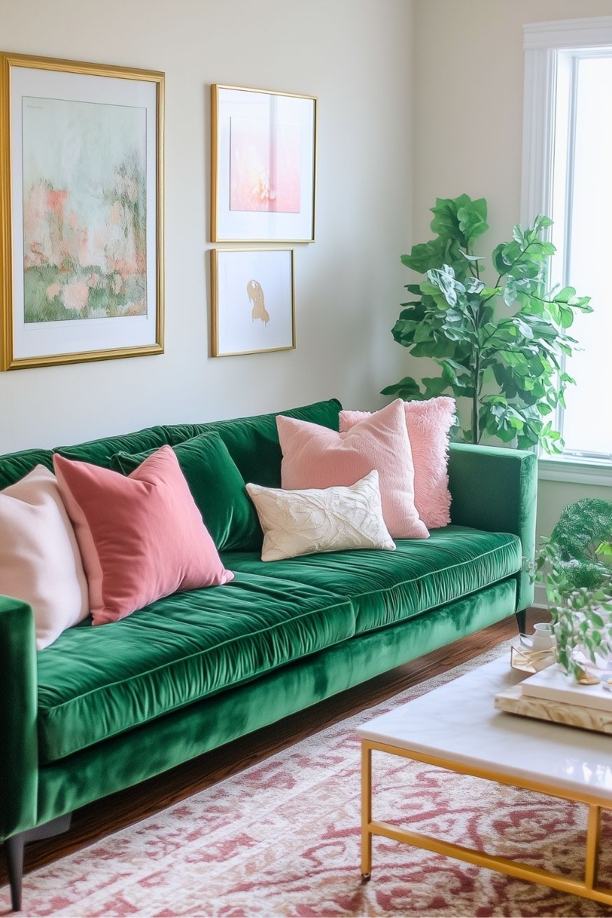
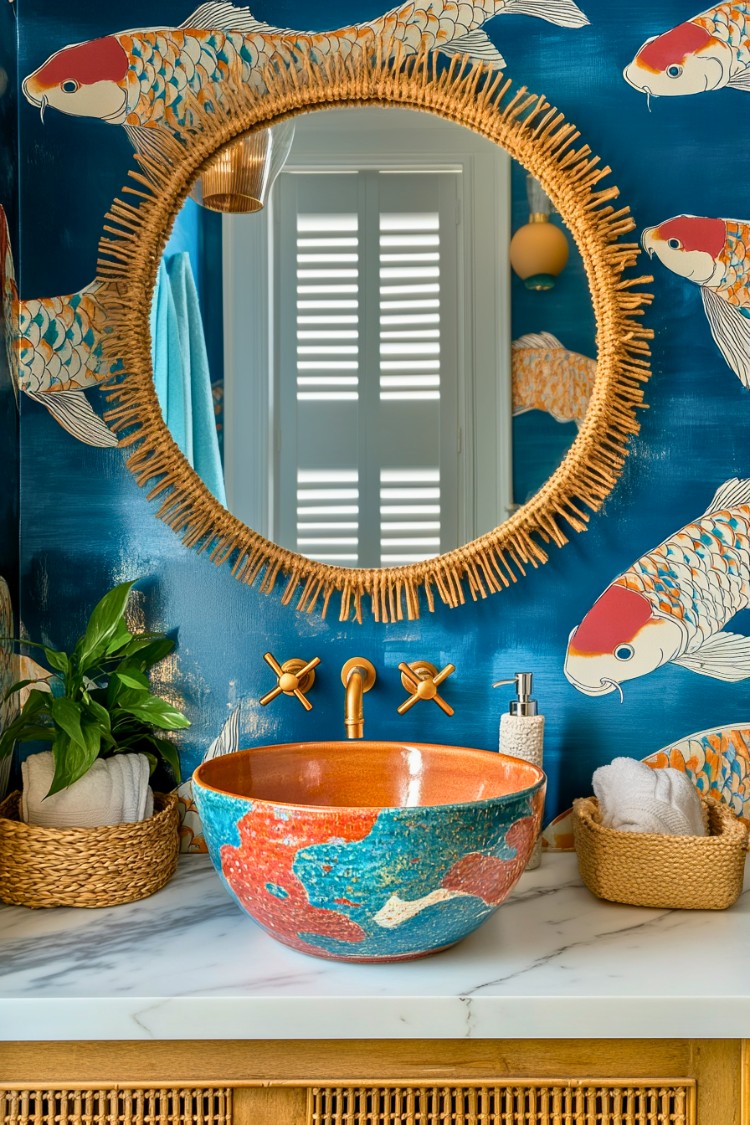
Real Room Photo of Cornucopia Tan 119
Undertones of Cornucopia Tan ?
The undertones of Cornucopia Tan are a key aspect of its character, leaning towards Red. These subtle underlying hues are what give the color its depth and complexity. For example, a gray with a blue undertone will feel cooler and more modern, while one with a brown undertone will feel warmer and more traditional. It’s essential to test this paint in your home and observe it next to your existing furniture, flooring, and decor to see how these undertones interact and reveal themselves throughout the day.
HEX value: #D0864E
RGB code: 208, 134, 78
Is Cornucopia Tan Cool or Warm?
Cornucopia Tan is considered a warm paint color. This characteristic plays a huge role in the overall feel of a room. Warm colors, like this one, tend to create a cozy, inviting, and energetic atmosphere, making them great for social spaces like living rooms and dining rooms. In contrast, cool colors often evoke a sense of calm and serenity, which is why they are popular in bedrooms and bathrooms. The warmth of Cornucopia Tan means it will pair beautifully with corresponding decor elements.
Understanding Color Properties and Interior Design Tips
Hue refers to a specific position on the color wheel, measured in degrees from 0 to 360. Each degree represents a different pure color:
- 0° represents red
- 120° represents green
- 240° represents blue
Saturation describes the intensity or purity of a color and is expressed as a percentage:
- At 0%, the color appears completely desaturated—essentially a shade of gray
- At 100%, the color is at its most vivid and vibrant
Lightness indicates how light or dark a color is, also expressed as a percentage:
- 0% lightness results in black
- 100% lightness results in white
Using Warm Colors in Interior Design
Warm hues—such as reds, oranges, yellows, warm beiges, and greiges—are excellent choices for creating inviting and energetic spaces. These colors are particularly well-suited for:
- Kitchens, living rooms, and bathrooms, where warmth enhances comfort and sociability
- Large rooms, where warm tones can help reduce the sense of emptiness and make the space feel more intimate
For example:
- Warm beige shades provide a cozy, inviting atmosphere, ideal for living rooms, bedrooms, and hallways.
- Warm greige (a mix of beige and gray) offers the warmth of beige with the modern appeal of gray, making it a versatile backdrop for dining areas, bedrooms, and living spaces.
However, be mindful when using warm light tones in rooms with limited natural light. These shades may appear muted or even take on an unpleasant yellowish tint. To avoid a dull or flat appearance:
- Add depth by incorporating richer tones like deep greens, charcoal, or chocolate brown
- Use textured elements such as curtains, rugs, or cushions to bring dimension to the space
Pro Tip: Achieving Harmony with Warm and Cool Color Balance
To create a well-balanced and visually interesting interior, mix warm and cool tones strategically. This contrast adds depth and harmony to your design.
- If your walls feature warm hues, introduce cool-colored accents such as blue or green furniture, artwork, or accessories to create contrast.
- For a polished look, consider using a complementary color scheme, which pairs colors opposite each other on the color wheel (e.g., red with green, orange with blue).
This thoughtful mix not only enhances visual appeal but also creates a space that feels both dynamic and cohesive.

Save this color to your Pinterest board to revisit when planning your room.
Light Temperature Affects on Cornucopia Tan
Natural Light
Natural daylight changes in color temperature as the sun moves across the sky. At sunrise and sunset, the light tends to have a warm, golden tone with a color temperature around 2000 Kelvin (K). As the day progresses and the sun rises higher, the light becomes cooler and more neutral. Around midday, especially when the sky is clear, natural light typically reaches its peak brightness and shifts to a cooler tone, ranging from 5500 to 6500 Kelvin. This midday light is close to what we perceive as pure white or daylight-balanced light.
These shifts in natural light can significantly influence how colors appear in a space, which is why designers often consider both the time of day and the orientation of windows when planning interior color schemes.
Explore how this color transforms from sunrise through sunset as natural light changes throughout the day. Use the slider to simulate morning light, midday brightness, and warm afternoon tones.
North-facing rooms stay cooler throughout the day and benefit from warmer paint tones to compensate. South-facing rooms receive more direct sunlight, making even deeper shades more workable. East-facing rooms get bright morning light that fades by afternoon, while west-facing rooms glow warmly in the evening.
Artificial Light
When choosing artificial lighting, pay close attention to the color temperature, measured in Kelvin (K). This determines how warm or cool the light will appear. Lower temperatures, around 2700K, give off a warm, yellow glow often used in living rooms or bedrooms. Higher temperatures, above 5000K, create a cool, bluish light similar to daylight, commonly used in kitchens, offices, or task areas.
Use the slider to see how lighting temperature can affect the appearance of a surface or color throughout a space.
See how this color looks under different artificial light temperatures — from warm candlelight (2000K) to cool daylight (7000K). Move the slider to simulate your room's lighting conditions.


4800K
Keep in mind that natural light from windows, the warmth of lamps, and overhead lighting all affect how this color reads on your walls at different times of day. Always observe a sample swatch in your actual space before purchasing.
LRV of Cornucopia Tan
The Light Reflectance Value (LRV) of Cornucopia Tan is 29.92%, which places it in the Medium colors category. This means it reflect a lot of light. Understanding a paint’s LRV is crucial for predicting how it will look in your space. A higher LRV indicates a lighter color that reflects more light, making rooms feel larger and brighter. A lower LRV signifies a darker color that absorbs more light, creating a cozier, more intimate atmosphere. Always consider the natural and artificial lighting in your room when selecting a paint color based on its LRV.
Detailed Review of Cornucopia Tan
Additional Paint Characteristics
When you apply Cornucopia Tan, you’re greeted with a warm embrace that instantly uplifts the mood of your room. The color is particularly effective in larger spaces, where it can breathe life without overwhelming your decor. Thanks to its good coverage, you might find that one to two coats are sufficient for a beautiful finish. It’s also touch-up friendly, which means you can easily maintain its vibrant look over time. Whether you’re looking to create an accent wall or a complete room makeover, Cornucopia Tan delivers a rich, inviting hue that feels like home. Just remember to test it in your space, as lighting can affect how the color appears.
Pros & Cons of 119 Cornucopia Tan
Colors that go with Benjamin Moore Cornucopia Tan
FAQ on 119 Cornucopia Tan
Can Cornucopia Tan be used in small rooms?
Absolutely! While Cornucopia Tan is a warm, rich color that can darken smaller spaces, using it strategically can create a cozy and inviting atmosphere. To prevent the room from feeling too enclosed, consider pairing it with lighter furniture or accents. Additionally, good lighting can help balance the warmth of the color, making the space feel more open and airy.
What finishes work best with Cornucopia Tan?
Cornucopia Tan looks stunning in various finishes, but for a soft, inviting look, consider using it in an eggshell or satin finish. These finishes offer a subtle sheen that enhances the warmth of the color while remaining easy to clean. If you’re looking for a more matte appearance, a flat finish can work beautifully, especially in low-traffic areas. Choose the finish based on the room’s function and desired ambiance.
Comparisons Cornucopia Tan with other colors
Official Page of Benjamin Moore Cornucopia Tan 119