Imagine a color that smoothly connects the vibrancy of nature with the deep calm of the ocean. That’s Salamander 2050-10. It’s a rich, deep green that manages to be both bold and subtle. This color has a unique way of bringing warmth and elegance to any space, making it feel both striking and inviting.
Bringing Salamander onto your walls is like inviting a piece of the natural world inside. It’s wonderfully adaptable, fitting seamlessly whether your style is traditional or modern. Think of it as a backdrop for cozy gatherings in your living room or inspiring focus and creativity in a study. It also pairs beautifully with lots of other colors and textures, offering endless design possibilities. Ultimately, if you’re aiming for a space that feels vibrant yet peaceful, Salamander is a fantastic choice.
What Color Is Salamander 2050-10?
Salamander by Benjamin Moore is generally described as a rich, deep green. It includes hints of blue undertones. This shade really evokes the feeling of a dense, lush forest, making it perfect for those wanting to introduce nature into their home. It’s a sophisticated color that works well in modern, traditional, and eclectic interior styles.
In modern spaces, you can use Salamander on accent walls for a bold contrast against neutral colors, adding depth and interest. For a traditional look, it pairs beautifully with warm woods and vintage pieces, giving a classic yet fresh vibe. If your style is eclectic, Salamander makes an excellent backdrop, allowing a mix of patterns and colors to pop.
This color truly harmonizes with a variety of materials. Think rich wood tones like walnut and mahogany, adding warmth. Metal finishes like gold and brass bring a luxurious touch. Textures like velvet and linen enhance its depth, creating a comfortable and inviting feel. Overall, Salamander is a versatile and timeless color, capable of being a focal point or a refined background.
Is Salamander 2050-10 Warm or Cool?
Salamander 2050-10 by Benjamin Moore is a deep, rich green with hints of blue and black. It makes a bold statement and works well in various rooms because it adds depth and warmth.
In living rooms, it feels cozy and inviting. In bedrooms, it’s serene and calming. For dining areas, Salamander can set an elegant and sophisticated mood. It pairs well with neutral tones, metallic accents, and natural wood, making it incredibly versatile.
In rooms with plenty of light, Salamander appears more vibrant. In dimmer areas, it gives off a more dramatic and intimate feel. It enhances both traditional and modern homes, adding character and depth.
(Note: One section of the source uniquely describes Salamander 2050-10 as a vibrant shade of orange or a vibrant and warm shade with a mix of orange and red tones in comparison sections, while the main descriptions consistently refer to it as a deep green).
What is the Masstone of Salamander 2050-10?
Interestingly, one description of Salamander 2050-10’s masstone (the color perceived when viewing a bulk amount of paint) is a deep, dark grey. This description highlights its very dark nature and sophisticated feel. Using this color adds a sense of depth and warmth to different spaces. Its dark tone can make larger rooms feel cozier and provides a strong background to highlight other decor. This dark grey description is seen as versatile, working with modern, industrial, or traditional styles. It can create a relaxing environment in living rooms or bedrooms.
Pairing this deep color with lighter shades like whites or pastels helps create a balanced look, making the space feel open yet inviting. In areas like kitchens or dining rooms, this dark tone can make a bold statement, especially with metallic accents. It’s described as offering an elegant and timeless touch.
(Note: This specific description of the masstone as “deep, dark grey” contrasts with the frequent description of Salamander as a deep green color throughout other sections of the source).
Undertones of Salamander 2050-10
Salamander 2050-10 is known for its rich, complex color thanks to its multiple undertones. While it looks like a deep green initially, you might also notice dark green, navy, and subtle brown notes upon closer inspection. These undertones really influence how the color looks in different lighting and settings.
The dark green and navy undertones give it a sense of depth that feels both calming and sophisticated. This helps bring a feeling of nature indoors. When brown notes appear, they introduce warmth, making a room feel more inviting. There are also mentions of dark turquoise and purple undertones, which add a unique, mysterious quality, contributing to both a vibrant and cozy feel.
Light is key to how these undertones show up. In natural daylight, you might see the green dominance, giving an earthy feel. In dim or artificial light, the blue and brown undertones could be more prominent, changing the room’s mood. On walls, the olive and grey undertones mentioned help soften the color, making it adaptable.
Coordinating Colors for Salamander 2050-10
Coordinating colors are those that work harmoniously with a main color, like Salamander’s deep, rich green. They complement it by providing contrast or continuity, enhancing its look without being overwhelming. These colors help define the mood and style of a room.
Here are some recommended coordinating colors:
- OC-17 White Dove: This is a gentle, warm white that blends beautifully with Salamander’s boldness, offering a crisp yet soft backdrop.
- 2139-50 Silver Marlin: A muted blue-green that connects with Salamander’s undertones, adding a refreshing element.
- HC-173 Edgecomb Gray: This warm, neutral gray adds a subtle earthiness that bridges colors nicely.
- OC-137 Sebring White: Another soft white, this one leans slightly cooler, balancing the warmth of other neutrals.
These hues together create a harmonious palette, making a space feel connected and inviting.
How Does Lighting Affect Salamander 2050-10?
Lighting is a huge factor in how paint colors appear. Different light sources can significantly change a color’s look. Natural sunlight often shows colors most truly, but even the angle and intensity of daylight shift throughout the day. Artificial light changes colors too, with incandescent bulbs adding warm, yellow tones and fluorescent lighting adding a cooler, bluish tint.
Salamander 2050-10, a deep, rich green with blue undertones, is definitely affected by light. In natural light, especially daylight, its depth and richness are more apparent, looking lush and sophisticated. Under warm incandescent bulbs, it might feel cozier, emphasizing the green tones. Fluorescent lighting might highlight the blue undertones, making the color feel cooler and more modern.
Consider the direction your room faces:
- North-facing rooms get cooler, indirect light, making Salamander appear darker and more subdued. The blue undertones might be more visible, potentially making the room feel cooler.
- South-facing rooms have warmer, more direct light, causing Salamander to look brighter and more vibrant. The sunlight enhances the green tones, creating an inviting, lively atmosphere.
- East-facing rooms have warm morning light. Salamander can look welcoming and fresh in the morning, but may appear more muted as the day goes on.
- West-facing rooms have softer morning light and more intense afternoon/evening light. Salamander will look richer and more intense later in the day when stronger light hits it.
Understanding these effects is super helpful when selecting colors and planning your lighting.
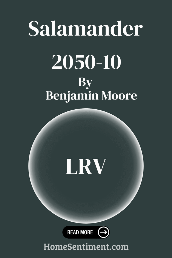
What is the LRV of Salamander 2050-10?
LRV stands for Light Reflectance Value. It’s a number from 0 (absolute black, no reflection) to 100 (pure white, reflects all light) that indicates how much light a color reflects. A low LRV means a color absorbs more light, making rooms feel darker and cozier. A high LRV means it reflects more light, making spaces feel brighter and more open.
LRV is crucial for understanding how a color will interact with both natural and artificial light.
Salamander 2050-10 has an LRV of 5.72. This is very low on the scale, meaning it absorbs a lot of light. On walls, this creates an intimate and enveloping atmosphere, great for achieving a cozy or dramatic effect.
This deep color heavily influences the mood of a space, making it popular for accent walls or bold statements. Just remember to consider the natural light; in poorly lit rooms, it could make the space feel smaller and darker.
What are the Trim colors for Salamander 2050-10?
Trim colors are what you use on moldings, baseboards, window casings, and doors. They’re important for adding contrast and highlighting architectural details. With a deep color like Salamander, the right trim can really impact the room’s overall feel. Trim helps define areas and adds a polished finish.
Using white trim with Salamander can give the space a fresh, clean look, letting the deep green stand out without making the room feel too dark.
Here are some recommended trim colors:
- OC-117 Simply White: This is a warm, versatile white that feels soft and inviting. Its subtle warmth beautifully complements Salamander’s richness, adding a touch of coziness.
- OC-152 Super White: For a crisper, more pristine white, Super White is a great choice. It offers a classic, sharp contrast that highlights edges and corners for a clean, elegant aesthetic.
Both these whites work well, keeping their own character while allowing Salamander’s deep tones to be the main focus.
Colors Similar to Salamander 2050-10
Looking at similar colors is helpful for creating harmony and balance in your design. Colors like Salamander, along with Pacific Sea Teal, Midnight, Regent Green, and Blacktop, can work together beautifully for a cohesive feel. Using these colors alongside each other helps the eye move smoothly through a space, avoiding jarring transitions and making the room feel more inviting and coordinated. Together, they bring a sense of depth, richness, sophistication, and comfort.
Here are some colors considered similar:
- 2049-10 Pacific Sea Teal: A cool, calming tone with a subtle teal hue, offering a fresh, modern, soft touch.
- 2131-20 Midnight: Deep and mysterious, evoking a sense of depth and space, excellent as a backdrop or accent for lighter elements.
- 2136-20 Regent Green: A classic, deep green tone that brings a soothing, natural element, grounding the space.
- 2135-10 Blacktop: A dark charcoal color that offers a strong, elegant look, perfect for creating contrast and depth.
These colors together form a versatile and stylish palette.
Colors that Go With Salamander 2050-10
Choosing colors that pair well with Salamander 2050-10 is key to creating a balanced and harmonious space. Salamander is a deep, rich shade with green and blue undertones. Colors that complement it provide contrast and depth. When used together, they can make a space feel vibrant and inviting.
Here are some recommended colors that go well with Salamander:
- 2050-50 Waterfall: A refreshing light aqua that brings freshness.
- 2050-30 Newport Green: A medium teal that brightens a room without being overpowering.
- 2050-20 Dollar Bill Green: Earthy and calm, adding a grounded touch.
- 2050-70 Blue Bonnet: A soft blue with hints of periwinkle, offering a gentle, calming vibe.
- 2050-60 Arctic Blue: Cool and crisp, creating a feeling of cleanliness and clarity.
- 2050-40 Florida Keys Blue: Bright and cheerful, evoking sunshine and sea breezes.
These colors create a beautiful palette that complements Salamander’s richness, allowing different moods to flourish.
How to Use Salamander 2050-10 In Your Home?
Salamander 2050-10 is a rich, deep green that adds a bold touch to any room, bringing warmth and elegance. It works exceptionally well in living rooms and studies, creating a cozy and inviting atmosphere.
Using Salamander on walls can give a room a dramatic and sophisticated look. Pairing it with light-colored furniture or accents like cream or beige provides beautiful contrast that brightens the room without overwhelming it.
In a bedroom, Salamander can be wonderfully calming, helping create a restful environment. Try accessorizing with gold or brass accents to add a touch of luxury. For smaller spaces like a bathroom or hallway, consider using Salamander alongside lots of white to prevent the space from feeling too dark. This color truly brings depth and character to different areas of the home.
(Note: Two comparison sections in the source describe Salamander 2050-10 as a vibrant orange or orange/red mix, suggesting different usage contexts where a more energetic color is desired, such as inspiring creativity or creating a lively atmosphere).
Salamander 2050-10 vs Midnight 2131-20
Let’s compare Salamander 2050-10 with another deep shade, Midnight 2131-20.
One description presents Salamander 2050-10 as a rich, vibrant orange, bringing warmth and energy. It’s seen as working well where you want to inspire creativity or foster a lively atmosphere, making a room feel more inviting and enthusiastic.
Midnight 2131-20, on the other hand, is described as a deep, dark blue. This color creates a sense of calm and sophistication. It’s perfect for spaces where relaxation and peace are desired, like bedrooms or cozy reading areas, adding elegance and intimacy.
So, while one perspective describes Salamander as vibrant and energizing, Midnight offers a soothing, classy feel. One stands out with warmth, the other provides a cool calm presence.
(Note: This comparison uses a description of Salamander as orange, which contradicts its primary description as a deep green elsewhere in the source).
Salamander 2050-10 vs Pacific Sea Teal 2049-10
Comparing Salamander 2050-10 with Pacific Sea Teal 2049-10 shows two different vibes.
Salamander is described as a deep, earthy color with a rich green base, like a lush forest. It radiates warmth and gives a cozy, enveloping feel. This shade is great for spaces that benefit from a grounded, natural atmosphere, creating an intimate setting perfect for a bedroom or study.
Pacific Sea Teal 2049-10 is a vibrant, aquatic tone with a bluish-green hue. This lively color brings a refreshing and energetic vibe. It reminds you of ocean waves and clear skies, adding a sense of openness and airy brightness. This color is ideal for spaces meant to feel open and invigorating, like a bathroom or living room.
Salamander offers a cozy retreat with its richness, while Pacific Sea Teal gives you a burst of brightness and energy. They cater to different moods.
Salamander 2050-10 vs Regent Green 2136-20
Pitting Salamander 2050-10 against Regent Green 2136-20 highlights their distinct characters.
One perspective describes Salamander as a vibrant and warm shade with a mix of orange and red tones, creating a lively atmosphere. It adds energy and brightness, perfect for feeling invigorated and inspired, and can feel cozy due to its warmth.
Regent Green 2136-20, however, offers a deep, rich green. This color provides a calm and sophisticated feel. It evokes nature and makes spaces feel grounded and serene. Regent Green is versatile as an accent or main color for a more dramatic look.
Using them together creates an interesting contrast: one lively and energizing (Salamander), the other calm (Regent Green). They can balance a room, with one bringing warmth and the other depth and tranquility.
(Note: This comparison section uses a description of Salamander as orange/red, which contradicts its primary description as a deep green elsewhere in the source).
Salamander 2050-10 vs Blacktop 2135-10
Finally, comparing Salamander 2050-10 with Blacktop 2135-10 shows the difference between a deep color hue and a deep neutral.
Salamander presents as a deep, dark green with strong blue undertones. It brings to mind dense forests and mysterious landscapes. Its rich tone adds depth and sophistication, making it great for accent walls or creating a moody atmosphere.
Blacktop 2135-10 is a charcoal black with slight gray hints. This is a neutral but bold color that brings a sleek, modern feel. It fits easily into different design themes, from industrial to minimalist.
Salamander adds color with its green-blue hue, while Blacktop stays grounded as a dark neutral. Salamander can suggest growth and mystery, while Blacktop channels strength and simplicity. Both are deep and intense but differ in undertones and the feelings they inspire. Salamander leans toward nature-inspired warmth, while Blacktop remains cool and sleek.
In Conclusion
Salamander 2050-10 by Benjamin Moore is a truly captivating color. It’s a deep, moody green that brings a rich, sophisticated feel to any space. Its earthy undertones add depth and warmth, making it a striking yet inviting choice.
This color works beautifully in both modern and classic interiors, offering a bold statement without being overwhelming. Inspired by nature, it echoes the richness of forest greens and deep shadows, creating a cozy yet refined atmosphere.
Whether you use it as an accent or a main shade, Salamander pairs well with various textures and materials, offering endless design possibilities. It effortlessly anchors a space, making it a go-to for adding depth and character to your home.