Natural Beauty for Lasting Style
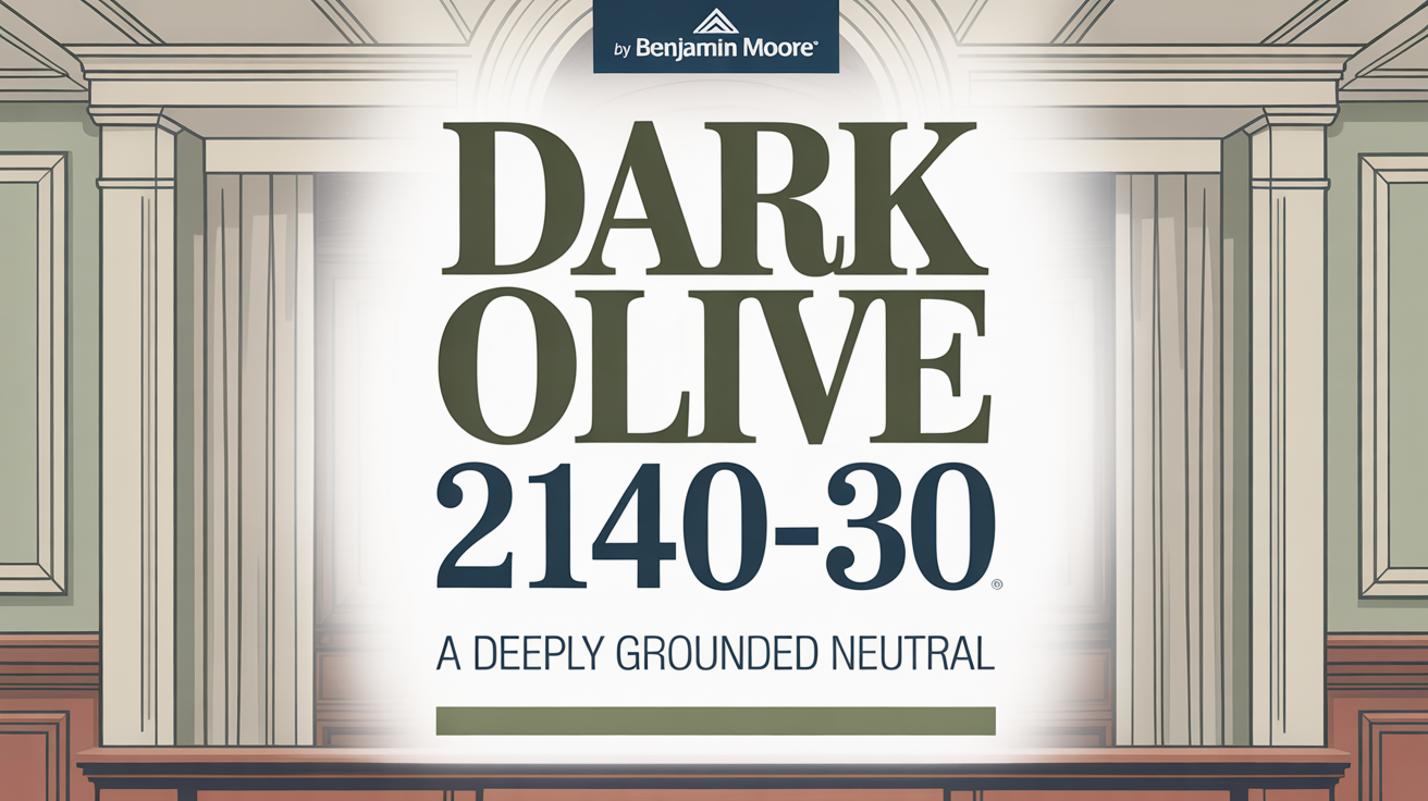
Thinking about adding color to your home? Benjamin Moore’s Dark Olive 2140-30 is a standout shade. It offers a rich, deep tone that can add warmth and unique character to any space you choose.
Whether you’re looking to refresh your living room or give your bedroom a new look, Dark Olive brings a strong yet calming presence. It’s a color with timeless charm.
Consider how this color can create a cozy vibe in your space. It pairs beautifully with natural elements like wood and metal, adding depth and visual interest.
It works well on its own or as part of a larger color palette. This offers great flexibility for different design styles, from modern to traditional and everything in between.
Using Dark Olive means thinking about your current decor. It can make a bold statement as an accent wall. Or, you could use it throughout a room for a more immersive feel. Pay attention to how your lighting changes its look from day to night.
Ultimately, choosing Dark Olive is about setting a mood that complements your personal style and makes your space feel truly welcoming. It’s a color that invites creativity and has undeniable charm.
What Color Is Dark Olive 2140-30 by Benjamin Moore?
So, what kind of color are we talking about? Dark Olive 2140-30 is a beautiful, muted green with brown undertones. This gives it a natural, earthy vibe that helps ground a space and adds depth.
The color resembles the deep hues found in a forest. It truly creates a cozy and inviting atmosphere. You’ll find it works wonderfully in traditional, rustic, and modern farmhouse styles because of its warm, organic feel.
Is Dark Olive 2140-30 by Benjamin Moore Warm or Cool color?
Dark Olive 2140-30 is definitely a warm, earthy color. It brings richness and depth to any room it’s used in.
This muted green shade creates a cozy and inviting atmosphere. When you use it on your walls, it can make a space feel more intimate and grounded, offering a sense of calm and stability.
It plays well with natural materials like wood and leather, enhancing the overall warmth of the space. It also pairs beautifully with neutral colors such as beige and cream, adding a touch of sophistication.
And if you like a little sparkle, it complements metallic accents like brass or gold, bringing a touch of elegance. Using it on an accent wall is a great way to make a bold statement without overwhelming the room.
Its versatility means it fits seamlessly into both traditional and modern homes, making it a truly timeless choice.
What is the Masstone of the Dark Olive 2140-30 by Benjamin Moore?
Let’s talk about the masstone. Dark Olive 2140-30 is a rich green with strong earthy tones. Its true color is a deep olive, specifically identified as #80802B.
This deep olive shade brings natural warmth and depth. It’s excellent for creating a cozy atmosphere and adding sophistication and comfort to a room.
In living rooms or bedrooms, it helps create a calming and restful environment. The warmth of this color pairs perfectly with natural materials like wood or stone.
How light hits it matters. In well-lit spaces, Dark Olive shows its vibrant side. In areas with low light, it takes on a more muted and deep character.
Pairing it with neutral tones like beige or cream can balance its intensity. This makes it really versatile for different design styles.
It’s a color that can ground your space, making it feel connected to nature while staying elegant and timeless. If you’re looking for warmth, this color is an excellent choice.
Undertones of Dark Olive 2140-30 by Benjamin Moore
Dark Olive 2140-30 is a wonderfully complex color. It has undertones of grey, dark green, and brown, which give it that deep, earthy feeling. These undertones help spaces feel grounded and cozy, creating a solid backdrop with warmth and comfort.
You’ll also find dark turquoise and dark grey undertones. These introduce a touch of coolness, which helps balance the warmth and can make the color appear more sophisticated. This adds a hint of mystery, which looks quite stylish, especially in modern homes.
Navy and purple undertones add depth and a touch of elegance. They can make a space feel more formal and refined. The combination of these darker shades provides a serious yet inviting vibe.
But it’s not all deep tones! Lighter shades like light green, mint, and light turquoise offer refreshing brightness. They lighten the overall color, stopping it from feeling too heavy or dense. This can actually help smaller rooms feel more open and airy.
Finally, red, pink, and orange undertones add energy and liveliness. These warm undertones make sure the room feels inviting and dynamic, never dull. Yellow and pale yellow undertones inject a subtle cheerfulness, enhancing a positive ambiance.
All these undertones work together, making Dark Olive a versatile and adaptive paint. It’s truly perfect for many interior styles.
Coordinating Colors of Dark Olive 2140-30 by Benjamin Moore
Coordinating colors are those that work in harmony to create a balanced and pleasing look. They complement a primary color like Dark Olive, enhancing its richness and depth.
Using coordinating colors can really bring a room together, especially one featuring Dark Olive. It helps create a cohesive and beautiful look.
Here are some colors that coordinate well:
- Swiss Coffee OC-45: This is a warm, soft off-white. It offers a clean, neutral contrast that helps lighten the space beautifully when paired with Dark Olive.
- Winter Orchard 1555: You’ll find subtle hints of gray and green here. It echoes the earthy tones of Dark Olive, adding elegance and sophistication.
- Sea Haze 2137-50: This is a gentle greenish-gray. It mirrors the serene, muted aspects of Dark Olive, helping create a soothing environment. Its soft touch makes rooms feel airy and calm.
- White Wisp OC-54: This color provides a cool, ethereal quality. It balances the deep nature of Dark Olive. This delicate, light gray adds a breezy feeling that brightens and refreshes, enhancing the room’s overall ambiance.
By using these coordinating colors, you can effortlessly create a harmonious and inviting space. Each shade adds its own unique charm to the palette.
How Does Lighting Affect Dark Olive 2140-30 by Benjamin Moore?
It’s amazing how much lighting changes color perception! Both natural and artificial light can make the same color look completely different. Dark Olive 2140-30 is a deep, earthy shade that truly transforms depending on the lighting conditions.
In natural light, Dark Olive can appear rich and vibrant. Its warm undertones become much more noticeable when sunlight hits it directly. Under artificial light, the color might seem darker and more muted.
Warm artificial light, like from incandescent bulbs, can make it look more brownish or add warmth. On the flip side, cool artificial light, like from fluorescent or some LED lights, can give it a cooler tone.
The direction your room faces also plays a big role. In a north-facing room, which gets cooler and steadier light, Dark Olive may appear a bit more subdued and cooler. The natural light isn’t as bright, so the color might look deeper and more grayish.
In a south-facing room, the color will feel much warmer and more inviting. These rooms get the most sunlight, so Dark Olive will look more dynamic and its warm undertones will really stand out. This can make the room feel extra welcoming.
East-facing rooms get bright, soft light in the morning, then cooler light later. Here, Dark Olive will look vibrant with the morning sun. But in the afternoon, it might appear softer and cooler.
West-facing rooms receive warmer and stronger light in the late afternoon and evening. In these spaces, Dark Olive can shift from a more neutral tone during the day to a rich, almost golden hue as the sun sets. That warm evening light really enhances its earthy qualities, making it feel super cozy and comfortable.
So, keep your space’s orientation in mind! Dark Olive’s appearance changes significantly with lighting.
What is the LRV of Dark Olive 2140-30 by Benjamin Moore?
Let’s talk about Light Reflectance Value, or LRV. This is a number, from 0 (absolute black) to 100 (pure white), that tells you how much light a color reflects or absorbs. A low LRV means a color absorbs more light, making a room feel cozier and more intimate. A high LRV means it reflects more light, creating a brighter, more open space. It’s a key measurement for understanding how colors will look under various lighting conditions.
Dark Olive 2140-30 has an LRV of 13.52. This means it’s quite dark and absorbs most of the light that hits it.
Rooms painted with Dark Olive will have a more subdued, muted atmosphere. This shade is excellent for adding depth and a sense of coziness. However, it might not be the best choice for spaces that don’t get much natural light, as it could make them feel smaller.
It’s often better suited for larger spaces or areas where you want a rich, deep color to enhance the look without making the room feel cramped.
What are the Trim colors of Dark Olive 2140-30 by Benjamin Moore?
Trim colors are the shades you use on moldings, doors, and window frames. They highlight architectural details and add contrast to the main wall color. Choosing the right trim colors for Dark Olive is crucial. It helps complement the rich, deep green and brings it to life.
Dark Olive is deep and earthy, so lighter trim colors are often beneficial. They provide balance and can make the room feel larger and more inviting.
Consider these specific trim colors to enhance visual appeal and create a polished look:
- OC-128 Minced Onion: This is a light cream with warm undertones. It adds a soft glow that pairs beautifully with Dark Olive, giving the room a welcoming feel.
- OC-145 Atrium White: A clean, crisp white. It offers a sharp contrast to the dark walls, providing a fresh, modern touch. This choice makes the room feel airy and sophisticated.
Both of these trim colors work well. They play a vital role in enhancing the warmth of Dark Olive and tying the whole look together.
Colors Similar to Dark Olive 2140-30 by Benjamin Moore
Exploring similar colors is key for creating harmony and balance in design. When you’re working with a color like Dark Olive, choosing shades that share some of its tones helps create a cohesive feel. Similar colors often have connecting undertones, allowing them to flow seamlessly.
Dark Olive is deep and earthy. Finding colors that complement its richness helps enhance its natural beauty without clashing.
Here are some colors similar to Dark Olive:
- Jade Romanesque 476: This color adds a refined green touch. It truly resonates with the earthiness of Dark Olive.
- Mohegan Sage 2138-30: With its muted gray-green hue, this brings a sense of calm and softens the palette.
- Forest Floor 1498: This shade really mirrors the natural feel of the outdoors. It deepens the connection to nature.
- Castle Peak Gray 1561: This color ties everything together with a subtle, gentle neutral tone.
Using these similar colors creates a seamless, calming atmosphere. Each shade complements the next, providing depth and warmth to any space.
By considering similar colors, you can craft spaces that feel unified and inviting, drawing out the best qualities of each hue.
Colors that Go With Dark Olive 2140-30 by Benjamin Moore
Choosing colors that complement Dark Olive 2140-30 is all about creating harmony. This rich, earthy tone pairs well with specific shades to enhance a room’s ambiance.
Here are some excellent complementary colors:
- OC-21 Winter White: Offers a crisp contrast. It’s a clean, fresh backdrop that allows the deeper hue of Dark Olive to pop without overwhelming the space.
- 2140-40 Storm Cloud Gray: Introduces a soothing element. It adds depth without overshadowing Dark Olive’s richness.
- Tuscany Green 2140-20: Provides a subtly muted green. This harmonizes beautifully with Dark Olive, creating a natural, cohesive look.
- Gray Horse 2140-50: Brings a gentle, grounded neutrality. It balances the darker tones while maintaining an inviting environment.
- Fatigue Green 2140-10: This is slightly darker. It provides a more somber yet rich contrast that enriches the color scheme.
- OC-56 Moonshine: A soft gray with a hint of warmth. It effortlessly ties these colors together, offering a light yet engaging finish.
Each of these colors plays an integral role in coordinating with Dark Olive. They help ensure a balanced and harmonious design.
How to Use Dark Olive 2140-30 by Benjamin Moore In Your Home?
Dark Olive 2140-30 is a rich, deep green hue that instantly brings a cozy, sophisticated feel to any space.
Want to warm up a living room? It’s a perfect choice for accent walls. Or, use it on larger areas to create that cozy atmosphere you’re after.
In a dining room, it can enhance comfort and make it feel more welcoming for family and guests.
Thinking about a bold kitchen? Consider using Dark Olive for your lower cabinets. Pairing it with lighter countertops or backsplashes creates a pleasant balance.
For a bedroom, this color adds wonderful warmth and depth, helping foster a truly restful environment. Pair it with soft bedding and light-colored decor to contrast the deep green.
Dark Olive pairs beautifully with neutral colors like beige, white, or soft grays. Light wood furniture or brass accents also complement its earthy tone, adding elegance to your home’s style.
Dark Olive 2140-30 by Benjamin Moore vs Forest Floor 1498 by Benjamin Moore
Both Dark Olive 2140-30 and Forest Floor 1498 offer rich, earthy tones. But they definitely have their own distinct personalities.
Dark Olive is a deep, muted green with subtle brown undertones. It creates a grounded, sophisticated atmosphere. It’s well-suited for spaces that need warmth and depth without being overwhelming.
Forest Floor 1498, on the other hand, leans more towards a true green. It has a fresher, more vibrant appearance, evoking a sense of nature and liveliness. It’s perfect for areas aiming for a refreshing vibe.
While Dark Olive feels a bit more traditional, perhaps ideal for a study or dining room, Forest Floor suggests a more open, airy feeling, great for living rooms or sunrooms. Both bring nature indoors, but Dark Olive is more intense and formal, while Forest Floor offers brightness.
Dark Olive 2140-30 by Benjamin Moore vs Jade Romanesque 476 by Benjamin Moore
Let’s compare Dark Olive 2140-30 and Jade Romanesque 476. Dark Olive is a rich blend of green and brown. It gives you that earthy, sophisticated feel. This hue is fantastic for spaces aiming for a warm, grounded atmosphere. Its depth makes it suitable for feature walls or anywhere you want a cozy vibe.
Jade Romanesque 476 presents a more vibrant and lively character. It has a stronger green influence, feeling fresh and invigorating. This color brings a sense of energy and can brighten a space while staying chic.
They both share green undertones, but Dark Olive offers a subdued, mature ambiance, perfect for traditional settings. In contrast, Jade Romanesque injects a burst of liveliness, perhaps better for areas seeking a pop of color or a more modern touch.
Dark Olive 2140-30 by Benjamin Moore vs Castle Peak Gray 1561 by Benjamin Moore
Comparing Dark Olive 2140-30 and Castle Peak Gray 1561. Dark Olive has that rich, earthy tone, combining deep green with subtle brown undertones. It creates a warm, grounded atmosphere. This color works beautifully for relaxation or cozy comfort, bringing to mind lush forests. It’s great for accent walls or cabinets, adding depth without overwhelming the room.
Castle Peak Gray 1561 offers a completely different vibe. It’s a soft, neutral gray with slight blue undertones. This brings a sense of calm and openness to spaces. Castle Peak Gray fits well with modern and minimalist designs, providing a clean backdrop that complements various styles.
It’s ideal for painting entire rooms. This gray creates a fresh look without feeling cold. While Dark Olive offers warmth and intensity, Castle Peak Gray provides a serene, versatile option.
Dark Olive 2140-30 by Benjamin Moore vs Mohegan Sage 2138-30 by Benjamin Moore
Dark Olive 2140-30 and Mohegan Sage 2138-30 are both green, but they offer distinct looks. Dark Olive is a deep, rich green with undertones that lean towards brown. This gives it a warm, earthy feel. It’s ideal for cozy, intimate spaces or accent walls that need depth.
Mohegan Sage is also a rich green, but it has cooler undertones, bringing a slight hint of blue. This results in a fresher, more modern look compared to Dark Olive. Its cool vibe lends itself well to contemporary settings, offering calm and sophistication.
When you’re deciding, think about the mood you want to create. Dark Olive provides warmth and grounding, great for traditional or rustic styles. Mohegan Sage, with its cooler tones, suits modern and airy spaces.
Conclusion
Dark Olive truly strikes a unique balance. It embodies richness and sophistication while keeping a warm, inviting presence.
Its earthy tones ground a space, making it a fantastic choice for anyone who loves a natural, comforting ambiance. You can see endless possibilities for design and mood with this color.
It’s an ideal backdrop for a variety of styles. Think modern, minimalist, classic, or traditional. Its adaptability means you can use it in different areas of your home, whether it’s a statement wall or a soothing bedroom hue.
It pairs effortlessly with other colors. It supports bolder accents or complements neutral shades beautifully. Plus, Dark Olive feels timeless. It stays relevant across trends, ensuring your space feels fresh and connected to nature all year. By incorporating this shade, you create a peaceful, grounded environment.
Choosing this harmonious hue brings both style and substance. It’s a thoughtful addition to any design palette.