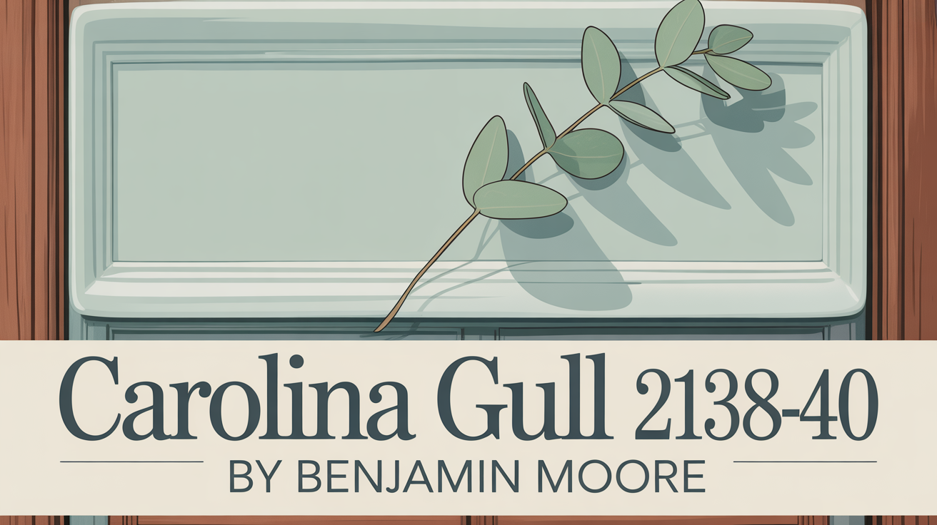
Effortless Elegance with a Classic Touch
Imagine walking into a space that instantly feels calm and completely relaxed. That’s exactly what Boothbay Gray by Benjamin Moore can do. With its gentle mix of gray and blue tones, this paint color brings a serene vibe to any area. It’s spot on for creating an environment that feels both welcoming and incredibly soothing.
As you see it on your walls, you’ll notice it subtly changes throughout the day. This adds an intriguing element without ever feeling overwhelming. It’s perfect for spaces like a living room, bedroom, or even a cozy spot for reading. Boothbay Gray truly feels like a fresh breath, making your home feel easy and comfortable.
Boothbay Gray doesn’t just make your space more inviting; it pairs beautifully with all sorts of decor styles. Whether your home is modern, leans traditional, or is somewhere in between, this color adds an elegant touch that ties everything together smoothly.
It works as a really versatile backdrop. Feel free to introduce pops of vibrant color, stick to neutral tones, or bring in lush green plants.
Consider Boothbay Gray for your next painting project if you’re dreaming of a space that just oozes peace and sophistication. It’s a lovely choice that can genuinely turn a simple room into your own personal retreat.
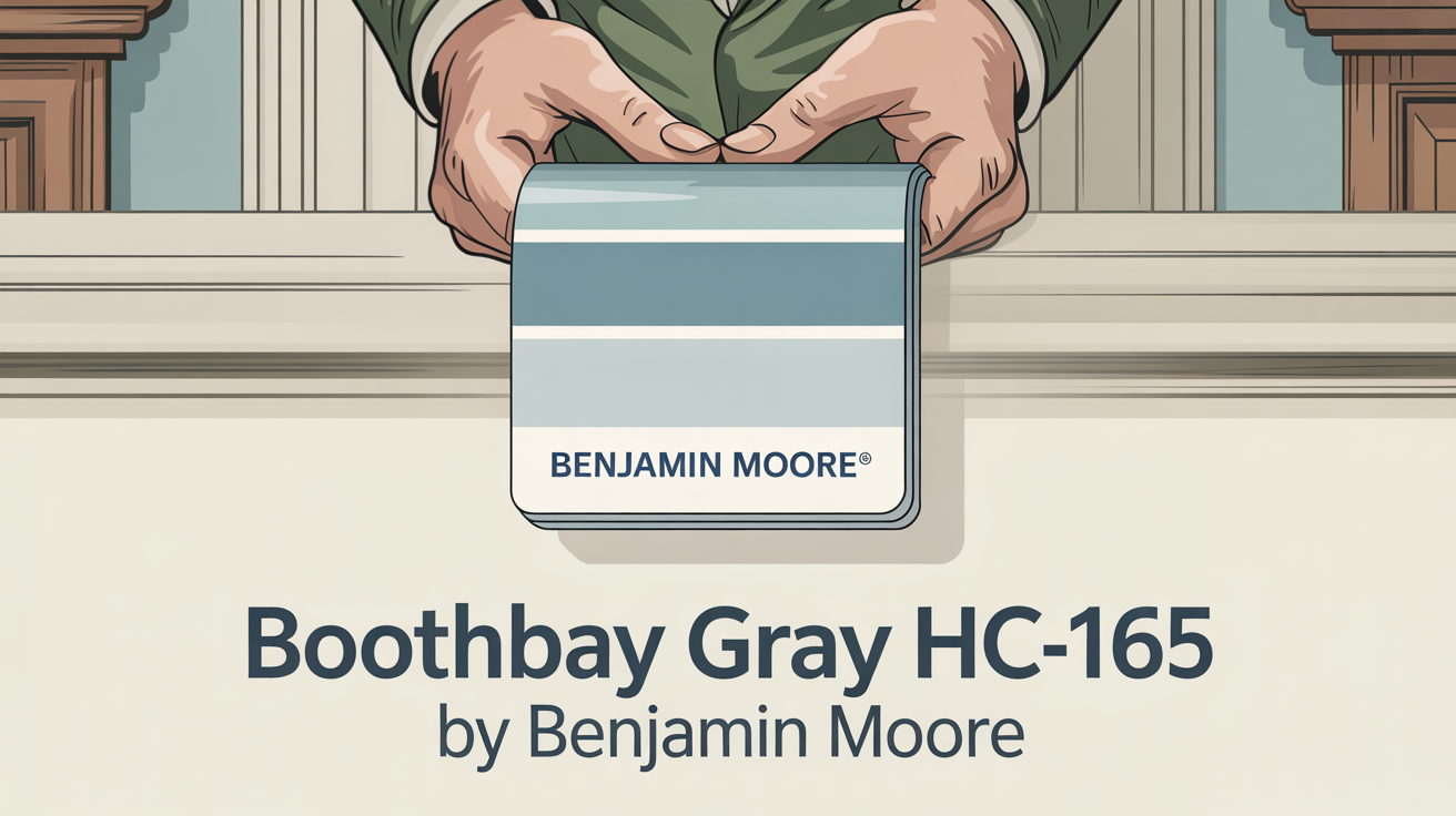
What Color Is Boothbay Gray HC-165 by Benjamin Moore?
Boothbay Gray HC-165 by Benjamin Moore is a color that’s both versatile and sophisticated. It strikes a fine balance between gray and blue, giving it a calm, understated presence. This gentle shade can actually shift slightly depending on the light, sometimes appearing more blue or more gray at different times.
Boothbay Gray fits right in with various interior design styles, making it an excellent pick for many homes. If you have a traditional setting, it adds an elegant feel and looks great with classic wooden furniture.
For modern spaces, it provides a cool, sleek background. This creates a beautiful contrast with bold shapes and metallic details. If you love coastal or nautical themes, that hint of blue is just right, subtly reminding you of the sea.
This color is especially good friends with natural materials. Think about soft, cozy fabrics like wool or linen. It also complements wooden pieces wonderfully, from light oak to deep walnut. Pair Boothbay Gray with crisp white trim or cabinets, and you’ll instantly brighten the space for a really clean look.
Using it alongside exposed brick or concrete adds warmth and texture. And if you’re a fan of metals, brushed nickel or matte black fixtures create a truly harmonious look. Overall, Boothbay Gray is a super flexible choice. It enhances different design elements and helps bring a cohesive feel to your interiors.
Is Boothbay Gray HC-165 by Benjamin Moore Warm or Cool color?
Boothbay Gray HC-165 by Benjamin Moore is a versatile paint color that brings together gray with subtle blue undertones. It works really well in homes by creating a calm and relaxed vibe, making it perfect for living rooms, bedrooms, and even bathrooms. Boothbay Gray pairs beautifully with furniture, whether it’s light or dark, giving you plenty of flexibility in decorating.
This color has a knack for looking both modern and completely timeless, adapting easily to styles from traditional to contemporary. In rooms filled with lots of natural light, you’ll tend to see its blue hues show up more, which gives the space a refreshing feel.
In areas with less light, it takes on a cozy, warm gray tone, providing a definite sense of comfort.
Plus, Boothbay Gray can serve as a neutral backdrop. This allows bold art or decor pieces to really pop and stand out. Its balanced nature makes it a go-to choice for anyone wanting a soothing environment.
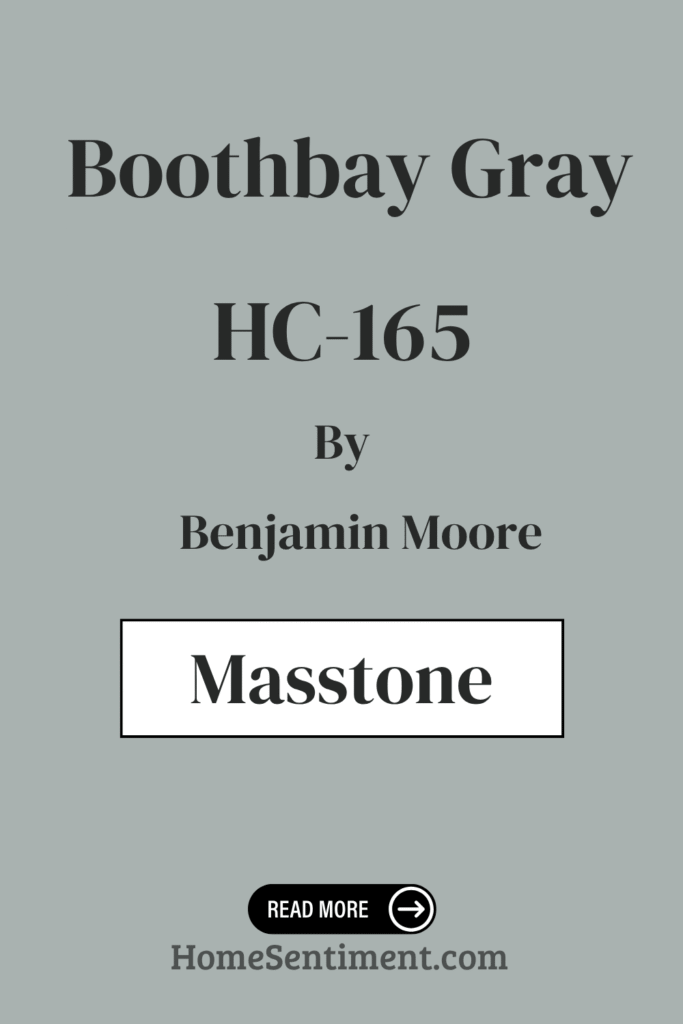
What is the Masstone of the Boothbay Gray HC-165 by Benjamin Moore?
The masstone of Boothbay Gray HC-165 by Benjamin Moore shows off a light gray shade (#D5D5D5). This specific shade brings a sense of calm and balance into any space. It’s incredibly versatile and works well with various styles, from modern to traditional. This light gray naturally makes rooms feel more open and airy. Its softness means it complements other colors without ever taking over.
In a living room, Boothbay Gray creates a cozy yet sophisticated atmosphere. For kitchens, it looks great with both stainless steel appliances and rustic wood accents, offering a truly timeless look. In bedrooms, this light gray encourages rest and relaxation, which can even help you sleep better.
The color is also wonderfully neutral. This means it can match different furniture pieces and decor items easily. It makes updating your space down the road much simpler, without needing huge changes. All in all, Boothbay Gray is a fantastic choice for creating comfortable and harmonious environments.
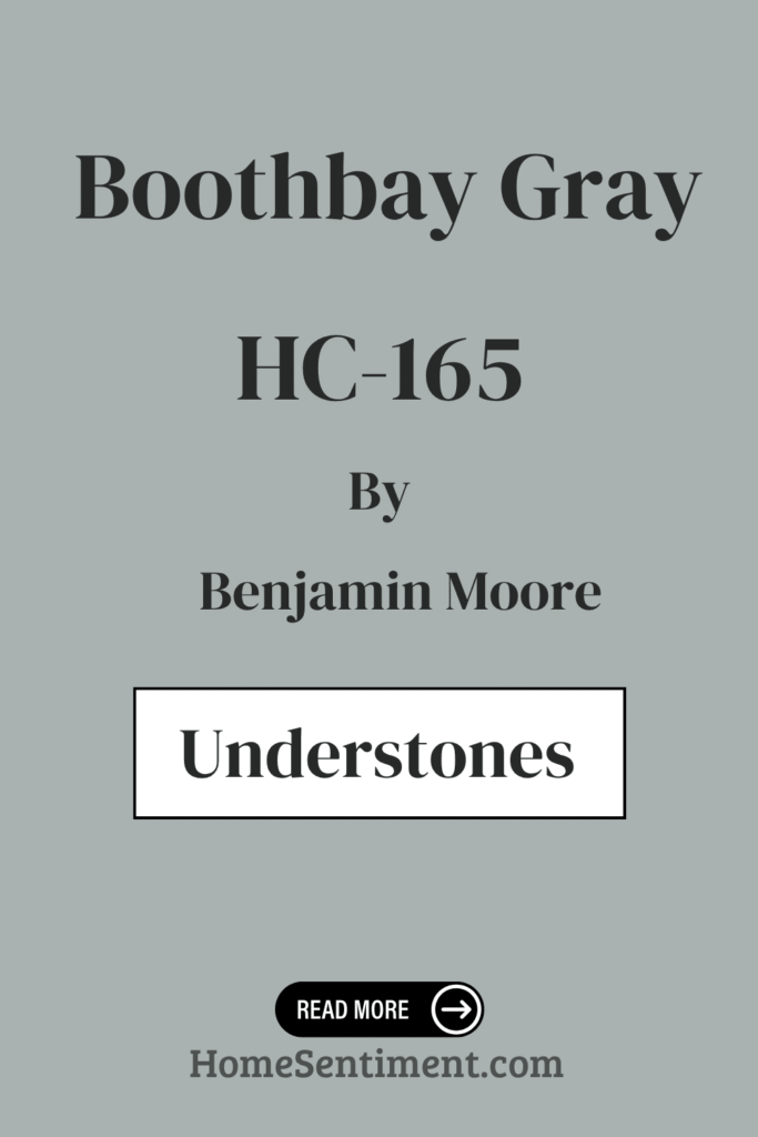
Undertones of Boothbay Gray HC-165 by Benjamin Moore
Boothbay Gray HC-165 by Benjamin Moore is actually a complex color. It has various undertones that really influence how it looks on your walls. These subtle undertones include light blue, pale yellow, mint, light purple, lilac, gray, and pale pink. These hints of color subtly change how we perceive the main shade.
Undertones are so important because they add depth and richness to color. They can make a paint color seem warmer or cooler, brighter or softer. This often depends on the lighting and everything else in the room.
For Boothbay Gray, this means the color on your walls might look different at various times of the day. It shifts as the natural light changes from morning to evening.
The light blue and gray undertones give Boothbay Gray a cool, calming feeling. They help spaces feel open and airy. Pale yellow and mint undertones add a slight warmth. This helps balance the cool tones with a touch of freshness. Hints of lilac, light purple, and pale pink add a gentle softness. These undertones contribute to an inviting and cozy atmosphere.
On interior walls, Boothbay Gray adjusts well under different lighting conditions. It subtly changes to highlight various features in the room. It pairs effectively with both neutral colors and bolder shades, making it incredibly versatile.
Whether you use it in a living room or a bedroom, Boothbay Gray fosters a peaceful setting. This is largely thanks to its unique mix of undertones.
Coordinating Colors of Boothbay Gray HC-165 by Benjamin Moore
Let’s talk about coordinating colors. These are the shades that work beautifully together with your main paint color to create a harmonious look. They complement each other and enhance the overall feel of a room without clashing or being too dominant. When you’re thinking about Boothbay Gray HC-165 by Benjamin Moore, you want colors that will pair nicely with its soft, muted blue-gray tone. The goal is a balanced and cohesive environment.
This is where colors like Frosted Petal, Stonington Gray, White Wisp, and Chantilly Lace come in as excellent coordinating options.
Frosted Petal (2089-70) is a delicate, gentle pink. It adds a touch of warmth and softness to the mix. It pairs beautifully with Boothbay Gray, offering a subtle contrast that doesn’t overwhelm the space. Stonington Gray (HC-170) is another sophisticated shade of gray. It has a hint of blue, making it a fantastic partner to Boothbay Gray by reinforcing that cool, calming effect.
White Wisp (OC-54), on the other hand, is an off-white option. It has just a whisper of gray-green in it. This is perfect for adding lightness and an airy feel to a room.
Finally, Chantilly Lace (OC-65) is a pure, crisp white. It gives you a bright and clean look. This is perfect for things like trim or ceilings to create a sharp, clean contrast with the softer gray walls.
Used together, these colors form a cohesive palette. They really enhance the natural beauty of Boothbay Gray.
Here are some recommended paint colors that coordinate well:
- 2089-70 Frosted Petal
- HC-170 Stonington Gray
- OC-54 White Wisp
- OC-65 Chantilly Lace
How Does Lighting Affect Boothbay Gray HC-165 by Benjamin Moore?
Lighting has a huge impact on how we see colors, and Boothbay Gray HC-165 is a great example. It’s a versatile gray with blue undertones. The way this color looks changes quite a bit depending on the lighting conditions, which is why you should always think about the light in a room.
In natural light, Boothbay Gray can look different as the day goes on. In the morning, when the light is soft, it might appear cooler and a bit more muted. As the sun moves and the day gets brighter, the color could seem warmer or show off more of its blue side, depending on how the sunlight hits it.
Under artificial light, the kind of light bulb you use makes a difference. Warm white bulbs might bring out more of the gray tones, downplaying the blue undertones. This can give the space a cozier feel. Cool white bulbs, however, could enhance the blue, making the room look crisper. With LED bulbs, you have a wide range of temperature options, giving you flexibility in how the color is perceived.
In north-facing rooms, the light is softer and cooler. This often makes Boothbay Gray look more blue and muted. Since these rooms don’t get direct sunlight, the color stays pretty consistent throughout the day but definitely leans towards a cool tone.
South-facing rooms get plenty of sunlight, which is often warm and bright. In these rooms, the color becomes warmer and more vibrant. The natural light can create a nice balance between the gray and blue, making the room feel bright and welcoming.
East-facing rooms get direct sunlight in the morning. This makes the color look fresher and cooler earlier in the day. By the afternoon, as the light changes, the room cools down again, and the gray undertones become more noticeable.
West-facing rooms are the opposite. They start the day cool but get warmer as the sun starts to set. In the evening, Boothbay Gray can appear richer and cozier. That warm, setting sun brings out more depth in the color.
Understanding these shifts is really helpful when you’re deciding where to use this paint. It helps ensure you get the look you’re aiming for in that specific space.
What is the LRV of Boothbay Gray HC-165 by Benjamin Moore?
LRV stands for Light Reflectance Value. It’s essentially a measurement of how much light a paint color reflects. It’s shown on a scale from 0 to 100, where 0 is total black (reflects no light) and 100 is pure white (reflects all light). A color’s LRV impacts how bright or dark it looks in different lighting conditions.
When a color has a higher LRV, it means it reflects more light. This usually makes it appear brighter on your walls and can make a space feel bigger and more open. On the flip side, a lower LRV means a color absorbs more light. This often makes a room feel cozier but might make it seem a bit smaller.
Knowing the LRV is really key. It helps you understand how a color will interact with the light in any given space, which is super important when you’re picking paint for your home.
Boothbay Gray HC-165 has an LRV of 43.26. This puts it right in the medium range. It reflects a moderate amount of light, so it looks neither too bright nor too dark on your walls.
In a room with good lighting, Boothbay Gray can come across as a soft, muted gray. It offers a really balanced appearance that isn’t overwhelming.
Its medium LRV ensures it has a noticeable presence without dominating the room. It works well in various settings, from living rooms to bedrooms. In spaces with less natural light, Boothbay Gray might appear a bit darker, but its tone will still add depth and character.
This makes it a versatile choice. It’s great for anyone who wants a color that can adapt to different lighting, providing a calm yet distinctive backdrop for any decor.
What are the Trim colors of Boothbay Gray HC-165 by Benjamin Moore?
Trim colors are what you use for moldings, window frames, doors, and other architectural details. These colors help define spaces and add either contrast or harmony to the main wall color. For Boothbay Gray HC-165 by Benjamin Moore, choosing the right trim is important because it’s a medium-tone gray with those subtle blue undertones we’ve discussed.
The right trim color can really enhance its elegance. It can give the walls a cleaner, more defined look. Trim colors are kind of like the finishing touches that pull the whole room together. By creating a clear line between the walls and other features, they can make a space feel more sophisticated and deliberately designed.
Simply White OC-117 is a warm, soft white that pairs well with many colors, including grays like Boothbay Gray. It brings a sense of freshness and brightens up spaces. It’s a perfect choice for trim when you’re using cool-colored walls.
Mountain Peak White OC-121, on the other hand, is a creamy white. It has a hint of warmth and richness to it. Its subtle warmth works nicely with Boothbay Gray, adding a cozy feel without being too much. Both of these trim colors don’t just highlight architectural details; they add layers of depth and character to any room painted with Boothbay Gray.
Here are some recommended trim colors:
- OC-117 Simply White
- OC-121 Mountain Peak White
Colors Similar to Boothbay Gray HC-165 by Benjamin Moore
Similar colors play a big role in design. They help create harmony and a sense of flow within a space. Choosing colors closely related to Boothbay Gray HC-165 by Benjamin Moore can give you a really seamless and balanced look. Think about shades like Silver Mink 1586, Marina Gray 1599, Mount Saint Anne 1565, and Iced Marble 1578.
These colors share a cool undertone. This allows them to work well together, and with Boothbay Gray itself. They can enhance the overall look and feel of a room. When you use these colors alongside each other, they help create a relaxing and welcoming atmosphere. The slight differences between each shade offer variety without becoming overwhelming.
Silver Mink 1586 has a soft, muted quality. It offers a gentle balance that complements colors that might be more dominant. Marina Gray 1599 adds a slightly warmer gray tone. This brings a sense of depth and coziness to the space. Mount Saint Anne 1565 introduces a noticeable hint of blue. This gives rooms a touch of serenity and peacefulness.
Meanwhile, Iced Marble 1578 brings a lighter, almost frosty note. It brightens spaces and adds an airy feel. Together, these colors offer a palette that supports elegant transitions between different areas. They keep things visually interesting while maintaining harmony.
They ensure that the space feels thoughtfully put together and looks visually cohesive.
Here are some recommended similar paint colors:
- 1586 Silver Mink
- 1599 Marina Gray
- 1565 Mount Saint Anne
- 1578 Iced Marble
Boothbay Gray HC-165 by Benjamin Moore vs Silver Mink 1586 by Benjamin Moore
Boothbay Gray HC-165 and Silver Mink 1586 by Benjamin Moore are both elegant gray shades. But they each have a distinct feel. Boothbay Gray is a medium-toned gray with cool undertones. This gives it that soft, sophisticated look.
It balances blue and gray nicely, creating a calm backdrop for various rooms. Silver Mink, on the other hand, is a lighter, more silvery tone. It comes across as slightly warmer than Boothbay Gray, though it’s definitely still a gray.
Silver Mink gives off an airy, open vibe. It’s a great choice for spaces where you prefer a more subtle gray presence. While Boothbay Gray can help create a cozy, grounded atmosphere, Silver Mink brightens a room with its lighter hue. Both colors fit well in modern, minimalist designs. However, their different undertones give you distinct options for personalizing your space. Think about using them on walls or for accent areas.
Here is Silver Mink 1586:
- 1586 Silver Mink
Boothbay Gray HC-165 by Benjamin Moore vs Marina Gray 1599 by Benjamin Moore
Boothbay Gray HC-165 by Benjamin Moore offers a sophisticated mix of gray and blue. It provides a balanced, serene feel. This shade is really versatile and works well in many spaces. It serves as a great backdrop that complements both classic and modern decor styles. Its subtle warmth makes it a cozy choice. It’s ideal for living rooms or bedrooms where you want a calming atmosphere.
Marina Gray 1599, also by Benjamin Moore, leans more towards being a true gray. It has cooler undertones. This gives it a look that’s slightly more modern and crisp. It’s well-suited for contemporary spaces, adding a clean, polished appearance. Its neutrality means it pairs effortlessly with bold accent colors or vibrant furnishings.
Both colors are flexible, no doubt about that. But Boothbay Gray adds that hint of blue warmth, while Marina Gray maintains a more straightforward, cool expression. Your choice between them really depends on whether you’d like a subtle touch of warmth or a decisively cool, neutral finish.
Here is Marina Gray 1599:
- 1599 Marina Gray
Boothbay Gray HC-165 by Benjamin Moore vs Mount Saint Anne 1565 by Benjamin Moore
Boothbay Gray HC-165 by Benjamin Moore is a muted, sophisticated gray. It has subtle blue undertones. This creates a calm ambiance that’s perfect for all sorts of spaces. This shade works well in both modern and traditional settings. It gives you a neutral, yet stylish, backdrop that complements various accent colors and materials.
Mount Saint Anne 1565 by Benjamin Moore, meanwhile, has more blue than gray in it. It offers a soft, dusty blue hue. This shade feels soothing and airy. It’s ideal for bedrooms or areas where relaxation is key. It’s a bit brighter than Boothbay Gray. It can bring in a gentle pop of color without being too much.
Boothbay Gray provides a more neutral, balanced tone that fits easily into many styles. Mount Saint Anne brings a touch more lightness with its stronger blue presence. Both colors can really enhance a room’s mood. Boothbay Gray tends to be more understated, while Mount Saint Anne offers a delicate, slightly more vibrant touch.
Here is Mount Saint Anne 1565:
- 1565 Mount Saint Anne
Boothbay Gray HC-165 by Benjamin Moore vs Iced Marble 1578 by Benjamin Moore
Boothbay Gray HC-165 and Iced Marble 1578 by Benjamin Moore have subtle differences that give them distinct character and applications. Boothbay Gray, a soft and muted gray with a hint of blue, brings a calm and sophisticated vibe to any space. It’s a great choice for rooms where you want a serene and refined atmosphere.
Its muted hue easily works with various design styles. It offers versatility in both modern and traditional settings. Iced Marble 1578, in contrast, has a cooler and crisper look. It’s a light gray tone. This color gives interiors a clean, refreshing feel, making spaces seem open and light. It’s an excellent option for areas where you want to brighten the room without necessarily using a pure white.
While Boothbay Gray provides a sense of warmth and depth, Iced Marble brings clarity and brightness. This makes Iced Marble ideal for places where you prefer a lighter ambiance. Both colors blend nicely with other palettes, but they truly serve different moods and purposes.
Here is Iced Marble 1578:
- 1578 Iced Marble
How to Use Boothbay Gray HC-165 by Benjamin Moore In Your Home?
Boothbay Gray HC-165 by Benjamin Moore is a calming gray with those signature blue undertones. It brings a sense of comfort and simplicity wherever you use it. This color is fantastic in living rooms or bedrooms, creating a really cozy atmosphere. Its neutral quality means it blends well with other colors, making it easy to match with your existing furniture and decor.
In the kitchen, Boothbay Gray can help create a modern look. Try it on cabinets or walls. It’s a solid choice if you’re looking for a soft touch that isn’t overly dominant. For a bathroom, this shade adds a sense of relaxation. It works well with white tiles and fixtures.
If you want an inviting front door or exterior, Boothbay Gray provides a subtle yet sophisticated touch. It definitely enhances curb appeal. Using this paint indoors or outdoors can create a consistent and pleasing look throughout your home. It’s a perfect backdrop for both classic and contemporary styles.
Conclusion
This particular shade of gray offers a balanced mix of warmth and coolness. This makes it suitable for just about any setting or style you can think of.
Whether you use it on interior walls, kitchen cabinets, or even exterior siding, Boothbay Gray effortlessly enhances the elegance of any space.
I personally appreciate how well it works as a neutral backdrop. It lets your other design elements take the spotlight without overshadowing them. Because of its subtle undertones, this gray pairs wonderfully with a huge range of colors, from soft pastels to bold, vibrant shades. It’s a bit of a chameleon, adapting seamlessly to different lighting conditions. This adds depth and dimension to your room as the day goes by.
For me, Boothbay Gray is a calming presence. It’s perfect for creating a soothing environment whether you’re at home or in an office space.
It brings a sense of sophistication without feeling too cold or industrial. It truly invites a quiet sense of comfort. Under different lights, this hue subtly shifts. This keeps things looking fresh and offers new perspectives throughout the day.
Bringing HC-165 Boothbay Gray into any design scheme can spark creativity and help foster a harmonious atmosphere.
With its timeless appeal, this color remains a top pick for anyone seeking a look that’s reliable and refined.