Lasting Beauty in Every Color
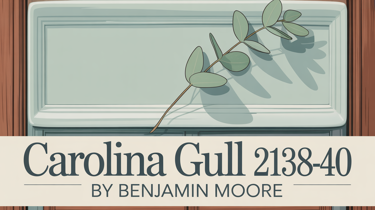
Choosing the right paint color for your home can truly feel overwhelming, right? You want a shade that not only looks good but also reflects who you are and makes your space feel amazing. Well, let me tell you about a color that absolutely deserves your attention: 2138-40 Carolina Gull by Benjamin Moore.
This isn’t just any color; it’s a hue that beautifully balances sophistication and warmth. It’s like a cozy hug for your walls, perfect for so many different rooms in your home.
Imagine a color that brings a sense of calm and comfort to any space. That’s Carolina Gull for you. Its mix of gray and green tones helps turn a room into a cozy retreat.
Think about your living room, bedroom, or even your home office. This color fits right in, versatile enough for modern or traditional styles. You can let it shine by pairing it with neutral furniture, or go bold with vibrant accents. What’s great is how it works with different lighting, always enhancing its natural beauty, whether it’s filled with sunshine or relying on lamps.
So, picture how this color could transform your home. It truly brings a touch of elegance and serenity.
What Color Is Carolina Gull 2138-40 by Benjamin Moore?
Carolina Gull 2138-40 is a lovely muted, medium gray with a subtle hint of blue-green undertone. This gives it that soft, soothing quality you’ll love.
It’s incredibly versatile, fitting seamlessly into modern, contemporary, coastal, and traditional interior styles. Its understated nature is perfect for creating a calm and balanced atmosphere in living rooms, bedrooms, or kitchens.
This color also pairs wonderfully with natural materials like wood and stone, adding warmth and depth. Light oak or walnut finishes can really make the cool tones pop, creating a harmonious palette. Soft textures like linen or cotton add an inviting touch. In modern spaces, it’s a sophisticated backdrop for metal accents like brushed nickel, while coastal interiors feel breezy paired with whites or sandy neutrals. It’s truly adaptable, a subtle backdrop that enhances your design without overpowering it.
Is Carolina Gull 2138-40 by Benjamin Moore Warm or Cool color?
Carolina Gull is a versatile and soothing color choice for your home. Its muted gray-green brings a hint of nature indoors, creating a calm and relaxing vibe. It’s perfect for living rooms, bedrooms, and bathrooms, providing a gentle backdrop that lets your decor shine.
This color’s softness means it works well with various design styles, from modern to traditional. It pairs beautifully with neutrals like whites and creams, adding elegance. With lots of natural light, it feels serene and open. In dimmer areas, it offers a cozy, inviting ambiance without feeling heavy. Its understated elegance is ideal if you want color without making a huge statement. It truly enhances spaces without overwhelming them, making them feel welcoming and harmonious.
What is the Masstone of the Carolina Gull 2138-40 by Benjamin Moore?
The masstone of Carolina Gull 2138-40 is a specific shade of gray, known by the number #808080. This gives it a neutral, balanced look that blends well with different decor styles. Grey, in general, creates a calm, relaxed atmosphere in any room.
This color doesn’t overpower things, which makes it easy to pair with other colors and textures. It works for modern, traditional, or eclectic looks. Using it on walls can make a space feel sophisticated and polished. It reflects natural light well, helping rooms feel larger and airier without being too cool. It’s a great backdrop, letting your furniture and art stand out, and it complements both warm and cool tones beautifully. Overall, it helps create a cozy and inviting space.
Undertones of Carolina Gull 2138-40 by Benjamin Moore
Undertones are those subtle colors that lie beneath the main shade, really affecting how you see the color on your wall. Lighting can make these undertones appear differently throughout the day.
Carolina Gull is fascinating because it has undertones of blues, greens, and pinks. For instance, touches of dark and light turquoise add a cool, calming vibe, perfect for serenity. Dark green and olive bring a hint of nature, adding warmth and earthiness.
Lilac and purple undertones can give it a richer, more luxurious feel, adding a bit of classic depth. Pink and pale pink offer a soft warmth, balancing out the cooler tones. Meanwhile, a light gray undertone subtly keeps the more vibrant tones in check, ensuring that calming presence remains. All these undertones work together, allowing Carolina Gull to shift between warm and cool depending on the light and surrounding colors. It’s a fantastic choice if you want a balanced, adaptable backdrop.
Coordinating Colors of Carolina Gull 2138-40 by Benjamin Moore
Coordinating colors are those perfect partners that create a harmonious look when used together. They bring balance and unity, making a space feel cohesive and visually appealing.
For Carolina Gull, that serene shade that brings gentle coastal vibes, several colors truly shine alongside it. Light Khaki 2148-40 adds a warm, subtle earthiness that pairs wonderfully with Carolina Gull’s calm tone. Mountain Peak White OC-121 is a crisp, clean choice, perfect for trim or ceilings, making the room feel airy. Soft Chamois OC-13 is a gentle, creamy neutral that blends seamlessly, providing a cozy backdrop. And Nantucket Gray HC-111, a soft, muted green, adds depth and sophistication.
Using these colors together can create a palette that turns your home into a welcoming retreat. Whether it’s for walls, furniture, or accessories, this collection makes it easy to design a space that feels both modern and timeless. The key is using them thoughtfully to add their unique touch to the overall look.
Here are those coordinating colors:
- Light Khaki 2148-40
- Mountain Peak White OC-121
- Soft Chamois OC-13
- Nantucket Gray HC-111
How Does Lighting Affect Carolina Gull 2138-40 by Benjamin Moore?
Lighting is a huge factor in how we see colors. The same color can look totally different depending on the light. Carolina Gull, being a muted shade, definitely changes appearance under various lighting conditions.
In natural light, colors usually look more vibrant and true. With ample daylight, Carolina Gull might really show off its green undertones. However, its exact look shifts throughout the day as the sun moves. Morning and afternoon sun can highlight different aspects.
Artificial lighting can also dramatically change things. Warm lights, like from incandescent bulbs, can add a yellowish tint, making the green seem warmer or a bit muddier. Cool lights, like some LEDs, can make the color look crisper and cooler.
In a north-facing room, which gets softer, diffused light, Carolina Gull might appear more subdued and cooler. It could look slightly more gray-green here. A south-facing room gets direct sun, often highlighting the full spectrum. Here, Carolina Gull might look brighter and more vivid, showing off its green more prominently.
East-facing rooms get the best light in the morning. Carolina Gull might look lighter and fresher early on, highlighting its green tones, but become more muted later. In west-facing rooms, you’ll see warmer, intense light late afternoon. This can bring out warmer tones in Carolina Gull, giving it a cozier feel towards evening. It might appear quite dynamic with the changing light. Understanding this helps you pick the perfect spot for this color.
What is the LRV of Carolina Gull 2138-40 by Benjamin Moore?
LRV stands for Light Reflectance Value. It measures how much light a color reflects or absorbs on a scale from 0 (pure black, absorbs all light) to 100 (pure white, reflects all light). This number is super helpful for knowing how light or dark a color will appear on your walls. Higher LRV colors reflect more light, making spaces feel larger and brighter. Lower LRV colors absorb more light, making rooms feel darker and cozier.
For Carolina Gull 2138-40, the LRV is 27.41. This tells you it’s a relatively dark color that absorbs more light than it reflects. On walls, it will create a more intimate, cozy feel compared to lighter shades. In a room with lots of natural light, it can feel rich and moody. However, in a space with limited light, it might make the room feel even darker, so think about your lighting when using it. Its lower LRV makes it great for accent walls or adding depth without overwhelming the whole space.
What are the Trim colors of Carolina Gull 2138-40 by Benjamin Moore?
Trim colors are those shades you use on moldings, window frames, and door frames. They are really important with Carolina Gull because they define the spaces and add elegance.
Colors like Pink Damask OC-72 or Decorator’s White OC-149 create a beautiful contrast with Carolina Gull’s muted blue-green tone. They provide a subtle yet noticeable framework, highlighting architectural details and creating a cohesive, polished look.
Pink Damask OC-72 has a gentle blush tone that adds soft warmth. It brings a hint of elegance and romance, making spaces feel inviting and cozy alongside Carolina Gull’s muted backdrop. Decorator’s White OC-149, on the other hand, is clean and crisp. It offers a fresh, minimalistic edge, bringing brightness and clarity. It perfectly offsets the cool hues of Carolina Gull and highlights features without stealing the show. Both options are fantastic for defining and enhancing the character of any room.
Here are those recommended trim colors:
- OC-72 Pink Damask
- OC-149 Decorator’s White
Colors Similar to Carolina Gull 2138-40 by Benjamin Moore
Finding similar colors is key to creating a cohesive and harmonious look. They offer subtle variations that add depth without clashing. Carolina Gull brings that calming, muted gray feeling reminiscent of coastal landscapes.
Colors similar to it include Garden Oasis 699, a soft green that feels fresh and natural, complementing the coastal vibe. Cos Cob Stonewall 1483 is a warm gray with brown undertones, giving a grounding, cozy feel. Duxbury Gray HC-163 is a deeper green-gray with bluish-green undertones, adding richness and sophistication if you want a stronger statement but still crave that serene feel. Intrigue 1580, a dark and moody navy, adds drama and depth, great for accent walls or cozy nooks. Using these together creates an inviting and stylish environment where each color complements the others.
Here are those similar colors:
- 699 Garden Oasis
- 1483 Cos Cob Stonewall
- HC-163 Duxbury Gray
- 1580 Intrigue
Colors that Go With Carolina Gull 2138-40 by Benjamin Moore
Finding colors that complement Carolina Gull is essential for a balanced and harmonious space. These colors work together to enhance the mood and bring out the best in each other.
Misted Green 2138-50 offers a soft, muted tone that pairs beautifully, providing a gentle, calming effect. Southern Vine 2138-10 adds depth and richness with its deep, lush green, creating a striking, cozy contrast. Gray Cashmere 2138-60, a soft gray with a hint of green, adds sophistication and subtle contrast. Mohegan Sage 2138-30, with its earthy tones, grounds the scheme and adds stability. Green Grove 2138-20, a vibrant but balanced green, adds energy while keeping harmony. Lastly, Gray Lake 2138-70, tranquil and soothing, unifies the palette. These colors, used thoughtfully with Carolina Gull, contribute to a well-designed space with depth, character, and an inviting ambiance.
Here are those coordinating colors:
- 2138-50 Misted Green
- 2138-10 Southern Vine
- 2138-60 Gray Cashmere
- 2138-30 Mohegan Sage
- 2138-20 Green Grove
- 2138-70 Gray Lake
How to Use Carolina Gull 2138-40 by Benjamin Moore In Your Home?
Carolina Gull is a sophisticated gray-green that brings a serene and balanced feel to any room. It’s super versatile, working well in living rooms, bedrooms, and even kitchens. It looks beautiful with white or cream trims and is fantastic for accent walls.
In a living room, it creates a calm atmosphere, perfect for relaxing or chatting. In bedrooms, it provides a soothing backdrop for rest. For kitchens, it can feel contemporary yet cozy, especially with wood or copper accents. This color complements both modern and traditional furniture, fitting almost any decor style. Consider accessories in gold or brushed metal to enhance the look, and natural fabrics for warmth and texture. Using Carolina Gull can help your home exude understated elegance and calmness.
Carolina Gull 2138-40 by Benjamin Moore vs Duxbury Gray HC-163 by Benjamin Moore
Let’s compare Carolina Gull to another lovely shade, Duxbury Gray HC-163. Carolina Gull is a cool, earthy mix of gray and green. It offers a gentle, subdued look, great for creating a calming, neutral space that blends easily with various styles.
Duxbury Gray, on the other hand, is a deeper green-gray tone with a bit more warmth. This shade feels richer and more traditional. It adds depth and character, making it a great choice for a cozy, inviting atmosphere. While both share a gray-green base, Carolina Gull is softer and more understated, while Duxbury Gray has a stronger presence. It really comes down to whether you prefer a lighter, cooler feel or a darker, warmer ambiance. Both are beautiful choices, each adding unique charm.
Here is that comparison color:
- HC-163 Duxbury Gray
Carolina Gull 2138-40 by Benjamin Moore vs Garden Oasis 699 by Benjamin Moore
Comparing Carolina Gull to Garden Oasis 699 shows two distinct vibes. Carolina Gull is that sophisticated, muted blue-gray we’ve been talking about. It has a calm, cool feel, ideal for spaces where you want a soothing atmosphere. Its tone leans neutral, pairing easily with both warm and cool colors.
Garden Oasis, however, is a rich, vibrant green. It totally evokes the freshness and vitality of lush gardens. This color brings a lively, natural touch, perfect if you love a burst of nature-inspired color. Essentially, Carolina Gull offers subtlety and elegance, while Garden Oasis brings energy and vibrancy. Choose Carolina Gull for a peaceful, understated look, or Garden Oasis if you’re after a lively, nature-filled setting.
Here is that comparison color:
- 699 Garden Oasis
Carolina Gull 2138-40 by Benjamin Moore vs Cos Cob Stonewall 1483 by Benjamin Moore
Let’s look at Carolina Gull next to Cos Cob Stonewall 1483. Carolina Gull is a soft, muted gray with just a hint of green. It gives off a calm, grounded feeling, adding a subtle touch to any room. Its gentle tone works well in both modern and traditional settings.
Cos Cob Stonewall is a bit different – it’s a slightly deeper, more pronounced gray with a touch of warmth. This color feels richer and can add a sense of coziness. It pairs nicely with both lighter and darker colors, creating great contrast. While Carolina Gull feels airy and light, Cos Cob Stonewall feels warmer and more robust. If you’re aiming for a spacious feel, Carolina Gull might be your pick. For a snug, inviting atmosphere, Cos Cob Stonewall could be ideal. Both have their unique charm to match different moods and styles.
Here is that comparison color:
- 1483 Cos Cob Stonewall
Carolina Gull 2138-40 by Benjamin Moore vs Intrigue 1580 by Benjamin Moore
Finally, let’s compare Carolina Gull to Intrigue 1580. Carolina Gull is a soft, muted gray with subtle green undertones. It brings that calming, neutral tone, creating warmth and coziness. It’s a versatile backdrop for living rooms or bedrooms, easy to coordinate with accents and styles.
Intrigue, on the other hand, is a rich, complex shade with deep green and gray undertones. This color adds serious depth and interest, making it perfect for feature walls or accents. It has a bolder presence than Carolina Gull, adding more character. Comparing them, Carolina Gull is more subdued and elegant, harmonizing without overpowering. Intrigue is more intense, adding drama and sophistication, ideal when you want to make a statement. They both have unique appeals for different moods and settings.
Here is that comparison color:
- 1580 Intrigue
This specific hue, Carolina Gull, feels like it blends naturally with coastal settings, echoing the peacefulness of seaside landscapes. Its soft, muted tones really evoke calmness. This makes it a great choice if you want to bring a piece of the outdoors inside. Its versatility means it works with so many design styles, whether you want a modern retreat or a cozy sanctuary. Using Carolina Gull, you can achieve a beautiful balance that mirrors nature’s beauty.
Choosing the right color isn’t just about how it looks; it’s also about how it makes you feel and how it connects your indoor space to the world outside. By considering colors like Carolina Gull, we can create environments that truly uplift and inspire us every single day.
