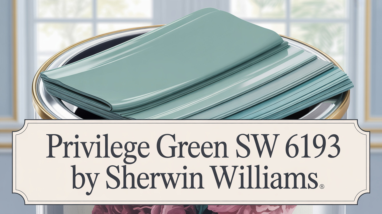
Where Style Feels Effortless
Looking for a paint color that just works? Collingwood OC-28 from Benjamin Moore is a warm gray that truly makes style feel effortless. It’s one of those rare shades that bridges both contemporary and classic looks beautifully. Choosing the right paint sets the whole mood for a room, right? This color offers a soft, inviting atmosphere. It’s perfect for spots like living rooms or bedrooms where you want sophistication without feeling overwhelming.
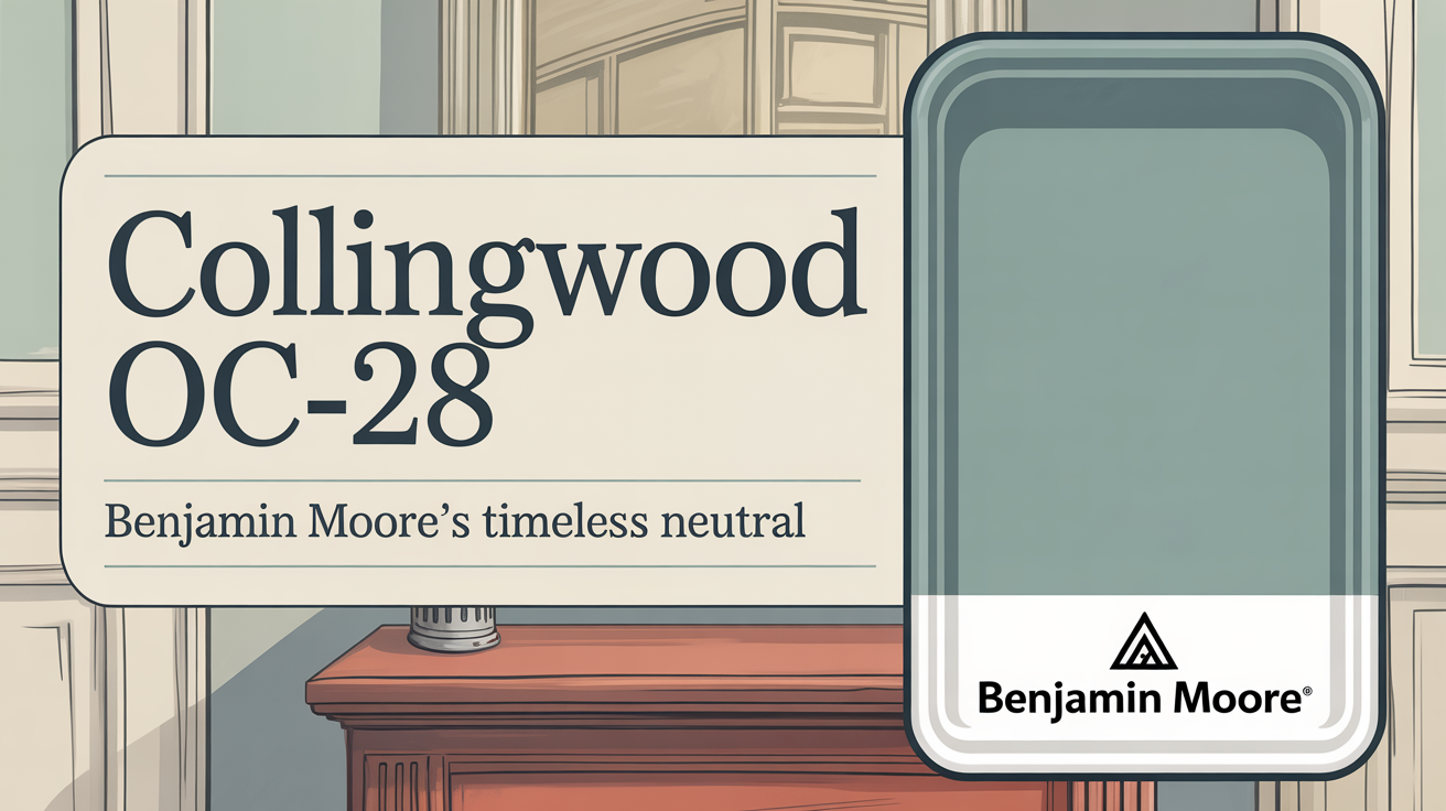
What Color Is Collingwood OC-28 by Benjamin Moore?
Let’s get specific. Collingwood OC-28 is a gorgeous greige. That means it’s a mix of gray and beige. It combines sophistication with real warmth. This neutral hue has soft undertones. That adaptability means it can look a bit warmer or cooler depending on the light in your room.
Is Collingwood OC-28 by Benjamin Moore Warm or Cool Color?
Here’s the deal: Collingwood OC-28 is considered a versatile paint color. It adds a soft, welcoming feel to your home. This particular light gray shade has warm undertones. That’s what gives it that cozy, inviting atmosphere. Its neutral tones make it a fantastic backdrop for all sorts of interior styles, whether your furniture leans modern or traditional. It really complements everything well.
What is the Masstone of the Collingwood OC-28 by Benjamin Moore?
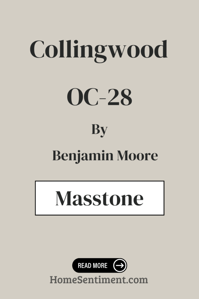
The main color you see, the masstone, of Collingwood OC-28 is a light gray. It offers a lovely balance of warmth and neutrality. This shade is super versatile. It works well in many different spaces throughout your home. Because it’s a light gray, it doesn’t dominate a room. It actually helps spaces feel airy and open. It’s especially effective in places like living rooms and kitchens where you’re often looking for a bright, fresh look. The subtle warmth keeps it from feeling too cold. This color really complements different styles of décor. Whether you’re into modern, traditional, or rustic vibes, Collingwood blends easily with furniture and accents. It’s a gentle neutral, letting other colors, like artwork or furniture, truly pop. Overall, it brings light and harmony to interiors.
Undertones of Collingwood OC-28 by Benjamin Moore
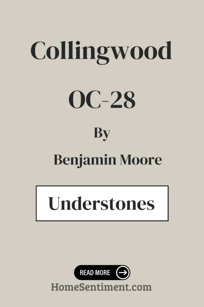
What exactly gives this color its character? Collingwood OC-28 has interesting undertones. These are subtle hues beneath the surface that affect how the color looks. For Collingwood, these include shades like pale yellow, light purple, light blue, pale pink, mint, lilac, and grey. Each one can subtly shift how you see the paint depending on the lighting and what’s around it. The grey undertone provides a soft, stable base. This makes it a flexible choice for your walls. The pastel undertones like pale yellow or light blue add warmth and softness. This creates a welcoming feel. Hints of light purple or lilac introduce a slight coolness. This adds a sophisticated, calming quality. These undertones allow Collingwood OC-28 to adapt. It looks great whether bathed in warm sunlight or cooler artificial light. It can feel cozy or sleek, making it adaptable for any room.
Coordinating Colors of Collingwood OC-28 by Benjamin Moore
Pairing paint colors is key to a balanced look. Choosing coordinating colors that enhance Collingwood OC-28 is important. Collingwood is a neutral with soft gray undertones, serving as that versatile backdrop. Its coordinating colors bring out its depth. They also add character to any room.
Here are some recommended shades:
- AF-15 Steam is a soft white. It offers a clean, fresh feel and works perfectly as a base or trim color. It highlights other colors without being overpowering.
- AF-655 Silhouette is a rich, warm charcoal. This adds depth and drama. It provides a modern touch when used alongside lighter tones.
- For an earthy feel, 2115-30 Amazon Soil offers a deep brown. This grounds a space with a cozy vibe.
- Finally, OC-57 White Heron is a crisp, classic white. It’s ideal for creating contrasts or adding lightness.
Using these together creates a cohesive palette. It enhances the mood of a room, making it feel thoughtfully designed.
How Does Lighting Affect Collingwood OC-28 by Benjamin Moore?
Lighting totally changes how paint colors appear. Collingwood OC-28, a light gray with warm undertones, looks different depending on the light it gets. In natural light, it shifts throughout the day. In rooms facing north, the color might seem slightly cooler. These rooms get less direct sun, so the gray tones can be more noticeable. It might even take on a slightly bluish tint because north-facing light is often cooler.
Rooms facing south will see it look warmer and brighter. They get direct sunlight for most of the day, which brings out those warm undertones. It feels extra cozy here. In east-facing rooms, it’s bright and crisp in the morning when the sun is strong. As the day goes on, the light softens, and the color might look a bit more muted. In the evening, it can lean back towards its gray tones. West-facing rooms are the opposite: muted in the morning. But in the afternoon and evening as the sun sets, it truly glows warmly, highlighting its beige and taupe side.
Under artificial light, it also varies. Incandescent bulbs (warm, yellowish) will make the color look warmer and more beige. LED or fluorescent bulbs (cooler or neutral) might emphasize the gray tones. Understanding these shifts helps you pick the best room for this versatile color.
What is the LRV of Collingwood OC-28 by Benjamin Moore?
Ever heard of LRV? LRV stands for Light Reflectance Value. It’s a number showing how much light a paint color reflects, from 0 (black) to 100 (white). It helps predict how light or dark a color will seem on your walls. A higher LRV means more light reflection, making spaces look brighter and bigger. Lower LRV colors absorb more light, making rooms feel smaller and cozier.
Collingwood OC-28 has an LRV of 61.52. This puts it in the mid-range. It reflects a good amount of light without being too bright or too dark. This color can brighten a room without overwhelming it. It’s a soft, warm gray, making it versatile. It works well in various lighting conditions. It helps create a balanced, inviting atmosphere. It’s effective in both small and large spaces. Because its LRV is in the medium range, its hue stays pretty consistent. It doesn’t drastically change when natural or artificial light hits it. This ensures consistent color throughout the day.
What are the Trim colors of Collingwood OC-28 by Benjamin Moore?
Trim colors are super important! They accentuate architectural details. They also provide a clean break between walls and other surfaces. When paired with Collingwood OC-28, certain trim colors really enhance the overall look.
Consider these recommended options:
- OC-110 Milkyway is a soft off-white. It brings warmth and subtle brightness. This creates a gentle contrast that makes the walls pop without being harsh.
- OC-128 Minced Onion leans towards a creamy hue. It adds a touch of sophistication. It blends seamlessly with Collingwood’s versatile gray.
Choosing the right trim is key. It can change how spacious a room feels. It outlines features like windows and baseboards. It even affects the room’s mood. Using Milkyway offers a subtle, inviting frame. It helps define the space beautifully. Minced Onion adds depth and richness. It enhances the room’s overall elegance. Both options complement Collingwood OC-28. They bring out its versatility and make spaces feel cohesive.
Colors Similar to Collingwood OC-28 by Benjamin Moore
Using similar colors can create a cohesive, balanced design. Colors close on the color wheel naturally harmonize well. Collingwood OC-28 is a versatile, soft gray with a warm undertone. This makes it popular for both modern and traditional spaces.
Using similar shades enhances this harmony. Nimbus 1465 is a great example. Nimbus is a gentle, cool gray. It has a slightly bluer tint than Collingwood. But it still feels calm and sophisticated. The subtle differences allow them to complement each other. You get a varied yet unified look. Using similar colors helps create a seamless flow. It makes spaces feel rooted. The way Nimbus and Collingwood work together can make rooms appear larger and more open. They transition smoothly without harsh contrasts. This connection is effective in multi-room settings. You can use these tones on different walls or accent pieces for consistency with added depth. These shades provide a serene backdrop. They allow your decor and furnishings to truly shine. Using similar colors helps achieve a stylish, balanced interior. It feels intentionally designed.
Here is a recommended similar color:
- 1465 Nimbus
Collingwood OC-28 by Benjamin Moore vs Nimbus 1465 by Benjamin Moore
Let’s compare Collingwood and Nimbus. Both are by Benjamin Moore and both are great neutrals. Collingwood OC-28 is a light gray with a hint of warmth. That warmth, with faint beige undertones, makes it feel inviting and cozy. It’s perfect for living rooms or bedrooms where you want a gentle ambiance. Nimbus 1465 is also gray, but it’s cooler. Its undertones include blue and green. This makes it feel crisp and modern. It works well in spaces needing a fresh, airy environment, like kitchens or bathrooms. While both are neutral, Collingwood feels slightly warmer and more traditional. Nimbus, being cooler, offers a more contemporary feel. Choosing between them depends on the mood and style you want to create. Both effectively complement various decor elements.
Here is the color for comparison:
- 1465 Nimbus
How to Use Collingwood OC-28 by Benjamin Moore In Your Home?
So, where can you use this color? Collingwood OC-28 is a really popular choice for home interiors. This neutral shade combines warm-gray with subtle beige undertones. Its versatility means it works in lots of different spaces. In the living room, it creates a comfortable, inviting atmosphere. It pairs well with both modern and traditional decor. Its soft tone makes matching with colorful furnishings easy.
In the bedroom, it’s a soothing backdrop. It’s great for relaxation. Pairing it with crisp white trim gives the room a clean look. For kitchens or dining areas, it complements wood tones and stainless steel. It offers a cohesive feel without being too much. Bathrooms benefit from its calming tone too. It helps them feel larger and open. Overall, Collingwood OC-28’s flexibility makes it a reliable choice throughout your home. It adds warmth and sophistication everywhere.
Conclusion
Wrapping it up, Collingwood by Benjamin Moore, OC-28, offers a fantastic mix of sophistication and versatility. It works great for both interiors and exteriors. This neutral hue has a unique ability to adapt to different lighting. It really fills spaces with warmth and comfort. This shade of gray hits that sweet spot – not too cool, not too warm. It’s truly an ideal backdrop for any decor style. It pairs beautifully with bold and subtle accents. This allows for a harmonious balance in any room. Using it in different areas, you’ll see how it creates a calming environment. It’s perfect for lounging or hosting. Its elegance is understated. It doesn’t overshadow the room’s elements. Instead, it subtly enhances them. You’ll notice how it seamlessly complements wood tones and metallic finishes. It adds a layer of sophistication to your design. What’s best about Collingwood is its timeless appeal. It works well across different design trends. You won’t feel the need to repaint constantly just to keep up. OC-28 brings elegance and adaptability to your space. It really is a top choice for a neutral paint.