A Soothing Splash of Serenity
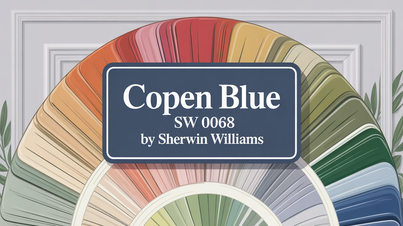
Are you ready for a change? Let’s talk about Sherwin Williams SW 0068 Copen Blue. This isn’t just any blue; it’s a calming shade with a subtle hint of gray. It brings a soft, serene touch to any room you use it in.
Whether you’re looking to refresh your living room, bedroom, or even your kitchen, Copen Blue is perfect for creating that peaceful atmosphere you crave. It’s a unique blend that balances coolness with a soft, inviting warmth. Plus, it effortlessly pairs with elements like white trim, wood, and metal, making it super versatile for various decorating styles. It truly transforms a room into a soothing escape while keeping things chic.
What Color Is Copen Blue SW 0068 by Sherwin Williams?
So, what exactly is Copen Blue? It’s a soothing, mid-toned blue featuring subtle gray undertones. This blend gives it a calm and serene vibe, creating a refreshing atmosphere wherever it’s applied.
It’s a versatile hue that fits beautifully into various interior styles. You’ll find it particularly shines in Coastal, Scandinavian, and Traditional designs because of its inherently clean and crisp nature.
In Coastal spaces, it captures the peaceful feeling of the seaside. It pairs wonderfully with sandy beiges, soft whites, and natural wood finishes like distressed oak or walnut. Adding textures like linen, jute, and light cotton enhances that maritime appeal.
For Scandinavian looks, Copen Blue supports that signature minimalistic and functional aesthetic. Try combining it with pale woods such as birch or pine, and materials like wool or felt in neutral tones for a cozy, uncluttered feel.
Traditional rooms benefit from its pairing with richer wood tones like cherry or mahogany and elegant fabrics such as velvet or silk. This brings a touch of sophistication and depth. Overall, Copen Blue is adaptable, harmonizing with many materials and textures to create inviting interiors.
Is Copen Blue SW 0068 by Sherwin Williams Warm or Cool color?
Copen Blue SW 0068 is a soft, misty blue that brings a calming feel to your home. It pairs well with different decorating styles, from coastal to traditional.
In rooms with lots of natural light, Copen Blue looks airy and gentle, making the space feel larger and more open. If a room has less light, it adds a cozy, comforting vibe without making it feel closed in.
It’s also flexible with color combinations. Pair it with whites and grays for a crisp look, or with warm woods and creams for a more grounded feel. It’s excellent for bedrooms to create a peaceful setting or bathrooms for a soothing atmosphere.
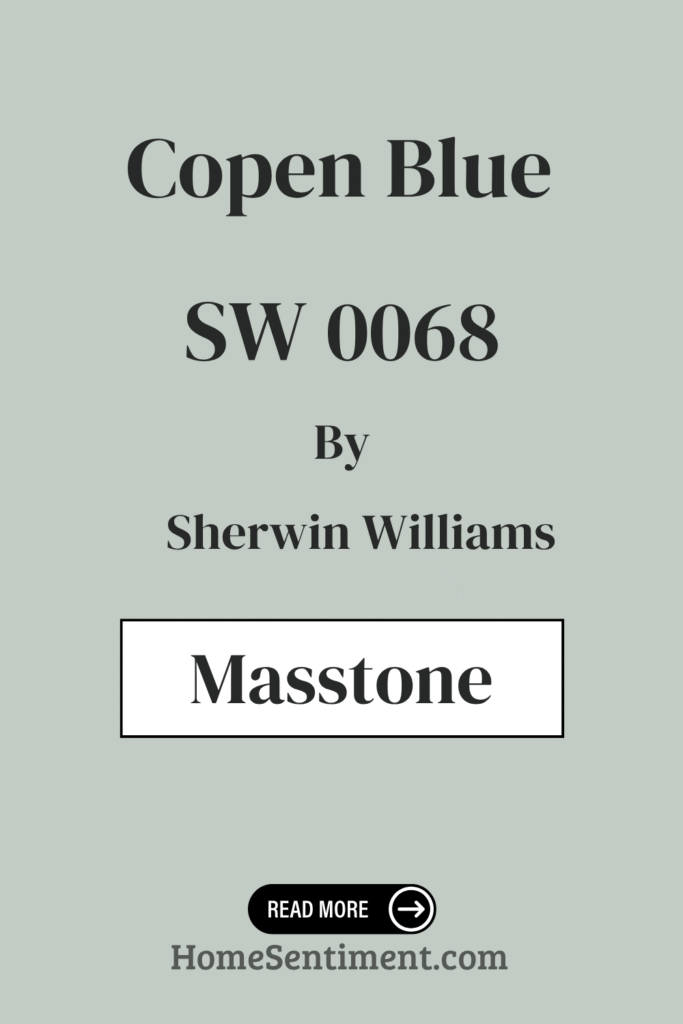
What is the Masstone of the Copen Blue SW 0068 by Sherwin Williams?
The masstone of Copen Blue SW 0068 is a light gray, specifically represented by the color code #D5D5D5. This light gray tint provides a gentle look, allowing the color to blend seamlessly into many home environments.
Its neutrality makes it a versatile backdrop, almost like a canvas for different decor styles and color palettes. Whether your home is modern or cozy country, Copen Blue can fit without overwhelming the space. This color can even help smaller rooms appear larger and brighter by reflecting more light. It enhances the feeling of space and light without being overpowering. It’s particularly effective in living areas and bedrooms where you want a calm atmosphere.
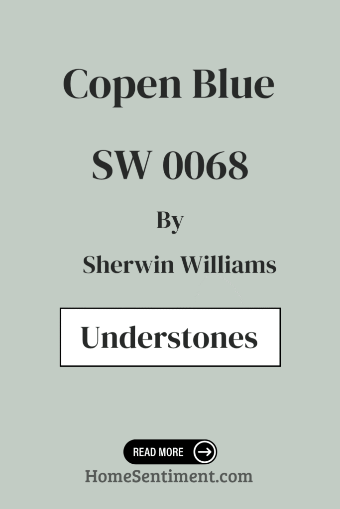
Undertones of Copen Blue SW 0068 by Sherwin Williams
Copen Blue is versatile and creates a soothing atmosphere. Its undertones are the subtle hues that affect how the paint looks on your walls. For Copen Blue, these include:
- Light blue and Mint
- Pale yellow and Pale pink
- Light purple and Lilac
- Grey
Each undertone plays a role: Light Blue and Mint enhance the calming blue feel. Pale Yellow and Pale Pink add a slight warmth, making the space feel more inviting. Light Purple and Lilac introduce softness, which can make larger spaces feel more intimate. Grey moderates the blue’s vibrancy, preventing it from being overwhelming and adding a contemporary edge.
These undertones mean Copen Blue maintains a balance suitable for various lighting conditions and decor styles. Lighter and warmer undertones make rooms feel spacious and airy, while cooler ones like mint and lilac can make them feel cozier. This mix allows for decorating flexibility, whether you prefer a soft, neutral look or pairing it with bolder colors.
Coordinating Colors of Copen Blue SW 0068 by Sherwin Williams
Choosing coordinating colors is key to complementing your main shade and enhancing the overall design without overpowering it. They should harmonize or offer a pleasant contrast to add depth.
For Copen Blue, consider these excellent matches:
- Aquaverde SW 9051: This soft green with a hint of aqua lightens the atmosphere when paired with Copen Blue. It provides a refreshing feel.
- Ivory Lace SW 7013: A soft, warm white with a delicate touch. Ivory Lace serves as a neutral backdrop, letting Copen Blue stand out while keeping the room bright and airy.
Using these together creates a serene and inviting environment, enhancing the visual appeal and mood of your space.
How Does Lighting Affect Copen Blue SW 0068 by Sherwin Williams?
Lighting really changes how a color appears. Copen Blue, a soft, serene blue, subtly shifts depending on the light.
Under artificial light (like LED or incandescent), Copen Blue can appear slightly warmer, leaning towards a muted teal. Artificial light often enhances the green undertone, giving it a cozy feel, perfect for living spaces needing a soothing ambiance.
In natural light, Copen Blue looks truer to its original shade. Sunlight reveals its crisp, clean qualities, making the room feel airy and fresh. Natural light really showcases its soothing blue tones.
- North-facing rooms have cooler, consistent, but limited light. Copen Blue might look more subdued and shadowy here, potentially appearing as a deeper, more contemplative blue. This makes it good for bedrooms or study areas seeking a calmer, focused mood.
- South-facing rooms get bright, warm light. Copen Blue becomes vibrant and lively, transforming the room into a refreshing space. It’s perfect for kitchens or family rooms where you want a cheerful, inviting environment.
- East-facing rooms receive bright morning light, making Copen Blue exceptionally cheerful. It softens throughout the day. This dynamic lighting works well in dining areas or breakfast nooks.
- West-facing rooms have intense evening light. Copen Blue can appear richer and more intense. This might be ideal for living spaces used mostly in the afternoon or evening, helping relaxation.
Its versatility in different lighting and directions makes Copen Blue a flexible choice for various areas in your home.
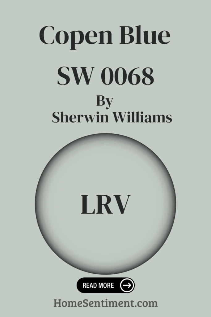
What is the LRV of Copen Blue SW 0068 by Sherwin Williams?
LRV stands for Light Reflectance Value. It measures how much light a paint color reflects. The scale goes from 0 (pure black, absorbs all light) to 100 (pure white, reflects all light). Higher LRVs make spaces feel larger and brighter, while lower ones absorb more light, making a room feel cozier but potentially smaller or darker.
Copen Blue SW 0068 has an LRV of 58.649. This means it’s moderately reflective. It won’t brighten a space as much as colors with higher LRVs, but it won’t darken it significantly either.
Copen Blue provides a balanced ambiance. It works well in spaces with a good amount of natural light, enhancing the room’s feel without making it feel cramped or excessively bright.
What are the Trim colors of Copen Blue SW 0068 by Sherwin Williams?
Trim colors are used on architectural details like baseboards, moldings, doors, and window frames. They define and accentuate a space, highlighting its architectural features. Choosing the right trim color is essential to enhance the atmosphere with a wall color like Copen Blue without overpowering it.
A light trim color visually breaks up the space, creating a fresh contrast that makes the wall color pop. It provides a polished finish.
Here are some recommended trim colors:
- Pearly White SW 7009: A soft, muted white with a subtle pearl-like undertone. This adds a gentle warmth that perfectly complements Copen Blue’s cooler tones. It softens the transition between surfaces, adding subtle coziness.
- Pure White SW 7005: A brighter, more straightforward white. This provides a crisp, clear boundary against colors like Copen Blue. It brings fresh clarity, ensuring the trim stands out distinctly for a clean, vibrant aesthetic.
Colors Similar to Copen Blue SW 0068 by Sherwin Williams
Using similar colors creates a cohesive and harmonious aesthetic. They subtly enhance each other without overwhelming. This palette involves hues that blend seamlessly, promoting a serene atmosphere.
Colors similar to Copen Blue include:
- Pearl Gray SW 0052: A soft, muted gray that’s a subtle backdrop for relaxed environments.
- Frostwork SW 0059: Slightly lighter and airier, pairing well with soft furnishings.
- Comfort Gray SW 6205: Leans greenish-gray, giving it a warm, earthy, comforting quality.
- Rainwashed SW 6211: Has hints of blue and green, like a misty morning, perfect for a soothing space.
- Piedmont SW 9657: A deeper tone adding sophistication.
- Silver Strand SW 7057: Blends gray with blue for a fresh, modern vibe.
- Slow Green SW 6456: A gentle green with gray hints, providing a natural, restful color.
- Pine Frost SW 9656: A cooler green, reminiscent of a frosty forest.
- Sea Spray SW 9651: A light, bluish-green whispering of coastal breezes and calm seas.
- Sea Salt SW 6204: Another soft green-blue blend, embodying ocean spray lightness for an airy feel.
Using these similar shades can create a unified and refined space where each color supports the overall aesthetic.
How to Use Copen Blue SW 0068 by Sherwin Williams In Your Home?
Copen Blue is a soft, pastel blue with gray hints. It’s ideal for creating a peaceful atmosphere. It pairs beautifully with both light and dark colors, offering versatile design choices.
Use Copen Blue in bedrooms for a restful escape or in bathrooms for a spa-like feel. It works well in living areas and kitchens too, where a serene, welcoming space is desired. It complements natural elements like wood and stone, enhancing their beauty without overpowering them.
If you want a subtle pop of color without making a space feel busy, Copen Blue is a perfect choice. It’s especially effective in Coastal or Scandinavian themed homes, but it fits well with most design schemes. Consider it for accent walls, cabinets, or even ceilings.
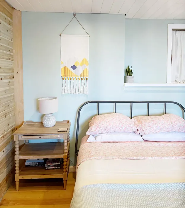
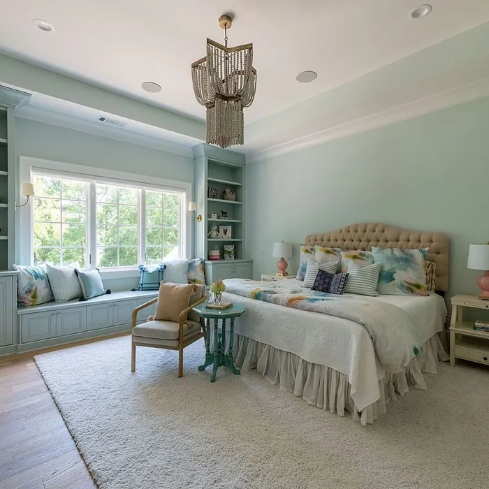
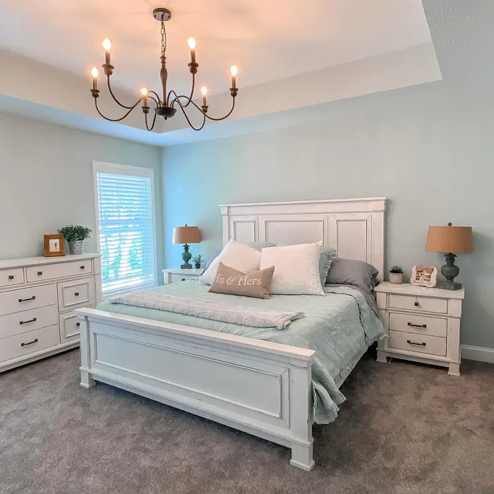
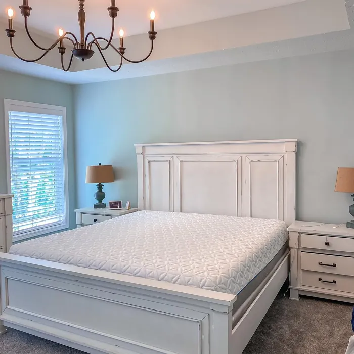
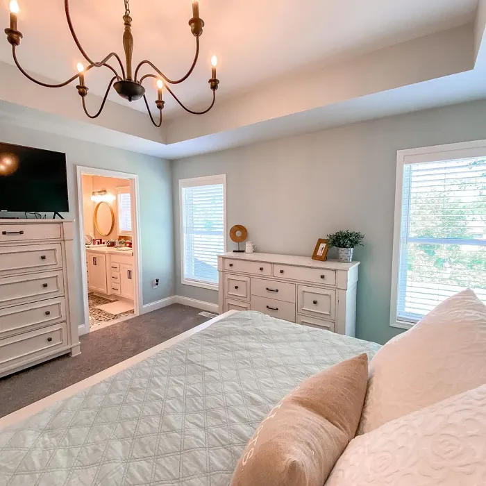
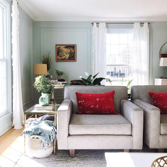
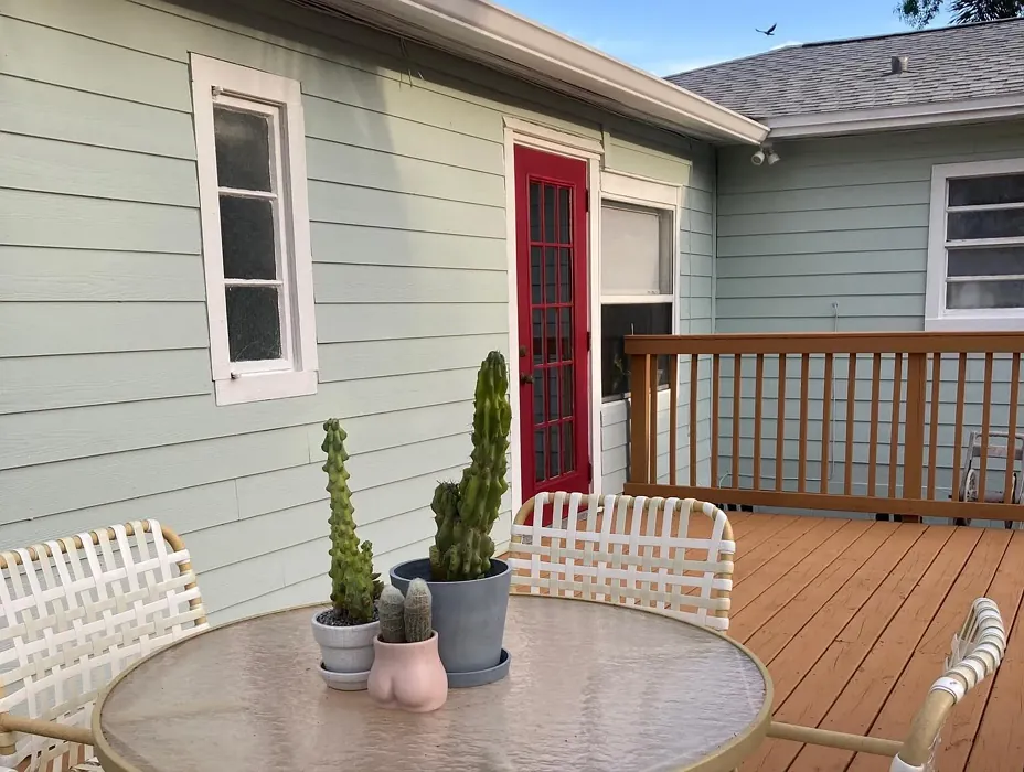
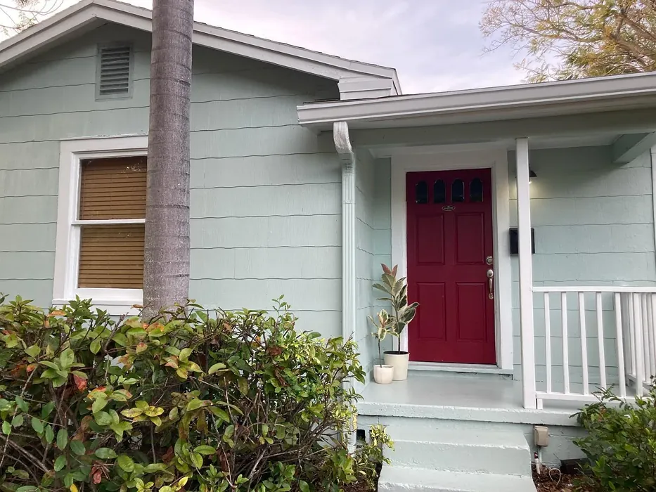
Copen Blue for Bedroom
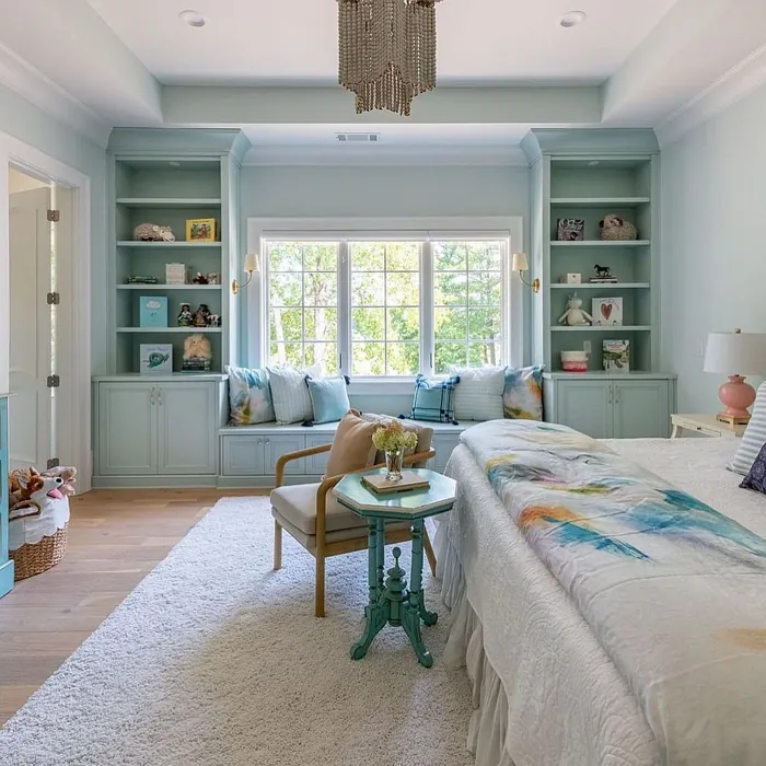
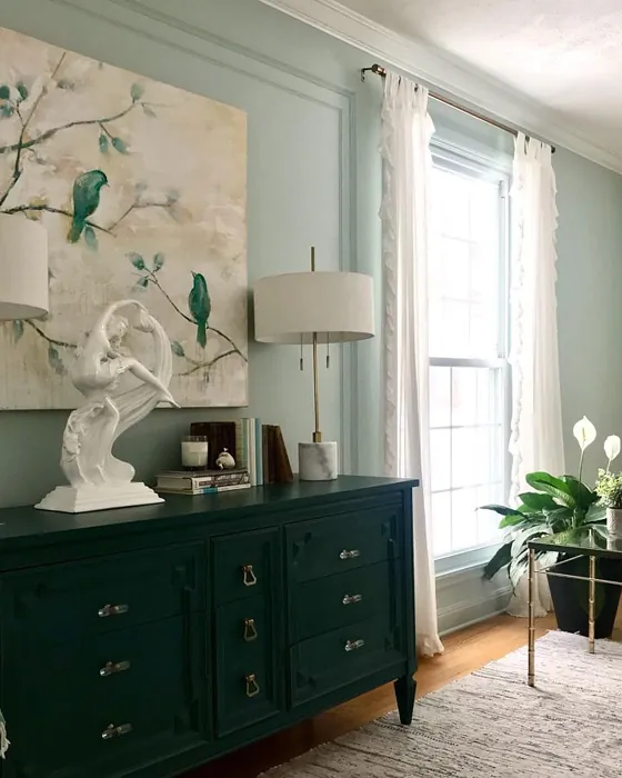
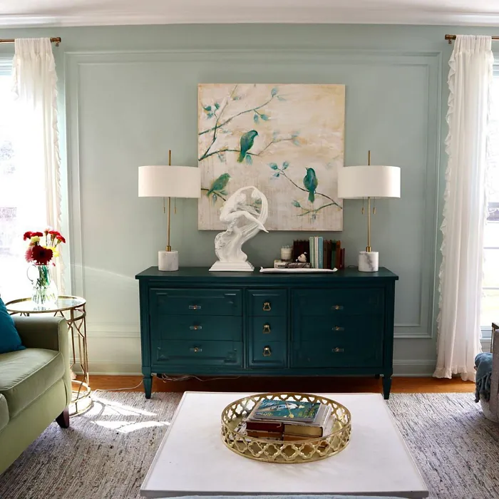
Copen Blue for Living room

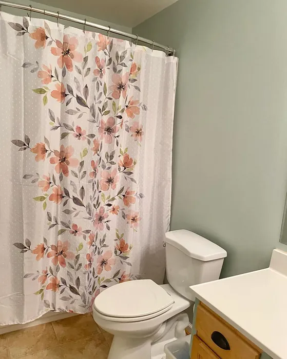
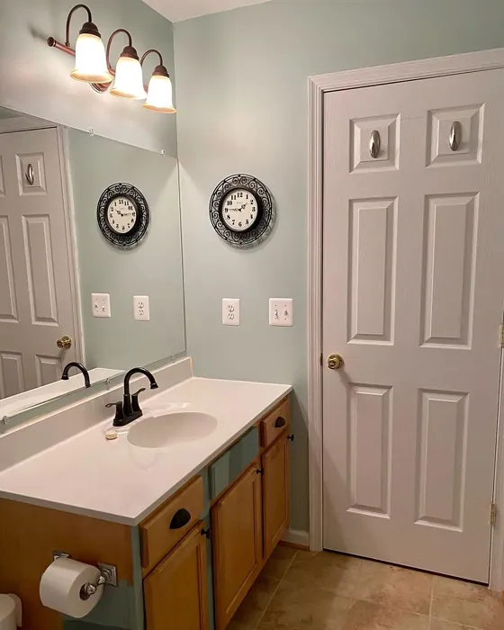
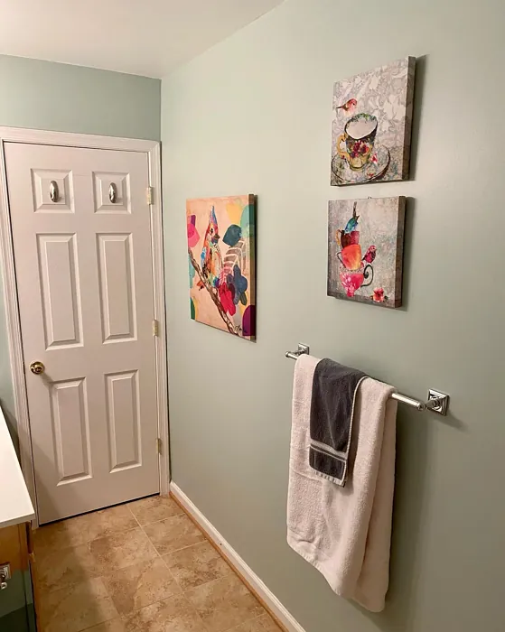
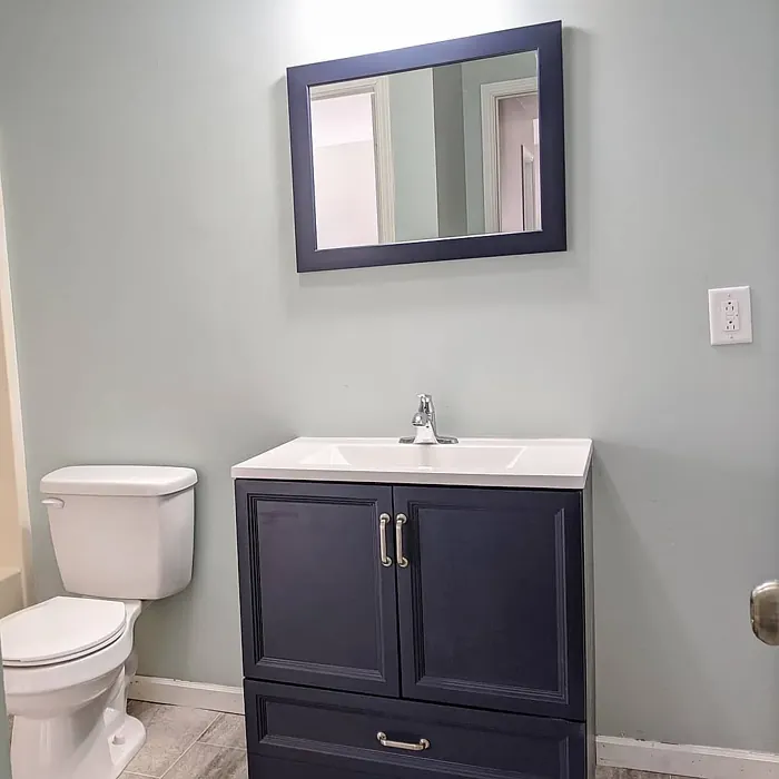
Copen Blue for Bathroom


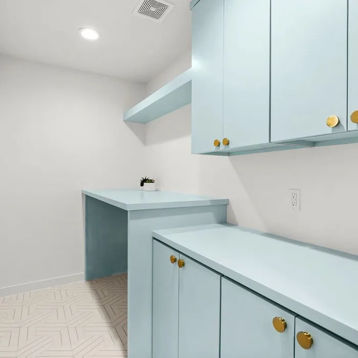
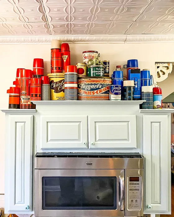
Copen Blue for Kitchen Cabinets

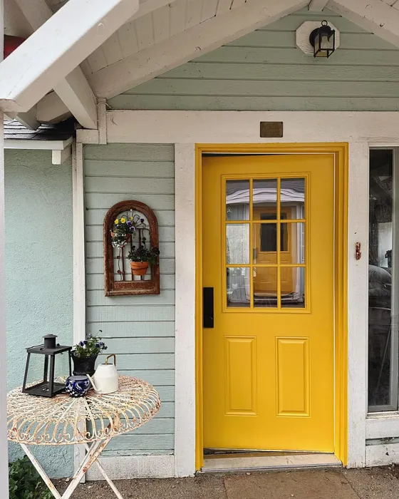
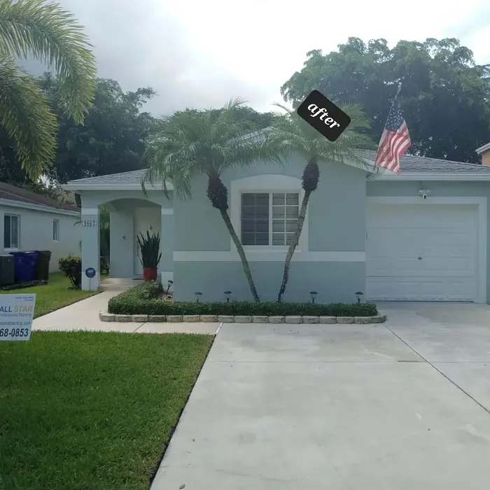
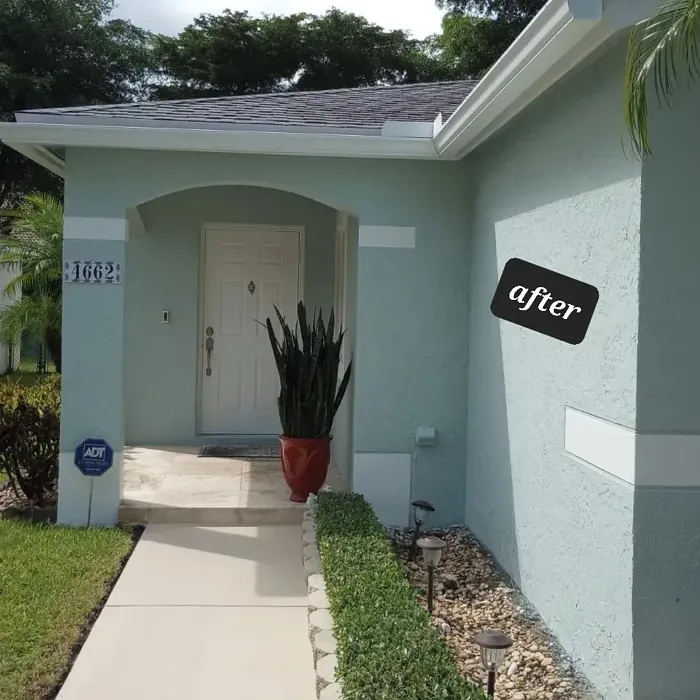
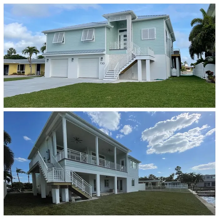
Copen Blue for Kitchen Exterior
Copen Blue SW 0068 vs Rainwashed SW 6211
Copen Blue SW 0068 is a deep, grayish-blue with a hint of nostalgia and classic beauty. It’s great for spaces needing calmness and steadiness. It pairs well with natural woods or crisp whites for a sophisticated, timeless look.
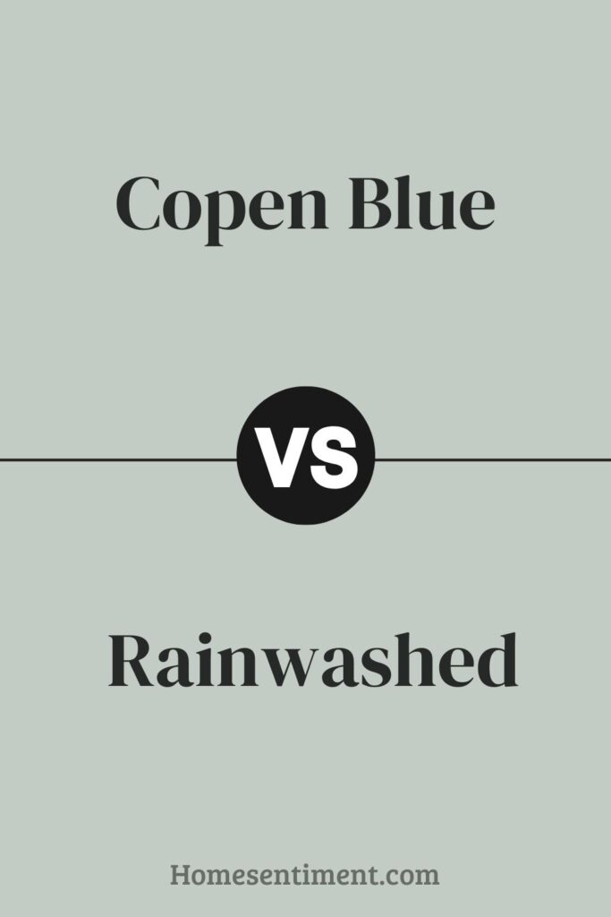
Rainwashed SW 6211 is lighter and leans towards a soft green with subtle blue undertones. Its green presence makes it soothing, perfect for bedrooms or bathrooms, offering a fresh, airy feel. It works well with light creams or soft beige, enhancing bright, open spaces.
While Copen Blue creates an anchored, serene environment, Rainwashed offers a gentle uplift. Consider the mood and function of the space. Rainwashed might suit smaller, well-lit rooms, while Copen Blue fits larger or more formal areas.
Copen Blue SW 0068 vs Pearl Gray SW 0052
Copen Blue SW 0068 is a vibrant, soothing blue that adds a refreshing touch. It brings calmness and can brighten rooms while maintaining a serene feel. It’s great for areas where relaxation is key, like bedrooms and bathrooms.
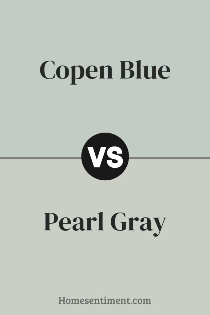
Pearl Gray SW 0052 is a neutral gray offering a subtle, sophisticated backdrop. It’s versatile and can make other colors in a room pop. Being lighter, it helps spaces seem larger and more open.
Copen Blue adds a splash of color, while Pearl Gray creates a clean, minimalistic look. Both enhance a home’s aesthetic effectively in different ways.
Copen Blue SW 0068 vs Sea Salt SW 6204
Copen Blue SW 0068 is a medium-to-deep blue with subtle green undertones. This gives it a calm and serene feel, making spaces cozy and inviting. It works well in living areas or bedrooms where a soothing atmosphere is desired.
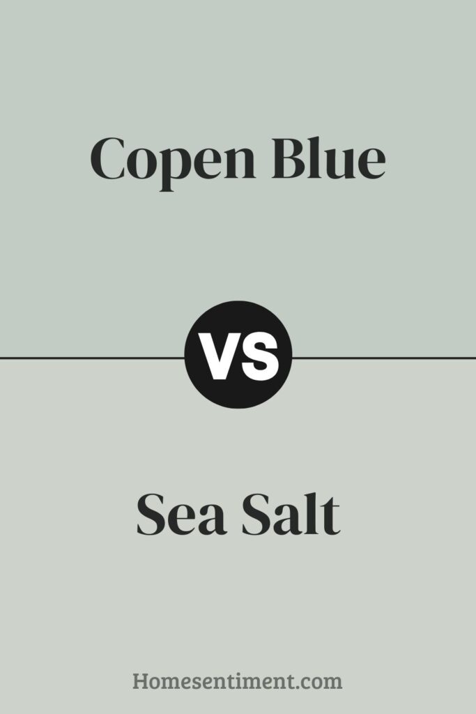
Sea Salt SW 6204 is much lighter, a mix of gray and green tones. It’s perfect for a fresh, airy look. It often appears more neutral, adapting to lighting and reflecting a softer feel, ideal for bathrooms and kitchens.
Copen Blue is deeper and richer, making a bolder statement. Sea Salt offers a subtle, clean appearance, enhancing spaces with a light, breezy touch. Their use depends on the intensity and mood you want for the space.
Copen Blue SW 0068 vs Piedmont SW 9657
Copen Blue SW 0068 is a soothing, mid-tone blue with a noticeable gray undertone. It brings a calm and peaceful vibe, ideal for creating a serene environment. It works well in bedrooms or bathrooms for a relaxing atmosphere.
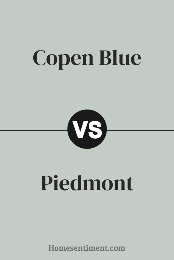
In contrast, Piedmont SW 9657 is much lighter and softer. It has a delicate, airy quality, making it perfect for small rooms or spaces with limited natural light. Its subtle tones can make a room feel larger and more open.
Both offer unique benefits depending on your goal. Copen Blue is stronger, suited for a more defined color presence. Piedmont is lighter, excellent for adding just a hint of color while keeping a bright, spacious feel.
Copen Blue SW 0068 vs Comfort Gray SW 6205
Copen Blue SW 0068 is a soft, subdued blue with a gentle, calming feel. It has a clear blue quality, reminding you of a peaceful sky or distant ocean, making it suitable for rooms needing relaxation like bedrooms or bathrooms.
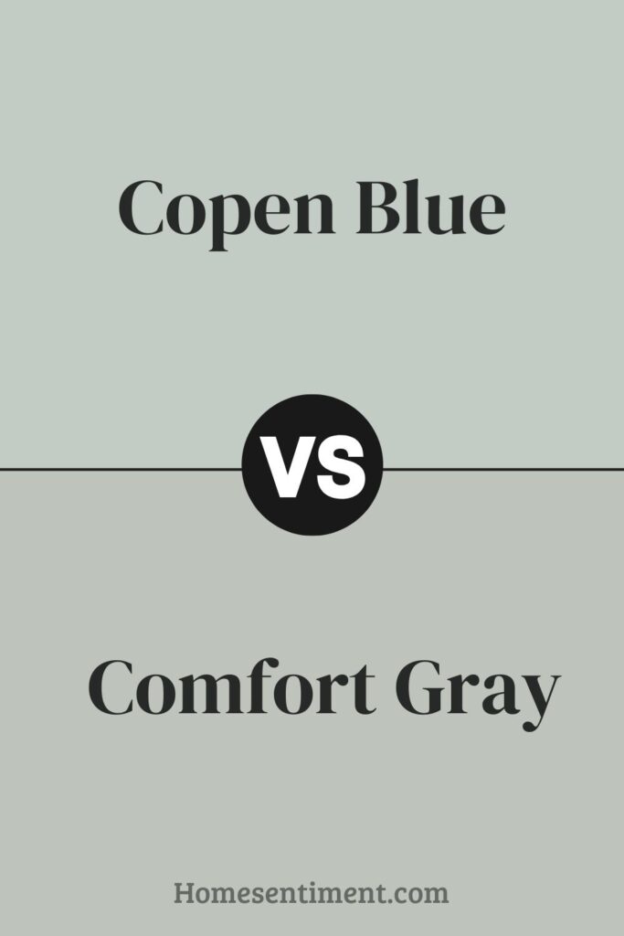
Comfort Gray SW 6205, despite its name, leans more towards a greenish-gray. It’s a neutral, soothing backdrop pairing well with many colors but brings a warmer, earthier feel than Copen Blue. It fits spaces for unwinding or casual gatherings, offering an organic, grounded atmosphere.
Both are versatile and muted, but create different moods due to their distinct undertones. Copen Blue offers a fresher, crisper vibe, while Comfort Gray provides a cozy, natural ambiance.
Copen Blue SW 0068 vs Pine Frost SW 9656
Copen Blue SW 0068 is a soothing, mid-tone blue with a slight gray touch. It brings a serene, calm atmosphere, ideal for bedrooms or bathrooms. Its muted quality pairs well with both bright and soft palettes, adding depth without overwhelming.
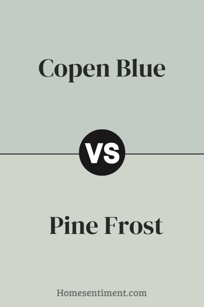
Pine Frost SW 9656 leans towards a cool, fresh green with hints of blue. It reflects nature’s hues, like pine trees with frost. It’s well-suited for spaces needing a refreshing, invigorating vibe, such as kitchens or living areas. Its vibrant yet understated tone complements natural materials like wood or stone.
Copen Blue offers a tranquil retreat, while Pine Frost injects a lively burst of nature-inspired freshness. Each creates distinctive yet harmonious environments.
Copen Blue SW 0068 vs Silver Strand SW 7057
Copen Blue SW 0068 is a deeper, grayish-blue that brings calm and subtlety. It’s great for bedrooms or relaxation areas due to its peaceful blue tone, which isn’t too vibrant but provides enough color for a serene atmosphere.
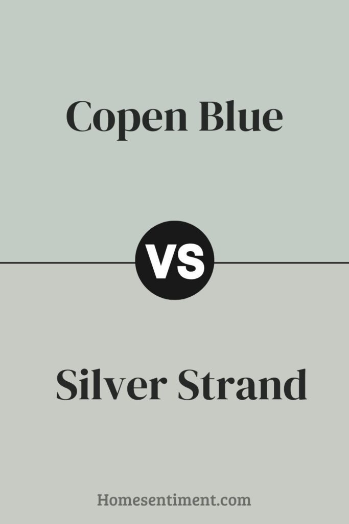
Silver Strand SW 7057 leans more towards a lighter, gray-green. It offers a neutral backdrop with soft green undertones, making it highly adaptable for various settings, from kitchens to living rooms. It’s excellent for adding a hint of color while keeping a room bright and airy.
Both are soothing, but Copen Blue is more distinctly blue, potentially affecting a room’s mood more noticeably with its cooler, calming presence. Silver Strand leans more neutral, making it easier to pair with various decor styles and colors.
Copen Blue SW 0068 vs Slow Green SW 6456
Copen Blue SW 0068 is a soothing, medium-dark blue with a hint of gray. It tends to lend a serene and calming presence, ideal for bedrooms or quiet areas. Its muted quality pairs well with brighter shades or stands confidently alone.
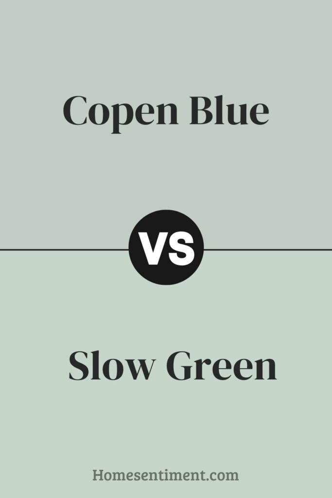
Slow Green SW 6456 is a soft, muted green. Its undertones may appear slightly gray or sage depending on the lighting. This color is perfect for creating a relaxed, cozy atmosphere. It works well in spaces where you seek calmness and comfort, such as living rooms or reading nooks.
Both share a gentle mutedness, making them versatile. Copen Blue leans towards cool tranquility, while Slow Green brings a warm, earthy feel. They both provide a backdrop supporting a range of accent colors and interior themes. These hues are particularly effective for creating a peaceful retreat.
Copen Blue SW 0068 vs Sea Spray SW 9651
Copen Blue SW 0068 is a deep, soothing blue with a slightly gray undertone, giving it a serene, grounded feel. It offers a classic, timeless look, versatile for various spaces. It works well in both bright and dim lighting.
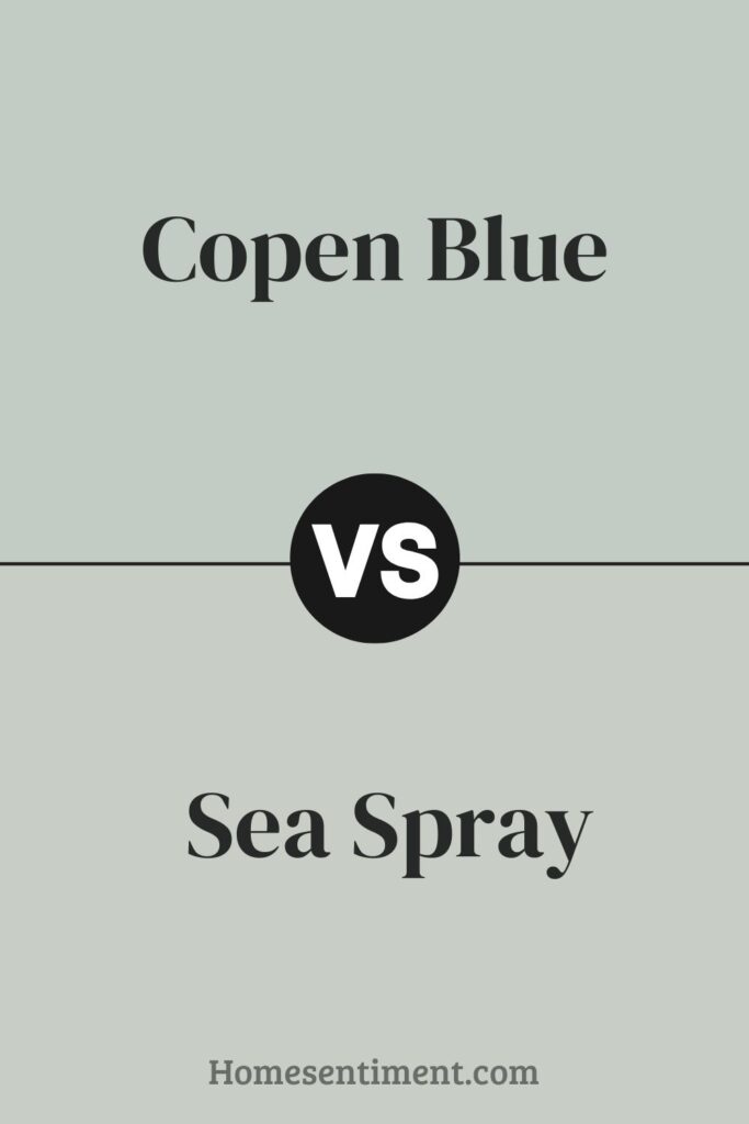
Sea Spray SW 9651 is a lighter, airier blue with green undertones. It feels fresh and invigorating, reminiscent of a gentle ocean breeze. This color suits spaces meant to feel open and breezy. The green undertones help create a soft, natural ambiance, ideal for bathrooms or bedrooms where calm is desired.
Copen Blue is a more traditional blue, suitable for formal or cozy settings. Sea Spray offers a lighter, fresh vibe for a relaxed, casual environment. Both provide distinct moods.
Copen Blue SW 0068 vs Frostwork SW 0059
Copen Blue SW 0068 is a soothing shade leaning towards a soft, muted blue with a slight gray undertone. It gives off a calm, serene feeling, making it ideal for spaces like bedrooms or bathrooms needing relaxation. It works well in well-lit areas as natural light accentuates its gentle tones.
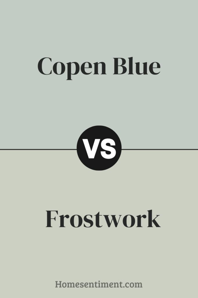
Frostwork SW 0059 is lighter and more neutral. It’s almost a silvery light blue that can appear gray in certain lighting. This versatility makes Frostwork suitable for various spaces, helping to brighten rooms lacking natural sunlight or complementing modern decor with its subtle hue.
Both contribute to a peaceful ambiance. Copen Blue adds more color presence with its depth, while Frostwork maintains a minimalist vibe with its lighter touch. Each has its charm depending on the mood and style you want.
Conclusion
Copen Blue SW 0068 truly is a standout choice. It fits beautifully in any room, offering a calm, serene vibe that’s incredibly comforting. Whether you’re aiming for a peaceful bedroom or adding a splash of subdued color to a lively space, Copen Blue works wonders.
Its soft nature complements various decor styles, from modern to shabby chic, making it easy to incorporate into your home. And it’s not just for walls; it looks wonderful on cabinets and furniture too, helping you achieve that cohesive look. If you’re thinking about a fresh paint job, giving Copen Blue a try is highly recommended. It adds a subtle yet impactful charm wherever it graces a space.