Bold Sophistication for Modern Spaces
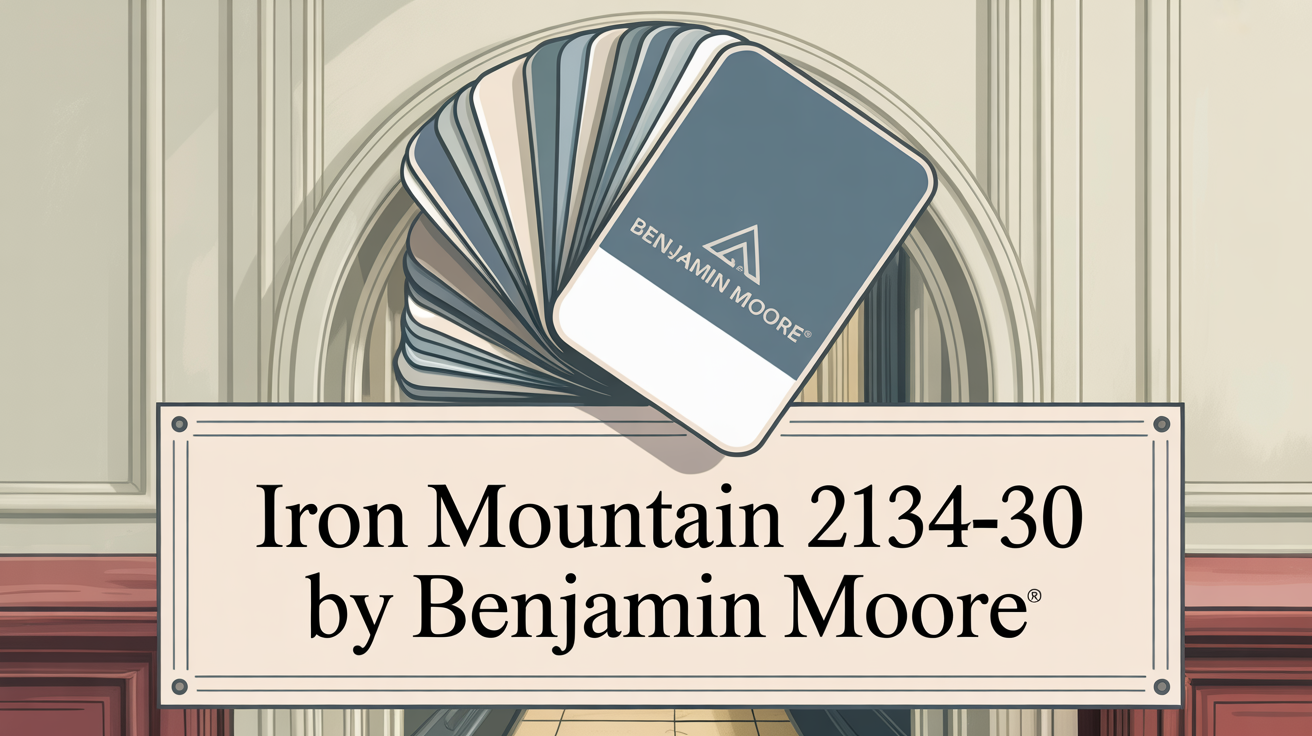
Picking the right paint color can feel like a huge decision, right? You want something that looks fantastic but also stands the test of time. Let me introduce you to Iron Mountain by Benjamin Moore. It’s this incredibly rich, dark color that brings a real sense of sophistication to any room.
It’s a deep gray, but here’s the cool part: it has these lovely warm undertones. That means it feels cozy and inviting, not cold or heavy.
What Color Is Iron Mountain 2134-30 by Benjamin Moore?
So, what exactly is Iron Mountain 2134-30? Think of it as a deep charcoal gray. But it’s got a secret weapon – a brown undertone. This is what gives it that warm, sophisticated vibe.
This color is super versatile. You can totally use it with different interior styles, like industrial, modern, or even rustic designs. It just works.
Is Iron Mountain 2134-30 by Benjamin Moore Warm or Cool color?
Great question! Iron Mountain 2134-30 is a rich, deep gray with a subtle hint of warmth. It’s not strictly warm, but those warm undertones keep it from feeling icy or cold.
This makes it perfect for creating a cozy and sophisticated feel in your home. It brings elegance without being too much. Its depth can make large walls feel more intimate.
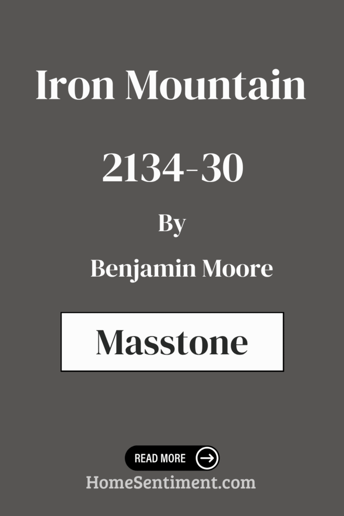
What is the Masstone of the Iron Mountain 2134-30 by Benjamin Moore?
The masstone of Iron Mountain 2134-30 is described as a rich, muted olive. Yes, you read that right, olive! It’s got this deep, earthy quality that brings a touch of nature indoors.
This earthy tone is quite noticeable as the main characteristic of the color. It’s fantastic for creating a really cozy atmosphere.
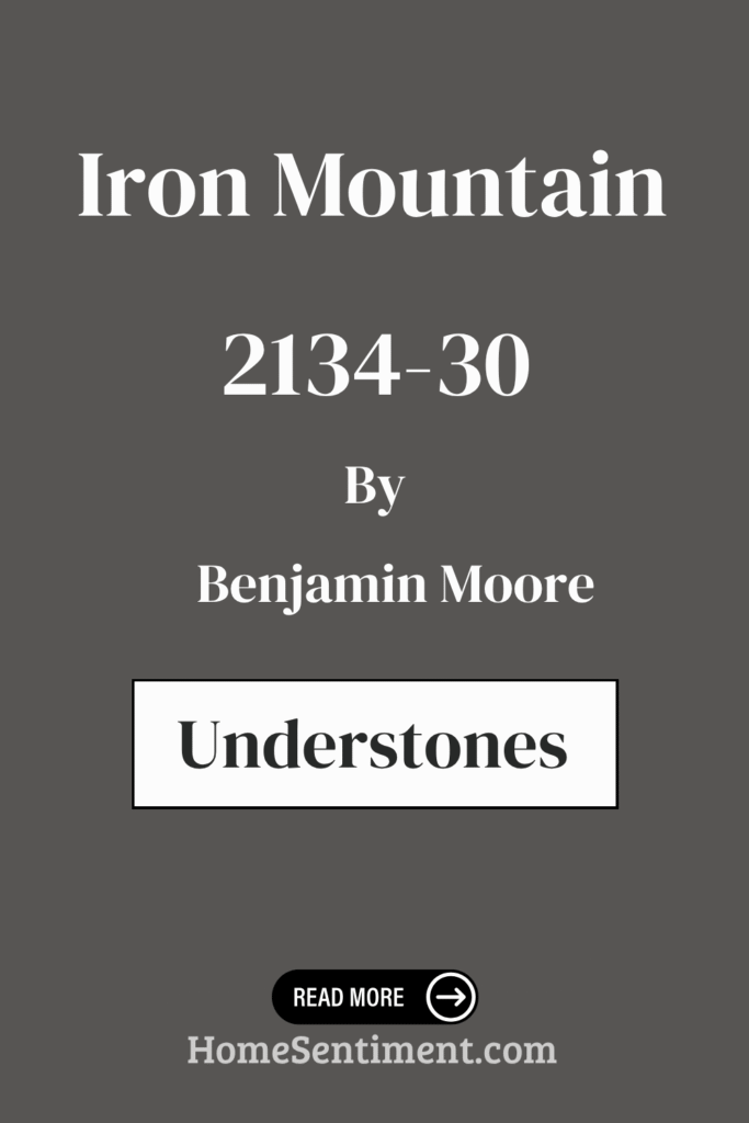
Undertones of Iron Mountain 2134-30 by Benjamin Moore
This is where Iron Mountain gets really interesting. It’s a complex color because of its undertones. The base is a deep, dark gray, but there’s more going on.
You’ll find brown and dark green undertones adding warmth and earthiness. These give it a grounded, organic feel that makes spaces feel cozy. Dark gray and navy tones deepen it, adding drama.
But wait, there’s a twist! A hint of purple and red gives it a slight vibrancy. This keeps the color from falling flat. Depending on the light, you might even see touches of pink, orange, or a subtle dark turquoise. Lighter undertones like pale pink and yellow can also show up in brighter light, softening it. This color seriously transforms throughout the day!
Coordinating Colors of Iron Mountain 2134-30 by Benjamin Moore
Picking colors that work well together is key to a harmonious space. Coordinating colors just naturally complement each other, creating a balanced look. Iron Mountain is a strong color, so pairing it right really enhances its depth.
Here are some coordinating colors that balance Iron Mountain’s depth beautifully:
- White Dove OC-17: A warm, inviting white that adds lightness and warmth.
- Barren Plain 2111-60: A soft, cool gray that complements Iron Mountain and offers a serene backdrop.
- Stardust 2108-40: A subtle, muted taupe adding depth and a cozy warmth.
- Snowfall White OC-118: A crisp, clean white providing a fresh, bright accent.
Using these tones helps you create a space that’s both sophisticated and super welcoming.
How Does Lighting Affect Iron Mountain 2134-30 by Benjamin Moore?
Lighting is a game-changer for how paint colors look. Natural light changes all day, while artificial light stays constant but also alters color perception. Iron Mountain is definitely one of those colors that shifts depending on the light.
In natural light, it can sometimes look a bit cooler because natural light emphasizes blue tones. How it looks depends on which way the room faces. North-facing rooms with cooler light might highlight its cooler, bluish-gray side, making it feel bold.
South-facing rooms get warmer, direct light, which softens Iron Mountain’s coolness. It might appear warmer and more inviting. East-facing rooms see it lighter and warmer in the morning, then cooler later. West-facing rooms start muted in the morning and become richer and more dramatic in the warmer setting sun light.
Think about your artificial lighting too! Warm bulbs will bring out those warmer undertones, while cooler bulbs enhance the cooler aspects. You can totally play with lighting to get the exact vibe you want.
What is the LRV of Iron Mountain 2134-30 by Benjamin Moore?
LRV stands for Light Reflectance Value. It’s a measure from 0 to 100 showing how much light a color bounces back. 0 is pure black (no light reflected), and 100 is pure white (all light reflected). Lower LRV means more light is absorbed, making a room feel cozier or smaller. Higher LRV means more light reflected, potentially making a room feel larger and brighter.
Iron Mountain 2134-30 has an LRV of 10.96. This is a low value, meaning it absorbs most light. In a bright room, it creates depth and warmth. But in a low-light space, it could make the room feel less bright or even more confined. It’s a fantastic choice for sophistication and contrast in well-lit areas.
What are the Trim colors of Iron Mountain 2134-30 by Benjamin Moore?
Trim colors are super important! They frame your walls and add contrast. With a strong color like Iron Mountain, picking the right trim really makes it pop and enhances its sophistication.
Here are some great trim colors that work wonderfully with Iron Mountain:
- Frostine AF-5: This is a soft, pale gray. It adds a gentle touch of coolness and creates a subtle frame around the deeper wall color. It’s elegant and complements Iron Mountain’s boldness without fighting it.
- Simply White OC-117: A classic! This is a crisp, clean white that offers a bright, fresh contrast. It makes the space feel more open and really highlights architectural details.
Both options offer versatility and style, helping you create a balanced, well-defined space.
Colors Similar to Iron Mountain 2134-30 by Benjamin Moore
Sometimes you want colors that are in the same family to create a really harmonious feel. These similar colors share earthy, muted undertones with Iron Mountain, making transitions smooth.
Here are a few colors similar in spirit to Iron Mountain:
- Ashwood Moss 1484: A deep green with gray undertones, bringing an earthy richness.
- Silhouette AF-655: A soft charcoal gray that adds depth without overwhelming.
- Dragon’s Breath 1547: A warm brown-charcoal that feels cozy and inviting.
- Gray 2121-10: A versatile gray with cool undertones.
Using these together in a space can add character and interest through subtle contrasts.
Colors that Go With Iron Mountain 2134-30 by Benjamin Moore
Pairing colors thoughtfully with Iron Mountain is key to a beautiful space. This rich gray with warm hints is so versatile.
Here are some colors that pair perfectly:
- Night Horizon 2134-10: A cool, mysterious dark shade for drama and sophistication.
- Gull Wing Gray 2134-50: A lighter, balanced gray offering chic contrast.
- Whitestone 2134-60: A light gray for brightness and a sense of increased space.
- Midsummer Night 2134-20: A deep, almost navy blue complementing Iron Mountain’s depth.
- Genesis White 2134-70: A crisp white providing excellent contrast to make the dark shades stand out.
- Whale Gray 2134-40: A medium gray that ties everything together with a balanced tone.
Mixing and matching these colors can seriously enhance your room’s look while keeping that Iron Mountain sophistication.
How to Use Iron Mountain 2134-30 by Benjamin Moore In Your Home?
Iron Mountain is a fantastic color to bring elegance into your home. It’s a mix of dark gray and brown, giving you a strong but neutral foundation.
Try it in your living room! It creates a warm, inviting vibe. An accent wall is a great way to add depth without going too dark in the whole room. It also makes an awesome backdrop for artwork or your favorite furniture pieces.
In the kitchen, Iron Mountain on cabinets or an island looks super modern. It works perfectly with stainless steel and natural wood. For bedrooms, it can feel wonderfully cocoon-like and help with restful sleep. Pair it with lighter shades like soft whites or light blues for balance. It’s a bold but flexible choice for pretty much any setting.
Iron Mountain 2134-30 by Benjamin Moore vs Silhouette AF-655 by Benjamin Moore
Let’s compare Iron Mountain to Silhouette AF-655. Iron Mountain is that deep, bold gray with brown undertones. It’s designed to make a statement and add drama. It pairs well with both lighter and darker colors.
Silhouette AF-655 is similar, but softer. It’s a muted, warm gray with purple and brown undertones. It gives a more subdued, calming, and cozy feel. It pairs nicely with neutral tones.
Basically, Iron Mountain is your go-to for a bold backdrop, while Silhouette offers subtle warmth for a cozier vibe. Both are great, just for different moods!
Iron Mountain 2134-30 by Benjamin Moore vs Dragon’s Breath 1547 by Benjamin Moore
Comparing Iron Mountain and Dragon’s Breath is interesting because they’re both dark but very different. Iron Mountain is a cool, sophisticated dark gray with subtle blue undertones. It feels sleek and modern, perfect for highlighting artwork and décor.
Dragon’s Breath, though, is warmer. It’s a deep charcoal brown. It brings a cozier, more intimate feel. It’s fantastic for rustic or traditional styles and makes a warm statement.
Iron Mountain leans industrial and contemporary, while Dragon’s Breath is all about warmth and comfort for a homelier feel.
Iron Mountain 2134-30 by Benjamin Moore vs Ashwood Moss 1484 by Benjamin Moore
Let’s look at Iron Mountain versus Ashwood Moss. Iron Mountain, as we know, is that deep, dark gray with subtle warm brown hints. It’s strong and sophisticated, great for bold statements and creating a cozy, modern feel.
Ashwood Moss 1484 is a different beast. It’s a darker green with gray undertones. It feels earthy and grounding, connecting spaces to nature and creating a calming environment.
Iron Mountain has that modern industrial vibe with its gray-brown mix. Ashwood Moss is more about a nature-inspired, serene atmosphere with its green tones. Your choice depends on which feeling you want to capture!
Iron Mountain 2134-30 by Benjamin Moore vs Gray 2121-10 by Benjamin Moore
Finally, how does Iron Mountain stack up against Gray 2121-10? Iron Mountain is the deep, rich gray with those warm brown undertones. It’s all about comfort and elegance, working well with many styles.
Gray 2121-10 is a cooler, more traditional gray. It has bluish undertones, giving it a crisp, clean, and contemporary look. This one reflects light nicely, making spaces feel bright and airy while still being a neutral backdrop.
Iron Mountain gives you warmth and depth for intimate settings. Gray 2121-10 offers a cooler, open, and fresh feel. Both are versatile, just with different vibes!
Conclusion
Honestly, Iron Mountain 2134-30 is a color that just grabs your attention. It’s deep, rich, and brings this amazing blend of elegance and versatility. It has a way of making spaces feel warm and sophisticated at the same time.
It seriously works in modern and traditional settings alike. Use it on walls, furniture, or just accents – it leaves a memorable impression that feels both bold and comforting.
What I find most fascinating is how adaptable it is. It seems to effortlessly pair with so many other colors, from soft whites to even brighter shades. This flexibility gives you so much room to play with different design ideas.
It just elevates a room, providing a strong yet balanced backdrop that lets other elements shine. Its presence makes spaces feel intimate and inviting, perfect for places where you want to relax or gather.
Iron Mountain strikes this fantastic balance of strength and subtlety. It’s definitely a go-to if you want to make a statement that has depth and character without totally overwhelming the room. It inspires creativity while offering a real sense of comfort.