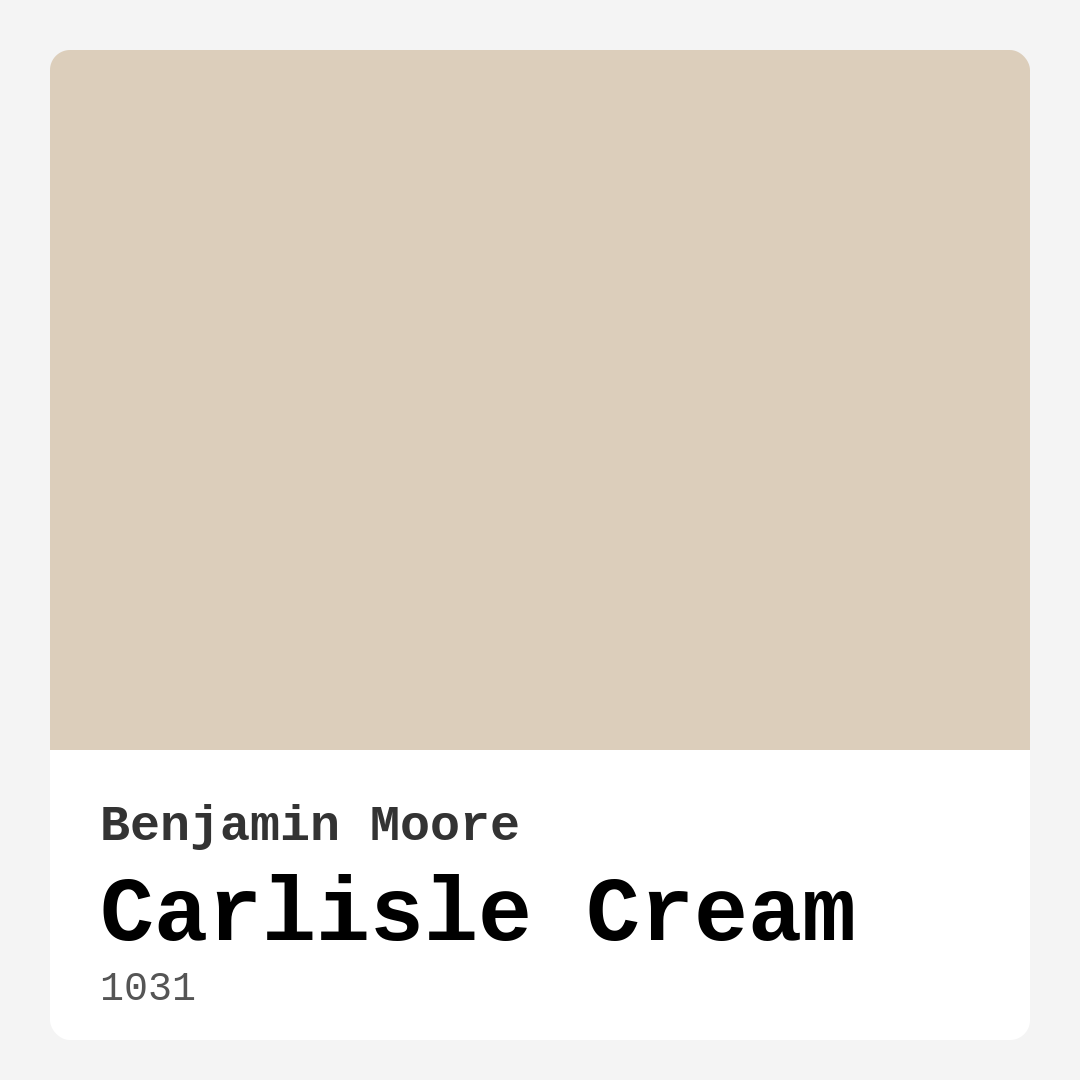
Color Preview & Key Details
| HEX Code | #DCCEBB |
| RGB | 220, 206, 187 |
| LRV | 61.98% |
| Undertone | Red |
| Finish Options | Eggshell, Satin, Semi-Gloss |
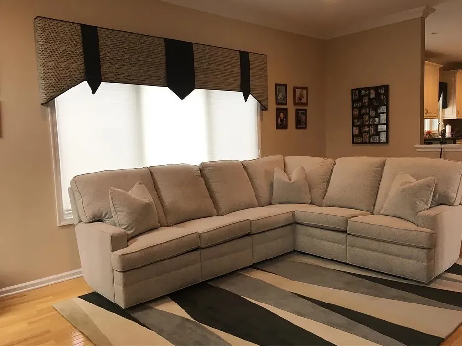
Imagine walking into a room that instantly makes you feel at ease—soft, warm, and effortlessly elegant. The walls wrap around you like a gentle hug, and the light dances across them, creating a space that’s both inviting and refined. That’s the magic of Benjamin Moore’s Carlisle Cream (1031). If you’ve been searching for a paint color that strikes the perfect balance between cozy and sophisticated, this might be the one.
Carlisle Cream is a light, warm beige with subtle yellow undertones and a hint of red, giving it a depth that keeps it from feeling flat or sterile. It’s the kind of color that adapts to its surroundings, looking just as stunning in a sun-drenched living room as it does in a softly lit bedroom. With an LRV of 61.98%, it reflects plenty of light, making spaces feel airy and open—ideal for smaller rooms or areas where you want to maximize brightness.
One of the best things about Carlisle Cream is its versatility. Whether your style leans modern farmhouse, transitional, or even contemporary, this color works. Pair it with crisp white trim like Benjamin Moore’s White Dove for a classic, clean look, or layer it with deeper earth tones and brass fixtures for a richer, more grounded vibe. It plays well with other neutrals, too—think soft grays, creamy whites, or even muted blues for a subtle contrast.
Application is a breeze, even if you’re new to painting. It’s beginner-friendly, with a smooth finish that doesn’t require expert technique to look polished. Two coats are usually enough for full coverage, and it’s touch-up friendly, so minor scuffs or marks won’t leave you scrambling to repaint an entire wall. The low VOC formula means you won’t have to deal with harsh fumes, making it a great choice for homes with kids or pets.
Now, let’s talk about lighting. Carlisle Cream truly comes alive in natural light, where its warm undertones shine. In north-facing rooms or spaces with less sunlight, it can appear slightly deeper, but it never loses its inviting glow. If you’re worried about it feeling too dark, test a swatch in different areas of the room and observe how it changes throughout the day.
This color isn’t just for walls, either. Consider using it on trim, cabinetry, or even furniture for a cohesive look. In a kitchen, it pairs beautifully with marble countertops and open shelving. In a bedroom, it creates a restful backdrop for layered textiles and wood tones. And in an entryway, it sets a welcoming tone the moment guests step inside.
Of course, no color is perfect for every situation. If your space has very little natural light, you might want to lean toward one of Carlisle Cream’s lighter siblings, like OC-70 or AF-55. And while it’s a forgiving shade, proper surface prep—filling holes, sanding, and priming—will ensure the smoothest finish.
At the end of the day, Carlisle Cream is more than just a paint color—it’s a mood. It’s the feeling of a lazy Sunday morning, the warmth of a well-loved book, the quiet elegance of a space that doesn’t try too hard. If you’re looking for a hue that’s timeless, adaptable, and downright lovely, this might just be your new favorite. So grab a sample, brush a little on your wall, and see how it transforms your home. You might just fall in love.
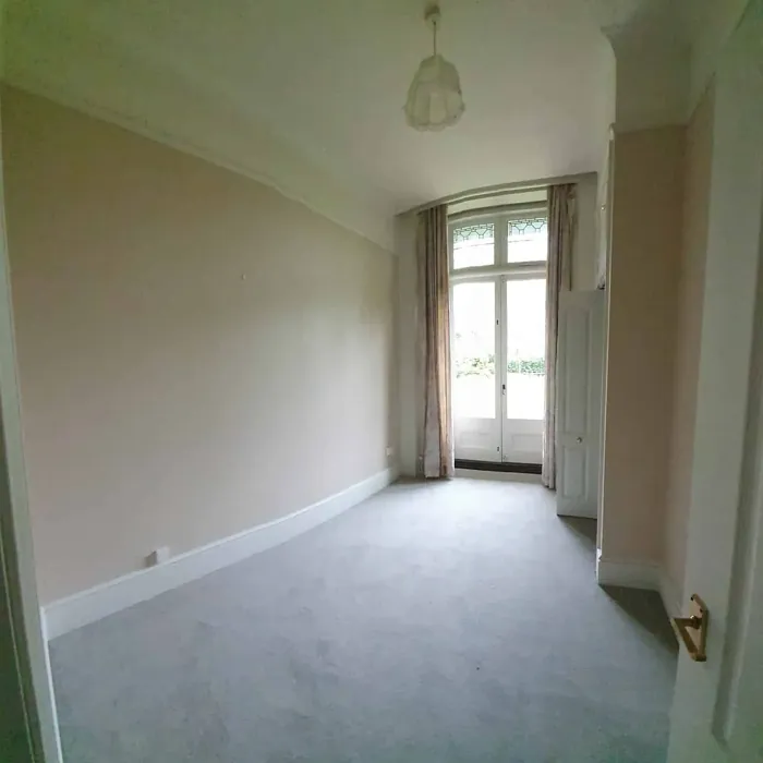
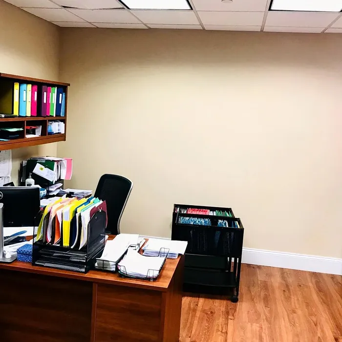
Real Room Photo of Carlisle Cream 1031
Undertones of Carlisle Cream ?
The undertones of Carlisle Cream are a key aspect of its character, leaning towards Red. These subtle underlying hues are what give the color its depth and complexity. For example, a gray with a blue undertone will feel cooler and more modern, while one with a brown undertone will feel warmer and more traditional. It’s essential to test this paint in your home and observe it next to your existing furniture, flooring, and decor to see how these undertones interact and reveal themselves throughout the day.
HEX value: #DCCEBB
RGB code: 220, 206, 187
Is Carlisle Cream Cool or Warm?
Carlisle Cream leans towards the warm side of the spectrum, making spaces feel more inviting and comfortable. It’s perfect for creating a cozy atmosphere that encourages relaxation and warmth.
Understanding Color Properties and Interior Design Tips
Hue refers to a specific position on the color wheel, measured in degrees from 0 to 360. Each degree represents a different pure color:
- 0° represents red
- 120° represents green
- 240° represents blue
Saturation describes the intensity or purity of a color and is expressed as a percentage:
- At 0%, the color appears completely desaturated—essentially a shade of gray
- At 100%, the color is at its most vivid and vibrant
Lightness indicates how light or dark a color is, also expressed as a percentage:
- 0% lightness results in black
- 100% lightness results in white
Using Warm Colors in Interior Design
Warm hues—such as reds, oranges, yellows, warm beiges, and greiges—are excellent choices for creating inviting and energetic spaces. These colors are particularly well-suited for:
- Kitchens, living rooms, and bathrooms, where warmth enhances comfort and sociability
- Large rooms, where warm tones can help reduce the sense of emptiness and make the space feel more intimate
For example:
- Warm beige shades provide a cozy, inviting atmosphere, ideal for living rooms, bedrooms, and hallways.
- Warm greige (a mix of beige and gray) offers the warmth of beige with the modern appeal of gray, making it a versatile backdrop for dining areas, bedrooms, and living spaces.
However, be mindful when using warm light tones in rooms with limited natural light. These shades may appear muted or even take on an unpleasant yellowish tint. To avoid a dull or flat appearance:
- Add depth by incorporating richer tones like deep greens, charcoal, or chocolate brown
- Use textured elements such as curtains, rugs, or cushions to bring dimension to the space
Pro Tip: Achieving Harmony with Warm and Cool Color Balance
To create a well-balanced and visually interesting interior, mix warm and cool tones strategically. This contrast adds depth and harmony to your design.
- If your walls feature warm hues, introduce cool-colored accents such as blue or green furniture, artwork, or accessories to create contrast.
- For a polished look, consider using a complementary color scheme, which pairs colors opposite each other on the color wheel (e.g., red with green, orange with blue).
This thoughtful mix not only enhances visual appeal but also creates a space that feels both dynamic and cohesive.
Light Temperature Affects on Carlisle Cream
Natural Light
Natural daylight changes in color temperature as the sun moves across the sky. At sunrise and sunset, the light tends to have a warm, golden tone with a color temperature around 2000 Kelvin (K). As the day progresses and the sun rises higher, the light becomes cooler and more neutral. Around midday, especially when the sky is clear, natural light typically reaches its peak brightness and shifts to a cooler tone, ranging from 5500 to 6500 Kelvin. This midday light is close to what we perceive as pure white or daylight-balanced light.
These shifts in natural light can significantly influence how colors appear in a space, which is why designers often consider both the time of day and the orientation of windows when planning interior color schemes.
Artificial Light
When choosing artificial lighting, pay close attention to the color temperature, measured in Kelvin (K). This determines how warm or cool the light will appear. Lower temperatures, around 2700K, give off a warm, yellow glow often used in living rooms or bedrooms. Higher temperatures, above 5000K, create a cool, bluish light similar to daylight, commonly used in kitchens, offices, or task areas.
Use the slider to see how lighting temperature can affect the appearance of a surface or color throughout a space.


4800K
LRV of Carlisle Cream
The Light Reflectance Value (LRV) of Carlisle Cream is 61.98%, which places it in the Light colors category. This means it reflect most of the incident light. Understanding a paint’s LRV is crucial for predicting how it will look in your space. A higher LRV indicates a lighter color that reflects more light, making rooms feel larger and brighter. A lower LRV signifies a darker color that absorbs more light, creating a cozier, more intimate atmosphere. Always consider the natural and artificial lighting in your room when selecting a paint color based on its LRV.
Detailed Review of Carlisle Cream
Additional Paint Characteristics
Ideal Rooms
Bedroom, Dining Room, Home Office, Kitchen, Living Room
Decor Styles
Contemporary, Modern Farmhouse, Rustic, Traditional, Transitional
Coverage
Good (1–2 Coats), Touch-Up Friendly
Ease of Application
Beginner Friendly, Brush Smooth, Roller-Ready
Washability
Washable, Wipeable
VOC Level
Low VOC
Best Use
Accent Wall, Furniture, Interior Walls, Trim
Room Suitability
Bedroom, Dining Room, Entryway, Kitchen, Living Room
Tone Tag
Creamy, Neutral, Warm
Finish Type
Eggshell, Satin
Paint Performance
Easy Touch-Up, Low Odor, Scuff Resistant
Use Cases
Best for Rentals, Best for Small Spaces, Classic Favorite, Designer Favorite
Mood
Cozy, Inviting, Restful
Trim Pairing
Complements Brass Fixtures, Matches Pure White, Pairs with White Dove
Carlisle Cream is a delightful choice for anyone looking to add warmth to their space without overwhelming it. Its soft hue works beautifully across a variety of decor styles, making it incredibly versatile. Whether you’re going for a modern farmhouse vibe or something more traditional, this color complements almost any palette. The application is smooth, and it dries evenly, which is a huge plus. You can expect a lovely finish that enhances the light in your room, giving it a bright yet cozy feel. Overall, Carlisle Cream is an excellent option for both beginners and experienced DIYers alike, ensuring a professional look with minimal effort.
Pros & Cons of 1031 Carlisle Cream
Pros
Cons
Colors that go with Benjamin Moore Carlisle Cream
FAQ on 1031 Carlisle Cream
Is Carlisle Cream suitable for small spaces?
Absolutely! Carlisle Cream is an excellent choice for small spaces. Its warm and light-reflective qualities can make a compact area feel more open and airy. It brightens corners and creates a welcoming atmosphere, making it ideal for hallways, entryways, or even small bedrooms.
How does Carlisle Cream pair with other colors?
Carlisle Cream is incredibly versatile and pairs well with a wide range of colors. It looks stunning alongside crisp whites, soft grays, or even rich earth tones. For a bolder contrast, consider pairing it with darker trim or accents in navy or charcoal for a sophisticated look. Its adaptability makes it a favorite for both modern and traditional palettes.
Comparisons Carlisle Cream with other colors
Carlisle Cream 1031 vs Natural Linen SW 9109
| Attribute | Carlisle Cream 1031 | Natural Linen SW 9109 |
|---|---|---|
| Color Name | Carlisle Cream 1031 | Natural Linen SW 9109 |
| Color | ||
| Hue | Beige | Beige |
| Brightness | Light | Light |
| RGB | 220, 206, 187 | 223, 211, 195 |
| LRV | 61.98% | 74% |
| Finish Type | Eggshell, Satin | Eggshell, Matte, Satin |
| Finish Options | Eggshell, Satin, Semi-Gloss | Eggshell, Matte, Satin |
| Ideal Rooms | Bedroom, Dining Room, Home Office, Kitchen, Living Room | Bedroom, Dining Room, Hallway, Home Office, Kitchen, Living Room |
| Decor Styles | Contemporary, Modern Farmhouse, Rustic, Traditional, Transitional | Bohemian, Modern Farmhouse, Scandinavian, Transitional |
| Coverage | Good (1–2 Coats), Touch-Up Friendly | Good (1–2 Coats), Touch-Up Friendly |
| Ease of Application | Beginner Friendly, Brush Smooth, Roller-Ready | Beginner Friendly, Brush Smooth, Fast-Drying, Roller-Ready |
| Washability | Washable, Wipeable | Highly Washable, Washable, Wipeable |
| Room Suitability | Bedroom, Dining Room, Entryway, Kitchen, Living Room | Bedroom, Dining Room, Home Office, Kitchen, Living Room |
| Tone | Creamy, Neutral, Warm | Earthy, Neutral, Warm |
| Paint Performance | Easy Touch-Up, Low Odor, Scuff Resistant | Easy Touch-Up, Low Odor, Quick Drying, Scuff Resistant |
Carlisle Cream 1031 vs Alabaster SW 7008
| Attribute | Carlisle Cream 1031 | Alabaster SW 7008 |
|---|---|---|
| Color Name | Carlisle Cream 1031 | Alabaster SW 7008 |
| Color | ||
| Hue | Beige | Beige |
| Brightness | Light | Light |
| RGB | 220, 206, 187 | 237, 234, 224 |
| LRV | 61.98% | 82% |
| Finish Type | Eggshell, Satin | Eggshell, Matte, Satin |
| Finish Options | Eggshell, Satin, Semi-Gloss | Eggshell, Matte, Satin |
| Ideal Rooms | Bedroom, Dining Room, Home Office, Kitchen, Living Room | Bathroom, Bedroom, Dining Room, Entryway, Home Office, Kitchen, Living Room, Nursery |
| Decor Styles | Contemporary, Modern Farmhouse, Rustic, Traditional, Transitional | Coastal, Contemporary, Minimalist, Modern Farmhouse, Traditional, Transitional |
| Coverage | Good (1–2 Coats), Touch-Up Friendly | Good (1–2 Coats), Touch-Up Friendly |
| Ease of Application | Beginner Friendly, Brush Smooth, Roller-Ready | Beginner Friendly, Brush Smooth, Fast-Drying, Low Splatter, Roller-Ready |
| Washability | Washable, Wipeable | Washable, Wipeable |
| Room Suitability | Bedroom, Dining Room, Entryway, Kitchen, Living Room | Bathroom, Bedroom, Dining Room, Hallway, Home Office, Kitchen, Living Room, Nursery |
| Tone | Creamy, Neutral, Warm | Creamy, Neutral, Warm |
| Paint Performance | Easy Touch-Up, Low Odor, Scuff Resistant | Easy Touch-Up, High Coverage, Low Odor, Quick Drying |
Carlisle Cream 1031 vs White Duck SW 7010
| Attribute | Carlisle Cream 1031 | White Duck SW 7010 |
|---|---|---|
| Color Name | Carlisle Cream 1031 | White Duck SW 7010 |
| Color | ||
| Hue | Beige | Beige |
| Brightness | Light | Light |
| RGB | 220, 206, 187 | 229, 223, 210 |
| LRV | 61.98% | 75% |
| Finish Type | Eggshell, Satin | Eggshell, Matte, Satin |
| Finish Options | Eggshell, Satin, Semi-Gloss | Eggshell, Matte, Satin |
| Ideal Rooms | Bedroom, Dining Room, Home Office, Kitchen, Living Room | Bedroom, Dining Room, Home Office, Kitchen, Living Room, Nursery |
| Decor Styles | Contemporary, Modern Farmhouse, Rustic, Traditional, Transitional | Farmhouse, Modern, Scandinavian, Traditional, Transitional |
| Coverage | Good (1–2 Coats), Touch-Up Friendly | Good (1–2 Coats), Touch-Up Friendly |
| Ease of Application | Beginner Friendly, Brush Smooth, Roller-Ready | Beginner Friendly, Brush Smooth, Fast-Drying, Roller-Ready |
| Washability | Washable, Wipeable | Highly Washable, Washable |
| Room Suitability | Bedroom, Dining Room, Entryway, Kitchen, Living Room | Bedroom, Dining Room, Home Office, Kitchen, Living Room |
| Tone | Creamy, Neutral, Warm | Creamy, Neutral, Warm |
| Paint Performance | Easy Touch-Up, Low Odor, Scuff Resistant | Easy Touch-Up, Fade Resistant, Low Odor, Quick Drying |
Carlisle Cream 1031 vs Greek Villa SW 7551
| Attribute | Carlisle Cream 1031 | Greek Villa SW 7551 |
|---|---|---|
| Color Name | Carlisle Cream 1031 | Greek Villa SW 7551 |
| Color | ||
| Hue | Beige | Beige |
| Brightness | Light | Light |
| RGB | 220, 206, 187 | 240, 236, 226 |
| LRV | 61.98% | 82% |
| Finish Type | Eggshell, Satin | Eggshell, Satin |
| Finish Options | Eggshell, Satin, Semi-Gloss | Eggshell, Flat, Satin |
| Ideal Rooms | Bedroom, Dining Room, Home Office, Kitchen, Living Room | Bedroom, Dining Room, Hallway, Home Office, Kitchen, Living Room |
| Decor Styles | Contemporary, Modern Farmhouse, Rustic, Traditional, Transitional | Coastal, Minimalist, Modern Farmhouse, Traditional, Transitional |
| Coverage | Good (1–2 Coats), Touch-Up Friendly | Good (1–2 Coats), Touch-Up Friendly |
| Ease of Application | Beginner Friendly, Brush Smooth, Roller-Ready | Beginner Friendly, Brush Smooth, Roller-Ready |
| Washability | Washable, Wipeable | Washable, Wipeable |
| Room Suitability | Bedroom, Dining Room, Entryway, Kitchen, Living Room | Bedroom, Dining Room, Hallway, Kitchen, Living Room |
| Tone | Creamy, Neutral, Warm | Creamy, Neutral, Warm |
| Paint Performance | Easy Touch-Up, Low Odor, Scuff Resistant | Easy Touch-Up, High Coverage, Low Odor, Quick Drying |
Carlisle Cream 1031 vs City Loft SW 7631
| Attribute | Carlisle Cream 1031 | City Loft SW 7631 |
|---|---|---|
| Color Name | Carlisle Cream 1031 | City Loft SW 7631 |
| Color | ||
| Hue | Beige | Beige |
| Brightness | Light | Light |
| RGB | 220, 206, 187 | 223, 218, 209 |
| LRV | 61.98% | 66% |
| Finish Type | Eggshell, Satin | Eggshell, Matte, Satin |
| Finish Options | Eggshell, Satin, Semi-Gloss | Eggshell, Matte, Satin |
| Ideal Rooms | Bedroom, Dining Room, Home Office, Kitchen, Living Room | Bedroom, Hallway, Home Office, Kitchen, Living Room |
| Decor Styles | Contemporary, Modern Farmhouse, Rustic, Traditional, Transitional | Minimalist, Modern, Scandinavian, Transitional |
| Coverage | Good (1–2 Coats), Touch-Up Friendly | Good (1–2 Coats), Touch-Up Friendly |
| Ease of Application | Beginner Friendly, Brush Smooth, Roller-Ready | Beginner Friendly, Brush Smooth, Fast-Drying, Low Splatter, Roller-Ready |
| Washability | Washable, Wipeable | Highly Washable, Washable |
| Room Suitability | Bedroom, Dining Room, Entryway, Kitchen, Living Room | Bedroom, Hallway, Home Office, Living Room |
| Tone | Creamy, Neutral, Warm | Balanced, Muted, Neutral, Warm |
| Paint Performance | Easy Touch-Up, Low Odor, Scuff Resistant | Easy Touch-Up, High Coverage, Low Odor, Quick Drying, Scuff Resistant |
Carlisle Cream 1031 vs Shoji White SW 7042
| Attribute | Carlisle Cream 1031 | Shoji White SW 7042 |
|---|---|---|
| Color Name | Carlisle Cream 1031 | Shoji White SW 7042 |
| Color | ||
| Hue | Beige | Beige |
| Brightness | Light | Light |
| RGB | 220, 206, 187 | 230, 223, 211 |
| LRV | 61.98% | 74% |
| Finish Type | Eggshell, Satin | Eggshell, Matte, Satin |
| Finish Options | Eggshell, Satin, Semi-Gloss | Eggshell, Matte, Satin |
| Ideal Rooms | Bedroom, Dining Room, Home Office, Kitchen, Living Room | Bedroom, Dining Room, Home Office, Living Room, Nursery |
| Decor Styles | Contemporary, Modern Farmhouse, Rustic, Traditional, Transitional | Farmhouse, Japanese, Minimalist, Modern, Transitional |
| Coverage | Good (1–2 Coats), Touch-Up Friendly | Good (1–2 Coats), Touch-Up Friendly |
| Ease of Application | Beginner Friendly, Brush Smooth, Roller-Ready | Beginner Friendly, Brush Smooth, Roller-Ready |
| Washability | Washable, Wipeable | Washable, Wipeable |
| Room Suitability | Bedroom, Dining Room, Entryway, Kitchen, Living Room | Bedroom, Dining Room, Home Office, Living Room, Nursery |
| Tone | Creamy, Neutral, Warm | Creamy, Neutral, Warm |
| Paint Performance | Easy Touch-Up, Low Odor, Scuff Resistant | Easy Touch-Up, High Coverage, Low Odor |
Carlisle Cream 1031 vs Neutral Ground SW 7568
| Attribute | Carlisle Cream 1031 | Neutral Ground SW 7568 |
|---|---|---|
| Color Name | Carlisle Cream 1031 | Neutral Ground SW 7568 |
| Color | ||
| Hue | Beige | Beige |
| Brightness | Light | Light |
| RGB | 220, 206, 187 | 226, 218, 202 |
| LRV | 61.98% | 40% |
| Finish Type | Eggshell, Satin | Eggshell, Matte, Satin |
| Finish Options | Eggshell, Satin, Semi-Gloss | Eggshell, Matte, Satin |
| Ideal Rooms | Bedroom, Dining Room, Home Office, Kitchen, Living Room | Bedroom, Dining Room, Hallway, Home Office, Kitchen, Living Room |
| Decor Styles | Contemporary, Modern Farmhouse, Rustic, Traditional, Transitional | Farmhouse, Modern, Scandinavian, Traditional, Transitional |
| Coverage | Good (1–2 Coats), Touch-Up Friendly | Good (1–2 Coats) |
| Ease of Application | Beginner Friendly, Brush Smooth, Roller-Ready | Beginner Friendly, Brush Smooth, Roller-Ready |
| Washability | Washable, Wipeable | Highly Washable, Washable |
| Room Suitability | Bedroom, Dining Room, Entryway, Kitchen, Living Room | Bedroom, Dining Room, Home Office, Kitchen, Living Room |
| Tone | Creamy, Neutral, Warm | Earthy, Neutral, Warm |
| Paint Performance | Easy Touch-Up, Low Odor, Scuff Resistant | Easy Touch-Up, Low Odor, Quick Drying, Scuff Resistant |
Carlisle Cream 1031 vs Limewash SW 9589
| Attribute | Carlisle Cream 1031 | Limewash SW 9589 |
|---|---|---|
| Color Name | Carlisle Cream 1031 | Limewash SW 9589 |
| Color | ||
| Hue | Beige | Beige |
| Brightness | Light | Light |
| RGB | 220, 206, 187 | 219, 213, 203 |
| LRV | 61.98% | 75% |
| Finish Type | Eggshell, Satin | Flat, Matte |
| Finish Options | Eggshell, Satin, Semi-Gloss | Flat, Matte |
| Ideal Rooms | Bedroom, Dining Room, Home Office, Kitchen, Living Room | Bedroom, Dining Room, Hallway, Kitchen, Living Room |
| Decor Styles | Contemporary, Modern Farmhouse, Rustic, Traditional, Transitional | Bohemian, Contemporary, Modern Farmhouse, Rustic |
| Coverage | Good (1–2 Coats), Touch-Up Friendly | Good (1–2 Coats), Touch-Up Friendly |
| Ease of Application | Beginner Friendly, Brush Smooth, Roller-Ready | Beginner Friendly, Brush Smooth, Roller-Ready, Thin Formula |
| Washability | Washable, Wipeable | Washable, Wipeable |
| Room Suitability | Bedroom, Dining Room, Entryway, Kitchen, Living Room | Bathroom, Bedroom, Dining Room, Kitchen, Living Room |
| Tone | Creamy, Neutral, Warm | Earthy, Muted, Warm |
| Paint Performance | Easy Touch-Up, Low Odor, Scuff Resistant | Easy Touch-Up, Long Lasting, Low Odor |
Carlisle Cream 1031 vs Creamy SW 7012
| Attribute | Carlisle Cream 1031 | Creamy SW 7012 |
|---|---|---|
| Color Name | Carlisle Cream 1031 | Creamy SW 7012 |
| Color | ||
| Hue | Beige | Beige |
| Brightness | Light | Light |
| RGB | 220, 206, 187 | 239, 232, 219 |
| LRV | 61.98% | 75% |
| Finish Type | Eggshell, Satin | Eggshell, Satin |
| Finish Options | Eggshell, Satin, Semi-Gloss | Eggshell, Flat, Satin |
| Ideal Rooms | Bedroom, Dining Room, Home Office, Kitchen, Living Room | Bedroom, Dining Room, Hallway, Home Office, Kitchen, Living Room |
| Decor Styles | Contemporary, Modern Farmhouse, Rustic, Traditional, Transitional | Contemporary, Minimalist, Modern Farmhouse, Rustic, Traditional |
| Coverage | Good (1–2 Coats), Touch-Up Friendly | Good (1–2 Coats), Touch-Up Friendly |
| Ease of Application | Beginner Friendly, Brush Smooth, Roller-Ready | Beginner Friendly, Fast-Drying, Low Splatter |
| Washability | Washable, Wipeable | Washable, Wipeable |
| Room Suitability | Bedroom, Dining Room, Entryway, Kitchen, Living Room | Bedroom, Dining Room, Hallway, Kitchen, Living Room |
| Tone | Creamy, Neutral, Warm | Creamy, Neutral, Warm |
| Paint Performance | Easy Touch-Up, Low Odor, Scuff Resistant | High Coverage, Low Odor, Quick Drying |
Carlisle Cream 1031 vs White Sesame SW 9586
| Attribute | Carlisle Cream 1031 | White Sesame SW 9586 |
|---|---|---|
| Color Name | Carlisle Cream 1031 | White Sesame SW 9586 |
| Color | ||
| Hue | Beige | Beige |
| Brightness | Light | Light |
| RGB | 220, 206, 187 | 227, 219, 205 |
| LRV | 61.98% | 75% |
| Finish Type | Eggshell, Satin | Eggshell, Matte, Satin |
| Finish Options | Eggshell, Satin, Semi-Gloss | Eggshell, Matte, Satin |
| Ideal Rooms | Bedroom, Dining Room, Home Office, Kitchen, Living Room | Bedroom, Home Office, Kitchen, Living Room, Nursery |
| Decor Styles | Contemporary, Modern Farmhouse, Rustic, Traditional, Transitional | Minimalist, Modern Farmhouse, Rustic, Scandinavian, Transitional |
| Coverage | Good (1–2 Coats), Touch-Up Friendly | Good (1–2 Coats), Touch-Up Friendly |
| Ease of Application | Beginner Friendly, Brush Smooth, Roller-Ready | Beginner Friendly, Brush Smooth, Roller-Ready |
| Washability | Washable, Wipeable | Highly Washable, Washable |
| Room Suitability | Bedroom, Dining Room, Entryway, Kitchen, Living Room | Bedroom, Dining Room, Home Office, Living Room, Nursery |
| Tone | Creamy, Neutral, Warm | Creamy, Earthy, Neutral, Warm |
| Paint Performance | Easy Touch-Up, Low Odor, Scuff Resistant | Easy Touch-Up, High Coverage, Low Odor, Quick Drying |
Official Page of Benjamin Moore Carlisle Cream 1031