
Color Preview & Key Details
| HEX Code | #E0C4B8 |
| RGB | 224, 196, 184 |
| LRV | 57.42% |
| Undertone | Red |
| Finish Options | Eggshell, Matte, Satin |
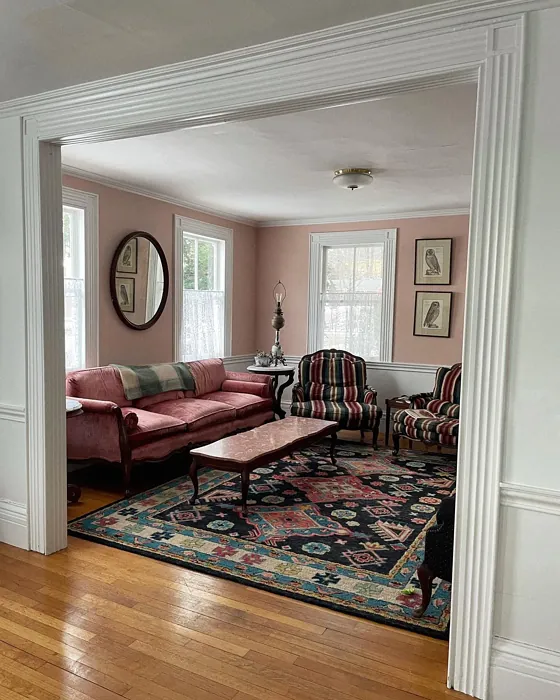
Imagine walking into a room that instantly envelops you in warmth and serenity, making you feel as if you’ve just stepped into a tranquil oasis. That’s the magic of color, and today, I want to introduce you to a captivating shade that embodies this experience: Pale Petal by Benjamin Moore. This delicate hue, with a color code of 1178, is more than just a paint color; it’s a transformative element for any space.
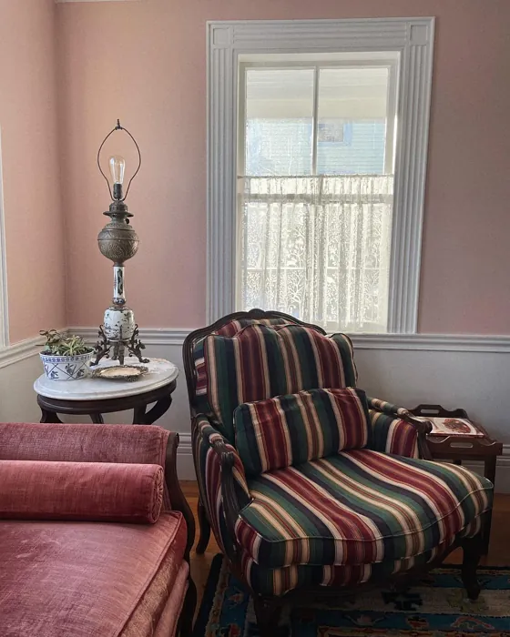
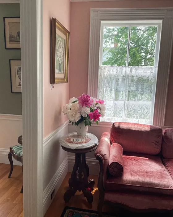
Pale Petal is a soft, muted pink with a warm blush undertone that feels both inviting and elegant. Its subtlety allows it to blend beautifully with various decor styles, from Modern Farmhouse to Bohemian, Transitional, and even Scandinavian. Whether you’re refreshing a living room, creating a cozy nursery, or setting an inviting dining room, this color offers a versatile backdrop that lets your furnishings shine.
What makes Pale Petal particularly appealing is its friendly nature. The color has a Light Reflectance Value (LRV) of 57.42%, classifying it as a light color that reflects a significant amount of incident light. This means it can make your spaces feel larger and brighter, perfect for smaller rooms that need an illusion of depth. Picture a snug bedroom or a lively living room where the walls seem to breathe and expand, creating a sense of openness.
When applying Pale Petal, you’ll find that it’s beginner-friendly with a smooth application. It’s roller-ready and brush-smooth, making it an ideal choice for DIY enthusiasts. For optimal results, aim for at least two coats; this not only ensures a vibrant and even finish but also enhances the depth of the color. The result? A soft yet captivating ambiance that radiates warmth.
However, as with any paint color, it’s essential to consider how it interacts with light. Pale Petal can shift slightly under varying lighting conditions, creating a dynamic visual experience. In natural light, it illuminates beautifully, enhancing its soft hue, while in dimmer settings, it maintains a soothing warmth that feels intimate and welcoming. If you’re planning to use this color, it’s wise to test it in your space and observe how it changes throughout the day.
One of the standout features of Pale Petal is its eco-friendliness. It boasts low VOC levels and is eco-certified, making it a responsible choice for those who are environmentally conscious. You can enjoy the beauty of this color without compromising on air quality. Plus, it’s wipeable and washable, so maintenance is a breeze, especially in homes with kids or pets. Just remember that while it’s durable, it may not be the best fit for high-traffic areas unless you opt for a satin finish for added resilience.
Decorating with Pale Petal opens up a world of possibilities for complementing shades. It pairs beautifully with crisp whites, like Benjamin Moore’s White Dove, allowing for a clean and sophisticated look. Imagine white trim against the soft pink walls, creating an elegant contrast that enhances your decor. You can also introduce accents of brass fixtures or natural wood elements, which harmonize wonderfully with this warm hue, bringing an organic feel to your interiors.
Now, let’s talk about the rooms where Pale Petal truly shines. For living rooms, it sets a cozy, inviting atmosphere, perfect for entertaining or family gatherings. In bedrooms, its calming tones create a peaceful sanctuary for rest and relaxation. And if you’re designing a nursery, this color provides a nurturing environment that feels both safe and serene. The versatility of Pale Petal makes it suitable not just for homes but also for rental spaces, where you want to leave your mark without extensive renovations.
Choosing the right finish can further enhance the beauty of Pale Petal. A matte finish provides a soft, velvety appearance, ideal for spaces where you want a touch of understated elegance. On the other hand, an eggshell or satin finish adds a subtle sheen, increasing durability while still maintaining that soft look. Depending on the room’s function and your desired aesthetic, you can easily tailor the finish to meet your needs.
If you’re concerned about using Pale Petal in a small space, fear not! This color works wonders in compact rooms, creating an open, airy feel that instantly elevates the atmosphere. Just be sure to complement it with adequate lighting and carefully curated decor to enhance that bright, inviting vibe.
While the pros of Pale Petal significantly outweigh the cons, it’s essential to acknowledge that it might require multiple coats for deeper coverage, depending on the surface you’re painting. Additionally, its color perception can change with lighting, so always test samples on your walls before committing.
In terms of surrounding colors, you might consider lighter shades like Soft Blush or Light Mauve for a monochromatic palette that feels soft and cohesive. Alternatively, introducing darker accents, such as hues from the HC line like HC-58, can create a striking contrast that adds depth to your design.
As you embark on your journey to incorporate Pale Petal into your home, remember that the undertones play a crucial role in its character. This particular shade leans towards red, giving it warmth and a hint of sophistication. Observing it next to various elements in your home—furniture, flooring, and existing decor—will help you appreciate how it evolves and reveals itself throughout the day.
In conclusion, Pale Petal by Benjamin Moore is more than just a pretty color; it’s a versatile choice that enhances any space with warmth and elegance. Whether you’re aiming to refresh a single room or transform your entire home, this soft blush hue can create an inviting atmosphere that feels both timeless and contemporary. So why not take a leap and introduce this delightful color into your home? It might just be the perfect touch you’ve been looking for.

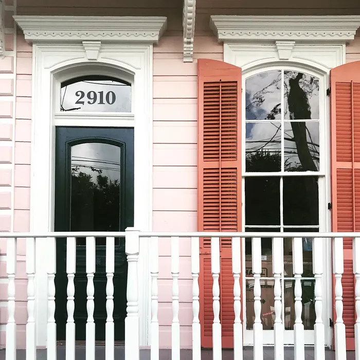
Real Room Photo of Pale Petal 1178
Undertones of Pale Petal ?
The undertones of Pale Petal are a key aspect of its character, leaning towards Red. These subtle underlying hues are what give the color its depth and complexity. For example, a gray with a blue undertone will feel cooler and more modern, while one with a brown undertone will feel warmer and more traditional. It’s essential to test this paint in your home and observe it next to your existing furniture, flooring, and decor to see how these undertones interact and reveal themselves throughout the day.
HEX value: #E0C4B8
RGB code: 224, 196, 184
Is Pale Petal Cool or Warm?
Pale Petal is considered a warm paint color. This characteristic plays a huge role in the overall feel of a room. Warm colors, like this one, tend to create a cozy, inviting, and energetic atmosphere, making them great for social spaces like living rooms and dining rooms. In contrast, cool colors often evoke a sense of calm and serenity, which is why they are popular in bedrooms and bathrooms. The warmth of Pale Petal means it will pair beautifully with corresponding decor elements.
Understanding Color Properties and Interior Design Tips
Hue refers to a specific position on the color wheel, measured in degrees from 0 to 360. Each degree represents a different pure color:
- 0° represents red
- 120° represents green
- 240° represents blue
Saturation describes the intensity or purity of a color and is expressed as a percentage:
- At 0%, the color appears completely desaturated—essentially a shade of gray
- At 100%, the color is at its most vivid and vibrant
Lightness indicates how light or dark a color is, also expressed as a percentage:
- 0% lightness results in black
- 100% lightness results in white
Using Warm Colors in Interior Design
Warm hues—such as reds, oranges, yellows, warm beiges, and greiges—are excellent choices for creating inviting and energetic spaces. These colors are particularly well-suited for:
- Kitchens, living rooms, and bathrooms, where warmth enhances comfort and sociability
- Large rooms, where warm tones can help reduce the sense of emptiness and make the space feel more intimate
For example:
- Warm beige shades provide a cozy, inviting atmosphere, ideal for living rooms, bedrooms, and hallways.
- Warm greige (a mix of beige and gray) offers the warmth of beige with the modern appeal of gray, making it a versatile backdrop for dining areas, bedrooms, and living spaces.
However, be mindful when using warm light tones in rooms with limited natural light. These shades may appear muted or even take on an unpleasant yellowish tint. To avoid a dull or flat appearance:
- Add depth by incorporating richer tones like deep greens, charcoal, or chocolate brown
- Use textured elements such as curtains, rugs, or cushions to bring dimension to the space
Pro Tip: Achieving Harmony with Warm and Cool Color Balance
To create a well-balanced and visually interesting interior, mix warm and cool tones strategically. This contrast adds depth and harmony to your design.
- If your walls feature warm hues, introduce cool-colored accents such as blue or green furniture, artwork, or accessories to create contrast.
- For a polished look, consider using a complementary color scheme, which pairs colors opposite each other on the color wheel (e.g., red with green, orange with blue).
This thoughtful mix not only enhances visual appeal but also creates a space that feels both dynamic and cohesive.
Light Temperature Affects on Pale Petal
Natural Light
Natural daylight changes in color temperature as the sun moves across the sky. At sunrise and sunset, the light tends to have a warm, golden tone with a color temperature around 2000 Kelvin (K). As the day progresses and the sun rises higher, the light becomes cooler and more neutral. Around midday, especially when the sky is clear, natural light typically reaches its peak brightness and shifts to a cooler tone, ranging from 5500 to 6500 Kelvin. This midday light is close to what we perceive as pure white or daylight-balanced light.
These shifts in natural light can significantly influence how colors appear in a space, which is why designers often consider both the time of day and the orientation of windows when planning interior color schemes.
Artificial Light
When choosing artificial lighting, pay close attention to the color temperature, measured in Kelvin (K). This determines how warm or cool the light will appear. Lower temperatures, around 2700K, give off a warm, yellow glow often used in living rooms or bedrooms. Higher temperatures, above 5000K, create a cool, bluish light similar to daylight, commonly used in kitchens, offices, or task areas.
Use the slider to see how lighting temperature can affect the appearance of a surface or color throughout a space.


4800K
LRV of Pale Petal
The Light Reflectance Value (LRV) of Pale Petal is 57.42%, which places it in the Light colors category. This means it reflect most of the incident light. Understanding a paint’s LRV is crucial for predicting how it will look in your space. A higher LRV indicates a lighter color that reflects more light, making rooms feel larger and brighter. A lower LRV signifies a darker color that absorbs more light, creating a cozier, more intimate atmosphere. Always consider the natural and artificial lighting in your room when selecting a paint color based on its LRV.
Detailed Review of Pale Petal
Additional Paint Characteristics
Ideal Rooms
Bedroom, Dining Room, Home Office, Living Room, Nursery
Decor Styles
Bohemian, Cottage, Modern Farmhouse, Scandinavian, Transitional
Coverage
Good (1–2 Coats), Touch-Up Friendly
Ease of Application
Beginner Friendly, Brush Smooth, Roller-Ready
Washability
Washable, Wipeable
VOC Level
Eco-Certified, Low VOC
Best Use
Accent Wall, Furniture, Interior Walls
Room Suitability
Bedroom, Dining Room, Living Room, Nursery
Tone Tag
Muted, Pastel, Warm
Finish Type
Eggshell, Matte
Paint Performance
Easy Touch-Up, Low Odor, Quick Drying
Use Cases
Best for Rentals, Best for Small Spaces, Designer Favorite, Trending in 2025
Mood
Calm, Cozy, Inviting
Trim Pairing
Complements Brass Fixtures, Good with Wood Trim, Pairs with White Dove
Pale Petal stands out as a versatile color that can transform your space into a tranquil retreat. Whether you’re painting a nursery for a new arrival or refreshing your living room, this color provides a soft backdrop that allows your furnishings to shine. Its warm undertones make it particularly inviting, and it serves as a fantastic canvas for various decor styles.
When applying, you’ll find that it has a smooth finish, which contributes to its overall appeal. Depending on the lighting, the color can shift slightly, creating a dynamic visual experience. However, it’s essential to apply at least two coats for optimal coverage, ensuring that the final result is both even and vibrant. Overall, Pale Petal is a delightful choice for anyone looking to add a touch of warmth and sophistication to their home.
Pros & Cons of 1178 Pale Petal
Pros
Cons
Colors that go with Benjamin Moore Pale Petal
FAQ on 1178 Pale Petal
Can I use Pale Petal in a small space?
Absolutely! Pale Petal is an excellent choice for small spaces. Its light and airy quality helps to create an illusion of depth and openness, making your room feel larger. Pair it with adequate lighting and carefully selected decor to enhance the bright, inviting atmosphere.
What finishes work best for Pale Petal?
For Pale Petal, both matte and satin finishes work beautifully. A matte finish gives a soft, velvety look, perfect for bedrooms or living areas, while a satin finish adds a bit of sheen that can enhance durability, making it ideal for kitchens or bathrooms. Choose based on your desired aesthetic and functionality.
Comparisons Pale Petal with other colors
Pale Petal 1178 vs Realist Beige SW 6078
| Attribute | Pale Petal 1178 | Realist Beige SW 6078 |
|---|---|---|
| Color Name | Pale Petal 1178 | Realist Beige SW 6078 |
| Color | ||
| Hue | Pink | Pink |
| Brightness | Medium | Medium |
| RGB | 224, 196, 184 | 211, 200, 189 |
| LRV | 57.42% | 34% |
| Finish Type | Eggshell, Matte | Eggshell, Matte, Satin |
| Finish Options | Eggshell, Matte, Satin | Eggshell, Matte, Satin |
| Ideal Rooms | Bedroom, Dining Room, Home Office, Living Room, Nursery | Bedroom, Dining Room, Entryway, Home Office, Kitchen, Living Room |
| Decor Styles | Bohemian, Cottage, Modern Farmhouse, Scandinavian, Transitional | Contemporary, Minimalist, Modern Farmhouse, Rustic, Traditional |
| Coverage | Good (1–2 Coats), Touch-Up Friendly | Good (1–2 Coats), Touch-Up Friendly |
| Ease of Application | Beginner Friendly, Brush Smooth, Roller-Ready | Beginner Friendly, Brush Smooth, Fast-Drying, Roller-Ready |
| Washability | Washable, Wipeable | Washable, Wipeable |
| Room Suitability | Bedroom, Dining Room, Living Room, Nursery | Bedroom, Dining Room, Home Office, Kitchen, Living Room |
| Tone | Muted, Pastel, Warm | Earthy, Neutral, Warm |
| Paint Performance | Easy Touch-Up, Low Odor, Quick Drying | High Coverage, Low Odor, Quick Drying |
Pale Petal 1178 vs Rosaline Pearl SW 9077
| Attribute | Pale Petal 1178 | Rosaline Pearl SW 9077 |
|---|---|---|
| Color Name | Pale Petal 1178 | Rosaline Pearl SW 9077 |
| Color | ||
| Hue | Pink | Pink |
| Brightness | Medium | Medium |
| RGB | 224, 196, 184 | 163, 136, 135 |
| LRV | 57.42% | 69% |
| Finish Type | Eggshell, Matte | Eggshell, Matte |
| Finish Options | Eggshell, Matte, Satin | Eggshell, Matte, Satin |
| Ideal Rooms | Bedroom, Dining Room, Home Office, Living Room, Nursery | Bedroom, Dining Room, Home Office, Living Room |
| Decor Styles | Bohemian, Cottage, Modern Farmhouse, Scandinavian, Transitional | Bohemian, Contemporary, Modern, Transitional |
| Coverage | Good (1–2 Coats), Touch-Up Friendly | Good (1–2 Coats) |
| Ease of Application | Beginner Friendly, Brush Smooth, Roller-Ready | Beginner Friendly, Brush Smooth, Fast-Drying, Roller-Ready |
| Washability | Washable, Wipeable | Washable, Wipeable |
| Room Suitability | Bedroom, Dining Room, Living Room, Nursery | Bedroom, Dining Room, Home Office, Living Room |
| Tone | Muted, Pastel, Warm | Dusty, Muted, Warm |
| Paint Performance | Easy Touch-Up, Low Odor, Quick Drying | Easy Touch-Up, Fade Resistant, Low Odor |
Pale Petal 1178 vs Cabbage Rose SW 0003
| Attribute | Pale Petal 1178 | Cabbage Rose SW 0003 |
|---|---|---|
| Color Name | Pale Petal 1178 | Cabbage Rose SW 0003 |
| Color | ||
| Hue | Pink | Pink |
| Brightness | Medium | Medium |
| RGB | 224, 196, 184 | 197, 159, 145 |
| LRV | 57.42% | 15% |
| Finish Type | Eggshell, Matte | Eggshell, Matte, Satin |
| Finish Options | Eggshell, Matte, Satin | Eggshell, Matte, Satin |
| Ideal Rooms | Bedroom, Dining Room, Home Office, Living Room, Nursery | Bedroom, Dining Room, Hallway, Living Room, Nursery |
| Decor Styles | Bohemian, Cottage, Modern Farmhouse, Scandinavian, Transitional | Cottage, Modern Farmhouse, Romantic, Shabby Chic, Vintage |
| Coverage | Good (1–2 Coats), Touch-Up Friendly | Good (1–2 Coats), Touch-Up Friendly |
| Ease of Application | Beginner Friendly, Brush Smooth, Roller-Ready | Beginner Friendly, Brush Smooth, Roller-Ready |
| Washability | Washable, Wipeable | Washable, Wipeable |
| Room Suitability | Bedroom, Dining Room, Living Room, Nursery | Bedroom, Dining Room, Hallway, Living Room, Nursery |
| Tone | Muted, Pastel, Warm | Earthy, Muted, Warm |
| Paint Performance | Easy Touch-Up, Low Odor, Quick Drying | Easy Touch-Up, Low Odor |
Pale Petal 1178 vs Sashay Sand SW 6051
| Attribute | Pale Petal 1178 | Sashay Sand SW 6051 |
|---|---|---|
| Color Name | Pale Petal 1178 | Sashay Sand SW 6051 |
| Color | ||
| Hue | Pink | Pink |
| Brightness | Medium | Medium |
| RGB | 224, 196, 184 | 207, 180, 168 |
| LRV | 57.42% | 64% |
| Finish Type | Eggshell, Matte | Eggshell, Matte, Satin |
| Finish Options | Eggshell, Matte, Satin | Eggshell, Matte, Satin |
| Ideal Rooms | Bedroom, Dining Room, Home Office, Living Room, Nursery | Bedroom, Dining Room, Home Office, Kitchen, Living Room |
| Decor Styles | Bohemian, Cottage, Modern Farmhouse, Scandinavian, Transitional | Bohemian, Contemporary, Modern Farmhouse, Scandinavian, Transitional |
| Coverage | Good (1–2 Coats), Touch-Up Friendly | Good (1–2 Coats), Touch-Up Friendly |
| Ease of Application | Beginner Friendly, Brush Smooth, Roller-Ready | Beginner Friendly, Fast-Drying, Roller-Ready |
| Washability | Washable, Wipeable | Highly Washable, Washable |
| Room Suitability | Bedroom, Dining Room, Living Room, Nursery | Bedroom, Dining Room, Home Office, Kitchen, Living Room |
| Tone | Muted, Pastel, Warm | Earthy, Muted, Warm |
| Paint Performance | Easy Touch-Up, Low Odor, Quick Drying | Easy Touch-Up, Low Odor, Quick Drying, Scuff Resistant |
Pale Petal 1178 vs Touch of Sand SW 9085
| Attribute | Pale Petal 1178 | Touch of Sand SW 9085 |
|---|---|---|
| Color Name | Pale Petal 1178 | Touch of Sand SW 9085 |
| Color | ||
| Hue | Pink | Pink |
| Brightness | Medium | Medium |
| RGB | 224, 196, 184 | 213, 199, 186 |
| LRV | 57.42% | 66% |
| Finish Type | Eggshell, Matte | Eggshell, Matte, Satin |
| Finish Options | Eggshell, Matte, Satin | Eggshell, Matte, Satin |
| Ideal Rooms | Bedroom, Dining Room, Home Office, Living Room, Nursery | Bathroom, Bedroom, Dining Room, Home Office, Kitchen, Living Room |
| Decor Styles | Bohemian, Cottage, Modern Farmhouse, Scandinavian, Transitional | Bohemian, Coastal, Contemporary, Modern Farmhouse, Rustic |
| Coverage | Good (1–2 Coats), Touch-Up Friendly | Good (1–2 Coats), Touch-Up Friendly |
| Ease of Application | Beginner Friendly, Brush Smooth, Roller-Ready | Beginner Friendly, Brush Smooth, Fast-Drying, Roller-Ready |
| Washability | Washable, Wipeable | Washable, Wipeable |
| Room Suitability | Bedroom, Dining Room, Living Room, Nursery | Bathroom, Bedroom, Dining Room, Home Office, Kitchen, Living Room |
| Tone | Muted, Pastel, Warm | Earthy, Muted, Neutral, Warm |
| Paint Performance | Easy Touch-Up, Low Odor, Quick Drying | Easy Touch-Up, Low Odor, Quick Drying, Scuff Resistant |
Pale Petal 1178 vs Pink Shadow SW 0070
| Attribute | Pale Petal 1178 | Pink Shadow SW 0070 |
|---|---|---|
| Color Name | Pale Petal 1178 | Pink Shadow SW 0070 |
| Color | ||
| Hue | Pink | Pink |
| Brightness | Medium | Medium |
| RGB | 224, 196, 184 | 222, 195, 185 |
| LRV | 57.42% | 45% |
| Finish Type | Eggshell, Matte | Eggshell, Matte, Satin |
| Finish Options | Eggshell, Matte, Satin | Eggshell, Matte, Satin |
| Ideal Rooms | Bedroom, Dining Room, Home Office, Living Room, Nursery | Bedroom, Dining Room, Home Office, Living Room, Nursery |
| Decor Styles | Bohemian, Cottage, Modern Farmhouse, Scandinavian, Transitional | Bohemian, Minimalist, Modern Farmhouse, Scandinavian, Traditional |
| Coverage | Good (1–2 Coats), Touch-Up Friendly | Good (1–2 Coats) |
| Ease of Application | Beginner Friendly, Brush Smooth, Roller-Ready | Beginner Friendly, Brush Smooth, Fast-Drying, Roller-Ready |
| Washability | Washable, Wipeable | Washable, Wipeable |
| Room Suitability | Bedroom, Dining Room, Living Room, Nursery | Bedroom, Dining Room, Living Room, Nursery |
| Tone | Muted, Pastel, Warm | Muted, Pastel, Warm |
| Paint Performance | Easy Touch-Up, Low Odor, Quick Drying | Easy Touch-Up, High Coverage, Low Odor |
Pale Petal 1178 vs Hushed Auburn SW 9080
| Attribute | Pale Petal 1178 | Hushed Auburn SW 9080 |
|---|---|---|
| Color Name | Pale Petal 1178 | Hushed Auburn SW 9080 |
| Color | ||
| Hue | Pink | Pink |
| Brightness | Medium | Medium |
| RGB | 224, 196, 184 | 168, 133, 122 |
| LRV | 57.42% | 12% |
| Finish Type | Eggshell, Matte | Eggshell, Matte, Satin |
| Finish Options | Eggshell, Matte, Satin | Eggshell, Matte, Satin |
| Ideal Rooms | Bedroom, Dining Room, Home Office, Living Room, Nursery | Bedroom, Dining Room, Home Office, Living Room |
| Decor Styles | Bohemian, Cottage, Modern Farmhouse, Scandinavian, Transitional | Contemporary, Modern Farmhouse, Rustic, Transitional |
| Coverage | Good (1–2 Coats), Touch-Up Friendly | Good (1–2 Coats), Touch-Up Friendly |
| Ease of Application | Beginner Friendly, Brush Smooth, Roller-Ready | Beginner Friendly, Brush Smooth, Fast-Drying, Roller-Ready |
| Washability | Washable, Wipeable | Washable, Wipeable |
| Room Suitability | Bedroom, Dining Room, Living Room, Nursery | Bedroom, Dining Room, Home Office, Living Room |
| Tone | Muted, Pastel, Warm | Earthy, Muted, Warm |
| Paint Performance | Easy Touch-Up, Low Odor, Quick Drying | Easy Touch-Up, High Coverage, Low Odor |
Pale Petal 1178 vs Likeable Sand SW 6058
| Attribute | Pale Petal 1178 | Likeable Sand SW 6058 |
|---|---|---|
| Color Name | Pale Petal 1178 | Likeable Sand SW 6058 |
| Color | ||
| Hue | Pink | Pink |
| Brightness | Medium | Medium |
| RGB | 224, 196, 184 | 209, 183, 168 |
| LRV | 57.42% | 61% |
| Finish Type | Eggshell, Matte | Eggshell, Matte, Satin |
| Finish Options | Eggshell, Matte, Satin | Eggshell, Matte, Satin |
| Ideal Rooms | Bedroom, Dining Room, Home Office, Living Room, Nursery | Bedroom, Dining Room, Home Office, Kitchen, Living Room |
| Decor Styles | Bohemian, Cottage, Modern Farmhouse, Scandinavian, Transitional | Bohemian, Coastal, Contemporary, Modern Farmhouse, Rustic |
| Coverage | Good (1–2 Coats), Touch-Up Friendly | Good (1–2 Coats), Touch-Up Friendly |
| Ease of Application | Beginner Friendly, Brush Smooth, Roller-Ready | Beginner Friendly, Brush Smooth, Fast-Drying, Roller-Ready |
| Washability | Washable, Wipeable | Washable, Wipeable |
| Room Suitability | Bedroom, Dining Room, Living Room, Nursery | Bedroom, Dining Room, Home Office, Kitchen, Living Room |
| Tone | Muted, Pastel, Warm | Earthy, Muted, Warm |
| Paint Performance | Easy Touch-Up, Low Odor, Quick Drying | Easy Touch-Up, Low Odor, Quick Drying |
Pale Petal 1178 vs Glamour SW 6031
| Attribute | Pale Petal 1178 | Glamour SW 6031 |
|---|---|---|
| Color Name | Pale Petal 1178 | Glamour SW 6031 |
| Color | ||
| Hue | Pink | Pink |
| Brightness | Medium | Medium |
| RGB | 224, 196, 184 | 182, 160, 154 |
| LRV | 57.42% | 30% |
| Finish Type | Eggshell, Matte | Eggshell, Matte, Satin |
| Finish Options | Eggshell, Matte, Satin | Eggshell, Matte, Satin |
| Ideal Rooms | Bedroom, Dining Room, Home Office, Living Room, Nursery | Bedroom, Dining Room, Home Office, Living Room |
| Decor Styles | Bohemian, Cottage, Modern Farmhouse, Scandinavian, Transitional | Bohemian, Classic, Modern, Transitional |
| Coverage | Good (1–2 Coats), Touch-Up Friendly | Good (1–2 Coats) |
| Ease of Application | Beginner Friendly, Brush Smooth, Roller-Ready | Beginner Friendly, Brush Smooth, Fast-Drying, Roller-Ready |
| Washability | Washable, Wipeable | Scrubbable, Washable |
| Room Suitability | Bedroom, Dining Room, Living Room, Nursery | Bedroom, Dining Room, Home Office, Living Room |
| Tone | Muted, Pastel, Warm | Balanced, Neutral, Warm |
| Paint Performance | Easy Touch-Up, Low Odor, Quick Drying | Easy Touch-Up, Low Odor, Quick Drying |
Pale Petal 1178 vs Temperate Taupe SW 6037
| Attribute | Pale Petal 1178 | Temperate Taupe SW 6037 |
|---|---|---|
| Color Name | Pale Petal 1178 | Temperate Taupe SW 6037 |
| Color | ||
| Hue | Pink | Pink |
| Brightness | Medium | Medium |
| RGB | 224, 196, 184 | 191, 177, 170 |
| LRV | 57.42% | 34% |
| Finish Type | Eggshell, Matte | Eggshell, Matte, Satin |
| Finish Options | Eggshell, Matte, Satin | Eggshell, Matte, Satin |
| Ideal Rooms | Bedroom, Dining Room, Home Office, Living Room, Nursery | Bedroom, Dining Room, Home Office, Kitchen, Living Room |
| Decor Styles | Bohemian, Cottage, Modern Farmhouse, Scandinavian, Transitional | Bohemian, Modern Farmhouse, Rustic, Transitional |
| Coverage | Good (1–2 Coats), Touch-Up Friendly | Good (1–2 Coats), Touch-Up Friendly |
| Ease of Application | Beginner Friendly, Brush Smooth, Roller-Ready | Beginner Friendly, Brush Smooth, Fast-Drying, Roller-Ready |
| Washability | Washable, Wipeable | Highly Washable, Washable |
| Room Suitability | Bedroom, Dining Room, Living Room, Nursery | Bedroom, Dining Room, Home Office, Living Room |
| Tone | Muted, Pastel, Warm | Earthy, Neutral, Warm |
| Paint Performance | Easy Touch-Up, Low Odor, Quick Drying | Long Lasting, Low Odor, Quick Drying, Scuff Resistant |
Official Page of Benjamin Moore Pale Petal 1178