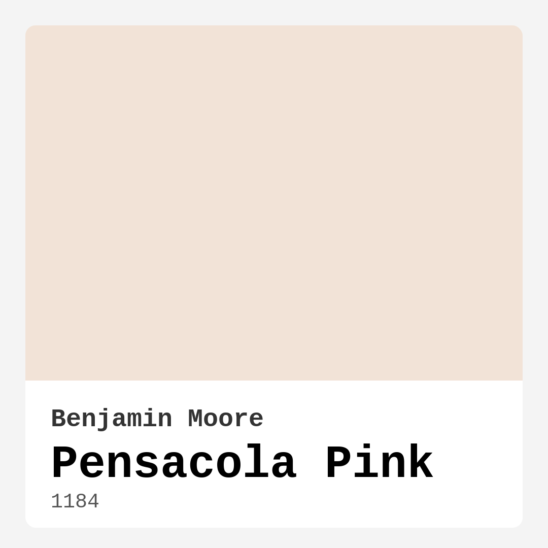
Color Preview & Key Details
| HEX Code | #F2E3D7 |
| RGB | 242, 227, 215 |
| LRV | 77.14% |
| Undertone | Red |
| Finish Options | Eggshell, Flat, Satin |
Imagine walking into a room that instantly makes you exhale—soft, warm, and effortlessly elegant. That’s the magic of Benjamin Moore’s Pensacola Pink. It’s not just a paint color; it’s a mood. Whether you’re dreaming of a serene bedroom retreat, a cozy living room, or a nursery that feels like a gentle hug, this shade has a way of transforming spaces into something special. But is it right for *your* home? Let’s dive in.
Pensacola Pink (color code 1184) is a blush-toned hue with a whisper of warmth, thanks to its subtle red undertones. It’s light, with an LRV of 77.14%, meaning it reflects plenty of light, making rooms feel airy and bright. That’s why it’s a superstar in smaller spaces—it opens them up without feeling stark or cold. The hex code #F2E3D7 translates to a delicate balance of pink and beige, so it never feels too sweet or overwhelming. It’s the kind of color that plays well with others, whether you’re into coastal vibes, modern farmhouse charm, or Scandinavian simplicity.
One of the best things about this paint? It’s beginner-friendly. With good coverage (often just one or two coats), easy application, and low VOC levels, it’s a dream for DIYers. You can choose from flat, eggshell, or satin finishes depending on your needs. Flat hides imperfections beautifully, while satin adds a subtle sheen that’s perfect for spaces where you want a touch of sophistication. And because it’s wipeable and washable, it holds up well in most rooms—though I’d think twice before using it in a high-traffic hallway without some extra protection.
Now, let’s talk about light. Pensacola Pink loves natural light. In a sun-drenched room, it glows, enhancing its warm, inviting character. But in low-light spaces? It can lean a touch muted, so pair it with warm white bulbs or layered lighting to keep it from feeling flat. The undertones are key here—that hint of red means it’ll cozy up a north-facing room but stay balanced in a south-facing one. Always test a swatch on your walls and observe it at different times of day. You’ll see how it shifts, sometimes pulling more neutral, other times revealing its rosy side.
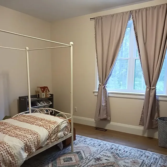
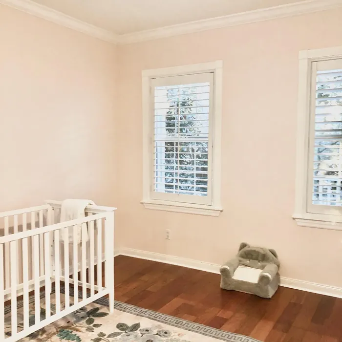
Wondering where to use it? Bedrooms are a no-brainer. This color creates a tranquil oasis, especially when paired with crisp white trim like Benjamin Moore’s White Dove. Nurseries? Absolutely—it’s soft and gender-neutral, working beautifully with greens or warm woods. Dining rooms and living spaces benefit from its ability to feel both elegant and approachable. And if you’re renting, it’s a landlord-friendly shade that’s easy to paint over later.
For decor pairings, think complementary colors. A touch of sage green (its color-wheel opposite) adds freshness, while brass fixtures bring out its warmth. Layer in textures like linen, rattan, or reclaimed wood to keep it grounded. If you’re feeling bold, try it on an accent wall with a darker shade like HC-157 for depth. And don’t forget trim—clean white or even a soft gray can make Pensacola Pink pop without competing.
Of course, no color is perfect for every situation. If your room gets very little light, you might want to go a shade brighter to avoid it feeling dingy. And while it’s versatile, it’s not the best pick for a kid’s playroom or a mudroom where stains are inevitable. But for most interiors? It’s a winner.
So, should you choose Pensacola Pink? If you’re after a color that’s warm but not heavy, elegant but not fussy, and timeless but still fresh, the answer is yes. It’s one of those shades that feels like *home*—subtle, soothing, and full of personality. Grab a sample, paint a test patch, and see how it makes you feel. Sometimes, the right color just clicks.
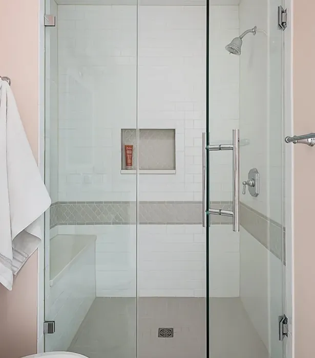
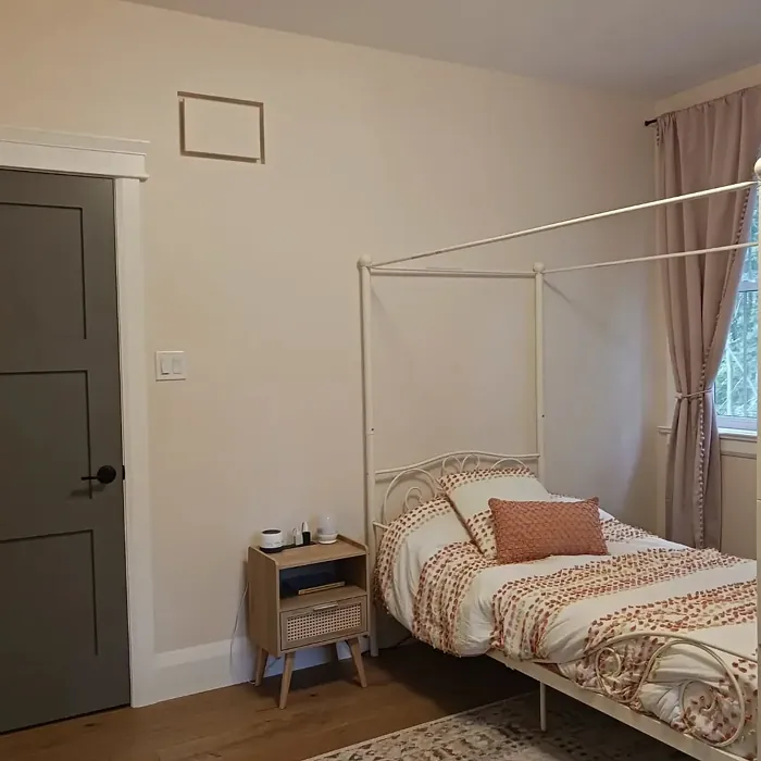
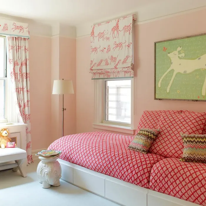
Real Room Photo of Pensacola Pink 1184
Undertones of Pensacola Pink ?
The undertones of Pensacola Pink are a key aspect of its character, leaning towards Red. These subtle underlying hues are what give the color its depth and complexity. For example, a gray with a blue undertone will feel cooler and more modern, while one with a brown undertone will feel warmer and more traditional. It’s essential to test this paint in your home and observe it next to your existing furniture, flooring, and decor to see how these undertones interact and reveal themselves throughout the day.
HEX value: #F2E3D7
RGB code: 242, 227, 215
Is Pensacola Pink Cool or Warm?
Pensacola Pink is predominantly warm, with a soft, inviting feel that makes it perfect for cozy settings. This warmth works particularly well in rooms that get ample natural light, creating a welcoming ambiance.
Understanding Color Properties and Interior Design Tips
Hue refers to a specific position on the color wheel, measured in degrees from 0 to 360. Each degree represents a different pure color:
- 0° represents red
- 120° represents green
- 240° represents blue
Saturation describes the intensity or purity of a color and is expressed as a percentage:
- At 0%, the color appears completely desaturated—essentially a shade of gray
- At 100%, the color is at its most vivid and vibrant
Lightness indicates how light or dark a color is, also expressed as a percentage:
- 0% lightness results in black
- 100% lightness results in white
Using Warm Colors in Interior Design
Warm hues—such as reds, oranges, yellows, warm beiges, and greiges—are excellent choices for creating inviting and energetic spaces. These colors are particularly well-suited for:
- Kitchens, living rooms, and bathrooms, where warmth enhances comfort and sociability
- Large rooms, where warm tones can help reduce the sense of emptiness and make the space feel more intimate
For example:
- Warm beige shades provide a cozy, inviting atmosphere, ideal for living rooms, bedrooms, and hallways.
- Warm greige (a mix of beige and gray) offers the warmth of beige with the modern appeal of gray, making it a versatile backdrop for dining areas, bedrooms, and living spaces.
However, be mindful when using warm light tones in rooms with limited natural light. These shades may appear muted or even take on an unpleasant yellowish tint. To avoid a dull or flat appearance:
- Add depth by incorporating richer tones like deep greens, charcoal, or chocolate brown
- Use textured elements such as curtains, rugs, or cushions to bring dimension to the space
Pro Tip: Achieving Harmony with Warm and Cool Color Balance
To create a well-balanced and visually interesting interior, mix warm and cool tones strategically. This contrast adds depth and harmony to your design.
- If your walls feature warm hues, introduce cool-colored accents such as blue or green furniture, artwork, or accessories to create contrast.
- For a polished look, consider using a complementary color scheme, which pairs colors opposite each other on the color wheel (e.g., red with green, orange with blue).
This thoughtful mix not only enhances visual appeal but also creates a space that feels both dynamic and cohesive.
Light Temperature Affects on Pensacola Pink
Natural Light
Natural daylight changes in color temperature as the sun moves across the sky. At sunrise and sunset, the light tends to have a warm, golden tone with a color temperature around 2000 Kelvin (K). As the day progresses and the sun rises higher, the light becomes cooler and more neutral. Around midday, especially when the sky is clear, natural light typically reaches its peak brightness and shifts to a cooler tone, ranging from 5500 to 6500 Kelvin. This midday light is close to what we perceive as pure white or daylight-balanced light.
These shifts in natural light can significantly influence how colors appear in a space, which is why designers often consider both the time of day and the orientation of windows when planning interior color schemes.
Artificial Light
When choosing artificial lighting, pay close attention to the color temperature, measured in Kelvin (K). This determines how warm or cool the light will appear. Lower temperatures, around 2700K, give off a warm, yellow glow often used in living rooms or bedrooms. Higher temperatures, above 5000K, create a cool, bluish light similar to daylight, commonly used in kitchens, offices, or task areas.
Use the slider to see how lighting temperature can affect the appearance of a surface or color throughout a space.


4800K
LRV of Pensacola Pink
The Light Reflectance Value (LRV) of Pensacola Pink is 77.14%, which places it in the Off‑White colors category. This means it reflect a lot of light. Understanding a paint’s LRV is crucial for predicting how it will look in your space. A higher LRV indicates a lighter color that reflects more light, making rooms feel larger and brighter. A lower LRV signifies a darker color that absorbs more light, creating a cozier, more intimate atmosphere. Always consider the natural and artificial lighting in your room when selecting a paint color based on its LRV.
Detailed Review of Pensacola Pink
Additional Paint Characteristics
Ideal Rooms
Bedroom, Dining Room, Kitchen, Living Room, Nursery
Decor Styles
Bohemian, Coastal, Modern Farmhouse, Scandinavian
Coverage
Good (1–2 Coats)
Ease of Application
Beginner Friendly, Brush Smooth, Roller-Ready
Washability
Washable, Wipeable
VOC Level
Low VOC
Best Use
Accent Wall, Bedroom, Interior Walls, Nursery
Room Suitability
Bedroom, Dining Room, Living Room, Nursery
Tone Tag
Airy, Pastel, Warm
Finish Type
Eggshell, Flat, Satin
Paint Performance
Easy Touch-Up, Low Odor, Quick Drying
Use Cases
Best for Rentals, Best for Small Spaces, Classic Favorite
Mood
Calm, Cozy, Inviting
Trim Pairing
Complements Brass Fixtures, Matches Pure White, Pairs with White Dove
Pensacola Pink is a delightful choice for both subtle and bold decorating styles. The soft blush tone creates an inviting environment, perfect for spaces meant for relaxation or socializing. Its versatility allows it to work well with various decor styles, from coastal to modern farmhouse. Applying this paint is straightforward, and it provides good coverage, typically requiring only one or two coats, depending on the surface. The finish options, ranging from flat to satin, let you customize the look to suit your preference. This color truly shines in natural light, enhancing its soft undertones while promoting a calm vibe in any room.
Pros & Cons of 1184 Pensacola Pink
Pros
Cons
Colors that go with Benjamin Moore Pensacola Pink
FAQ on 1184 Pensacola Pink
Can I use Pensacola Pink in a small room?
Absolutely! Pensacola Pink is perfect for small rooms. Its soft, light tone helps create an illusion of space, making rooms feel larger and airier. Just ensure you balance it with adequate lighting to maintain its warmth.
What finishes are available for Pensacola Pink?
Pensacola Pink comes in several finishes, including flat, eggshell, and satin. Each finish offers a different sheen level, allowing you to choose based on the look and feel you want to achieve in your space. Flat is great for hiding imperfections, while satin can add a subtle sheen for a more polished appearance.
Comparisons Pensacola Pink with other colors
Pensacola Pink 1184 vs Malted Milk SW 6057
| Attribute | Pensacola Pink 1184 | Malted Milk SW 6057 |
|---|---|---|
| Color Name | Pensacola Pink 1184 | Malted Milk SW 6057 |
| Color | ||
| Hue | Pink | Pink |
| Brightness | Light | Light |
| RGB | 242, 227, 215 | 222, 202, 189 |
| LRV | 77.14% | 74% |
| Finish Type | Eggshell, Flat, Satin | Eggshell, Satin |
| Finish Options | Eggshell, Flat, Satin | Eggshell, Matte, Satin |
| Ideal Rooms | Bedroom, Dining Room, Kitchen, Living Room, Nursery | Bedroom, Dining Room, Kitchen, Living Room, Nursery |
| Decor Styles | Bohemian, Coastal, Modern Farmhouse, Scandinavian | Coastal, Farmhouse, Modern, Scandinavian, Transitional |
| Coverage | Good (1–2 Coats) | Good (1–2 Coats), Touch-Up Friendly |
| Ease of Application | Beginner Friendly, Brush Smooth, Roller-Ready | Beginner Friendly, Brush Smooth, Fast-Drying, Roller-Ready |
| Washability | Washable, Wipeable | Washable, Wipeable |
| Room Suitability | Bedroom, Dining Room, Living Room, Nursery | Bedroom, Dining Room, Kitchen, Living Room, Nursery |
| Tone | Airy, Pastel, Warm | Creamy, Neutral, Warm |
| Paint Performance | Easy Touch-Up, Low Odor, Quick Drying | High Coverage, Low Odor, Quick Drying |
Pensacola Pink 1184 vs Intimate White SW 6322
| Attribute | Pensacola Pink 1184 | Intimate White SW 6322 |
|---|---|---|
| Color Name | Pensacola Pink 1184 | Intimate White SW 6322 |
| Color | ||
| Hue | Pink | Pink |
| Brightness | Light | Light |
| RGB | 242, 227, 215 | 240, 225, 216 |
| LRV | 77.14% | 75% |
| Finish Type | Eggshell, Flat, Satin | Eggshell, Matte, Satin |
| Finish Options | Eggshell, Flat, Satin | Eggshell, Matte, Satin |
| Ideal Rooms | Bedroom, Dining Room, Kitchen, Living Room, Nursery | Bedroom, Hallway, Home Office, Living Room, Nursery |
| Decor Styles | Bohemian, Coastal, Modern Farmhouse, Scandinavian | Farmhouse, Minimalist, Modern, Traditional |
| Coverage | Good (1–2 Coats) | Good (1–2 Coats) |
| Ease of Application | Beginner Friendly, Brush Smooth, Roller-Ready | Beginner Friendly, Brush Smooth, Roller-Ready |
| Washability | Washable, Wipeable | Highly Washable, Washable |
| Room Suitability | Bedroom, Dining Room, Living Room, Nursery | Bedroom, Hallway, Living Room, Nursery |
| Tone | Airy, Pastel, Warm | Creamy, Muted, Warm |
| Paint Performance | Easy Touch-Up, Low Odor, Quick Drying | Easy Touch-Up, Fade Resistant, Low Odor |
Pensacola Pink 1184 vs Abalone Shell SW 6050
| Attribute | Pensacola Pink 1184 | Abalone Shell SW 6050 |
|---|---|---|
| Color Name | Pensacola Pink 1184 | Abalone Shell SW 6050 |
| Color | ||
| Hue | Pink | Pink |
| Brightness | Light | Light |
| RGB | 242, 227, 215 | 219, 199, 189 |
| LRV | 77.14% | 30% |
| Finish Type | Eggshell, Flat, Satin | Eggshell, Matte, Satin |
| Finish Options | Eggshell, Flat, Satin | Eggshell, Matte, Satin |
| Ideal Rooms | Bedroom, Dining Room, Kitchen, Living Room, Nursery | Bedroom, Dining Room, Home Office, Living Room |
| Decor Styles | Bohemian, Coastal, Modern Farmhouse, Scandinavian | Coastal, Farmhouse, Minimalist, Modern, Traditional |
| Coverage | Good (1–2 Coats) | Good (1–2 Coats), Touch-Up Friendly |
| Ease of Application | Beginner Friendly, Brush Smooth, Roller-Ready | Beginner Friendly, Brush Smooth, Fast-Drying, Roller-Ready |
| Washability | Washable, Wipeable | Washable, Wipeable |
| Room Suitability | Bedroom, Dining Room, Living Room, Nursery | Bedroom, Dining Room, Home Office, Living Room |
| Tone | Airy, Pastel, Warm | Balanced, Muted, Warm |
| Paint Performance | Easy Touch-Up, Low Odor, Quick Drying | Easy Touch-Up, Fade Resistant, Low Odor, Quick Drying |
Pensacola Pink 1184 vs White Truffle SW 6029
| Attribute | Pensacola Pink 1184 | White Truffle SW 6029 |
|---|---|---|
| Color Name | Pensacola Pink 1184 | White Truffle SW 6029 |
| Color | ||
| Hue | Pink | Pink |
| Brightness | Light | Light |
| RGB | 242, 227, 215 | 215, 200, 194 |
| LRV | 77.14% | 48% |
| Finish Type | Eggshell, Flat, Satin | Eggshell, Satin |
| Finish Options | Eggshell, Flat, Satin | Eggshell, Flat, Matte, Satin |
| Ideal Rooms | Bedroom, Dining Room, Kitchen, Living Room, Nursery | Bedroom, Dining Room, Hallway, Kitchen, Living Room |
| Decor Styles | Bohemian, Coastal, Modern Farmhouse, Scandinavian | Eclectic, Farmhouse, Modern, Traditional |
| Coverage | Good (1–2 Coats) | Good (1–2 Coats), Touch-Up Friendly |
| Ease of Application | Beginner Friendly, Brush Smooth, Roller-Ready | Beginner Friendly, Brush Smooth, Roller-Ready |
| Washability | Washable, Wipeable | Washable, Wipeable |
| Room Suitability | Bedroom, Dining Room, Living Room, Nursery | Bedroom, Dining Room, Hallway, Living Room |
| Tone | Airy, Pastel, Warm | Earthy, Neutral, Warm |
| Paint Performance | Easy Touch-Up, Low Odor, Quick Drying | Easy Touch-Up, Low Odor, Scuff Resistant |
Pensacola Pink 1184 vs Faint Coral SW 6329
| Attribute | Pensacola Pink 1184 | Faint Coral SW 6329 |
|---|---|---|
| Color Name | Pensacola Pink 1184 | Faint Coral SW 6329 |
| Color | ||
| Hue | Pink | Pink |
| Brightness | Light | Light |
| RGB | 242, 227, 215 | 238, 222, 213 |
| LRV | 77.14% | 66% |
| Finish Type | Eggshell, Flat, Satin | Eggshell, Matte, Satin |
| Finish Options | Eggshell, Flat, Satin | Eggshell, Matte, Satin |
| Ideal Rooms | Bedroom, Dining Room, Kitchen, Living Room, Nursery | Bedroom, Dining Room, Hallway, Living Room, Nursery |
| Decor Styles | Bohemian, Coastal, Modern Farmhouse, Scandinavian | Bohemian, Coastal, Modern Farmhouse, Scandinavian, Vintage |
| Coverage | Good (1–2 Coats) | Good (1–2 Coats), Touch-Up Friendly |
| Ease of Application | Beginner Friendly, Brush Smooth, Roller-Ready | Beginner Friendly, Brush Smooth, Fast-Drying, Roller-Ready |
| Washability | Washable, Wipeable | Washable, Wipeable |
| Room Suitability | Bedroom, Dining Room, Living Room, Nursery | Bedroom, Dining Room, Hallway, Living Room, Nursery |
| Tone | Airy, Pastel, Warm | Airy, Muted, Pastel, Warm |
| Paint Performance | Easy Touch-Up, Low Odor, Quick Drying | Easy Touch-Up, Low Odor, Quick Drying |
Pensacola Pink 1184 vs Romance SW 6323
| Attribute | Pensacola Pink 1184 | Romance SW 6323 |
|---|---|---|
| Color Name | Pensacola Pink 1184 | Romance SW 6323 |
| Color | ||
| Hue | Pink | Pink |
| Brightness | Light | Light |
| RGB | 242, 227, 215 | 235, 207, 195 |
| LRV | 77.14% | 69% |
| Finish Type | Eggshell, Flat, Satin | Eggshell, Matte |
| Finish Options | Eggshell, Flat, Satin | Eggshell, Flat, Matte, Satin |
| Ideal Rooms | Bedroom, Dining Room, Kitchen, Living Room, Nursery | Bedroom, Dining Room, Living Room, Nursery |
| Decor Styles | Bohemian, Coastal, Modern Farmhouse, Scandinavian | Bohemian, Modern, Shabby Chic, Vintage |
| Coverage | Good (1–2 Coats) | Good (1–2 Coats), Touch-Up Friendly |
| Ease of Application | Beginner Friendly, Brush Smooth, Roller-Ready | Beginner Friendly, Brush Smooth, Fast-Drying, Roller-Ready |
| Washability | Washable, Wipeable | Washable, Wipeable |
| Room Suitability | Bedroom, Dining Room, Living Room, Nursery | Bedroom, Dining Room, Living Room, Nursery |
| Tone | Airy, Pastel, Warm | Pastel, Soft, Warm |
| Paint Performance | Easy Touch-Up, Low Odor, Quick Drying | Easy Touch-Up, Low Odor, Quick Drying |
Pensacola Pink 1184 vs Innocence SW 6302
| Attribute | Pensacola Pink 1184 | Innocence SW 6302 |
|---|---|---|
| Color Name | Pensacola Pink 1184 | Innocence SW 6302 |
| Color | ||
| Hue | Pink | Pink |
| Brightness | Light | Light |
| RGB | 242, 227, 215 | 235, 209, 207 |
| LRV | 77.14% | 75% |
| Finish Type | Eggshell, Flat, Satin | Eggshell, Matte |
| Finish Options | Eggshell, Flat, Satin | Eggshell, Matte, Satin |
| Ideal Rooms | Bedroom, Dining Room, Kitchen, Living Room, Nursery | Bedroom, Dining Room, Living Room, Nursery |
| Decor Styles | Bohemian, Coastal, Modern Farmhouse, Scandinavian | Bohemian, Modern Farmhouse, Scandinavian, Shabby Chic |
| Coverage | Good (1–2 Coats) | Good (1–2 Coats), Touch-Up Friendly |
| Ease of Application | Beginner Friendly, Brush Smooth, Roller-Ready | Beginner Friendly, Brush Smooth, Roller-Ready |
| Washability | Washable, Wipeable | Washable, Wipeable |
| Room Suitability | Bedroom, Dining Room, Living Room, Nursery | Bedroom, Dining Room, Living Room, Nursery |
| Tone | Airy, Pastel, Warm | Pastel, Soft, Warm |
| Paint Performance | Easy Touch-Up, Low Odor, Quick Drying | Easy Touch-Up, Fade Resistant, Low Odor |
Pensacola Pink 1184 vs Angelic SW 6602
| Attribute | Pensacola Pink 1184 | Angelic SW 6602 |
|---|---|---|
| Color Name | Pensacola Pink 1184 | Angelic SW 6602 |
| Color | ||
| Hue | Pink | Pink |
| Brightness | Light | Light |
| RGB | 242, 227, 215 | 242, 220, 215 |
| LRV | 77.14% | 75% |
| Finish Type | Eggshell, Flat, Satin | Eggshell, Satin |
| Finish Options | Eggshell, Flat, Satin | Eggshell, Flat, Matte, Satin |
| Ideal Rooms | Bedroom, Dining Room, Kitchen, Living Room, Nursery | Bedroom, Dining Room, Home Office, Living Room, Nursery |
| Decor Styles | Bohemian, Coastal, Modern Farmhouse, Scandinavian | Bohemian, Farmhouse, Modern, Transitional |
| Coverage | Good (1–2 Coats) | Good (1–2 Coats), Touch-Up Friendly |
| Ease of Application | Beginner Friendly, Brush Smooth, Roller-Ready | Beginner Friendly, Brush Smooth, Roller-Ready |
| Washability | Washable, Wipeable | Washable, Wipeable |
| Room Suitability | Bedroom, Dining Room, Living Room, Nursery | Bedroom, Home Office, Living Room, Nursery |
| Tone | Airy, Pastel, Warm | Airy, Pastel, Warm |
| Paint Performance | Easy Touch-Up, Low Odor, Quick Drying | Easy Touch-Up, Fade Resistant, Low Odor |
Pensacola Pink 1184 vs Rosy Outlook SW 6316
| Attribute | Pensacola Pink 1184 | Rosy Outlook SW 6316 |
|---|---|---|
| Color Name | Pensacola Pink 1184 | Rosy Outlook SW 6316 |
| Color | ||
| Hue | Pink | Pink |
| Brightness | Light | Light |
| RGB | 242, 227, 215 | 235, 206, 203 |
| LRV | 77.14% | 45% |
| Finish Type | Eggshell, Flat, Satin | Eggshell, Matte, Satin |
| Finish Options | Eggshell, Flat, Satin | Eggshell, Matte, Satin |
| Ideal Rooms | Bedroom, Dining Room, Kitchen, Living Room, Nursery | Bedroom, Home Office, Living Room, Nursery |
| Decor Styles | Bohemian, Coastal, Modern Farmhouse, Scandinavian | Bohemian, Cottage, Modern, Traditional |
| Coverage | Good (1–2 Coats) | Good (1–2 Coats), Touch-Up Friendly |
| Ease of Application | Beginner Friendly, Brush Smooth, Roller-Ready | Beginner Friendly, Brush Smooth, Roller-Ready |
| Washability | Washable, Wipeable | Scuff Resistant, Washable, Wipeable |
| Room Suitability | Bedroom, Dining Room, Living Room, Nursery | Bedroom, Home Office, Living Room, Nursery |
| Tone | Airy, Pastel, Warm | Muted, Pastel, Warm |
| Paint Performance | Easy Touch-Up, Low Odor, Quick Drying | High Coverage, Low Odor, Quick Drying |
Pensacola Pink 1184 vs Demure SW 6295
| Attribute | Pensacola Pink 1184 | Demure SW 6295 |
|---|---|---|
| Color Name | Pensacola Pink 1184 | Demure SW 6295 |
| Color | ||
| Hue | Pink | Pink |
| Brightness | Light | Light |
| RGB | 242, 227, 215 | 232, 212, 213 |
| LRV | 77.14% | 50% |
| Finish Type | Eggshell, Flat, Satin | Eggshell, Matte |
| Finish Options | Eggshell, Flat, Satin | Eggshell, Matte, Satin |
| Ideal Rooms | Bedroom, Dining Room, Kitchen, Living Room, Nursery | Bedroom, Home Office, Living Room, Nursery |
| Decor Styles | Bohemian, Coastal, Modern Farmhouse, Scandinavian | Minimalist, Modern, Shabby Chic, Transitional |
| Coverage | Good (1–2 Coats) | Good (1–2 Coats), Touch-Up Friendly |
| Ease of Application | Beginner Friendly, Brush Smooth, Roller-Ready | Beginner Friendly, Brush Smooth, Roller-Ready |
| Washability | Washable, Wipeable | Washable, Wipeable |
| Room Suitability | Bedroom, Dining Room, Living Room, Nursery | Bedroom, Home Office, Living Room, Nursery |
| Tone | Airy, Pastel, Warm | Muted, Pastel, Warm |
| Paint Performance | Easy Touch-Up, Low Odor, Quick Drying | Easy Touch-Up, Low Odor, Quick Drying |
Official Page of Benjamin Moore Pensacola Pink 1184