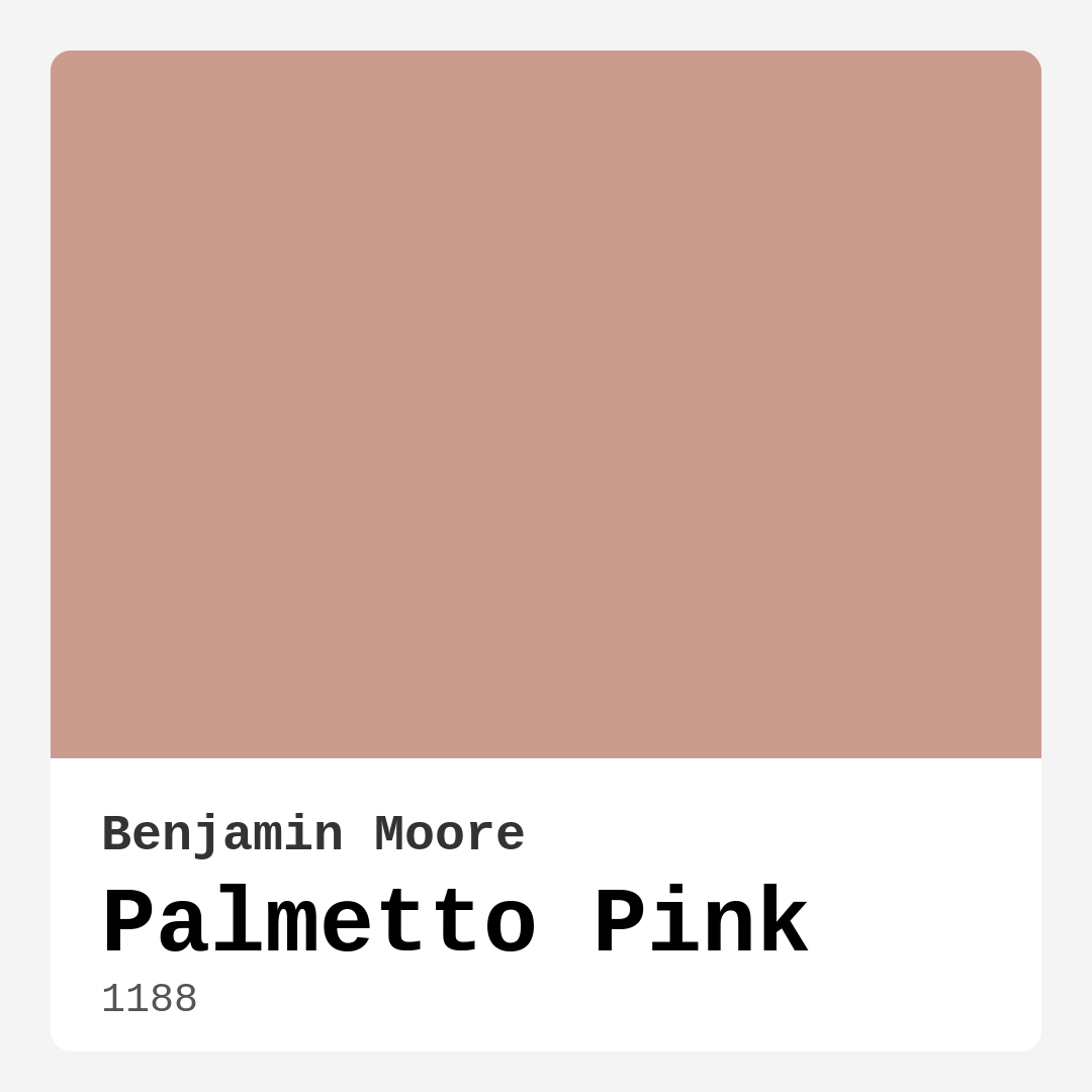
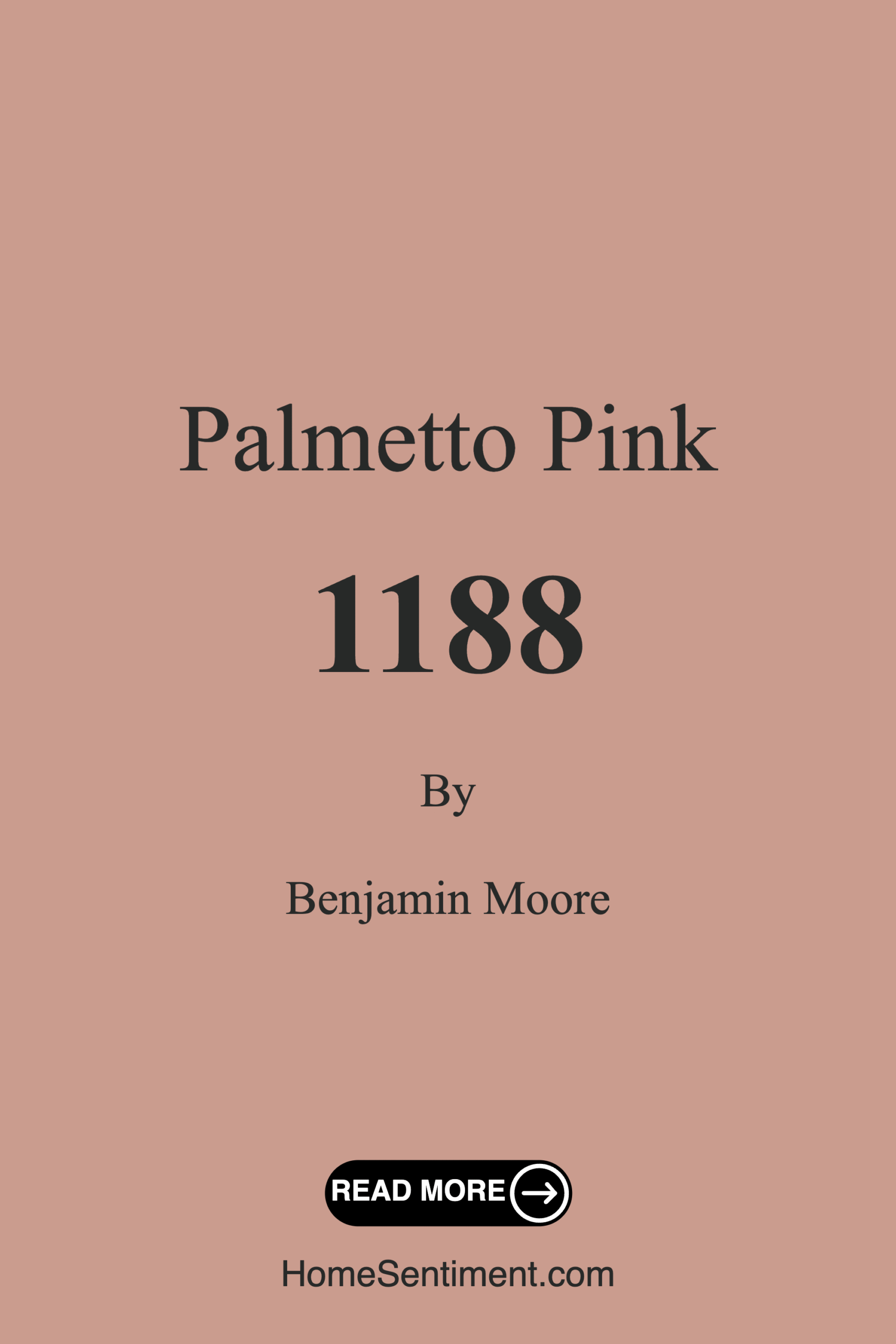
Color Preview & Key Details
| HEX Code | #CA9C8E |
| RGB | 202, 156, 142 |
| LRV | 38.21% |
| Undertone | Red |
| Finish Options | Eggshell, Matte, Satin |
Imagine stepping into a room that feels like a warm embrace, a soothing retreat that invites you to unwind and relax. That’s the magic of Palmetto Pink, a breathtaking hue from Benjamin Moore that effortlessly transforms spaces into cozy sanctuaries. If you’re considering a fresh coat of paint, this might just be the shade you didn’t know you needed.
Palmetto Pink is a soft blush color that carries a gentle warmth, making it an incredibly versatile choice for a variety of rooms and decor styles. Its warm undertones, which lean toward a subtle red, create a depth that adds character without overwhelming a space. Whether you’re revamping a living room, refreshing a bedroom, or preparing a nursery, this color can adapt beautifully, enhancing both modern and traditional aesthetics alike.
One of the most appealing aspects of Palmetto Pink is its ability to foster a cozy atmosphere. Imagine hosting friends in a living room bathed in this gentle blush, where laughter and warmth fill the air. It encourages comfort and conversation, making your space feel inviting. In a bedroom, Palmetto Pink becomes a restful retreat, perfect for winding down at the end of a long day. Its soft nature calms the senses, allowing you to drift off peacefully.
When it comes to application, Palmetto Pink shines as a beginner-friendly option. You won’t need to be a pro to achieve that smooth, even finish. The paint goes on beautifully, whether you’re using a roller or brush, and it’s known for its good coverage—typically requiring just one to two coats. Plus, with its low VOC content, you don’t have to worry about harsh odors lingering in your home. This makes it not only a practical choice but also a healthier one for your living environment.
You might be wondering how to pair Palmetto Pink with other colors and decor elements. Its warm undertone allows it to harmonize beautifully with whites, creams, and warm woods. Think about how stunning it would look against white trim, creating a crisp yet soft contrast that enhances its inviting nature. Brass fixtures are another fantastic pairing; they can elevate the blush tone, adding a touch of sophistication and warmth.
However, it’s essential to consider the size and lighting of your space. While Palmetto Pink can make a room feel cozy and intimate, in smaller areas, it might appear a bit darker than expected. If you’re working with a small room, think about how natural light interacts with the paint throughout the day. Under natural light, it reflects beautifully, appearing as a soft blush that brightens the space. Under artificial lighting, it retains its warm glow, making it perfect for those cozy evenings at home.
Testing the color in your space is crucial. Consider painting a small sample area on your wall and observe how it changes during different times of the day. This can help you see how the undertones shift in varying light conditions. The nuance of Palmetto Pink reveals itself in how it interacts with your existing decor, flooring, and furniture, so take your time to explore its potential in your unique setting.
Looking for inspiration? Palmetto Pink is particularly popular in children’s rooms and nurseries. Its soft, serene quality fosters a peaceful environment, making it an ideal backdrop for play and creativity. Furthermore, it’s a fantastic choice for dining rooms where you want to create an intimate setting. Picture sharing meals surrounded by this gentle hue—it’s bound to enhance the dining experience, encouraging warmth and connection.
As for finishing options, you’ve got choices! Palmetto Pink comes in eggshell, satin, and matte finishes. Each brings a different feel and can dramatically change the overall appearance of the paint. An eggshell finish offers a slight sheen while still being easy to clean. Satin is perfect for areas that may need a bit more durability, like dining rooms and living spaces, while a matte finish can create a more understated, sophisticated look.
If you’re considering how this shade fits into your broader decorating scheme, look at complementary colors. Shades like white, soft greens, and earthy neutrals can work beautifully alongside Palmetto Pink. Think about using these colors in your furniture or accessories to create a cohesive look that feels pulled together and intentional.
And let’s not overlook its washability and easy touch-up capabilities. Life happens, and walls can take a beating. With Palmetto Pink, you’ll find it easy to wipe off marks and keep your walls looking fresh. This practicality makes it a favored choice for busy homes and families.
When deciding if Palmetto Pink is the right choice for your project, think about the mood you want to create. It’s cozy, inviting, and restful—perfect for spaces where you want to feel at ease. Imagine curling up with a book in a room painted this soft hue, feeling the stress of the day melt away.
Ultimately, Palmetto Pink is more than just a color; it’s an experience. It embodies the warmth of home and the joy of connection, making it a superb choice for anyone looking to enhance their space. Whether you opt for a full room transformation or just an accent wall, this shade is bound to leave a lasting impression on both you and your guests.
In conclusion, Palmetto Pink is a delightful option that doesn’t just beautify a space but also elevates the overall atmosphere. It’s versatile, inviting, and easy to work with—what more could you ask for? So go ahead, dip that brush in, and let this lovely shade breathe new life into your home. You won’t regret it!
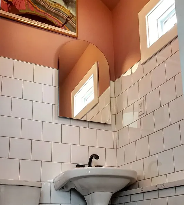
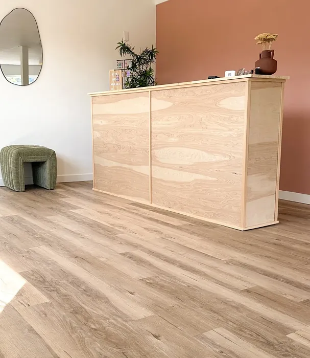
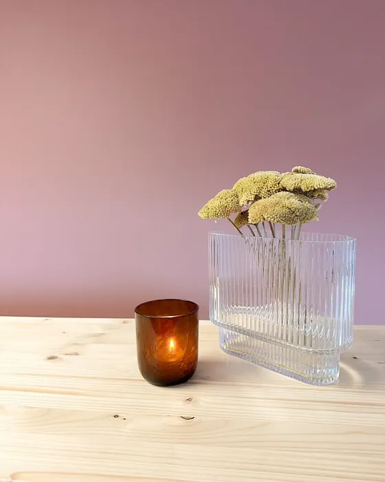
Real Room Photo of Palmetto Pink 1188
Undertones of Palmetto Pink ?
The undertones of Palmetto Pink are a key aspect of its character, leaning towards Red. These subtle underlying hues are what give the color its depth and complexity. For example, a gray with a blue undertone will feel cooler and more modern, while one with a brown undertone will feel warmer and more traditional. It’s essential to test this paint in your home and observe it next to your existing furniture, flooring, and decor to see how these undertones interact and reveal themselves throughout the day.
HEX value: #CA9C8E
RGB code: 202, 156, 142
Is Palmetto Pink Cool or Warm?
Palmetto Pink is considered a warm paint color. This characteristic plays a huge role in the overall feel of a room. Warm colors, like this one, tend to create a cozy, inviting, and energetic atmosphere, making them great for social spaces like living rooms and dining rooms. In contrast, cool colors often evoke a sense of calm and serenity, which is why they are popular in bedrooms and bathrooms. The warmth of Palmetto Pink means it will pair beautifully with corresponding decor elements.
Understanding Color Properties and Interior Design Tips
Hue refers to a specific position on the color wheel, measured in degrees from 0 to 360. Each degree represents a different pure color:
- 0° represents red
- 120° represents green
- 240° represents blue
Saturation describes the intensity or purity of a color and is expressed as a percentage:
- At 0%, the color appears completely desaturated—essentially a shade of gray
- At 100%, the color is at its most vivid and vibrant
Lightness indicates how light or dark a color is, also expressed as a percentage:
- 0% lightness results in black
- 100% lightness results in white
Using Warm Colors in Interior Design
Warm hues—such as reds, oranges, yellows, warm beiges, and greiges—are excellent choices for creating inviting and energetic spaces. These colors are particularly well-suited for:
- Kitchens, living rooms, and bathrooms, where warmth enhances comfort and sociability
- Large rooms, where warm tones can help reduce the sense of emptiness and make the space feel more intimate
For example:
- Warm beige shades provide a cozy, inviting atmosphere, ideal for living rooms, bedrooms, and hallways.
- Warm greige (a mix of beige and gray) offers the warmth of beige with the modern appeal of gray, making it a versatile backdrop for dining areas, bedrooms, and living spaces.
However, be mindful when using warm light tones in rooms with limited natural light. These shades may appear muted or even take on an unpleasant yellowish tint. To avoid a dull or flat appearance:
- Add depth by incorporating richer tones like deep greens, charcoal, or chocolate brown
- Use textured elements such as curtains, rugs, or cushions to bring dimension to the space
Pro Tip: Achieving Harmony with Warm and Cool Color Balance
To create a well-balanced and visually interesting interior, mix warm and cool tones strategically. This contrast adds depth and harmony to your design.
- If your walls feature warm hues, introduce cool-colored accents such as blue or green furniture, artwork, or accessories to create contrast.
- For a polished look, consider using a complementary color scheme, which pairs colors opposite each other on the color wheel (e.g., red with green, orange with blue).
This thoughtful mix not only enhances visual appeal but also creates a space that feels both dynamic and cohesive.
Light Temperature Affects on Palmetto Pink
Natural Light
Natural daylight changes in color temperature as the sun moves across the sky. At sunrise and sunset, the light tends to have a warm, golden tone with a color temperature around 2000 Kelvin (K). As the day progresses and the sun rises higher, the light becomes cooler and more neutral. Around midday, especially when the sky is clear, natural light typically reaches its peak brightness and shifts to a cooler tone, ranging from 5500 to 6500 Kelvin. This midday light is close to what we perceive as pure white or daylight-balanced light.
These shifts in natural light can significantly influence how colors appear in a space, which is why designers often consider both the time of day and the orientation of windows when planning interior color schemes.
Artificial Light
When choosing artificial lighting, pay close attention to the color temperature, measured in Kelvin (K). This determines how warm or cool the light will appear. Lower temperatures, around 2700K, give off a warm, yellow glow often used in living rooms or bedrooms. Higher temperatures, above 5000K, create a cool, bluish light similar to daylight, commonly used in kitchens, offices, or task areas.
Use the slider to see how lighting temperature can affect the appearance of a surface or color throughout a space.


4800K
LRV of Palmetto Pink
The Light Reflectance Value (LRV) of Palmetto Pink is 38.21%, which places it in the Medium colors category. This means it reflect a lot of light. Understanding a paint’s LRV is crucial for predicting how it will look in your space. A higher LRV indicates a lighter color that reflects more light, making rooms feel larger and brighter. A lower LRV signifies a darker color that absorbs more light, creating a cozier, more intimate atmosphere. Always consider the natural and artificial lighting in your room when selecting a paint color based on its LRV.
Detailed Review of Palmetto Pink
Additional Paint Characteristics
Ideal Rooms
Bedroom, Dining Room, Home Office, Living Room, Nursery
Decor Styles
Bohemian, Coastal, Modern Farmhouse, Traditional
Coverage
Good (1–2 Coats), Touch-Up Friendly
Ease of Application
Beginner Friendly, Brush Smooth, Roller-Ready
Washability
Washable, Wipeable
VOC Level
Low VOC, Ultra Low VOC
Best Use
Accent Wall, Furniture, Interior Walls
Room Suitability
Bedroom, Dining Room, Living Room, Nursery
Tone Tag
Earthy, Soft, Warm
Finish Type
Eggshell, Satin
Paint Performance
Easy Touch-Up, Low Odor, Quick Drying
Use Cases
Best for Low Light Rooms, Best for Small Spaces, Designer Favorite
Mood
Cozy, Inviting, Restful
Trim Pairing
Complements Brass Fixtures, Pairs with White Dove, Works with Warm Trim
Palmetto Pink is a delightful choice for anyone looking to add a touch of warmth to their home. It beautifully balances between being playful and sophisticated, making it suitable for various applications. In living rooms, it can create a welcoming ambiance, while in bedrooms, it fosters a restful retreat. This paint’s versatility extends to different decor styles, effortlessly complementing both contemporary and classic furnishings. When applied, it has a smooth finish that enhances the lightness of the shade, making spaces feel larger and more open. Whether you’re refreshing a child’s room or giving your dining area a soft update, Palmetto Pink is sure to impress.
Pros & Cons of 1188 Palmetto Pink
Pros
Cons
Colors that go with Benjamin Moore Palmetto Pink
FAQ on 1188 Palmetto Pink
Can Palmetto Pink be used in bathrooms?
Absolutely! Palmetto Pink works well in bathrooms, offering a soft and soothing atmosphere. Just ensure proper ventilation to maintain the paint’s integrity in humid conditions. Its washability helps keep the walls looking fresh and clean.
What finishes are available for Palmetto Pink?
Palmetto Pink is available in a variety of finishes including eggshell, satin, and matte. Each finish offers a unique look and feel, allowing you to choose the perfect sheen based on your space and preference.
Comparisons Palmetto Pink with other colors
Palmetto Pink 1188 vs Realist Beige SW 6078
| Attribute | Palmetto Pink 1188 | Realist Beige SW 6078 |
|---|---|---|
| Color Name | Palmetto Pink 1188 | Realist Beige SW 6078 |
| Color | ||
| Hue | Pink | Pink |
| Brightness | Medium | Medium |
| RGB | 202, 156, 142 | 211, 200, 189 |
| LRV | 38.21% | 34% |
| Finish Type | Eggshell, Satin | Eggshell, Matte, Satin |
| Finish Options | Eggshell, Matte, Satin | Eggshell, Matte, Satin |
| Ideal Rooms | Bedroom, Dining Room, Home Office, Living Room, Nursery | Bedroom, Dining Room, Entryway, Home Office, Kitchen, Living Room |
| Decor Styles | Bohemian, Coastal, Modern Farmhouse, Traditional | Contemporary, Minimalist, Modern Farmhouse, Rustic, Traditional |
| Coverage | Good (1–2 Coats), Touch-Up Friendly | Good (1–2 Coats), Touch-Up Friendly |
| Ease of Application | Beginner Friendly, Brush Smooth, Roller-Ready | Beginner Friendly, Brush Smooth, Fast-Drying, Roller-Ready |
| Washability | Washable, Wipeable | Washable, Wipeable |
| Room Suitability | Bedroom, Dining Room, Living Room, Nursery | Bedroom, Dining Room, Home Office, Kitchen, Living Room |
| Tone | Earthy, Soft, Warm | Earthy, Neutral, Warm |
| Paint Performance | Easy Touch-Up, Low Odor, Quick Drying | High Coverage, Low Odor, Quick Drying |
Palmetto Pink 1188 vs Rosaline Pearl SW 9077
| Attribute | Palmetto Pink 1188 | Rosaline Pearl SW 9077 |
|---|---|---|
| Color Name | Palmetto Pink 1188 | Rosaline Pearl SW 9077 |
| Color | ||
| Hue | Pink | Pink |
| Brightness | Medium | Medium |
| RGB | 202, 156, 142 | 163, 136, 135 |
| LRV | 38.21% | 69% |
| Finish Type | Eggshell, Satin | Eggshell, Matte |
| Finish Options | Eggshell, Matte, Satin | Eggshell, Matte, Satin |
| Ideal Rooms | Bedroom, Dining Room, Home Office, Living Room, Nursery | Bedroom, Dining Room, Home Office, Living Room |
| Decor Styles | Bohemian, Coastal, Modern Farmhouse, Traditional | Bohemian, Contemporary, Modern, Transitional |
| Coverage | Good (1–2 Coats), Touch-Up Friendly | Good (1–2 Coats) |
| Ease of Application | Beginner Friendly, Brush Smooth, Roller-Ready | Beginner Friendly, Brush Smooth, Fast-Drying, Roller-Ready |
| Washability | Washable, Wipeable | Washable, Wipeable |
| Room Suitability | Bedroom, Dining Room, Living Room, Nursery | Bedroom, Dining Room, Home Office, Living Room |
| Tone | Earthy, Soft, Warm | Dusty, Muted, Warm |
| Paint Performance | Easy Touch-Up, Low Odor, Quick Drying | Easy Touch-Up, Fade Resistant, Low Odor |
Palmetto Pink 1188 vs Cabbage Rose SW 0003
| Attribute | Palmetto Pink 1188 | Cabbage Rose SW 0003 |
|---|---|---|
| Color Name | Palmetto Pink 1188 | Cabbage Rose SW 0003 |
| Color | ||
| Hue | Pink | Pink |
| Brightness | Medium | Medium |
| RGB | 202, 156, 142 | 197, 159, 145 |
| LRV | 38.21% | 15% |
| Finish Type | Eggshell, Satin | Eggshell, Matte, Satin |
| Finish Options | Eggshell, Matte, Satin | Eggshell, Matte, Satin |
| Ideal Rooms | Bedroom, Dining Room, Home Office, Living Room, Nursery | Bedroom, Dining Room, Hallway, Living Room, Nursery |
| Decor Styles | Bohemian, Coastal, Modern Farmhouse, Traditional | Cottage, Modern Farmhouse, Romantic, Shabby Chic, Vintage |
| Coverage | Good (1–2 Coats), Touch-Up Friendly | Good (1–2 Coats), Touch-Up Friendly |
| Ease of Application | Beginner Friendly, Brush Smooth, Roller-Ready | Beginner Friendly, Brush Smooth, Roller-Ready |
| Washability | Washable, Wipeable | Washable, Wipeable |
| Room Suitability | Bedroom, Dining Room, Living Room, Nursery | Bedroom, Dining Room, Hallway, Living Room, Nursery |
| Tone | Earthy, Soft, Warm | Earthy, Muted, Warm |
| Paint Performance | Easy Touch-Up, Low Odor, Quick Drying | Easy Touch-Up, Low Odor |
Palmetto Pink 1188 vs Sashay Sand SW 6051
| Attribute | Palmetto Pink 1188 | Sashay Sand SW 6051 |
|---|---|---|
| Color Name | Palmetto Pink 1188 | Sashay Sand SW 6051 |
| Color | ||
| Hue | Pink | Pink |
| Brightness | Medium | Medium |
| RGB | 202, 156, 142 | 207, 180, 168 |
| LRV | 38.21% | 64% |
| Finish Type | Eggshell, Satin | Eggshell, Matte, Satin |
| Finish Options | Eggshell, Matte, Satin | Eggshell, Matte, Satin |
| Ideal Rooms | Bedroom, Dining Room, Home Office, Living Room, Nursery | Bedroom, Dining Room, Home Office, Kitchen, Living Room |
| Decor Styles | Bohemian, Coastal, Modern Farmhouse, Traditional | Bohemian, Contemporary, Modern Farmhouse, Scandinavian, Transitional |
| Coverage | Good (1–2 Coats), Touch-Up Friendly | Good (1–2 Coats), Touch-Up Friendly |
| Ease of Application | Beginner Friendly, Brush Smooth, Roller-Ready | Beginner Friendly, Fast-Drying, Roller-Ready |
| Washability | Washable, Wipeable | Highly Washable, Washable |
| Room Suitability | Bedroom, Dining Room, Living Room, Nursery | Bedroom, Dining Room, Home Office, Kitchen, Living Room |
| Tone | Earthy, Soft, Warm | Earthy, Muted, Warm |
| Paint Performance | Easy Touch-Up, Low Odor, Quick Drying | Easy Touch-Up, Low Odor, Quick Drying, Scuff Resistant |
Palmetto Pink 1188 vs Touch of Sand SW 9085
| Attribute | Palmetto Pink 1188 | Touch of Sand SW 9085 |
|---|---|---|
| Color Name | Palmetto Pink 1188 | Touch of Sand SW 9085 |
| Color | ||
| Hue | Pink | Pink |
| Brightness | Medium | Medium |
| RGB | 202, 156, 142 | 213, 199, 186 |
| LRV | 38.21% | 66% |
| Finish Type | Eggshell, Satin | Eggshell, Matte, Satin |
| Finish Options | Eggshell, Matte, Satin | Eggshell, Matte, Satin |
| Ideal Rooms | Bedroom, Dining Room, Home Office, Living Room, Nursery | Bathroom, Bedroom, Dining Room, Home Office, Kitchen, Living Room |
| Decor Styles | Bohemian, Coastal, Modern Farmhouse, Traditional | Bohemian, Coastal, Contemporary, Modern Farmhouse, Rustic |
| Coverage | Good (1–2 Coats), Touch-Up Friendly | Good (1–2 Coats), Touch-Up Friendly |
| Ease of Application | Beginner Friendly, Brush Smooth, Roller-Ready | Beginner Friendly, Brush Smooth, Fast-Drying, Roller-Ready |
| Washability | Washable, Wipeable | Washable, Wipeable |
| Room Suitability | Bedroom, Dining Room, Living Room, Nursery | Bathroom, Bedroom, Dining Room, Home Office, Kitchen, Living Room |
| Tone | Earthy, Soft, Warm | Earthy, Muted, Neutral, Warm |
| Paint Performance | Easy Touch-Up, Low Odor, Quick Drying | Easy Touch-Up, Low Odor, Quick Drying, Scuff Resistant |
Palmetto Pink 1188 vs Pink Shadow SW 0070
| Attribute | Palmetto Pink 1188 | Pink Shadow SW 0070 |
|---|---|---|
| Color Name | Palmetto Pink 1188 | Pink Shadow SW 0070 |
| Color | ||
| Hue | Pink | Pink |
| Brightness | Medium | Medium |
| RGB | 202, 156, 142 | 222, 195, 185 |
| LRV | 38.21% | 45% |
| Finish Type | Eggshell, Satin | Eggshell, Matte, Satin |
| Finish Options | Eggshell, Matte, Satin | Eggshell, Matte, Satin |
| Ideal Rooms | Bedroom, Dining Room, Home Office, Living Room, Nursery | Bedroom, Dining Room, Home Office, Living Room, Nursery |
| Decor Styles | Bohemian, Coastal, Modern Farmhouse, Traditional | Bohemian, Minimalist, Modern Farmhouse, Scandinavian, Traditional |
| Coverage | Good (1–2 Coats), Touch-Up Friendly | Good (1–2 Coats) |
| Ease of Application | Beginner Friendly, Brush Smooth, Roller-Ready | Beginner Friendly, Brush Smooth, Fast-Drying, Roller-Ready |
| Washability | Washable, Wipeable | Washable, Wipeable |
| Room Suitability | Bedroom, Dining Room, Living Room, Nursery | Bedroom, Dining Room, Living Room, Nursery |
| Tone | Earthy, Soft, Warm | Muted, Pastel, Warm |
| Paint Performance | Easy Touch-Up, Low Odor, Quick Drying | Easy Touch-Up, High Coverage, Low Odor |
Palmetto Pink 1188 vs Hushed Auburn SW 9080
| Attribute | Palmetto Pink 1188 | Hushed Auburn SW 9080 |
|---|---|---|
| Color Name | Palmetto Pink 1188 | Hushed Auburn SW 9080 |
| Color | ||
| Hue | Pink | Pink |
| Brightness | Medium | Medium |
| RGB | 202, 156, 142 | 168, 133, 122 |
| LRV | 38.21% | 12% |
| Finish Type | Eggshell, Satin | Eggshell, Matte, Satin |
| Finish Options | Eggshell, Matte, Satin | Eggshell, Matte, Satin |
| Ideal Rooms | Bedroom, Dining Room, Home Office, Living Room, Nursery | Bedroom, Dining Room, Home Office, Living Room |
| Decor Styles | Bohemian, Coastal, Modern Farmhouse, Traditional | Contemporary, Modern Farmhouse, Rustic, Transitional |
| Coverage | Good (1–2 Coats), Touch-Up Friendly | Good (1–2 Coats), Touch-Up Friendly |
| Ease of Application | Beginner Friendly, Brush Smooth, Roller-Ready | Beginner Friendly, Brush Smooth, Fast-Drying, Roller-Ready |
| Washability | Washable, Wipeable | Washable, Wipeable |
| Room Suitability | Bedroom, Dining Room, Living Room, Nursery | Bedroom, Dining Room, Home Office, Living Room |
| Tone | Earthy, Soft, Warm | Earthy, Muted, Warm |
| Paint Performance | Easy Touch-Up, Low Odor, Quick Drying | Easy Touch-Up, High Coverage, Low Odor |
Palmetto Pink 1188 vs Likeable Sand SW 6058
| Attribute | Palmetto Pink 1188 | Likeable Sand SW 6058 |
|---|---|---|
| Color Name | Palmetto Pink 1188 | Likeable Sand SW 6058 |
| Color | ||
| Hue | Pink | Pink |
| Brightness | Medium | Medium |
| RGB | 202, 156, 142 | 209, 183, 168 |
| LRV | 38.21% | 61% |
| Finish Type | Eggshell, Satin | Eggshell, Matte, Satin |
| Finish Options | Eggshell, Matte, Satin | Eggshell, Matte, Satin |
| Ideal Rooms | Bedroom, Dining Room, Home Office, Living Room, Nursery | Bedroom, Dining Room, Home Office, Kitchen, Living Room |
| Decor Styles | Bohemian, Coastal, Modern Farmhouse, Traditional | Bohemian, Coastal, Contemporary, Modern Farmhouse, Rustic |
| Coverage | Good (1–2 Coats), Touch-Up Friendly | Good (1–2 Coats), Touch-Up Friendly |
| Ease of Application | Beginner Friendly, Brush Smooth, Roller-Ready | Beginner Friendly, Brush Smooth, Fast-Drying, Roller-Ready |
| Washability | Washable, Wipeable | Washable, Wipeable |
| Room Suitability | Bedroom, Dining Room, Living Room, Nursery | Bedroom, Dining Room, Home Office, Kitchen, Living Room |
| Tone | Earthy, Soft, Warm | Earthy, Muted, Warm |
| Paint Performance | Easy Touch-Up, Low Odor, Quick Drying | Easy Touch-Up, Low Odor, Quick Drying |
Palmetto Pink 1188 vs Glamour SW 6031
| Attribute | Palmetto Pink 1188 | Glamour SW 6031 |
|---|---|---|
| Color Name | Palmetto Pink 1188 | Glamour SW 6031 |
| Color | ||
| Hue | Pink | Pink |
| Brightness | Medium | Medium |
| RGB | 202, 156, 142 | 182, 160, 154 |
| LRV | 38.21% | 30% |
| Finish Type | Eggshell, Satin | Eggshell, Matte, Satin |
| Finish Options | Eggshell, Matte, Satin | Eggshell, Matte, Satin |
| Ideal Rooms | Bedroom, Dining Room, Home Office, Living Room, Nursery | Bedroom, Dining Room, Home Office, Living Room |
| Decor Styles | Bohemian, Coastal, Modern Farmhouse, Traditional | Bohemian, Classic, Modern, Transitional |
| Coverage | Good (1–2 Coats), Touch-Up Friendly | Good (1–2 Coats) |
| Ease of Application | Beginner Friendly, Brush Smooth, Roller-Ready | Beginner Friendly, Brush Smooth, Fast-Drying, Roller-Ready |
| Washability | Washable, Wipeable | Scrubbable, Washable |
| Room Suitability | Bedroom, Dining Room, Living Room, Nursery | Bedroom, Dining Room, Home Office, Living Room |
| Tone | Earthy, Soft, Warm | Balanced, Neutral, Warm |
| Paint Performance | Easy Touch-Up, Low Odor, Quick Drying | Easy Touch-Up, Low Odor, Quick Drying |
Palmetto Pink 1188 vs Temperate Taupe SW 6037
| Attribute | Palmetto Pink 1188 | Temperate Taupe SW 6037 |
|---|---|---|
| Color Name | Palmetto Pink 1188 | Temperate Taupe SW 6037 |
| Color | ||
| Hue | Pink | Pink |
| Brightness | Medium | Medium |
| RGB | 202, 156, 142 | 191, 177, 170 |
| LRV | 38.21% | 34% |
| Finish Type | Eggshell, Satin | Eggshell, Matte, Satin |
| Finish Options | Eggshell, Matte, Satin | Eggshell, Matte, Satin |
| Ideal Rooms | Bedroom, Dining Room, Home Office, Living Room, Nursery | Bedroom, Dining Room, Home Office, Kitchen, Living Room |
| Decor Styles | Bohemian, Coastal, Modern Farmhouse, Traditional | Bohemian, Modern Farmhouse, Rustic, Transitional |
| Coverage | Good (1–2 Coats), Touch-Up Friendly | Good (1–2 Coats), Touch-Up Friendly |
| Ease of Application | Beginner Friendly, Brush Smooth, Roller-Ready | Beginner Friendly, Brush Smooth, Fast-Drying, Roller-Ready |
| Washability | Washable, Wipeable | Highly Washable, Washable |
| Room Suitability | Bedroom, Dining Room, Living Room, Nursery | Bedroom, Dining Room, Home Office, Living Room |
| Tone | Earthy, Soft, Warm | Earthy, Neutral, Warm |
| Paint Performance | Easy Touch-Up, Low Odor, Quick Drying | Long Lasting, Low Odor, Quick Drying, Scuff Resistant |
Official Page of Benjamin Moore Palmetto Pink 1188