Color Preview & Key Details
| HEX Code | #F2D9CC |
| RGB | 242, 217, 204 |
| LRV | 71.95% |
| Undertone | Red |
| Finish Options | Eggshell, Matte, Satin |
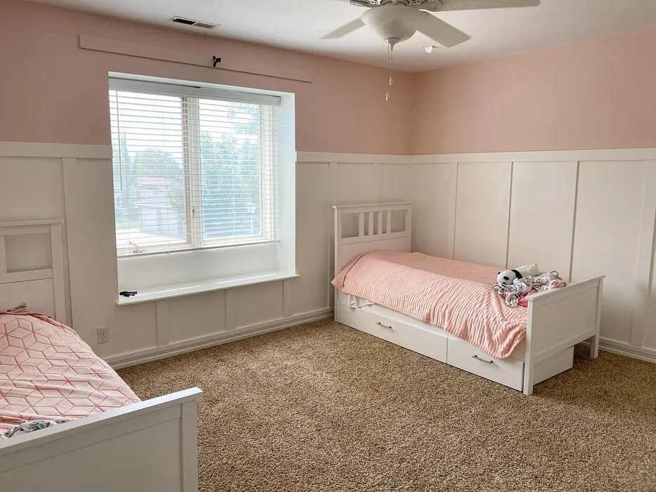
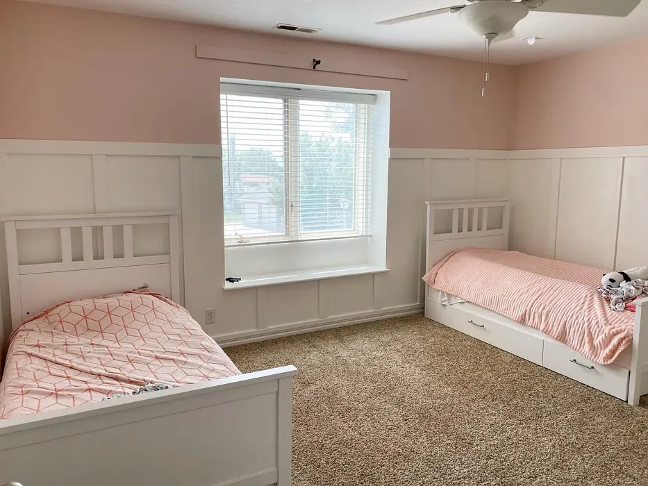
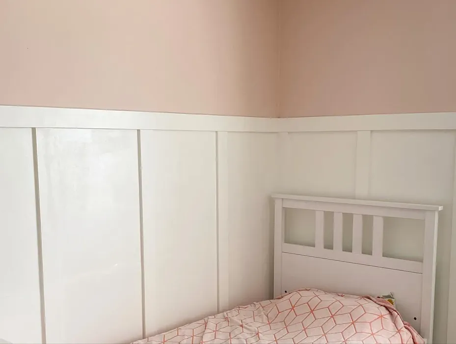
Imagine stepping into a room that instantly envelops you in warmth and comfort. The walls, painted in a soft blush hue, radiate a sense of joy and tranquility. This is the magic of Love & Happiness by Benjamin Moore, a color that perfectly captures the essence of cozy, inviting spaces.
Choosing a paint color is more than just picking a shade; it’s about creating an atmosphere that complements your lifestyle and personal taste. Love & Happiness, with its exquisite blend of warmth and softness, offers an ideal option for various rooms in your home. Whether it’s your bedroom, living room, nursery, or dining room, this color can transform your space into a comforting retreat.
One of the standout features of Love & Happiness is its gentle pink tone that speaks to both modern and classic sensibilities. The color code 1191 signifies not only its unique identity but also the emotional response it evokes. With an LRV (Light Reflectance Value) of 71.95%, Love & Happiness reflects a significant amount of light, brightening your space while maintaining an intimate feel. It’s a versatile choice that enhances the atmosphere, making rooms feel larger and more open.
As an expert in home design, I can assure you that this color is rich in personality. The warm undertones, leaning towards red, provide depth and complexity. When you apply Love & Happiness, you’ll notice how it interacts beautifully with natural light, creating a soft glow that feels uplifting during the day. In the evening, the color shifts to a cozy ambiance, perfect for relaxation after a long day.
Now, let’s talk about how to incorporate Love & Happiness into your home. It pairs wonderfully with a variety of decor styles. If your aesthetic leans towards modern, consider combining it with sleek, minimalist furniture in light woods or whites to maintain that airy feel. For a more eclectic or bohemian vibe, feel free to mix it with vintage pieces or darker woods, creating a charming contrast that adds character.
A common concern is whether this color can work in high-traffic areas. The answer is a resounding yes! Love & Happiness is not only beautiful but also practical. Its washable properties mean you can keep your walls looking fresh, making it suitable for busy spaces like hallways or family rooms. Just opt for a durable finish like eggshell or satin to enhance its longevity.
While Love & Happiness is universally appealing, it’s wise to consider personal preferences. Its subtle hue may not resonate with everyone’s taste, and lighter shades can show dirt more easily. However, the warmth and inviting nature of this blush pink make it a compelling choice for those looking to create a soothing environment.
When it comes to complementing colors, you have plenty of options. Shades like White Dove and Pure White work beautifully as trim, providing a crisp contrast that makes the pink pop. If you’re looking for a bit of flair, consider incorporating brass fixtures, which add a touch of elegance against the soft backdrop of Love & Happiness.
If you’re still uncertain about how this color will play out in your unique space, I highly recommend sampling it first. Test the paint in different lighting conditions—natural light during the day and artificial light in the evening—to see how its character shifts. Observing the color alongside your existing furniture and decor will give you a clearer picture of how it will transform your home.
For those with an eye for detail, the undertones of Love & Happiness are key to understanding its full potential. The red undertone infuses warmth, making it approachable and friendly. In contrast, cooler hues can create a sense of distance or formality, while warmer shades foster connection and intimacy. This quality makes Love & Happiness an excellent choice for spaces meant for gatherings, conversation, or relaxation.
Now, let’s address the practical aspects of using Love & Happiness. It’s beginner-friendly, with a smooth application process that even novice painters will appreciate. The paint goes on beautifully, and the low splatter formula makes cleanup a breeze. Plus, its quick-drying nature means you won’t be waiting long to enjoy your freshly painted room.
In terms of coverage, you can expect good results with just one or two coats, depending on your base color and desired vibrancy. While some may find that they need to apply multiple coats to achieve full coverage, the final result is well worth the effort. Once it’s up, you’ll be captivated by how Love & Happiness transforms your space.
Beyond aesthetics, this color has a way of influencing the mood within a room. It creates an atmosphere that feels cozy, inviting, and restful—perfect for unwinding after a busy day or gathering with friends and family. Imagine dining under this soft blush, feeling the warmth it exudes while you enjoy a meal or a celebratory toast.
Love & Happiness is not just a paint color; it’s a lifestyle choice. It embodies the spirit of joy and comfort, making it a beloved option for many homeowners. If you’re considering a refresh or a new project altogether, let this delightful hue guide your vision. By incorporating Love & Happiness, you’re not just painting walls; you’re crafting a sanctuary that reflects who you are and what you cherish.
So, are you ready to embrace Love & Happiness in your home? With its versatility and charm, this color is sure to inspire creativity and warmth, transforming your space into a haven of tranquility and joy. The world of color is vast, but some shades, like this one, resonate on a deeper level, promising to not just beautify your environment but also uplift your spirit. Dive into the journey of color with Love & Happiness, and watch as it brings your vision to life.
Real Room Photo of Love & Happiness 1191

Undertones of Love & Happiness ?
The undertones of Love & Happiness are a key aspect of its character, leaning towards Red. These subtle underlying hues are what give the color its depth and complexity. For example, a gray with a blue undertone will feel cooler and more modern, while one with a brown undertone will feel warmer and more traditional. It’s essential to test this paint in your home and observe it next to your existing furniture, flooring, and decor to see how these undertones interact and reveal themselves throughout the day.
HEX value: #F2D9CC
RGB code: 242, 217, 204
Is Love & Happiness Cool or Warm?
Love & Happiness is considered a warm paint color. This characteristic plays a huge role in the overall feel of a room. Warm colors, like this one, tend to create a cozy, inviting, and energetic atmosphere, making them great for social spaces like living rooms and dining rooms. In contrast, cool colors often evoke a sense of calm and serenity, which is why they are popular in bedrooms and bathrooms. The warmth of Love & Happiness means it will pair beautifully with corresponding decor elements.
Understanding Color Properties and Interior Design Tips
Hue refers to a specific position on the color wheel, measured in degrees from 0 to 360. Each degree represents a different pure color:
- 0° represents red
- 120° represents green
- 240° represents blue
Saturation describes the intensity or purity of a color and is expressed as a percentage:
- At 0%, the color appears completely desaturated—essentially a shade of gray
- At 100%, the color is at its most vivid and vibrant
Lightness indicates how light or dark a color is, also expressed as a percentage:
- 0% lightness results in black
- 100% lightness results in white
Using Warm Colors in Interior Design
Warm hues—such as reds, oranges, yellows, warm beiges, and greiges—are excellent choices for creating inviting and energetic spaces. These colors are particularly well-suited for:
- Kitchens, living rooms, and bathrooms, where warmth enhances comfort and sociability
- Large rooms, where warm tones can help reduce the sense of emptiness and make the space feel more intimate
For example:
- Warm beige shades provide a cozy, inviting atmosphere, ideal for living rooms, bedrooms, and hallways.
- Warm greige (a mix of beige and gray) offers the warmth of beige with the modern appeal of gray, making it a versatile backdrop for dining areas, bedrooms, and living spaces.
However, be mindful when using warm light tones in rooms with limited natural light. These shades may appear muted or even take on an unpleasant yellowish tint. To avoid a dull or flat appearance:
- Add depth by incorporating richer tones like deep greens, charcoal, or chocolate brown
- Use textured elements such as curtains, rugs, or cushions to bring dimension to the space
Pro Tip: Achieving Harmony with Warm and Cool Color Balance
To create a well-balanced and visually interesting interior, mix warm and cool tones strategically. This contrast adds depth and harmony to your design.
- If your walls feature warm hues, introduce cool-colored accents such as blue or green furniture, artwork, or accessories to create contrast.
- For a polished look, consider using a complementary color scheme, which pairs colors opposite each other on the color wheel (e.g., red with green, orange with blue).
This thoughtful mix not only enhances visual appeal but also creates a space that feels both dynamic and cohesive.
Light Temperature Affects on Love & Happiness
Natural Light
Natural daylight changes in color temperature as the sun moves across the sky. At sunrise and sunset, the light tends to have a warm, golden tone with a color temperature around 2000 Kelvin (K). As the day progresses and the sun rises higher, the light becomes cooler and more neutral. Around midday, especially when the sky is clear, natural light typically reaches its peak brightness and shifts to a cooler tone, ranging from 5500 to 6500 Kelvin. This midday light is close to what we perceive as pure white or daylight-balanced light.
These shifts in natural light can significantly influence how colors appear in a space, which is why designers often consider both the time of day and the orientation of windows when planning interior color schemes.
Artificial Light
When choosing artificial lighting, pay close attention to the color temperature, measured in Kelvin (K). This determines how warm or cool the light will appear. Lower temperatures, around 2700K, give off a warm, yellow glow often used in living rooms or bedrooms. Higher temperatures, above 5000K, create a cool, bluish light similar to daylight, commonly used in kitchens, offices, or task areas.
Use the slider to see how lighting temperature can affect the appearance of a surface or color throughout a space.


4800K
LRV of Love & Happiness
The Light Reflectance Value (LRV) of Love & Happiness is 71.95%, which places it in the Light colors category. This means it reflect most of the incident light. Understanding a paint’s LRV is crucial for predicting how it will look in your space. A higher LRV indicates a lighter color that reflects more light, making rooms feel larger and brighter. A lower LRV signifies a darker color that absorbs more light, creating a cozier, more intimate atmosphere. Always consider the natural and artificial lighting in your room when selecting a paint color based on its LRV.
Detailed Review of Love & Happiness
Additional Paint Characteristics
Ideal Rooms
Bedroom, Dining Room, Living Room, Nursery
Decor Styles
Bohemian, Farmhouse, Modern, Scandinavian
Coverage
Good (1–2 Coats)
Ease of Application
Beginner Friendly, Brush Smooth, Roller-Ready
Washability
Highly Washable, Washable
VOC Level
Low VOC
Best Use
Accent Wall, Bedroom, Interior Walls, Nursery
Room Suitability
Bedroom, Dining Room, Living Room, Nursery
Tone Tag
Creamy, Pastel, Warm
Finish Type
Eggshell, Matte
Paint Performance
Easy Touch-Up, Low Odor, Quick Drying, Scuff Resistant
Use Cases
Best for Low Light Rooms, Best for Small Spaces, Designer Favorite
Mood
Cozy, Inviting, Restful
Trim Pairing
Complements Brass Fixtures, Matches Pure White, Pairs with White Dove
Love & Happiness truly lives up to its name with a delightful blend of warmth and subtlety. When applied, this paint showcases a soft blush tone that feels both uplifting and serene. It has a smooth application process, ensuring that even novice painters can achieve a beautiful finish with minimal effort. The color adapts well to different lighting conditions, appearing warm and inviting during the day while maintaining a cozy ambiance at night. It’s ideal for accent walls or primary spaces where you want to foster a sense of tranquility. The low splatter formula makes clean-up easy, allowing you to enjoy the painting process without the hassle.
Pros & Cons of 1191 Love & Happiness
Pros
Cons
Colors that go with Benjamin Moore Love & Happiness
FAQ on 1191 Love & Happiness
Can I use Love & Happiness in high-traffic areas?
Absolutely! While Love & Happiness is perfect for creating a calming environment, its washable properties make it suitable for high-traffic areas as well. Just ensure to use a finish that’s durable, like eggshell or satin, to help withstand wear over time.
What types of furniture can I pair with this paint?
Love & Happiness pairs beautifully with a range of furniture styles. For a cohesive look, consider light wood or white furniture to maintain an airy feel. However, it also works well with darker woods or vintage pieces, adding a touch of charm and contrast. This color encourages creativity, so feel free to mix and match!
Comparisons Love & Happiness with other colors
Love & Happiness 1191 vs Realist Beige SW 6078
| Attribute | Love & Happiness 1191 | Realist Beige SW 6078 |
|---|---|---|
| Color Name | Love & Happiness 1191 | Realist Beige SW 6078 |
| Color | ||
| Hue | Pink | Pink |
| Brightness | Medium | Medium |
| RGB | 242, 217, 204 | 211, 200, 189 |
| LRV | 71.95% | 34% |
| Finish Type | Eggshell, Matte | Eggshell, Matte, Satin |
| Finish Options | Eggshell, Matte, Satin | Eggshell, Matte, Satin |
| Ideal Rooms | Bedroom, Dining Room, Living Room, Nursery | Bedroom, Dining Room, Entryway, Home Office, Kitchen, Living Room |
| Decor Styles | Bohemian, Farmhouse, Modern, Scandinavian | Contemporary, Minimalist, Modern Farmhouse, Rustic, Traditional |
| Coverage | Good (1–2 Coats) | Good (1–2 Coats), Touch-Up Friendly |
| Ease of Application | Beginner Friendly, Brush Smooth, Roller-Ready | Beginner Friendly, Brush Smooth, Fast-Drying, Roller-Ready |
| Washability | Highly Washable, Washable | Washable, Wipeable |
| Room Suitability | Bedroom, Dining Room, Living Room, Nursery | Bedroom, Dining Room, Home Office, Kitchen, Living Room |
| Tone | Creamy, Pastel, Warm | Earthy, Neutral, Warm |
| Paint Performance | Easy Touch-Up, Low Odor, Quick Drying, Scuff Resistant | High Coverage, Low Odor, Quick Drying |
Love & Happiness 1191 vs Rosaline Pearl SW 9077
| Attribute | Love & Happiness 1191 | Rosaline Pearl SW 9077 |
|---|---|---|
| Color Name | Love & Happiness 1191 | Rosaline Pearl SW 9077 |
| Color | ||
| Hue | Pink | Pink |
| Brightness | Medium | Medium |
| RGB | 242, 217, 204 | 163, 136, 135 |
| LRV | 71.95% | 69% |
| Finish Type | Eggshell, Matte | Eggshell, Matte |
| Finish Options | Eggshell, Matte, Satin | Eggshell, Matte, Satin |
| Ideal Rooms | Bedroom, Dining Room, Living Room, Nursery | Bedroom, Dining Room, Home Office, Living Room |
| Decor Styles | Bohemian, Farmhouse, Modern, Scandinavian | Bohemian, Contemporary, Modern, Transitional |
| Coverage | Good (1–2 Coats) | Good (1–2 Coats) |
| Ease of Application | Beginner Friendly, Brush Smooth, Roller-Ready | Beginner Friendly, Brush Smooth, Fast-Drying, Roller-Ready |
| Washability | Highly Washable, Washable | Washable, Wipeable |
| Room Suitability | Bedroom, Dining Room, Living Room, Nursery | Bedroom, Dining Room, Home Office, Living Room |
| Tone | Creamy, Pastel, Warm | Dusty, Muted, Warm |
| Paint Performance | Easy Touch-Up, Low Odor, Quick Drying, Scuff Resistant | Easy Touch-Up, Fade Resistant, Low Odor |
Love & Happiness 1191 vs Cabbage Rose SW 0003
| Attribute | Love & Happiness 1191 | Cabbage Rose SW 0003 |
|---|---|---|
| Color Name | Love & Happiness 1191 | Cabbage Rose SW 0003 |
| Color | ||
| Hue | Pink | Pink |
| Brightness | Medium | Medium |
| RGB | 242, 217, 204 | 197, 159, 145 |
| LRV | 71.95% | 15% |
| Finish Type | Eggshell, Matte | Eggshell, Matte, Satin |
| Finish Options | Eggshell, Matte, Satin | Eggshell, Matte, Satin |
| Ideal Rooms | Bedroom, Dining Room, Living Room, Nursery | Bedroom, Dining Room, Hallway, Living Room, Nursery |
| Decor Styles | Bohemian, Farmhouse, Modern, Scandinavian | Cottage, Modern Farmhouse, Romantic, Shabby Chic, Vintage |
| Coverage | Good (1–2 Coats) | Good (1–2 Coats), Touch-Up Friendly |
| Ease of Application | Beginner Friendly, Brush Smooth, Roller-Ready | Beginner Friendly, Brush Smooth, Roller-Ready |
| Washability | Highly Washable, Washable | Washable, Wipeable |
| Room Suitability | Bedroom, Dining Room, Living Room, Nursery | Bedroom, Dining Room, Hallway, Living Room, Nursery |
| Tone | Creamy, Pastel, Warm | Earthy, Muted, Warm |
| Paint Performance | Easy Touch-Up, Low Odor, Quick Drying, Scuff Resistant | Easy Touch-Up, Low Odor |
Love & Happiness 1191 vs Sashay Sand SW 6051
| Attribute | Love & Happiness 1191 | Sashay Sand SW 6051 |
|---|---|---|
| Color Name | Love & Happiness 1191 | Sashay Sand SW 6051 |
| Color | ||
| Hue | Pink | Pink |
| Brightness | Medium | Medium |
| RGB | 242, 217, 204 | 207, 180, 168 |
| LRV | 71.95% | 64% |
| Finish Type | Eggshell, Matte | Eggshell, Matte, Satin |
| Finish Options | Eggshell, Matte, Satin | Eggshell, Matte, Satin |
| Ideal Rooms | Bedroom, Dining Room, Living Room, Nursery | Bedroom, Dining Room, Home Office, Kitchen, Living Room |
| Decor Styles | Bohemian, Farmhouse, Modern, Scandinavian | Bohemian, Contemporary, Modern Farmhouse, Scandinavian, Transitional |
| Coverage | Good (1–2 Coats) | Good (1–2 Coats), Touch-Up Friendly |
| Ease of Application | Beginner Friendly, Brush Smooth, Roller-Ready | Beginner Friendly, Fast-Drying, Roller-Ready |
| Washability | Highly Washable, Washable | Highly Washable, Washable |
| Room Suitability | Bedroom, Dining Room, Living Room, Nursery | Bedroom, Dining Room, Home Office, Kitchen, Living Room |
| Tone | Creamy, Pastel, Warm | Earthy, Muted, Warm |
| Paint Performance | Easy Touch-Up, Low Odor, Quick Drying, Scuff Resistant | Easy Touch-Up, Low Odor, Quick Drying, Scuff Resistant |
Love & Happiness 1191 vs Touch of Sand SW 9085
| Attribute | Love & Happiness 1191 | Touch of Sand SW 9085 |
|---|---|---|
| Color Name | Love & Happiness 1191 | Touch of Sand SW 9085 |
| Color | ||
| Hue | Pink | Pink |
| Brightness | Medium | Medium |
| RGB | 242, 217, 204 | 213, 199, 186 |
| LRV | 71.95% | 66% |
| Finish Type | Eggshell, Matte | Eggshell, Matte, Satin |
| Finish Options | Eggshell, Matte, Satin | Eggshell, Matte, Satin |
| Ideal Rooms | Bedroom, Dining Room, Living Room, Nursery | Bathroom, Bedroom, Dining Room, Home Office, Kitchen, Living Room |
| Decor Styles | Bohemian, Farmhouse, Modern, Scandinavian | Bohemian, Coastal, Contemporary, Modern Farmhouse, Rustic |
| Coverage | Good (1–2 Coats) | Good (1–2 Coats), Touch-Up Friendly |
| Ease of Application | Beginner Friendly, Brush Smooth, Roller-Ready | Beginner Friendly, Brush Smooth, Fast-Drying, Roller-Ready |
| Washability | Highly Washable, Washable | Washable, Wipeable |
| Room Suitability | Bedroom, Dining Room, Living Room, Nursery | Bathroom, Bedroom, Dining Room, Home Office, Kitchen, Living Room |
| Tone | Creamy, Pastel, Warm | Earthy, Muted, Neutral, Warm |
| Paint Performance | Easy Touch-Up, Low Odor, Quick Drying, Scuff Resistant | Easy Touch-Up, Low Odor, Quick Drying, Scuff Resistant |
Love & Happiness 1191 vs Pink Shadow SW 0070
| Attribute | Love & Happiness 1191 | Pink Shadow SW 0070 |
|---|---|---|
| Color Name | Love & Happiness 1191 | Pink Shadow SW 0070 |
| Color | ||
| Hue | Pink | Pink |
| Brightness | Medium | Medium |
| RGB | 242, 217, 204 | 222, 195, 185 |
| LRV | 71.95% | 45% |
| Finish Type | Eggshell, Matte | Eggshell, Matte, Satin |
| Finish Options | Eggshell, Matte, Satin | Eggshell, Matte, Satin |
| Ideal Rooms | Bedroom, Dining Room, Living Room, Nursery | Bedroom, Dining Room, Home Office, Living Room, Nursery |
| Decor Styles | Bohemian, Farmhouse, Modern, Scandinavian | Bohemian, Minimalist, Modern Farmhouse, Scandinavian, Traditional |
| Coverage | Good (1–2 Coats) | Good (1–2 Coats) |
| Ease of Application | Beginner Friendly, Brush Smooth, Roller-Ready | Beginner Friendly, Brush Smooth, Fast-Drying, Roller-Ready |
| Washability | Highly Washable, Washable | Washable, Wipeable |
| Room Suitability | Bedroom, Dining Room, Living Room, Nursery | Bedroom, Dining Room, Living Room, Nursery |
| Tone | Creamy, Pastel, Warm | Muted, Pastel, Warm |
| Paint Performance | Easy Touch-Up, Low Odor, Quick Drying, Scuff Resistant | Easy Touch-Up, High Coverage, Low Odor |
Love & Happiness 1191 vs Hushed Auburn SW 9080
| Attribute | Love & Happiness 1191 | Hushed Auburn SW 9080 |
|---|---|---|
| Color Name | Love & Happiness 1191 | Hushed Auburn SW 9080 |
| Color | ||
| Hue | Pink | Pink |
| Brightness | Medium | Medium |
| RGB | 242, 217, 204 | 168, 133, 122 |
| LRV | 71.95% | 12% |
| Finish Type | Eggshell, Matte | Eggshell, Matte, Satin |
| Finish Options | Eggshell, Matte, Satin | Eggshell, Matte, Satin |
| Ideal Rooms | Bedroom, Dining Room, Living Room, Nursery | Bedroom, Dining Room, Home Office, Living Room |
| Decor Styles | Bohemian, Farmhouse, Modern, Scandinavian | Contemporary, Modern Farmhouse, Rustic, Transitional |
| Coverage | Good (1–2 Coats) | Good (1–2 Coats), Touch-Up Friendly |
| Ease of Application | Beginner Friendly, Brush Smooth, Roller-Ready | Beginner Friendly, Brush Smooth, Fast-Drying, Roller-Ready |
| Washability | Highly Washable, Washable | Washable, Wipeable |
| Room Suitability | Bedroom, Dining Room, Living Room, Nursery | Bedroom, Dining Room, Home Office, Living Room |
| Tone | Creamy, Pastel, Warm | Earthy, Muted, Warm |
| Paint Performance | Easy Touch-Up, Low Odor, Quick Drying, Scuff Resistant | Easy Touch-Up, High Coverage, Low Odor |
Love & Happiness 1191 vs Likeable Sand SW 6058
| Attribute | Love & Happiness 1191 | Likeable Sand SW 6058 |
|---|---|---|
| Color Name | Love & Happiness 1191 | Likeable Sand SW 6058 |
| Color | ||
| Hue | Pink | Pink |
| Brightness | Medium | Medium |
| RGB | 242, 217, 204 | 209, 183, 168 |
| LRV | 71.95% | 61% |
| Finish Type | Eggshell, Matte | Eggshell, Matte, Satin |
| Finish Options | Eggshell, Matte, Satin | Eggshell, Matte, Satin |
| Ideal Rooms | Bedroom, Dining Room, Living Room, Nursery | Bedroom, Dining Room, Home Office, Kitchen, Living Room |
| Decor Styles | Bohemian, Farmhouse, Modern, Scandinavian | Bohemian, Coastal, Contemporary, Modern Farmhouse, Rustic |
| Coverage | Good (1–2 Coats) | Good (1–2 Coats), Touch-Up Friendly |
| Ease of Application | Beginner Friendly, Brush Smooth, Roller-Ready | Beginner Friendly, Brush Smooth, Fast-Drying, Roller-Ready |
| Washability | Highly Washable, Washable | Washable, Wipeable |
| Room Suitability | Bedroom, Dining Room, Living Room, Nursery | Bedroom, Dining Room, Home Office, Kitchen, Living Room |
| Tone | Creamy, Pastel, Warm | Earthy, Muted, Warm |
| Paint Performance | Easy Touch-Up, Low Odor, Quick Drying, Scuff Resistant | Easy Touch-Up, Low Odor, Quick Drying |
Love & Happiness 1191 vs Glamour SW 6031
| Attribute | Love & Happiness 1191 | Glamour SW 6031 |
|---|---|---|
| Color Name | Love & Happiness 1191 | Glamour SW 6031 |
| Color | ||
| Hue | Pink | Pink |
| Brightness | Medium | Medium |
| RGB | 242, 217, 204 | 182, 160, 154 |
| LRV | 71.95% | 30% |
| Finish Type | Eggshell, Matte | Eggshell, Matte, Satin |
| Finish Options | Eggshell, Matte, Satin | Eggshell, Matte, Satin |
| Ideal Rooms | Bedroom, Dining Room, Living Room, Nursery | Bedroom, Dining Room, Home Office, Living Room |
| Decor Styles | Bohemian, Farmhouse, Modern, Scandinavian | Bohemian, Classic, Modern, Transitional |
| Coverage | Good (1–2 Coats) | Good (1–2 Coats) |
| Ease of Application | Beginner Friendly, Brush Smooth, Roller-Ready | Beginner Friendly, Brush Smooth, Fast-Drying, Roller-Ready |
| Washability | Highly Washable, Washable | Scrubbable, Washable |
| Room Suitability | Bedroom, Dining Room, Living Room, Nursery | Bedroom, Dining Room, Home Office, Living Room |
| Tone | Creamy, Pastel, Warm | Balanced, Neutral, Warm |
| Paint Performance | Easy Touch-Up, Low Odor, Quick Drying, Scuff Resistant | Easy Touch-Up, Low Odor, Quick Drying |
Love & Happiness 1191 vs Temperate Taupe SW 6037
| Attribute | Love & Happiness 1191 | Temperate Taupe SW 6037 |
|---|---|---|
| Color Name | Love & Happiness 1191 | Temperate Taupe SW 6037 |
| Color | ||
| Hue | Pink | Pink |
| Brightness | Medium | Medium |
| RGB | 242, 217, 204 | 191, 177, 170 |
| LRV | 71.95% | 34% |
| Finish Type | Eggshell, Matte | Eggshell, Matte, Satin |
| Finish Options | Eggshell, Matte, Satin | Eggshell, Matte, Satin |
| Ideal Rooms | Bedroom, Dining Room, Living Room, Nursery | Bedroom, Dining Room, Home Office, Kitchen, Living Room |
| Decor Styles | Bohemian, Farmhouse, Modern, Scandinavian | Bohemian, Modern Farmhouse, Rustic, Transitional |
| Coverage | Good (1–2 Coats) | Good (1–2 Coats), Touch-Up Friendly |
| Ease of Application | Beginner Friendly, Brush Smooth, Roller-Ready | Beginner Friendly, Brush Smooth, Fast-Drying, Roller-Ready |
| Washability | Highly Washable, Washable | Highly Washable, Washable |
| Room Suitability | Bedroom, Dining Room, Living Room, Nursery | Bedroom, Dining Room, Home Office, Living Room |
| Tone | Creamy, Pastel, Warm | Earthy, Neutral, Warm |
| Paint Performance | Easy Touch-Up, Low Odor, Quick Drying, Scuff Resistant | Long Lasting, Low Odor, Quick Drying, Scuff Resistant |
Official Page of Benjamin Moore Love & Happiness 1191