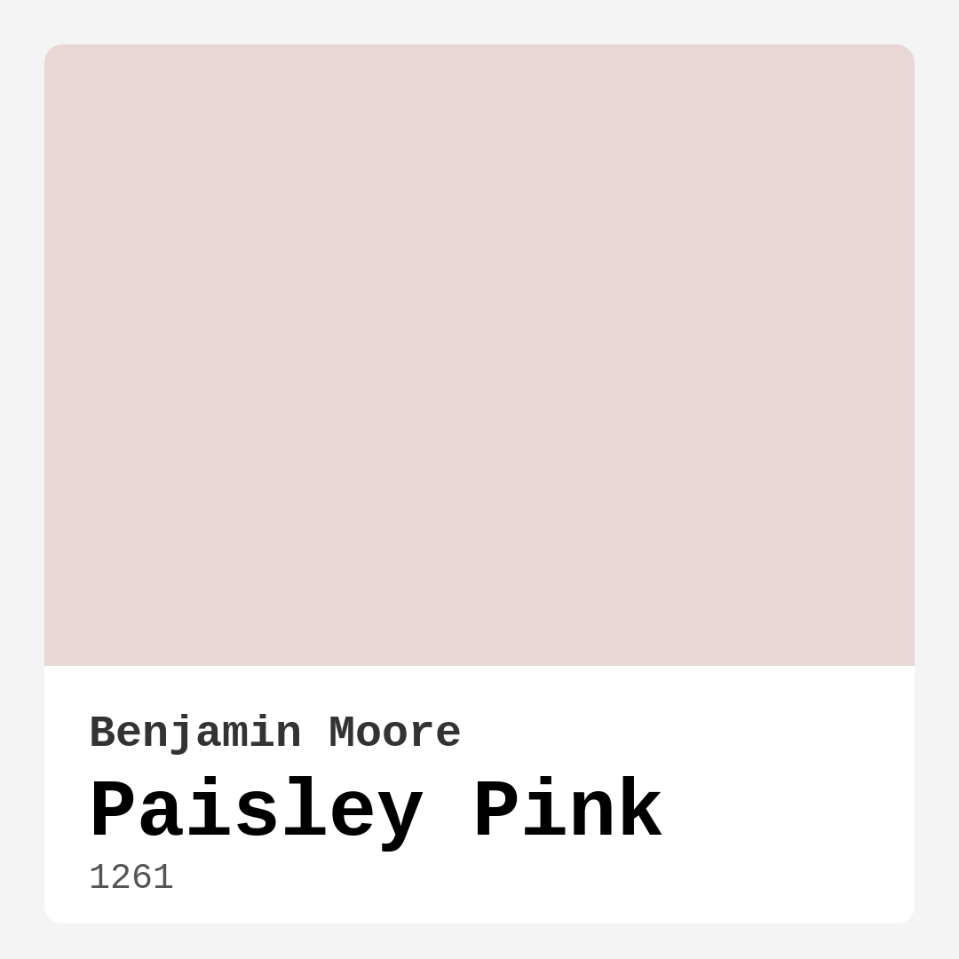
Color Preview & Key Details
| HEX Code | #E8D7D5 |
| RGB | 232, 215, 213 |
| LRV | 69.56% |
| Undertone | Red |
| Finish Options | Eggshell, Matte, Satin |
Imagine stepping into a room that instantly wraps you in warmth and comfort, almost like a cozy hug. That’s the magic of Paisley Pink, a stunning paint color from Benjamin Moore that can transform your space into a serene haven. It’s not just any pink; it’s a soft, muted hue that elegantly balances between pink and beige, creating a calming vibe while still inviting you to linger.
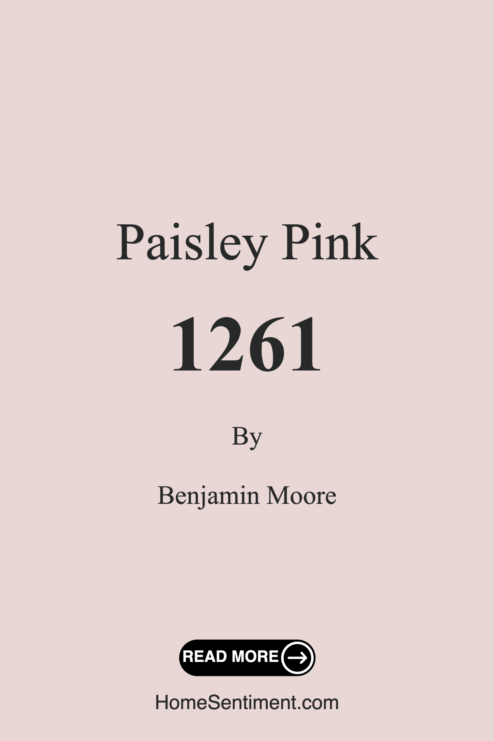
Paisley Pink, with its official color code of 1261, brings a unique charm to various interior styles. Whether you’re leaning towards a modern farmhouse aesthetic or a more bohemian flair, this color adapts beautifully. Its warm undertones, leaning towards red, give it depth and richness that can elevate any room, making it an excellent choice for living rooms, bedrooms, nurseries, and dining rooms.
One of the standout features of Paisley Pink is its remarkable versatility. With an LRV (Light Reflectance Value) of 69.56%, it reflects most of the light that hits it, making spaces feel larger and airier. In natural light, it appears fresh and bright, almost like a soft blush. However, under incandescent lighting, it takes on a cozy warmth that can make a space feel incredibly inviting. If you’re considering it for an open concept area, know that it can maintain a cohesive yet welcoming feel throughout your home.
When you’re thinking about how to incorporate Paisley Pink, consider its compatibility with other colors. It pairs perfectly with soft whites and creams, which can enhance its delicate nature. For an added touch of elegance, try it alongside natural wood tones, which can bring warmth and a sense of grounding to your decor. If you’re feeling bold, contrasting it with deeper accents like charcoal or navy can create a sophisticated and modern look that’s still cozy.
Applying Paisley Pink is a breeze, even if you’re new to painting. It’s beginner-friendly and smooth to apply, whether you’re using a roller or a brush. Plus, it offers great coverage, typically needing only one to two coats for a stunning finish. And if you’re ever in need of a touch-up, you’ll appreciate how easily it can blend back in, maintaining that flawless look.
Now, you might wonder if this shade works in smaller spaces. Absolutely! While it shines in larger rooms, it can also grace small areas beautifully. Just be sure there’s ample natural light to keep the space feeling open and inviting. If you’re concerned about darker corners, pair it with lighter trim to enhance brightness and create a more expansive feel.
One of the delightful aspects of Paisley Pink is its washability. It’s wipeable and washable, making it practical for high-traffic areas like dining rooms or nurseries, where little hands might leave their mark. Plus, with a low VOC level, you’re choosing a healthier option for your home environment.
When it comes to finishes, you have options that can suit your personal style. Matte, eggshell, and satin finishes each offer a different look and feel. A matte finish adds a soft, understated elegance, while eggshell can provide a slight sheen that enhances the warmth of the pink. Satin delivers a bit more gloss, making it ideal for areas where you want a touch of sophistication.
As you consider the overall mood you want to create, keep in mind that Paisley Pink exudes a cozy, inviting atmosphere. It’s perfect for social spaces where you want guests to feel welcome. This warm tone invites conversation and relaxation, making it particularly well-suited for living rooms and dining areas where family and friends gather.
Another great thing about Paisley Pink is its ability to shift throughout the day, adapting to the changing light conditions in your home. Its undertones can subtly reveal themselves, showcasing the color’s complexity. This quality makes it essential to test the paint in your space first. Observe how it interacts with your furniture, flooring, and decor to ensure it harmonizes beautifully.
If you’re looking for complementary colors, consider pairing Paisley Pink with shades like soft greens or muted earth tones. These can provide a beautiful contrast while maintaining a serene and cohesive look. Adding brass fixtures or natural textures can also enhance its warmth and bring a touch of elegance to your decor.
For those who may still be on the fence, think about the emotional benefits of using Paisley Pink in your home. Colors can significantly impact our mood and feelings, and this particular hue embodies a sense of calm and comfort. Walking into a room painted in this soft pink can evoke feelings of tranquility, making it a wonderful choice for spaces meant for unwinding and relaxation.
Ultimately, Paisley Pink is more than just a color; it’s a statement of warmth and welcome. It’s a versatile choice that works beautifully across various decor styles, making it a designer favorite. Whether you’re creating a cozy reading nook, a serene bedroom, or a lively dining area, this paint color has the ability to enhance the ambiance and elevate your space.
As you embark on your painting journey, remember that selecting the right color is just as important as picking the right shade. Paisley Pink’s warm, muted tone offers a timeless elegance that feels both fresh and inviting. So go ahead, embrace this beautiful hue, and watch as it transforms your home into a cozy sanctuary that reflects your personal style. After all, your home should be a reflection of who you are, and with Paisley Pink, you can create an environment that feels uniquely yours.
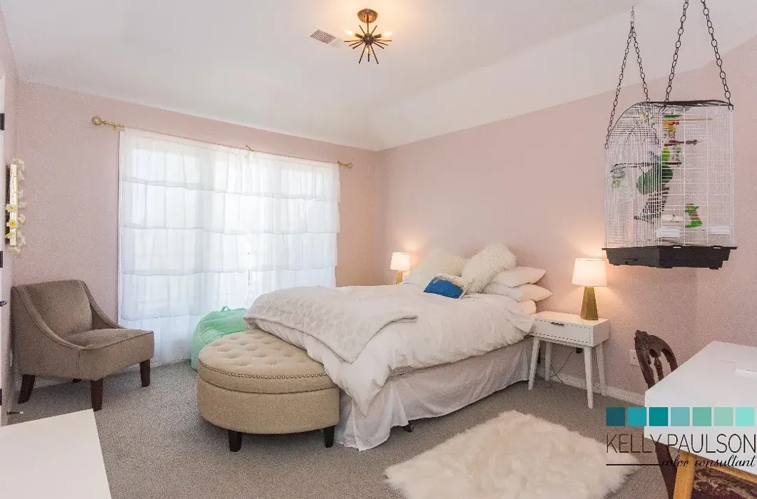
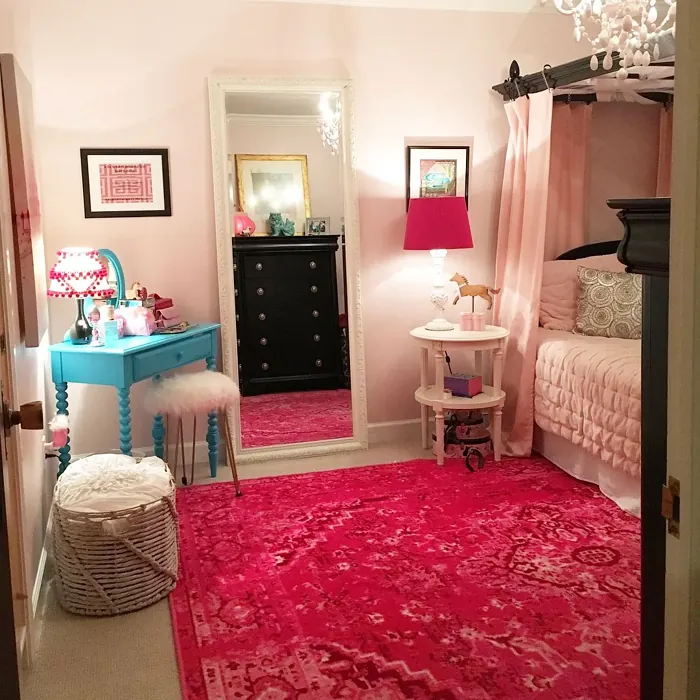
Real Room Photo of Paisley Pink 1261
Undertones of Paisley Pink ?
The undertones of Paisley Pink are a key aspect of its character, leaning towards Red. These subtle underlying hues are what give the color its depth and complexity. For example, a gray with a blue undertone will feel cooler and more modern, while one with a brown undertone will feel warmer and more traditional. It’s essential to test this paint in your home and observe it next to your existing furniture, flooring, and decor to see how these undertones interact and reveal themselves throughout the day.
HEX value: #E8D7D5
RGB code: 232, 215, 213
Is Paisley Pink Cool or Warm?
Paisley Pink is considered a warm paint color. This characteristic plays a huge role in the overall feel of a room. Warm colors, like this one, tend to create a cozy, inviting, and energetic atmosphere, making them great for social spaces like living rooms and dining rooms. In contrast, cool colors often evoke a sense of calm and serenity, which is why they are popular in bedrooms and bathrooms. The warmth of Paisley Pink means it will pair beautifully with corresponding decor elements.
Understanding Color Properties and Interior Design Tips
Hue refers to a specific position on the color wheel, measured in degrees from 0 to 360. Each degree represents a different pure color:
- 0° represents red
- 120° represents green
- 240° represents blue
Saturation describes the intensity or purity of a color and is expressed as a percentage:
- At 0%, the color appears completely desaturated—essentially a shade of gray
- At 100%, the color is at its most vivid and vibrant
Lightness indicates how light or dark a color is, also expressed as a percentage:
- 0% lightness results in black
- 100% lightness results in white
Using Warm Colors in Interior Design
Warm hues—such as reds, oranges, yellows, warm beiges, and greiges—are excellent choices for creating inviting and energetic spaces. These colors are particularly well-suited for:
- Kitchens, living rooms, and bathrooms, where warmth enhances comfort and sociability
- Large rooms, where warm tones can help reduce the sense of emptiness and make the space feel more intimate
For example:
- Warm beige shades provide a cozy, inviting atmosphere, ideal for living rooms, bedrooms, and hallways.
- Warm greige (a mix of beige and gray) offers the warmth of beige with the modern appeal of gray, making it a versatile backdrop for dining areas, bedrooms, and living spaces.
However, be mindful when using warm light tones in rooms with limited natural light. These shades may appear muted or even take on an unpleasant yellowish tint. To avoid a dull or flat appearance:
- Add depth by incorporating richer tones like deep greens, charcoal, or chocolate brown
- Use textured elements such as curtains, rugs, or cushions to bring dimension to the space
Pro Tip: Achieving Harmony with Warm and Cool Color Balance
To create a well-balanced and visually interesting interior, mix warm and cool tones strategically. This contrast adds depth and harmony to your design.
- If your walls feature warm hues, introduce cool-colored accents such as blue or green furniture, artwork, or accessories to create contrast.
- For a polished look, consider using a complementary color scheme, which pairs colors opposite each other on the color wheel (e.g., red with green, orange with blue).
This thoughtful mix not only enhances visual appeal but also creates a space that feels both dynamic and cohesive.

Light Temperature Affects on Paisley Pink
Natural Light
Natural daylight changes in color temperature as the sun moves across the sky. At sunrise and sunset, the light tends to have a warm, golden tone with a color temperature around 2000 Kelvin (K). As the day progresses and the sun rises higher, the light becomes cooler and more neutral. Around midday, especially when the sky is clear, natural light typically reaches its peak brightness and shifts to a cooler tone, ranging from 5500 to 6500 Kelvin. This midday light is close to what we perceive as pure white or daylight-balanced light.
These shifts in natural light can significantly influence how colors appear in a space, which is why designers often consider both the time of day and the orientation of windows when planning interior color schemes.
Artificial Light
When choosing artificial lighting, pay close attention to the color temperature, measured in Kelvin (K). This determines how warm or cool the light will appear. Lower temperatures, around 2700K, give off a warm, yellow glow often used in living rooms or bedrooms. Higher temperatures, above 5000K, create a cool, bluish light similar to daylight, commonly used in kitchens, offices, or task areas.
Use the slider to see how lighting temperature can affect the appearance of a surface or color throughout a space.


4800K
LRV of Paisley Pink
The Light Reflectance Value (LRV) of Paisley Pink is 69.56%, which places it in the Light colors category. This means it reflect most of the incident light. Understanding a paint’s LRV is crucial for predicting how it will look in your space. A higher LRV indicates a lighter color that reflects more light, making rooms feel larger and brighter. A lower LRV signifies a darker color that absorbs more light, creating a cozier, more intimate atmosphere. Always consider the natural and artificial lighting in your room when selecting a paint color based on its LRV.
Detailed Review of Paisley Pink
Additional Paint Characteristics
Ideal Rooms
Bedroom, Dining Room, Home Office, Living Room, Nursery
Decor Styles
Bohemian, Contemporary, Modern Farmhouse, Traditional
Coverage
Good (1–2 Coats), Touch-Up Friendly
Ease of Application
Beginner Friendly, Brush Smooth, Roller-Ready
Washability
Washable, Wipeable
VOC Level
Low VOC
Best Use
Accent Wall, Furniture, Interior Walls
Room Suitability
Bedroom, Dining Room, Living Room, Nursery
Tone Tag
Muted, Pastel, Warm
Finish Type
Eggshell, Matte, Satin
Paint Performance
Easy Touch-Up, High Coverage, Low Odor
Use Cases
Best for Modern Farmhouse, Best for Small Spaces, Designer Favorite
Mood
Cozy, Inviting, Warm
Trim Pairing
Complements Brass Fixtures, Matches Pure White, Pairs with White Dove
Paisley Pink is a versatile choice for anyone looking to introduce a soft color into their home. Its warm undertones make it suitable for various spaces, from bedrooms to living rooms. The hue can shift slightly depending on lighting; in natural light, it appears fresh and airy, while incandescent lighting brings out its cozy side. This makes it a fantastic option for open concept layouts where you want to maintain a cohesive but inviting feel. It pairs beautifully with a variety of trim colors, especially whites and soft woods, enhancing its elegance. Overall, it’s an excellent choice for anyone wanting to create a serene and welcoming environment.
Pros & Cons of 1261 Paisley Pink
Pros
Cons
Colors that go with Benjamin Moore Paisley Pink
FAQ on 1261 Paisley Pink
Can I use Paisley Pink in a small room?
Absolutely! While Paisley Pink works beautifully in larger areas, it can also be used in small rooms. Just ensure there’s enough natural light to keep the space feeling open and inviting. When used in small spaces, consider pairing it with lighter trims to enhance brightness.
What colors pair well with Paisley Pink?
Paisley Pink pairs wonderfully with soft whites, creams, and even muted greens. It also complements natural wood tones beautifully, adding warmth and depth to your decor. For a bolder contrast, consider pairing it with charcoal or deep navy accents.
Comparisons Paisley Pink with other colors
Paisley Pink 1261 vs Realist Beige SW 6078
| Attribute | Paisley Pink 1261 | Realist Beige SW 6078 |
|---|---|---|
| Color Name | Paisley Pink 1261 | Realist Beige SW 6078 |
| Color | ||
| Hue | Pink | Pink |
| Brightness | Medium | Medium |
| RGB | 232, 215, 213 | 211, 200, 189 |
| LRV | 69.56% | 34% |
| Finish Type | Eggshell, Matte, Satin | Eggshell, Matte, Satin |
| Finish Options | Eggshell, Matte, Satin | Eggshell, Matte, Satin |
| Ideal Rooms | Bedroom, Dining Room, Home Office, Living Room, Nursery | Bedroom, Dining Room, Entryway, Home Office, Kitchen, Living Room |
| Decor Styles | Bohemian, Contemporary, Modern Farmhouse, Traditional | Contemporary, Minimalist, Modern Farmhouse, Rustic, Traditional |
| Coverage | Good (1–2 Coats), Touch-Up Friendly | Good (1–2 Coats), Touch-Up Friendly |
| Ease of Application | Beginner Friendly, Brush Smooth, Roller-Ready | Beginner Friendly, Brush Smooth, Fast-Drying, Roller-Ready |
| Washability | Washable, Wipeable | Washable, Wipeable |
| Room Suitability | Bedroom, Dining Room, Living Room, Nursery | Bedroom, Dining Room, Home Office, Kitchen, Living Room |
| Tone | Muted, Pastel, Warm | Earthy, Neutral, Warm |
| Paint Performance | Easy Touch-Up, High Coverage, Low Odor | High Coverage, Low Odor, Quick Drying |
Paisley Pink 1261 vs Rosaline Pearl SW 9077
| Attribute | Paisley Pink 1261 | Rosaline Pearl SW 9077 |
|---|---|---|
| Color Name | Paisley Pink 1261 | Rosaline Pearl SW 9077 |
| Color | ||
| Hue | Pink | Pink |
| Brightness | Medium | Medium |
| RGB | 232, 215, 213 | 163, 136, 135 |
| LRV | 69.56% | 69% |
| Finish Type | Eggshell, Matte, Satin | Eggshell, Matte |
| Finish Options | Eggshell, Matte, Satin | Eggshell, Matte, Satin |
| Ideal Rooms | Bedroom, Dining Room, Home Office, Living Room, Nursery | Bedroom, Dining Room, Home Office, Living Room |
| Decor Styles | Bohemian, Contemporary, Modern Farmhouse, Traditional | Bohemian, Contemporary, Modern, Transitional |
| Coverage | Good (1–2 Coats), Touch-Up Friendly | Good (1–2 Coats) |
| Ease of Application | Beginner Friendly, Brush Smooth, Roller-Ready | Beginner Friendly, Brush Smooth, Fast-Drying, Roller-Ready |
| Washability | Washable, Wipeable | Washable, Wipeable |
| Room Suitability | Bedroom, Dining Room, Living Room, Nursery | Bedroom, Dining Room, Home Office, Living Room |
| Tone | Muted, Pastel, Warm | Dusty, Muted, Warm |
| Paint Performance | Easy Touch-Up, High Coverage, Low Odor | Easy Touch-Up, Fade Resistant, Low Odor |
Paisley Pink 1261 vs Cabbage Rose SW 0003
| Attribute | Paisley Pink 1261 | Cabbage Rose SW 0003 |
|---|---|---|
| Color Name | Paisley Pink 1261 | Cabbage Rose SW 0003 |
| Color | ||
| Hue | Pink | Pink |
| Brightness | Medium | Medium |
| RGB | 232, 215, 213 | 197, 159, 145 |
| LRV | 69.56% | 15% |
| Finish Type | Eggshell, Matte, Satin | Eggshell, Matte, Satin |
| Finish Options | Eggshell, Matte, Satin | Eggshell, Matte, Satin |
| Ideal Rooms | Bedroom, Dining Room, Home Office, Living Room, Nursery | Bedroom, Dining Room, Hallway, Living Room, Nursery |
| Decor Styles | Bohemian, Contemporary, Modern Farmhouse, Traditional | Cottage, Modern Farmhouse, Romantic, Shabby Chic, Vintage |
| Coverage | Good (1–2 Coats), Touch-Up Friendly | Good (1–2 Coats), Touch-Up Friendly |
| Ease of Application | Beginner Friendly, Brush Smooth, Roller-Ready | Beginner Friendly, Brush Smooth, Roller-Ready |
| Washability | Washable, Wipeable | Washable, Wipeable |
| Room Suitability | Bedroom, Dining Room, Living Room, Nursery | Bedroom, Dining Room, Hallway, Living Room, Nursery |
| Tone | Muted, Pastel, Warm | Earthy, Muted, Warm |
| Paint Performance | Easy Touch-Up, High Coverage, Low Odor | Easy Touch-Up, Low Odor |
Paisley Pink 1261 vs Sashay Sand SW 6051
| Attribute | Paisley Pink 1261 | Sashay Sand SW 6051 |
|---|---|---|
| Color Name | Paisley Pink 1261 | Sashay Sand SW 6051 |
| Color | ||
| Hue | Pink | Pink |
| Brightness | Medium | Medium |
| RGB | 232, 215, 213 | 207, 180, 168 |
| LRV | 69.56% | 64% |
| Finish Type | Eggshell, Matte, Satin | Eggshell, Matte, Satin |
| Finish Options | Eggshell, Matte, Satin | Eggshell, Matte, Satin |
| Ideal Rooms | Bedroom, Dining Room, Home Office, Living Room, Nursery | Bedroom, Dining Room, Home Office, Kitchen, Living Room |
| Decor Styles | Bohemian, Contemporary, Modern Farmhouse, Traditional | Bohemian, Contemporary, Modern Farmhouse, Scandinavian, Transitional |
| Coverage | Good (1–2 Coats), Touch-Up Friendly | Good (1–2 Coats), Touch-Up Friendly |
| Ease of Application | Beginner Friendly, Brush Smooth, Roller-Ready | Beginner Friendly, Fast-Drying, Roller-Ready |
| Washability | Washable, Wipeable | Highly Washable, Washable |
| Room Suitability | Bedroom, Dining Room, Living Room, Nursery | Bedroom, Dining Room, Home Office, Kitchen, Living Room |
| Tone | Muted, Pastel, Warm | Earthy, Muted, Warm |
| Paint Performance | Easy Touch-Up, High Coverage, Low Odor | Easy Touch-Up, Low Odor, Quick Drying, Scuff Resistant |
Paisley Pink 1261 vs Touch of Sand SW 9085
| Attribute | Paisley Pink 1261 | Touch of Sand SW 9085 |
|---|---|---|
| Color Name | Paisley Pink 1261 | Touch of Sand SW 9085 |
| Color | ||
| Hue | Pink | Pink |
| Brightness | Medium | Medium |
| RGB | 232, 215, 213 | 213, 199, 186 |
| LRV | 69.56% | 66% |
| Finish Type | Eggshell, Matte, Satin | Eggshell, Matte, Satin |
| Finish Options | Eggshell, Matte, Satin | Eggshell, Matte, Satin |
| Ideal Rooms | Bedroom, Dining Room, Home Office, Living Room, Nursery | Bathroom, Bedroom, Dining Room, Home Office, Kitchen, Living Room |
| Decor Styles | Bohemian, Contemporary, Modern Farmhouse, Traditional | Bohemian, Coastal, Contemporary, Modern Farmhouse, Rustic |
| Coverage | Good (1–2 Coats), Touch-Up Friendly | Good (1–2 Coats), Touch-Up Friendly |
| Ease of Application | Beginner Friendly, Brush Smooth, Roller-Ready | Beginner Friendly, Brush Smooth, Fast-Drying, Roller-Ready |
| Washability | Washable, Wipeable | Washable, Wipeable |
| Room Suitability | Bedroom, Dining Room, Living Room, Nursery | Bathroom, Bedroom, Dining Room, Home Office, Kitchen, Living Room |
| Tone | Muted, Pastel, Warm | Earthy, Muted, Neutral, Warm |
| Paint Performance | Easy Touch-Up, High Coverage, Low Odor | Easy Touch-Up, Low Odor, Quick Drying, Scuff Resistant |
Paisley Pink 1261 vs Pink Shadow SW 0070
| Attribute | Paisley Pink 1261 | Pink Shadow SW 0070 |
|---|---|---|
| Color Name | Paisley Pink 1261 | Pink Shadow SW 0070 |
| Color | ||
| Hue | Pink | Pink |
| Brightness | Medium | Medium |
| RGB | 232, 215, 213 | 222, 195, 185 |
| LRV | 69.56% | 45% |
| Finish Type | Eggshell, Matte, Satin | Eggshell, Matte, Satin |
| Finish Options | Eggshell, Matte, Satin | Eggshell, Matte, Satin |
| Ideal Rooms | Bedroom, Dining Room, Home Office, Living Room, Nursery | Bedroom, Dining Room, Home Office, Living Room, Nursery |
| Decor Styles | Bohemian, Contemporary, Modern Farmhouse, Traditional | Bohemian, Minimalist, Modern Farmhouse, Scandinavian, Traditional |
| Coverage | Good (1–2 Coats), Touch-Up Friendly | Good (1–2 Coats) |
| Ease of Application | Beginner Friendly, Brush Smooth, Roller-Ready | Beginner Friendly, Brush Smooth, Fast-Drying, Roller-Ready |
| Washability | Washable, Wipeable | Washable, Wipeable |
| Room Suitability | Bedroom, Dining Room, Living Room, Nursery | Bedroom, Dining Room, Living Room, Nursery |
| Tone | Muted, Pastel, Warm | Muted, Pastel, Warm |
| Paint Performance | Easy Touch-Up, High Coverage, Low Odor | Easy Touch-Up, High Coverage, Low Odor |
Paisley Pink 1261 vs Hushed Auburn SW 9080
| Attribute | Paisley Pink 1261 | Hushed Auburn SW 9080 |
|---|---|---|
| Color Name | Paisley Pink 1261 | Hushed Auburn SW 9080 |
| Color | ||
| Hue | Pink | Pink |
| Brightness | Medium | Medium |
| RGB | 232, 215, 213 | 168, 133, 122 |
| LRV | 69.56% | 12% |
| Finish Type | Eggshell, Matte, Satin | Eggshell, Matte, Satin |
| Finish Options | Eggshell, Matte, Satin | Eggshell, Matte, Satin |
| Ideal Rooms | Bedroom, Dining Room, Home Office, Living Room, Nursery | Bedroom, Dining Room, Home Office, Living Room |
| Decor Styles | Bohemian, Contemporary, Modern Farmhouse, Traditional | Contemporary, Modern Farmhouse, Rustic, Transitional |
| Coverage | Good (1–2 Coats), Touch-Up Friendly | Good (1–2 Coats), Touch-Up Friendly |
| Ease of Application | Beginner Friendly, Brush Smooth, Roller-Ready | Beginner Friendly, Brush Smooth, Fast-Drying, Roller-Ready |
| Washability | Washable, Wipeable | Washable, Wipeable |
| Room Suitability | Bedroom, Dining Room, Living Room, Nursery | Bedroom, Dining Room, Home Office, Living Room |
| Tone | Muted, Pastel, Warm | Earthy, Muted, Warm |
| Paint Performance | Easy Touch-Up, High Coverage, Low Odor | Easy Touch-Up, High Coverage, Low Odor |
Paisley Pink 1261 vs Likeable Sand SW 6058
| Attribute | Paisley Pink 1261 | Likeable Sand SW 6058 |
|---|---|---|
| Color Name | Paisley Pink 1261 | Likeable Sand SW 6058 |
| Color | ||
| Hue | Pink | Pink |
| Brightness | Medium | Medium |
| RGB | 232, 215, 213 | 209, 183, 168 |
| LRV | 69.56% | 61% |
| Finish Type | Eggshell, Matte, Satin | Eggshell, Matte, Satin |
| Finish Options | Eggshell, Matte, Satin | Eggshell, Matte, Satin |
| Ideal Rooms | Bedroom, Dining Room, Home Office, Living Room, Nursery | Bedroom, Dining Room, Home Office, Kitchen, Living Room |
| Decor Styles | Bohemian, Contemporary, Modern Farmhouse, Traditional | Bohemian, Coastal, Contemporary, Modern Farmhouse, Rustic |
| Coverage | Good (1–2 Coats), Touch-Up Friendly | Good (1–2 Coats), Touch-Up Friendly |
| Ease of Application | Beginner Friendly, Brush Smooth, Roller-Ready | Beginner Friendly, Brush Smooth, Fast-Drying, Roller-Ready |
| Washability | Washable, Wipeable | Washable, Wipeable |
| Room Suitability | Bedroom, Dining Room, Living Room, Nursery | Bedroom, Dining Room, Home Office, Kitchen, Living Room |
| Tone | Muted, Pastel, Warm | Earthy, Muted, Warm |
| Paint Performance | Easy Touch-Up, High Coverage, Low Odor | Easy Touch-Up, Low Odor, Quick Drying |
Paisley Pink 1261 vs Glamour SW 6031
| Attribute | Paisley Pink 1261 | Glamour SW 6031 |
|---|---|---|
| Color Name | Paisley Pink 1261 | Glamour SW 6031 |
| Color | ||
| Hue | Pink | Pink |
| Brightness | Medium | Medium |
| RGB | 232, 215, 213 | 182, 160, 154 |
| LRV | 69.56% | 30% |
| Finish Type | Eggshell, Matte, Satin | Eggshell, Matte, Satin |
| Finish Options | Eggshell, Matte, Satin | Eggshell, Matte, Satin |
| Ideal Rooms | Bedroom, Dining Room, Home Office, Living Room, Nursery | Bedroom, Dining Room, Home Office, Living Room |
| Decor Styles | Bohemian, Contemporary, Modern Farmhouse, Traditional | Bohemian, Classic, Modern, Transitional |
| Coverage | Good (1–2 Coats), Touch-Up Friendly | Good (1–2 Coats) |
| Ease of Application | Beginner Friendly, Brush Smooth, Roller-Ready | Beginner Friendly, Brush Smooth, Fast-Drying, Roller-Ready |
| Washability | Washable, Wipeable | Scrubbable, Washable |
| Room Suitability | Bedroom, Dining Room, Living Room, Nursery | Bedroom, Dining Room, Home Office, Living Room |
| Tone | Muted, Pastel, Warm | Balanced, Neutral, Warm |
| Paint Performance | Easy Touch-Up, High Coverage, Low Odor | Easy Touch-Up, Low Odor, Quick Drying |
Paisley Pink 1261 vs Temperate Taupe SW 6037
| Attribute | Paisley Pink 1261 | Temperate Taupe SW 6037 |
|---|---|---|
| Color Name | Paisley Pink 1261 | Temperate Taupe SW 6037 |
| Color | ||
| Hue | Pink | Pink |
| Brightness | Medium | Medium |
| RGB | 232, 215, 213 | 191, 177, 170 |
| LRV | 69.56% | 34% |
| Finish Type | Eggshell, Matte, Satin | Eggshell, Matte, Satin |
| Finish Options | Eggshell, Matte, Satin | Eggshell, Matte, Satin |
| Ideal Rooms | Bedroom, Dining Room, Home Office, Living Room, Nursery | Bedroom, Dining Room, Home Office, Kitchen, Living Room |
| Decor Styles | Bohemian, Contemporary, Modern Farmhouse, Traditional | Bohemian, Modern Farmhouse, Rustic, Transitional |
| Coverage | Good (1–2 Coats), Touch-Up Friendly | Good (1–2 Coats), Touch-Up Friendly |
| Ease of Application | Beginner Friendly, Brush Smooth, Roller-Ready | Beginner Friendly, Brush Smooth, Fast-Drying, Roller-Ready |
| Washability | Washable, Wipeable | Highly Washable, Washable |
| Room Suitability | Bedroom, Dining Room, Living Room, Nursery | Bedroom, Dining Room, Home Office, Living Room |
| Tone | Muted, Pastel, Warm | Earthy, Neutral, Warm |
| Paint Performance | Easy Touch-Up, High Coverage, Low Odor | Long Lasting, Low Odor, Quick Drying, Scuff Resistant |
Official Page of Benjamin Moore Paisley Pink 1261