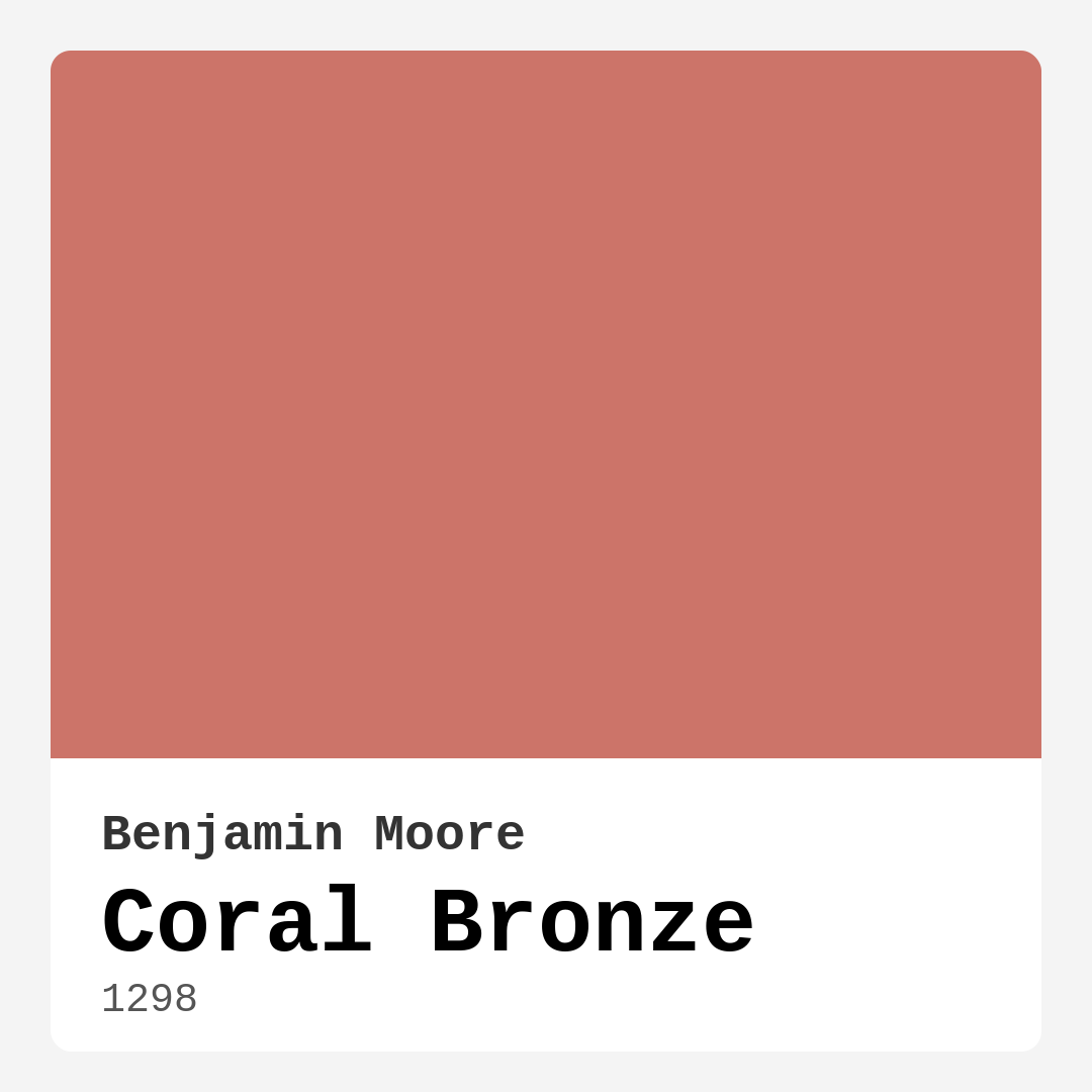
Color Preview & Key Details
| HEX Code | #CC7469 |
| RGB | 204, 116, 105 |
| LRV | 26.08% |
| Undertone | Red |
| Finish Options | Matte, Satin, Semi-Gloss |
Imagine walking into a room that feels like a warm embrace, where the colors wrap around you like a favorite blanket. That’s the magic of Coral Bronze, a stunning hue from Benjamin Moore that effortlessly balances warmth and elegance. It’s a color that doesn’t just sit on your walls; it transforms your space into something inviting and sophisticated.
Coral Bronze, with its color code of 1298, embodies a delightful blend of pink and bronze with a red undertone that injects life into any room. The hex code #CC7469 captures its essence beautifully, radiating a medium brightness that feels both uplifting and cozy. With an LRV (Light Reflectance Value) of 26.08%, it reflects a good amount of light, making it surprisingly adaptable.
You might be wondering how to incorporate this lovely shade into your home. Let’s talk about the perfect spaces for Coral Bronze. This hue shines in living rooms, bedrooms, dining rooms, and home offices. It’s especially suited for areas where you want to create a welcoming atmosphere. Imagine hosting friends in a dining room painted Coral Bronze; the rich warmth of the color encourages conversation and connection.
When it comes to decor styles, Coral Bronze excels in a variety of settings. Whether your taste leans towards modern, transitional, bohemian, or coastal, this color integrates seamlessly. It has that special ability to either stand out or complement your existing decor, depending on how you choose to use it.
One of the best things about Coral Bronze is its ease of application. It’s beginner-friendly, which means even if you’re new to painting, you can achieve a lovely finish without stress. The paint goes on smoothly, whether you’re using a roller or a brush, and it’s touch-up friendly. You won’t find yourself dreading the thought of needing to fix a chip or scratch later on; it adheres well and maintains its beautiful color over time.
As for finishes, Coral Bronze looks particularly stunning in satin. This finish adds a subtle sheen that enhances the color’s warmth without being overwhelming. If you’re leaning towards a more muted look, a matte finish will still showcase Coral Bronze beautifully. For trims and accents, consider using a semi-gloss finish. It provides a lovely contrast while keeping the overall look cohesive.
Now, let’s discuss lighting. Coral Bronze thrives in well-lit spaces, where it can radiate warmth and vibrancy. However, if you’re considering it for smaller rooms or areas lacking natural light, be cautious. In dimmer environments, it can appear darker and might make the space feel heavier than intended. Always test the paint in your specific setting to see how it reacts to different lighting throughout the day.
You might be thinking, “Does this color work for my rental?” Absolutely! Coral Bronze is a designer favorite and perfect for rentals. It’s classic yet modern, making it a versatile choice for anyone looking to inject life into a temporary space. Plus, its low VOC level means it’s a healthier option for your home, minimizing any unpleasant odors during and after application.
The versatility of Coral Bronze doesn’t stop at walls. This color can be utilized on furniture as well. Picture a beautiful vintage dresser or a sleek modern console table coated in Coral Bronze. The result? A timeless piece that draws attention without overpowering the room.
If you’re still considering your options, think about complementary shades. Coral Bronze pairs beautifully with white, and using a trim like Benjamin Moore’s White Dove will enhance its warmth. Brass fixtures can also elevate the aesthetic, adding a touch of elegance that works wonderfully with the rich undertones of this hue.
In terms of related colors, if you’re looking to create a cohesive palette, consider shades like 2136-40 or 1625. These can serve as excellent accent colors or even as part of a multi-color scheme. Coral Bronze’s warm, earthy tone can harmonize beautifully with these complementary hues, creating a rich tapestry of color in your home.
Now, let’s touch on the practical aspects of this color. Coral Bronze is known for its good coverage, typically requiring just one to two coats for a perfect finish. It’s highly washable, making it ideal for high-traffic areas or homes with kids and pets. The durability of this paint speaks volumes; it stands up well to the wear and tear of everyday life, ensuring your space remains looking fresh and inviting.
One common concern is how it will look in a small space. It can indeed work well in compact areas, but the lighting plays a crucial role. In a sunlit room, Coral Bronze can create a cozy nook, while in darker corners, it might feel a bit heavier. To balance this, consider lighter furnishings or decor elements to keep the area feeling open and airy.
As an expert in home design, I can confidently say that Coral Bronze is more than just a color; it’s a mood. It invites warmth and comfort, creating spaces where memories are made and cherished. The adaptability of this hue allows it to grow with your decor style, making it a timeless choice that won’t go out of fashion.
So, whether you’re looking to refresh a single wall or transform an entire room, Coral Bronze deserves a spot on your shortlist. It’s a color that can stand the test of time while keeping your home feeling fresh and inviting. Remember, testing it in your space is essential, so grab a sample and see how it plays with your lighting and existing decor.
Incorporating Coral Bronze into your home decor is a decision you won’t regret. It embodies elegance, warmth, and versatility, all while being easy to work with. So go ahead, embrace this stunning hue, and let your walls tell a beautiful story.
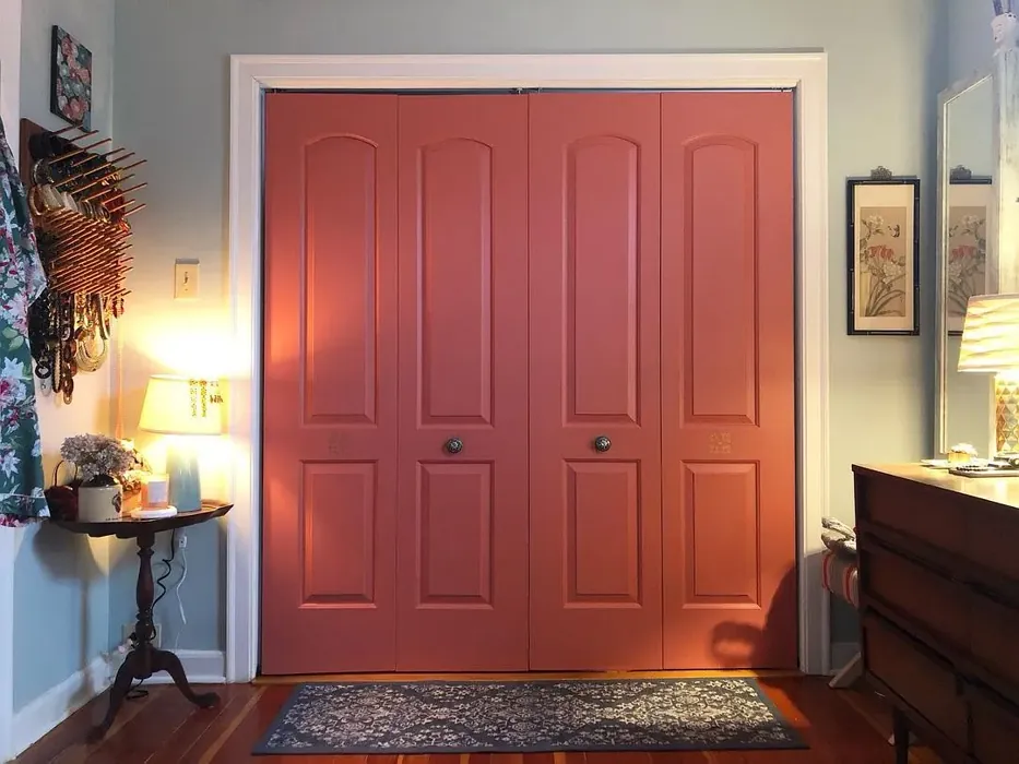
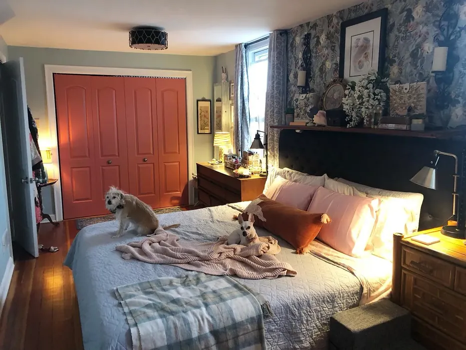
Real Room Photo of Coral Bronze 1298
Undertones of Coral Bronze ?
The undertones of Coral Bronze are a key aspect of its character, leaning towards Red. These subtle underlying hues are what give the color its depth and complexity. For example, a gray with a blue undertone will feel cooler and more modern, while one with a brown undertone will feel warmer and more traditional. It’s essential to test this paint in your home and observe it next to your existing furniture, flooring, and decor to see how these undertones interact and reveal themselves throughout the day.
HEX value: #CC7469
RGB code: 204, 116, 105
Is Coral Bronze Cool or Warm?
Coral Bronze is considered a warm paint color. This characteristic plays a huge role in the overall feel of a room. Warm colors, like this one, tend to create a cozy, inviting, and energetic atmosphere, making them great for social spaces like living rooms and dining rooms. In contrast, cool colors often evoke a sense of calm and serenity, which is why they are popular in bedrooms and bathrooms. The warmth of Coral Bronze means it will pair beautifully with corresponding decor elements.
Understanding Color Properties and Interior Design Tips
Hue refers to a specific position on the color wheel, measured in degrees from 0 to 360. Each degree represents a different pure color:
- 0° represents red
- 120° represents green
- 240° represents blue
Saturation describes the intensity or purity of a color and is expressed as a percentage:
- At 0%, the color appears completely desaturated—essentially a shade of gray
- At 100%, the color is at its most vivid and vibrant
Lightness indicates how light or dark a color is, also expressed as a percentage:
- 0% lightness results in black
- 100% lightness results in white
Using Warm Colors in Interior Design
Warm hues—such as reds, oranges, yellows, warm beiges, and greiges—are excellent choices for creating inviting and energetic spaces. These colors are particularly well-suited for:
- Kitchens, living rooms, and bathrooms, where warmth enhances comfort and sociability
- Large rooms, where warm tones can help reduce the sense of emptiness and make the space feel more intimate
For example:
- Warm beige shades provide a cozy, inviting atmosphere, ideal for living rooms, bedrooms, and hallways.
- Warm greige (a mix of beige and gray) offers the warmth of beige with the modern appeal of gray, making it a versatile backdrop for dining areas, bedrooms, and living spaces.
However, be mindful when using warm light tones in rooms with limited natural light. These shades may appear muted or even take on an unpleasant yellowish tint. To avoid a dull or flat appearance:
- Add depth by incorporating richer tones like deep greens, charcoal, or chocolate brown
- Use textured elements such as curtains, rugs, or cushions to bring dimension to the space
Pro Tip: Achieving Harmony with Warm and Cool Color Balance
To create a well-balanced and visually interesting interior, mix warm and cool tones strategically. This contrast adds depth and harmony to your design.
- If your walls feature warm hues, introduce cool-colored accents such as blue or green furniture, artwork, or accessories to create contrast.
- For a polished look, consider using a complementary color scheme, which pairs colors opposite each other on the color wheel (e.g., red with green, orange with blue).
This thoughtful mix not only enhances visual appeal but also creates a space that feels both dynamic and cohesive.
Light Temperature Affects on Coral Bronze
Natural Light
Natural daylight changes in color temperature as the sun moves across the sky. At sunrise and sunset, the light tends to have a warm, golden tone with a color temperature around 2000 Kelvin (K). As the day progresses and the sun rises higher, the light becomes cooler and more neutral. Around midday, especially when the sky is clear, natural light typically reaches its peak brightness and shifts to a cooler tone, ranging from 5500 to 6500 Kelvin. This midday light is close to what we perceive as pure white or daylight-balanced light.
These shifts in natural light can significantly influence how colors appear in a space, which is why designers often consider both the time of day and the orientation of windows when planning interior color schemes.
Artificial Light
When choosing artificial lighting, pay close attention to the color temperature, measured in Kelvin (K). This determines how warm or cool the light will appear. Lower temperatures, around 2700K, give off a warm, yellow glow often used in living rooms or bedrooms. Higher temperatures, above 5000K, create a cool, bluish light similar to daylight, commonly used in kitchens, offices, or task areas.
Use the slider to see how lighting temperature can affect the appearance of a surface or color throughout a space.


4800K
LRV of Coral Bronze
The Light Reflectance Value (LRV) of Coral Bronze is 26.08%, which places it in the Medium colors category. This means it reflect a lot of light. Understanding a paint’s LRV is crucial for predicting how it will look in your space. A higher LRV indicates a lighter color that reflects more light, making rooms feel larger and brighter. A lower LRV signifies a darker color that absorbs more light, creating a cozier, more intimate atmosphere. Always consider the natural and artificial lighting in your room when selecting a paint color based on its LRV.
Detailed Review of Coral Bronze
Additional Paint Characteristics
Ideal Rooms
Bedroom, Dining Room, Home Office, Living Room
Decor Styles
Bohemian, Coastal, Modern, Transitional
Coverage
Good (1–2 Coats), Touch-Up Friendly
Ease of Application
Beginner Friendly, Brush Smooth, Roller-Ready
Washability
Highly Washable, Washable
VOC Level
Low VOC
Best Use
Accent Wall, Furniture, Interior Walls
Room Suitability
Bedroom, Dining Room, Home Office, Living Room
Tone Tag
Earthy, Muted, Warm
Finish Type
Matte, Satin
Paint Performance
Easy Touch-Up, High Coverage, Low Odor
Use Cases
Best for Rentals, Classic Favorite, Designer Favorite
Mood
Cozy, Inviting, Warm
Trim Pairing
Complements Brass Fixtures, Pairs with White Dove, Works with Warm Trim
Coral Bronze is truly a standout choice for anyone looking to refresh their space. This paint color doesn’t just cover walls; it transforms them. Its warm undertones create an inviting atmosphere that makes rooms feel cozy and lived-in. As light changes throughout the day, you’ll notice how Coral Bronze adapts, offering different shades that can brighten a room or provide a calming backdrop. This versatility makes it a great option for various decor styles, ensuring it can complement both modern and traditional spaces alike.
Application is straightforward, and you’ll appreciate how well it adheres, requiring minimal touch-ups. Whether you’re painting an accent wall or refreshing an entire room, Coral Bronze delivers a delightful finish that feels both fresh and timeless. Just remember to test it in your space, as lighting can significantly impact its appearance.
Pros & Cons of 1298 Coral Bronze
Pros
Cons
Colors that go with Benjamin Moore Coral Bronze
FAQ on 1298 Coral Bronze
Is Coral Bronze suitable for small rooms?
Yes, Coral Bronze can work in small rooms, but it’s essential to consider the lighting. In well-lit spaces, it can create a cozy, inviting atmosphere. However, if the room lacks natural light, the color might feel a bit heavier, so testing it in your specific space is advisable. Pairing it with lighter furnishings can also help keep the room feeling open.
What finishes work best with Coral Bronze?
Coral Bronze looks stunning in a satin finish, giving it a subtle sheen that enhances its warmth. However, if you’re aiming for a more matte look, it also performs beautifully in a flat finish. Semi-gloss can be used for trims and accents, providing a nice contrast while keeping the overall look cohesive.
Comparisons Coral Bronze with other colors
Coral Bronze 1298 vs Realist Beige SW 6078
| Attribute | Coral Bronze 1298 | Realist Beige SW 6078 |
|---|---|---|
| Color Name | Coral Bronze 1298 | Realist Beige SW 6078 |
| Color | ||
| Hue | Pink | Pink |
| Brightness | Medium | Medium |
| RGB | 204, 116, 105 | 211, 200, 189 |
| LRV | 26.08% | 34% |
| Finish Type | Matte, Satin | Eggshell, Matte, Satin |
| Finish Options | Matte, Satin, Semi-Gloss | Eggshell, Matte, Satin |
| Ideal Rooms | Bedroom, Dining Room, Home Office, Living Room | Bedroom, Dining Room, Entryway, Home Office, Kitchen, Living Room |
| Decor Styles | Bohemian, Coastal, Modern, Transitional | Contemporary, Minimalist, Modern Farmhouse, Rustic, Traditional |
| Coverage | Good (1–2 Coats), Touch-Up Friendly | Good (1–2 Coats), Touch-Up Friendly |
| Ease of Application | Beginner Friendly, Brush Smooth, Roller-Ready | Beginner Friendly, Brush Smooth, Fast-Drying, Roller-Ready |
| Washability | Highly Washable, Washable | Washable, Wipeable |
| Room Suitability | Bedroom, Dining Room, Home Office, Living Room | Bedroom, Dining Room, Home Office, Kitchen, Living Room |
| Tone | Earthy, Muted, Warm | Earthy, Neutral, Warm |
| Paint Performance | Easy Touch-Up, High Coverage, Low Odor | High Coverage, Low Odor, Quick Drying |
Coral Bronze 1298 vs Rosaline Pearl SW 9077
| Attribute | Coral Bronze 1298 | Rosaline Pearl SW 9077 |
|---|---|---|
| Color Name | Coral Bronze 1298 | Rosaline Pearl SW 9077 |
| Color | ||
| Hue | Pink | Pink |
| Brightness | Medium | Medium |
| RGB | 204, 116, 105 | 163, 136, 135 |
| LRV | 26.08% | 69% |
| Finish Type | Matte, Satin | Eggshell, Matte |
| Finish Options | Matte, Satin, Semi-Gloss | Eggshell, Matte, Satin |
| Ideal Rooms | Bedroom, Dining Room, Home Office, Living Room | Bedroom, Dining Room, Home Office, Living Room |
| Decor Styles | Bohemian, Coastal, Modern, Transitional | Bohemian, Contemporary, Modern, Transitional |
| Coverage | Good (1–2 Coats), Touch-Up Friendly | Good (1–2 Coats) |
| Ease of Application | Beginner Friendly, Brush Smooth, Roller-Ready | Beginner Friendly, Brush Smooth, Fast-Drying, Roller-Ready |
| Washability | Highly Washable, Washable | Washable, Wipeable |
| Room Suitability | Bedroom, Dining Room, Home Office, Living Room | Bedroom, Dining Room, Home Office, Living Room |
| Tone | Earthy, Muted, Warm | Dusty, Muted, Warm |
| Paint Performance | Easy Touch-Up, High Coverage, Low Odor | Easy Touch-Up, Fade Resistant, Low Odor |
Coral Bronze 1298 vs Cabbage Rose SW 0003
| Attribute | Coral Bronze 1298 | Cabbage Rose SW 0003 |
|---|---|---|
| Color Name | Coral Bronze 1298 | Cabbage Rose SW 0003 |
| Color | ||
| Hue | Pink | Pink |
| Brightness | Medium | Medium |
| RGB | 204, 116, 105 | 197, 159, 145 |
| LRV | 26.08% | 15% |
| Finish Type | Matte, Satin | Eggshell, Matte, Satin |
| Finish Options | Matte, Satin, Semi-Gloss | Eggshell, Matte, Satin |
| Ideal Rooms | Bedroom, Dining Room, Home Office, Living Room | Bedroom, Dining Room, Hallway, Living Room, Nursery |
| Decor Styles | Bohemian, Coastal, Modern, Transitional | Cottage, Modern Farmhouse, Romantic, Shabby Chic, Vintage |
| Coverage | Good (1–2 Coats), Touch-Up Friendly | Good (1–2 Coats), Touch-Up Friendly |
| Ease of Application | Beginner Friendly, Brush Smooth, Roller-Ready | Beginner Friendly, Brush Smooth, Roller-Ready |
| Washability | Highly Washable, Washable | Washable, Wipeable |
| Room Suitability | Bedroom, Dining Room, Home Office, Living Room | Bedroom, Dining Room, Hallway, Living Room, Nursery |
| Tone | Earthy, Muted, Warm | Earthy, Muted, Warm |
| Paint Performance | Easy Touch-Up, High Coverage, Low Odor | Easy Touch-Up, Low Odor |
Coral Bronze 1298 vs Sashay Sand SW 6051
| Attribute | Coral Bronze 1298 | Sashay Sand SW 6051 |
|---|---|---|
| Color Name | Coral Bronze 1298 | Sashay Sand SW 6051 |
| Color | ||
| Hue | Pink | Pink |
| Brightness | Medium | Medium |
| RGB | 204, 116, 105 | 207, 180, 168 |
| LRV | 26.08% | 64% |
| Finish Type | Matte, Satin | Eggshell, Matte, Satin |
| Finish Options | Matte, Satin, Semi-Gloss | Eggshell, Matte, Satin |
| Ideal Rooms | Bedroom, Dining Room, Home Office, Living Room | Bedroom, Dining Room, Home Office, Kitchen, Living Room |
| Decor Styles | Bohemian, Coastal, Modern, Transitional | Bohemian, Contemporary, Modern Farmhouse, Scandinavian, Transitional |
| Coverage | Good (1–2 Coats), Touch-Up Friendly | Good (1–2 Coats), Touch-Up Friendly |
| Ease of Application | Beginner Friendly, Brush Smooth, Roller-Ready | Beginner Friendly, Fast-Drying, Roller-Ready |
| Washability | Highly Washable, Washable | Highly Washable, Washable |
| Room Suitability | Bedroom, Dining Room, Home Office, Living Room | Bedroom, Dining Room, Home Office, Kitchen, Living Room |
| Tone | Earthy, Muted, Warm | Earthy, Muted, Warm |
| Paint Performance | Easy Touch-Up, High Coverage, Low Odor | Easy Touch-Up, Low Odor, Quick Drying, Scuff Resistant |
Coral Bronze 1298 vs Touch of Sand SW 9085
| Attribute | Coral Bronze 1298 | Touch of Sand SW 9085 |
|---|---|---|
| Color Name | Coral Bronze 1298 | Touch of Sand SW 9085 |
| Color | ||
| Hue | Pink | Pink |
| Brightness | Medium | Medium |
| RGB | 204, 116, 105 | 213, 199, 186 |
| LRV | 26.08% | 66% |
| Finish Type | Matte, Satin | Eggshell, Matte, Satin |
| Finish Options | Matte, Satin, Semi-Gloss | Eggshell, Matte, Satin |
| Ideal Rooms | Bedroom, Dining Room, Home Office, Living Room | Bathroom, Bedroom, Dining Room, Home Office, Kitchen, Living Room |
| Decor Styles | Bohemian, Coastal, Modern, Transitional | Bohemian, Coastal, Contemporary, Modern Farmhouse, Rustic |
| Coverage | Good (1–2 Coats), Touch-Up Friendly | Good (1–2 Coats), Touch-Up Friendly |
| Ease of Application | Beginner Friendly, Brush Smooth, Roller-Ready | Beginner Friendly, Brush Smooth, Fast-Drying, Roller-Ready |
| Washability | Highly Washable, Washable | Washable, Wipeable |
| Room Suitability | Bedroom, Dining Room, Home Office, Living Room | Bathroom, Bedroom, Dining Room, Home Office, Kitchen, Living Room |
| Tone | Earthy, Muted, Warm | Earthy, Muted, Neutral, Warm |
| Paint Performance | Easy Touch-Up, High Coverage, Low Odor | Easy Touch-Up, Low Odor, Quick Drying, Scuff Resistant |
Coral Bronze 1298 vs Pink Shadow SW 0070
| Attribute | Coral Bronze 1298 | Pink Shadow SW 0070 |
|---|---|---|
| Color Name | Coral Bronze 1298 | Pink Shadow SW 0070 |
| Color | ||
| Hue | Pink | Pink |
| Brightness | Medium | Medium |
| RGB | 204, 116, 105 | 222, 195, 185 |
| LRV | 26.08% | 45% |
| Finish Type | Matte, Satin | Eggshell, Matte, Satin |
| Finish Options | Matte, Satin, Semi-Gloss | Eggshell, Matte, Satin |
| Ideal Rooms | Bedroom, Dining Room, Home Office, Living Room | Bedroom, Dining Room, Home Office, Living Room, Nursery |
| Decor Styles | Bohemian, Coastal, Modern, Transitional | Bohemian, Minimalist, Modern Farmhouse, Scandinavian, Traditional |
| Coverage | Good (1–2 Coats), Touch-Up Friendly | Good (1–2 Coats) |
| Ease of Application | Beginner Friendly, Brush Smooth, Roller-Ready | Beginner Friendly, Brush Smooth, Fast-Drying, Roller-Ready |
| Washability | Highly Washable, Washable | Washable, Wipeable |
| Room Suitability | Bedroom, Dining Room, Home Office, Living Room | Bedroom, Dining Room, Living Room, Nursery |
| Tone | Earthy, Muted, Warm | Muted, Pastel, Warm |
| Paint Performance | Easy Touch-Up, High Coverage, Low Odor | Easy Touch-Up, High Coverage, Low Odor |
Coral Bronze 1298 vs Hushed Auburn SW 9080
| Attribute | Coral Bronze 1298 | Hushed Auburn SW 9080 |
|---|---|---|
| Color Name | Coral Bronze 1298 | Hushed Auburn SW 9080 |
| Color | ||
| Hue | Pink | Pink |
| Brightness | Medium | Medium |
| RGB | 204, 116, 105 | 168, 133, 122 |
| LRV | 26.08% | 12% |
| Finish Type | Matte, Satin | Eggshell, Matte, Satin |
| Finish Options | Matte, Satin, Semi-Gloss | Eggshell, Matte, Satin |
| Ideal Rooms | Bedroom, Dining Room, Home Office, Living Room | Bedroom, Dining Room, Home Office, Living Room |
| Decor Styles | Bohemian, Coastal, Modern, Transitional | Contemporary, Modern Farmhouse, Rustic, Transitional |
| Coverage | Good (1–2 Coats), Touch-Up Friendly | Good (1–2 Coats), Touch-Up Friendly |
| Ease of Application | Beginner Friendly, Brush Smooth, Roller-Ready | Beginner Friendly, Brush Smooth, Fast-Drying, Roller-Ready |
| Washability | Highly Washable, Washable | Washable, Wipeable |
| Room Suitability | Bedroom, Dining Room, Home Office, Living Room | Bedroom, Dining Room, Home Office, Living Room |
| Tone | Earthy, Muted, Warm | Earthy, Muted, Warm |
| Paint Performance | Easy Touch-Up, High Coverage, Low Odor | Easy Touch-Up, High Coverage, Low Odor |
Coral Bronze 1298 vs Likeable Sand SW 6058
| Attribute | Coral Bronze 1298 | Likeable Sand SW 6058 |
|---|---|---|
| Color Name | Coral Bronze 1298 | Likeable Sand SW 6058 |
| Color | ||
| Hue | Pink | Pink |
| Brightness | Medium | Medium |
| RGB | 204, 116, 105 | 209, 183, 168 |
| LRV | 26.08% | 61% |
| Finish Type | Matte, Satin | Eggshell, Matte, Satin |
| Finish Options | Matte, Satin, Semi-Gloss | Eggshell, Matte, Satin |
| Ideal Rooms | Bedroom, Dining Room, Home Office, Living Room | Bedroom, Dining Room, Home Office, Kitchen, Living Room |
| Decor Styles | Bohemian, Coastal, Modern, Transitional | Bohemian, Coastal, Contemporary, Modern Farmhouse, Rustic |
| Coverage | Good (1–2 Coats), Touch-Up Friendly | Good (1–2 Coats), Touch-Up Friendly |
| Ease of Application | Beginner Friendly, Brush Smooth, Roller-Ready | Beginner Friendly, Brush Smooth, Fast-Drying, Roller-Ready |
| Washability | Highly Washable, Washable | Washable, Wipeable |
| Room Suitability | Bedroom, Dining Room, Home Office, Living Room | Bedroom, Dining Room, Home Office, Kitchen, Living Room |
| Tone | Earthy, Muted, Warm | Earthy, Muted, Warm |
| Paint Performance | Easy Touch-Up, High Coverage, Low Odor | Easy Touch-Up, Low Odor, Quick Drying |
Coral Bronze 1298 vs Glamour SW 6031
| Attribute | Coral Bronze 1298 | Glamour SW 6031 |
|---|---|---|
| Color Name | Coral Bronze 1298 | Glamour SW 6031 |
| Color | ||
| Hue | Pink | Pink |
| Brightness | Medium | Medium |
| RGB | 204, 116, 105 | 182, 160, 154 |
| LRV | 26.08% | 30% |
| Finish Type | Matte, Satin | Eggshell, Matte, Satin |
| Finish Options | Matte, Satin, Semi-Gloss | Eggshell, Matte, Satin |
| Ideal Rooms | Bedroom, Dining Room, Home Office, Living Room | Bedroom, Dining Room, Home Office, Living Room |
| Decor Styles | Bohemian, Coastal, Modern, Transitional | Bohemian, Classic, Modern, Transitional |
| Coverage | Good (1–2 Coats), Touch-Up Friendly | Good (1–2 Coats) |
| Ease of Application | Beginner Friendly, Brush Smooth, Roller-Ready | Beginner Friendly, Brush Smooth, Fast-Drying, Roller-Ready |
| Washability | Highly Washable, Washable | Scrubbable, Washable |
| Room Suitability | Bedroom, Dining Room, Home Office, Living Room | Bedroom, Dining Room, Home Office, Living Room |
| Tone | Earthy, Muted, Warm | Balanced, Neutral, Warm |
| Paint Performance | Easy Touch-Up, High Coverage, Low Odor | Easy Touch-Up, Low Odor, Quick Drying |
Coral Bronze 1298 vs Temperate Taupe SW 6037
| Attribute | Coral Bronze 1298 | Temperate Taupe SW 6037 |
|---|---|---|
| Color Name | Coral Bronze 1298 | Temperate Taupe SW 6037 |
| Color | ||
| Hue | Pink | Pink |
| Brightness | Medium | Medium |
| RGB | 204, 116, 105 | 191, 177, 170 |
| LRV | 26.08% | 34% |
| Finish Type | Matte, Satin | Eggshell, Matte, Satin |
| Finish Options | Matte, Satin, Semi-Gloss | Eggshell, Matte, Satin |
| Ideal Rooms | Bedroom, Dining Room, Home Office, Living Room | Bedroom, Dining Room, Home Office, Kitchen, Living Room |
| Decor Styles | Bohemian, Coastal, Modern, Transitional | Bohemian, Modern Farmhouse, Rustic, Transitional |
| Coverage | Good (1–2 Coats), Touch-Up Friendly | Good (1–2 Coats), Touch-Up Friendly |
| Ease of Application | Beginner Friendly, Brush Smooth, Roller-Ready | Beginner Friendly, Brush Smooth, Fast-Drying, Roller-Ready |
| Washability | Highly Washable, Washable | Highly Washable, Washable |
| Room Suitability | Bedroom, Dining Room, Home Office, Living Room | Bedroom, Dining Room, Home Office, Living Room |
| Tone | Earthy, Muted, Warm | Earthy, Neutral, Warm |
| Paint Performance | Easy Touch-Up, High Coverage, Low Odor | Long Lasting, Low Odor, Quick Drying, Scuff Resistant |
Official Page of Benjamin Moore Coral Bronze 1298